


Famous car logos: Car brand logos, names, and meanings

How many famous car logos could you recognize in an instant? Car company logos from Ford, BMW, Bentley, and many others have all grown increasingly iconic over the years.
Whether it’s the classy emblem of Aston Martin, or the simplicity of the Volvo marque, every car logo has a unique style. It’s the visual essence of these logos that’s crucial in attracting customers.
For today’s petrol heads and car enthusiasts, car brand logos are often more than just marketing collateral. Vehicle emblems have emerged as beacons of status and personality. Owners, staff, and enthusiasts even are engaged and recognized to wear lapel pins, and cuff-links with car brand logos. Some car badges are so sought-after, people have even resorted to stealing them in the past.
So, why are car logos so appealing, and how exactly did the companies behind these symbols come up with their visual markers? Today, we’ll be taking you on a tour through some of the most famous car logos of all time, and what they mean.
Car insignias and vehicle emblems: An introduction
Notably, automotive companies brand their cars in a number of distinctive ways. While all cars will include a company marker somewhere in the design, some prefer to use a hood ornament, while others use simple badges.
The basic vehicle emblem (like the Ford badge) is the more common choice, particularly among affordable vehicles.
However, more expensive luxury cars still prefer to use hood ornaments, which are small, sculpted figurines placed on the front or back of the vehicle. Think Bentley and Rolls-Royce.
Due to issues with people attempting to steel hood ornaments, many brands have begun to reduce their use of this branding asset.
For the purpose of this overview of famous car logos, we’ll be looking specifically at the car badges, rather than the ornaments occasionally placed alongside them.

Alfa Romeo logo
The Alfa Romeo car insignia is perhaps one of the most classic, and intricate automotive symbols. A company built on Italian tradition; the Alfa Romeo badge features storied elements dating back more than 100 years.
The original car badges for Alfa Romeo were sculpted in 1918, by Romano Cattaneo. The elements of the emblem, though simplified, are still in the badge today.
On the left, you’ll see a Milanese cross on a white background, and the Biscione snake eating a man on the right side of the badge. The Biscione signifies the house of Visconti who ruled the Milanese during the 14th century.
The colors of gold, blue, red, and green in the emblem signify quality, purity, and indulgence.
Learn more about the Alfa Romeo logo here.

Aston Martin logo
Car company logos frequently feature images intended to convey speed and freedom – like wings. The British Aston Martin company is an excellent example of this.
Founded in 1913 by Robert Bamford and Lionel Martin, the Aston Martin brand quickly rose to fame with the production of sophisticated and high-quality cars.
The logo has evolved somewhat over the years, starting with a combined “A” and “M”, but the wings have remained a consistent part of the image for some time. The first winged logo appeared in 1927, and wings are still at the heart of the image today, along with the Aston Martin name.
The wings denote speed and creativity, while the green behind the Aston Martin name highlights feelings of luxury and value.
Learn more about the Aston Martin logo here.

Audi logo
Easily one of the simpler vehicle emblems around, Audi’s symbol is a beautifully minimalist but meaningful choice. The four rings symbolize the merger of four of the oldest car creators in Germany, back in 1932.
The brands DKW, Audi, Wanderer, and Horch all joined together to create what we know as Audi today.
Originally, the four companies were called the Auto Union, but this name disappeared in 1985, and the “Audi” title took over. Since then, Audi has maintained the four circles in its logo, though the design is a little simpler than it once was.
Some people believe the four circles also represent the four wheels of a car, and Audi themselves have commented on the connection too.
Learn more about the Audi logo here.

Bentley logo
Perhaps one of the most prestigious of our famous car logos, Bentley is a long-standing icon of luxury in the UK automobile market. Bentley cars are also driven across the globe.
The stunning car symbols for Bentley started to emerge in 1919, when Walter Own Bentley founded the brand. The winged design links to the original name of the company, Bentley Aero.
Before making cars, Bentley was responsible for manufacturing rotary engines for planes during the first World War. The image of the Bentley logo makes a lot of sense when you consider the company’s history.
The wings today also stand for speed and freedom.
Learn more about the Bentley logo here.

Famous Car Logos: BMW
BMW is a car brand known throughout the world for its high-class products and beautiful designs. Over the years, the company has collected countless fans who love any opportunity to be associated with the BMW roundel.
The meaning of this vehicle emblem is still under debate, with some people saying it represents the blue sky and the propellor of a plane, as BMW used to make air vehicles.
Other experts believe the BMW logo comes from the original location of the BMW manufacturing company, in Bavaria. The emblem features the BMW name and a Bavarian flag in the center of a circle.
Either way, the logo today is memorable, easy to recognize, and well-designed. The colors blue and white are excellent for conveying reliability.
Learn more about the BMW logo here.

Bugatti logo
Many of the world’s most famous logos come from the name of the entrepreneur behind the business. Ettore Bugatti, continues to live on in the design and development of new Bugatti vehicles, thanks to the company’s logo.
Created in Italy in 1909, the Bugatti brand has taken the world by storm, producing amazing, high-quality, and fast cars.
After Ettore Bugatti, the founder of the company, passed away, fewer than 8,000 Bugattis were on the market. Fortunately, Volkswagen decided to take the helm and continue producing amazing sports and competitive vehicles.
Learn more about the Bugatti logo here.

Buick logo
A car company belonging to the larger General Motors brand, Buick was originally launched by David Dunbar Buick, in 1899. The Buick logo has years of history, representing one of the first American marques for the automobile industry.
While the Buick logo has changed a number of times over the years, the shield shape has remained a common component of the emblem for several years. The three shields in use today are designed to represent elements from founder of the company’s coat of arms.
The three different colors of the trilogy of shields represent three of the major cars released by the Buick brand, the Invicta, LeSabre, and Electra. The accompanying metallic silver hue identifies the company as a modern and forward-thinking organization.
Learn more about the Buick logo here.

Cadillac logo
Frequently associated with strength and dependability, the Cadillac car logo is a beautiful and modern rendition of a previous design for the brand. The original car emblems for Cadillac represented the family name of Le Sieur Antoine De La Mothe Cadillac.
According to history, Cadillac founded Detroit, Michigan in 1701, and inspired the name for the Cadillac business.
Though less obvious today than it once was, the Cadillac car logo features the coat of arms of Detroit’s founder. Although the newest version of the logo doesn’t feature as many details, like a shield (common on previous iterations), it’s easy to see the connection between the designs.
Today’s Cadillac symbol is easily recognizable, with colors like red and gold to symbolize power and luxury.
Learn more about the Cadillac logo here.

Chevrolet logo
Chevy’s bowtie logo is a relatively well-known and attractive emblem for the company. Supposedly, the original version of this design was chosen by William C. Durant, the co-founder of Chevrolet and General Motors, after he saw the repeating pattern on some French wallpaper.
Durant’s wife later disputed this story, saying the symbol was inspired by a newspaper ad.
Additional claims suggest Louis Chevrolet designed the bowtie in homage to the homeland of his parents, so it’s intended to look like a Swiss Cross.
Today, the strong shape, mixed with colors like gold and silver, demonstrate quality and resilience.
Learn more about the Chevrolet logo here.

Chrysler logo
Sleek and sophisticated, there are few famous car logos quite like the symbol for Chrysler. Officially part of the Stellantis brand, the Chrysler emblem was based on the Kruessler crest, and adopted a set of wings in the 1930s, intended to represent quality.
The Chrysler design, according to some professionals, was meant to look like a royal wax seal.
Though Chrysler has had moments of uncertainty in its identity over the years, experimenting with “Pentastar” logos and other shapes, the company seems to return regularly to the wings.
Today, the Chrysler badge is a symbol of elegance and grace.
Learn more about the Chrysler logo here.
Cupra logo
The Cupra logo might not be as well-known as some of the other famous car logos on this list, but it’s one of the most iconic and memorable images here. The Cupra brand, created by SEAT to replace the SEAT Racing company, first entered the spotlight officially in 2018.
With the introduction of the standalone company came a new logo, inspired by the designs used in tribal communities. The design, with its sharp edges and sleek lines, is intended to convey ideas of speed and precision, as well as community and belonging.
The official color palette of the emblem is black and white, like the SEAT logo, however this design also appears in various other shades, such as grey and silver.
This modern logo is also enhanced by the use of a modern, sans-serif wordmark, depicted in broad, bold letters, stretched horizontally across the screen.
Find out more about the Cupra logo here.

Dodge logo
American automotive manufacturer, Dodge, was initially established in 1900 as a private company, before becoming a division of the Stellantis brand. Dodge primarily focuses on the development of performance cars and race cars.
The name “Dodge” comes from the founders of the company, John Francis and Horace Elgin Dodge, who initially named their company the “Dodge Brothers Company.”
The Dodge logo is relatively simple, but powerful. It features the name of the business in a horizontally elongated sans-serif font. The name is depicted in black, and accompanied by a set of two diagonal red lines on the right-hand side.
Overall, the image is intended to convey ideas of stability and strength, as well as speed and innovation. The two lines could also be a reference to the initial two founders of the brand.
Find out more about the Dodge logo here.
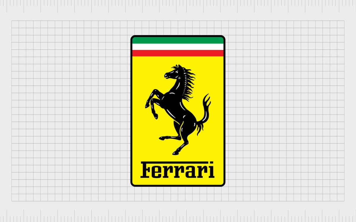
Ferrari logo
Ferrari is one of a handful of vehicle emblems sure to make an immediate impact anywhere in the world. The official name for the Ferrari logo is the “Cavallino Rampante” or “Prancing Horse”.
According to the company, the founder behind the brand, Enzo Ferrari often shared the story of his first win at the Savio circuit, where he met Count Enrico and Countess Paolina Baracca.
The count and countess were parents of an Italian fighter pilot who flew with a horse on his plane. The son had passed away, and the count and countess passed the design to Enzo, telling him it would bring him luck.
The prancing horse and bright yellow background has been a staple of the Ferrari brand throughout the decades.
Learn more about the Ferrari logo here.

Fiat logo
Fiat, one of the world’s biggest automakers, and the most popular vehicle brand in Italy, has experimented consistently with its logo since it first launched in 1899.
The company has one of the longest logo histories of anyone on this list, with dozens of different symbols introduced over the decades. Currently, the Fiat logo used today is one of the simplest ever produced by the brand. It features no decorative elements, just a simple wordmark.
The lettering of the Fiat logo is inspired by the custom typeface used by the business in multiple previous emblems. It’s a geometric sans-serif font, with unique components throughout, particularly in the interesting shape of the letter “A”.
The Fiat logo symbolizes strength and stability, as well as a commitment to heritage and innovation. It can appear either in black on a white background, or in a shade of scarlet red.
Learn more about the Fiat logo here.

Ford logo
Ford is credited with being one of the original companies in the car manufacturing industry. Though the car brand symbols of Ford haven’t changed much over the years, their simplicity makes it easy to recognize the company anywhere.
The blue oval of the Ford car emblem has remained with the company since 1927.
The script within the car insignia, written in white to convey purity and clarity, was created by the Ford Chief Engineer Childe Harold Wills, and was apparently based on the signature of Henry Ford himself, the creator of the company.
Learn more about the Ford logo here.
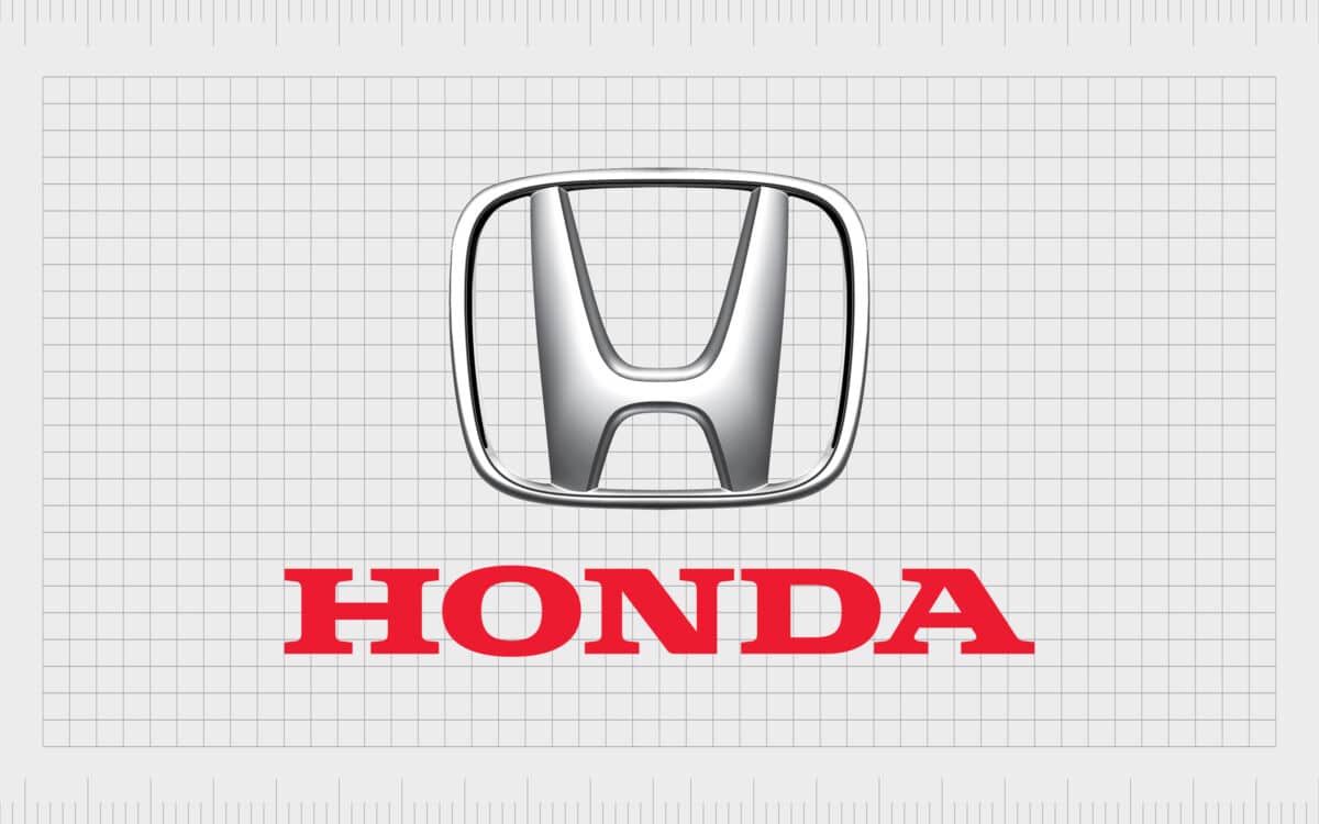
Honda logo
Famous car logos don’t have to be complex to be memorable. The Hondo logo is one of the easiest to recognize in the world, with its bold capital “H” at the center of a rectangle with curved edges. As car logo meanings go, Honda’s seems to be obvious.
However, the H apparently stands for more than just the word “Honda” – a name chosen for the founder, Soichiro Honda.
While the H does play homage to the company founder, mechanic, racer and tuner, it’s also intended to look a little like a person raising their arms to the sky in victory. This is why the top section of the H is much broader than the bottom.
Learn more about the Honda logo here.

Hyundai logo
At first glance, Hyundai’s emblem doesn’t look like it should be on a list for the most unique car company logos. You could even argue the design looks similar to the Honda symbol. However, this insignia still has its own unique appeal.
The South Korean company say the logo stands for more than most people would think.
While the H stands for “Hyundai”, it’s also intended to look like two people shaking hands. The decision to encase the H in an oval was also deliberate. Hyundai says the oval represents the internationality and inclusivity of the company.
Learn more about the Hyundai logo here.

Infiniti logo
One of the more modern famous car logos we’ve looked at so far, the Nissan luxury brand “Infiniti” uses a partial metallic oval, with a triangle in the center.
According to the branding team for Infiniti, the design isn’t just supposed to be an eye-catching shape. The triangle in the center represents a road trailing off into infinity.
Tasteful and clever, the Infiniti car insignia combines simplicity with hidden meaning. Although the business is still relatively new compared to some of its competitor, the Infiniti logo is helping to carve a place for the Nissan brand in logo history.
Learn more about the Infiniti logo here.

Jaguar logo
Similar to BMW or Ferrari, Jaguar is a name most people would associate with strength, luxury, and power. The Jaguar emblem seems like a natural choice, featuring a leaping Jaguar with its teeth bared.
According to the history of Jaguar, this symbol was actually a nod to the Swallow Sidecar business who produced the SS Jaguar in the 1930s.
Eye-catching and meaningful, the Jaguar logo conveys power, strength, and beauty. This car insignia is also an insight into how many companies use animals in their car brand badges.
Learn more about the Jaguar logo here.

Jetta Motors logo
A relatively new addition to the automotive industry, Jetta motors, or “JETTA” was launched in China during 2019, by the Volkswagen brand. The company immediately earned significant success, selling more than 30,000 vehicles to customers in less than a year.
Though the company operates under the Volkswagen parent brand, it has a brand identity of its own. The organization uses a sleek geometric design in white, on a bright purple background. Underneath the shape, which looks similar to a car door, we see the “JETTA” inscription.
The name is depicted all in uppercase letters, in a bold, sans-serif font, symbolizing strength, durability, and reliability. According to Volkswagen, the name “Jetta” comes from the German name for “Jet stream”, a reference to speed and innovation.
Find out more about the Jetta logo here.
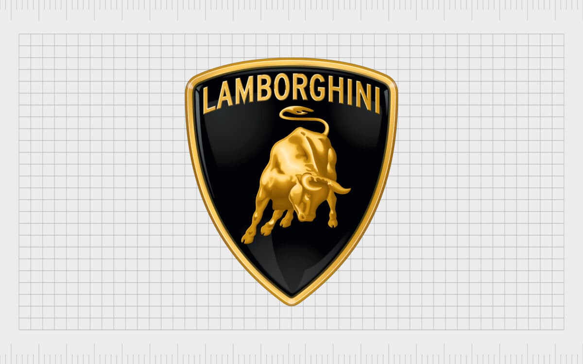
Lamborghini logo
Another well-known luxury brand, Lamborghini’s car badges are associated with class and quality. Similar to many other car company logos created for the premium market, the Lamborghini logo has its own animal mascot.
The bull represents strength, while also paying homage to founder Ferruccio Lamborghni, who visited Don Eduaro Mirau’s ranch and saw fighting bulls for himself.
Interestingly, Lamborghini also used the name of fighting bulls, as well as bullfighting terms for the names of cars, like Islero, Jalpa, and Diablo.
The use of gold and black as a color scheme denotes quality and luxury, while the shield shape is all about reliability.
Find out more about the Lamborghini logo here.
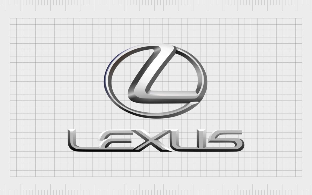
Lexus logo
The Lexus logo is an unusual, but simple addition to our list of famous car logos. Compared to other motor brands, Lexus is still relatively new, so it hasn’t had a chance to gain much of a name for itself yet.
However, the simplistic emblem is helping to generate brand awareness among motor lovers.
The current emblem features the letter “L” in a circle. The L stands for “Lexus”, which was taken from the name “Alexis” – the title Toyota originally wanted to use for its premium car brand.
The circle surrounding the “L” could be a nod to community, or inclusivity.
Learn more about the Lexus logo here.
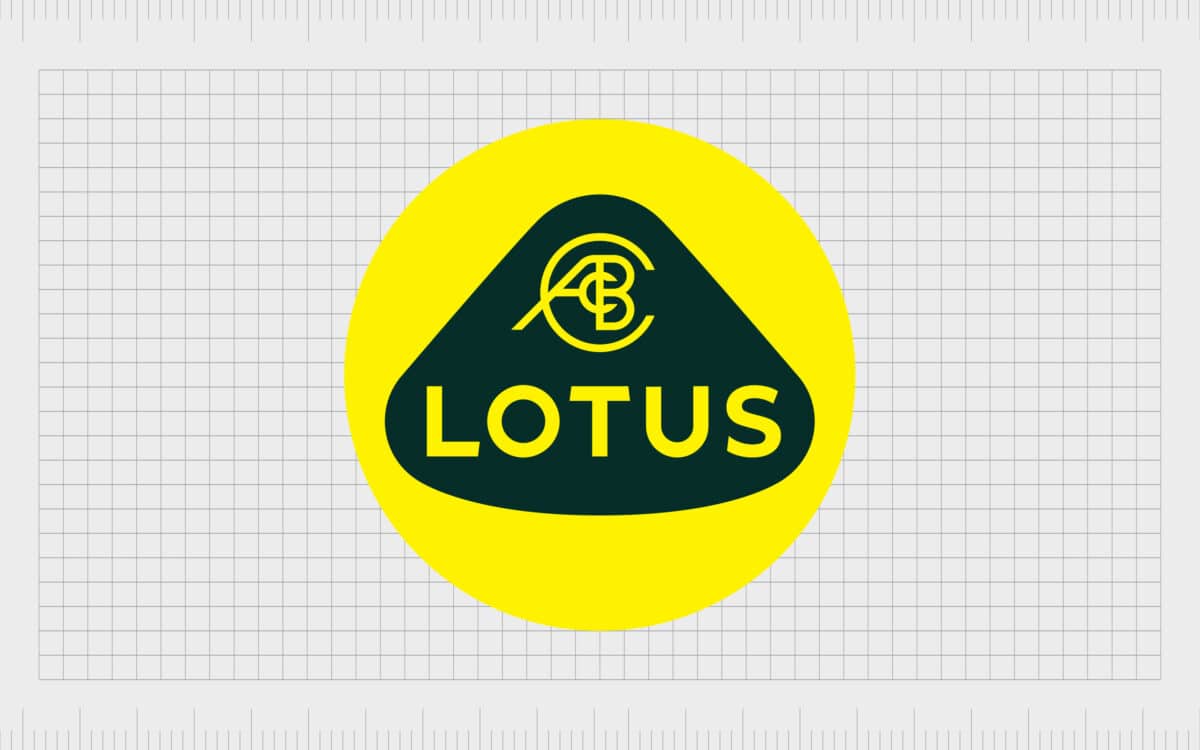
Lotus logo
The Lotus brand, founded by Anthony Chapman, started life as a manufacturer of road and racing cars. The Lotus emblem features Chapman’s initials, including the middle names, Colin, and Bruce.
Throughout the years, most of the elements of the Lotus icon have remained the same. Since the company began in 1952, it’s maintained a consistent image, with the British racing green in the background, and a bright yellow to symbolize happiness.
Lotus car’s have achieved a lot of fame over the years, particularly in the Formula 1 racing industry. Though Chapman is no longer with us, the Lotus company continues to produce some of the world’s best racing cars.
Learn more about the Lotus logo here.

Maserati logo
Maserati is one of the many car companies who decided to maintain the same aesthetic for their logo over the years. Since the company began in 1926, the Trident logo has remained largely consistent.
The image was inspired by the iconic statue of Neptune located in Bologna, Italy, where the Maserati company first began making cars.
The statue in Italy features Neptune wielding his famous trident. The Maserati team decided to use this powerful weapon in their symbol, with the addition of the Bologna colors, white, red, and blue.
Learn more about the Maserati logo here.

Mazda logo
Originally conceived in 1936, Mazda’s logo started life as a triple-stacked “M”, meaning Mazda Motor Manufacturers. Over the years, Mazda experimented with different designs, adding wings to symbolize agility, then eventually simplifying the logo to an M in a circle.
In 1992, Mazda introduced a new brand symbol made of a circle with a curved diamond shape in the middle.
The logo we see today is an oval with a set of simplified silver wings in the center. The shape in the middle of the oval is intended to represent wings, but it can also look a lot like an “M” when combined with the surrounding oval.
Learn more about the Mazda logo here.

Mercedes-Benz logo
Another great insight into the power of simplicity in the motor world, the Mercedes Benz logo is eye-catching and easy to remember.
Designed by Paul and Adolf Daimler in honor of their late farther, the original Mercedes logo focused on the shape of a star, intended to represent prosperity and good luck for the growing company.
The Mercedes company trademarked both a four-pointed version of the star, and the three-pointed alternative we know today.
According to the Mercedes team, the choice of the 3-pointed star was based on the company’s desire to one day create vehicles for three different purposes – land, sea, and sky. The simple shape drawn in silver continues to earn attention around the world today.
Learn more about the Mercedes Benz logo here.

Mini
British automotive marque, Mini, was originally founded in 1969, and has been owned by the BMW corporation since the year 2000. The word “Mini” was used in various car model names through the 1950s and 60s, before the company became a marque in its own right.
The name is a reference to the focus of the car manufacturer, which concentrates on the development of affordable compact cars, such as the Mini Cooper.
Mini’s logo is eye-catching, and minimalistic. It features a circular badge, with the name “Mini” presented in a sans-serif, uppercase typeface in the center.
On either side of the circular border, we see four extending lines in various sizes. These look a little like the wings common on many car company logos today.
Find out more about the Mini logo here.
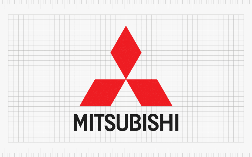
Mitsubishi logo
The Mitsubishi logo might seem simple at a glance, but it’s actually brimming with deeper meaning. The Mitsubishi Corporation, first established in 1870, draws attention to its heritage and roots with its three-diamond logo design.
The three rhomboids were inspired by the family crests of the Tosa clan, and Yatoro Iwasaki. They also reference the company’s name, which is a combination of two Japanese words. “Mitsu” stands for three, which “hishi” is a term used for a water chestnut.
The red coloring in the logo symbolizes vitality and passion, while the black lettering used for the wordmark conveys ideas of professionalism and strength. Together, the components of the Mitsubishi logo highlight its history in the automotive space, and its Japanese pride.
According to the company, the three diamonds also stand for the core values of Mitsubishi, which include integrity, success, and reliability.
Find out more about Mitsubishi logo here.

Nissan logo
Many famous car logos involve the name of the company placed somewhere in the brand’s badge. Nissan’s logo is a simple chrome badge with the word “Nissan” written in capital letters.
The origins of this symbol begin with Nissan’s ownership of the Datsun company. The Datsun brand used the name of the company in a blue rectangle atop a red circle – similar to the Japanese rising sun image.
The existing Nissan logo appeared in 2001, built on a more modern interpretation of the Datsun emblem. Today, the badge is available in both chrome and black. Both of these color choices are excellent for representing creativity and modernism.
Learn more about the Nissan logo here.
Polestar logo
Polestar, a Swedish electric car brand with an eye on the future of transportation, first launched in 1996. Drawing inspiration from its name from a famous racing team, and a passion for discovery, Polestar stands as an innovator in the automotive industry.
The Polestar logo, consisting of two silver arrows facing each other to form the minimalistic image of a star, symbolizes a focus on professionalism, excellence, and exploration. A blue and silver color palette reminds us of stars in the night sky.
Though the Polestar logo sometimes includes a wordmark, the four-pointed star image alone is enough to highlight the unique values, vision, and mission of the brand. The simplistic, yet evocative design gives the company a wonderfully modern aesthetic.
Find out more about the Polestar logo here.

Porsche logo
Frequently compared with Ferrari for the use of a prancing horse, the Porsche logo is an image focused heavily on sophistication, luxury, and heritage. It’s hard to find a famous car logo more eye-catching than this stunning crest, featuring the colors gold, red and black.
The symbol of Porsche hasn’t changed much since its original introduction in 1952, when the Porsche brand was brought to life. The unique coat of arms used in the Porsche logo has a strong connection with the city of Stuttgart, where the Porsche headquarters is located.
The antlers and black and red stripes surrounding the horse represent the Wurttemberg state in Germany.
Learn more about the Porsche logo here.

Saab logo
Saab’s iconic vehicle emblem dates back to the production of airplanes in the 20th century. A company named Swedish Aeroplane Limited (Svenska Areoplan AB) decided to begin producing cars in the 1950s.
The logo of the business previously featured the front of an airplane propeller, which didn’t make much sense on a car. The brand decided to use a red Griffin with a golden crown to symbolize fantasy, creativity, and luxury.
The Saab name was adopted with the new logo. Interestingly, the choice of the red Griffin is also inspired by the logo of Vadis-Scania, a truck manufacturer which partnered with the Saab parent company.
The griffin also appears in Swedish coats of arms.
Learn more about the Saab logo here.

Scout Motors
One of the most sophisticated looking car logos on this list comes from Scout Motors. The automotive company is a subsidiary of the Volkswagen group, introduced in 2022 to produce electric vehicles capable of off-road transport.
The company has yet to produce any new vehicles at the time of writing, though a small SUV and pickup truck are scheduled to be released in 2026. The Scout marque comes from the off-road vehicle, the “International Harvester Scout”.
Volkswagen has owned this vehicle since 2020, through the American truck subsidiary, Navistar International. The company’s logo, is a simple wordmark, written in a cursive, sans-serif font, with bold lines and sophisticated curves.
The black and white design draws attention to the professionalism of the company, while the unique font symbolizes innovation and creativity.
SEAT
The SEAT logo is one of the simplest emblems on this list, but that doesn’t make it any less impactful. This eye-catching emblem has changed a number of times since the company launched in 1950, to become the modern design we know today.
The SEAT logo features a large letter “S” with a single white stripe through the diagonal bar, intended to symbolize speed and progression. The black and white color palette draw attention to the company’s sophisticated and professional nature.
In the uppercase letters of the SEAT inscription, we see a reference to the strength and modernity of the brand, as well as its commitment to innovation.
This straightforward logo is immediately eye-catching, conveying ideas of luxury, excellence, and transformation.
Find out more about the SEAT logo here.
Škoda
The Škoda logo is certainly one of the most interesting emblems in the automotive industry. Škoda emerged as the brand following the Laurin & Klement company in 1925, and has been working on the development of a powerful brand image ever since.
The main element of the emblem, the winged arrow, was apparently inspired by a portrait of a Native American man wearing a traditional headdress. However, the design itself is intended to represent ideas of speed, precision, and freedom.
The Škoda color palette, featuring a dark green shade on a white background, is connected with concepts like wealth, growth, and creativity.
The Škoda wordmark, which appears alongside the badge in some branding materials, features bold, uppercase letters, with unique elements, showcasing modernity and strength.
Find out more about the Škoda logo here.

Subaru logo
The Suburu brand is actually named after the Pleiades, a star cluster from the Taurus constellation. Once you know this, it’s easier to understand the logo. There’s often a connection between car logos and names, and the Subaru brand is no exception.
The badge shows a selection of six stars from the Taurus constellation – the ones most visible to the naked eye when star gazing.
The five smaller stars behind the larger star also represents the merger of five small companies which combined to become Fuji Heavy Industries. The choice of blue and silver represent the colors of the night sky, but also the concepts of reliability and credibility.
Learn more about the Subaru logo here.
Suzuki logo
Sleek and powerful, the Suzuki logo is a symbol of the company’s commitment to evolution and adventure. Founded in 1909, Suzuki hasn’t changed its visual identity much over the years.
Its emblem today reminds us of the original Suzuki symbol, which featured two eagles facing in opposite directions to create an “S” shape. Though the logo has since been refined to something much simpler, it retains its modern geometric appeal.
The “S” character resembles the characters used in Japanese script, giving the company a hence of heritage and history. The bright red coloring is also evocative, demonstrating the passion and vitality of the brand, while the blue wordmark speaks of reliability and trust.
Though relatively straightforward, this icon is highly diverse, memorable, and impactful, which could be why it has stayed the same since 1990.
Find out more about the Suzuki logo here.

Tesla Inc logo
Introduced in 2003, Tesla is one of the most modern and innovative car companies in the world today. It’s currently one of the top-sellers of electric cars in the world, and also produces a wide variety of energy storage devices and solar panel systems.
Tesla hasn’t changed its logo much over the years. The unique emblem looks a little like the cross-section of an electric motor. This draws attention to the company’s focus on electric vehicle design, as well as the inspiration for the brand’s name, Nikola Tesla.
Underneath the “T” shaped component in the logo, the company sometimes uses a geometric wordmark, made of various disconnected lines. The image can appear either in black and white, silver, or in red on a white background.
Find out more about the Tesla logo here.

Toyota logo
At a glance, it’s easy to see why most people would see the Toyota emblem as an artistic or hand drawn “T” in an oval. However, according to the creators of the company, the meaning of this logo actually goes a lot deeper.
While the design is intended to remind people of the Toyota name, the choice to layer ovals on top of each other was deliberate.
The overlapping ovals in the Toyota logo symbolize trust between the car maker and its customers. The white space on the emblem is also meant to demonstrate the future potential of the company. The color red is for passion, power, and strength.
Learn more about the Toyota logo here.

Volkswagen logo
One of the largest manufacturers of cars in the world today, Volkswagen also has an extremely simple, but easy to recognize emblem.
The Volkswagen logo uses the letters W and V for “Volks” (people in German) and “Wagon” (cars in German). The stacked letters create a beautiful and simplistic shape, perfect for the front of a car bonnet.
The decision to surround the letters in a circle highlights ideas of community and inclusivity – values of the Volkswagen brand.
Learn more about the Volkswagen logo here.

Volvo logo
Taken from the Latin word “Volvere” for roll, the name Volvo is an important part of the company’s logo choice. The original emblem for the company was a blue oval with the name “Volvo” in the middle, and the words “Gothenburg, Sweden” underneath.
Over time, Vovlo began to embrace the icon of the Greek god of war, a symbol with an arrow pointing right and upwards.
According to the Volvo team, the icon is meant to symbolize the strength of the company and its commitment to protecting its customers. The arrow pointing upwards also evokes ideas of exploration and forward-thinking innovation.
Learn more about the Volvo logo here.
Celebrating famous car logos
There’s no shortage of famous car logos in the world today. Whether you’re a motor enthusiast, or just an everyday citizen, you’re probably familiar with a fair few of the car brand logos we’ve covered here today.
Car logos are more than just a mark on a piece of paper – they’re also important badges of identification in the automotive industry, each with their own unique power. Some of the leading car brand logos even inspire a sense of passion and community in their fans.
To learn more about the car brand logos mentioned above and where they came from, make sure you visit the individual Logofiles we have on our favorite car symbols.
Now read these:
—Which car companies own which car brand?
—The ultimate list of French car brand logos
—The 50 best-known car logos with wings
—The definitive guide to German car logos
—Famous car logos and emblems with stars
—Top American car brands and their logos
—Your ultimate guide to Italian car brands
—American car companies that went bust
—The conclusive guide to British car logos
—The essential list of Japanese car logos
—A decisive guide to car logos with circles
Fabrik: A branding agency for our times.

Clarity starts with a conversation.
Thanks—we’ll get back to you shortly.
Whether you're navigating a rebrand, merger, or simply need a clearer identity—we’re here to help. No hard sell, just honest advice from people who know the sector.
Let’s start with a simple question…
Prefer to email? Drop us a line.
Fabrik’s been helping organisations rethink and reshape their brands for over 25 years. We’ve guided companies through mergers, rebrands and new launches. Whatever stage you’re at, we’ll meet you there.