


Volkswagen logo history and emblem meaning
You don’t need to be an expert in motoring history to recognize the Volkswagen logo. One of the better-known companies in the vehicle manufacturing landscape, the Volkswagen brand has spread throughout the globe over the years.
Though the company was first established several decades ago in 1937, it remains as strong today as ever. The Volkswagen car logo is a testament to the brand’s resiliency, with many elements of the old Volkswagen emblem staying strong over the years.
Today, we’re going to take you on an adventure through Volkswagen history, so you can learn everything you need to know about Volkswagen logos across the decades.
Volkswagen history: The Volkswagen logo today
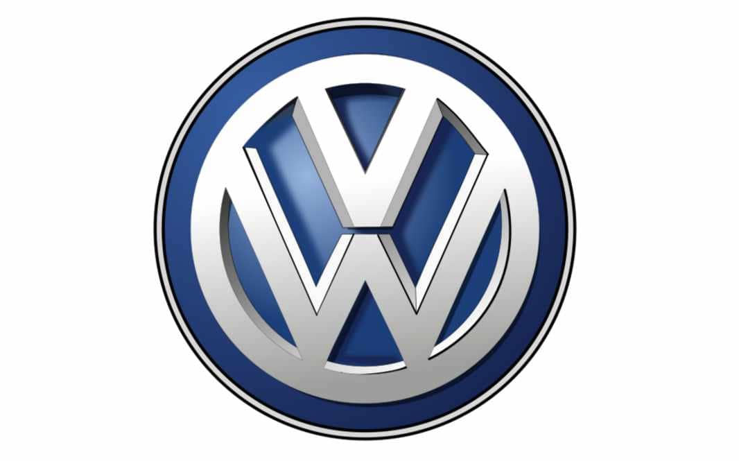
The Volkswagen symbol today is a simple but eye-catching emblem, showcasing the letters “V” and “W” in a clean, sleek circle. This current VW logo actually builds on a number of similar images products by the brand over the years.
Though the Volkswagen car logo can appear in various colors, depending on the nature of the marketing or branding campaign in question, the most common colors are blue and white. The colors of white and blue are often associated with purity, strength, vision, and reliability.
Perhaps unsurprisingly, the Volkswagen emblem is based on the name of the company, which translates from German to “car of the people”.
The brand of the Volkswagen logo is based on two letters, “V” for “Volks”, which means people in German, and “W” for “Wagen”, which translates to vehicle. The letters are enclosed in a circle to demonstrate concepts of community and inclusion.

Volkswagen: Brand overview
| Founded: | 1937 |
| Founder: | German Labor Front |
| Headquarters: | Wolfsburg, Germany |
| Website: | www.vw.com |
| Logo downloads: |
Volkswagen was initially founded in 1937 by the German Labor Front, with the assistance of Ferdinand Porsche (the man behind the Porsche brand).
The brand actually came from an idea from Adolf Hitler, who hoped to one day build a super-highway and make vehicles more affordable to the masses.
The idea for Volkswagen emerged in 1933, when Hitler visited a Berlin auto show. Following his rise to leadership over Germany, Adolf invited Ferdinand Porsche to launch the production of “people’s cars”.
The first car, the VW beetle, was inspired by a sketch taken from a French magazine. Today, Volkswagen is one of the biggest automobile companies in the world, known for the production of endless cars worldwide.
Volkswagen logo evolution: VW logo change through the years
Like many companies with decades of manufacturing history, Volkswagen has had a number of emblems over the world. Many of the older Volkswagen logos are similar to the emblem we know today, but there have been some significant changes throughout history too.
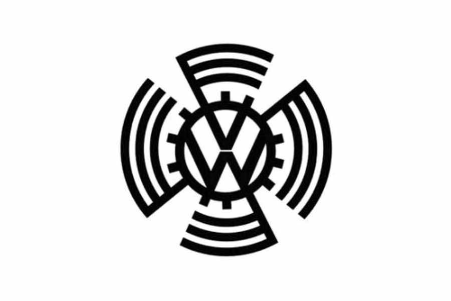
1937
The first old Volkswagen symbol was a far more complex version of the image we know today. The letters “V” and “W” still appeared in the image, one above the other in a circular frame.
However, there were several components around the circle which represented a cogwheel, and a version of the swastika symbol.
1939
1939 marked the first major change to the old Volkswagen logo, with the removal of the Nazi symbolism. The cogwheel components remained, along with the central lettering in the circle. This Volkswagen logo change created a masculine, practical, and bold image.
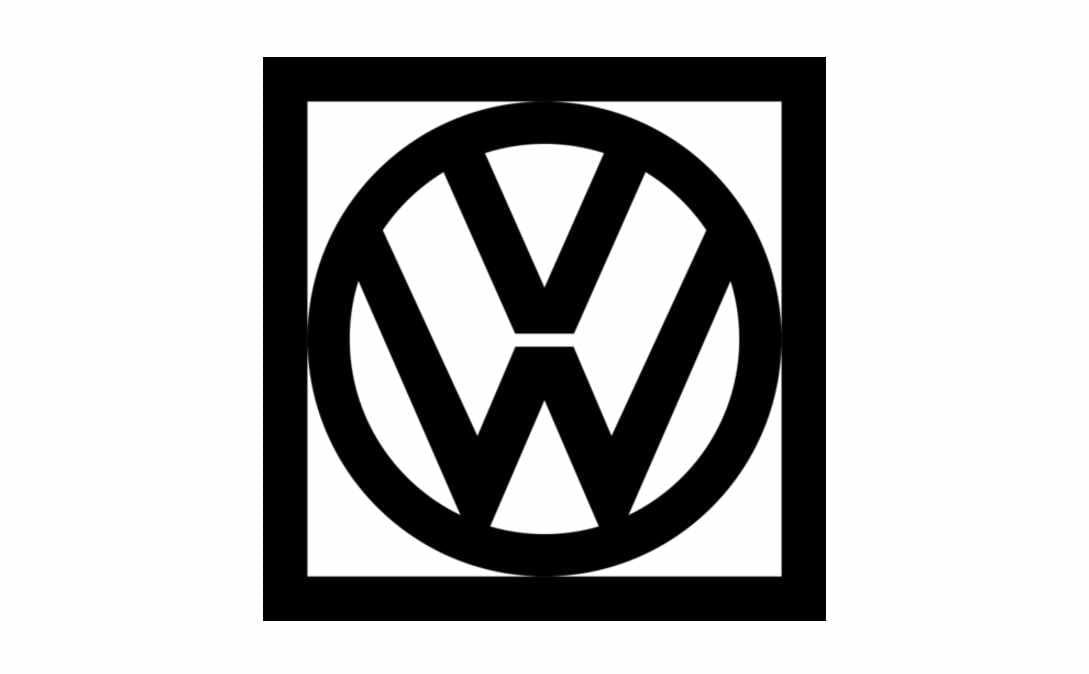
1960
In 1960, Volkswagen simplified its image again. A symbol very similar to the one used by the company today was introduced. The square placed around the circular emblem intended to demonstrate stability as the company moved into larger international markets.
The monochrome palette of the Volkswagen logo aimed to reflect the stability and power of the brand as a whole.
1967
The square disappeared again in the next 7 years, and the original Volkswagen logo circle returned. This new version of the logo was similar to the one from 1945. However, the minimalist design included a color change to blue and white.
During 1978, the company experimented with another version of the blue and white logo, this time choosing a bolder and brighter shade of blue.
The logo was also slightly modified to double the framing around the letters. The “V” from the iconic VW symbol also appeared to be a little smaller in this variation.
In 1989, the Volkswagen logo changed yet again, once again returning to a much lighter version of the blue and white coloring. The proportion changed slightly to make the logo appear cleaner and more elegant.
This image stayed with the company until the 2000s.
2000
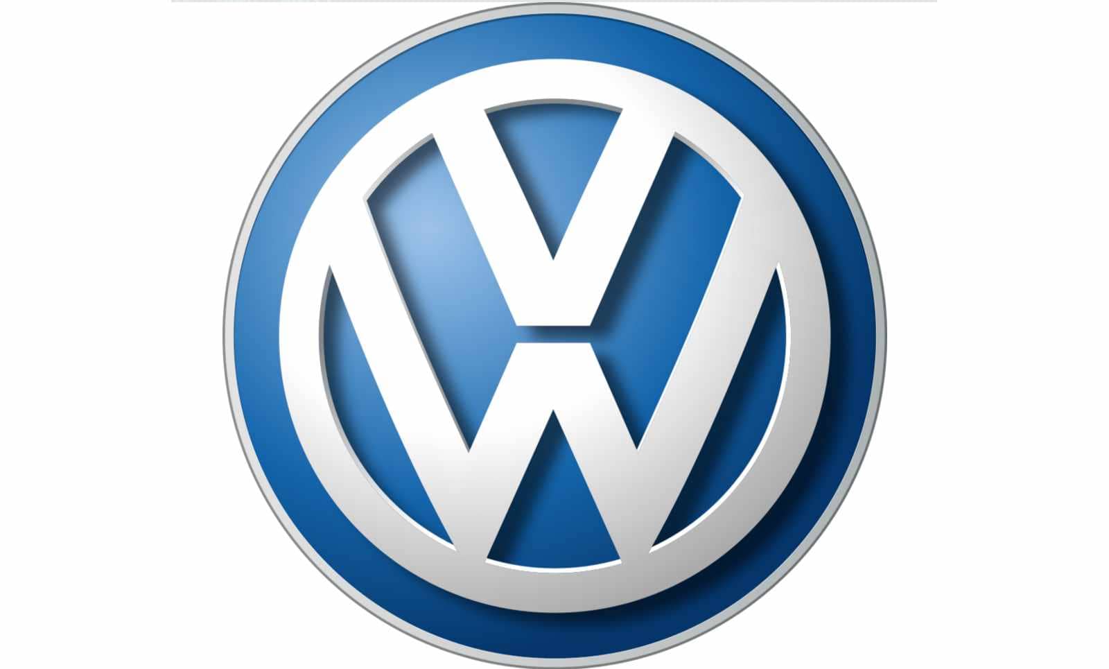
In 2000, the Volkswagen logo evolution continued as the company sought out a more modern image. The modifications introduced by Volkswagen involved a lot of gradient use, to make the emblem seem more three-dimensional.
The white coloring in the palette got a silver tone, while the blue became deeper and a little darker than the previous version.
In 2012, another version of this logo was introduced, maximizing the 3D effect. The size of the emblem was reduced a little, while the lines of the letters were made sharper and bolder.
The overall image was intended to convey modernism and progress.
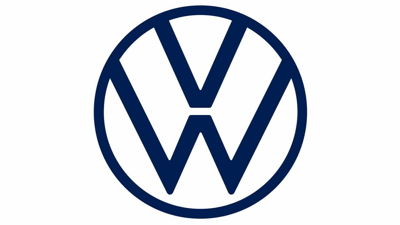
2019
In 2019, Volkswagen decided to eliminate the 3D aspects of its logo completely. The image evolved yet again, into something a lot sleeker and more slimline. The new Volkswagen logo was intended to celebrate the launch of the new range of electronic cars from the company.
Simple, sophisticated, and a little futuristic, this two-dimensional design is wonderfully stylish – perfect for a new age of Volkswagen cars.
Volkswagen symbol meaning: The Volkswagen emblem
Over the years, though there have been a number of Volkswagen logos, the image has maintained a few crucial elements at all times. The Volkswagen logo has always featured the iconic letters of “V” for people, and “W” for vehicles, taken from the name of the business.
The circle border around the monogram is an important part of the meaning of this logo. Circles in logo design often stand for community and inclusion, as well as global growth.
The branding today is simple and a lot more modern, similar to many of the minimalist logos we see produced by leading technology brands, as well as other car companies.
Although the image is similar in a lot of ways to the version from the 1960s, the circle and the “VW” symbol are a lot thinner, and the bottom of the “W” is fully separated from the circle for the first time.
Volkswagen logo colors
The Volkswagen logo color choices have changed a few times over the years. However, for the most part, the company has stayed with either black and white, or white and blue.
The colors in use today are the white and blue variants:
Silver lake blue
Hex: #6091C3
RGB: (96, 145, 195)
Space cadet blue
Hex: #1F2F57
RGB: (31, 47, 87)
Snow
Hex: #FDFAF9
RGB: (31, 47, 87)
Dark gray
Hex: #1F2F57
RGB: (31, 47, 87)
What font is the Volkswagen logo?
The Volkswagen logo font is a custom sans-serif typography. Unlike other vehicle brands, there’s no name “Volkswagen” written alongside the logo. However, the letters of “W” and “V” have always been a part of the brand’s image.
The letter “V” is smaller in size than the letter “W”, perhaps to indicate people have a more significant impact on the company than anything else.
Celebrating the Volkswagen logo today
Today, the Volkswagen logo is one of the better-known images in the world, and an incredibly memorable icon. This logo has earned the attention of countless vehicle lovers around the world and has helped the VW Company to expand on a global basis.
Don’t forget to check out other Logofiles if you’d like to learn more about the leading car logos throughout the years.
Now read these:
—Which car companies own which car brand?
—Famous car brands, their names and logos
—The ultimate list of French car brand logos
—The 50 best-known car logos with wings
—The definitive guide to German car logos
—Famous car logos and emblems with stars
—Top American car brands and their logos
—Your ultimate guide to Italian car brands
—American car companies that went bust
—The conclusive guide to British car logos
—The essential list of Japanese car logos
—A decisive guide to car logos with circles
Fabrik: A branding agency for our times.

Clarity starts with a conversation.
Thanks—we’ll get back to you shortly.
Whether you're navigating a rebrand, merger, or simply need a clearer identity—we’re here to help. No hard sell, just honest advice from people who know the sector.
Let’s start with a simple question…
Prefer to email? Drop us a line.
Fabrik’s been helping organisations rethink and reshape their brands for over 25 years. We’ve guided companies through mergers, rebrands and new launches. Whatever stage you’re at, we’ll meet you there.