Sight Scotland
A new name and identity provide a vision for the future.
Reshaping the image of a legacy brand.
For over 225 years, “Royal Blind” stood as a beacon of guidance, support, and compassion for people with visual impairments. Alongside its sister charity, Scottish War Blinded, the organisation enhanced people’s lives throughout Scotland, providing end-to-end support to those facing visual challenges. Unfortunately, like many historical companies, “Royal Blind” struggled to stay “fresh” and relevant in an evolving world.
Over time, the charity discovered the word “Blind” no longer resonated with its audience. Similarly, Scottish War Blinded felt their name wasn’t truly representative of the wide range of people they served. Over 98% of beneficiaries have vision issues unrelated to their service. It was time for a change, a fresh look, and a new perspective.
Crafting a new vision with innovation and insight.
Royal Blind and its sister charity approached Fabrik with a challenge. They wanted to shape a new identity that preserved their heritage and reputation but promoted inclusivity. The two charities needed more than a new logo; they wanted an identity that would resonate with their diverse service users on a deeper level and convey their unique values.
The two groups needed to reposition themselves in their niche as champions of hope, committed to bettering the lives of their community. This meant choosing new names, logos, and visual identities that would clearly delineate everything the charities stood for.
Rebuilding an iconic brand from the ground up.
As always, we began with an initial consultation, drawing insights from every major organisational stakeholder. We defined the “why” behind the charity to craft a new positioning statement. New names were introduced to clarify the vision and purpose of the charities. Royal Blind became Sight Scotland, and Scottish War Blinded became Sight Scotland Veterans.
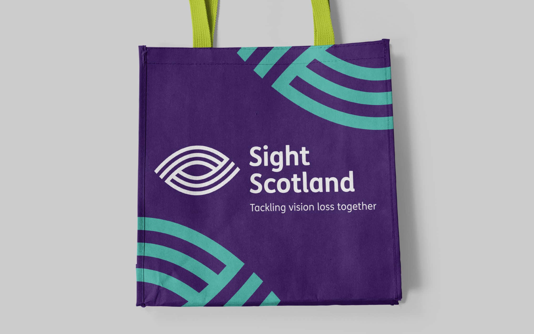
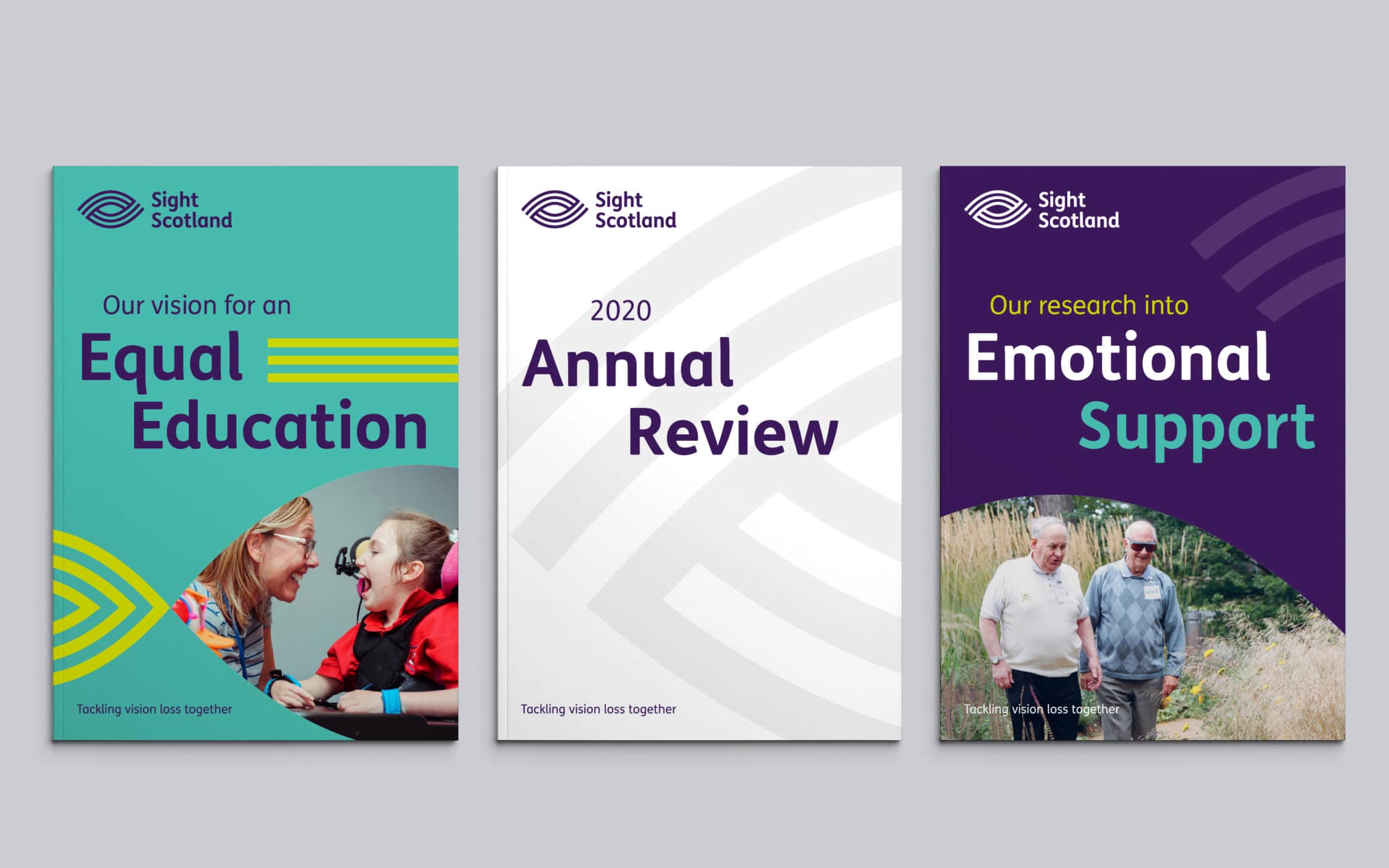
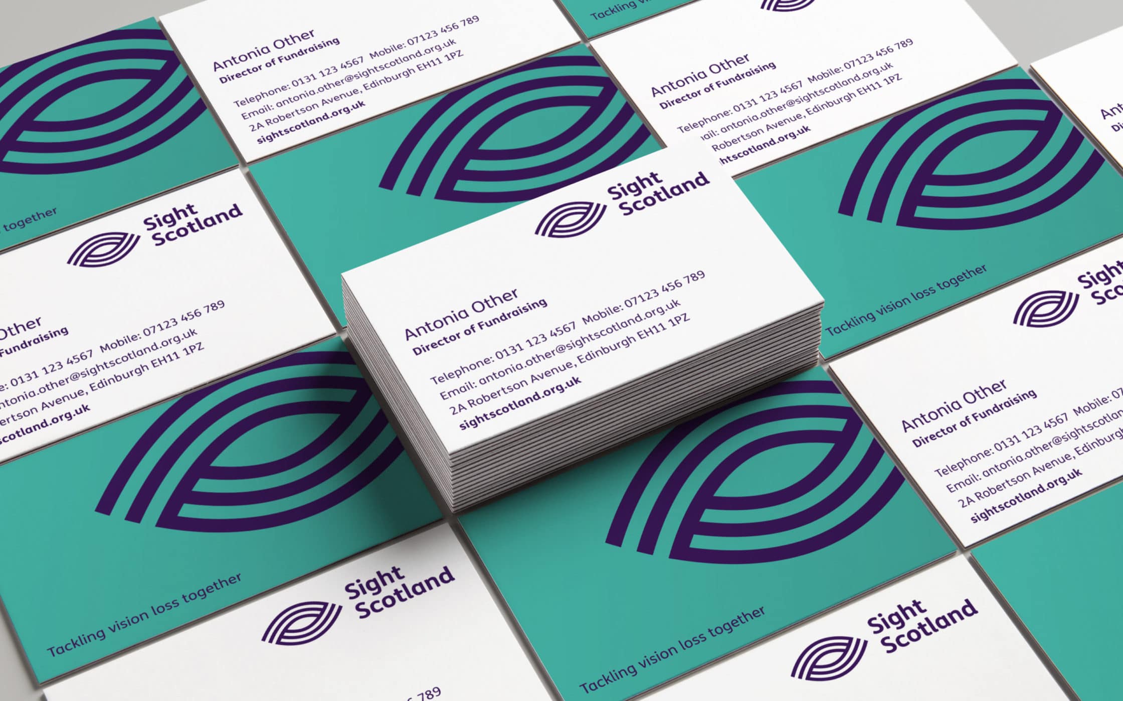
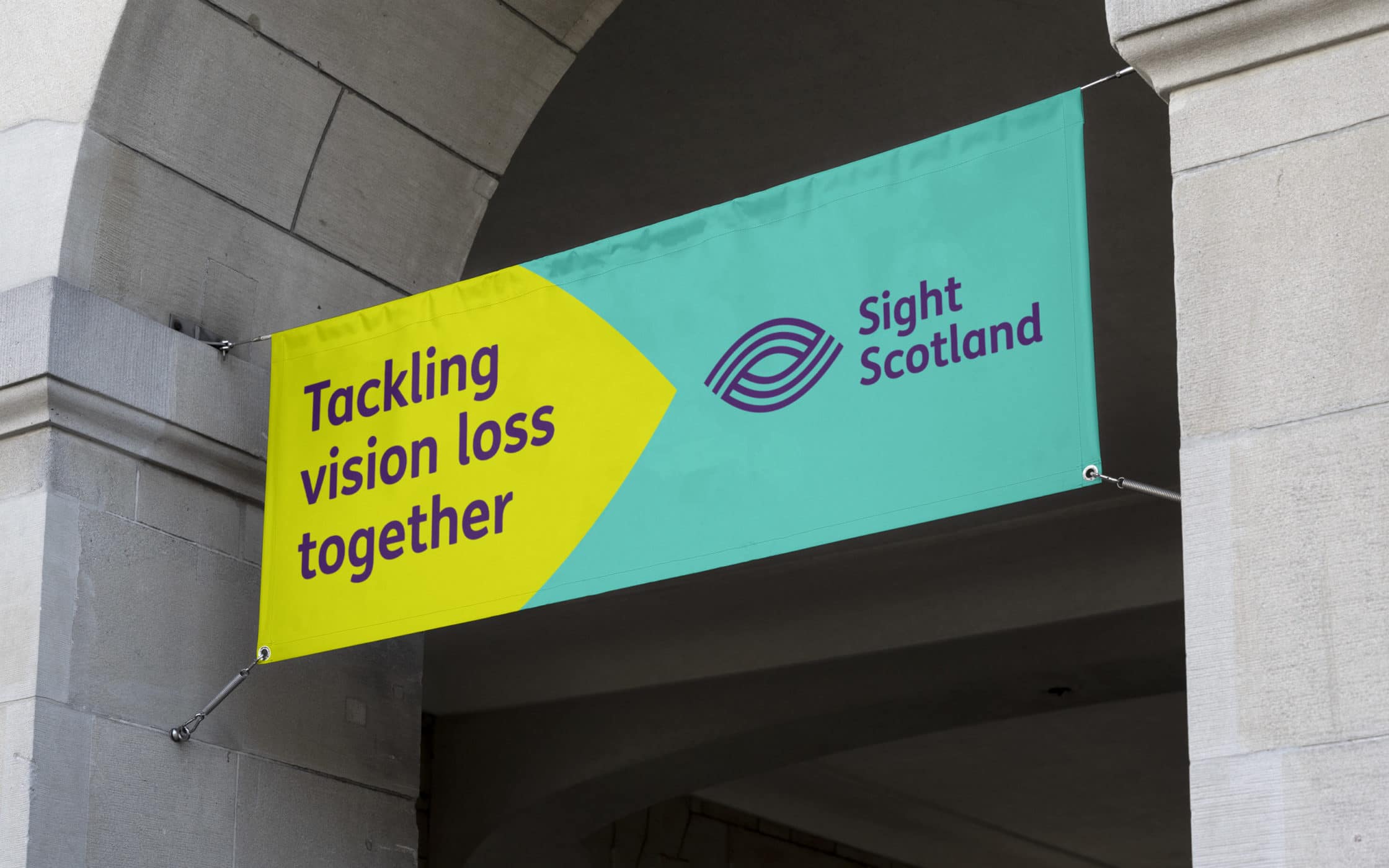
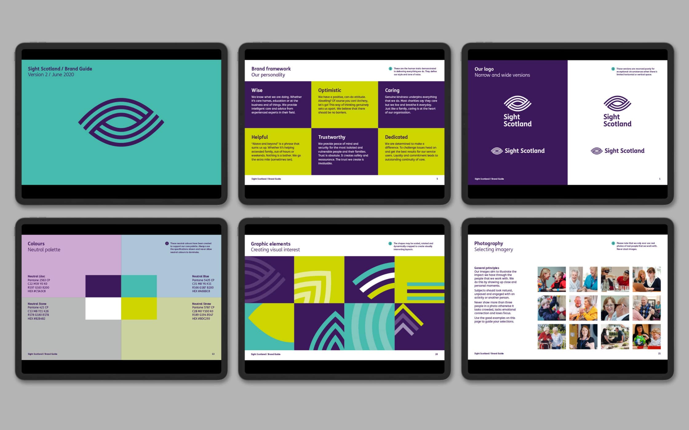
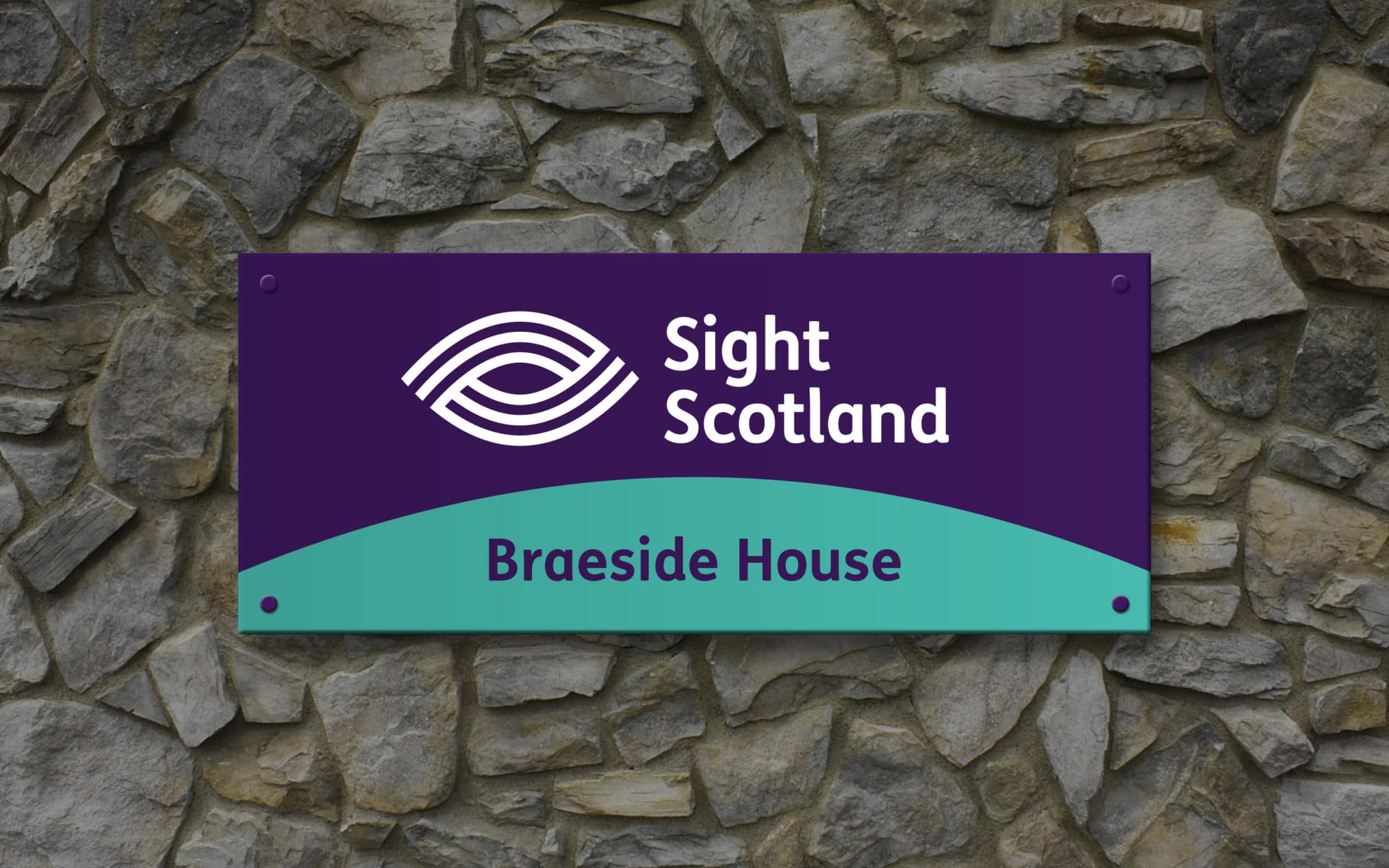
After ensuring the new names appealed to the charity’s stakeholders, we got to work on the visual assets. We created bold, friendly, and distinctive logo marks, representing the concepts of care, community, and support at the heart of both charities. Our teams crafted a new colour palette for each brand, conveying the warmth and energy powering the organisations.
A transformed identity for a brighter future.
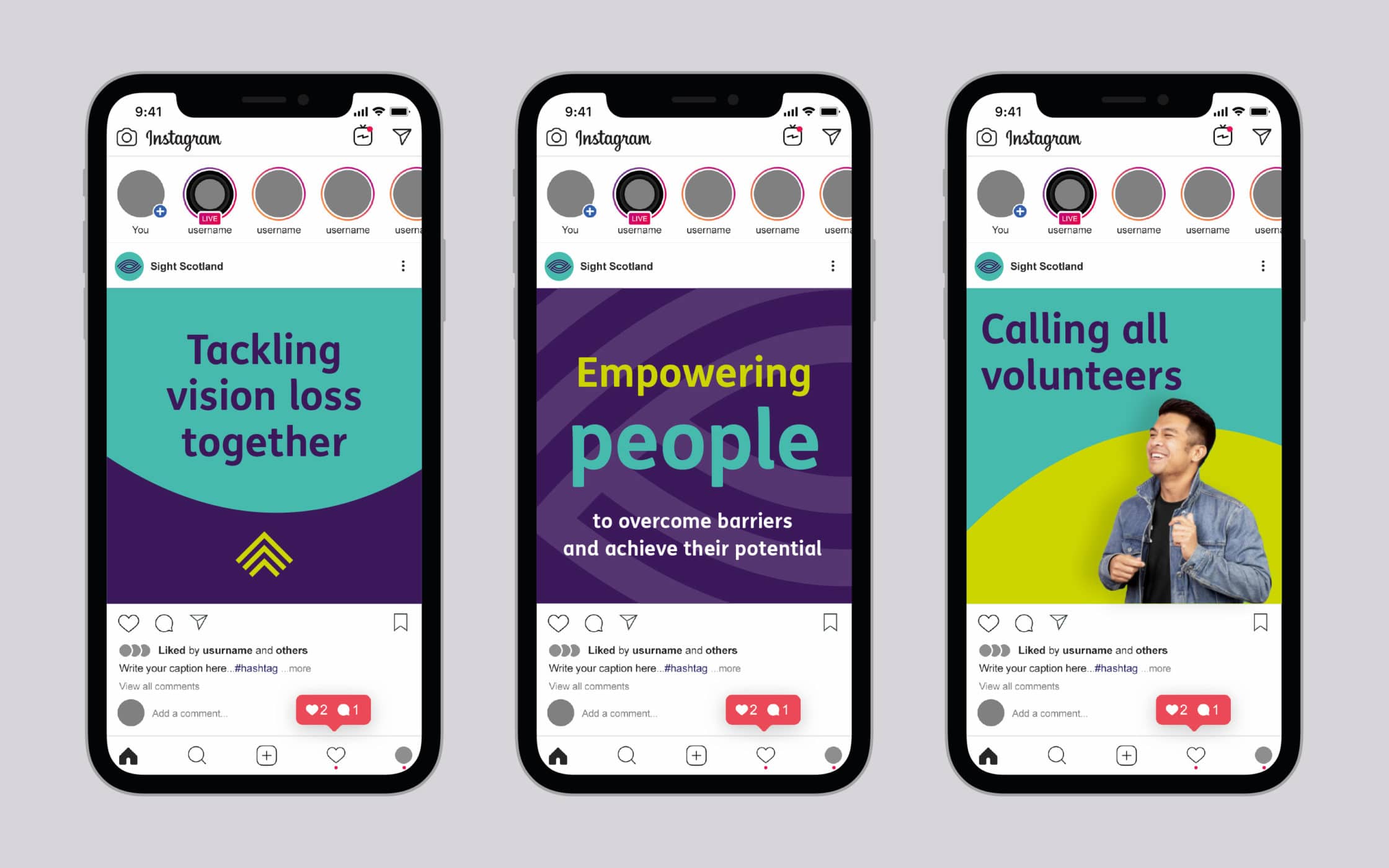
The Fabrik team went above and beyond to exceed Sight Scotland’s expectations. The new brand identities marked the beginning of a transformational journey. They allowed both groups to embrace a new image centred around inclusivity, compassion, and hope. We helped the two groups launch their unique identities with campaigns based on the proposition “Together, we can tackle vision loss.”
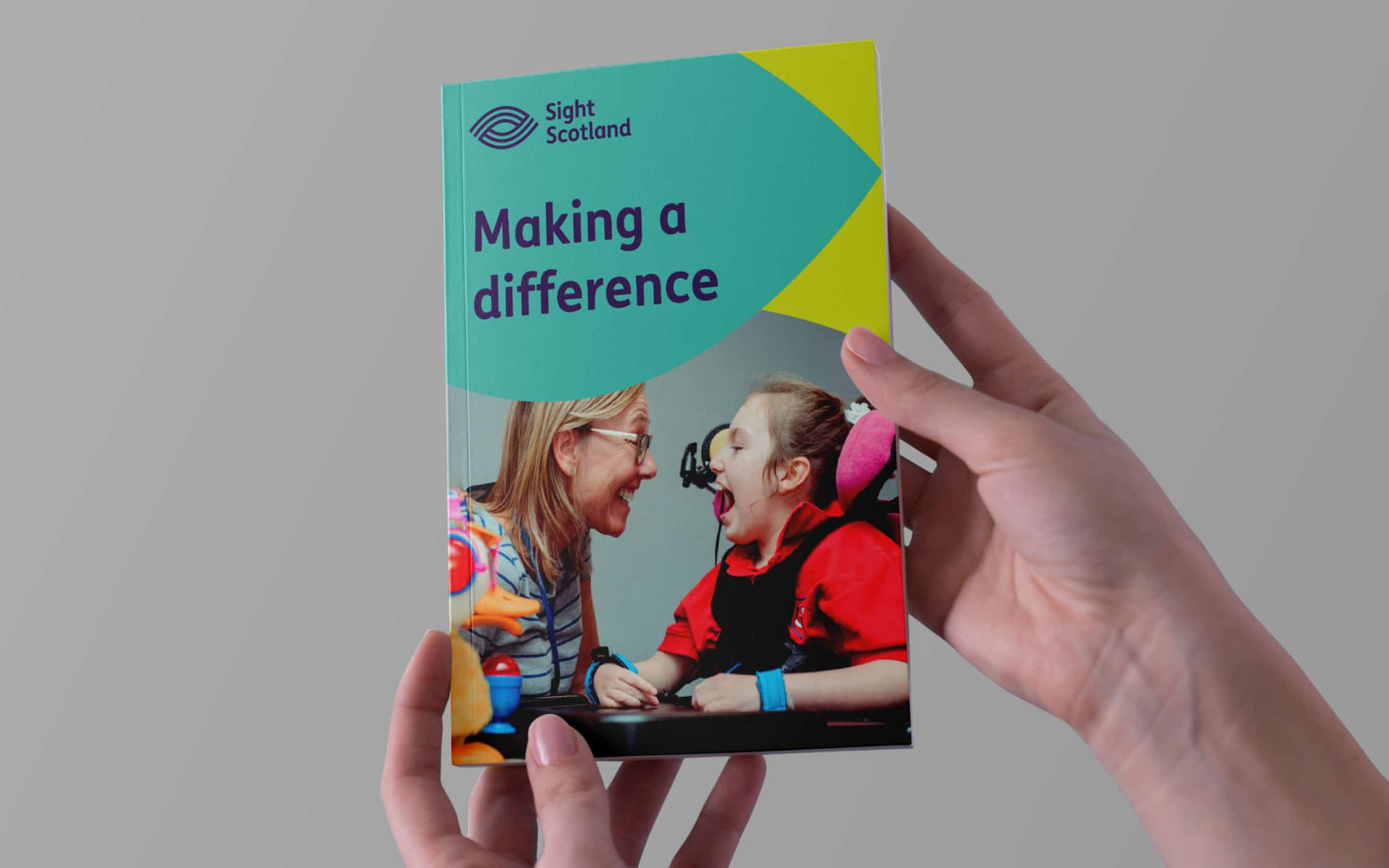
These campaigns rolled out across social media and through printed resources on busses, trains, and taxis. We even created a new campaign concept called “Sight for Sight,” encouraging individuals to engage in fundraising activities around Scottish landmarks. The complete refresh resulted in a more profound affinity between Sight Scotland and its community.
What we did:
|
—Research —Strategy —Naming —Positioning —Messaging |
—Logo design —Visual identity —Brand launch —Campaigns —Guidelines |
More from our portfolio...
Load more projectsWhat do you need?
Please tell us about your requirements, and we'll be in touch.
"(required)" indicates required fields


