An innovator in the built environment landscape.
Established in 1999, Causeway is an innovator in the built environment landscape, producing software solutions that empower engineering consultants, local authorities, and construction contractors alike. Its mission is to transform the industry with digital solutions that unify processes, data, and people, reduce risks, and enhance profitability, with a focus on positive global change.
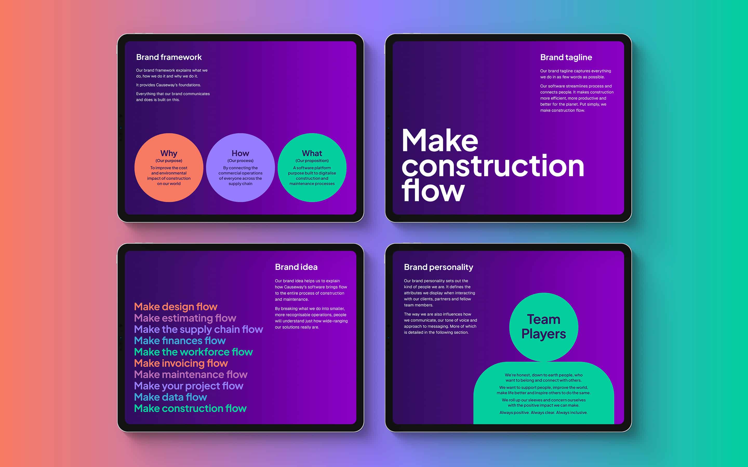
Recently, the Company began a new chapter in its evolution, with the design of a ground-breaking platform built to streamline processes throughout the construction industry. The launch of this new solution represented an opportunity for the business to refine and enhance every aspect of its brand strategy, from its positioning to tone of voice.
A comprehensive approach to rebranding.
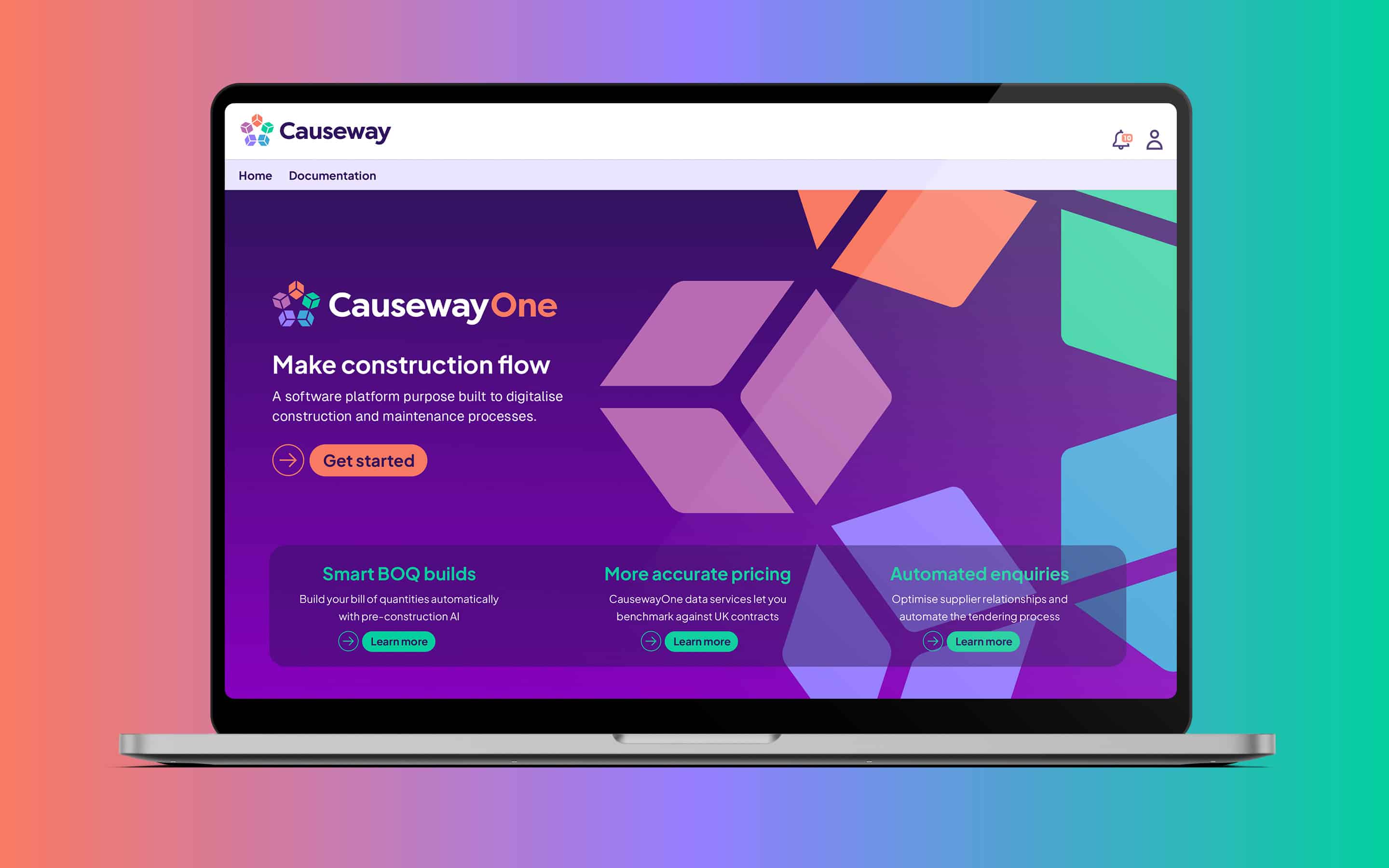
Causeway approached Fabrik with a comprehensive rebranding brief, drawing on our expertise in strategy, naming, and design. They asked us to help ensure their parent brand would thrive within the evolving sector, redefine, and highlight their values, and refresh both their visual and verbal identity. Additionally, they needed assistance with naming and launching their new platform, CausewayOne.
Our goal was to create a complete brand strategy and identity that would ensure the brand’s longevity, simplify its message, and elevate awareness. We needed to eliminate the complexities of the current brand architecture, establish new guidelines, and give Causeway a comprehensive framework for growth in the built environment industry.

Revitalising a revolutionary and revered brand.
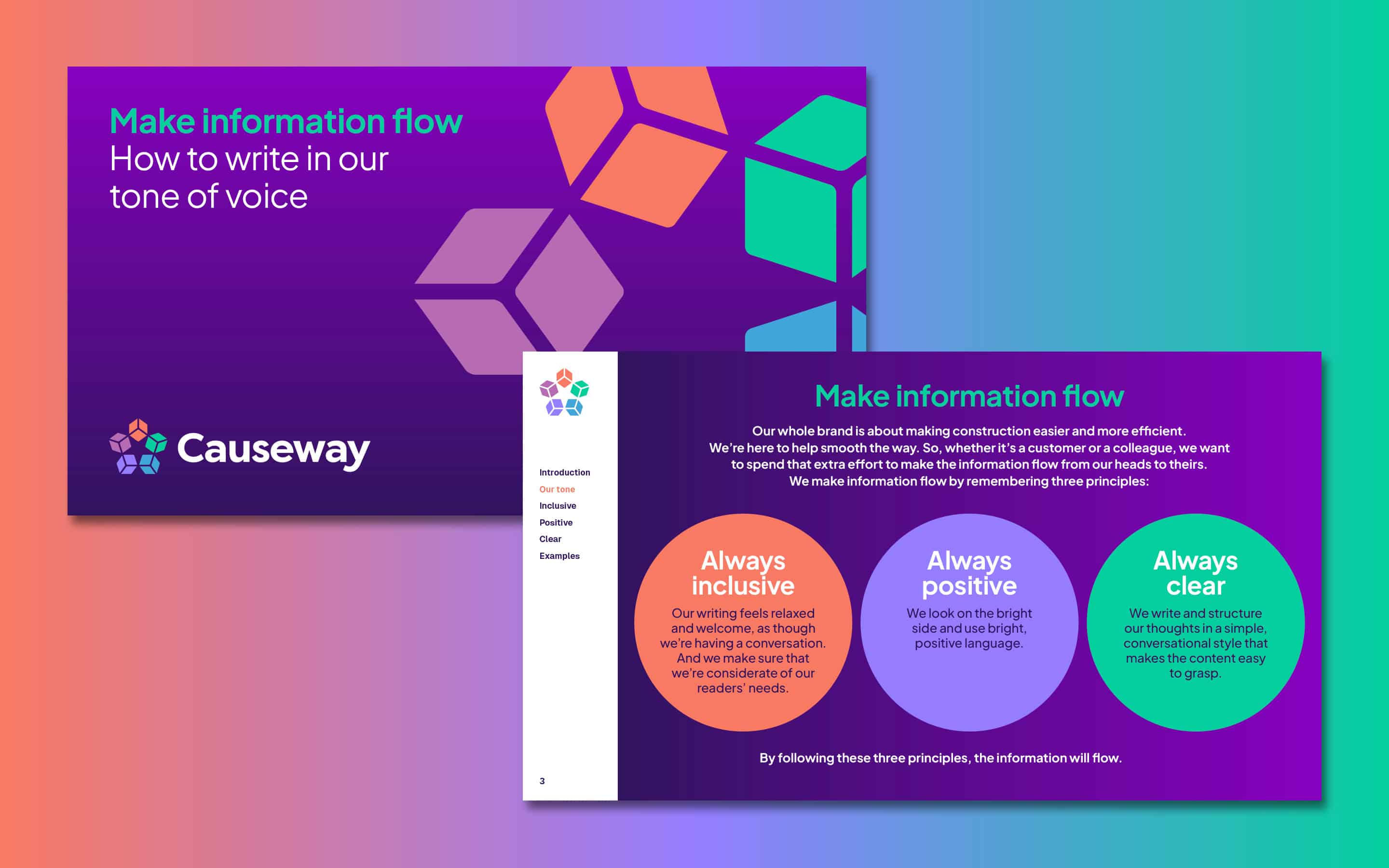
The Causeway branding project began with a comprehensive audit of its visual and verbal brand, competitors, and target audience. Based on our research, we refreshed the Company’s brand strategy, refined their values and personality, and created a clear value proposition, positioning Causeway as a business that helps improve the cost and environmental impact on the construction world. We also established a new tone of voice and tagline for the parent brand.
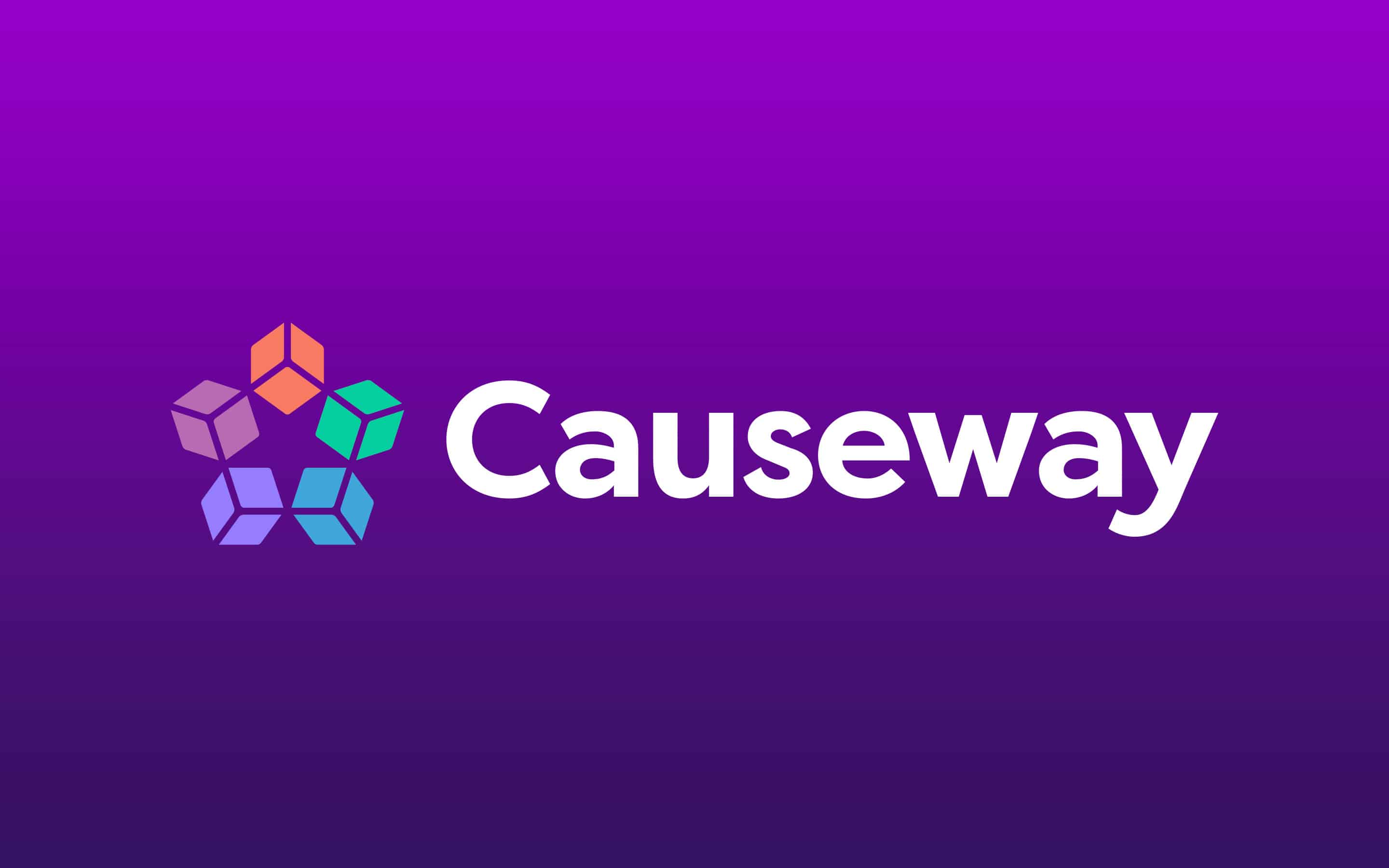
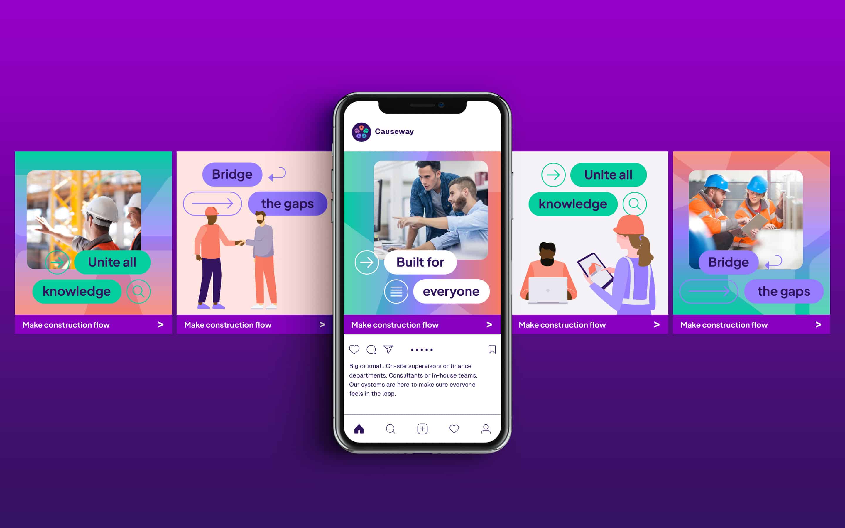
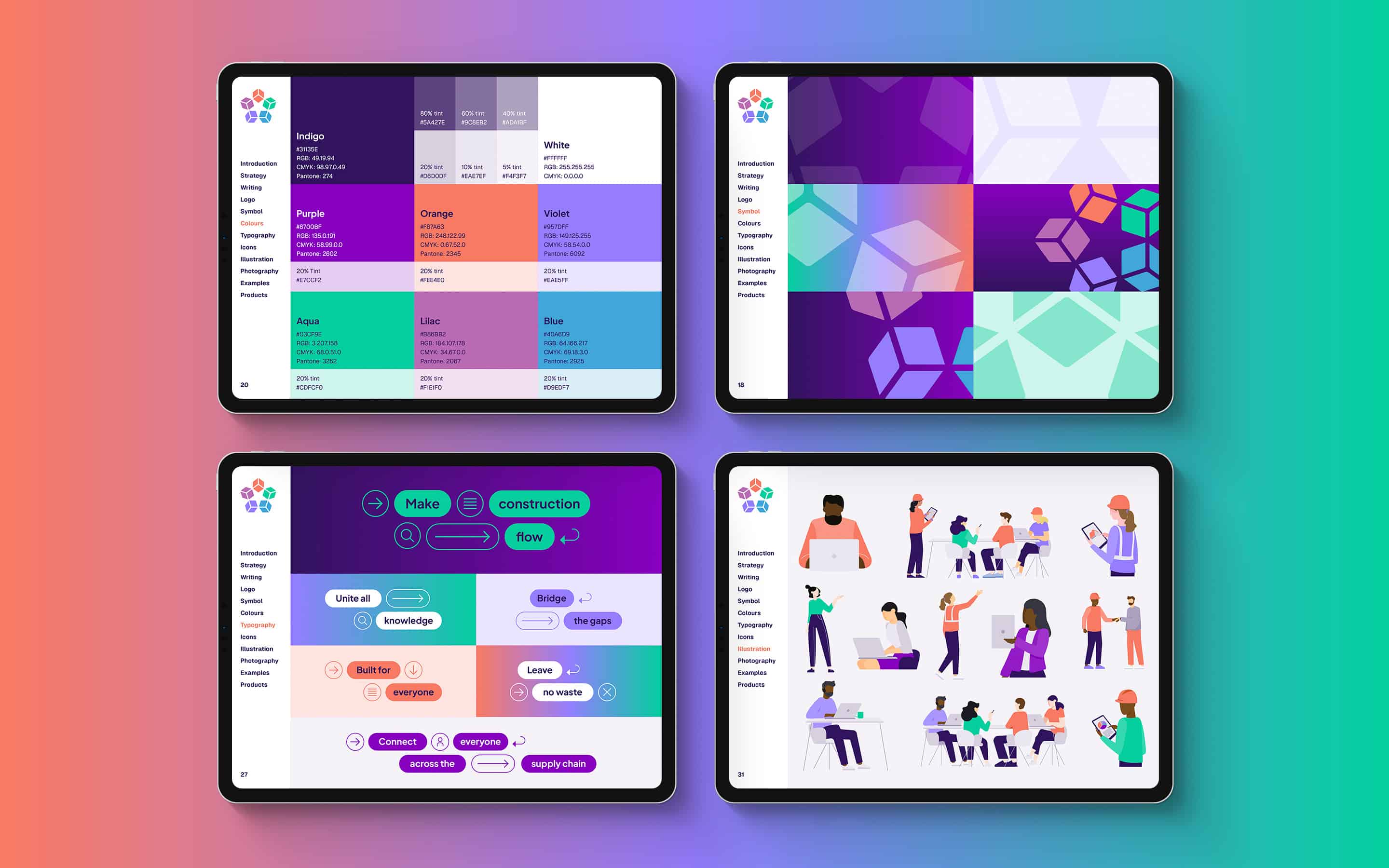
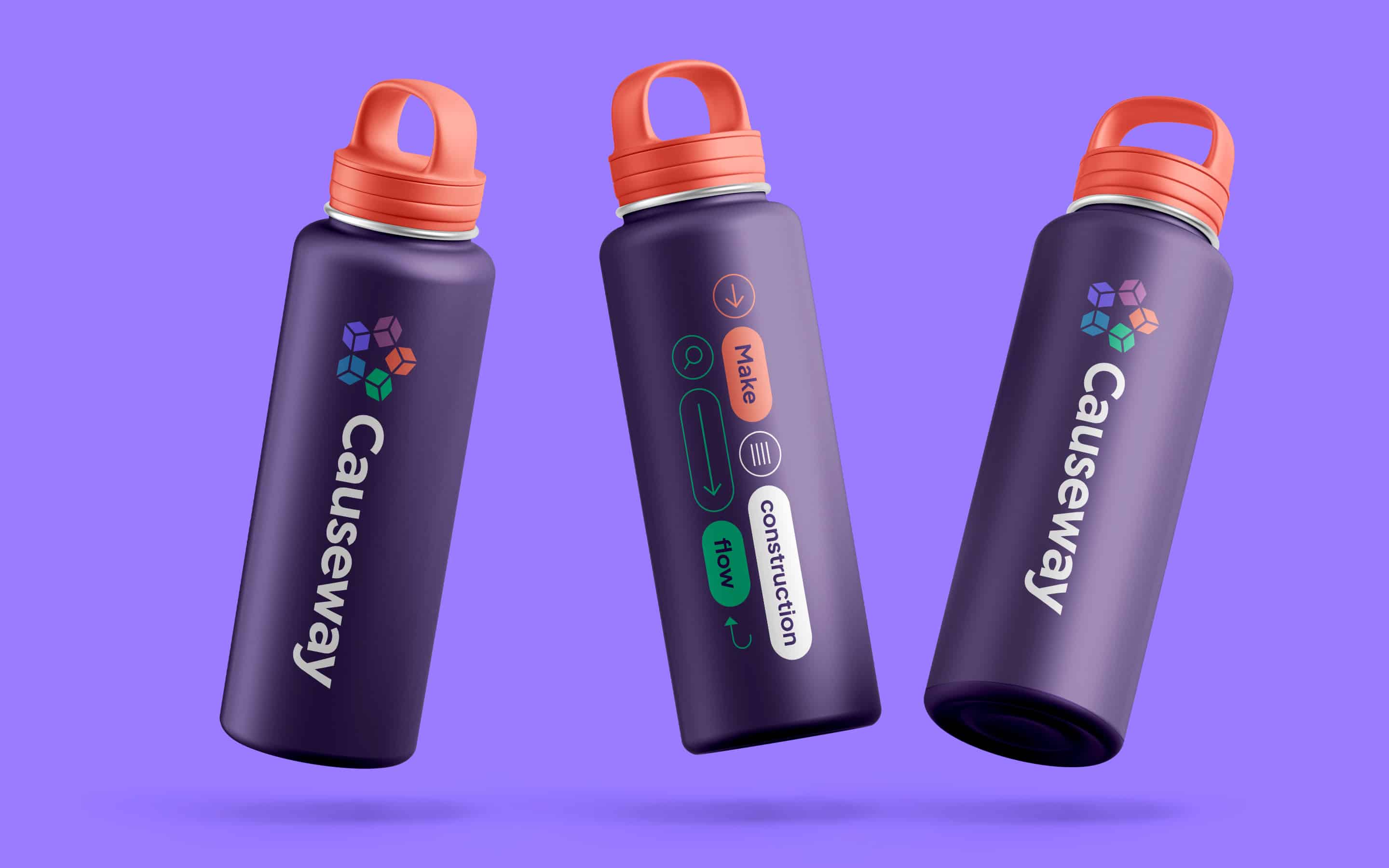
We then refreshed the brand’s visual identity, introducing a colour palette, with a distinctive purple shade. We updated the logo, retaining the previous star shape, while adding an abstract, interlinked symbol, highlighting networking and connectivity. Our team clarified the brand’s architecture, naming for sub-brands, designing product logos, and providing tone of voice training. We also initiated a brand launch program.

A transformative rebranding experience.
The comprehensive Causeway rebranding project included strategic initiatives that drew from every area of our expertise. We rejuvenated the appearance and verbal identity of the parent brand, simplified a complex brand architecture, and empowered the company to fortify its market position.
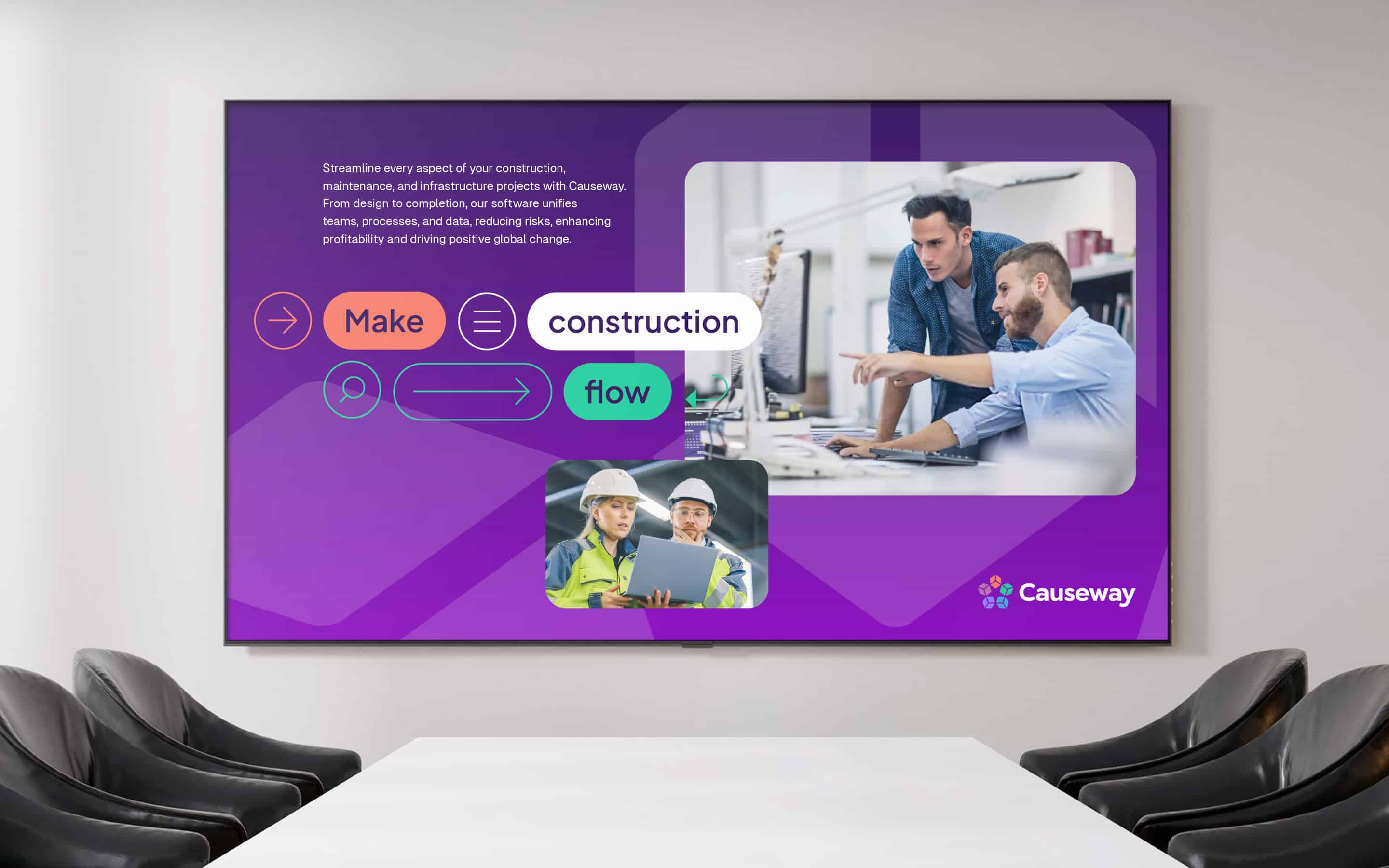
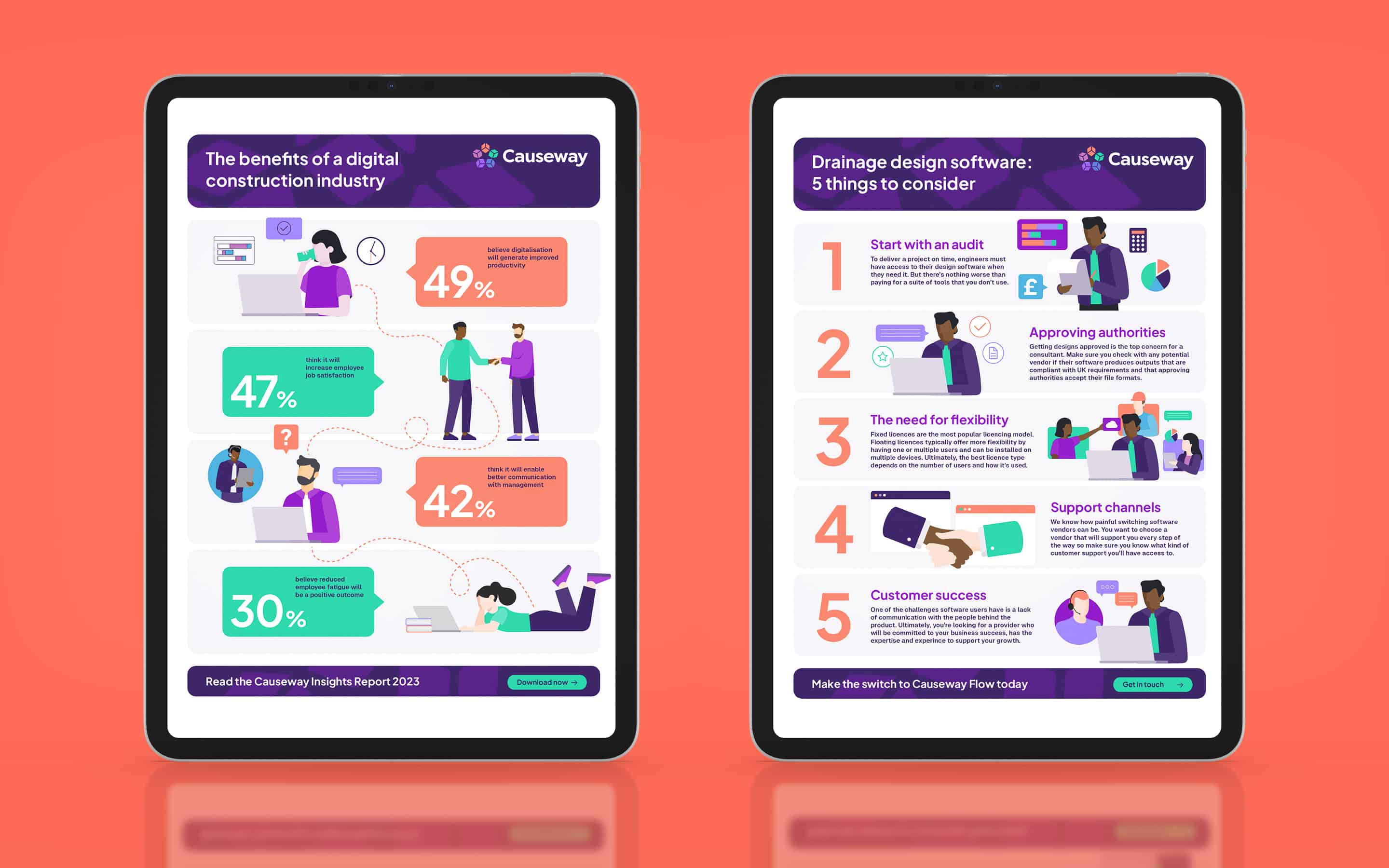
From logo design to product naming and guideline development, we provided Causeway with every resource it required to achieve its rebranding goals. The deliverables of this project have given the Company the foundation it needs to engage new and existing customers, differentiate itself from the competition, and reignite employee advocacy.
What we did:
|
—Visual & verbal audit —Research & positioning —Brand framework —Product architecture —Product naming —Tone of voice |
—Top-level messaging —Visual identity —Branding —Editorial guidelines —Training & workshops —Launch program |
More from our portfolio...
Load more projectsWhat do you need?
Please tell us about your requirements, and we'll be in touch.
"(required)" indicates required fields

