Athora: A legacy in European insurance.
Spinning out from its former parent brand, Athene (A US-based retirement services company), Athora was launched as an innovator in the European insurance market. The independent entity has flourished into a market leader in its region, focusing on long-term insurance and reinsurance business. Today, it proudly boasts more than €72 billion in assets under management.
Before it could evolve into a beacon of insurance excellence for European customers, Athora needed a distinct identity. It wanted to retain the heritage and history of its parent brand, while also highlighting its unique vision and mission, to transform the insurance market. Fortunately, the team turned to Fabrik.
Envisioning a European leader: Building a new brand.
Athora approached Fabrik with an ambitious request: Create a brand identity, name, and image that embodied credibility, trust, and a commitment to excellence. Though Athora wanted to retain an association with its parent brand, it was committed to branching out on its own, distinguishing itself as a forward-thinking, purpose-driven brand.
We began with a research phase, identifying the key attributes and differentiators of the new company. Our team discovered the goals, mission, and vision at the heart of the Athora brand, forming the foundations for a comprehensive process that spanned from naming through to logo creation, and strategy development.
Blending strategy and creativity to sculpt Athora.
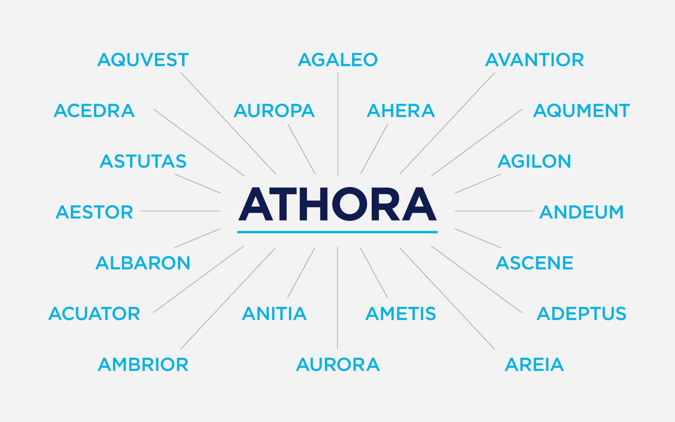
Our journey began with guiding Athora through our bespoke naming process. We helped them choose a name that shared the Greek and Latin influences of their parent brand, without diluting their individuality. The invented name “Athora” represents authority, meticulousness, and confidence. With the name agreed, we moved onto messaging, defining a distinct tone of voice.
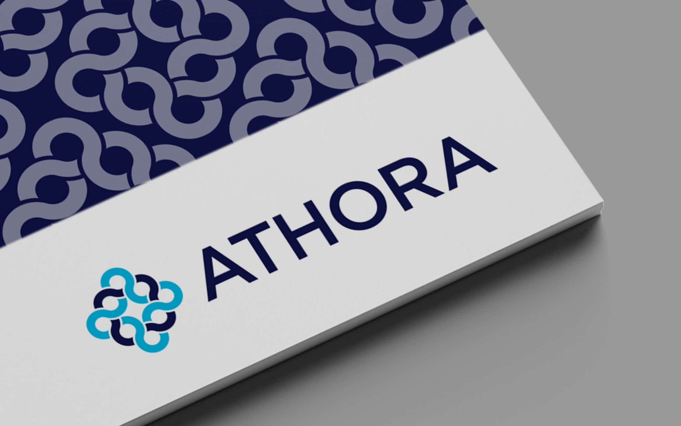
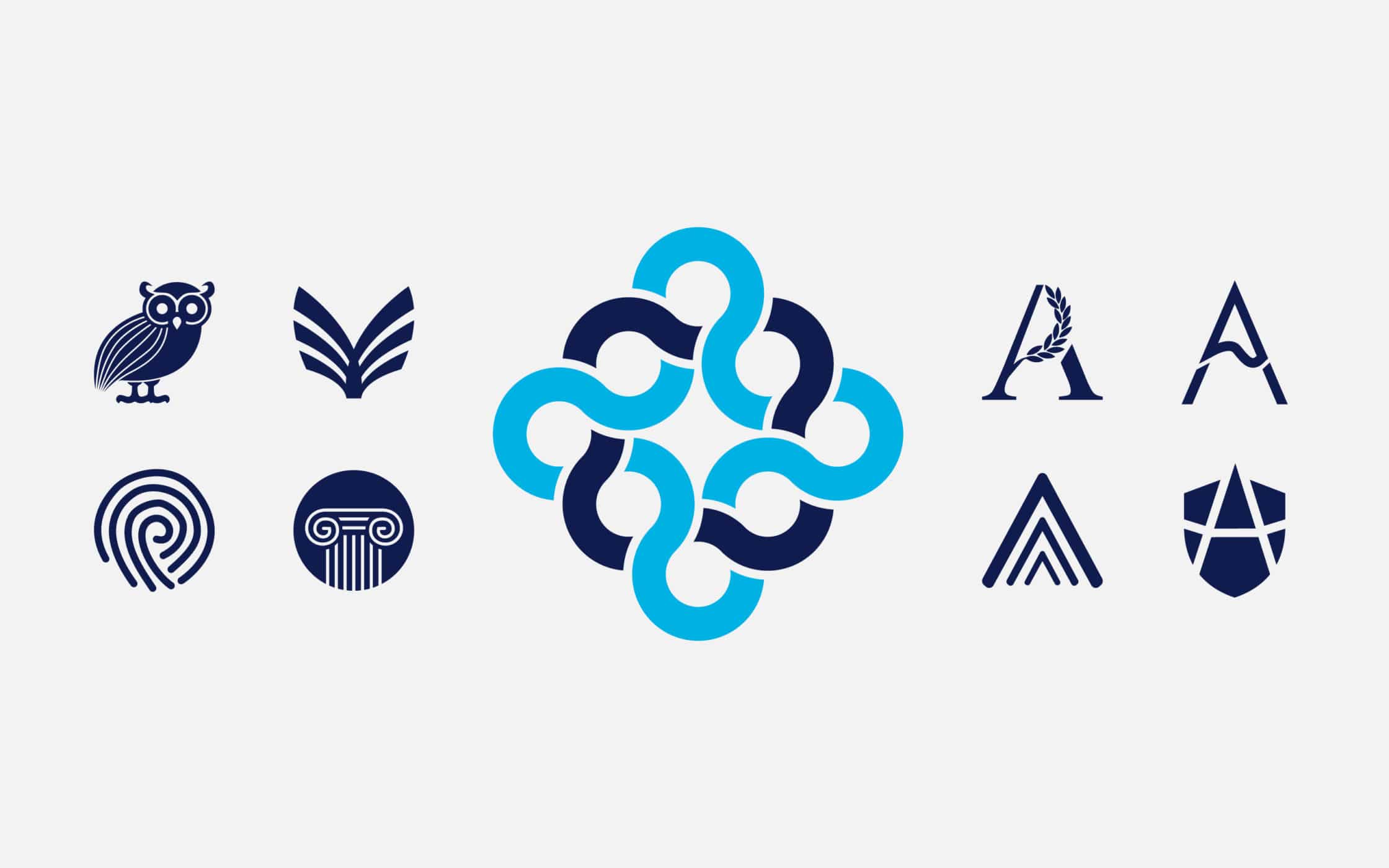
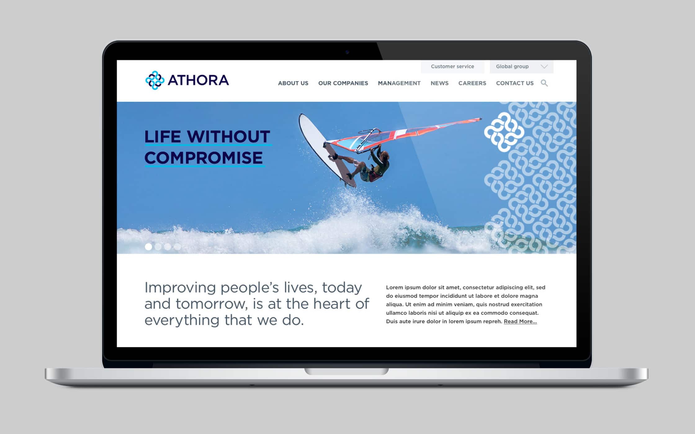
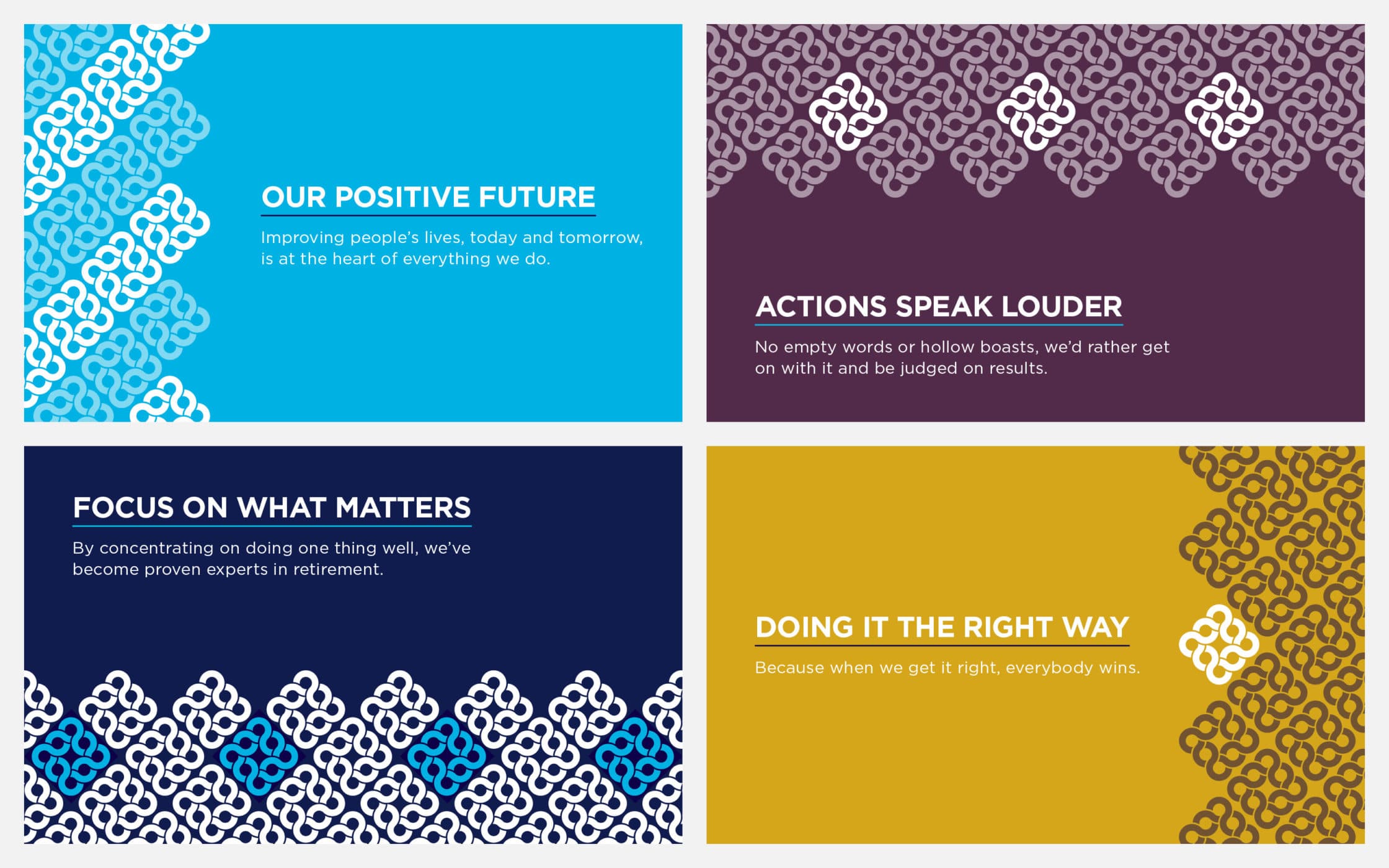
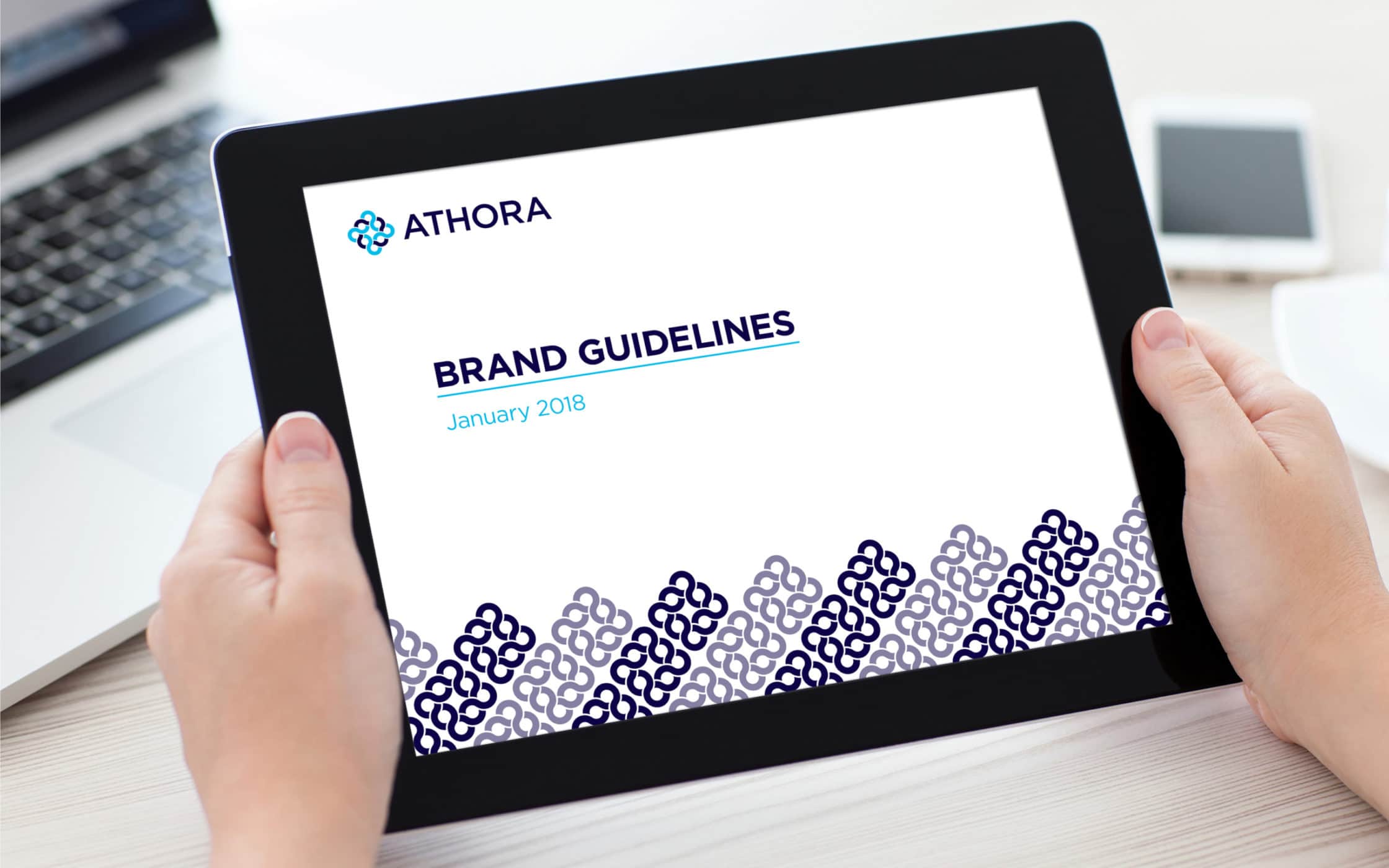
Our team created a series of statements, such as “life without compromise”, to echo Athora’s brand values. Next, we dove into the development of a comprehensive visual identity. The logo, derived from a Greek-inspired symbol, highlights unity and heritage. Its intricate components reflect how Athora connects people and investments, to forge a lasting legacy.
Encapsulating excellence: Athora’s new identity.
Our collaboration with Athora culminated in a comprehensive branding package, going beyond the basics of naming. We delivered a full verbal and visual identity, crafted to elevate, and enhance the company’s ethos. From the distinctive logo, to the brand messaging statements, each element meticulously highlights Athora’s position in the European insurance market.
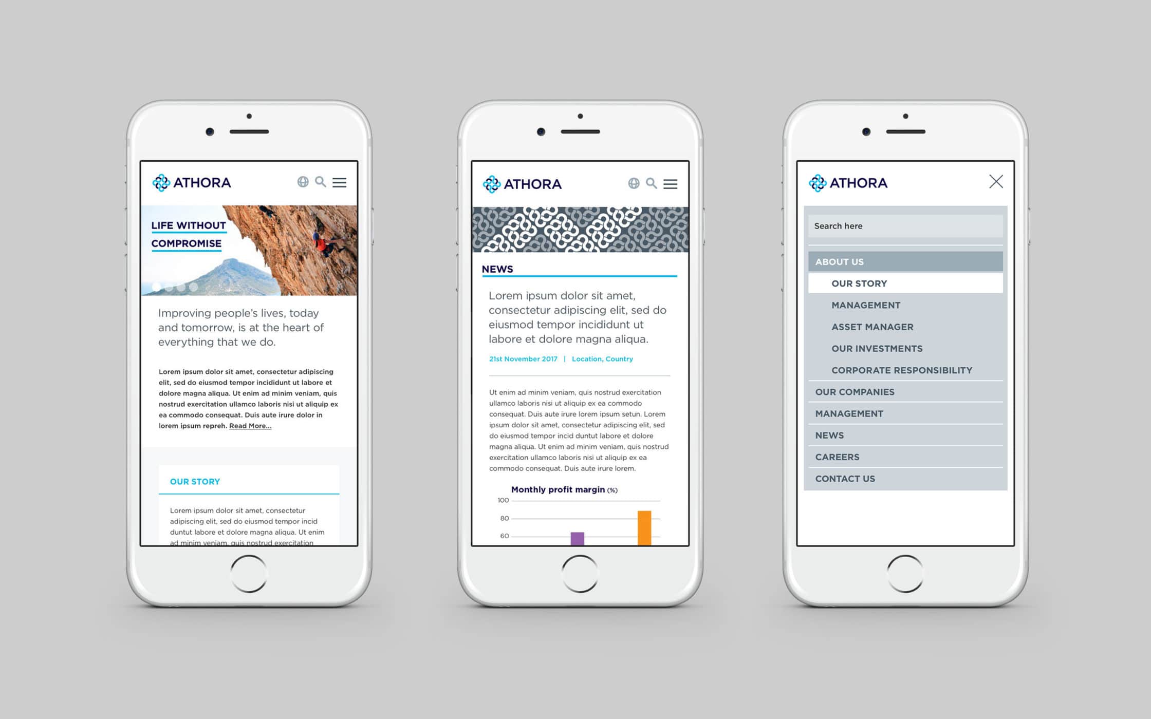
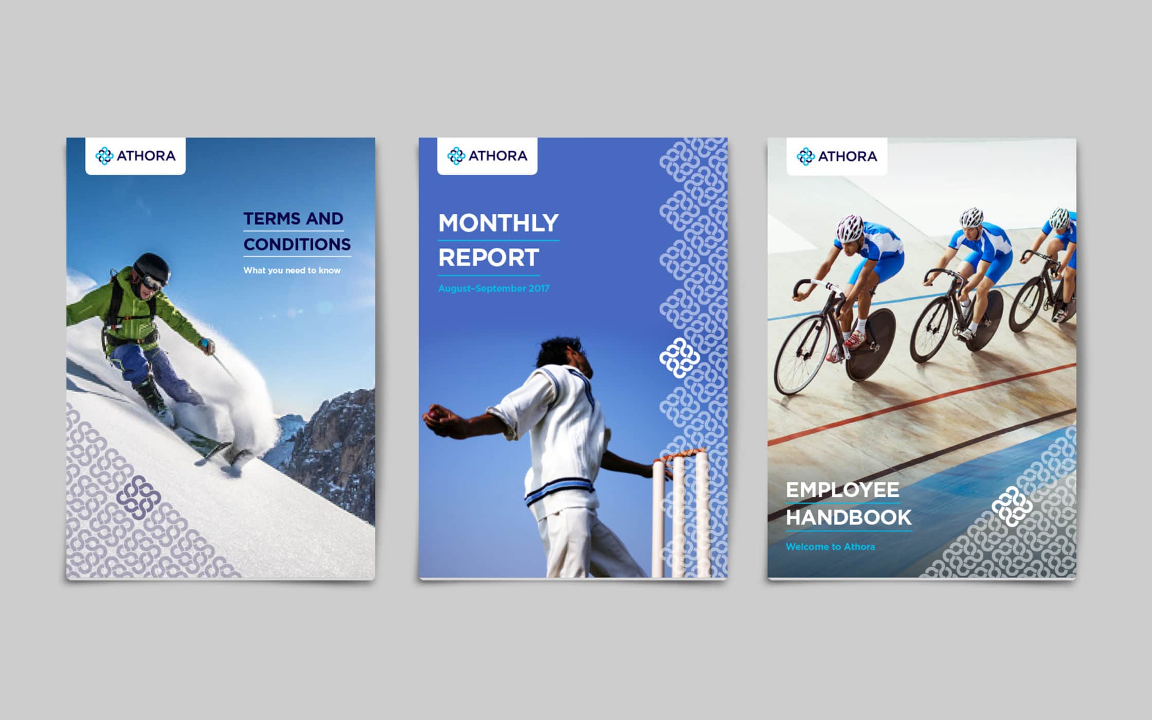
Our partnership also extended to supporting Athora throughout the launch of their new brand. We worked with the team on the development of signage, branded templates, and a user-focused website, Athora.com. Today, the firm has the crucial pillars it needs to strengthen its connections with existing customers, and attract opportunities for future growth.
What we did:
| —Research & analysis —Strategy & positioning —Brand naming —Tone of voice —Top-level messaging |
—Logo mark design —Visual identity —Brand guidelines —Templates —Web design & build |
More from our portfolio...
Load more projectsWhat do you need?
Please tell us about your requirements, and we'll be in touch.
"(required)" indicates required fields


