
A specialist dedicated to tailored insurance solutions.
Launched in 1996, Paragon is an insurance broker with a difference. In a world brimming with umbrella organisations, conglomerates, and corporations, Paragon takes a specialist approach to insurance solutions, specialising in professional liability. The Company takes a dedicated approach to tailoring its solutions to the needs of its target audience.
With an expert in-house claims handling service, a focus on building robust client relationships, and a global reach across various insurance markets, Paragon has become a major international insurance broker. The Company’s focused approach to serving its customers has distinguished it as a go-to partner for business protection and development.
Repositioning and realigning the Paragon brand.
Paragon approached Fabrik with the task of refreshing its existing brand, positioning the company as a leader in specialist insurance solutions. We needed to examine the core components of the Company’s ethos, and align everything into a clear identity that would resonate with both future and current customers.
It was a comprehensive challenge, one that would culminate in the creation of an impactful visual identity, a streamlined brand strategy, and a distinct tone of voice for evocative marketing messages. We also needed to create a new set of templates and guidelines, perfectly crafted to cultivate strategic alignment, and pave the way for future success.
A brand strategy with values, vision and clarity.
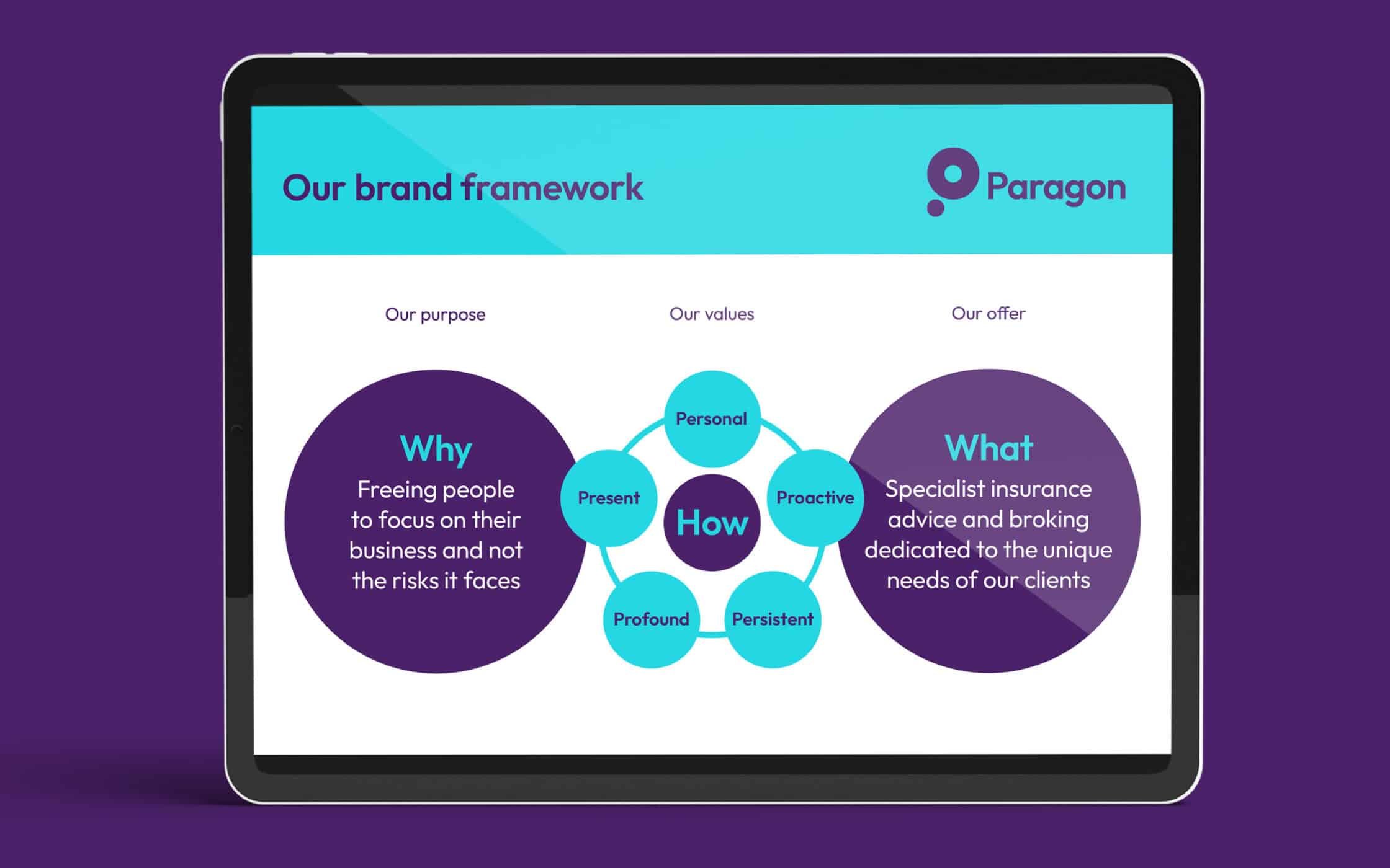
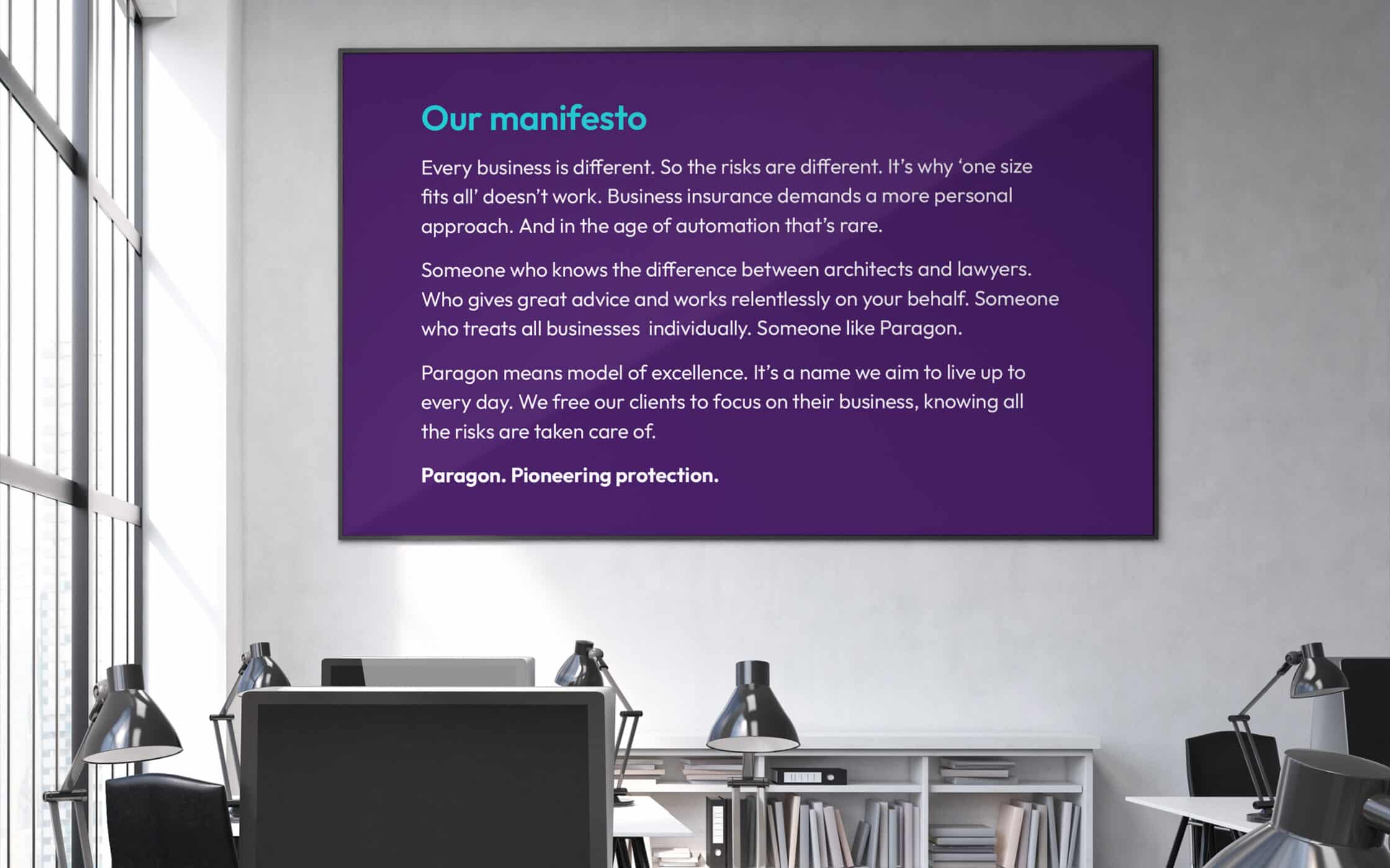
Our journey began with a full audit, identifying the strengths and weaknesses of the brand, and comparing its essence to existing competitors. We worked with the Company’s stakeholders, creating a clear value proposition for Paragon as specialists, and trusted advisors in their field. Fabrik wrote a new manifesto for internal audiences.
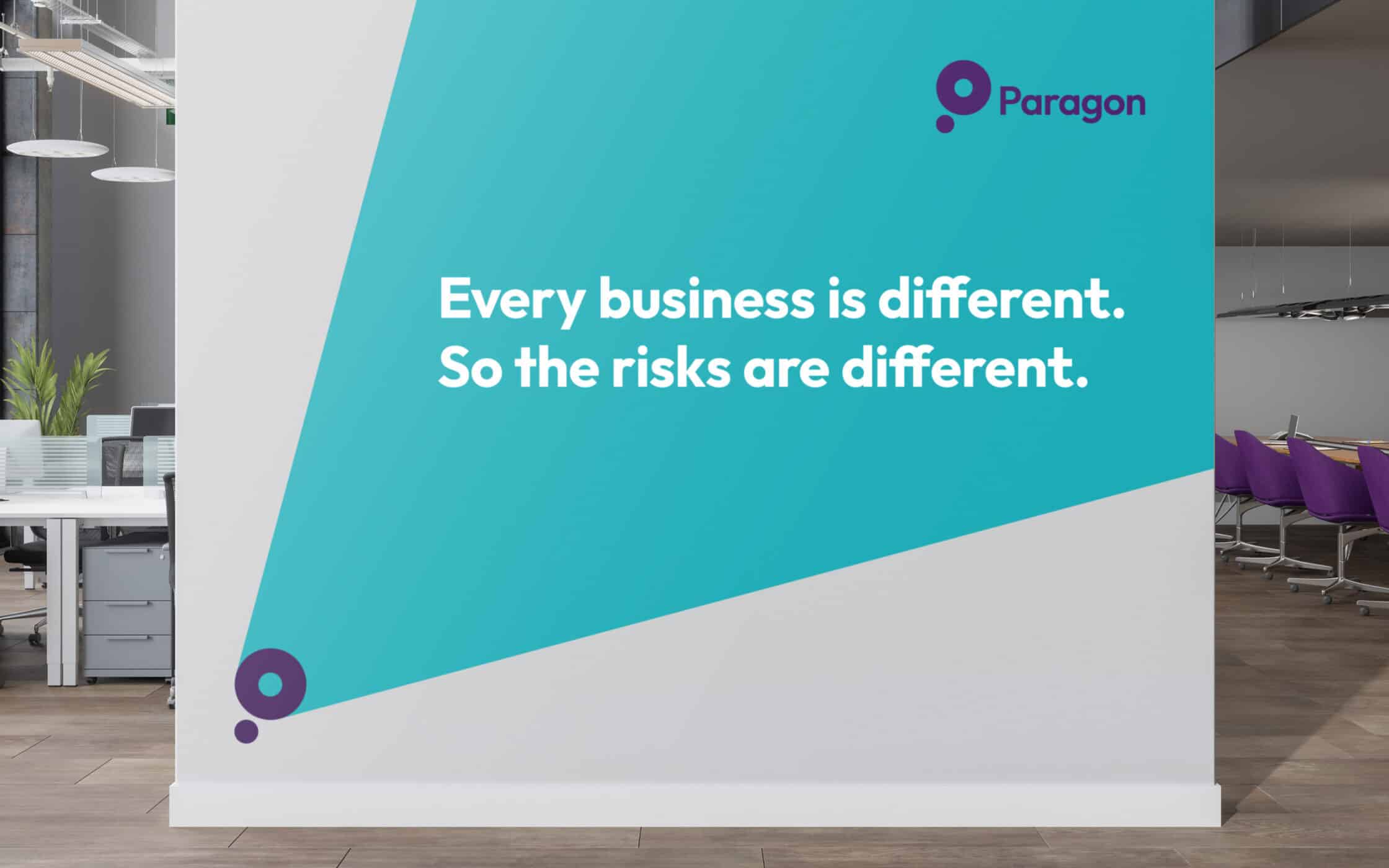
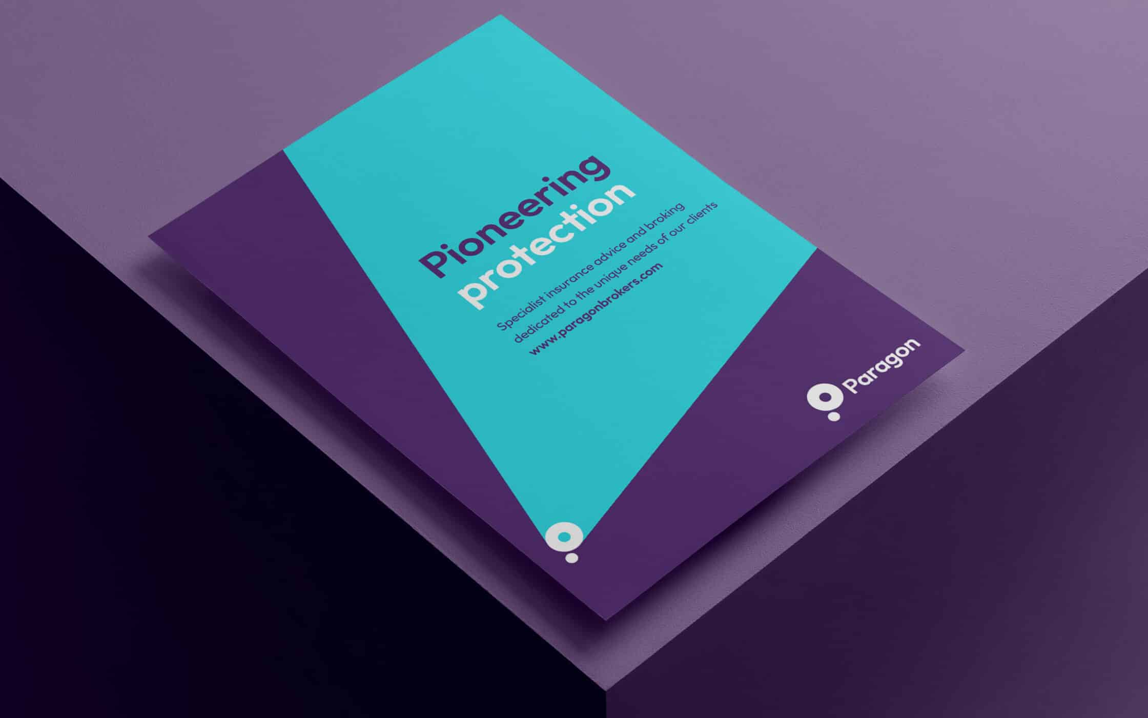
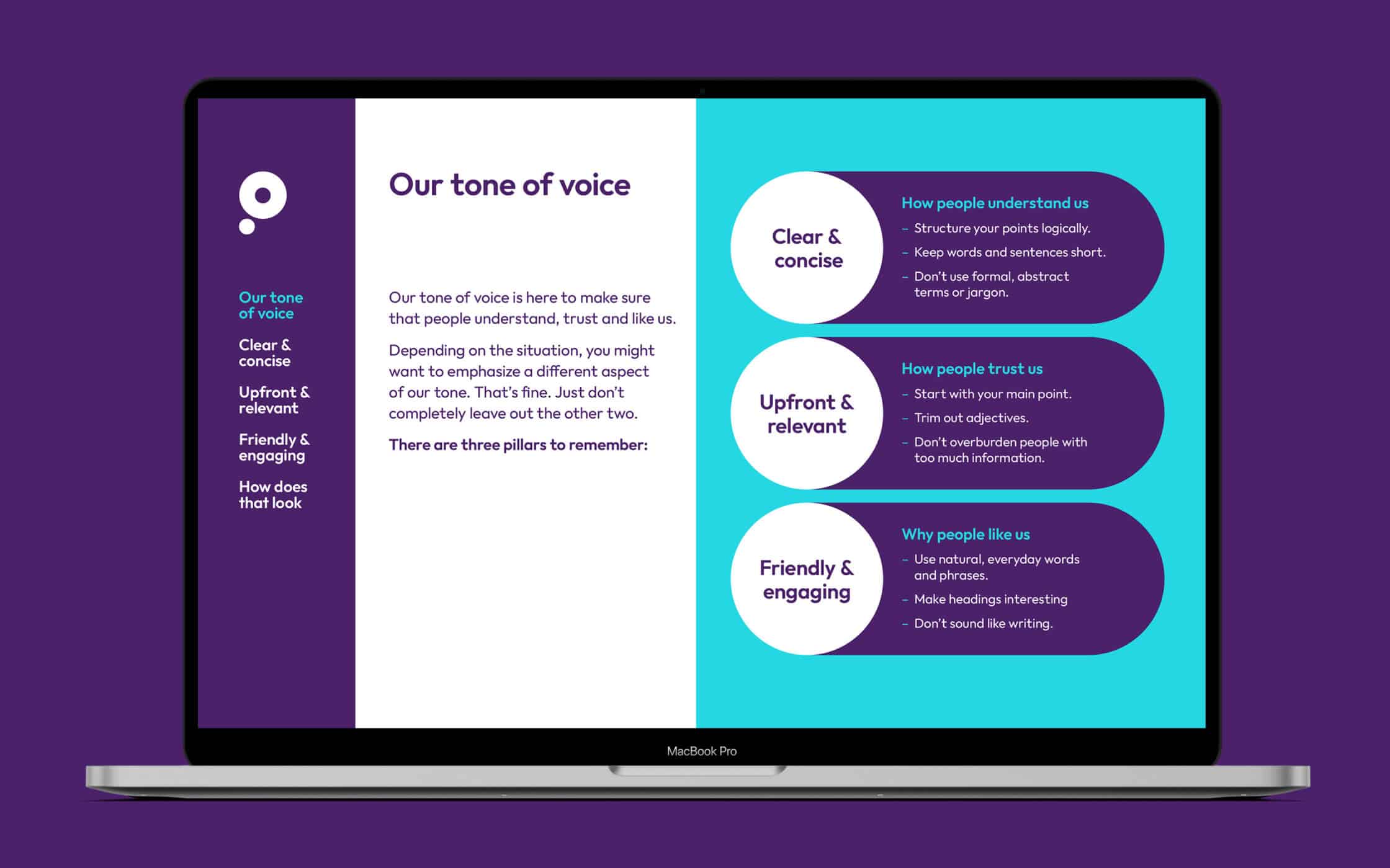
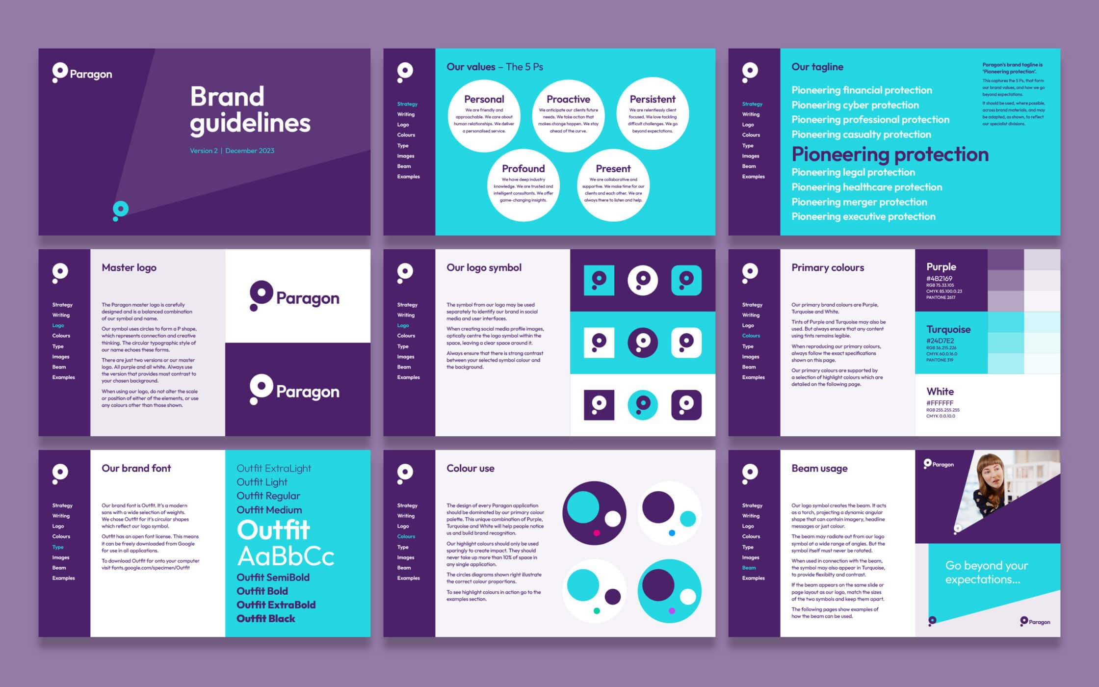
We also built an internal training program for team alignment, defining a new tone of voice, building a written style guide, and producing a host of guiding resources. We refreshed Paragon’s visual identity, working around the distinctive colour purple, updated the Company’s typography, and built a new visual system around a “beam” graphic design, representing guidance and innovation.
The start of a new chapter in the Paragon story.
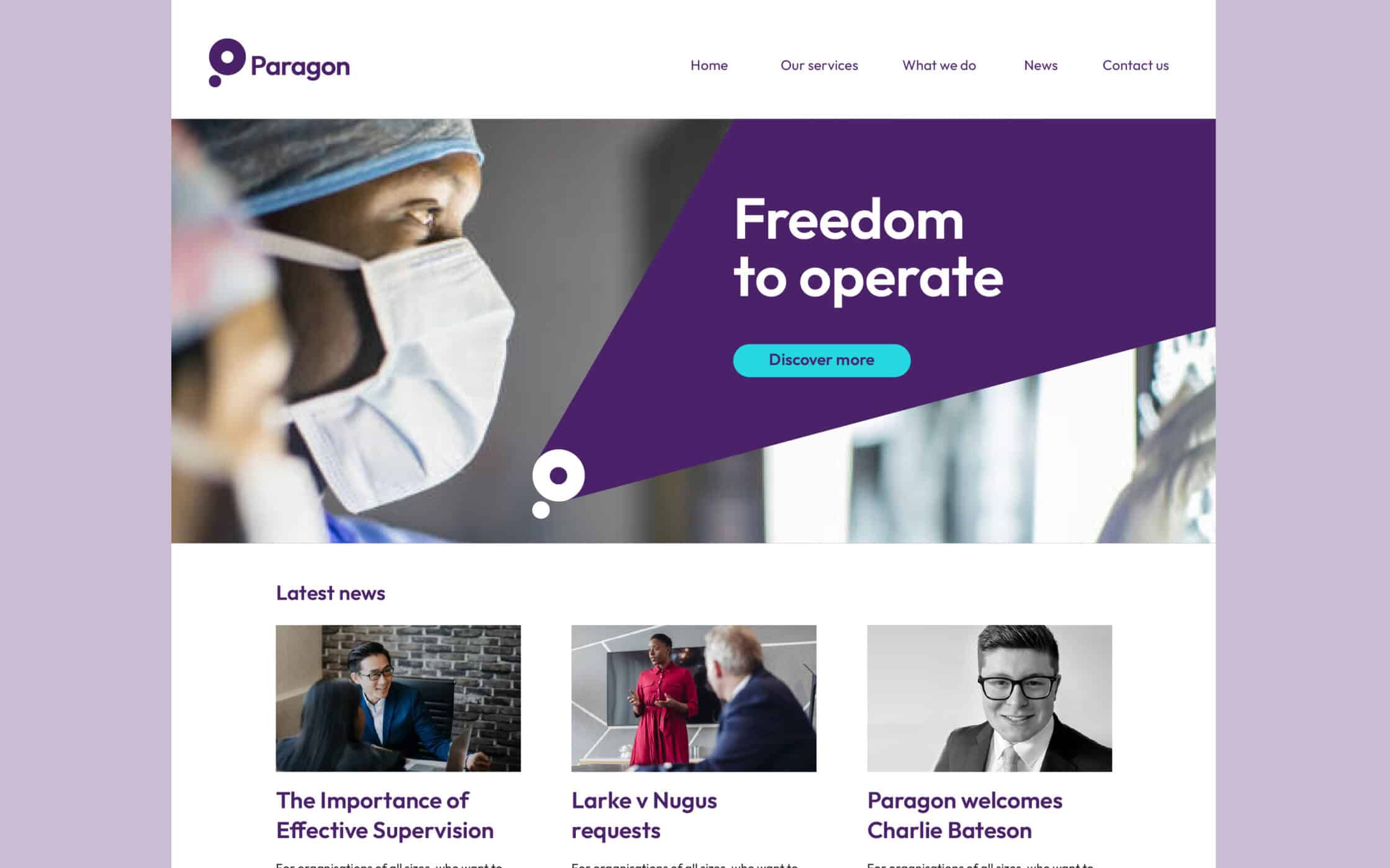
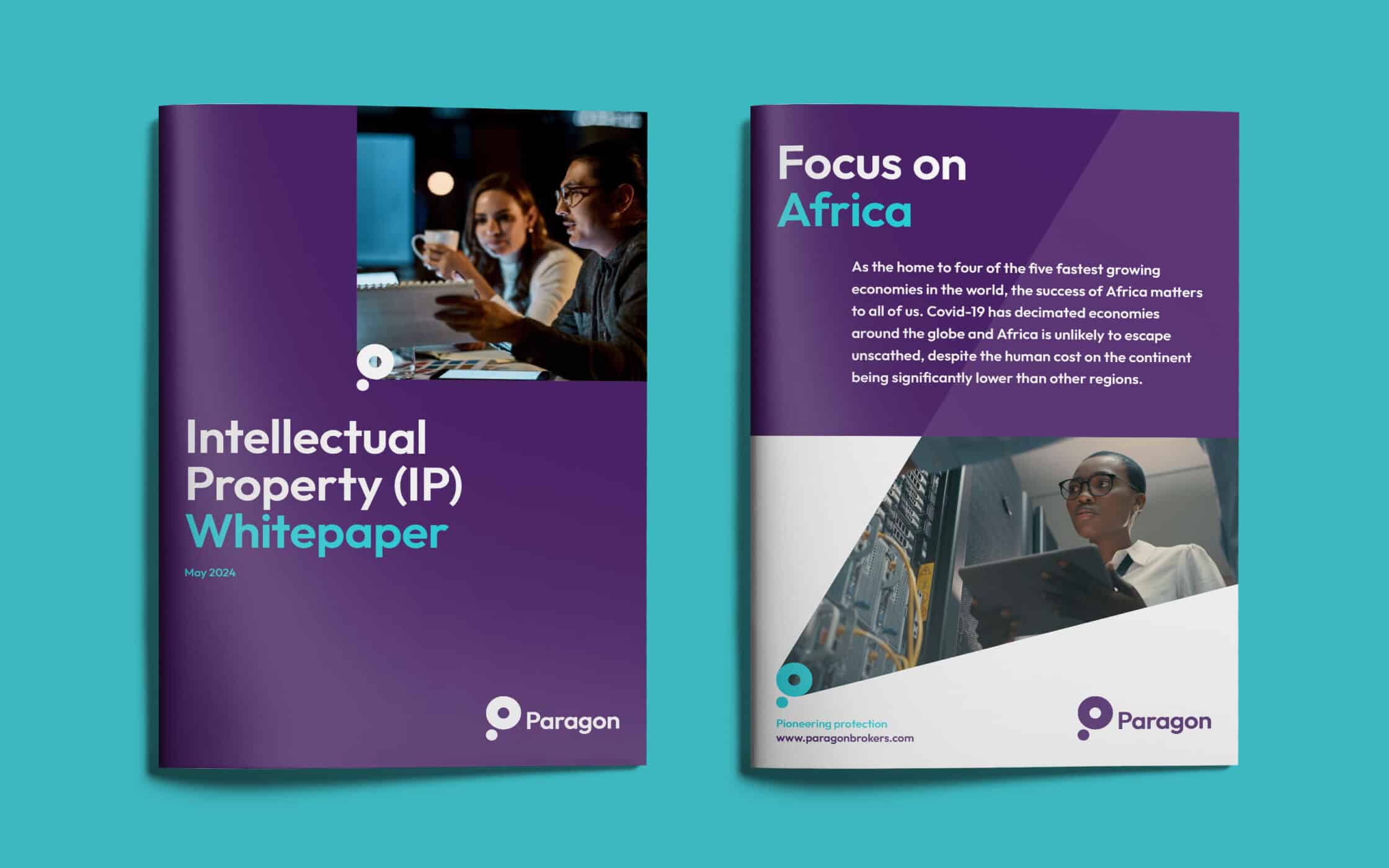
Our work with the Paragon brand culminated in a comprehensive rebranding strategy, revitalising and rationalising the core components of the brand identity. We empowered the team with the personality and messaging guidelines it needed to distinguish itself from competitors, and clarified where and how sub-branding elements should be used.
We created a new range of templates to use throughout the organisation on everything from business stationery, to social media assets, brochures, and sales material. Now, the Company has a clear, cohesive visual and verbal identity, capable of aligning internal teams, and capturing the hearts and minds of a growing target audience.
What we did:
| —Research —Workshops —Positioning —Strategy —Tone of voice |
—Copywriting —Messaging —Visual identity —User guidelines —Brand launch |
Kind words…
More from our portfolio...
Load more projectsWhat do you need?
Please tell us about your requirements, and we'll be in touch.
"(required)" indicates required fields

