
The evolution of a legacy housing brand.
Network Homes (formerly Network Housing Group) is a market leader in the real-estate service market, building, selling, renting, and managing quality homes in thriving communities. Over 40 years, the company became synonymous with quality housing and community growth.
Unfortunately, many structural changes, alongside the addition of new sub-brands and services, eventually culminated in a blurred brand vision. The organisation lost its direction, struggling to highlight its core values and differentiators to an evolving target audience. They needed a fresh start and stronger foundations to support a brighter, bolder future.
Building the blueprints for branding success.
Ready for a comprehensive transformation, Network Homes approached Fabrik to guide its metamorphosis. They didn’t just want to fill the cracks in their existing brand strategy; they were ready to return to the drawing board and create a new blueprint for success.
We spoke to staff, stakeholders, homeowners, tenants, and focus groups for the insights we needed to fuel the rebranding process. The team brought these insights to Fabrik, along with a vision: reinvigorate the company’s identity with a compelling narrative that would resonate with existing and potential clients for years to come.

Structuring a new mission, vision, and identity.
Our journey began with a strategic review of Network Homes’ existing brand portfolio. We dove into a thorough fact-finding process, collaborating with the team’s decision-makers to discover the purpose behind the company. A new mission statement emerged: “Good homes make everything possible.”
We embarked on a comprehensive branding journey with this ethos as our compass. Our team began with the introduction of a shorter, more memorable name before structuring each component of an updated brand manifesto. We explored everything, from personality guidelines to an exciting new visual identity, culminating in the creation of an evocative brand emblem.
A brand and visual identity that’s built to last.
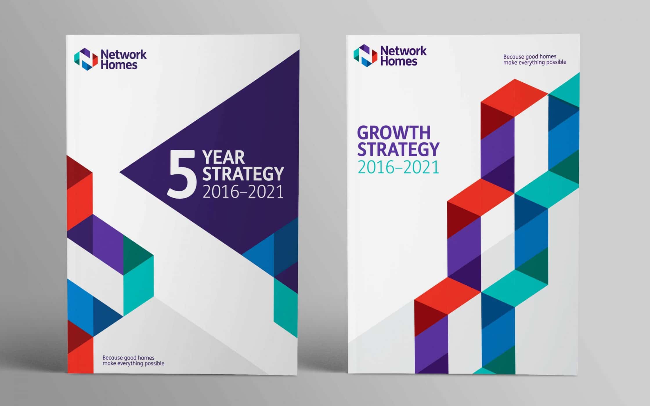
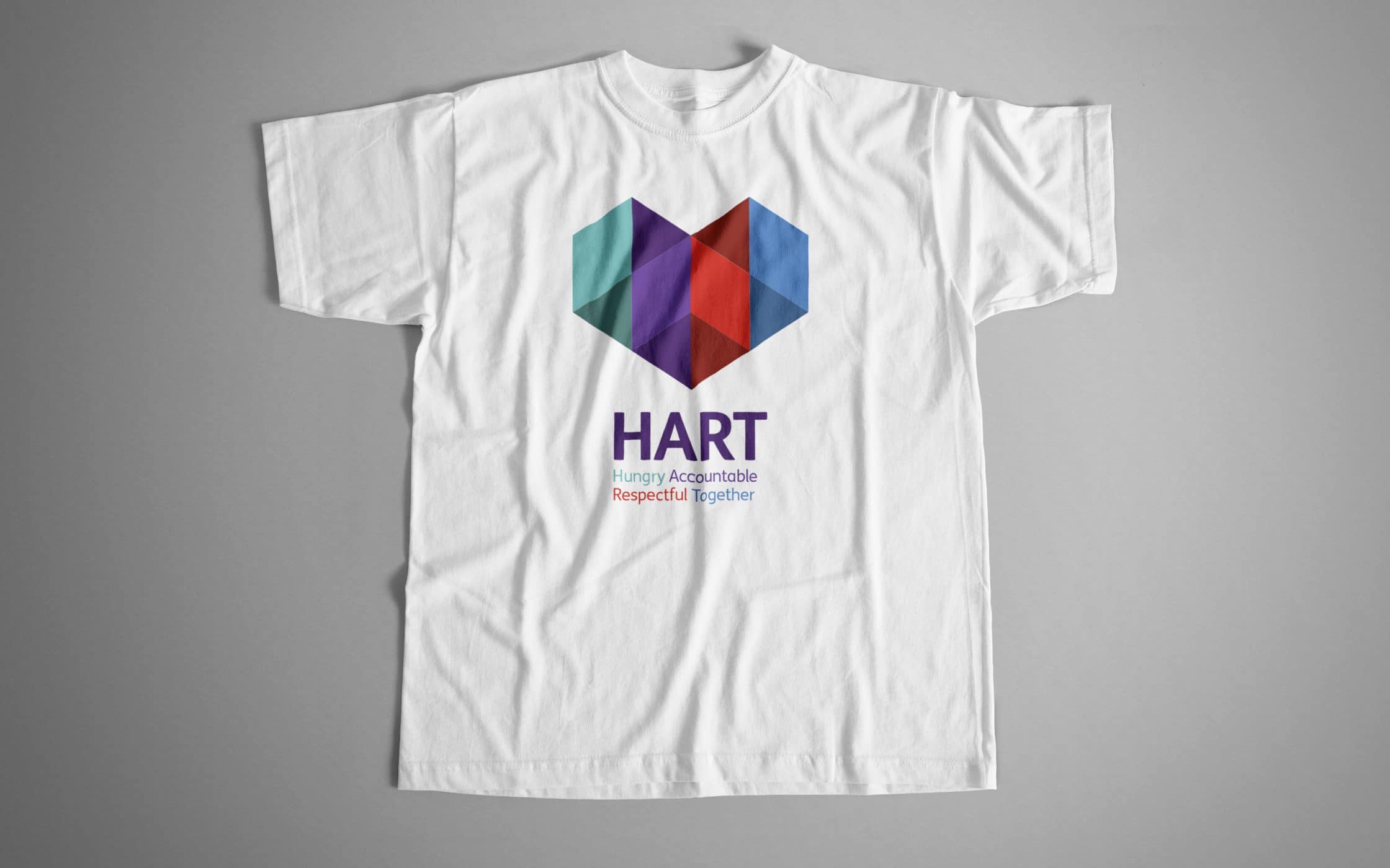
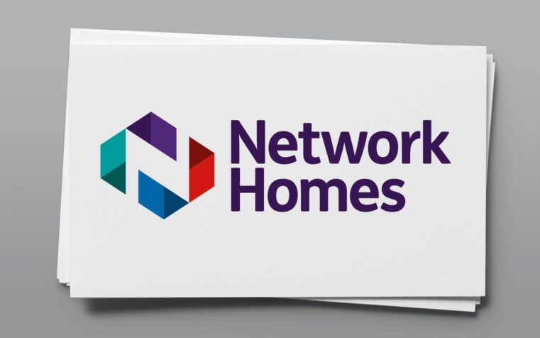
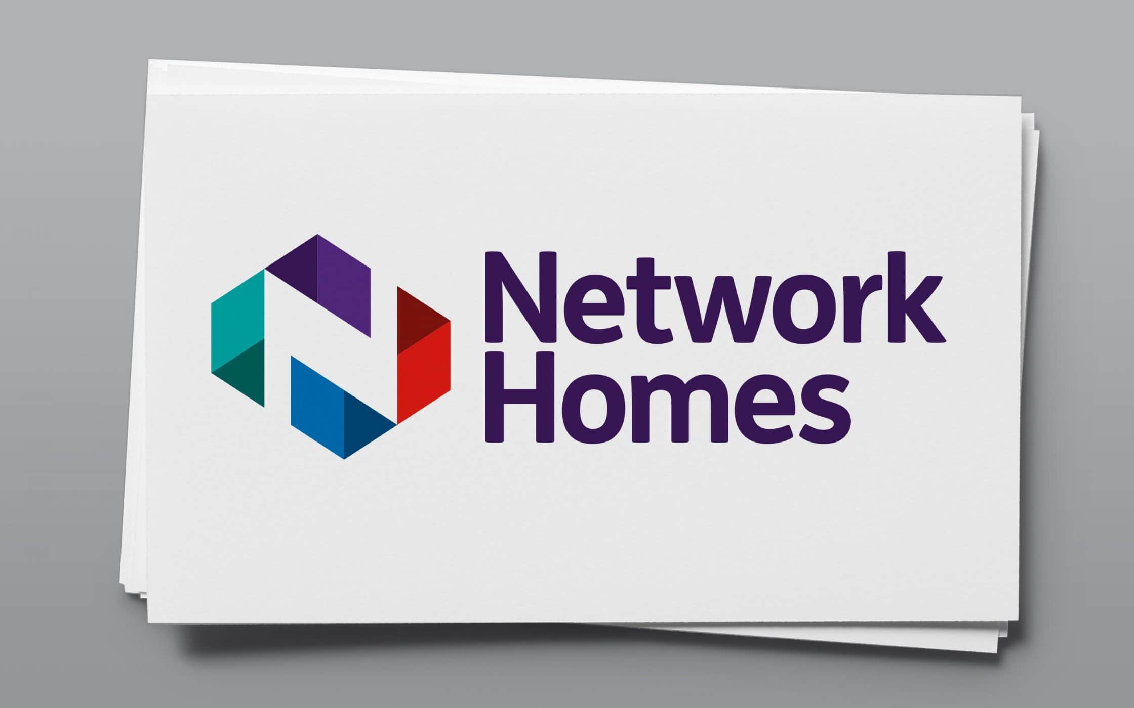
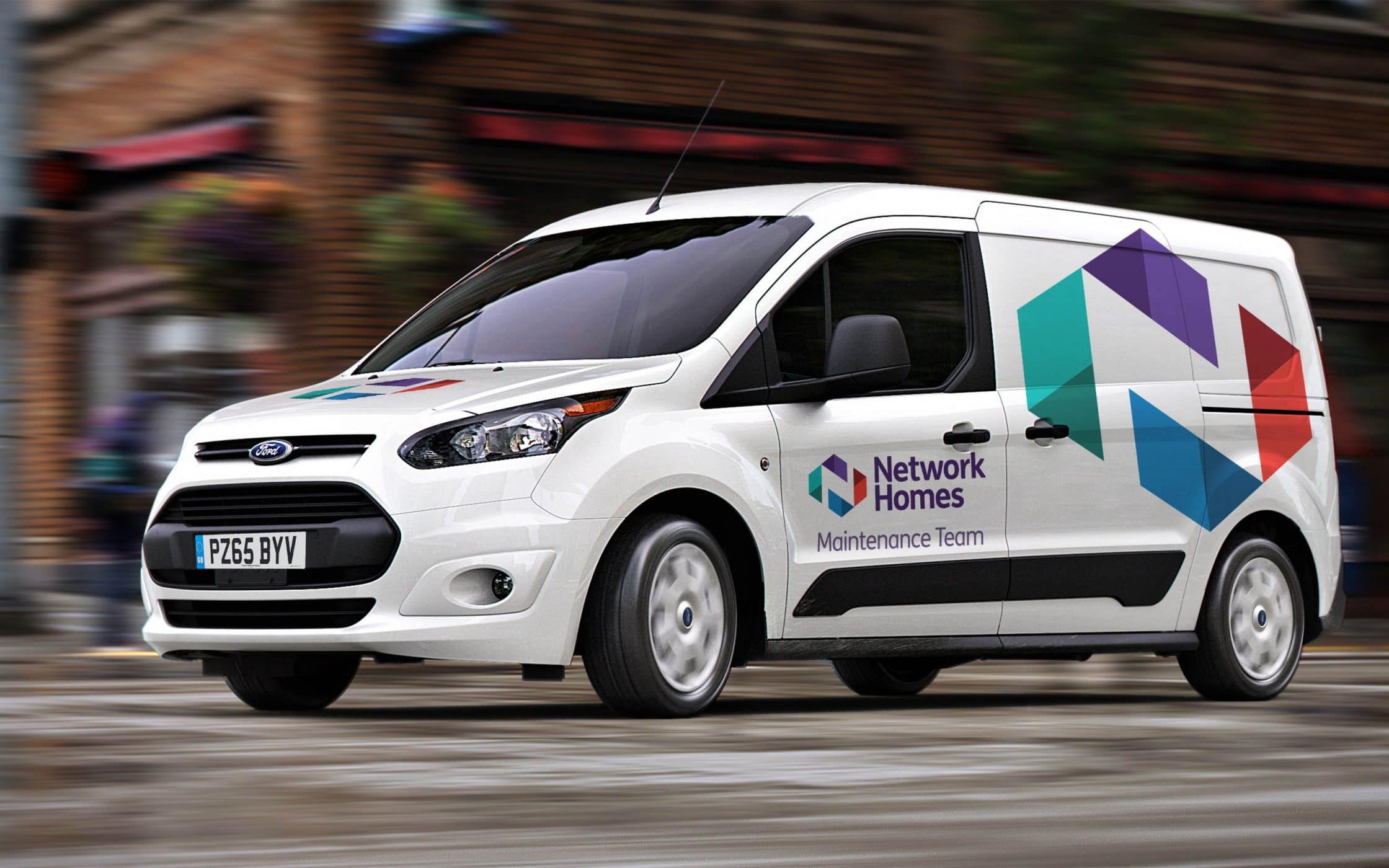
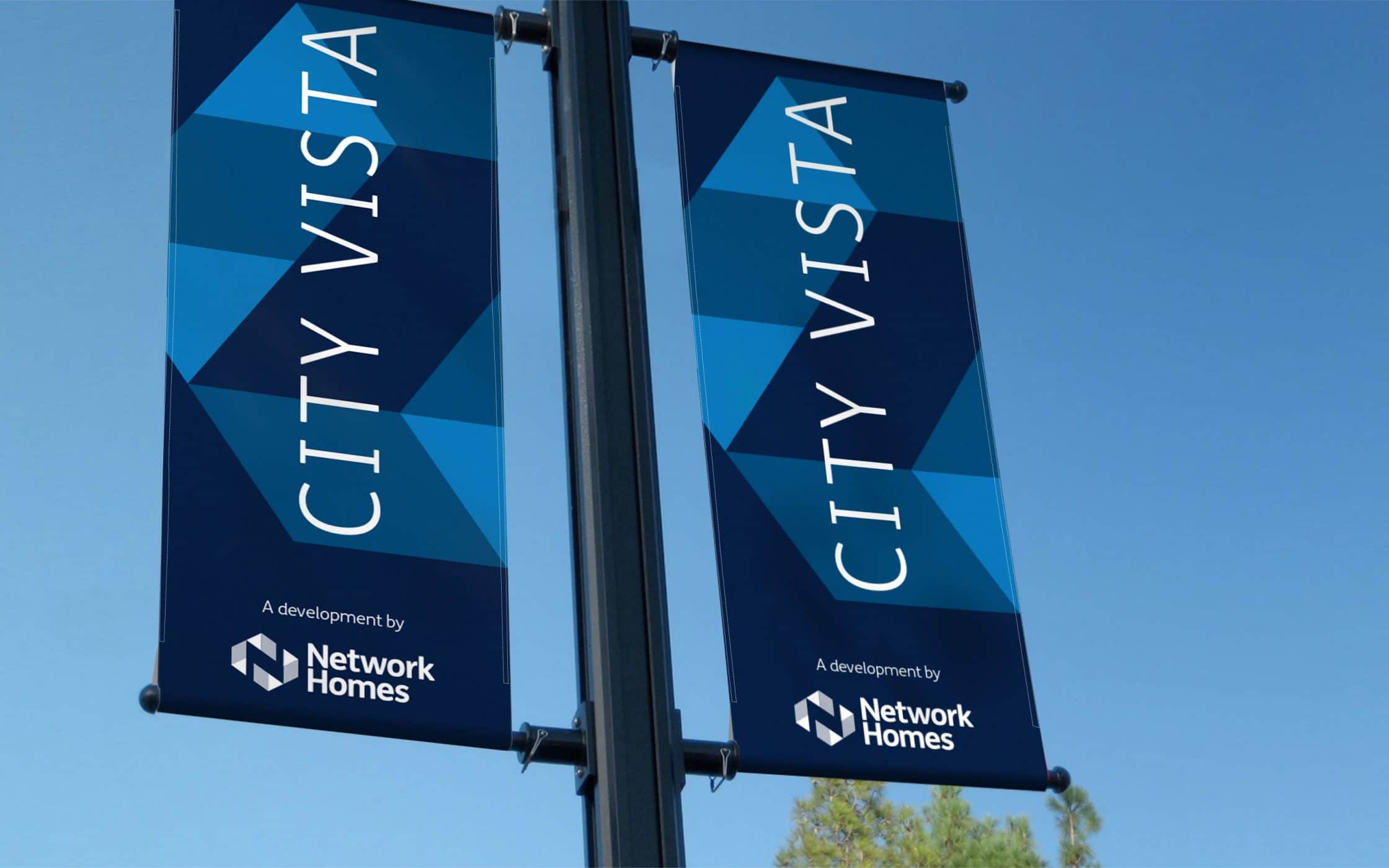
The Fabrik team ensured Network Homes had all the building blocks required for a robust identity. Using the company’s clarified mission statement and personality guidelines as our foundation, we designed a new image for the evolving business. A new symbol was conceived with angular elements, representing the 3-dimensional structure of a modern home, and the power of community.
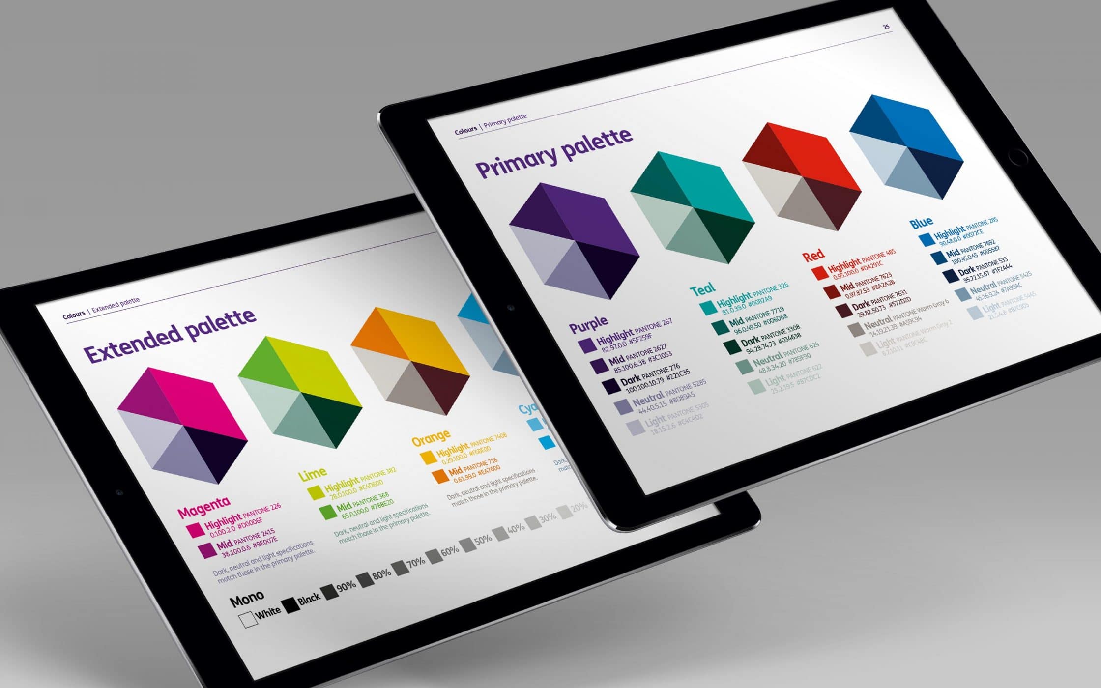
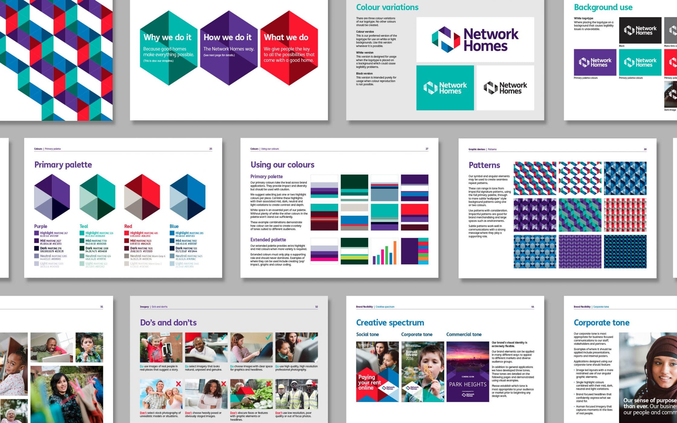
The new emblem, with its N-shaped pathway, demonstrates a future filled with endless possibilities, capturing the spirit of the brand. We ensured Network Homes had the strategic resources it needed to preserve success. A set of visual identity guidelines now acts as the company’s map to stronger connections with its target audience.
What we did:
|
—Research —Workshops —Positioning —Strategy —Naming |
—Tone of voice —Logo design —Visual identity —Communications —User guidelines |

Kind words…
More from our portfolio...
Load more projectsWhat do you need?
Please tell us about your requirements, and we'll be in touch.
"(required)" indicates required fields

