
Powering positive change: The LAGreen mission.
Working through its advisor, Finance in Motion, the LAGreen fund empowers positive climate, environmental, and social benefits, championing the green bond market. Driven by the quest for a brighter future, the Fund focuses on fostering a sustainable future for both Latin America and the Caribbean, crucial regions in the global battle against climate change.
Eager to capture the hearts and minds of an evolving audience, LAGreen needed a brand identity and online presence with a significant impact. The team approached Fabrik searching for a way to convey a distinctive brand story and values to its unique community.
Shaping an identity for a climate trailblazer.
The LAGreen fund’s ambitious mission depends on its ability to enlighten and activate an audience of socially conscious consumers. To earn the attention and support of its niche, the Fund needed a compelling new identity, and a profound online presence. The team turned to Fabrik for our strategic and creative support, building an image and voice.
Our discovery sessions with LAGreen revealed the Fund’s core aspirations, origins, and personality, allowing us to distil the essence of the brand into a set of key components. We defined how the Fund needed to be perceived to resonate with its Latin American audience, and dove into a comprehensive branding process.
Crafting an inspiring persona for an innovator.
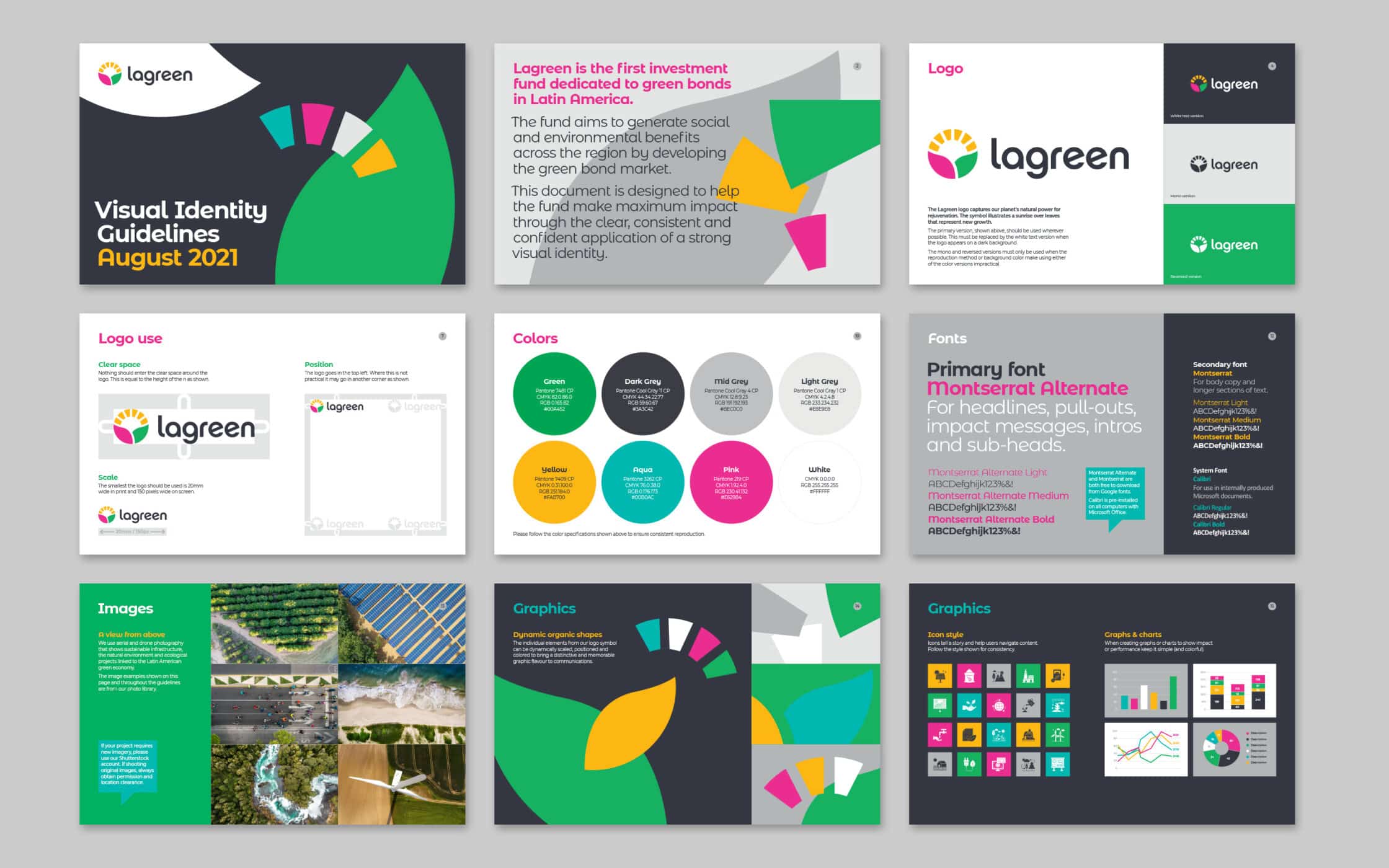
Our initial consultations with LAGreen included in-depth cultural and market research. We explored the influential factors driving consumers in the sector, drawing inspiration from regional architecture, colours, and patterns. From these foundations, the LAGreen identity began to emerge, starting with a bold colour palette, reflective of the dynamic region.
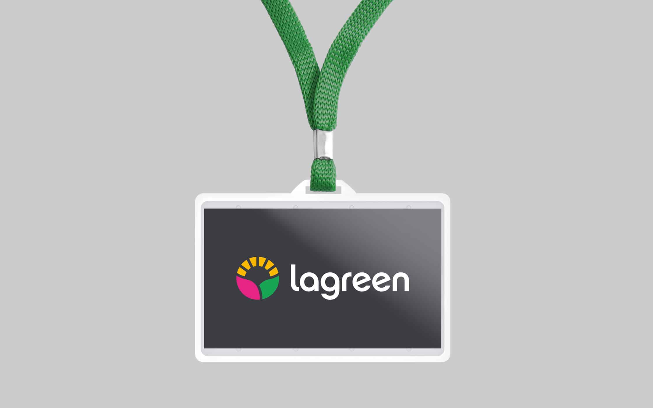
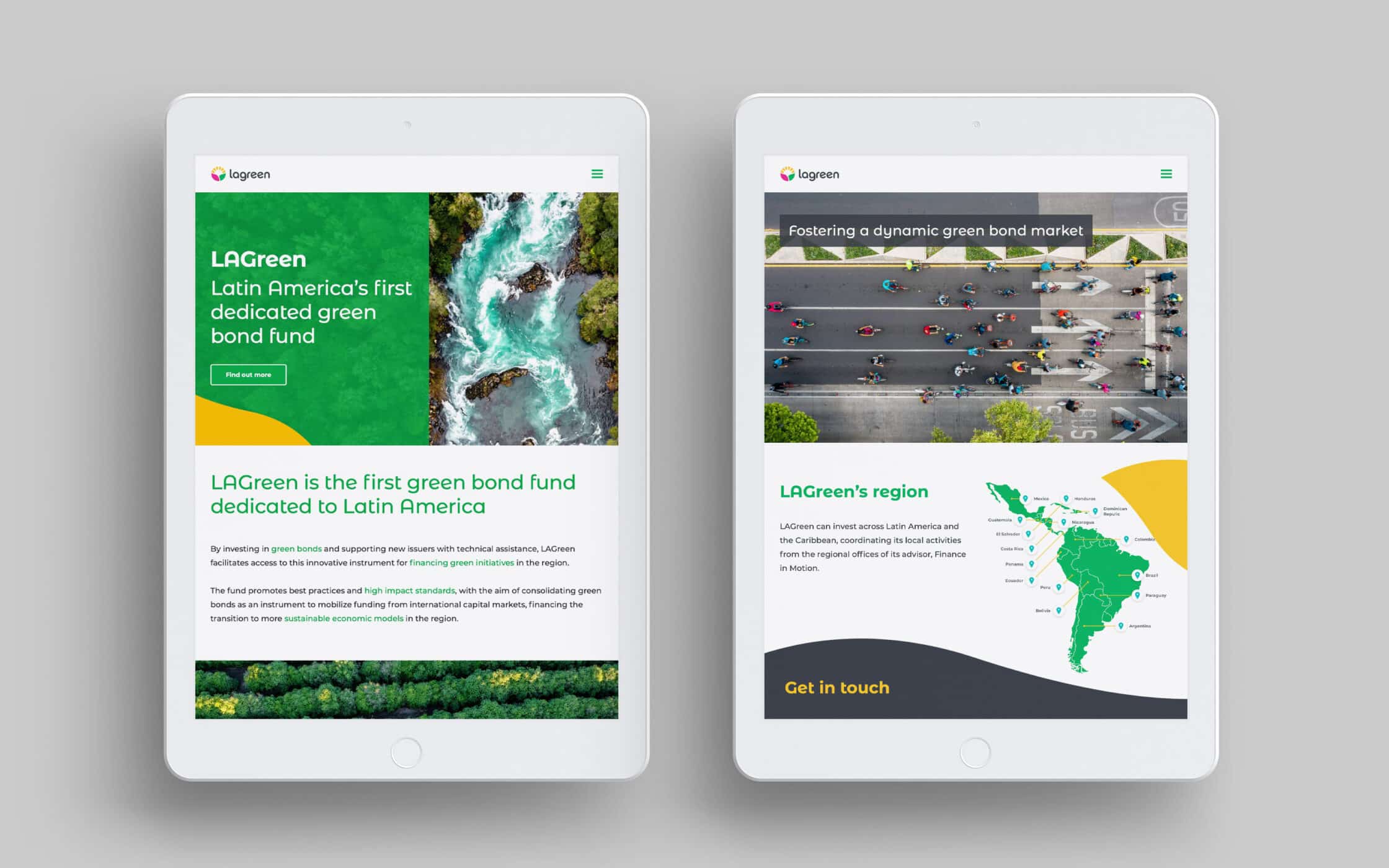
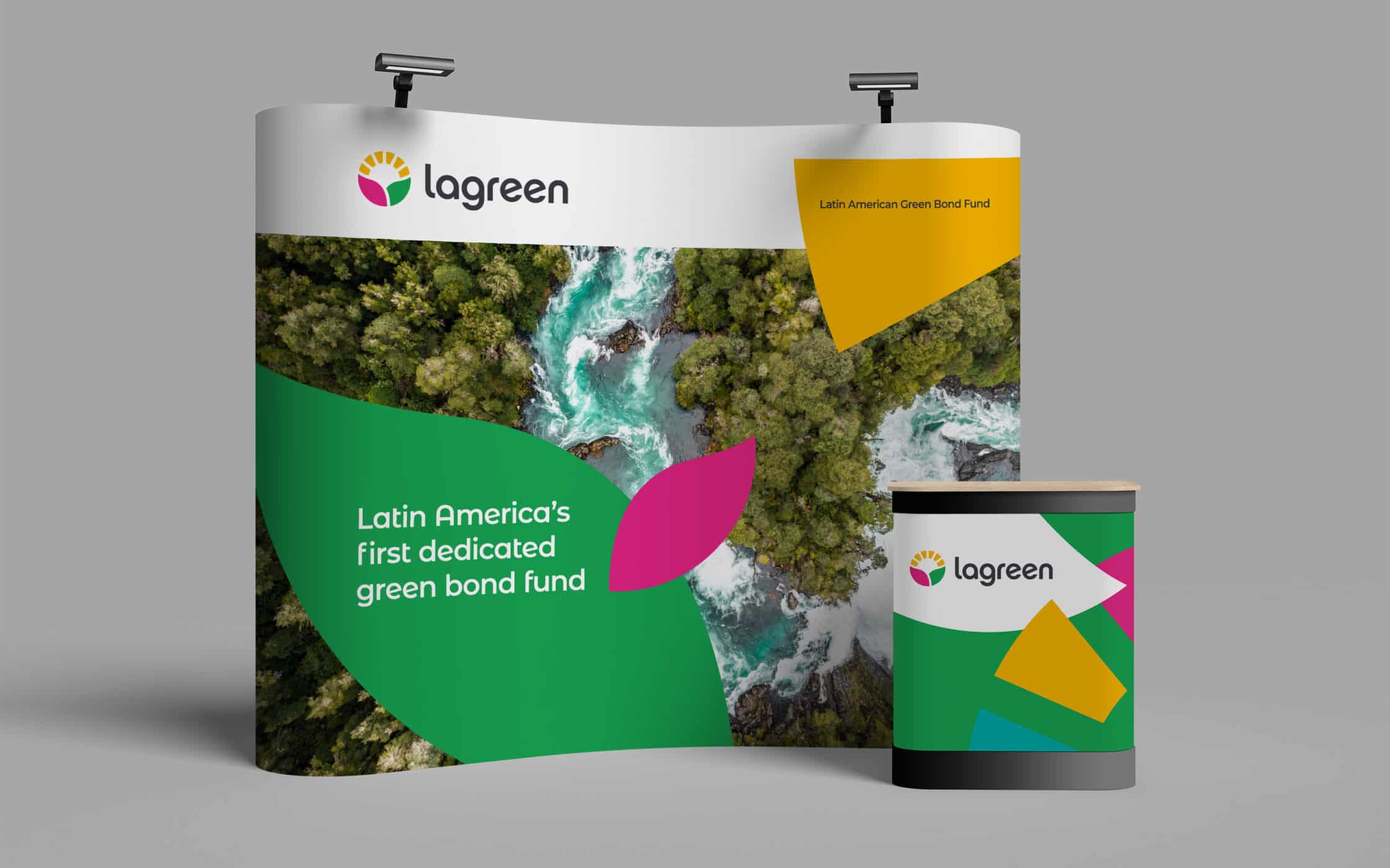
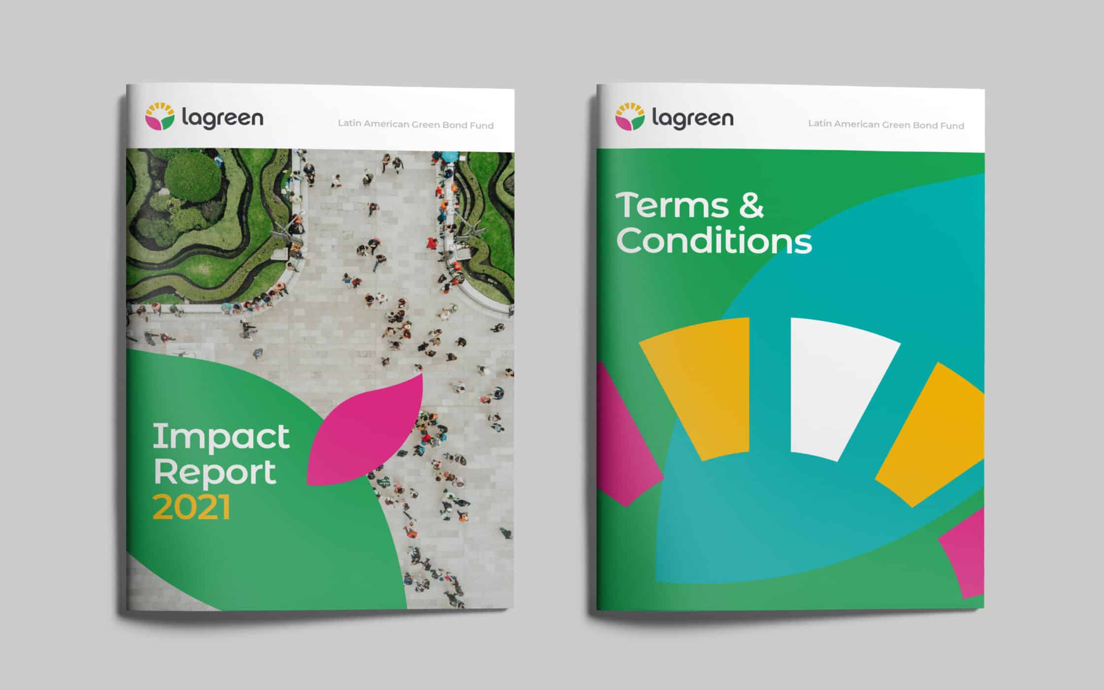
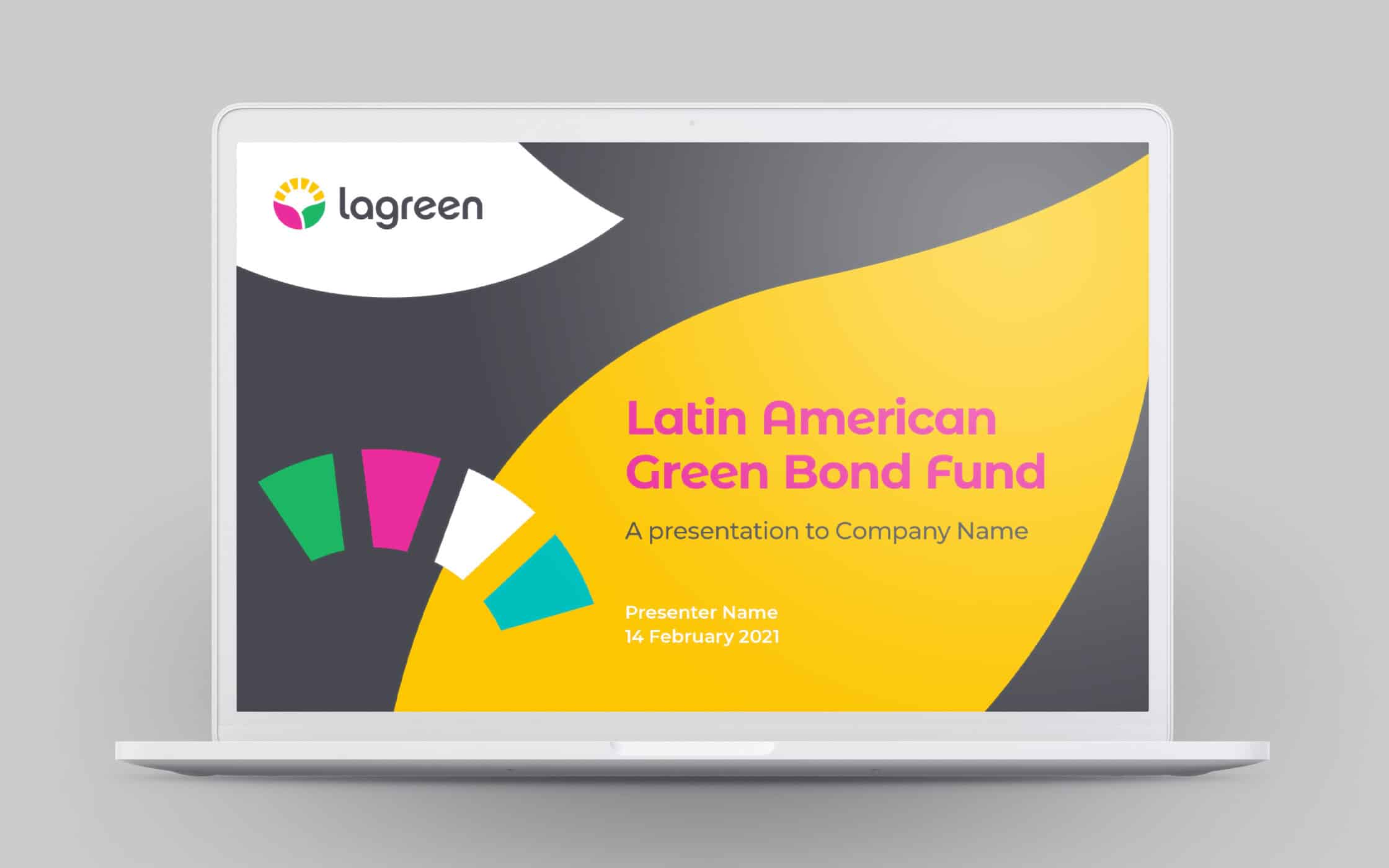
We combined green shades linked with sustainability, with bright tones to signify a fund with a difference. For the brand symbol, we developed a circular graphic, resonant of positivity, optimism, and opportunity. The Fabrik team completed LAGreen’s new visual identity, with a toolkit featuring graphic shapes, and aerial photography, showcasing Latin America’s burgeoning green economy.
Bringing LAGreen’s sustainable vision to life.
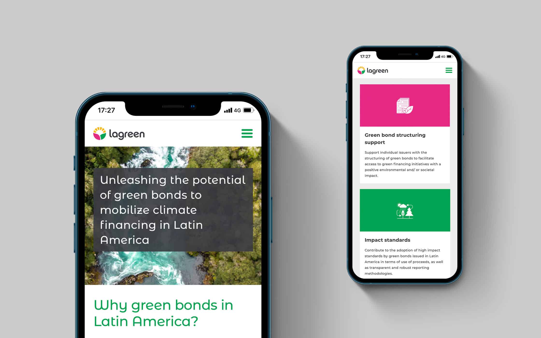
Our comprehensive visual branding assets gave LAGreen the core components it needed to launch an unforgettable, and emotionally evocative brand. To complement the new logo and colour palette, our team crafted a bespoke WordPress website, designed for scalability and adaptability. This new online presence ensures the Fund can continue to engage and enlighten its audience in the digital world.
With our help, LAGreen now has the brand guidelines, visual identity, and online presence required to inspire and motivate a community of socially conscious consumers. The brand’s identity reflects the dynamic nature of the Fund, and its powerful commitment to fostering the green economy in Latin America, the Caribbean, and beyond.
What we did:
| —Initial consultation —Brand workshop —Market research —Visual identity |
—Image sourcing —Brand guidelines —Website design —Website build |
Kind words…
In addition to the brand identity itself, as project manager, I needed trust, clear communication, and for Fabrik to gain a strong understanding of the Asset Manager and how we worked.
Fabrik did a great job! Not only did they clearly communicate the reasons behind their creative ideas, but they also brought my team a sense of security throughout the journey.
Fabrik delivered an out-of-the-box fund brand identity while managing to maintain some of the norms that reflect the finance industry—creative brilliance!

More from our portfolio...
Load more projects


What do you need?
Please tell us about your requirements, and we'll be in touch.
"(required)" indicates required fields