Hawkswell
A revolutionary brand identity for a gaming pioneer.
A new generation of storytelling engineers.
Hawkswell, an innovative and narrative-centric gaming studio, was founded by industry veterans with over 20 years of experience in hands-on production. United by a passion for interactive storytelling and world-class innovation, the company stands as a visionary force in its industry. Hawkswell inspires, motivates, and transforms, creating new worlds for players to discover.
Today, Hawkswell is part of France 2030, an initiative focused on empowering French startups to advance the national economy. However, before it could position itself as a pioneer in the gaming landscape, it needed the right brand identity. That’s where Fabrik stepped in.
Showcasing the power of storytelling.
Ready to reshape the gaming landscape, Hawkswell approached the Fabrik team with an exciting challenge: create a comprehensive brand identity for a visionary team. The company needed the visual assets, brand guidelines, and strategic support to develop a brand that emboldened a new era of gamers. This meant building an entire ethos from the ground up.
They wanted to show consumers their commitment to creating immersive, thought-provoking worlds that adapt to player choice, allowing each user to create their own narrative. Already, the company had a fantastic name, derived from a William Yeats play that questions mankind’s role in nature, and our desire for immortality. They just needed the brand to match.
Defining and refining a revolutionary brand.
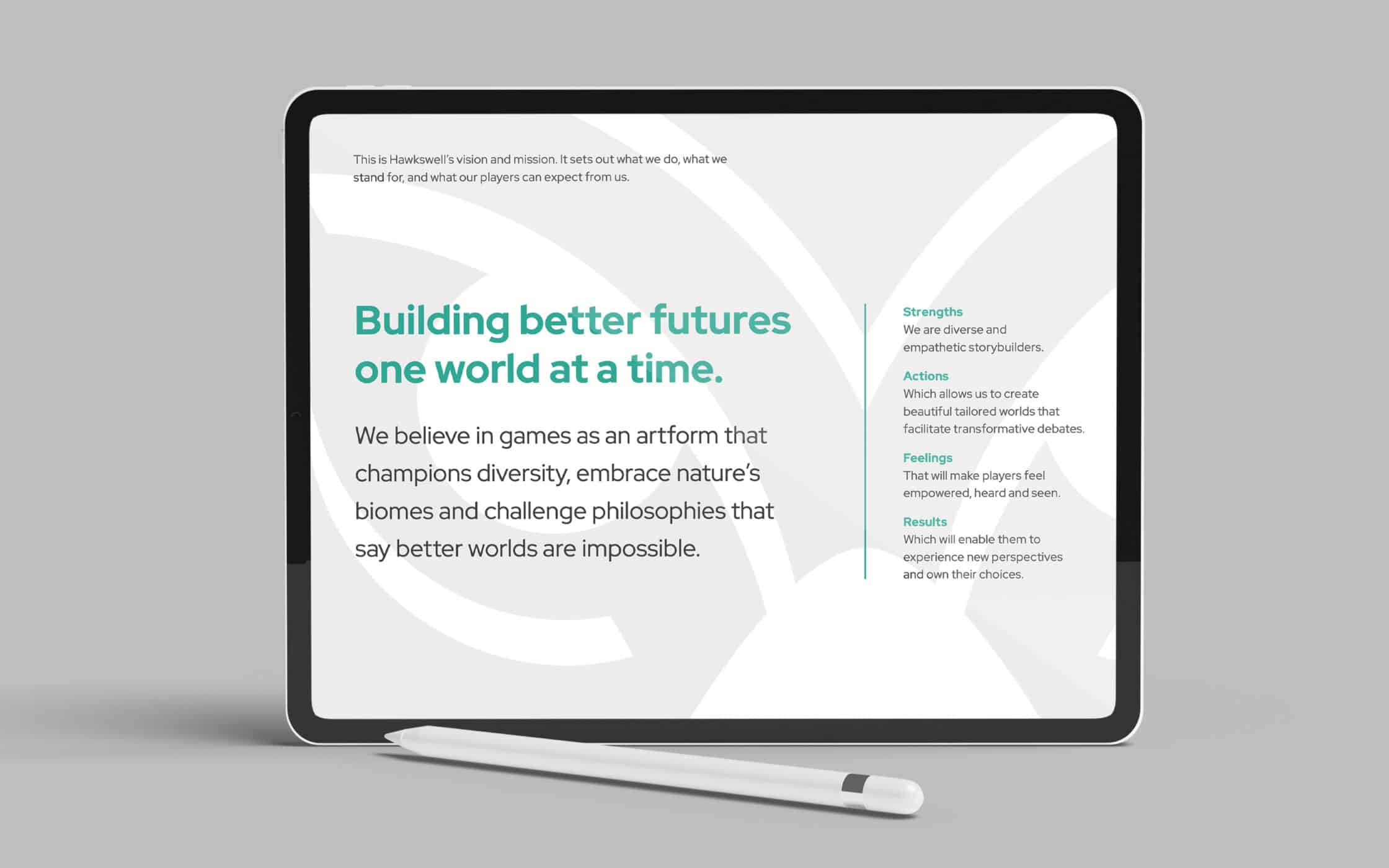
Hawkswell aspired to become a beacon for immersive storytelling, adventure, and discovery in the gaming landscape. We collaborated with the team in an initial research session, discovering the mission, purpose, and values behind the brand. This led to the creation of a brand personality, ready to inspire, excite, and engage a new community.
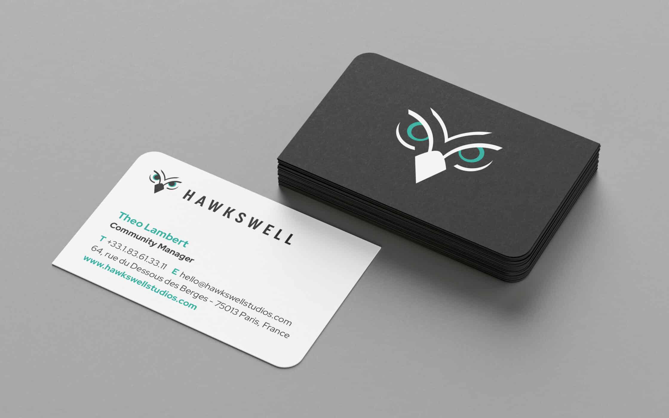
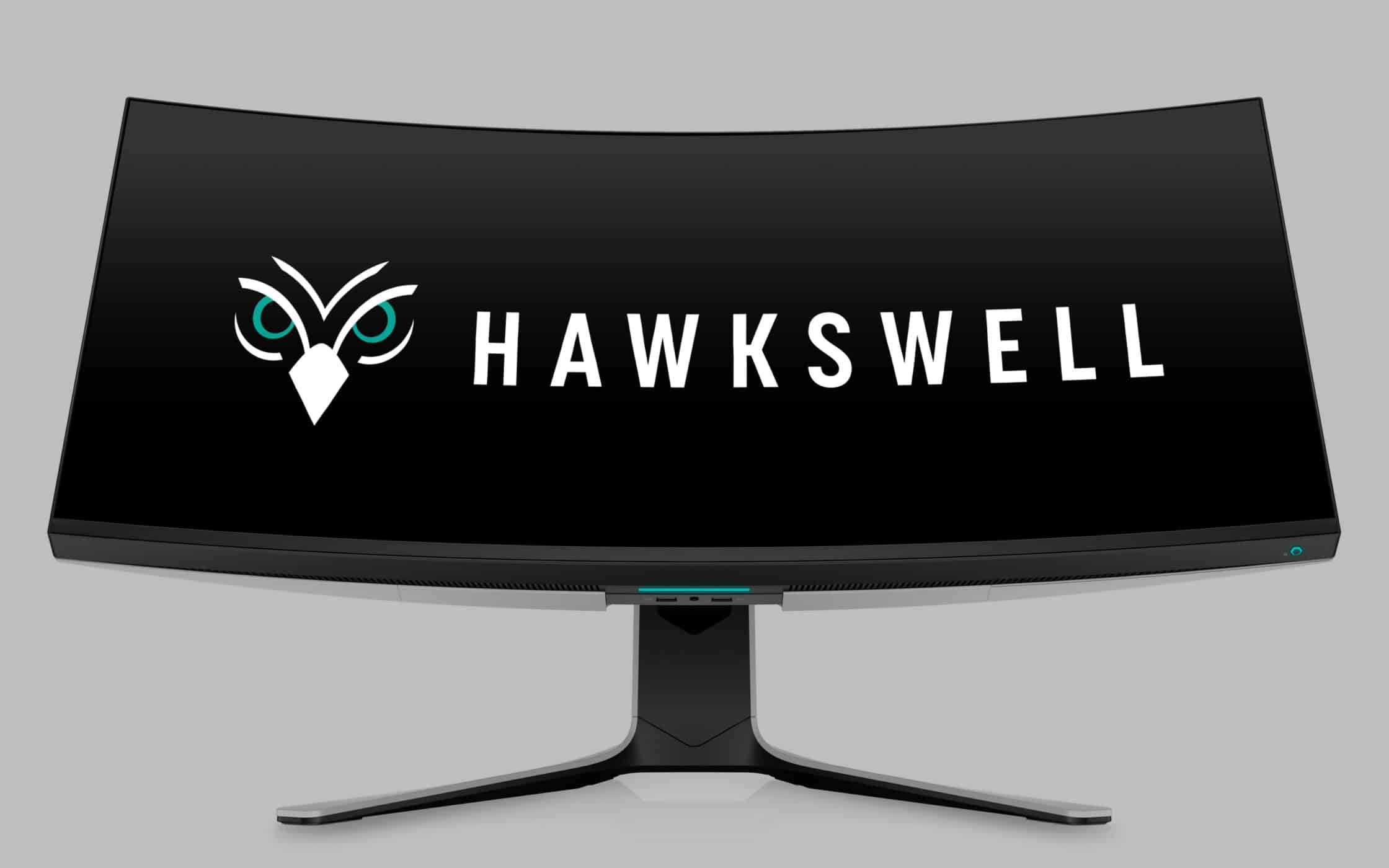
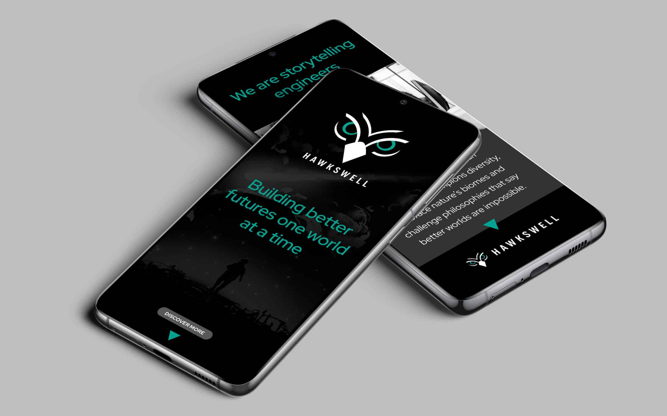
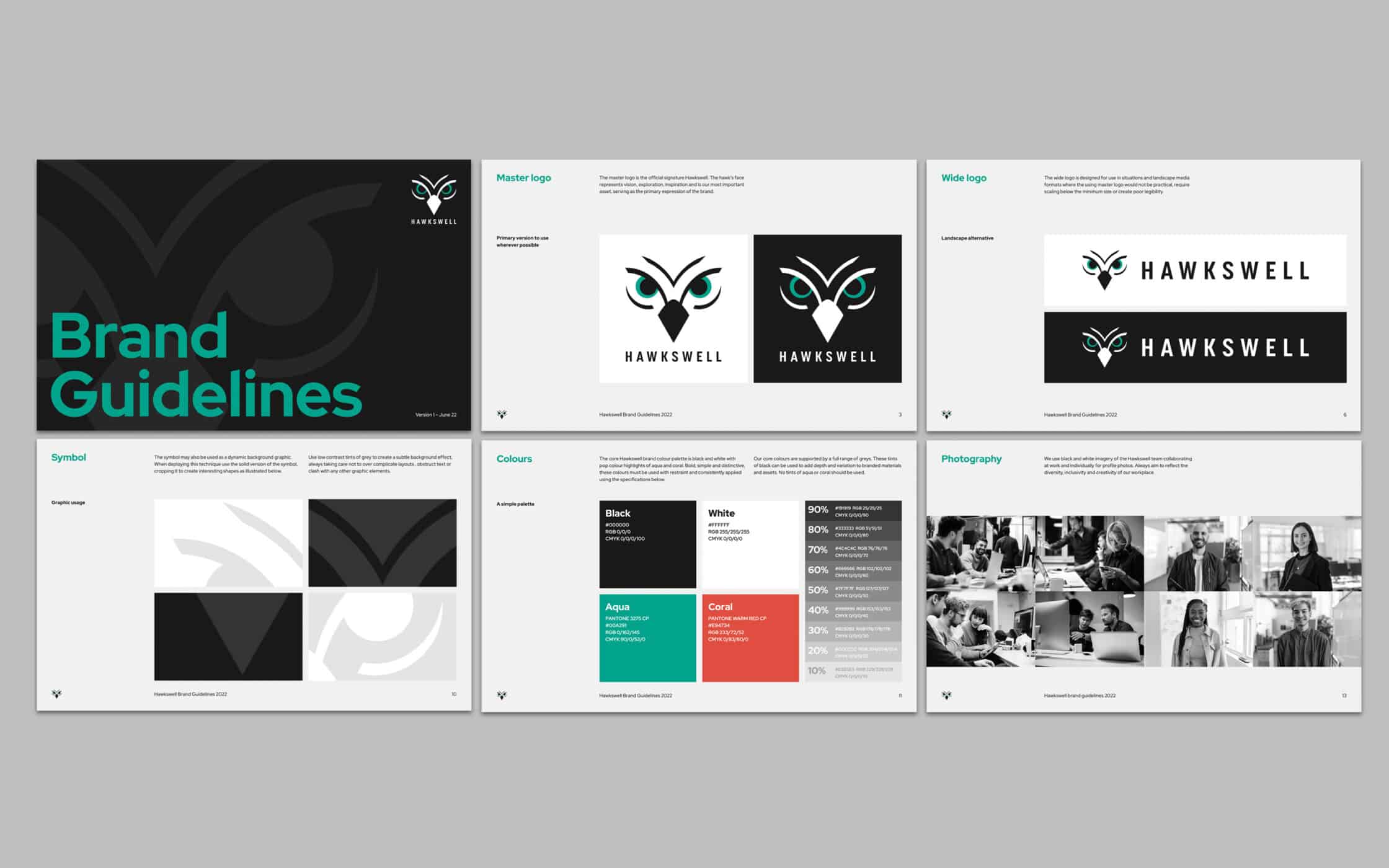
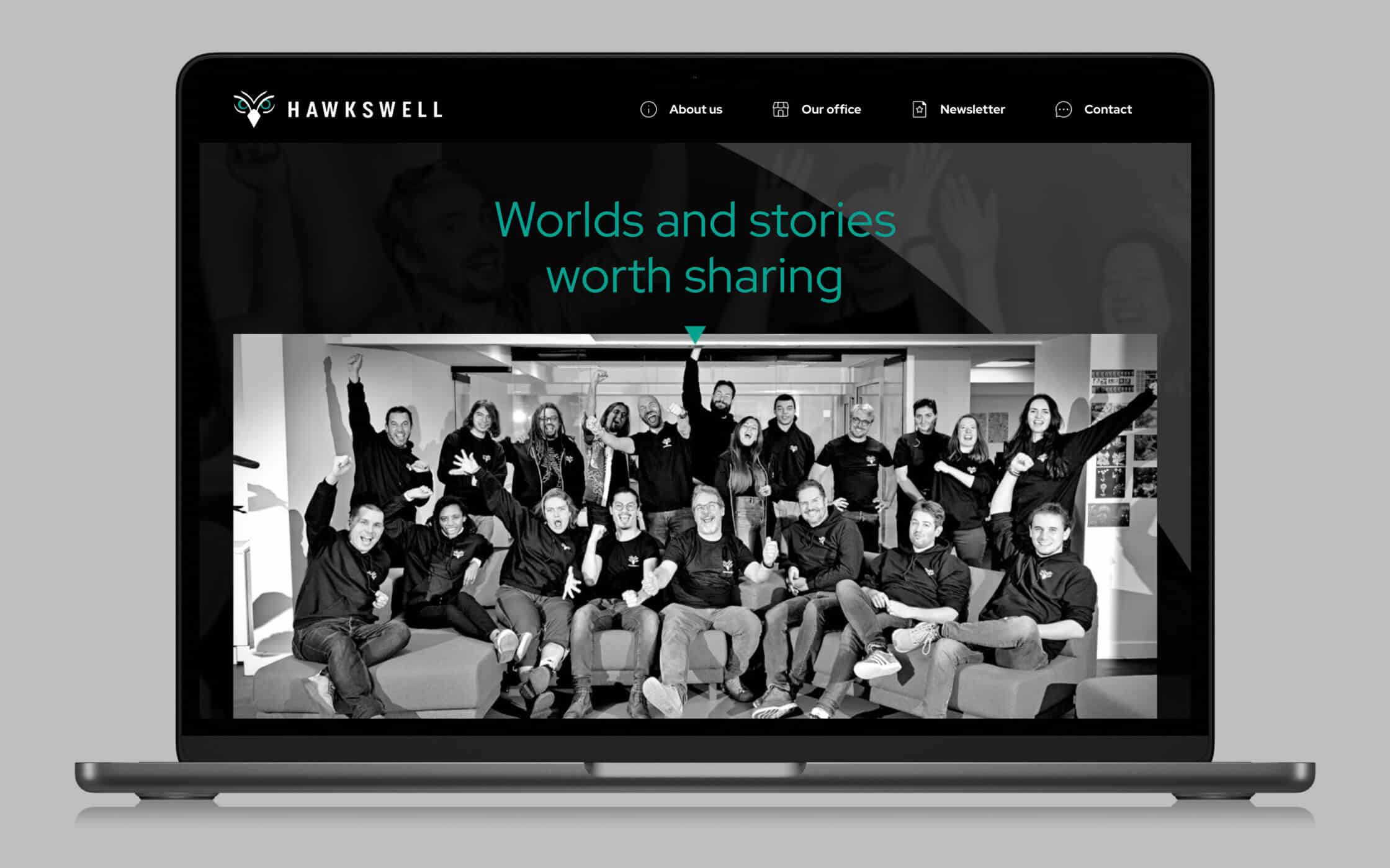
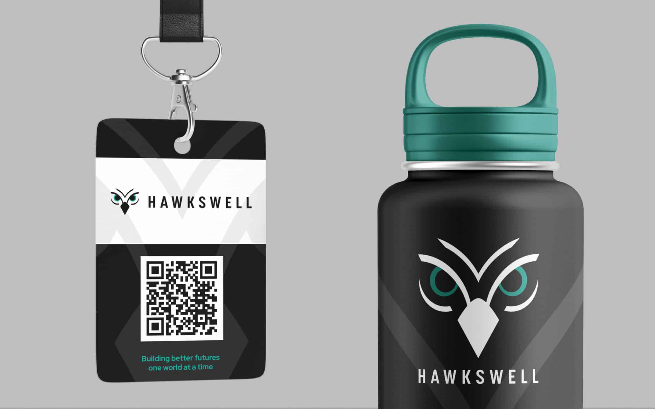
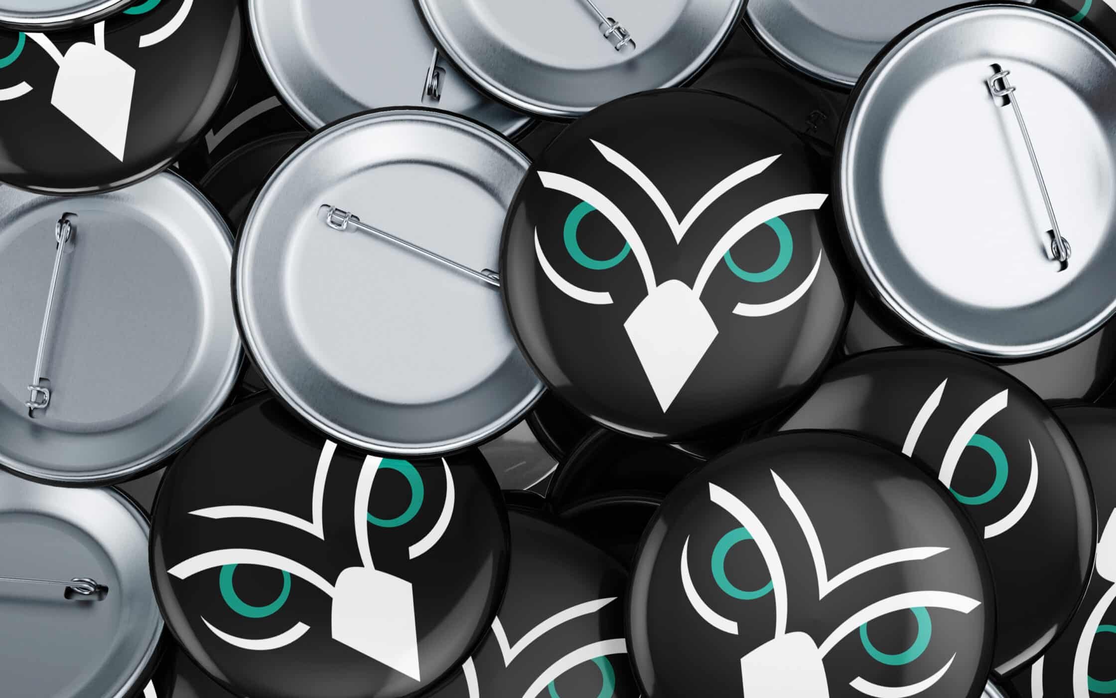
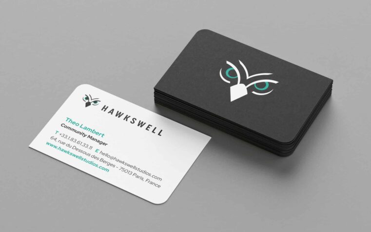
Careful competitor analysis revealed numerous ways to differentiate the Hawkswell brand, swapping ornate fonts and cliched imagery for minimalist modernity. Our team created visual identity concepts, revolving around a contemporary hawk mascot, a simple color palette and sleek typography. We also worked with the team to create initial launch materials, and a new online presence for the brand.
Transformative branding for a true visionary.
Working with the Hawkswell team, we identified, created, and refined a brand identity that highlights the company’s creativity and vision. The new logo with its hawk symbol encapsulates the company’s focus on elevating the gaming space to new heights. The modern image and colour guidelines, ensure they can connect with a new generation of players.
We laid the foundations for the studio’s success, providing everything from strategic messaging guidance, to cohesive launch materials. Now, Hawkswell has both the image and voice it needs to shine as a vanguard in the realm of fantasy gaming.
What we did:
| —Brand workshop —Messaging and tone of voice —Brand identity and logo-mark |
—Visual identity guidelines —Brand implementation —Website design and build |
More from our portfolio...
Load more projects


What do you need?
Please tell us about your requirements, and we'll be in touch.
"(required)" indicates required fields