
Redefining and repackaging student accommodation.
An innovator in student accommodation and support, Fresh Student Living is an organisation committed to creating incredible academic experiences. Managing an expansive portfolio of lodging options for students across the UK, the brand believes in eliminating housing hardships. It combines exceptional customer support and guidance with a focus on wellbeing and quality homes.
Rooted in a history of innovation, Fresh has achieved Platinum Certification as an operator from Global Student Living based on positive student feedback. The business has also won numerous awards based on the exceptional standard of its accommodation, and customer service. The team turned to Fabrik for help ensuring its brand identity matched its incredible reputation.
Crafting a refreshing new brand identity.
Keen to optimise its image and strengthen relationships with a growing audience, Fresh Student Living commissioned Fabrik for a comprehensive rebranding effort. On a strategic level, our work included developing a compelling brand proposition, positioning, and brand essence statements. From a creative perspective we were tasked with updating the company’s logo mark and tone of voice.
The goal of the project was to help differentiate Fresh from its competitors, while improving visibility, and ensuring a consistent personality for the business. Fabrik worked with the management team of the company to explore the core elements of the brand, identify its distinctive elements, and craft a strategy for a comprehensive rebranding journey.
Bringing inspiration and a fresh vision to life.
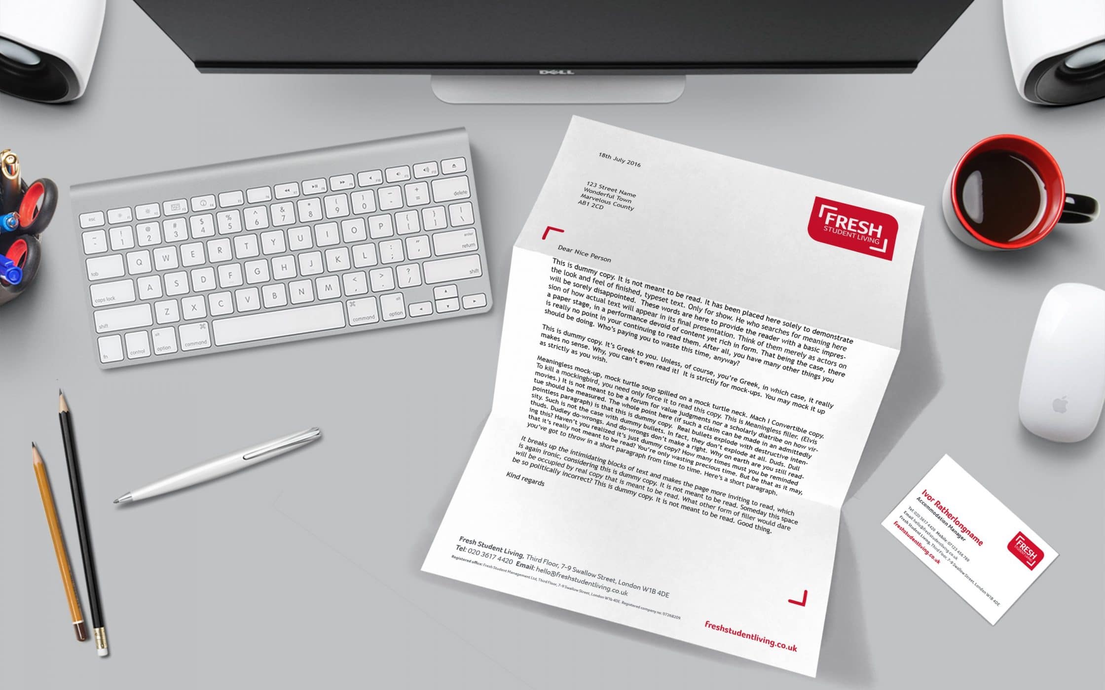
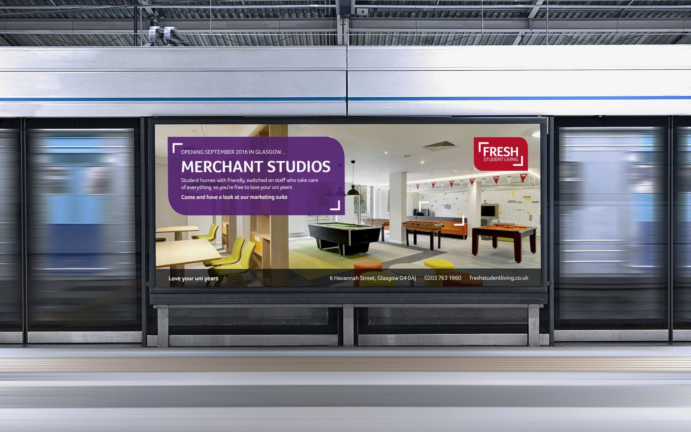
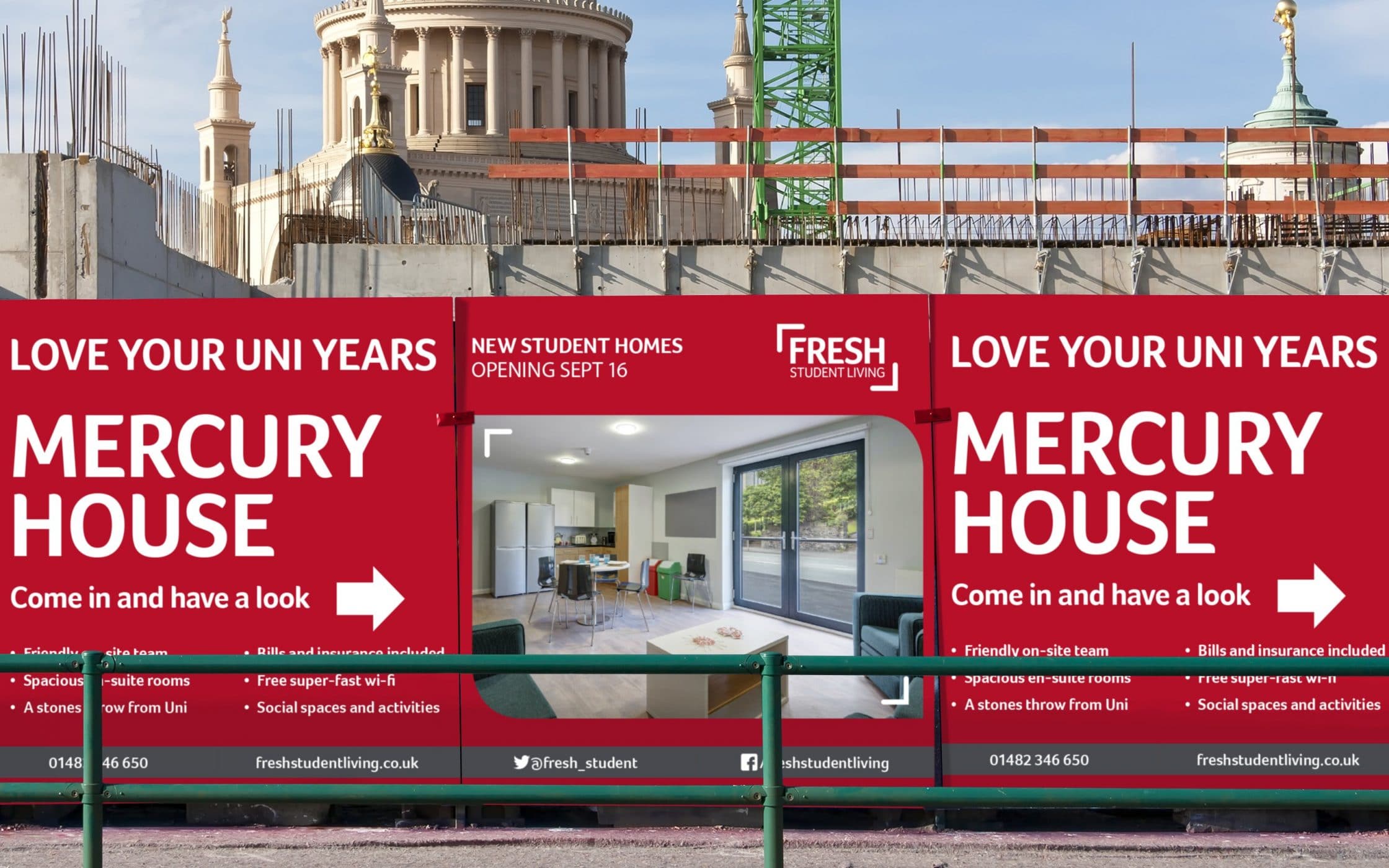
From our initial consultations with the Company, it was clear the Fresh brand was driven by compassion, warmth, and authenticity. They focus on making student accommodation simple, so learners can make the most of university life. Building on this ethos, Fabrik created the strapline “Love your uni years” as the cornerstone of the rebranding project.
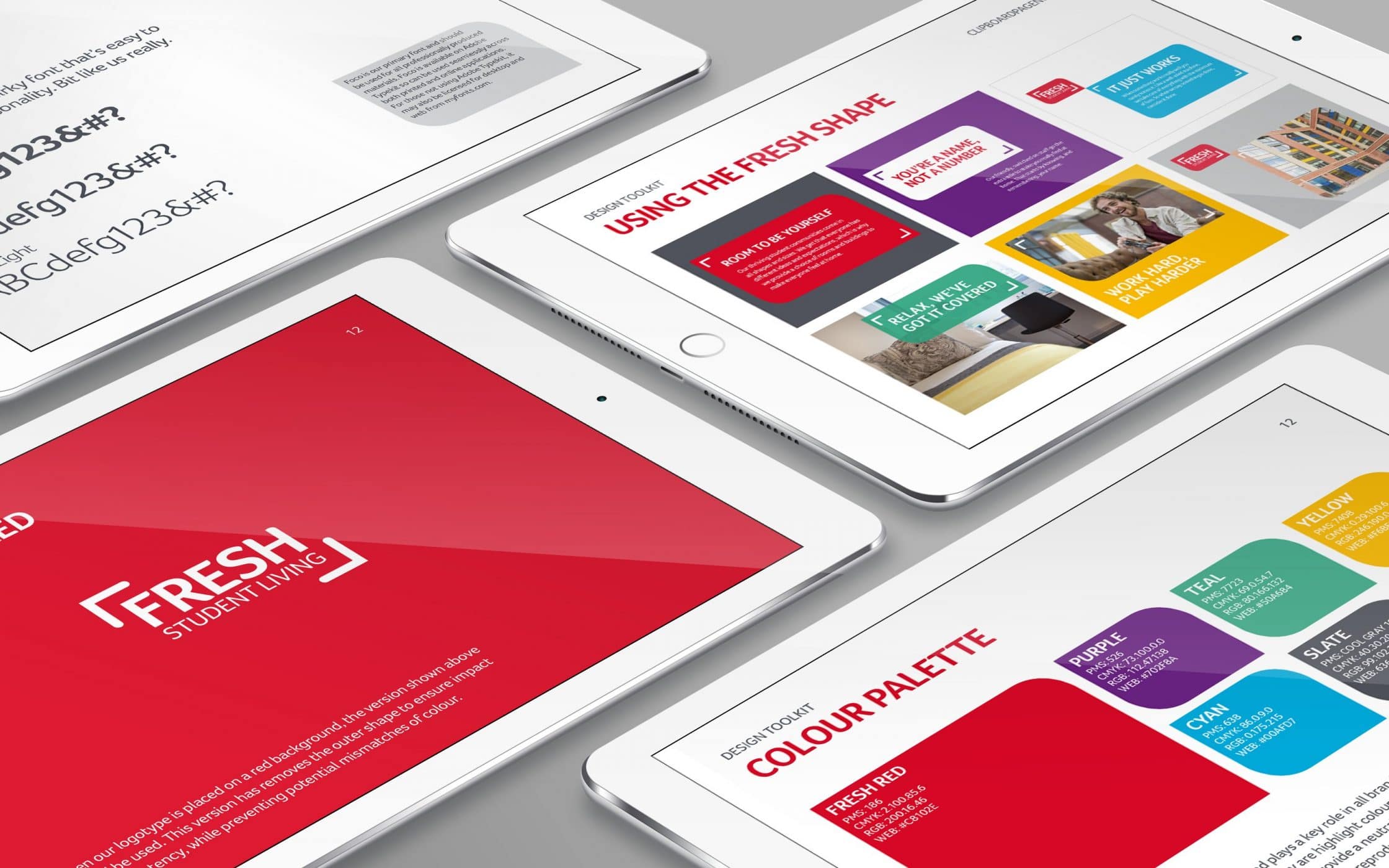
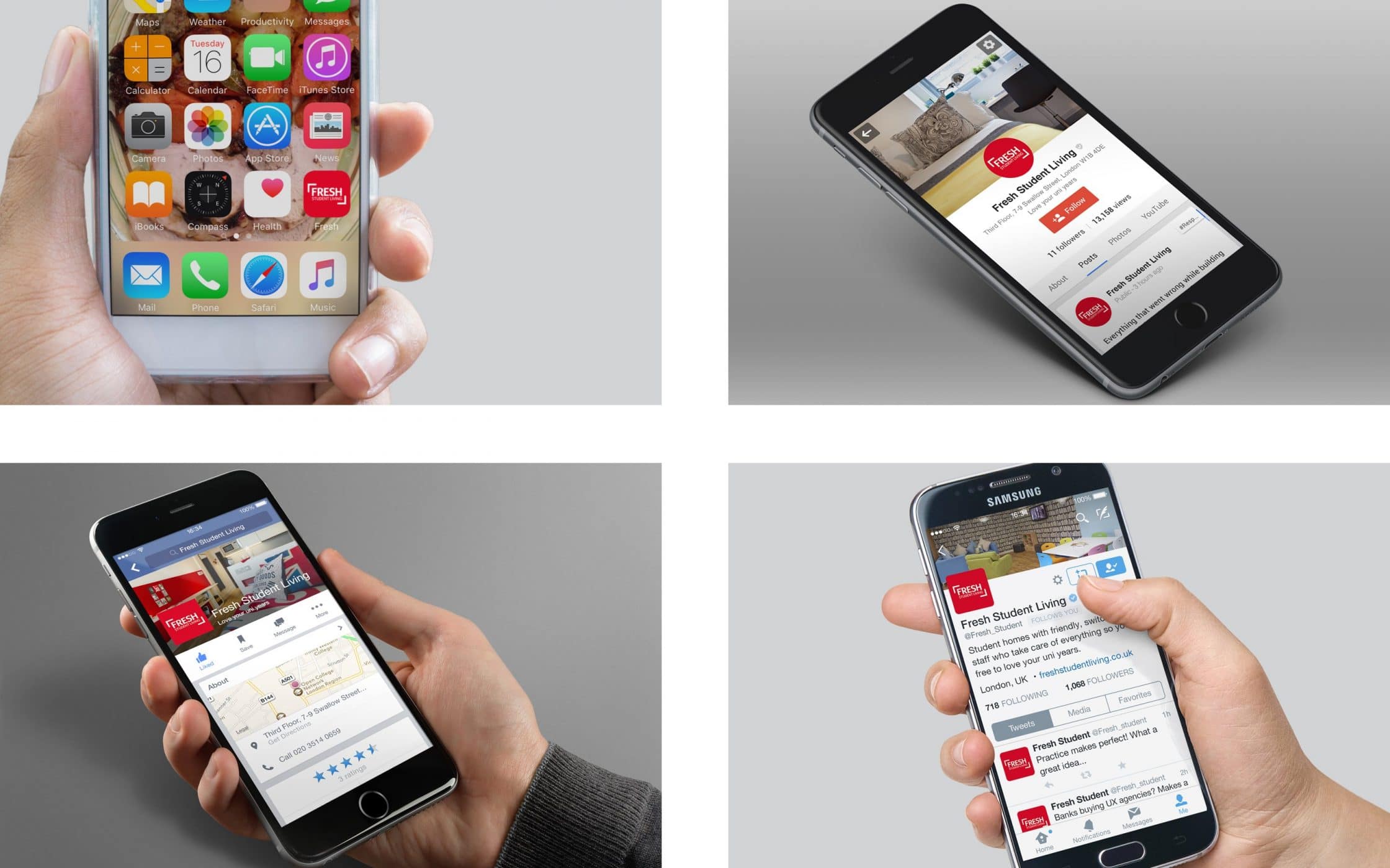
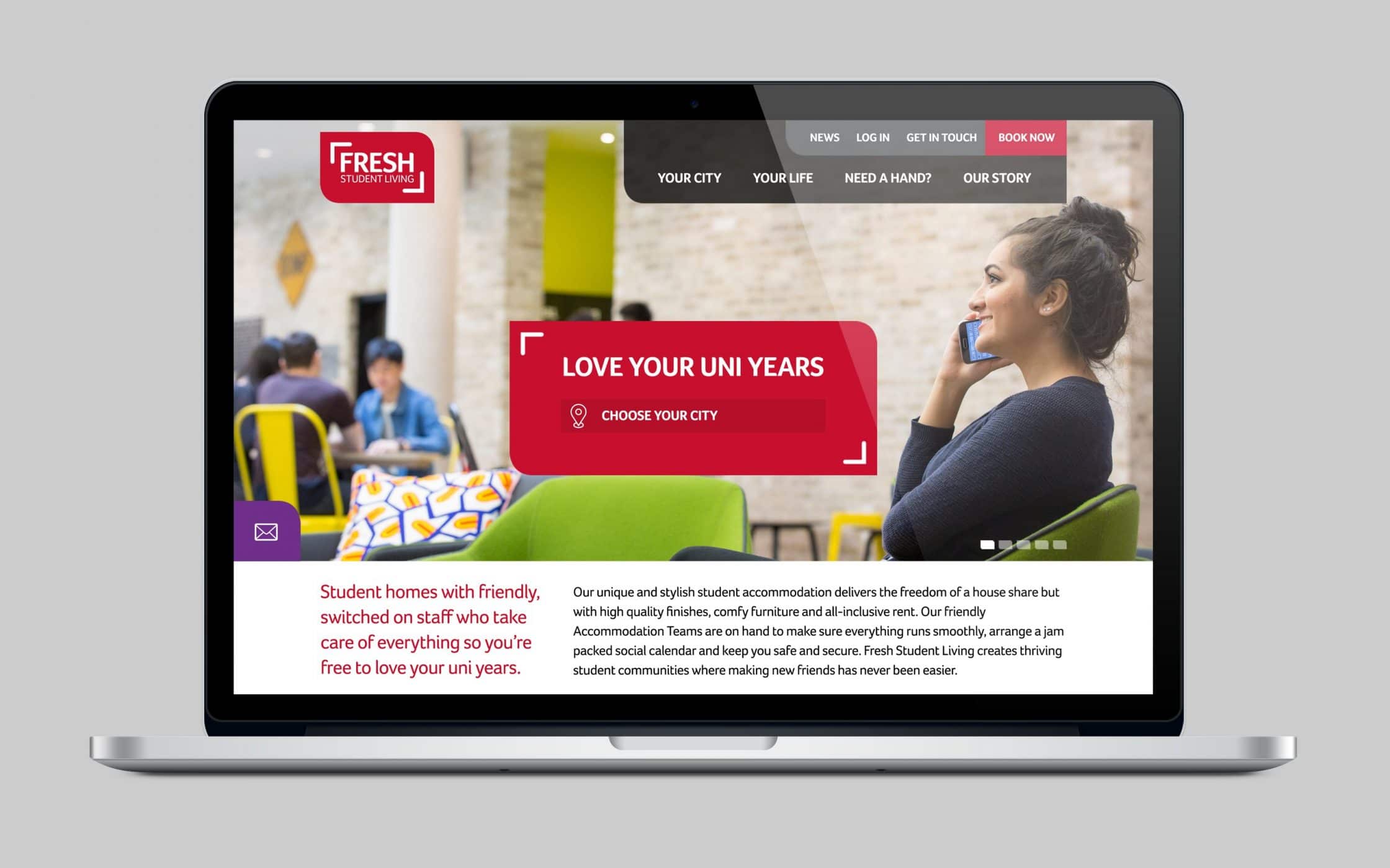
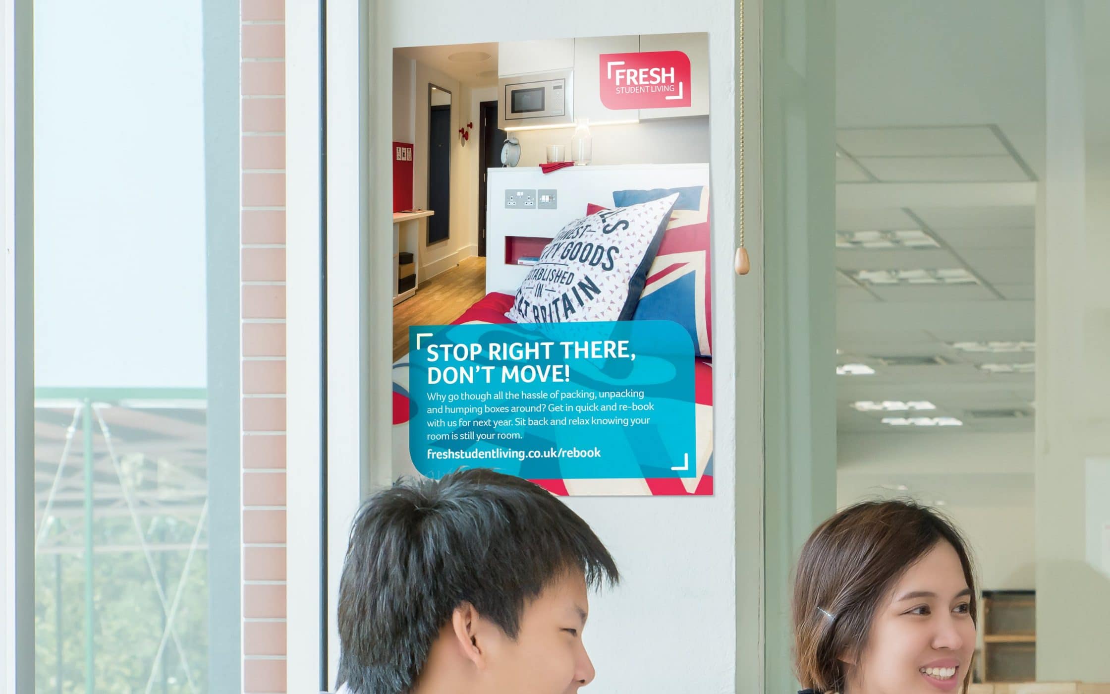
Next, we looked at tone of voice, crafting a series of key messages to guide the promotional team. Then, for the visual identity, we introduced a new logo, and a set of secondary colours to complement the Company’s primary shade of red. We also provided guidelines for the application of the new identity, and conducted on-site photoshoots.
An innovative student accommodation brand, transformed.
Our holistic approach to revitalising the Fresh Student Living brand encompassed everything from proposition development, to the creation of a strong communication strategy. We enhanced the existing visual identity with a logo and colour palette chosen to appeal to ambitious new students, and highlight the company’s unique ethos.
A combination of marketing messages, governance guidelines, and even on-site photo shoots provided Fresh with the key resources they needed to elevate their marketing materials. Now, the business has the comprehensive and evocative brand identity it needs to forge deeper connections with its target audience, and stand out in a growing industry.
What we did:
| —Brand strategy —Tone of voice —Logo design —Visual identity —Design templates |
—Photography —User guidelines —Implementation —Marketing —Website design |
More from our portfolio...
Load more projects


What do you need?
Please tell us about your requirements, and we'll be in touch.
"(required)" indicates required fields