


Toyota logo history: The Toyota symbol meaning and evolution
Are you familiar with Toyota logo history? Simple but effective, the Toyota emblem is one of the better-known images in the vehicle landscape, among Japanese consumers and car drivers across the globe.
The Toyota car logo has seen several changes over the years as the brand has evolved. Today, it consists of a set of three ovals, carefully designed to look a little like the shape of a “T”.
Even if you don’t know much about the inspiration behind the Toyota symbol, there’s a good chance you can easily recognize one of these badges on the street.
Let’s dive a little deeper into the Toyota logos over the years…
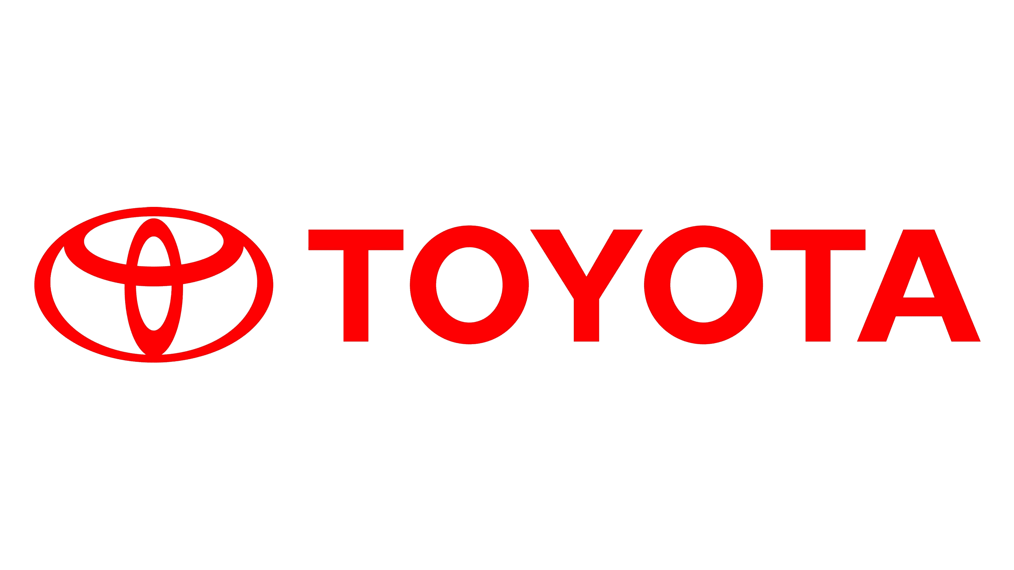
Toyota history: The Toyota logo today
Compared to some of the more complex car logos on the market, like the logo for Porsche or Ferrari, the Toyota logo is quite simplistic.
At a glance, it looks like a stylized version of the letter “T” written, like many of the leading vehicle wordmarks, in the middle of an oval. However, there are actually three ovals working together to create the image for Toyota.
Each of these ovals has its own symbolism. The smaller oval is supposed to represent the heart of the client, while the second oval represents the heart of the Toyota brand. The largest oval encircling the other two represents the limitless possibilities offered by the industry.
Use of the color red is meaningful here too. The shade is often associated with passion, power, and strength – all crucial concepts in the automobile industry.

Toyota: Brand overview
| Founded: | 1937 |
| Founder: | Kiichiro Toyoda |
| Headquarters: | Toyota City, Aichi |
| Website: | www.toyota.com |
| Logo downloads: |
The Toyota Motor Company actually started life as “Toyoda” – named after the founder of the brand. Today, the Toyota car symbol is a worldwide icon of reliable vehicle manufacturing. Love and awareness of the Toyota emblem has grown as the brand has continued to evolve.
Toyota is one of the largest automobile manufacturers worldwide, currently responsible for producing around 10 million vehicles on an annual basis. The company has also earned praise for its leadership in the hybrid and electric vehicle markets.
Toyota now has around 40 hybrid vehicle models worldwide.
Toyota logo evolution: The Toyota logo over the years
Toyota logos have evolved drastically over the years – perhaps unsurprisingly when you consider the original name of the business was “Toyoda”. Despite a number of changes however, the overall aim of the symbol has always remained the same.
Toyota’s emblems represent simplicity, stability, elegance, and performance throughout the years.
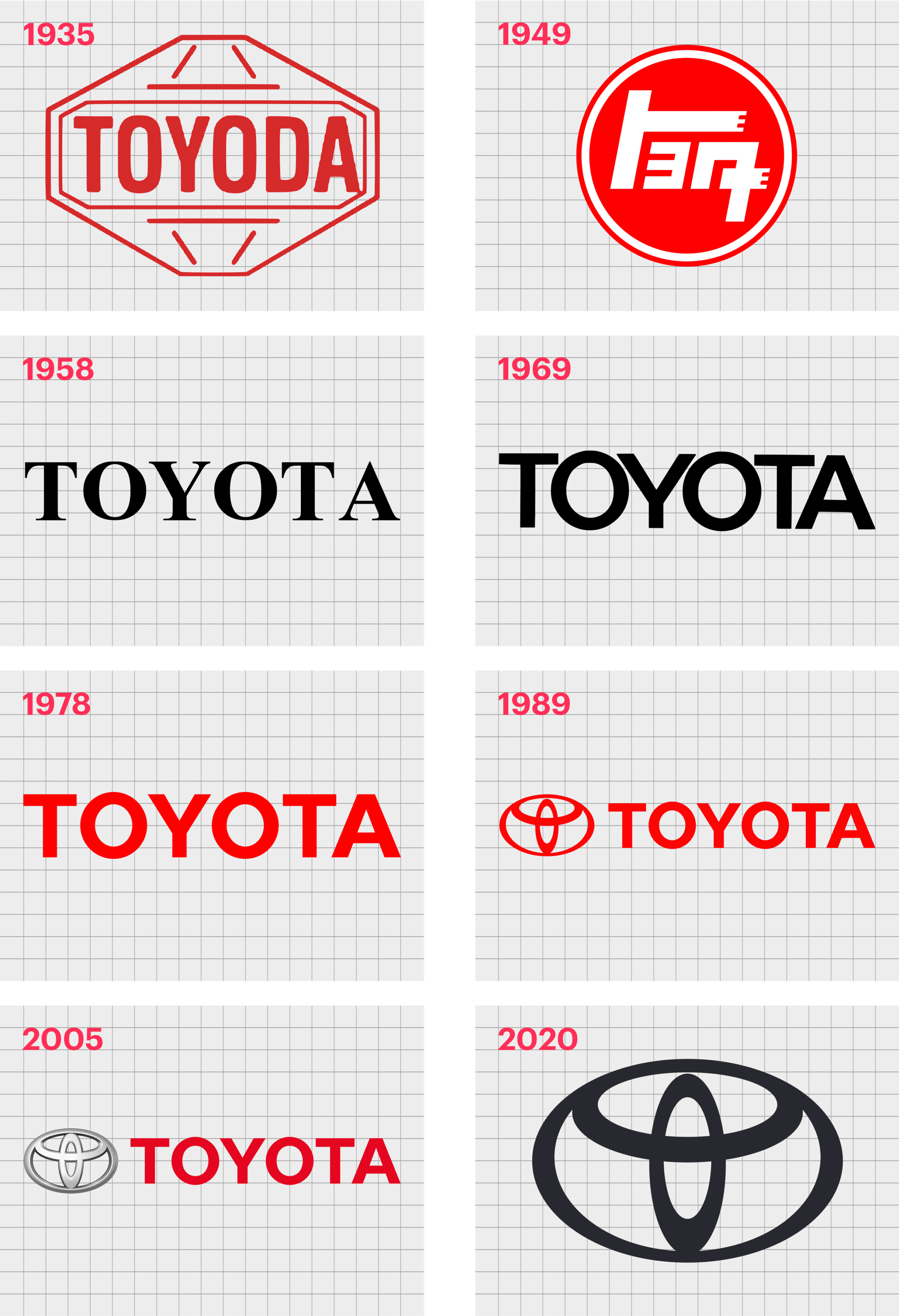
1935
The original Toyota logo was introduced in 1935, featuring the classic name of the brand. This image featured a red and white diamond with a sans-serif, bold wordmark in the middle.
The classic Toyota logo was very geometric in style, highlighting the engineering prowess and stability of the company. The diamond shape behind the wordmark was also representative excellence and class.
Interestingly, the colors of this old Toyota symbol aren’t too different from the shades most people associate with Toyota today. Red and white have become signatures of the Toyota brand, representing passion, energy, and acceptance.
1949
In 1949, a Japanese version of the old Toyota logo appeared. This image replaced the diamond-shaped background of the Toyota logo with a bold red circle. The white marks in the middle of the circle stood for the word “Toyota”.
This image was simple, elegant, and an interesting introduction to the use of the term “Toyota” instead of “Toyoda” for the brand.
The Toyota logo change also influenced the international market, where the company introduced a wordmark in a font very similar to Times New Roman. The serif font represented elegance and sophistication.
In 1969, the wordmark for the Toyota logo evolved again, this time switching to a sans-serif design, with closer kerning and a more modern image. The custom typeface here was similar to Hypersans Heavy in style.
1978
In 1978, another Toyota logo change took place, and the company embraced its bright red and white coloring once again. The wordmark we see here is similar to the one which continues to represent the Toyota Company today, alongside the iconic brand symbol.
The font is similar in style to the type which came before it, but with a reduced height and greater spacing.
1989
By 1989, Toyota decided it was time to update its logo with more than just a wordmark. The first version of the oval emblem was introduced, and very little about it has changed since then. The insignia features a large, horizontal oval, with a set of two overlapping ovals in the middle.
In some branding and marketing campaigns, the Toyota logo appears alongside the wordmark for the company. However, it’s also possible to use the oval badge alone
Originally, the red chosen for the overlapping ovals logo was a lot deeper and darker than the one we know today. In the following years, the color scheme has updated.
2006
In 2006, Toyota updated its logo to feature a chrome and silver version of the oval logo. This is the badge many people saw on their Toyota car for several years. In this version of the logo, the separate ovals of the Toyota symbol are easier to recognize.
By 2019, Toyota updated its image slightly again, this time making the contours of its iconic emblem more refined. The Toyota Company generally displays the oval logo on its own today, either in white on a red background or black on a white background.
Toyota symbol meaning: The new Toyota logo
The Toyota logo meaning has been an important aspect of the brand identity since the oval logo was originally introduced. According to Toyota, the ovals are designed to represent the various interlocking hearts of the Toyota Company, and their customers.
Interestingly, the Toyota symbol as we know it today wasn’t actually designed by Toyota but was instead chosen from a total of 46,000 logo options after a company announced a contest to help them find the best new brand image in 1936.
Part of what makes the logo so compelling is how well it reads across multiple geographies. For the western market, the image looks like the capital letter “T”. For the eastern market, the use of the interlocking logo ovals represent community, spirit, and connectedness.
Toyota logo colors
The official Toyota logo color has changed a number of times over the years, from the passionate red which still appears in some versions of the logo today, to the monochromatic versions of the logo introduced over the years.
The most common Toyota logo colors associated with the brand include:
Red: HEX: #EB0A1E; RGB: (235,10,30)
Black: HEX: #000000; RGB: (0,0,0)
White: HEX: #FFFFFF; RGB: (255,255,255)
While there’s also a silver metallic version of the logo, this is generally used in creating the Toyota car badge, rather than in the branding or marketing assets for the company.
The color red in the Toyota brand stands for passion and power, while white represents innovation and class. Black is often associated with power and sophistication.
What font is the Toyota logo? Toyota logo font
The font used for the Toyota wordmark today is a simple but appealing sans-serif font, similar to the Avenir typeface. The font is easy-to-read, bold, and well-balanced, perfect for a huge international brand.
Though Toyota has experimented with other serif fonts in the past, this is the type which has remained consistent with the brand for the longest.
Celebrating the Toyota logo today
Today, the Toyota logo stands as a testament to the stability and durability of the Toyota brand. Many aspects of the Toyota symbol have remained the same over the decades, highlighting the value of a future-proof, meaningful, yet simple emblem.
For fans of logo design, Toyota’s image is an excellent insight into how the right shapes and designs can transcend geographical boundaries.
Discover more Logofiles on Brand Fabrik!
Now read these:
—Which car companies own which car brand?
—Famous car brands, their names and logos
—The ultimate list of French car brand logos
—The 50 best-known car logos with wings
—The definitive guide to German car logos
—Famous car logos and emblems with stars
—Top American car brands and their logos
—Your ultimate guide to Italian car brands
—American car companies that went bust
—The conclusive guide to British car logos
—The essential list of Japanese car logos
—A decisive guide to car logos with circles
Fabrik: A branding agency for our times.

Clarity starts with a conversation.
Thanks—we’ll get back to you shortly.
Whether you're navigating a rebrand, merger, or simply need a clearer identity—we’re here to help. No hard sell, just honest advice from people who know the sector.
Let’s start with a simple question…
Prefer to email? Drop us a line.
Fabrik’s been helping organisations rethink and reshape their brands for over 25 years. We’ve guided companies through mergers, rebrands and new launches. Whatever stage you’re at, we’ll meet you there.