The fascinating story of the Pac-Man logo history and symbol

In the gaming industry, few symbols are instantly recognizable as the Pac-Man logo.
Considered by many to be an icon of arcade history, Pac-Man changed the way we viewed the entertainment landscape forever. Even now, several decades after the start of Pac-Man logo history, the emblem continues to capture the attention of gamers around the globe.
Since its inception, Pac-Man has inspired countless follow-on games and competing titles in the arcade landscape and among at-home entertainment vendors. There are even versions of Pac-Man people can play on mobile devices and modern consoles.
The character Pac-Man even became the official mascot of Bandai Namco Entertainment, and the game is one of the highest-grossing titles ever.
Today, we will closely examine the evolution of the original Pac-Man logo and its history.
Who created Pac-Man? An introduction
Originally known as “Puck Man” in Japan, Pac-Man was created in 1980 by the Namco video game company.
Designed specifically for the arcade landscape, the title places players in a maze-style environment where they must control the central character, racing to collect a number of white dots before they’re captured by the antagonists (ghosts) chasing them down.
Game development started in 1979, with a creator named Toru Iwatani and a 9-man team.
Keen to create a game capable of appealing to both women and men at the same time, Iwatani chose to look outside of the popular themes of war and sports when producing the title. The inspiration for the character was an image of a pizza with a single slice removed.
The title “Puck man” was taken from the phrase Paku paku taberu, which referred to eating something rapidly. The title was, however, quickly changed in the North American market to reduce the risk of vandalism.
Pac-Man rapidly achieved success around the world, leading to several game sequels, as well as two television series and a hit single. Today, it’s regularly referred to as one of the greatest video games ever created.
What does Pac-Man symbolize?
There have been numerous theories about the symbolism behind the Pac-Man game. Some people say the title is a metaphor for mental illness, suggesting the ghosts are symbolic of the ailments which tend to “haunt” those with issues such as depression.
However, such theories have never been officially confirmed by Namco, or Bandai Namco.
Pac-Man logo history: The evolution of Pac-Man
Notably, there have been numerous variations of the Pac-Man logo created throughout the years to represent sequels and follow-on assets. For the purpose of this article, we’re going to be specifically looking at the official Pac-Man logo history, which started in 1979.
1979
One of the original logos for the Pac-Man franchise was produced in the early stages of building the game when the organization and its developers were still settling on a name for both the American and Japanese markets.
This logo, designed to be utilized as an arcade flyer, featured the name of the game in bulky block letters.
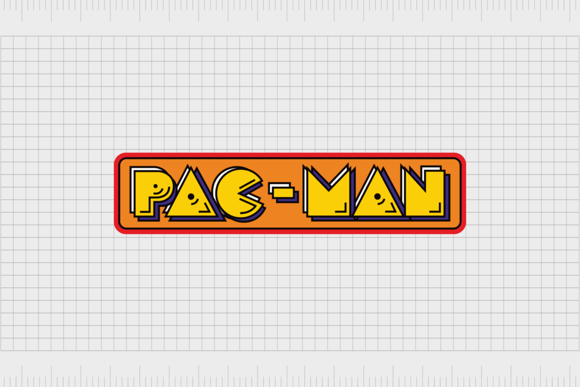
The characters were made three-dimensional and appeared in the bright yellow coloring used for Pac-Man himself. The “C” in Pac was designed to look like the eponymous character himself, with a set of two black eyes in the top section.
The whole wordmark was curved slightly and placed on a blue banner with a darker blue border. In the top right corner, we see a cherry, one of the fruits Pac-Man can collect when exploring the various mazes in the game.
1980
In 1980, two official logos were created, one for the Japanese market and one for the larger global and North American landscape. The first logo featured the original name, “Puck Man,” with no dash between the two letters.
The font style was very similar to the one used in the beta design, made up largely of three-dimensional geometric glyphs.
In this logo, the “C” was still made to look like the primary character, though the eyes were removed. The wordmark appeared on an orange banner background with a slim red border around the outside. The border components were also outlined in black.
The second variation of the logo for the global market was almost exactly the same in style, but this design featured the “Pac-Man” name instead.
A couple of additional variations were also created over the years, which either removed the banner-style aspect to leave the wordmark as a standalone emblem or experimented with different color palettes.
Similar logos have been used in recent years for official Pac-Man sequels, such as Pac-Man Vs, Pack-Man Remix, and the Pac-Man Arrangement.
The Pac-Man logo: Colors and Fonts
Since it was officially introduced in 1980, the core Pac-Man logo hasn’t undergone many changes. The color palettes and even font styles used in most parts of the world have remained consistent. However, some follow-on titles have experimented with different design styles.
The Ms. Pac-Man logo tends to include different color palettes and decorative components.
Though the font style and design of the Pac-Man logo might seem a little old-fashioned in today’s landscape, the retro nature of the emblem is part of what adds to its charm. Today, the design is considered to be one of the most meaningful in video game history.
If you want to take a closer look at the Pac-Man logo, you can find some useful resources here:
What color is the Pac-Man logo
Like many video game designers, the creators of Pac-Man experimented with a number of colors when they were first creating the Pac-Man title. Overall, the aim of the company was to create a bright, eye-catching logo capable of appealing to a wide audience of men, women, and children.
The official Pac-Man logo colors have also changed a few times over the years with the introduction of different follow-on titles. However, the core color of yellow remains a common component in virtually every version of the Pac-Man symbol.
This color is almost always used as the central shade for the wordmark in Pac-Man emblems. Accompanying the yellow shade, other Pac-Man logo color choices tend to include orange and red.
Various accent shades are also used throughout the Pac-Man design, such as white and black. The fun and eye-catching color palette is intended to convey concepts like creativity, joy, and excitement.
What font does the Pac-Man logo use?
The Pac-Man logo font is perhaps one of the most interesting aspects of the overall logo. It’s intended to be fun, youthful, and eye-catching. The design is very similar to Emulogic, a pixel-style typeface, as well as “Pac-Font,” designed by Fontalicious.
The design of the typeface is blocky and bold, with large, bubbly characters which contain a number of geometric elements. As mentioned above, one of the most compelling elements of the Pac-Man logo font is the “C” in Pac, which has been changed to mimic the shape of the core character.
In most versions of the Pac-Man logo, the font is intended to look three-dimensional, with numerous lines created to make the characters look as if they’re jumping from the page or screen.
The iconic Pac-Man logo
Looking back at Pac-Man logo history, we can see the game’s core design hasn’t changed much over the decades.
Although different variations of the Pac-Man logo have been designed for specific follow-up titles, many aspects of the original logo remain a consistent part of the game’s visual identity.
Today, the Pac-Man logo stands as one of the most recognizable icons in the gaming landscape, capturing the hearts and minds of fans everywhere.
With its playful font choices and warm color palette, the Pac-Man logo instantly appeals to a wide audience of potential gamers. Few emblems have achieved the same fame as the incredible Pac-Man logo.
Fabrik: A branding agency for our times.
Clarity starts with a conversation.
Thanks—we’ll get back to you shortly.
Whether you're navigating a rebrand, merger, or simply need a clearer identity—we’re here to help. No hard sell, just honest advice from people who know the sector.
Let’s start with a simple question…
Prefer to email? Drop us a line.
Fabrik’s been helping organisations rethink and reshape their brands for over 25 years. We’ve guided companies through mergers, rebrands and new launches. Whatever stage you’re at, we’ll meet you there.


