Alfa Romeo logo history: Exploring the Alfa Romeo symbol
Are you familiar with the Alfa Romeo logo and symbol? One of the better-known car manufacturers in the world, Alfa Romeo has earned the hearts of countless road warriors over the years. The Company, best-known for its commitment to beautiful design, has lasted for more than a century.
Unfortunately, despite a long-standing presence in the automobile sector, few people can cite much about Alfa Romeo logo history. Today, we’re going to give you an insight into the Alfa Romeo logos best-known for identifying the brand over the years – and what each design meant.
Join us on our journey into Alfa Romeo history.
The Alfa Romeo logo: Alfa Romeo symbol today
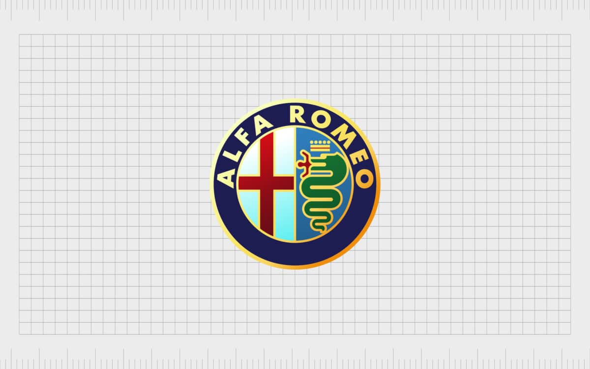
Today, The Alfa Romeo logo is a badge placed on every Alfa Romeo car. The design is a circular emblem designed specifically to fit well in the motor industry. The current version first began life in 1910, though various elements have evolved over the years.
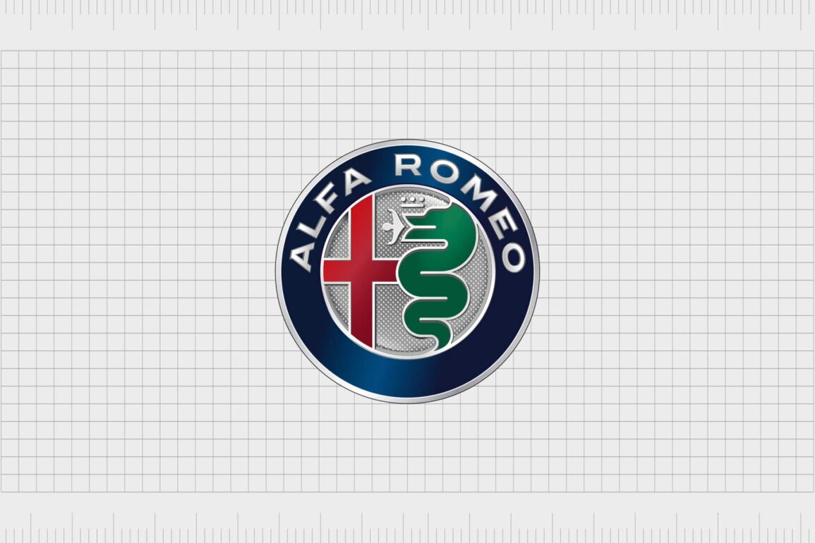
Within the Alfa Romeo logo, you’ll find a strange-looking serpent, a cross, or crucifix, and the Alfa Romeo name, written in all-caps sans-serif font.
Elegant and stylish, the Alfa Romeo insignia represents the fundamental pillars of the brand’s approach to design. Though the Alfa Romeo badge is sleek enough to be deemed modern today, it also carries a heritage which helps to cultivate trust among customers.
Current elements of the Alfa Romeo symbol include the Visconti serpent known as Biscione, a crown, a man being devoured, the cross of the municipality, and the Alpha Romeo wordmark.
| Founded: | 24th of June, 1910, Milan, Italy |
| Founder: | Nicola Romeo and Ugo Stella |
| Headquarters: | Turin, Piedmont, Italy |
| Website: | www.alfaromeo.com |
| Logo downloads: |
Alfa Romeo Automobiles is a premium Italian car manufacturer and a subsidiary of the Stellantis brand. Founded in Italy in 1910, Alfa chose its name as an acronym of “Anonima Lombarda Fabbrica Automobile”, the Lombard Automobile Company.
Technically founded by anonymous investors (hence the “Anomima” part of the name), Alfa bought the Portello factory building in Milan to begin producing cars.
The first car produced by the brand was the 24 HP 1910 car designed by Giuseppe Merosi. Over time, Alfa Romeo found its calling in the motor racing industry, and is well-known for today for its sport-oriented automobiles.
Alfa Romeo created its first iteration of the world-famous Alfa Romeo logo in 1910, the image we know today contains many of the same elements used then. Alfa Romeo’s original logo came from the mind of Romano Catteneo.
Alfa Romeo logo meaning and history
According to stories about the Alfa Romeo symbol, the initial idea for the logo struck the designer Romano Cattaneo when he was waiting for his tram.
As he stood in the Piazza Catello, Romano noticed heraldic interpretations on the Filarete Tower of the Biscione Visconteo – the coat of arms for Milan, and the Visconti family which ruled the location in medieval times.
The Biscione snake, or Alfa Romeo snake, has remained with the Company throughout the Alfa Romeo logo evolution over the years. Meaning “grass snake,” Biscione preserves Alfa Romeo’s connection with Milan.
According to stories, the snake devoured human beings, hence the man being eaten in the Alfa Romeo emblem.
1910
The old Alfa Romeo logo isn’t far removed from what most car enthusiasts would recognize today. The original design included two heraldic symbols in a badge. The Alfa Romeo symbol featured a large, outlined circle, divided into two parts.
On the left of the logo was white with a red cross, while the right featured the green snake Biscione devouring a man against a light blue background.
The design also featured the name “Alfa Romeo” in a serif font originally, though this changed to a sans serif font in 1912. On either side of the circle were a set of knotted ropes.
1915
In 1915, the logo was redesigned. The wordmark was elongated, this time featuring a hyphenated “Alpha-Romeo” at the top of the circular emblem, and the world “Milano” at the bottom.
The contours of the cross and serpent were refined and made more modern. The light and dark blue shades on the badge were intensified, and the man in the snake’s mouth became easier to identify.
1925
In 1925, the Alfa Romeo logo design became slightly more complex again, with a second outline featuring a silver leaf-based wreath. The wreath wrapped around the dark blue border of the original logo with the wording Alfa-Romeo Milano.
The ropes between the words “Alfa-Romeo” and “Milano” were simplified.
In 1933, the silver wreath was transformed to gold, and the lettering and cross were enlarged slightly, to make the design more eye-catching.
1946
In 1946 to 1947, Alfa Romeo simplified the logo again, replacing the silver wreath with a silver circle border in a mid-level thickness. The rope knotting was replaced with less intricate squiggles of silver, and the elements within the badge became more defined.
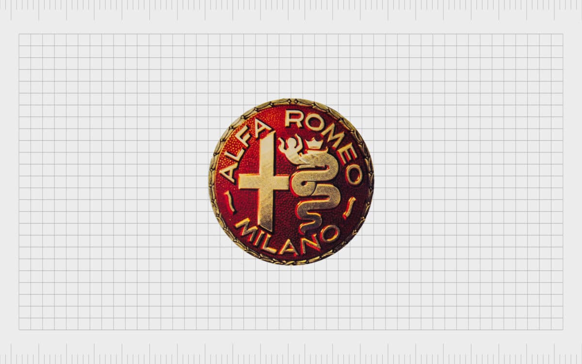
This brief change was quickly replaced again in 1947 when for a year, the iconic badge took on an entirely different color palette. This new design, created in red and gold, featured the central elements of the Alfa Romeo logo in a simplistic red circle.
1948
In 1948, the old Alfa Romeo logo changed again, going back to the original color palette and concept. The two parts of “Alfa Romeo” lost the dash connecting them. The green serpent and the man in his mouth lost a lot of their detail, making the design easier to replicate.
In 1950, the designers built on this simplification with a slightly more geometric design for the man in the serpent’s mouth, and an elongated version of the words “Alfa Romeo”. The word “Milano” took on a lightweight typeface here.
1971
In 1971, many of the elements of the original Alfa Romeo logo design came back into place, with a few simplifications. The “Milano” part of the Alfa Romeo badge disappeared. The outline of the snake, banner, and the circular emblem itself also took on a golden tone.
This slight change in 1971 paved the way for a much more significant change in 1972, where the golden metallic components of the logo swapped to a brighter yellow. The name “Alfa Romeo” also embraced the same shading.
The yellow outlines helped to highlight the now more simplified components of the Alfa Romeo image.
2000
For the year 2000, Alfa Romeo’s logo changed slightly once again. Gradient shades appeared in the yellow components of the logo to make them seem more metallic. The background of the cross became blue and white, rather than just white, and the crown atop the serpent was refined.
2015
In 2015, the official Alfa Romeo symbol most people know today was introduced. The yellow disappeared in favor of a sleek silver. The inner details of the badge were no longer separated in 2015, bringing the serpent and the cross together.
Alfa Romeo insignia: The Alpha Romeo emblem
Dating all the way back to 1910, the Alfa Romeo logo has featured various meaningful elements, from the Visconti serpent to the name “Alfa Romeo”.
Here are a few things you should know about the Alfa Romeo symbol:
Which creature is featured on the Alfa Romeo car logo?
The Alfa Romeo snake is the Visconti serpent, known as a Biscione. This was the symbol for the Visconti family – an influential group in Milan during the 11th century. The Biscoine is still frequently associated with Milan and appears on various monuments throughout the city.
The man being devoured by the snake is often considered a Moor or Saracen being defeated in the Christian crusades. The snake wears a golden crown, and the emblem also embraced a leaf garland after the Alfa Romeo P2 won the Inaugural Automobile world championships.
What does the Alfa Romeo cross stand for?
The cross on the left-hand side of the Alfa Romeo logo is the cross of municipality, often associated with the Milanese soldiers during the Christian crusades. The cross is also associated with the St George’s or St Ambrose cross.
Perhaps the only element in the Alfa Romeo logo which didn’t stand the test of time was the Savoy Dynasty knots placed alongside the wordmark.
Alfa Romeo logo colors: What are the Alfa Romeo colors?
The Alfa Romeo logo colors have remained mostly the same over the years, with only a couple of small changes, aside from the single year when the color scheme changed to red and yellow.
The base color of the Alfa Romeo symbol is blue. There’s a dark blue circle surrounding the inner emblem for most of the Alfa Romeo logos.
Most consider the dark blue to be representative of royal blood. Other colors included a light blue background for the snake, perhaps symbolizing the sky, and a deep green for the serpent itself. The man being eaten by the snake has been red, pink, gold, and silver.
Other primary Alfa Romeo colors include the golden crown, which is now silver, the red cross on a white background, and the outlines for the various logo elements. The outlining has moved between gold, yellow, black, and now silver.
Alfa Romeo logo font: The Alfa Romeo font
So, what font is the Alfa Romeo logo?
The design features an easy-to-read font, which now appears in silver. The coloring of the font has changed with the design of the logos over the years. Originally, the typography was in serif, but it’s now a much more legible sans serif alternative.
The design of the Alfa Romeo logo is unique to the brand, but it is very simple, classical, and easy to read. According to the designers, it’s meant to be both reliable, and confident.
Alfa Romeo today
Today, the Alfa Romeo logo is a long-standing and easily recognizable symbol for one of the world’s favorite automobile brands. This is a logo steeped in history.
While various elements have changed over the years, the most important components of the design hold strong, from the serpent to the bold shape of the Alfa Romeo badge.
Now read these:
—Which car companies own which car brand?
—Famous car brands, their names and logos
—The ultimate list of French car brand logos
—The 50 best-known car logos with wings
—The definitive guide to German car logos
—Famous car logos and emblems with stars
—Top American car brands and their logos
—Your ultimate guide to Italian car brands
—American car companies that went bust
—The conclusive guide to British car logos
—The essential list of Japanese car logos
—A decisive guide to car logos with circles
Fabrik: A branding agency for our times.
Check out these fantastic logo design resources:
Clarity starts with a conversation.
Thanks—we’ll get back to you shortly.
Whether you're navigating a rebrand, merger, or simply need a clearer identity—we’re here to help. No hard sell, just honest advice from people who know the sector.
Let’s start with a simple question…
Prefer to email? Drop us a line.
Fabrik’s been helping organisations rethink and reshape their brands for over 25 years. We’ve guided companies through mergers, rebrands and new launches. Whatever stage you’re at, we’ll meet you there.


