


The best movie logos: Your guide to the most iconic film logos of all-time
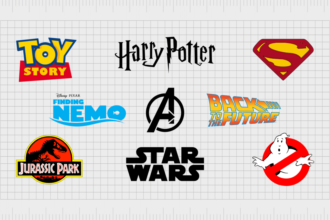
The best movie logos of all time have certainly made their mark on cinema history. Just as certain brand emblems, from the Nike swoosh, to the Coca-Cola script, are instantly recognizable, iconic film logos can be just as memorable and evocative.
The art-deco style appeal of the James Bond logo, the magical mystery of the Harry Potter emblem, and the powerful vibe of the Avengers symbol all connect with us in unique ways. That’s because just like most businesses, every production house knows logos are essential to successful branding.
The right logo, showcased on a title screen or movie poster can instantly spark excitement and intrigue, capturing the attention of a huge audience. Some movie logos are so impactful, they transcend beyond the screen, appearing on merch, shirts, and even in tattoos.
Today, we’re going to take a closer look at some of the most unforgettable movie logos of all time, and what makes them so compelling.
Introducing the most iconic movie logos
Whether you’re a movie buff or not, the chances are you’re familiar with at least a handful of popular movie logos. These days, it’s hard to find anyone who hasn’t seen the incredible Star Wars title card, or the eye-catching Batman symbol.
On the surface, motion picture logos might seem very different to the standard corporate logos created by major brands. However, the reality is both types of symbols serve a similar purpose. Companies use their logos to connect with customers emotionally, and showcase distinct values.
Similarly, film companies leverage logos to send a message to their target audience, about a motion picture’s theme, contents, and overarching genre.
At a glance, a strong movie logo can tell us everything we need to know about a film, using a carefully constructed combination of shapes, typography, and color psychology. Just think about how you feel when you see the Wizard of Oz logo, compared to the logo for “Alien”.
Popular movie logos are enduring, engaging, and emotionally charged. That’s why for years after a film’s release, we still remember these symbols just as well as the movies themselves.
The best movie logos of all time
Everyone has their own opinions when it comes to defining the best movie logos of all time. Different films resonate with us in unique ways, depending on our backgrounds and preferences. But it’s hard to deny that some logos have become truly iconic over the years.
Here are just some of the most famous movie logos ever created.

1. The Godfather
Considered by many to be one of the best movies of all time, The Godfather is a truly iconic motion picture. Everything from the characters to the cinematography has transformed the world of cinema forever. But part of what this makes 1972 crime film so amazing is its logo.
The legendary American graphic designer, Neil Fujita created the fonts used for the film, now known as the “Godfather” typeface. The image for the title card chosen by the film company is truly compelling.
Perhaps the most interesting component is the “puppet master” image, pulling the strings on the last letters of the “Godfather” inscription.
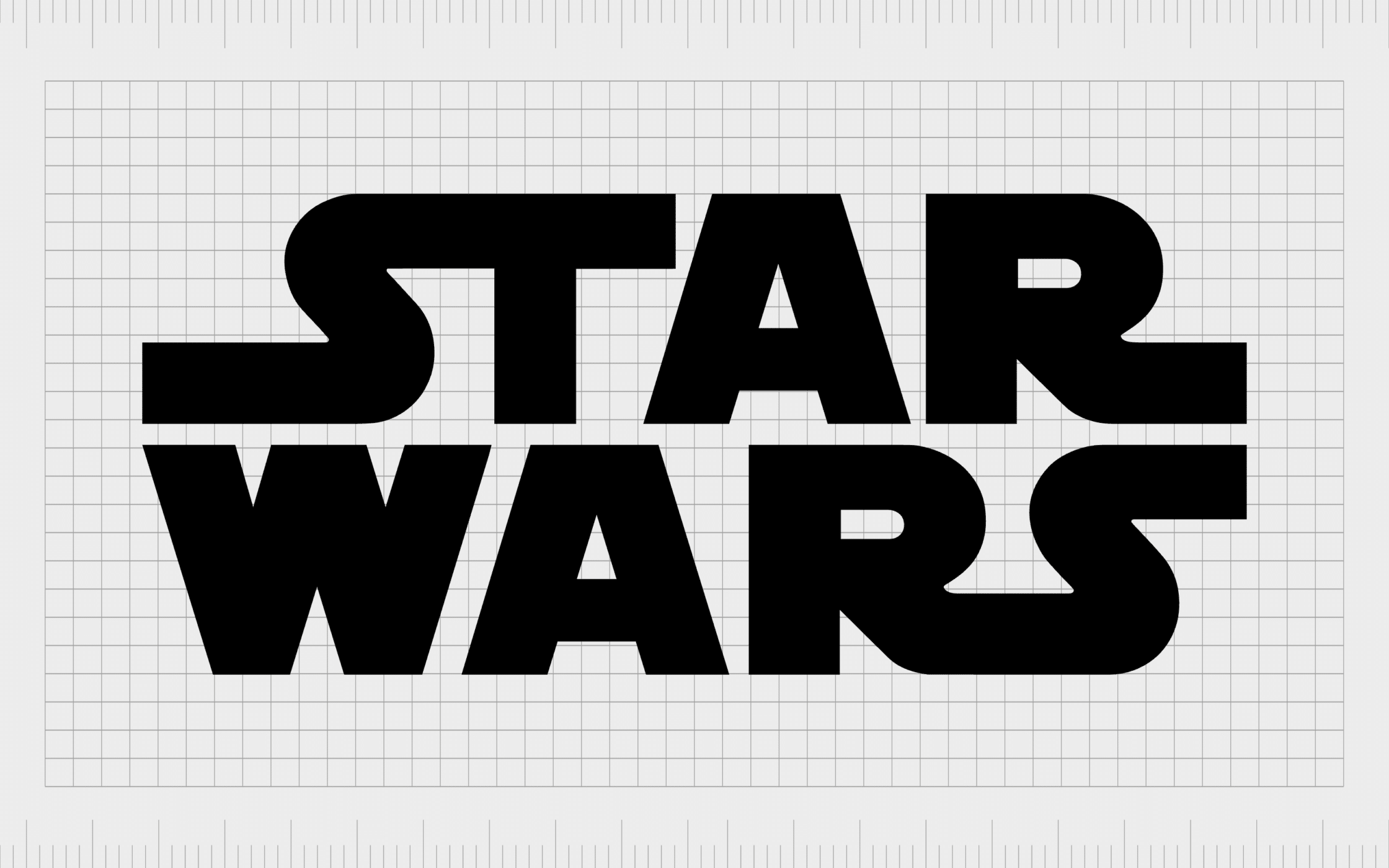
2. Star Wars
Another of the most iconic film franchises of all time, Star Wars was first created by George Lucas in 1977, and the initial movie led the way for a series which has transcended the decades.
Though Star Wars has used various designs in its title cards through the years, the iconic Star Wars font has remained consistent throughout the decades. The sans-serif typeface, with its elongated “S” shapes, and extended line on the “R” is instantly recognizable.
Though simple, this amazing wordmark acts as the perfect logo, capturing our attention with a sense of speed, innovation, and discovery.

3. James Bond
The introductory scenes in the James Bond franchise have always been wonderfully captivating. Not only does the franchise use amazing imagery at the beginning of its movies, but they also take advantage of audio branding, with custom-created songs for each film.
Although the colors and designs surrounding the James Bond logo in the title cards and movie posters have changed over the years, the memorable “007” emblem remains consistent. It features a slight slant to the characters, to symbolize speed, as well as a gun shape made from the “7”.

4. Jurassic Park
Easily one of the most famous movie logos of all time comes from the Jurassic Park franchise. Produced by Steven Spielberg, the movie won more than 20 awards and earned 3 Oscar nominations, before inspiring a series of follow-up films.
The current Jurassic Park logo was designed in 1993, and new elements have been added to the image with each new release. According to Chip Kidd, the creator of the logo, the image is based on his experiences visiting the Museum of Natural History.
The symbol is powerful, colorful, and even a little daunting in places, providing an insight into the action-packed nature of the film.
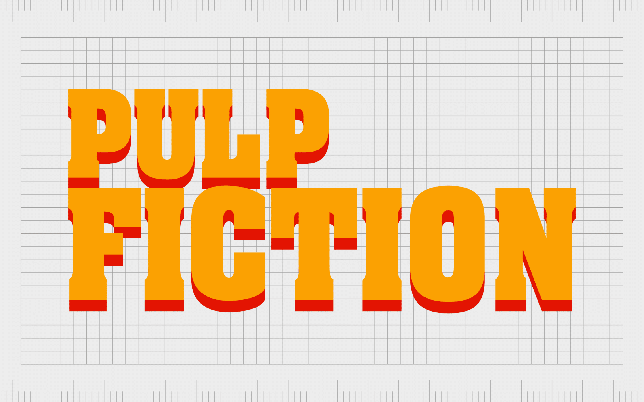
5. Pulp Fiction
Something of a cult classic among today’s movie fans, Pulp Fiction is considered a cinema masterpiece. Created by Quentin Tarantino, the movie features a star-studded cast, including Samuel L Jackson.
It also includes a series of compelling storylines, which led to it earning a number of awards over the years.
Despite being released in 1994, Pulp Fiction’s logo has a highly retro vibe to it, linked to the 60s and 70s. This is enhanced by the use of bright colors in the title cards, as well as a bulky font choice with bold drop shadows.
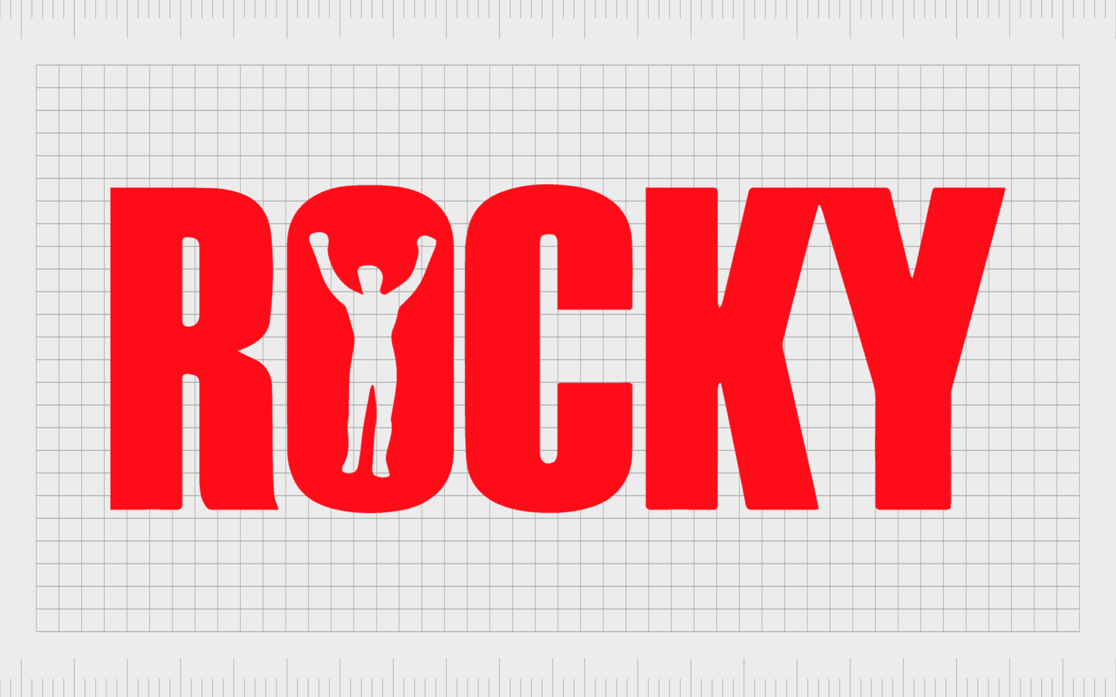
6. Rocky
The Rocky logo might seem simple at a glance, but it’s easily one of the most unforgettable motion picture logos in the world today. The Hollywood franchise began in 1976, with Sylvester Stallone writing and portraying the titular character.
Shown in both black and white, and red and white variations, the Rocky emblem consists of a powerful, blocky wordmark, showcasing the strength of the character. The man raising his arms in the middle of the “O”, symbolizes victory and accomplishment, as well as a crucial scene in the movie.

7. Indiana Jones
A major franchise in the entertainment industry, Indiana Jones is all about adventure, treasure, and discovery. The iconic logo of the successful movie franchise hasn’t changed much over the years, despite a number of new releases.
With an almost comic book style appeal, this powerful logo combines a bright color palette, with an interesting type of choice. The letters seem to get smaller towards the left, creating a sense of dynamism. The overall image feels fun and adventurous, just like the film itself.
The enduring brand identity of the Indiana Jones logo has helped to inspire numerous logo templates and designs over the years.

8. Harry Potter
Still one of the best movie logos of all time, even after years of evolution, the Harry Potter logo has become an iconic image in popular culture. Although the color and texture of the wordmark used in the Harry Potter films has changed throughout the franchise, the lettering remains consistent.
Drawn from the books that inspired the films, the custom logo features a stylized wordmark, with an almost mystical quality to it. Each letter is placed in a different position, to make the words seem like they’re almost levitating.
Perhaps the most iconic element of this logo is the lightning bolt shape on the letter “P”, which is a reference to Harry Potter’s unique scar.

9. Superman
Regarded by many to be the original American superhero, Superman first made his appearance on our screens in 1948. Since then, his iconic logo has remained largely the same, with a few simple changes made to the components in different film productions.
In his 75-year history, the Superman character has gone through a variety of changes. However, the Superman emblem, with its central “S”, has always remained crucial to the brand’s visual identity.
Today, the icon is one of the most recognizable in the world.
Find out more about the Superman logo here.
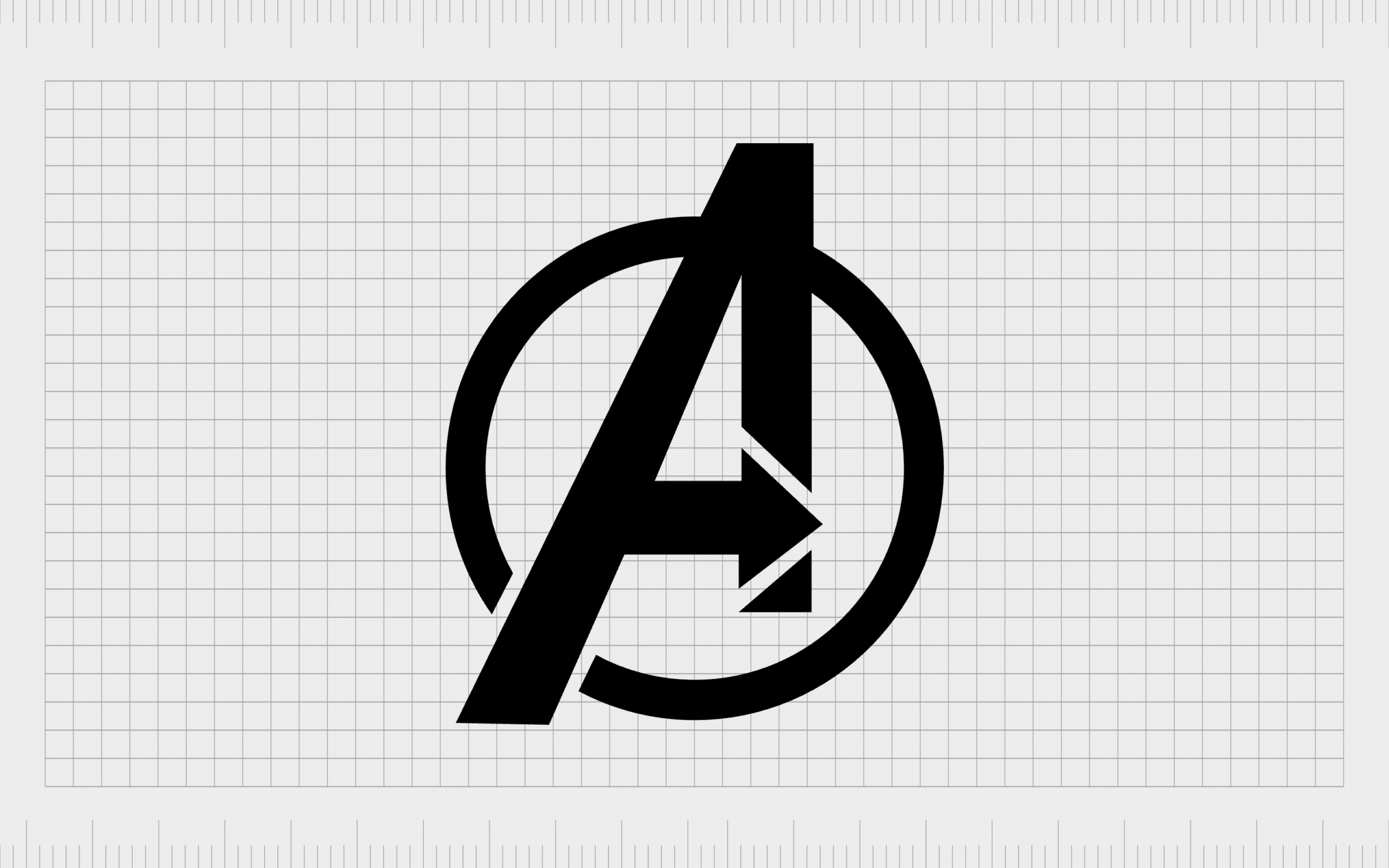
10. Avengers
Speaking of the superhero landscape, we can’t talk about the most iconic movie logos of all time without mentioning the Avengers emblem. One of the major reasons the Avengers has become such a successful franchise over the years is its memorable logo.
While each of the characters in the Avengers have their own visual identity, they’re all portrayed equally by the eye-catching “A” design, encased in a circle. The arrow in the “A”, pointing to the right is often associated with forward progression and innovation.
Find out more about the Avengers logo here.

11. Ghostbusters
First released in 1984, the Ghostbusters movie has become one of the most popular films of all time over the years. A cultural phenomenon, the original Ghostbusters movie paved the way for an incredible franchise, with various sequels, cartoons, and even games.
The “prohibition” road sign used in the logo is a crucial part of the group’s branding in the movie itself. The iconic ghost depicts exactly what viewers can expect from the movie – a combination of fun, frivolity, and excitement.

12. A Clockwork Orange
One of the most controversial dystopian films ever produced, “A Clockwork Orange” was written by Anthony Burgess and directed by Stanley Kubrick. The movie features one of the most memorable logo designs of all time, thanks to its unique font.
On the surface, the logo makes the movie seem fun and friendly, with bubbly letters in a bright shade of orange, featuring three-dimensional shadows. However, the imagery is actually a significant contrast to the movie itself, which features a number of grim scenes and messages.
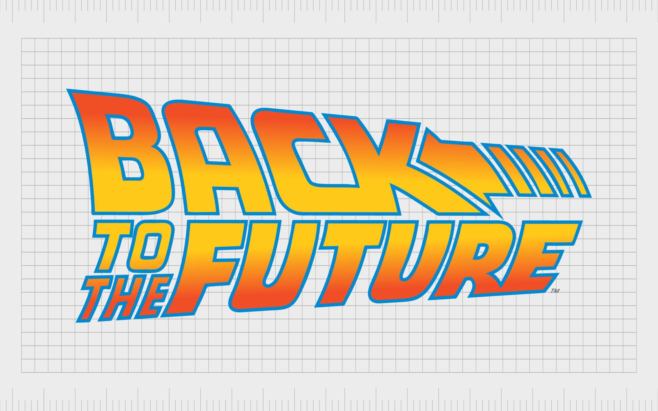
13. Back to the Future
If you’re a fan of classic science fiction films, you’re probably familiar with the powerful Back to the Future logo. Produced in 1985, this film was directed and written by Robert Zemeckis. It quickly became of the most famous movies of all time, and even inspired its own rides and games.
The logo features a wordmark, with an interesting arrow design, pointing back to the left. The color palette of red, orange, and yellow, combined with a blue outline gives the visual an energetic feel.
This is a great film logo, with a bubbly font that gives the brand mark a retro aesthetic.

14. Jaws
The Jaws logo might seem like one of the simplest motion picture logos on this list. However, it conveys a lot of meaning with just a simple brand mark. The bold letters, placed close to each other, create a daunting silhouette, referencing the overall feel of the movie.
The vivid shade of red, which alludes to bloodshed, tells us we’re not dealing with a particularly bright and child-friendly movie. Even the shape of the “J” looks like a hook, alluding to the fact that the film takes place in the nautical world.

15. Dirty Dancing
Released in 1987, Dirty Dancing is one of the most iconic romantic dramas ever produced. It changed the way people looked at “dancing” movies, and dance in general. Though the logo for the movie might seem relatively basic, it’s brimming with humanity and passion.
The letters seem to be made up of authentic brush strokes, giving a sense of creativity to the overall image. Even the coloring, sometimes depicted in purple, and other times in pink, sends an important message about the romantic action we can expect to see.

16. E.T.
Whether used as a standalone image, or accompanied by the silhouette of a child on his bicycle, the E.T logo forms a huge part of the film’s lasting cultural impact. The contrast between the scratchy lettering on the “E.T.” inscription and the serif font underneath is powerful.
The design seems to symbolize two worlds colliding, alluding to the experience we get in the film itself. Although the black and white color palette is often used for the E.T. logo, there are also variations of blue and white, which remind us of the night sky, and space.

17. Scott Pilgrim Vs. The World
Definitely one of the most eye-catching film logos on this list, Scott Pilgrim Vs the World tells us everything we need to know about the movie in a matter of seconds. The wordmark, which appears to vibrate off the screen, reminds us of sound and motion.
The lettering, with its bold, somewhat textured lines, give the film an unforgettable and modern appeal, reaching a younger audience of viewers. This powerful logo provides a phenomenal insight into the music-driven nature of the film.

18. Fight Club
When it comes to film logos, it’s hard to find anyone who isn’t familiar with the Fight Club emblem. This psychological thriller, released in 1999, has become a cult icon over the years, and was inspired by a 1996 novel by Chuck Palahniuk.
The official logo of the Fight Club film is somewhat simplistic, featuring a bold wordmark set across two lines. However, the connectivity between the letters tells us there’s something going on behind the scenes.
The image is confident, strong, and brimming with intrigue.
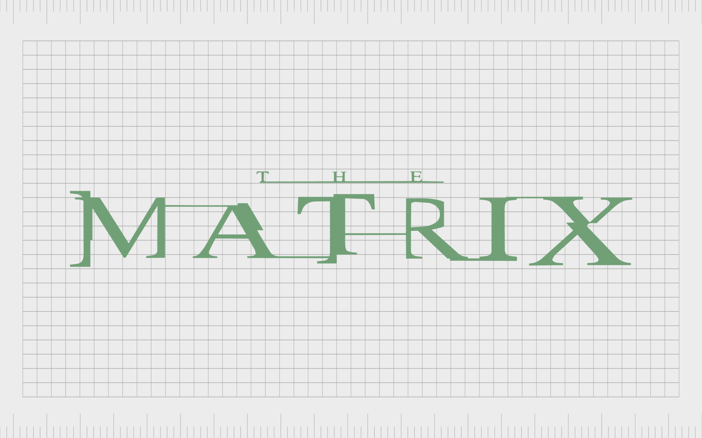
19. The Matrix
Easily one of the best movie logos ever created the title card for the Matrix film is extremely evocative. This movie, first released in 1999, introduced a new genre to the science fiction landscape, and launched the beginning of a truly thrilling franchise.
The wordmark used on the Matrix films looks like a distorted version of a standard serif-style wordmark. The letters appear to glitch and disappear in places, providing a reference to the science-fiction nature of the franchise.

20. The Lord of the Rings
When it comes to great movie production logos, it’s impossible to ignore the impact of the Lord of the Rings franchise. The logo design for this unforgettable fantasy franchise hasn’t changed much over the years, although various unique elements have been added for each installment.
Designed to stand the test of time, this compelling logo features an almost historical feel, with its textured letters and bold, archaic font choice. The eye-catching logo makes us think of magic, mystery, and adventure, perfect for a fantasy film.

21. Toy Story
One of the most successful film franchises ever created by Pixar and Walt Disney Studios, the Toy Story film series is a masterpiece of animation. The film was released initially in 1995, and has inspired various follow-up sequels since.
Since its first appearance on screens, the animated logo of the Toy Story film has captured the hearts and minds of millions. The attractive color palette, featuring primary colors, combined with the fun and bouncy lettering instantly appeals to a younger audience.
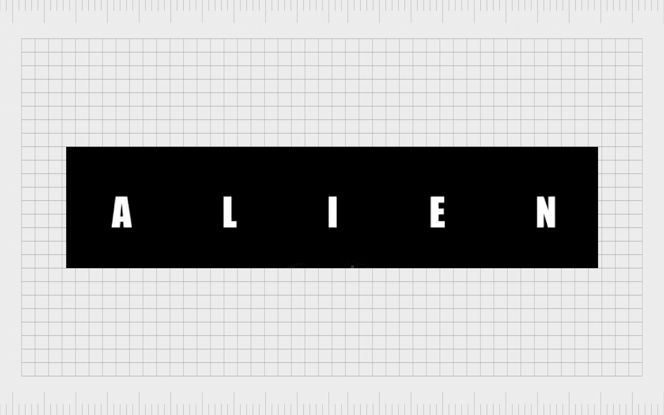
22. Alien
The science fiction horror film, Alien, directed by Ridley Scott and written by Dan O’Brien, first hit our screens in 1979. It was a masterpiece in the science fiction landscape, combining terror with intrigue and adventure.
In 2002, Alien was even deemed culturally significant by the Library of Congress, and has since been preserved in the National Film registry.
Though it might seem simple, the Alien logo has a daunting element to it. The significant amount of negative space between the lettering makes the wordmark look mysterious, and even a little frightening.
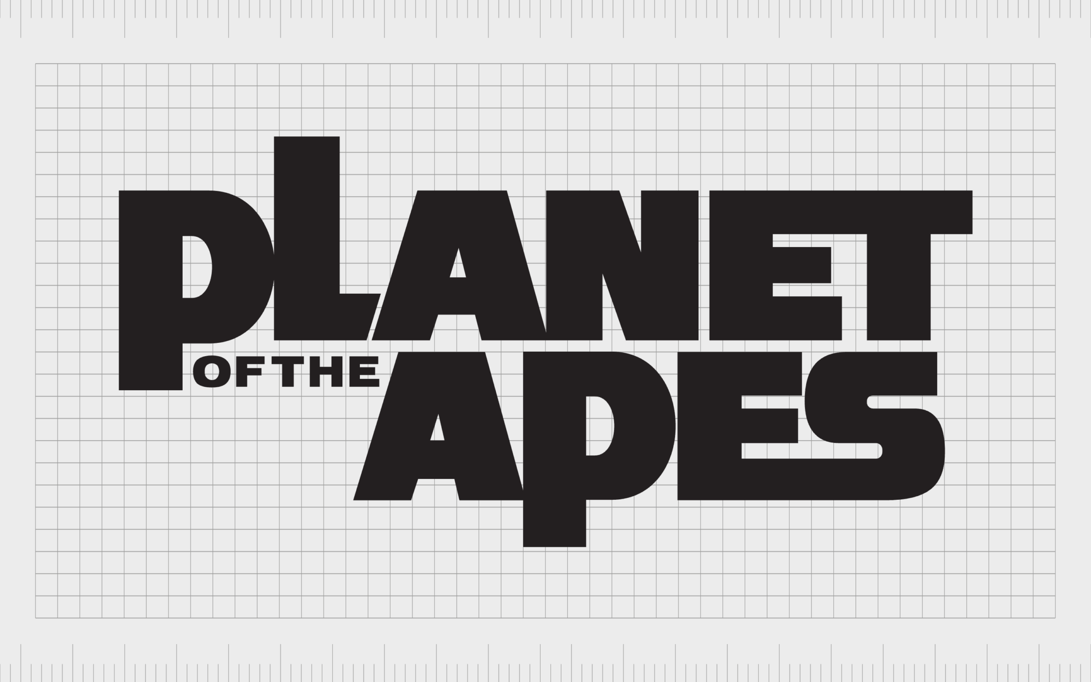
23. Planet of the Apes
Another of the most famous movie logos from the science fiction space, Planet of the Apes first appeared in 1968, based on a novel by Pierre Boulle in 1963. The 20th Century Fox company brought the film to life for viewers, choosing a unique logo design.
The title card features a wordmark set across two lines. Interestingly the words “of the” are placed alongside the “P”, causing the letter “L” to be pushed upwards slightly.
Many of the letters in this logo also seem to blend together, creating a unique visual effect.

24. Godzilla
The Godzilla franchise first appeared in the cinematic world in 1954, and has spawned various adaptations since. It’s based on a Japanese monster, or kaiju, and is recognized by the Guinness World Records as the longest running film franchise.
Though simple, the Godzilla logo is powerful, featuring block capital letters, with slight texture to some of the lines. The red coloring highlights the danger of the character, reminding us of bloodshed. The size of the letters are also a reference to the towering nature of the monster.

25. Forrest Gump
Considered by many to be one of the all-time great movies, Forrest Gump is a unique comedy drama film. Distributed by Paramount Pictures, Forrest Gump became one of the highest grossing films of all time after its release in 1994.
At a glance, there doesn’t appear to be anything particularly unique about the Forrest Gump logo. It features a simple serif font, with a purple and white color palette. However, the logo conveys ideas of authenticity and authority, making the story seem more meaningful and real.

26. Finding Nemo
Produced by Pixar and Walt Disney Pictures, Finding Nemo is considered one of the most successful Disney films ever. The 2003 animated film became the highest-grossing animated film of all time on its release, and received a number of academy awards.
The motion picture logo used for the Finding Nemo movie is truly eye catching, with a wavy underline beneath “Nemo” to represent the sea. Even the “O” has its own unique decoration in the form of a simple fish shape replacing the inner circle.
27. Barbie
The logo for the Barbie movie, which became a cultural phenomenon in 2023, is interesting. Like the official logo used by the Mattel toy brand, the logo is a wordmark, but it features a different design to the current “Barbie” brand mark.
The logo used for the movie is similar to the second logo introduced by the Mattel company, in 1975, featuring a three-dimensional logotype, with bold, feminine letters. The word “Barbie” is depicted in a soft shade of pink, with a vibrant pink shadow in the background.
The overall image is bright, playful, and imaginative, showcasing the core components that make up the Barbie brand’s personality.
Find out more about the Barbie logo here.
Learning from famous movie logos
The best movie logos show that a compelling emblem can elevate anything, whether a company, a non-profit organization, or a motion picture.
Throughout the years, various movie studios and production companies have worked hand-in-hand with leading graphic designers to create truly unforgettable emblems. Each of the famous logo examples mentioned above show just how powerful these designs can be.
With the right logos, movie studios can send an important message to their viewers about what they can expect to see. More importantly, they can ignite the emotions of their viewers, long before introducing the main characters and plot lines of a film story.
If you want to create your own compelling logo, reach out to the team at Fabrik Brands for help creating a professional logo that appeals to your target audience.
Fabrik: A branding agency for our times.

Clarity starts with a conversation.
Thanks—we’ll get back to you shortly.
Whether you're navigating a rebrand, merger, or simply need a clearer identity—we’re here to help. No hard sell, just honest advice from people who know the sector.
Let’s start with a simple question…
Prefer to email? Drop us a line.
Fabrik’s been helping organisations rethink and reshape their brands for over 25 years. We’ve guided companies through mergers, rebrands and new launches. Whatever stage you’re at, we’ll meet you there.