Dodge logo history; symbol meaning and evolution

Whether you’re an automotive enthusiast or not, chances are you’ve seen the Dodge logo on various roads and race tracks. This powerful symbol instantly conveys ideas of speed and professionalism. The question is, how has it changed throughout Dodge logo history?
Since the Dodge car brand first launched in 1910, the company has made a number of changes to its brand image, experimenting with different hood ornament and badge styles. Each version of the Dodge visual identity had its own purpose and unique meaning.
If we look back through the history of Dodge logos, we can see how the company has strategically altered its image with innovative designs, to differentiate itself in the vehicle market.
Today, we’re providing a behind-the-scenes insight into the evolution of the Dodge symbol, from the very first Dodge logo, to the emblem you may be familiar with today.
Introducing the Dodge car brand: What does Dodge mean?
Before we explore the history of the Dodge logo, it’s worth taking a moment to learn a little more about the Dodge brand and its origins. Dodge is an American automobile brand, and a division of the “Stellantis North America” company.
Initially, it was called the “Dodge Brothers Company”, a machine shop created by brothers Horace and John Dodge at the beginning of the 1900s. The Dodge brothers brand was best-known for supplying parts and assemblies to automakers like Ford.
However, they began building their own vehicles in 1914, just before the Chrysler Corporation was founded. The company, named after its founders, focused on the development of full-sized passenger cars and trucks through the 1970s, before branching into compact cars.
After the 1973 oil embargo caused the sale of larger cars to fall, Chrysler (the current owner of Dodge), and the Dodge brand began concentrating on smaller and mid-sized vehicles.
In 2011, Dodge and the sub-brands, the Dodge Viper, and Dodge Ram were separated, though the Dodge name is still associated with the trucks and sports cars produced by these companies today.
Dodge logo history: The old Dodge logos
Throughout Dodge logo history, there have been a number of different shapes, symbols, and color palettes associated with Dodge vehicles. Let’s take a closer look at some of the old Dodge logo designs that paved the way for the company’s visual identity today.

1910
The initial Dodge logo, created for the Dodge Brothers Company, was introduced in 1910. This original logo, featuring a monogram with the overlapping letters “D” and “B” in the center, stayed with the company for four years.
The stylish Dodge badge, with its gold coloring and circular border, made the company seem professional and sophisticated. Although the image featured industrial elements, it also seemed artistic and elegant, helping the company to stand out in the growing automotive market.
1914
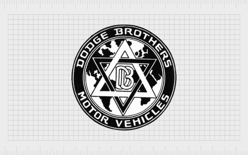
In 1914, a new logo design was introduced, featuring a six-pointed star (or Star of David). Presented in black and white, the design was placed on a circular background, featuring a map to symbolize global reach and growth. The black ring around the badge showed the name of the company.
The words “Dodge Brothers Motor Vehicles” appeared in a white serif font, with uppercase characters. Notably, at the center of the star in this logo, we also see an updated version of the Dodge Brother’s Monogram, where the letters “D” and “B” are connected.
This car logo was quite complex compared to the other designs used by Dodge over the years, but it remained with the company for 14 years.

1928
1928 marked the introduction of a new Dodge logo, much simpler than the last. All of the decorative elements of the previous Dodge badge were removed, leaving behind a straightforward wordmark, in a bold typeface, with thick, blocky serifs.
The lines were broad and stable, demonstrating the reliability of the company, while the rounded edges gave the brand a more approachable vibe. Like many Dodge logos, this design was depicted in black and white, giving it exceptional versatility.

1955
Nearly 3 decades later, the Dodge symbol was changed again. This time, the inscription was removed, leaving behind just a graphic symbol. This was the first time the company removed all typefaces from its logo, symbolizing a move into a modern era.
The new Dodge emblem consisted of two boomerang shapes, one in a bright red color, and the other in black. The red boomerang, or triangle, was broader, while the black partner design was sharper.
Many designers believe these symbols were meant to represent birds or arrows, demonstrating ideas of forward progression, speed, and innovation.
1962
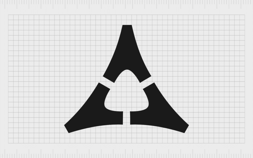
In the 60s, Dodge continued to keep its company name out of its logo, focusing on unique shapes to highlight its modern identity. A new emblem was introduced, reverting back to the previous white and black color palette. The image consisted of three angled triangles.
The triangles came together to form a larger triangular shape, with another shape with rounded edges created in the white space in the center. The new Dodge symbol looked a little like the Greek letter Delta, giving the company a sense of history and heritage.
Additionally, the triangular shapes were a meaningful choice. In shape psychology, triangles are often associated with direction, movement, and stability.

1964
Only two years after introducing the triangle logo, Dodge created a new wordmark for its brand, in a shade of scarlet red. The design featured a stylized sans-serif typeface, with each slanted letter including open contours, for a sense of progression and modernity.

1980
In the 80s, Dodge built on its previous logo, adding the wordmark to the center of a rectangular white banner, in the middle of a large rectangle shape. In the top section of the new Dodge logo, we see a pentagon in white, made up of five white triangles.
The center of the white pentagram shape is a red five-pointed star, drawing attention back to the previous Dodge logos, with their own star elements. The shape also appeared in variations of the Chrysler logo throughout the parent company’s history.

1994
The 90s marked the arrival of the iconic “Ram’s head logo”. The minimalist head of a ram, symbolizing speed, and strength, appeared in red on a white background, in the center of a simple shield emblem. Underneath the shield is the “Dodge” company name.
The inscription on this logo uses a similar font to the previous design, but the letters are straighter and more refined. They characters are also presented in black instead of red. The Ram logo still appears on Dodge Ram Trucks (now operating as a separate brand) today.
Dodge logo meaning: Understanding the new Dodge logo

The first version of the current Dodge logo most consumers are familiar with today was introduced in 2010. Initially, it featured a three-dimensional wordmark in shades of silver and grey, which appeared as though they were shining, thanks to the use of gradients and highlights.

The company then created a simpler version of the logo, choosing a flat black wordmark, and a slightly darker shade of red for the two accompanying lines on the right-hand side. The two diagonal red stripes look a little like a road, symbolizing movement, and transport.
This logo, still used by Dodge today, may seem simple, but it’s steeped in meaning. The red lines symbolize passion and vitality, as well as speed and motion. The bold Dodge inscription, with elongated sans-serif letters, demonstrates stability and strength.
The various components of the Dodge logo position the company as a reliable, authoritative brand in the automotive industry, combining sophistication and modernity.
The Dodge symbol: Colors and fonts
Minimalist and memorable, the Dodge symbol has come a long way since the first logo was introduced by the brand more than a century ago. As sub-brands in the Dodge landscape have moved in different directions over the years, the company has found its own unique identity.
Though the official Dodge logo might not be as impactful as the Ram logo of the truck company, or the snake emblem of the Viper brand, it’s still extremely memorable. It conveys the forward motion of the brand, and its commitment to innovation.
You can see some examples of the Dodge symbol here:
What is the Dodge logo font?
Since the “Dodge” wordmark makes up the majority of the Dodge logo today, the font chosen for the inscription is crucial to its overall impact. The stylized uppercase logotype of the Dodge badge is set in a bold, modern typeface, with stretched sans-serif letters.
The Dodge font looks stable and balanced, giving the company an image of reliability and strength. The typeface is similar in style to Ordin Rounded, with slightly modified contours.
What is the Dodge color palette?
While the shades used in the Dodge logo have changed a few times over the years, red, white, and black have always been common choices for the company. The official Dodge colors today include a bright, vibrant shade of red, with accompanying black and white components.
In some cases, the Dodge logo also appears in silver, particularly when its used for badges on Dodge trucks, and Dodge cars.
The impactful Dodge emblem
Dodge logo history offers an interesting insight into the design-focused journey the Dodge brand has taken in the automotive industry over the years. The Dodge logo has grown increasingly more modern and minimalistic over the years, adapting to the current trends of logo design.
Although the current logo used by Dodge might not be as decorative as the symbols used for the Viper and Ram sub-brands, it still makes an incredible impact.
This sleek logo, with its extended inscription and vibrant red lines symbolizes strength and stability, passion, and forward progression. The Dodge brand mark definitely leaves a lasting impression on any consumer who sees it.
Fabrik: A branding agency for our times.
Clarity starts with a conversation.
Thanks—we’ll get back to you shortly.
Whether you're navigating a rebrand, merger, or simply need a clearer identity—we’re here to help. No hard sell, just honest advice from people who know the sector.
Let’s start with a simple question…
Prefer to email? Drop us a line.
Fabrik’s been helping organisations rethink and reshape their brands for over 25 years. We’ve guided companies through mergers, rebrands and new launches. Whatever stage you’re at, we’ll meet you there.


