


Alignment in graphic design: The alignment principle of design

Alignment in graphic design is one of the fundamental principles of design, responsible for guiding a successful composition. Principles of design alignment encourage creative experts and designers to examine how the various elements of a page interact and relate to eachother.
Without alignment in design, a composition will often look chaotic, out of place, or simply unprofessional. Alternatively, if you can achieve true visual alignment with your design choices, you can create an aesthetic hierarchy which manipulates your viewer’s experience of a piece.
While alignment is only one of the principles designers adhere to when creating their compositions, it’s one of the most important concepts to master. You’ll need a knowledge of alignment in design if you’re going to create logos, marketing materials, websites, or virtually any other visual asset.
Today, we’re going to take a deep dive into the alignment principle of design, exploring what it means, how it works, and why it’s so valuable.
What is alignment in graphic design?
Simply put, alignment is the tool used by graphic designers to achieve synergy and flow in a composition. It ensures the elements in a piece are orderly, structured in a visually pleasing format, and designed to illicit a specific response.
The concept of alignment requires designers to consider the various aspects of a page or composition as part of a whole. This ensures nothing seems “out of place” in the wider aesthetic. Good alignment in graphic design makes an image look more professional, and appeals to the human eye.
To achieve the right alignment architecture in a composition or branding asset, designers need to think about the proximity, size, and positioning of each design element.
Look at a word document for instance. When every paragraph of text on your screen is aligned to the right, left, or center, it follows a specific flow which feels comfortable for the eye, and easy to follow.
Designers can also use alignment in design to draw attention to specific assets and elements. For instance, if everything on your page is aligned to the right, and you place a CTA button or box to the left, this will immediately draw attention to the button.
Definition of alignment in graphic design
The simplest way to define alignment in graphic design, is the ability to create synergy and consistency on a page. When the elements in a design are aligned, most people wouldn’t notice the alignment at all.
This is because we’re used to designers following a specific set of “grid lines” or invisible guidelines in where they place assets and elements.
Alignment is so commonplace in today’s design world; it’s often built into the tools creators use. Website design apps and theme builders have components embedded into the software which require creators to stick to a specific balance of aligned elements.
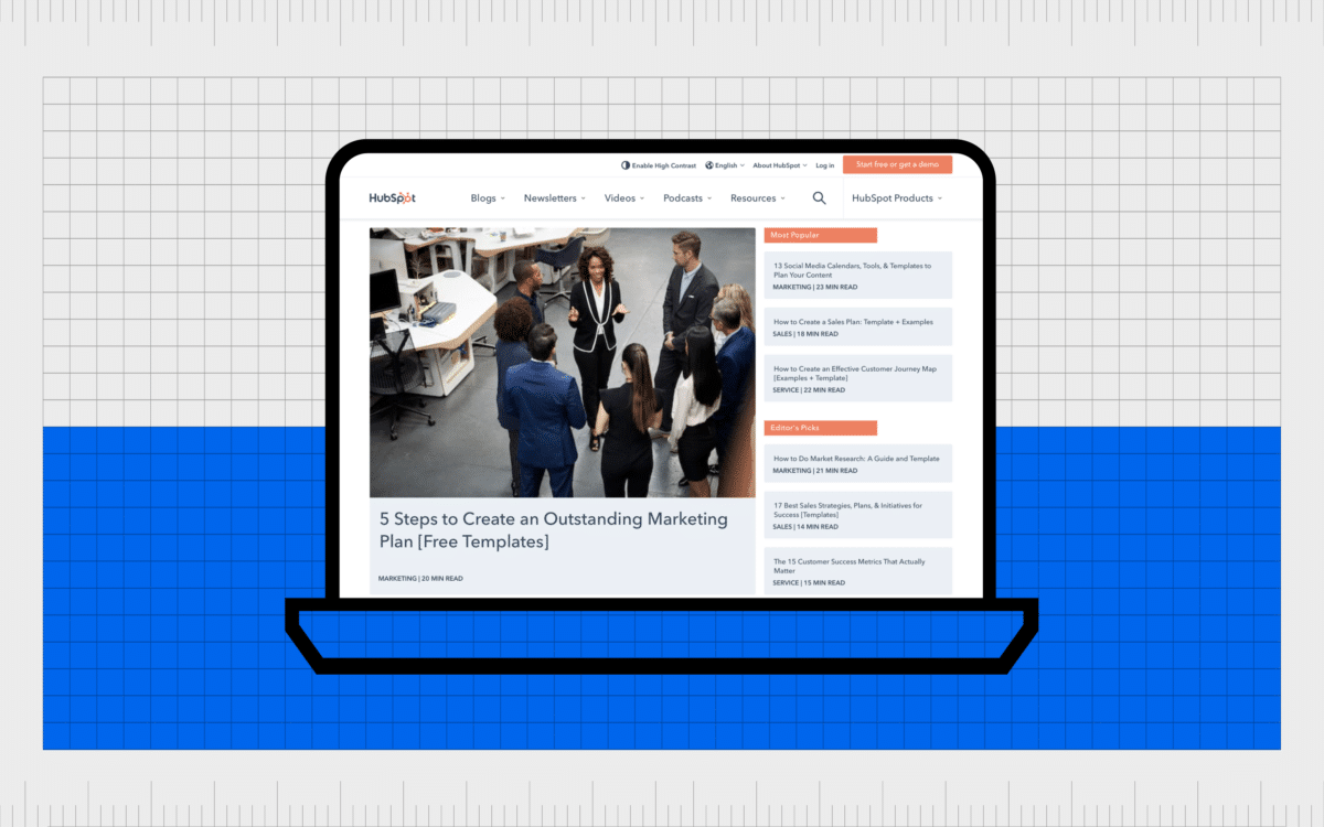
You can see an example of this alignment in blog post thumbnails and images on a page:
Although you won’t always notice the alignment architecture of a design when it’s used correctly, lack of alignment is immediately eye-catching.
Just think of how you would feel if you saw someone parking the wrong way between a set of parking lot lines, or what it looks like when a piece of text seems to appear in the wrong part of a website.
Good alignment in graphic design ensures harmony, so we’re not too distracted by inconsistencies on a page to focus on what matters.
Why is alignment important in graphic design?
Alignment gives designs structure, harmony, and consistency.
While not every visual asset will benefit from following the principles of design alignment precisely, most of the compositions we see in the branding world rely on basic alignment.
Even logos use alignment. Look at how the “Adidas” logo centers the emblem above the text.
Alignment helps designers to organize the components in a composition, providing a robust structure which feels pleasing to the eye, and natural to look at. Effective alignment in a design looks professional, crisp, and clear.
What’s more, it appeals to our human desire for structure. As human beings, we appreciate things looking organized.
Alignment in design:
Contributes to aesthetic impact
As mentioned above, visual alignment makes sense to us on an aesthetic level. Visually aligned designs feel professional, harmonious, and balanced. When everything fits together, it’s just satisfying.
Improves user experience
Alignment in design can help to guide the human eye through a page or a series of visual assets. On a website page, the alignment of different assets helps you to move through each section of content in a structured way.
Alignment creates a sense of unity
Good alignment also helps to demonstrate how pieces of a composition are connected. Aligning different assets correctly and positioning them the right distance from eachother shows they have a contextual link.
What is the principle of alignment?
The principle of alignment in design is one of the various essential principles of design used for virtually any aesthetic project. In design, the alignment principle states multiple objects should be placed to allow certain elements of the assets to “line up” in a common position.
The most obvious example of this is in document processing tools, which allow users to position their text to one side of a page, or in the center.
However, it’s not just the fonts used for a composition which benefit from alignment.
If you imagine a table with rows and columns, a designer will use this table to ensure every aspect of a page, from buttons and images to font and bullet points, follow a specific structure.
How is alignment used in graphic design?
Like most principles of design, alignment is a flexible concept commonly explored by designers. Countless graphic design experts have experimented with different styles and “types” of alignment in the past to create specific results.
By following or not following the rules of alignment, graphic designers can create a sense of organization, chaos, movement, or drama in a piece. Some designers and artists even deliberately ignore the concept of alignment to get the right results.
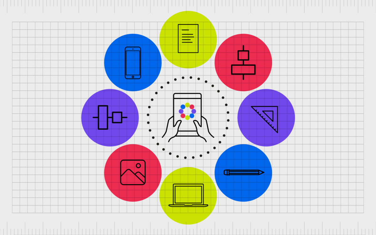
Here are some of the most common elements considered when using alignment in graphic design:
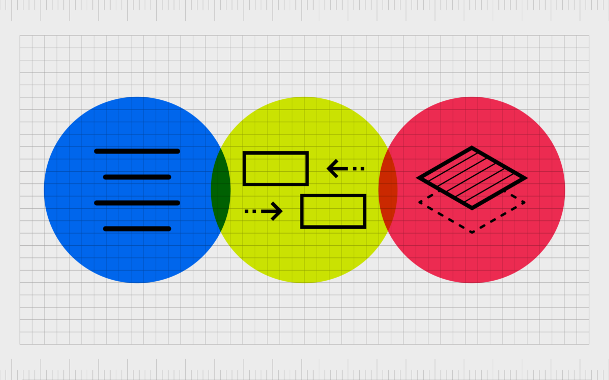
Text
The most commonly recognized example of alignment in design involves the placement of text. Virtually every website, leaflet, book, and other composition containing a font or typeface will use a specific alignment to position words on a page.
In some cases, different sections of text will follow a different alignment. For example, in an article, the headers and sub-headers on a page could be centered, while the rest of the text is aligned to the left.
This is usually a method used by designers to separate the headers from the rest of the content and make it easier to scan through the page.
The natural choice of how to align text also differs depending on where you are in the world. For some regions, it’s more common to see paragraphs aligned to the right. This is something designers need to be aware of when creating designs for global audiences.
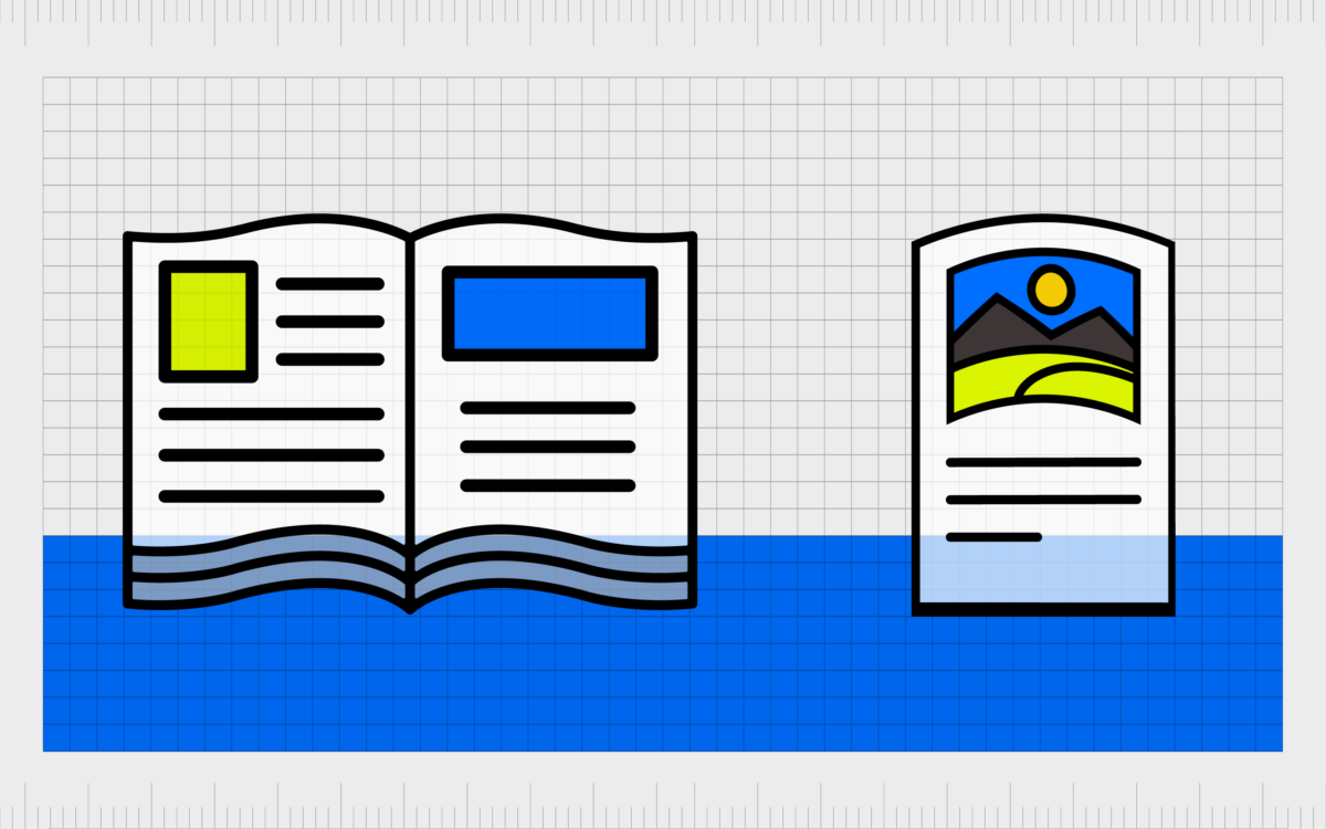
Images
Placing images can often be more difficult than placing text, because images aren’t always designed in the same resolution as accompanying graphics and elements. For images in a composition to be aligned, they need to feel as though they’re managed by a specific set of grid lines.
Sometimes this will mean aligning images by ensuring the top of the image and the bottom image rest on two invisible lines, even if the length of the visual differs from one asset to the next.
In other instances, designers will simply align images following the same structure as they would for text, placing one invisible line to the right or left, as the starting point for the graphic.
When aligning images in a composition, designers often need to be particularly aware of white space. It’s not enough to simply connect the images, as this will make the design look cluttered and complex.
Background images and shapes
Sometimes, even the background images and shapes in a composition need to be considered with alignment in mind.
For instance, look at the background in this web page:
The separate blocks of colors are aligned in a way which helps to create visual balance on a page and ensure everything has the same amount of space around it. The alignment of the background blocks of colors or shapes supports the remaining principles of design in the composition.
If there are designs or patterns in a background image, sometimes designers will need to ensure these patterns align with the shapes and lines in foreground elements too.
What are the types of alignment in graphic design?
There are various forms of graphic design alignment used by creative professionals to illicit a certain response. While all principles of design alignment are intended to bring a sense of sequence to your work and the elements within it, creatives can use different “gridlines” and rules for guidance.
Some of the most common forms of alignment in graphic design include:
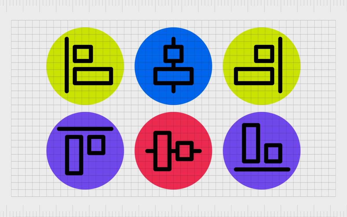
Edge alignment
Edge alignment refers to the careful positioning of content on the edge of a canvas or page. In edge alignment, it’s possible to place content and assets on the right, top, left, or bottom of the composition, and maintain the alignment, provided everything coincides with the edge of the piece.
Notably, if all of the assets in a piece are aligned from the right to left edge of the piece, this then becomes an example of “horizontal” alignment. Alternatively, if elements are arranged from the bottom or top of the page edge, this is called “vertical alignment”.
In edge alignment, the assets of the composition don’t have to touch the edge of the page to be aligned, but they should all be an equal distance from the edge guidelines.
Center alignment
One of the most common kinds of design alignment, center alignment places all of the content assets on a central imaginary line. One easy example of this is with center aligned text.
There’s no specific starting point or ending point for a sentence in center aligned text, but everything is equally balanced around a focused center point.
The same rule can often also apply in logo design and page design for the digital world. Central alignment can help to create a clean and consistent experience in a composition, particularly when there is plenty of white space around the aligned elements.
Horizontal alignment and vertical alignment
Horizontal alignment essentially means everything you see in a composition is placed on the same horizontal line. It’s common to see this form of alignment in various kinds of digital assets, including carousels on websites and product pages.
Some website designs place horizontal boxes in a page to make different elements look more balanced, like Amazon does here:
Alternatively, if the invisible gridlines in a page or composition seem to align everything from top to bottom, this is a form of vertical alignment. For instance, if you visit one of the product results pages on Amazon, you’ll see all the images and text are on different vertical lines.
Justified alignment
Justified alignment is one of the forms of alignment which can be a little a harder to understand. The purpose of justified alignment is to place the right and left sides of both text and images against hard, straight margins.
This is usually achieved with type by splitting up words when necessary, using dashes to connect one line to the next.
While the resulting alignment can appear very well organized, it can also make it harder to follow some pieces of text, because words can often be chopped up and less legible. Usually, this methodology is used only, when necessary, because the margins of a design are very specific.
For instance, you may see a lot of justified alignment in newspapers and magazines, where printing presses require designers to stick to specific guidelines with how they place images and text.
Flush left alignment
Probably the most common form of alignment seen in today’s landscape, flush left alignment is a form of horizontal alignment, which places all of the assets on the left-hand side of the page.
There’s often a tight left-hand margin or line guiding the positioning of text and images, while the right of the page allows for more design freedom.
Flush left alignment is most common in written content, particularly in the Western world, where we’re used to seeing things aligned to the left-hand side of a page in magazines, books, and websites.
The soft edge on the right with left alignment also allows for sentences to be as long or short as necessary, which helps with legibility.
Flush right alignment
Flush right alignment is simply the alternative to flush left alignment. It’s less common in Europe and America, but many countries do prefer to read from right to left, which makes flush right alignment more likely in these regions.
For instance, Arabic, and Hebrew scripts are written from right to left.
Flush right alignment is also sometimes used to make a website design stand out as different or unique, as it can help to draw the attention of a target audience by breaking the mold. Some designers even use flush right alignment for logo design.
For readers used to reading from left to right, it’s usually a good idea to avoid large chunks of text in flush right alignment, as the placement of words in a different format can be visually challenging.
Examples of alignment in graphic design
It’s possible to find examples of alignment in graphic design virtually everywhere in today’s world. Alignment appears in ads on your television screens, billboards, and is also a common presence in website design and logo creation.
Here are some quick examples to inspire you…
Website alignment
Most websites use a combination of vertical and horizontal alignment in their design elements with blocks and modules, as well as flush left alignment or central alignment for text.
For example, HubSpot’s blog page uses horizontal and vertical gridlines to make sure all of the different blog options you can choose from are in a kind of consistent order.
The great thing about aligning components on a website today is it’s often much easier than it seems. Because alignment is a critical part of good UX (user experience) most website design tools will automatically help to align the parts of your site pages for you.
Text alignment
Text alignment is everywhere, both online and offline. You’ll see text aligned (often from a flush left perspective) in magazines, books, leaflets, and newspapers.
As mentioned above, some companies will position different parts of text according to different alignment rules, such as when subtitles and titles are centered.
However, most use a single alignment to allow for easy reading.
The legibility of text enhanced by alignment can also be further improved with the correct use of kerning and leading in the paragraphs of a composition.
Logo alignment
Logo alignment is most common in situations where there are multiple graphic elements to a logo. A combination mark, for example, which features both a visual emblem and a word mark would position the image in alignment with the text, using central, flush left, or flush right alignment.
When there are multiple parts of text in a logo, such as in the case of a slogan or tagline, this secondary piece of text also needs to follow the same alignment. Good alignment in your logo helps to create a more impactful overall image.
Understanding alignment in graphic design
Alignment in graphic design is one of the simplest, but most important principles of design. It’s the key element in any composition responsible for bringing order and visual consistency to a piece.
Whether you’re creating a blog post or article, designing a logo, or making your own banner ad for the PPC world, you’ll need a basic knowledge of alignment.
Alignment in design ensures the components of a piece follow a constant structure from top to bottom or left to right. As such, it gives the overall visual you’re creating a more professional, clean, and well-organized vibe.
This is something most companies will definitely want to achieve when making the perfect logo, web page, or ad.
While there are countless tools available today to assist people in achieving the right graphic design alignment, few people can understand the principles of design alignment quite like professional designers.
If you’re not sure what kind of alignment your new project needs, the best thing you can do is speak to a graphic artist about your options.
Fabrik: A branding agency for our times.
Now read these:
—Introducing the principles of graphic design
—Understanding balance in graphic design
—What is the hierarchy principle of design?
—Exploring the unity principle of graphic design
—Getting to grips with contrast in graphic design
—Understanding the emphasis principle of design
—Discover the repetition principle of graphic design
—What is the pattern principle of graphic design?
—Exploring the rhythm principle of graphic design
—Get ahead with the movement principle of design
—Why variety is an important factor in design
—How to bring harmony to graphic design projects
—The principle of white space in graphic design
—How to use the proportion principle in design

Clarity starts with a conversation.
Thanks—we’ll get back to you shortly.
Whether you're navigating a rebrand, merger, or simply need a clearer identity—we’re here to help. No hard sell, just honest advice from people who know the sector.
Let’s start with a simple question…
Prefer to email? Drop us a line.
Fabrik’s been helping organisations rethink and reshape their brands for over 25 years. We’ve guided companies through mergers, rebrands and new launches. Whatever stage you’re at, we’ll meet you there.