


Rhythm in graphic design: Exploring graphic design rhythm

What is rhythm in graphic design? One of the key principles of design, rhythm in design influences how our eye moves across a page and consumes content.
A sense of rhythm can improve the aesthetic appeal of a composition, draw emphasis to specific components, and send a consistent message.
Like creating a song, producing a piece of graphic art requires experts to consider how various elements might work together to deliver a specific impact. With rhythm, designers guide viewers through the hierarchy of a page or piece, creating consistency and inspiring emotional responses.
Rhythm can almost hypnotize the viewer, influencing our thinking, memory, and psychological state. What’s more, when rhythm is broken, it can transform the emphasis of a composition, demonstrating which parts of a piece deserve the most focus.
It also guides us across a page by pointing to text and images, while simultaneously giving depth and personality to a brand.
Let’s explore graphic design rhythm.

What is rhythm in graphic design?
Often used in conjunction with repetition and pattern, principles of design rhythm transform the impact of a composition. In the artistic world, rhythm refers to the way certain elements appear in a design, often with a certain level of consistency.
Rhythm requires a level of repetition because elements need to appear more than once to show the almost musical connection between each component. We can create rhythm with the use of colors and tones, lines and shapes, and even the placement of white space.
Some of the most common elements of design rhythm include:
Random rhythm
Rhythm doesn’t always have to have an obvious and consistent melody. With random rhythm, you use repeating elements with no specific interval or regularity. You may have a series of triangles on a page, each with a different size and level of white space between them.
Though the image may seem chaotic at first, there’s still a rhythm in play.
Notably, rhythm can be extremely complex. At first, a rhythm may seem random when you’re only examining a small section of the composition. Regardless, if you step back and evaluate the whole concept holistically, you may begin to see regularity.
Regular rhythm
Regular rhythm is a little closer to standard repetition. It’s something we can actively predict, like the spacing between lines of text on a blog post.
This type of rhythm is one of the most common kinds of rhythm in design, used to create consistency and balance in various compositions. Aside from giving the viewer a sense of peacefulness and comfort, regular rhythm also improves usability.
When the human eye recognizes a rhythm, we develop an understanding of how components work together and use the understanding to guide our user choices. Regular rhythm can also become monotonous after a while.
Alternating rhythm
Just like music can switch between different rhythms for a chorus and verse, designs can also have an alternating rhythm. In an alternating design, you move between different patterns in a regular format. Think of the white and black squares on a chessboard.
Alternating rhythm is really a form of regular rhythm with greater complexity. It can be as straightforward or as advanced as you choose, provided you’re moving between the same consistent images, back and forth.
Alternating rhythm is useful in graphic design because it breaks the monotony of a regular rhythm and creates more visual interest. Do note that the more complex the rhythm, the more likely it is to confuse and overwhelm the eye.
Flowing rhythm
Flowing rhythm is a unique kind of rhythm that builds on concepts of alignment and unity. Common in the natural world, flowing rhythm shows repeated elements following specific bends, undulations, and curves. In nature, we see this in sand dunes and waves on beaches.
Designers can mimic the influence of nature by making amazing patterns of elements using flowing rhythm.
We can show flowers moving around a logo in a curve or patterns outlining a specific part of a website. Flowing rhythm can be a great way to draw specific emphasis to a certain part of a composition. It can also improve design hierarchy by drawing the eye in a direction.
Progressive rhythm
Progressive rhythm involves gradually increasing the intensity or weight of a repeated element. You simply change the component you’re repeating gradually as you go, perhaps making a line larger as you progress down a screen or making colors deeper with a gradient.
With progressive rhythm, you can change perspective, making certain parts of a composition look closer to your audience, and others look further away. It can generate excitement and intrigue, like the sound of a guitar or a drum getting louder as we approach the crescendo of a musical piece.
This type of rhythm can also tell an important story, gradually drawing the human eye to one part of a page, and then the next, focusing on different elements as you go.
Exploring the definition of rhythm in graphic design
Rhythm is a design principle in its own right, but it also emerges from the concept of repetition.
Without repetition (the use and reuse of identical or similar elements), you couldn’t have a clear rhythm. Repetition helps to tie the components of a piece of work together, telling the eye how various elements align to create a specific whole.
Rhythm is created by considering the relationship and intervals between the elements we repeat. It’s easy to understand this concept from a musical perspective. If you’re playing a set of drums with a 4/4 timing, you’d repeat the 1-2-3-4 count four times to create the rhythm.
Similarly, in graphic design, you may repeat a series of 4 different shapes four times to create your rhythm. You can adjust the size of the shapes, or experiment with colors and other components, but as long as there’s a sense of repetition, you’ll still have a rhythm.
The exact rhythm you create, and how it influences your audience, depends on what kind of repetition or pattern you build.
Rhythm in design definition
Rhythm is a relatively simple concept in graphic design. Unfortunately, it’s also easy to confuse the principles of design rhythm with repetition, or movement.
Repetition involves the use of an identical element multiple times in a composition. Rhythm, on the other hand, looks at the space between the elements, and how they’re aligned to create a unique impact on the audience.
Repeating design elements and the space between those elements draw the viewer’s eye from one section of a composition to another in a cadence. Rhythm also creates a sense of movement and order, or it can create a distinct emotional response.
Movement is another principle of design commonly connected to rhythm.
Like rhythm, movement gives a sense of life to a composition, but the purpose is to suggest motion within an image. If you scroll down a page on a website and the pictures you see of a hand change gradually to make it seem like the fingers are moving, this is movement.
Other ways to create movement include using blurs and gradients to suggest speed. A picture of a horse, even if its legs are caught in motion, will still be a static image. However, if the legs are slightly blurred, this evokes a greater sense of motion.
The nature of rhythm and its focus on repeating patterns can suggest movement. This is particularly true in progressive rhythm, where designers can make it seem as though elements are gradually approaching the top of a page or coming closer to the viewer.
The thing is, rhythm is specifically associated with influencing the hierarchy of an image and pulling the viewer’s eye through the composition. Movement is used to imply action and give a design a sense of life or dynamism.
Why is rhythm important in graphic design?
The key principles of graphic design all have an important role to play in conveying a certain effect on your target audience. Repetition and rhythm resonate with viewers because we generally seek order and familiarity in the things we see.
When using graphic design for branding and advertising, we repeat elements users can associate with the brand to create a sense of familiarity.
Rhythm builds a degree of order into this repetition, giving it a more unique feel. When repetition happens in quick succession, we can even experience a sense of urgency, which helps to push action in advertising.
Rhythm is used not only in images, but in design pieces, such as marketing literature. The design can repeat the use of particular typography, colors, and design elements to attract the attention of a viewer and guide them through the piece in an orderly fashion.
When combined with movement, rhythm in advertisements can add a sense of action to an image, and make it appear as though the product or concept is in motion.
Repeated elements delivered in a rhythm can create a consistent and reliable visual experience, giving users a sense of comfort and ease, so they easily focus their attention on other important parts of your content.
You can also use repetition and rhythm to draw attention to a particular area of content or design or show a relationship between different content blocks.
How is rhythm used in graphic design?
Designers use rhythm for a variety of purposes.
The right strategy can create excitement, with elements building in influence and weight over time, or deliver a sense of reassurance through consistency. Rhythm can create a sense of movement in a design or develop an idea of cohesion and consistency within a composition.
In some cases, rhythm can even help with the creation of a sense of drama or tension within a piece, conveying a certain mood or atmosphere. Ultimately, rhythm is just one of many tools an artist can leverage to create an influential piece.
Rhythm doesn’t exist in a vacuum for designers, of course. Rather, it’s a critical component of a holistic series of design elements all used in synergy. Oftentimes, rhythm is a tool that appears alongside repetition, movement, and unity in design.
What are the types of rhythm in graphic design?
We’ve already discussed some of the elements of rhythm in design above. We can also differentiate types of rhythm in graphic design by the components used to create a specific impact.
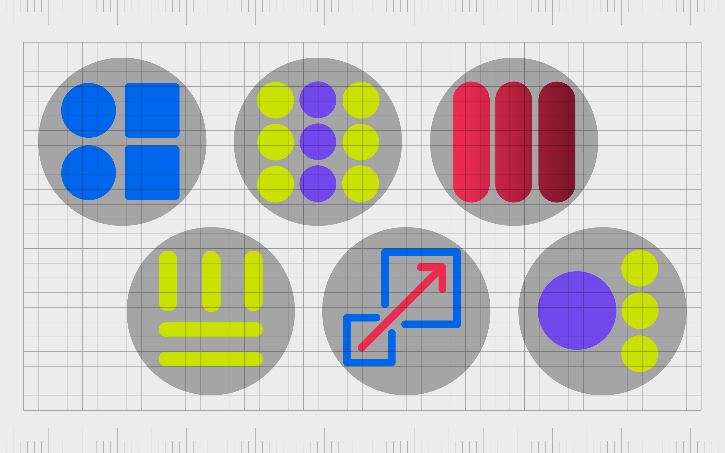
As an example, designers can leverage rhythm of shape and rhythm of color to elicit certain results.
Rhythm of shape
Rhythm of shape involves using a series of geometrical shapes to form a rhythm. The shape doesn’t always have to be exactly the same for a rhythm to emerge. In progressive rhythm, a circle on a page could get gradually larger as you scroll through a screen.
Rhythm of color
Rhythm of color in graphic design involves using a series of colors or tones to create a specific pattern. In an alternating rhythm, you may use yellow and pink repeatedly. The shades could differ, but the same underlying color would be present.
Rhythm of tints and tones
Changing color saturation in an image can also create a sense of rhythm.
You may notice certain parts of a web page moving between darker and lighter shades of blue. The rhythm creates a sense of movement in this case, as well as emphasizing certain portions of the page. Darker tones are often associated with greater emphasis.
Rhythm of lines
The rhythm of lines is perhaps one of the most common forms of rhythm we see on a daily basis. Lines are used throughout web pages and applications to help separate modules in a composition. The distance between each line builds a sense of rhythm.
Rhythm of scale
With rhythm of scale, the designer focuses on moving between various sizes and repeating the same sizes of components in a composition. A rhythm of scale can be progressive or random, drawing attention to the components in the composition with the most weight.
Rhythm of emphasis
It’s possible to create a sense of rhythm in a piece by highlighting specific sections of the composition with color and visual weight. Emphasis delivered in rhythm draws the eye through a page and demonstrates which assets a viewer needs to pay the most attention to.
How to use rhythm in graphic design
Rhythm is one of the most common tools graphic designers use. In fact, when using principles like movement and repetition, it’s common to stumble into rhythm without fully being aware of it.
However, failure to properly identify and refine a rhythm can lead designers to send the wrong message.
With that in mind, it’s important to learn how to use rhythm effectively.
Decide on the effect you want to create
Rhythm is a powerful tool capable of creating excitement or relaxation, depending on how it’s used. A regular rhythm can create a sense of consistency and put your users at ease. A progressive rhythm, on the other hand, will help to generate excitement and push your user towards a specific action.
Choose what to emphasize
Using rhythm in graphic design is one of the best ways to draw emphasis to specific parts of a piece.
If you’re using progressive rhythm, you’ll need to determine what the progressive elements are going to be leading your user towards. If you’re using flowing rhythm, you may need to think about which elements of your piece you want to outline or convey motion through.
Consider the holistic piece
As you’re creating a rhythm, it’s important to think about the overall impact of the piece. Focusing on just a small part of the composition could mean you accidentally create an overall rhythm far more complex than you intended.
Remember white space
Rhythm needs white space and blank portions to have the right impact. It’s important to think carefully about the gaps and breaths between different parts of your composition to determine how significant your rhythm is.
Examples of rhythm in graphic design
Rhythm in graphic design can appear in a multitude of different environments. Visual rhythm examples are almost everywhere you look, both offline and online, in advertising and branding assets.
Here are some interesting options to inspire you:
Moooi
The Moooi website offers excellent insight into how rhythm and movement in graphic design often work cohesively together. As you scroll through the page, the elements move and animate, but there’s also a rhythm in the space between each animation and how the design evolves over time.
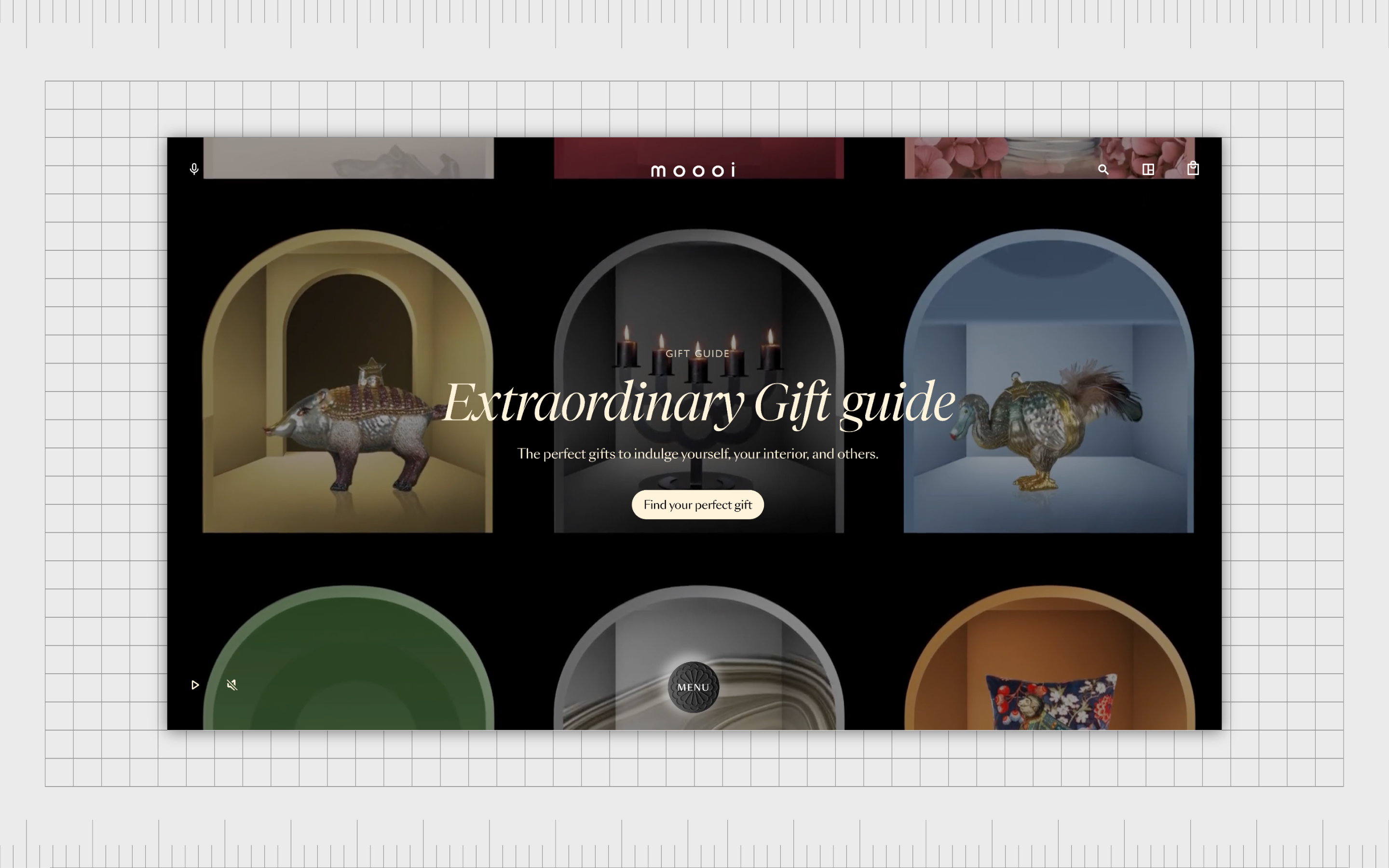
This is a very complex example of rhythm, but it’s also an interesting overview of how designers can use the principles of design to make a static image like a webpage into something more dynamic.
Buffer
The Buffer website offers a simpler insight into the potential of rhythm in graphic design. As we move through the website, we see various examples of rhythm and repetition used to draw the eye and create a level of emphasis for certain components.
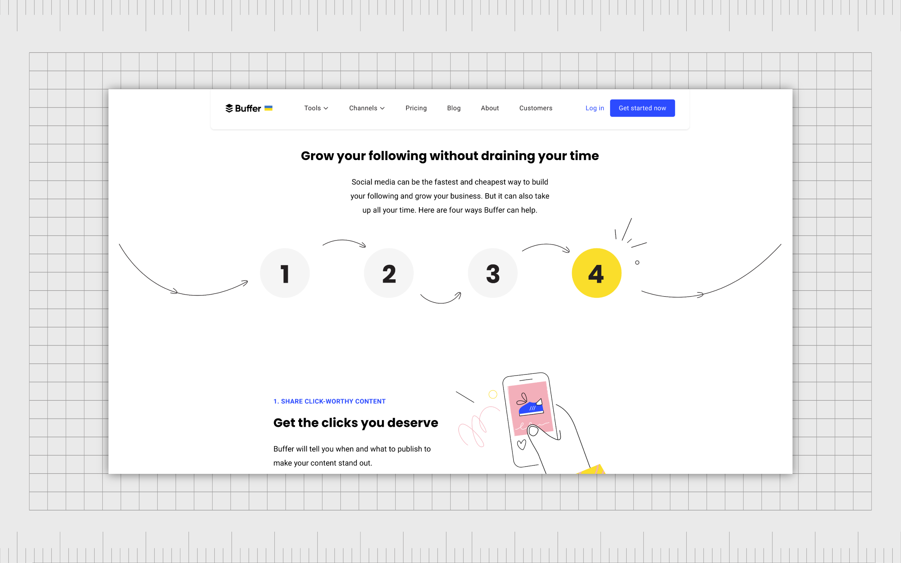
Buffer uses the rhythm of shapes and colors throughout its website to help direct the visual hierarchy of the experience. The design is also very clean and easy to follow, thanks to the use of white space as part of the rhythm.
Sprout Social
Another example of a leading company using rhythm in graphic design, Sprout Social uses the rhythm of shapes, colors, and white space to create a consistent and smooth scrolling experience for users. Rhythm and movement work together to create a dynamic experience on various parts of the page.

What’s more, as you scroll down, the colors get gradually darker, helping to remind you you’re coming to the bottom of the composition.
What is the principle of rhythm?
Rhythm in graphic design is one of the most important tools designers will learn when they’re honing their skills in the creation of brand assets. However, the rhythm principle of design can be somewhat complex to understand for a beginner.
The principles of design rhythm work alongside the other crucial principles of graphic design to bring life and structure to a composition. Designers need to evaluate the rhythm of each component of their design independently, as well as look at the visual impact holistically.
If you’re struggling with rhythm in design, the best thing you can do is seek the support of an expert team of design professionals.
Fabrik: A branding agency for our times.
Now read these:
—Introducing the principles of graphic design
—Understanding balance in graphic design
—Discover the alignment principle of design
—What is the hierarchy principle of design?
—Exploring the unity principle of graphic design
—Getting to grips with contrast in graphic design
—Understanding the emphasis principle of design
—Discover the repetition principle of graphic design
—What is the pattern principle of graphic design?
—Get ahead with the movement principle of design
—Why variety is an important factor in design
—How to bring harmony to graphic design projects
—The principle of white space in graphic design
—How to use the proportion principle in design

Clarity starts with a conversation.
Thanks—we’ll get back to you shortly.
Whether you're navigating a rebrand, merger, or simply need a clearer identity—we’re here to help. No hard sell, just honest advice from people who know the sector.
Let’s start with a simple question…
Prefer to email? Drop us a line.
Fabrik’s been helping organisations rethink and reshape their brands for over 25 years. We’ve guided companies through mergers, rebrands and new launches. Whatever stage you’re at, we’ll meet you there.