


Contrast in graphic design: Exploring the principles of design contrast

Contrast in graphic design is a valuable tool for creating visual impact and hierarchy. With contrast in design, you can guide viewers to a certain asset on a page, or separate one part of a creation from another. Without at least some contrast, the elements of your composition would blend together.
Often, when referencing contrast, most people think of color or shade, like black and white. However, there are countless ways to apply contrast to a design, from adjusting the shapes and positioning in a piece, to experimenting with visual weight and typography.
Learning how to master contrast is one of the most important things any graphic designer needs to do to ensure they can create effective logos, brand graphics, and websites.
Today, we’re going to look carefully at the principles of design contrast, and how they influence the impact of a composition.
What is contrast in graphic design?
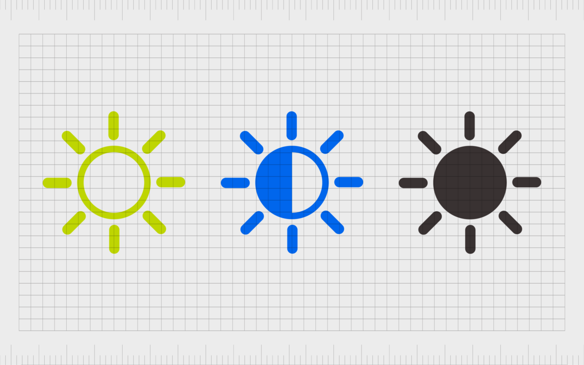
Contrast in design represents the representation of specific assets in a composition in two different ways. For instance, you have contrast when you place a black font on a white background.
There’s contrast between the large font size of the headings in your articles, and the smaller type of the body copy. You can even see contrast between shapes in a design.
Contrast is a tool for designers to direct attention to specific elements of a design, as well as helping to ensure groups of related elements are kept apart.
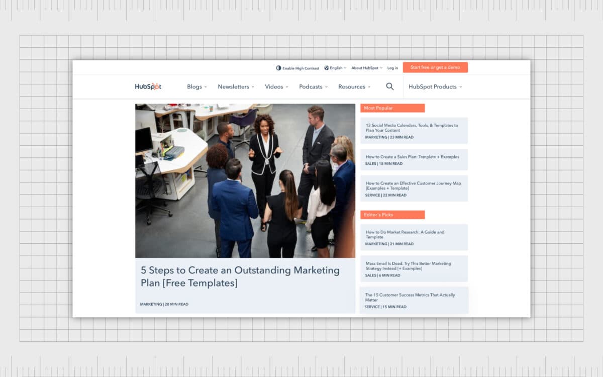
HubSpot, for instance, use size to contrast between their latest blog posts and widgets for Most Popular and Editor’s Picks highlighting the components as being two separate entities with different functions.
Contrast in design isn’t just about making an impact, it’s essential for a good user experience. Imagine how difficult it would be to read an article if a magazine published a black font on a dark background. Contrast can be a powerful tool in ensuring legibility.
The definition of contrast in graphic design
There are many elements of contrast which can work together in a design composition to achieve a specific result. The main focus of contrast is making one component different from another. This means context is crucial to achieving contrast.
Rather than simply looking at each part of a composition individually, a designer needs to consider the whole composition and the relationships of different components to achieve contrast. For instance, a small grey circle would say very little on its own.
However, if you placed the circle alongside a much larger sphere, you’d be sending the message the larger sphere needs the attention of your viewer before the smaller alternative. This is because assets with more visual weight demand more immediate attention in any composition.
A designer could add further visual weight and contrast to a design by changing the color of one asset compared to another, or even choosing an entirely different shape.
By making one circle darker, for instance, a designer can leverage two principles of design at the same time. Unity shows the circles are related in some way because they share the same shape. At the same time, the darker coloring of the second circle separates it from the other assets.
Contrast helps us to define the relationships between different components in a design and determine which elements may hold the most importance.
Why is contrast important in graphic design?
As mentioned above, contrast is essential for a number of reasons. First and foremost, it delivers a better user experience to anyone viewing the composition.
In the example above, the use of contrast helps to separate components on a page, while also making important things easier to see (like fonts and content tags).
Contrast is particularly important when designing for “UX” (User Experience). Without contrast it would be extremely difficult for anyone to navigate a website, read the content on a blog page, or interact with an app.
Contrast also plays a role in ensuring visual hierarchy. With elements of contrast on a page, you can show a viewer exactly where you want them to focus their attention first, what they should look at next, and so on.
Think about the structure of a blog post, for example. The headline is often much bigger than the rest of the content, showing you what you need to read first.
Our eyes like contrast because it grabs attention and helps us to digest the information we’re seeing in a structured way. We often consume the largest, brightest, and most differentiated assets on a page first, before we move onto anything else.
Without contrast, all of the elements on a page would look the same, blending into the same consistent background. This would make it practically impossible to determine how to navigate the page.
What is the principle of contrast?
The contrast principle of design is one of the 7 essential principles of design intended to guide experts in creating a host of compositions, from websites and blogs to art pieces.
Like all of the principles of design, visual contrast plays an important part in ensuring a visual element is successful at achieving specific goals or sending a certain message.
The correct use of graphic design contrast helps organize a design and ensure a specific visual hierarchy, signaling where your viewers should look first.
Perhaps even more importantly, the contrast principle of design also adds visual interest to an image. Imagine a website where everything was the same shape, size, and color. The image would be pretty boring. With no contrast at all, you’d just end up with a single colored block.
Contrast spices things up, separates your components, and gives each of them the right level of impact. However, it’s important to use contrast with caution. While visual assets should have contrast, they still need to consider the other principles of graphic design, like unity and alignment.
If every element on a page or in a design was completely different from the rest, this would create a cluttered mess of disconnected components.
How is contrast used in graphic design?
Contrast is applied to graphic design to separate elements, create visual hierarchy, and create emphasis in certain aspects of a composition. There are many different ways to apply contrast to a design. Some aspects of contrast are used entirely for practicality.
For instance, it’s crucial for the color of the text you use for your blog to be a contrasting shade to the background for the font. If your typography and background were the same, they’d blend together and be impossible to read.
In other instances, contrast in design is specifically intended as a way of making a specific statement. Choosing a contrasting size of font for the headline of a blog post shows users what’s supposed to grab their attention first.
Usually, contrast is used in conjunction with other principles of design to create a specific result. One of the most important tools to use with contrast is “unity”. In the example of a blog post, contrast might allow you to make the body and copy of your post different sizes of font.
However, unity would keep the style or color of font the same.
By using elements of unity alongside contrast, you can create emphasis, while still showing users which parts of a design are conceptually connected.
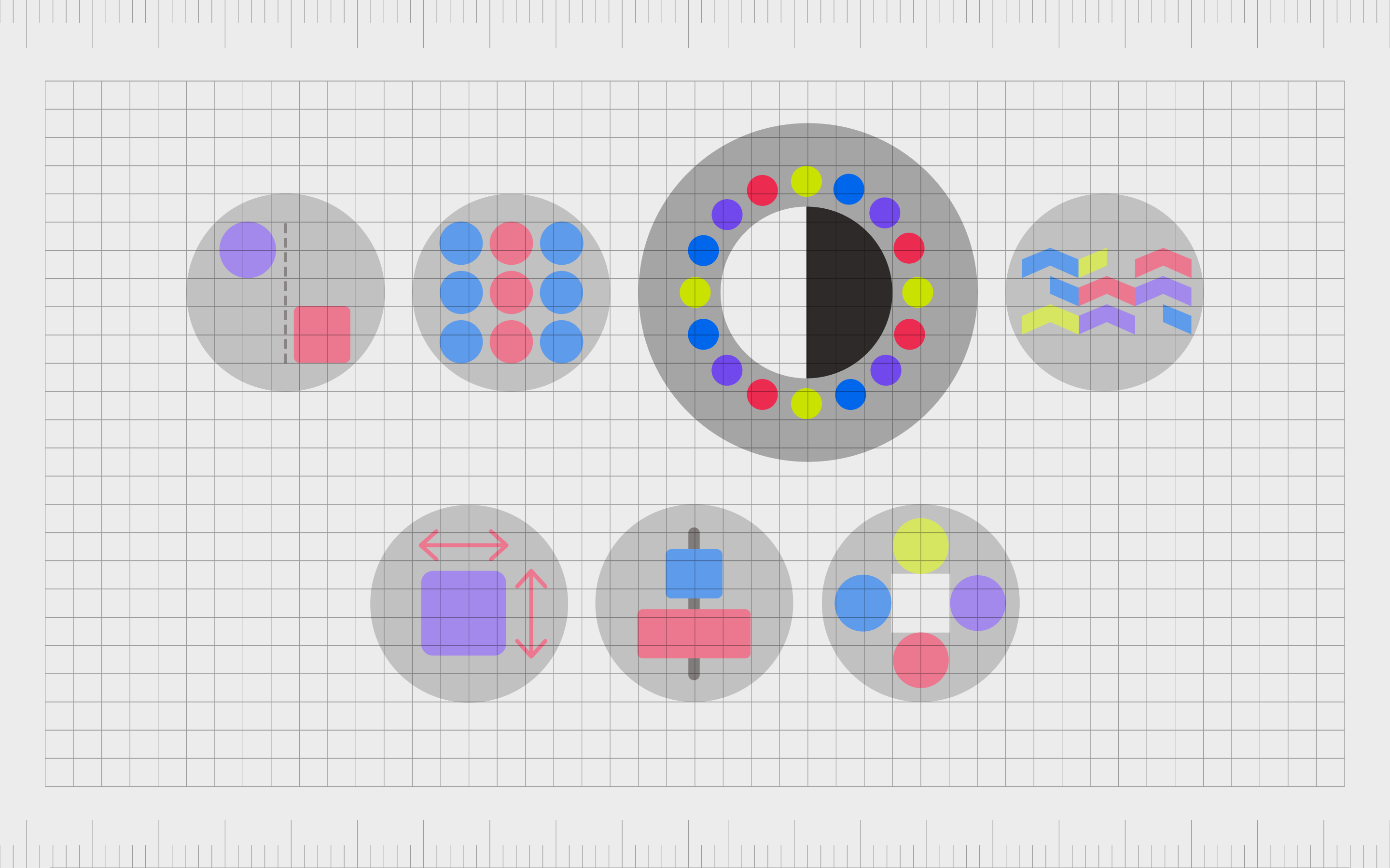
What are the types of contrast in graphic design?
There are endless ways graphic designers in the modern world can separate one element of a design from the rest of the components on a page. If you can use a strategy to make one aspect of your design different from the rest, you’ll be using “contrast”.
Here are some of the types of contrast in graphic design…
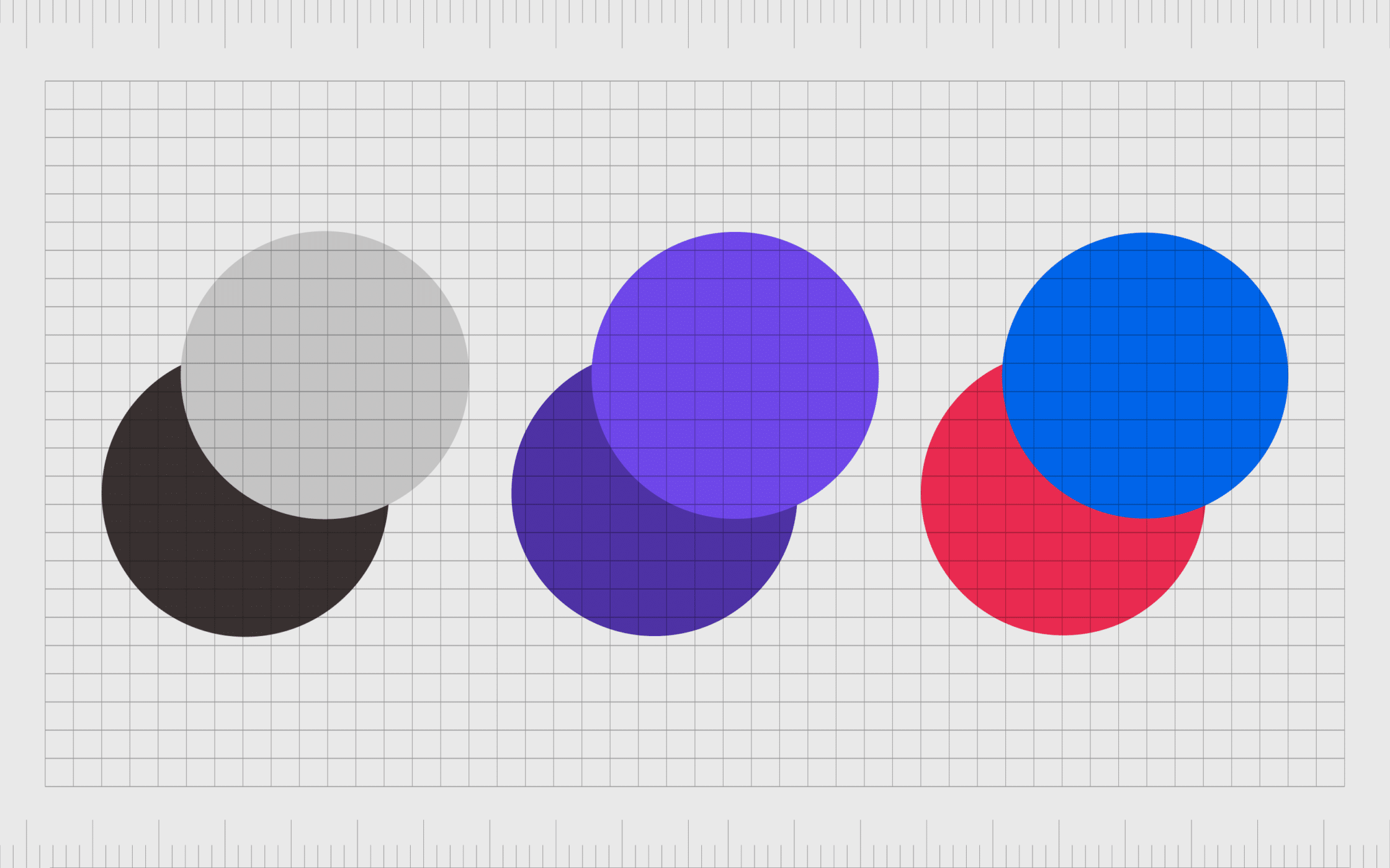
Contrast in color
Contrast in color is one of the most common types of contrast seen in virtually all aspects of design. Think of light text on a dark background, or vice versa. Or consider how brightly colored buttons on a white website background can draw your attention.
While complementary colors create a sense of unity on a page, tying one element to another, contrast helps to separate each component. A completely contrasting color, like a red button on a white background would separate the button from the rest of the page, and capture attention.
A contrasting hue of the same color, such as a dark blue button on a light blue background, would draw attention, while demonstrating the button as still being connected to the rest of the composition.
Some different forms of contrast in color include:
- Contrast with color value (dark or light colors).
- Contrast with color hue (shades on the color wheel).
- Contrast with color temperature (such as red and blue).
- Contrast with color intensity.
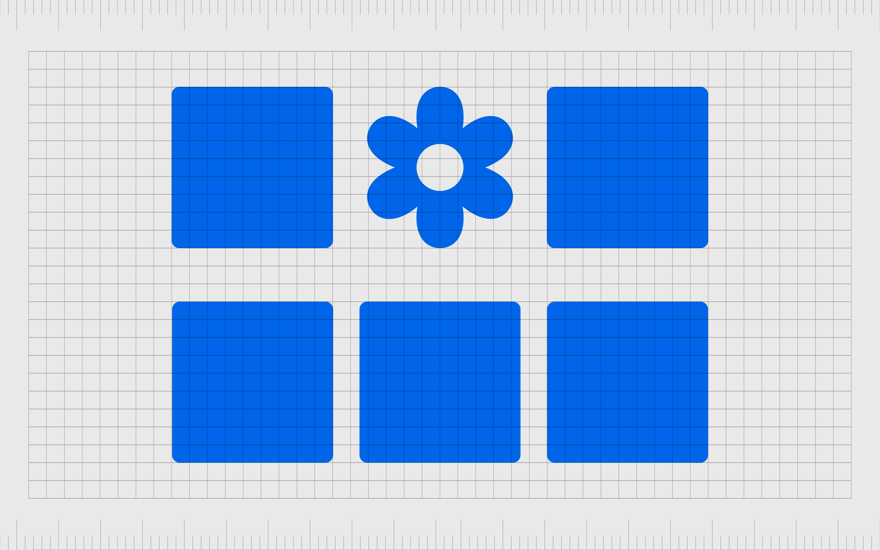
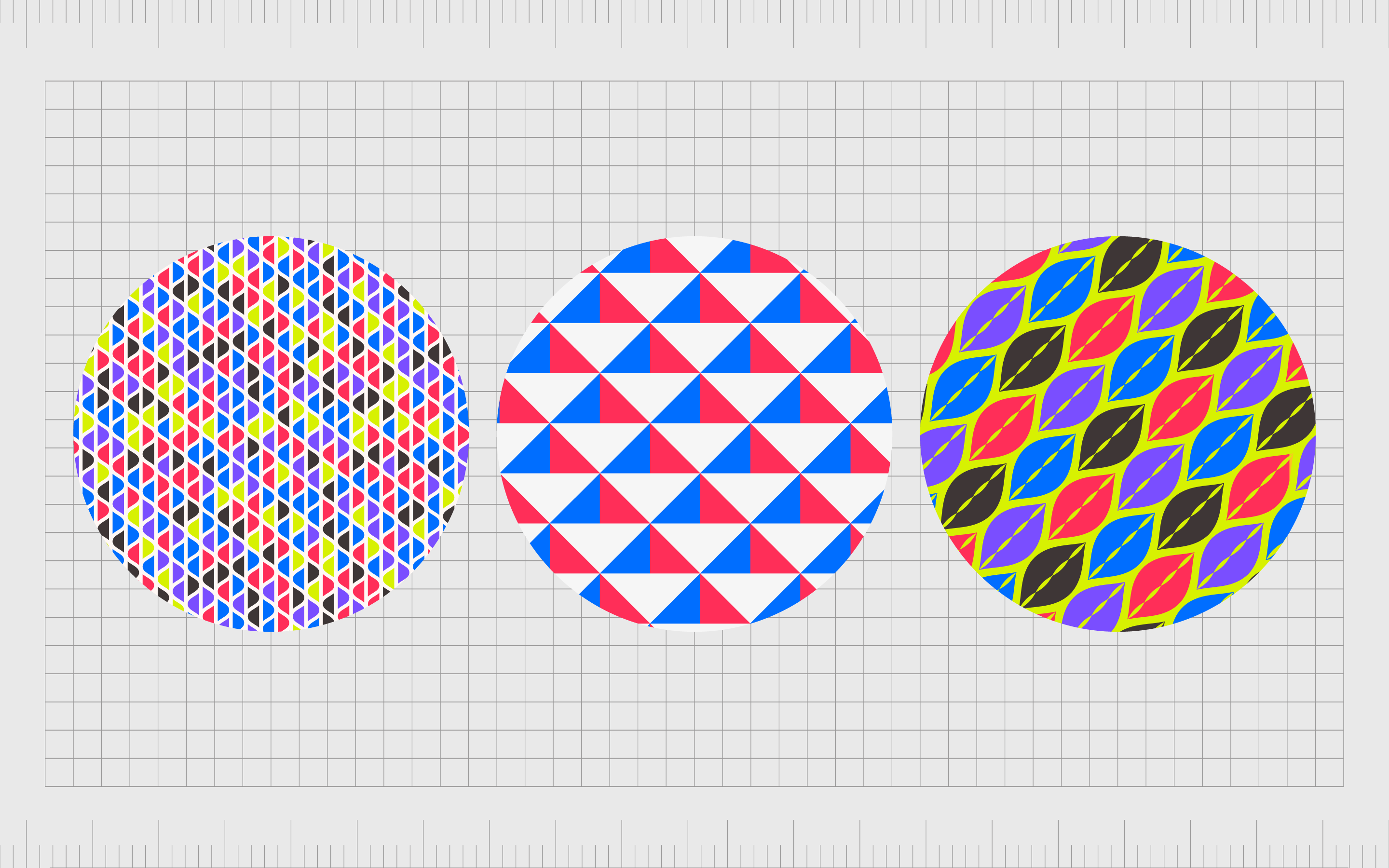
Contrast in shape
Repetition of shapes is common in many design compositions, particularly with website design. Creators might use the same shaped block on a page to split various components into modules. Sometimes, changing the shape can draw the viewer’s attention to the new element.
Imagine a website page where all of the shapes are square or geometric. A new, more organic shape, like a flower, would immediately stand out as something different.
There are subtle ways to add contrast to a design via shape too. A designer using a lot of sharp corners and edges might use a rounded edge to create a more welcoming appeal, or add a sense of “texture” to the composition.
Texture is a common way to contrast shapes on a page, as it’s possible to make different components appear rough or smooth, depending on how they’re depicted.
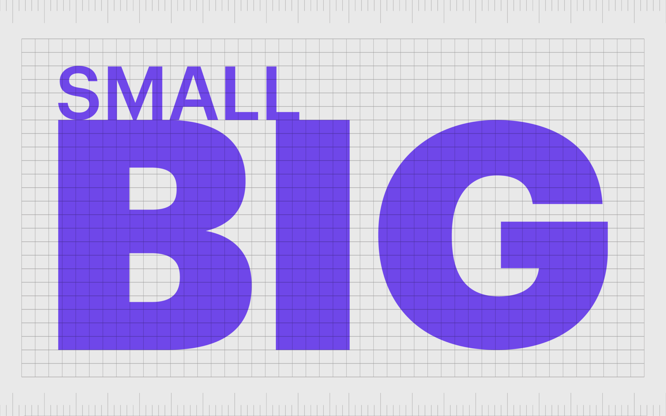
Contrast in size
Contrast in size and scale is one of the most common ways to separate elements on a page. As human beings, we’re wired to pay attention to the largest thing we see first. As such, if two circles were on a page, we’d look at the largest circle first, even if the smaller circle was in a contrasting color.
Contrast in size is one of the best ways to add visual hierarchy to a composition, as it demonstrates where your customer should be focusing their attention first.
The most common form of size-based contrast is using a much larger font or text for a headline or sub-head in an article to the rest of the copy. Not only does this help to direct the eye of the viewer, but it can also separate components of a text into different segments.
Contrast in size can also be combined with contrast in visual weight. You can add more weight to a contrasted element by intentionally reducing the weight of other elements in the image.
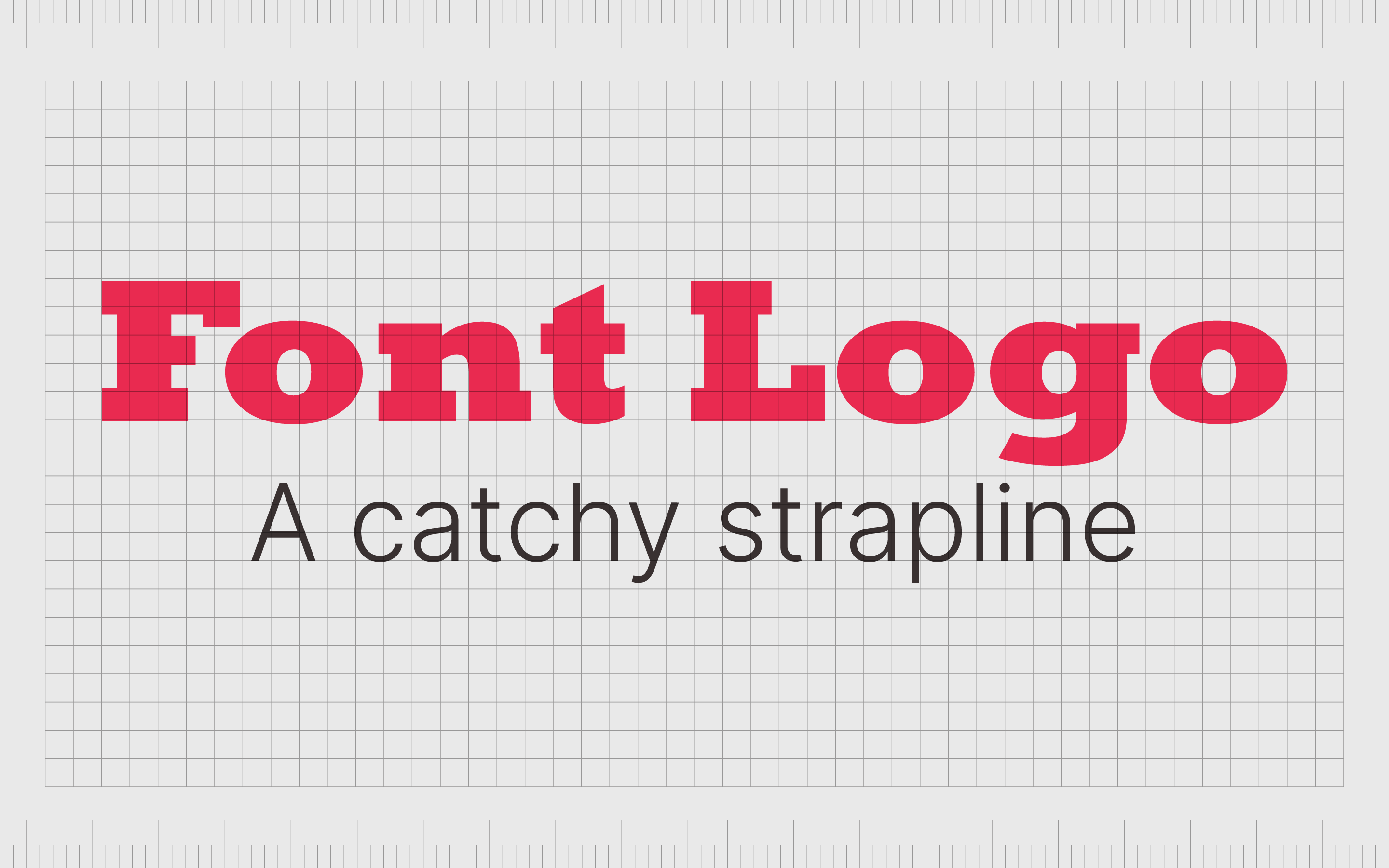
Contrast in typography
Another very common example of contrast in graphic design, is in the use of combinations of different fonts. Usually, if a designer is creating a logo wordmark with a tagline or strapline under the name of the brand, they’ll use two different kinds of typeface to direct attention.
You may have noticed logos where the name of the brand is set using a bold slab serif font, while the text underneath the name is in a smaller sans-serif typeface.
Bolder, more decorative fonts are more likely to grab a viewer’s attention, but they don’t always have the best readability for long pieces of text. This is why it’s more common to see decorative typefaces used in headers and logos, while simpler fonts are used for body text.
Contrasts between different kinds of typography can be enhanced using different weights and sizes of fonts too. However, it’s important not to use too many different styles of type in one design, as this can damage cohesion.
Other elements of contrast in design
There are various other ways of bringing contrast into design by experimenting with the visual impact of different elements in your composition. For instance, on a minimalist leaflet design with a lot of simple components, a complex or highly decorative element would create contrast.
You can also add contrast with visual cues and complementary elements. Adding a box around or a line underneath a heading or subheading, for example, gives it more of an impact.
Other forms of contrast include:
- Contrast with proximity and separation: If all the aspects on a page are generally grouped close together, placing more white space between certain objects would create contrast.
- Contrast with position: Placing one line of text on the opposite side of a page to the rest of the lines on a blog post would create contrast for that single line.
- Contrast with patterns: Designers usually access the same patterns repeatedly in an image or composition to ensure unity. Using a different pattern would create contrast.
How to use contrast in graphic design
Learning how to use contrast in graphic design can feel complex, but it’s actually quite a simple process. The key goal is to find ways of making parts of your design feel separate from the rest, without completely eliminating things like unity.
You can create contrast in design by:
Resizing elements
One of the easiest ways to add contrast to a design is to make one element bigger than the rest of the elements around it. A larger component will draw attention much faster than a smaller element.
This is a common practice companies will often use when creating sub-headings and headings for blogs and articles.
Use textures and patterns
Patterns and textures are excellent for creating high-contrast designs when the characteristics of different components are very different. A rough-textured background on a logo matched with a smooth-textured foreground would bring character and contrast to the design.
Use color
Adding contrast to a design with colors is very effective. You can contrast with dark colors on light backgrounds, or vice versa. You can also use different color intensities or temperatures to create a sense of color.
It’s even possible to use different shades from the same palette create a powerful sense of contrast. It’s important to be careful with color in most designs, as too many shades and hues on one page can reduce the impact.
Pay attention to alignment
White space and textual alignment help to establish the structure of the design, and the visual hierarchy. If you’re designing a page which includes a lot of content, surrounding crucial elements with more white space helps to draw the viewer’s attention and make the elements stand out.
You can also group certain elements together to show their connection.
Use typography
Typography is an important component of a lot of different design projects, particularly in the digital world. The right use of different kinds of type can have a direct impact on which elements of a design attract your audience first.
You can use different styles of type, like serif or sans-serif, or experiment with font styles, like italic or bold fonts.
Add unexpected elements
Unexpected elements in a design, when used carefully, can give your designs a powerful sense of contrast. If everything on your page appears to be hand-drawn, and you suddenly place a photo-realistic image among the mix, this can help to separate this image from everything else.
Examples of contrast in graphic design
Visual contrast examples in design aren’t difficult to find. Virtually any website you visit, logo you look at, or brochure you read will have some elements of contrast worth mentioning.
Let’s take a look at some quick examples of contrast in graphic design…
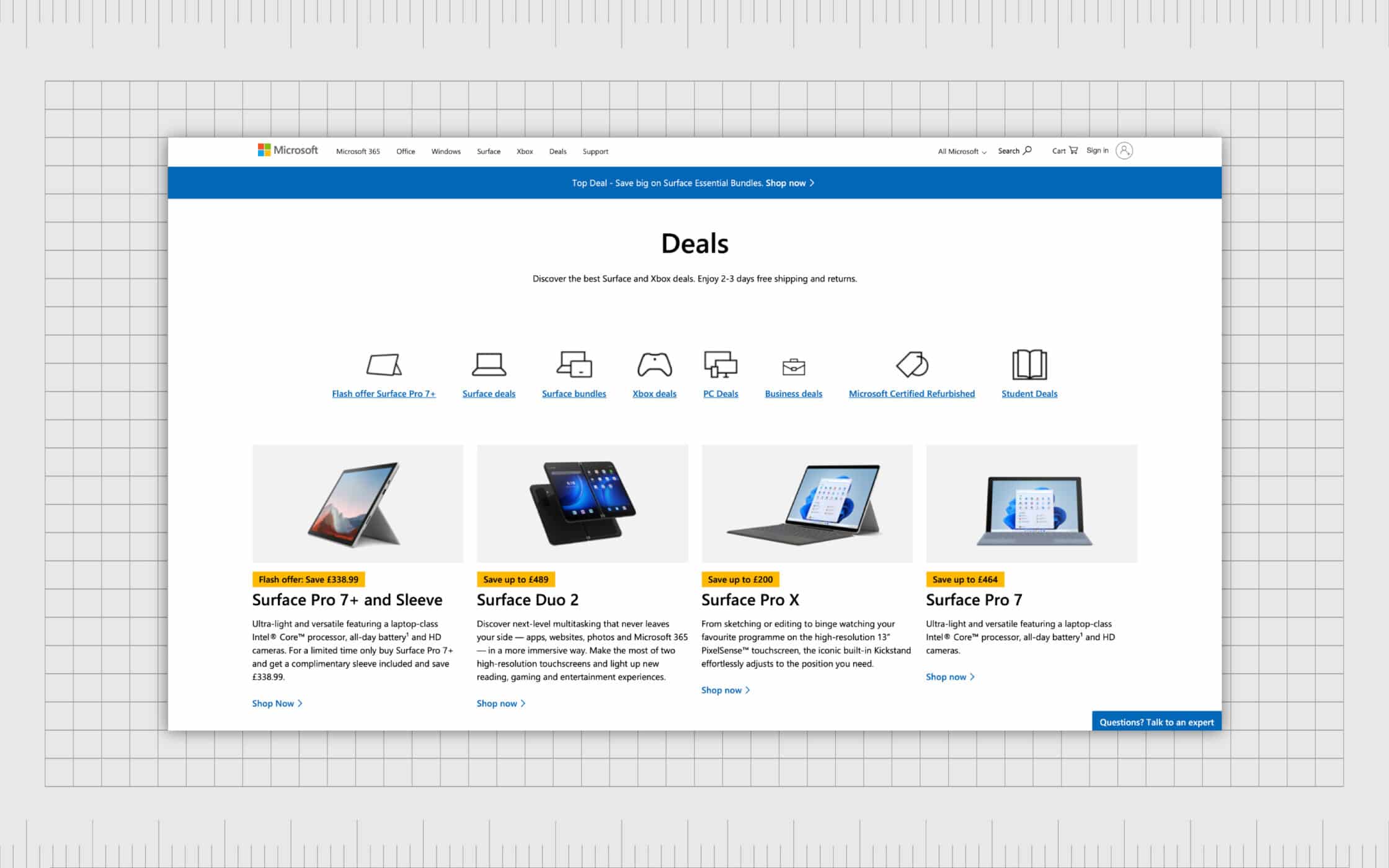
Microsoft
The Microsoft website, like many sites on the web today, uses contrast in a number of ways to attract attention. In this example on the homepage, the bright color of yellow complements the rest of the colors in the web design, while still drawing attention from a viewer.
The different sizing choices used for the typography on this page also helps us to identify what we should be reading first on the page.
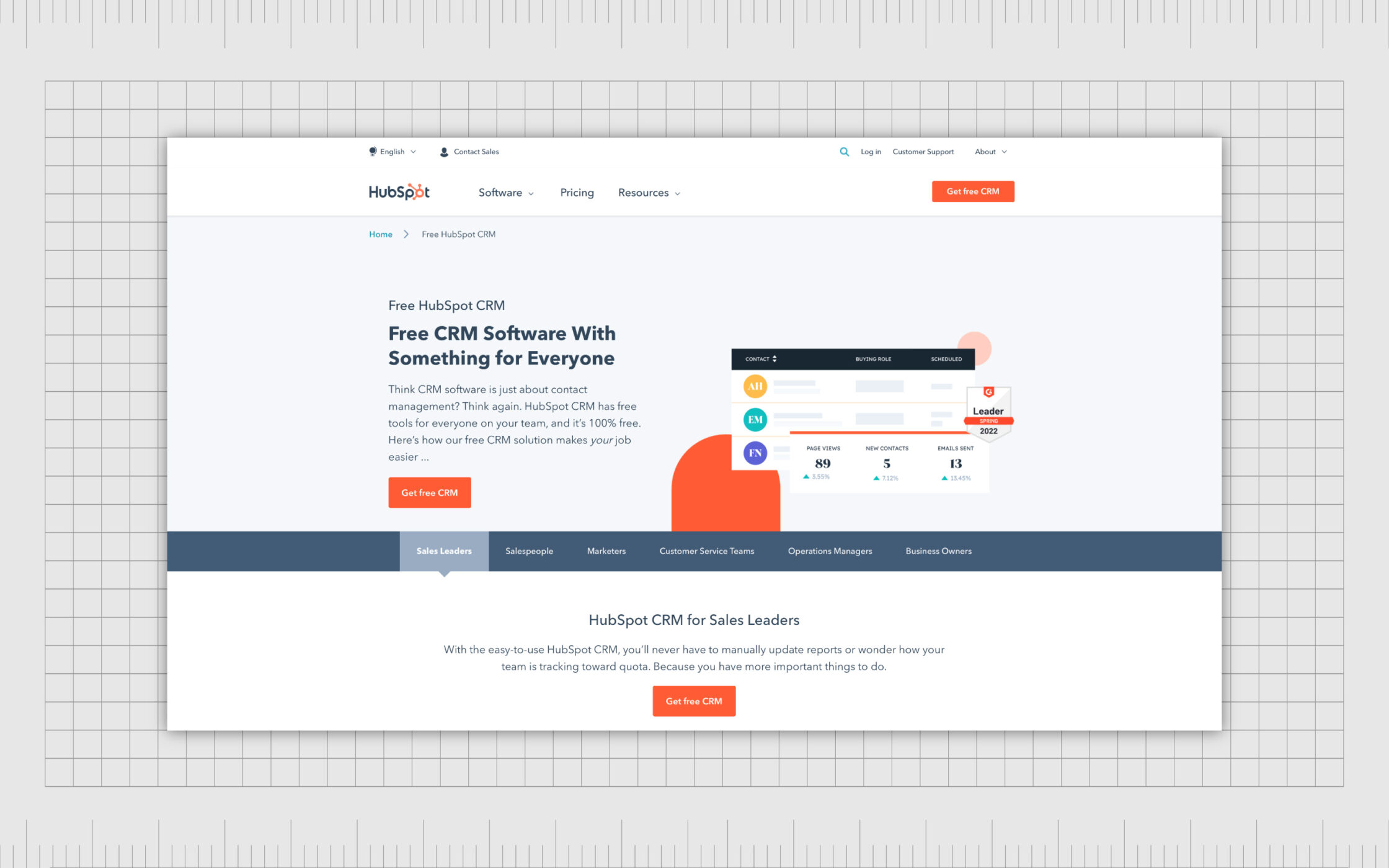
HubSpot
HubSpot uses contrast in design to highlight the buttons it wants customers to click on. As with Microsoft, the buttons are colored using the company’s brand shades, which helps to create a sense of unity and alignment in the company’s image.
However, they’re still contrasting to the rest of the background images and content.
Once again, we see examples of size-based contrast here, helping to drive visual hierarchy. We see specific headlines first, followed by smaller pieces of text which provide additional information. HubSpot also uses spacing to create contrast and separate the different modules on the page.
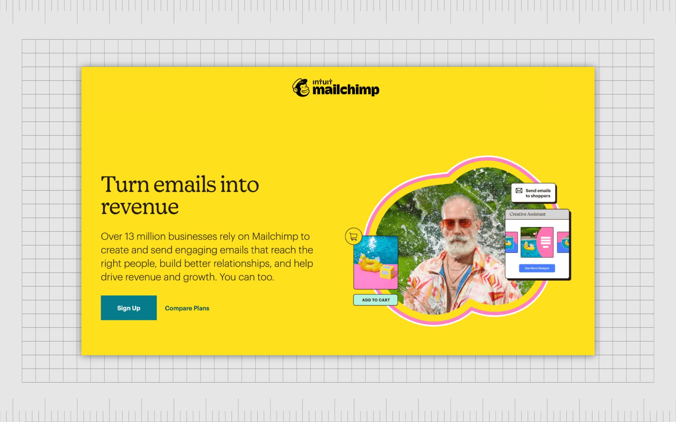
Mailchimp
Mailchimp, a popular email marketing tool, uses contrast in typography to separate headline content from the rest of the copy on the page. The headlines on the website are depicted in a serif font, to highlight instant authority, while the rest of the copy is in a softer, sans-serif typeface.
Mailchimp also uses font elements like bolding to draw attention to specific pieces of text it wants the reader to pay attention to first, after reading the headlines.
Using contrast in design
Learning how to leverage contrast in graphic design is one of the most important things you can do as a budding designer. Contrast is crucial to making your designs more user-friendly and legible, but it also adds interest and impact to any composition.
While contrast needs to be used with caution, taking into account the other principles of graphic design like unity and alignment, it’s something no designer can afford to ignore. Without contrast, designs would be boring, and almost impossible to understand.
If you’re struggling with contrast in your graphic design strategies, the best thing you can do is seek support from an expert.
Fabrik: A branding agency for our times.
Now read these:
—Introducing the principles of graphic design
—Understanding balance in graphic design
—Discover the alignment principle of design
—What is the hierarchy principle of design?
—Exploring the unity principle of graphic design
—Understanding the emphasis principle of design
—Discover the repetition principle of graphic design
—What is the pattern principle of graphic design?
—Exploring the rhythm principle of graphic design
—Get ahead with the movement principle of design
—Why variety is an important factor in design
—How to bring harmony to graphic design projects
—The principle of white space in graphic design
—How to use the proportion principle in design

Clarity starts with a conversation.
Thanks—we’ll get back to you shortly.
Whether you're navigating a rebrand, merger, or simply need a clearer identity—we’re here to help. No hard sell, just honest advice from people who know the sector.
Let’s start with a simple question…
Prefer to email? Drop us a line.
Fabrik’s been helping organisations rethink and reshape their brands for over 25 years. We’ve guided companies through mergers, rebrands and new launches. Whatever stage you’re at, we’ll meet you there.