


Repetition in graphic design: Discover the repetition principle of design

Repetition in graphic design is all about creating a sense of consistency, cohesion, and rhythm in a composition. While too much repetition in design can be boring, the right amount clarifies brand identity and create a sense of visual comfort.
As one of the major principles of graphic design, visual repetition guides experts toward creating more powerful pieces of content.
Learning when it makes sense to utilize elements of repetition and when you may need to break free from the pattern develops a visual hierarchy for your projects.
Of course, like most of the common rules of design, mastering visual repetition can be easier said than done. It takes time to discover which aspects of repetition work best for different projects and use cases.
Today, we explore the definition of repetition in graphic design and why it can be important in enhancing your projects.
What is repetition in graphic design?
Repetition in design involves using the same component or element over and over again. To ensure a sense of rhythm and unity in an image, most designers will use repetition alongside other principles of graphic design, such as proximity, hierarchy, and alignment.
Elements of repetition in design can include using everything from the same colors to identical shapes, images, font types, textures, lines, and more.
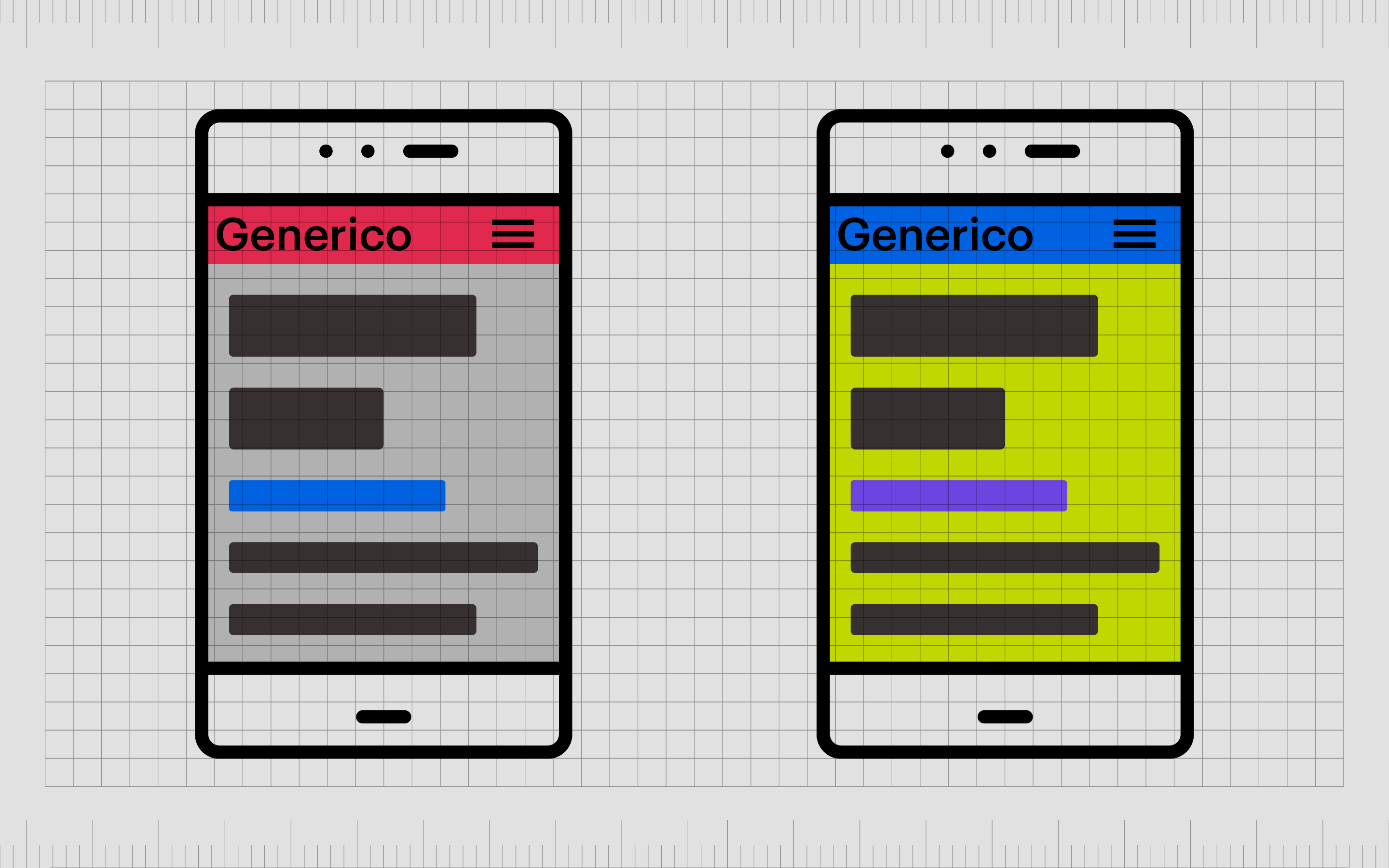
Perhaps the most well-known form of repetition in graphic design is the use of consistent assets in branding. Companies need to use the same colors and images (like logos) repeatedly in all of the assets they produce, from packaging for products, to marketing campaigns and websites.
This consistent repetition of the same assets helps to create an association between the brand and the visual components they’re using all the time. For instance, most people associate McDonald’s with the colors golden yellow and red.
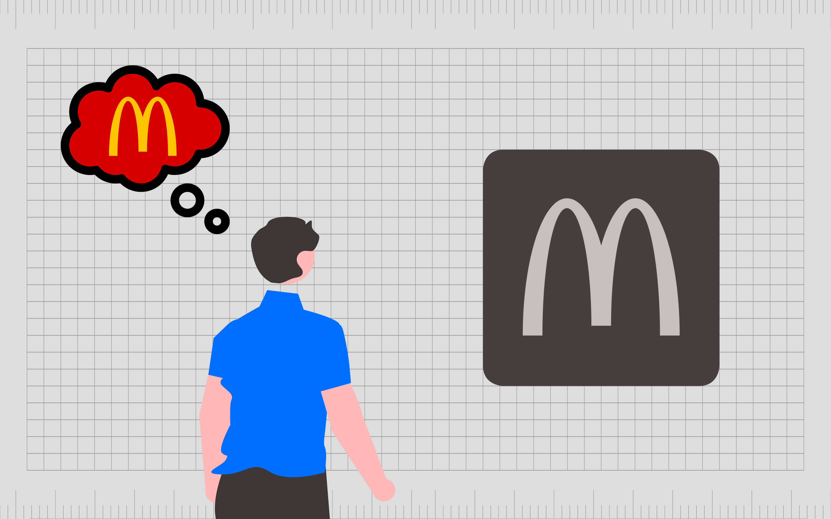
Repetition triggers familiarity and memorability, ensuring companies can carve a space for themselves in the minds of their target audience.
Without repetition, a company would be presenting a different image and emotional experience to their customer with every interaction. This would make it impossible to distinguish the brand from other companies.
The definition of repetition in graphic design
The term “definition” in design simply comes from the word “repeat” which means to use an element, word or concept more than once. In graphic design, we use repetition in different ways to build a sense of familiarity, create patterns, and ensure rhythm.
While repetition can be important in all artistic endeavors, it’s particularly crucial in relation to branding. Without repetition, companies can’t create any consistent style or identity to differentiate them from their competition.
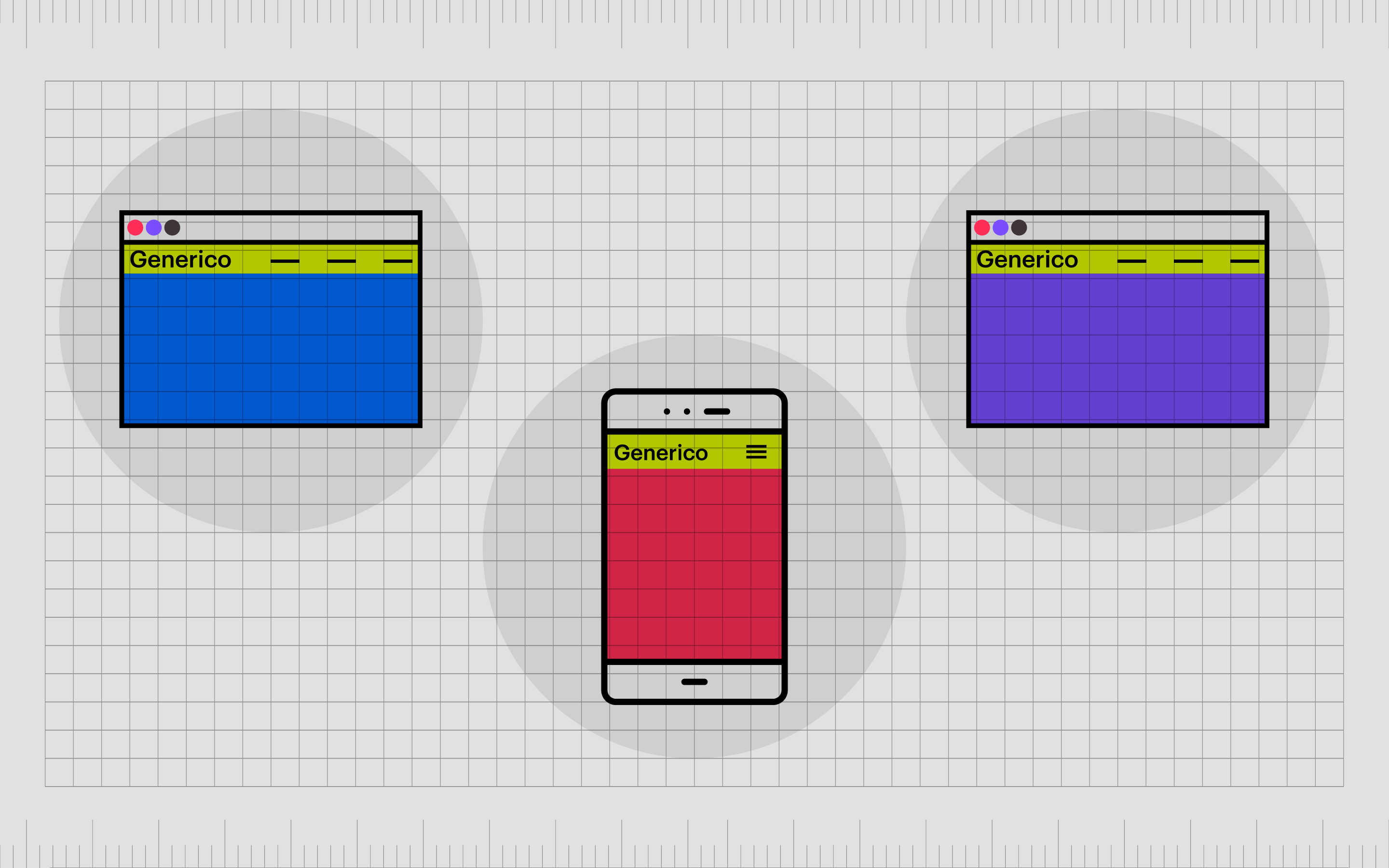
Repetition also appears frequently in web and app design.
On a website, you’ll often notice the same elements are used time and time again from one page to the next. When you move from one page on Amazon to another, the logo at the top of the page stays the same, as does the search bar, the footer, and various other components.
Repetition in this aspect allows for a better user experience by ensuring customers don’t have to rediscover aspects of navigation or learn where they need to go to find information every time they visit a new part of an app or site.
Why is repetition important in graphic design?
Graphic design repetition can be important for a range of reasons.
We naturally seek out patterns in the things we see. Consistency makes us feel more at ease with our surroundings, sparks memory (to help us identify what things are), and creates a sense of rhythm.
In art, repetition can help to pull someone into a piece by guiding their eye along a series of repeating elements or surprising them with a break from a repeated pattern. In graphic design, repetition plays an important role in both user experience and branding.
As discussed, repetition in branding creates familiarity and ensures we build the correct association between companies we see and specific elements of their identity, like a kind of font or color.
In graphic design, repetition helps us understand and learn how interactive elements work, where we can expect to find them, and what we can use them for.
With repetition in graphic design, companies can:
Organize information
Repetition arranges data coherently and guides the audience in a clear, memorable way. A repeated navigation bar across multiple pages on a website gives us a consistent way to find the information we need and visit new pages.
Form connections
The use of repetition in design forms connections. Using the same style of italic font for quotes in a document helps identify those pieces of text belonging to the same group for information type.
Improves user experience
With graphic design and web design, repetition teaches customers to use your assets quickly and set expectations.
Creates a sense of aesthetic comfort
Because we’re naturally predisposed to look for patterns in visual content, repeated elements in a design can make us feel comfortable and at ease.
Make concepts more memorable
If you need to send a clear message or highlight a concept as being important, repetition helps the idea to stick in someone’s mind.
What is the principle of repetition?
The repetition principle of design is one of the various “design principles” graphic artists follow to achieve effective aesthetic compositions.
The principles of design repetition are used alongside other crucial elements like unity, movement, hierarchy, emphasis, balance, contrast, and rhythm to achieve a certain result in each design project.
Repetition is often the tool used for aesthetics, consistency, and usability in design.
As mentioned above, the human eye is naturally attracted to patterns and repetition. Because of this, using repetition can give us something pleasing to look at. A break from repetition can also easily show us where our attention needs to be focused.
Repetition can also create consistency, which breeds familiarity and memory, as well as a sense of unity between different components of an asset.
You may notice most websites use the same repeated fonts over and over to make everything on a website feel connected. If you clicked on one page of a site and the elements were totally different, you would feel like you’re no longer on the same site.
Another purpose of repetition in design is for usability. The repetition of various elements, like where you place a navigation or search bar, means users don’t have to work as hard to interact with your composition. Repetition is a common principle of UX design.
How is repetition used in graphic design?
Like all crucial principles of graphic design, repetition is used in conjunction with other important concepts like unity and alignment to achieve specific results.
However, there are two particular principles of graphic design that often go hand-in-hand with visual repetition:
- Pattern
- Rhythm
Patterns are repetitions of more than one design element working in alignment with each other.
Seamless patterns allow every element in a design to work together to form a whole. This is commonly used in the backgrounds of app pages and websites, and it’s also common in wallpaper, carpet, and even clothing design.
Patterns rely on repetition to create a sense of consistency. Without repetition, there is no pattern. When using repetition in design, graphic artists will often have to think how much they want to extend a repetition.
If you repeat an element too many times, it becomes more of a pattern.
Rhythm is the other element that often goes alongside graphic design repetition. The concept of rhythm looks at the general motion and movement of the visual hierarchy in designs. When you repeat certain elements, the intervals between each repetition can create a sense of movement.
Imagine you were creating a website page for your blog posts.
If you repeat the same block module a certain distance apart throughout your page to display each new blog, scrolling through the page will create a rhythm. The rhythm comes not just from the blocks of repeated shapes, but from the gaps between those shapes too.
Using repetition, rhythm, and pattern together, you can reinforce certain ideas, teaching customers how to use your app or website, or giving them a clear image of your brand and its visual aesthetic.
It’s also possible to break from rhythm, repetition, and patterns, to create emphasis and contrast. If the repeated blog blocks on your website are suddenly separated by a large rectangular ad, this would naturally draw attention to the ad.

What are the types of repetition in graphic design?
There are various types of repetition a designer can apply to their graphic design elements. As with most instances of using design principles, the key to success is learning how to find the correct balance between too much repetition and not enough.
Some of the most common types of repetition you’re likely to see in graphic design include:
Fonts and typefaces
Ideal for creating consistency and improving user experience, typefaces and fonts are often repeated throughout web designs, leaflets, and booklets.
When you create a visual asset, which includes some element of text, it’s important not to use too many kinds of typeface as this can cause confusion.
However, you can emphasize a typeface with bolding, underlines, and italics without harming your rhythm or unity.
Patterns and lines
Patterns and lines are common within the use of repetition.
Using the same background pattern on every page of a website creates a sense of cohesion throughout the site. Using lines and visual elements multiple times on a design creates a consistent pattern for users to follow.
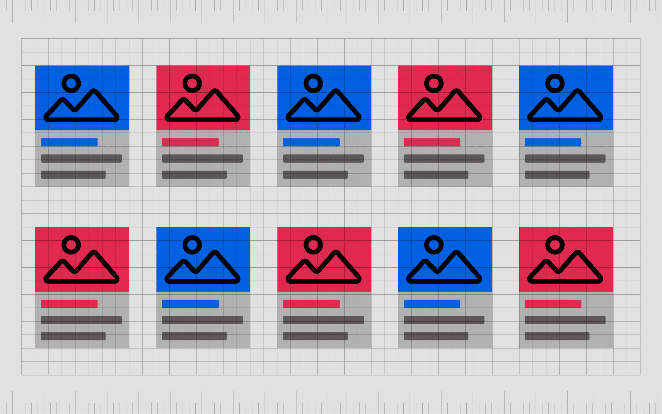
Images and graphics
It’s common to keep certain images and graphics on a website or branding project the same. For example, websites and apps will use the same logo design on every page where they interact with their user.
Other images and graphics you may repeat include CTA buttons or specific interactive elements.
Colors
Colors are one of the most commonly repeated elements in any graphic design project.
By repeating the same series of colors over and over again, you can build a brand identity or create a consistent pattern. The use of consistent colors also prevents a design from becoming overwhelming with too many shades.
Shapes
Repeated shapes are used to create patterns in artistic design.
In graphic design, repeated shapes are common in website development and app creation. Using the same shape multiple times is a great way to make a site look clean and consistent. Many website designers use grids to help place shapes throughout their sites.
Messages
Sometimes repetition in design can involve sending the same message over and over, such as with the use of a stylized strapline or tagline. This repeated message can help to ensure customers understand the meaning of a component in a design too.
You would use the label “home” for the home page button on all of the pages of your website, so your customers know what to click to go back to your entry page.
Themes
It’s common to repeat themes with graphic design repetition to send a certain message. As an example, you might use multiple images from the food landscape on your website when you’re trying to convey your position in the food service industry.
How to use repetition in graphic design
Repetition is simply the process of using the same element multiple times continuously. It can extend to become a pattern or help with the creation of rhythms and unity in your design composition.
It can add texture and depth to a piece as well as contribute to the overall hierarchy of your design. Repetition also improves user experience and overall brand appeal.
It’s also possible to use a break from repetition as a powerful tool in your design strategy. When we become accustomed to certain repetitions and patterns in the visual elements we see, a break from these patterns forces us to pay attention.
Here are some of the ways creators can use repetition in graphic design:
1. Use repetition to establish brand identity
Repetition is one of the most important tools in any branding strategy. With repetition, you build familiarity with your audience through the use of the same crucial assets in multiple different environments, from social media and websites to packaging.
Through consistent repetition, you teach your audience what to expect from your brand and send a consistent message about your personality, identity, and image. The more repetition you use, the more memorable your brand becomes.
2. Use repetition for comfort and usability
Repetition is reassuring, as it guarantees we’re not going to be surprised by any new information or experiences when we’re getting used to a new concept. As a result, repetition is one of the more frequent tools used in web design and app development.
When you’re building a website, you’ll use repetition to give your users a sense of comfort. Placing a navigation bar and a logo in the same space on every page ensures your audience always knows which company they’re interacting with and how they can move around the site.
3. Use repetition for reinforcement
In graphic design, the principles of design repetition can be a powerful tool for reinforcement.
If you’re trying to convey your brand is a sophisticated and reliable company using serif fonts and blue coloring, using these elements multiple times across various environments and elements reinforces this message.
The use of a specific image in your design or certain graphics can also reinforce ideas. An eco-friendly company might use lots of plant-related concepts in their designs to remind customers of their connection with the natural world.
Examples of repetition in graphic design
Visual repetition examples are extremely common in all kinds of graphic design, so it’s likely you’ve already seen some great examples of this principle in the past.
Here are some quick insights into what repetition can look like from some top websites and brands:
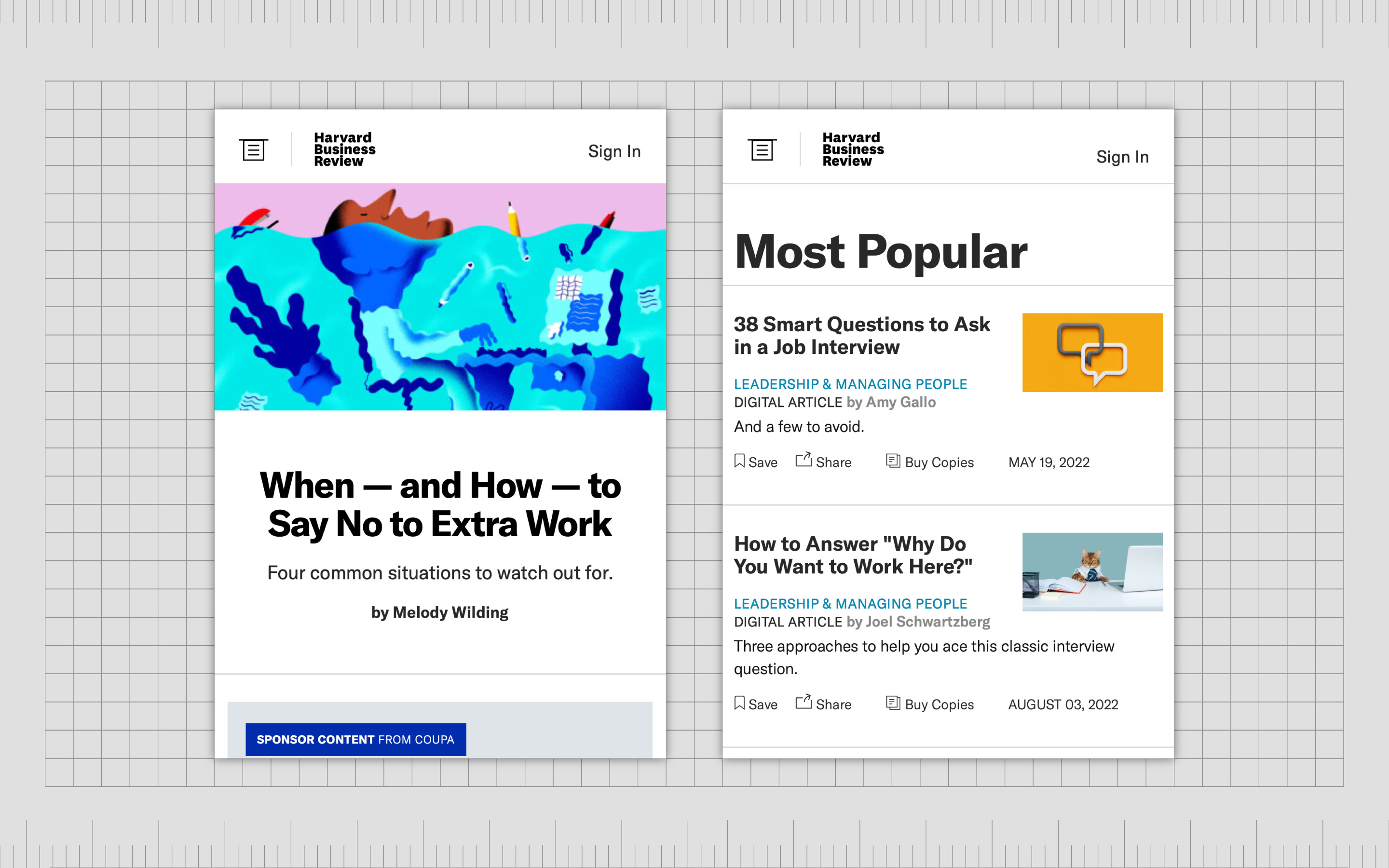
Harvard Business Review
The Harvard Business Review uses the same fonts and typefaces throughout all its pages to create a consistent and reputable image. The design feels like a standard newspaper and even has lines and columns to help you associate it with more traditional media.
Dropbox
Dropbox uses repetition in the form of the same style of images across its content.
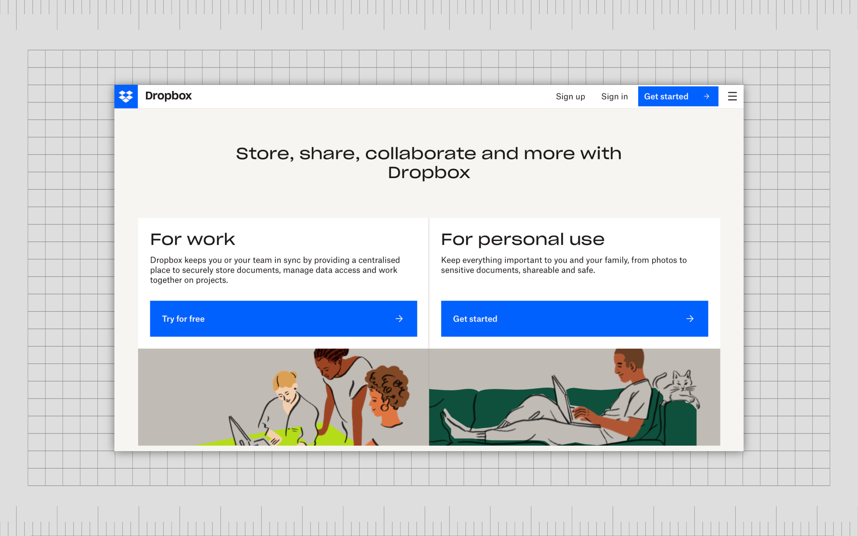
You see hand-drawn components wherever you go on the website, including in the animations the site uses to help demonstrate how the technology works. Dropbox also uses repetition in the form of colors and shapes. Every button on the site looks the same.
Asos
Asos also uses repetition on its website in different ways.
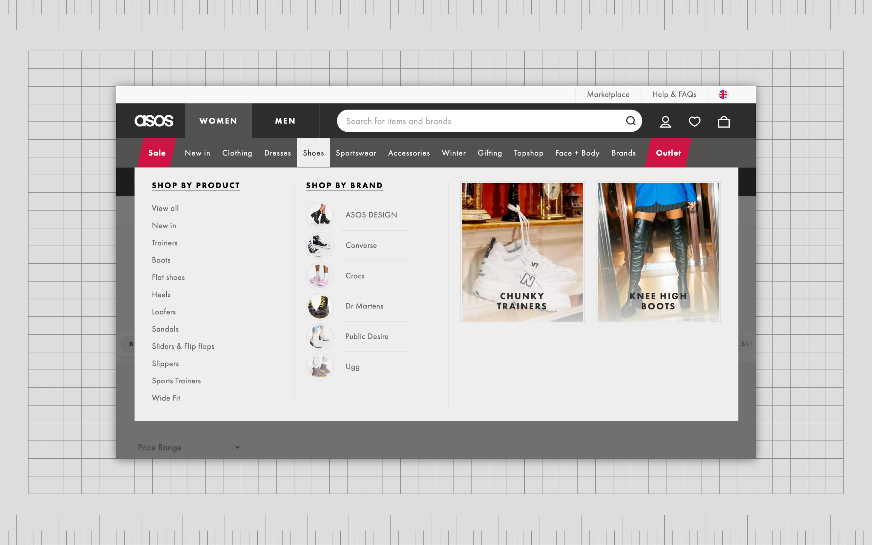
In the menu, the style of font and typeface is repeated, as is the use of certain shapes, like circles, to showcase the kinds of products available from each category. The company also uses repetition in its navigation, search bar, and logo, which all appear at the top of every page.
Using repetition in graphic design
Repetition in graphic design is just one of the powerful principles designers can use to transform their composition. The use of repetition is excellent for making an impact on your audience, leaving a lasting impression, or just strengthening the message your company sends.
You can use repetition to provide a consistent visual experience between parts of an app or website, making it easier for users to navigate your creation. You can also use repetition in design as a way of drawing attention to a particular area of content and to show relationships between blocks of content.
Also, you can use patterns and rhythm in backgrounds to add consistency, texture, and more, deploying them to deliver consistency between pages of the same type. Repetition can even create excitement and anticipation or help to guide a person through the hierarchy of a page.
Of course, the best way to ensure you’re getting the most out of the principles of design repetition is to speak to a graphic designer with full experience using this concept. Contact Fabrik to find out more.
Fabrik: A branding agency for our times.
Now read these:
—Introducing the principles of graphic design
—Understanding balance in graphic design
—Discover the alignment principle of design
—What is the hierarchy principle of design?
—Exploring the unity principle of graphic design
—Getting to grips with contrast in graphic design
—Understanding the emphasis principle of design
—What is the pattern principle of graphic design?
—Exploring the rhythm principle of graphic design
—Get ahead with the movement principle of design
—Why variety is an important factor in design
—How to bring harmony to graphic design projects
—The principle of white space in graphic design
—How to use the proportion principle in design

Clarity starts with a conversation.
Thanks—we’ll get back to you shortly.
Whether you're navigating a rebrand, merger, or simply need a clearer identity—we’re here to help. No hard sell, just honest advice from people who know the sector.
Let’s start with a simple question…
Prefer to email? Drop us a line.
Fabrik’s been helping organisations rethink and reshape their brands for over 25 years. We’ve guided companies through mergers, rebrands and new launches. Whatever stage you’re at, we’ll meet you there.