


Harmony in graphic design: Exploring the harmony principle of design
How would you define harmony in graphic design? Take a moment to close your eyes and imagine something you consider to be a “harmonious” composition. Are the colors well-balanced and complementary? Do the shapes and proportions work well together?
The harmony principle of design is one of the most important for artists and creators because it actually involves considering how a wide number of other design principles work together.
When you’re working with proportion, repetition, patterns, and unity in design, your overall goal is to create a sense of visual harmony suitable for your peace.
Harmony is balance. Harmony doesn’t have to mean a design looks peaceful and “pretty.” However, it does mean the elements are working together in unison.
Let’s take a closer look at harmony in design and how it influences us.
What is harmony in graphic design?
The harmony principle of design involves using the concepts of balance, alignment, unity, and relationship to make design components work seamlessly together. When it comes to graphic design, your work should generally have a sense of harmony to make it aesthetically appealing.
In a lot of ways, harmony is usually related to “unity” – another principle of design. However, there are some significant differences.
Harmony refers to the various elements of an art piece, or composition being arranged in relation to each other, to make a composition well-balanced and appealing. Alternatively, unity in graphic design refers to the holistic quality of a composition – something harmony contributes to.
Unity ensures all of the parts of a concept work to create a specific whole. It asks us to look at the “whole” of a piece and how the various elements work together to send a specific message or create a certain effect.
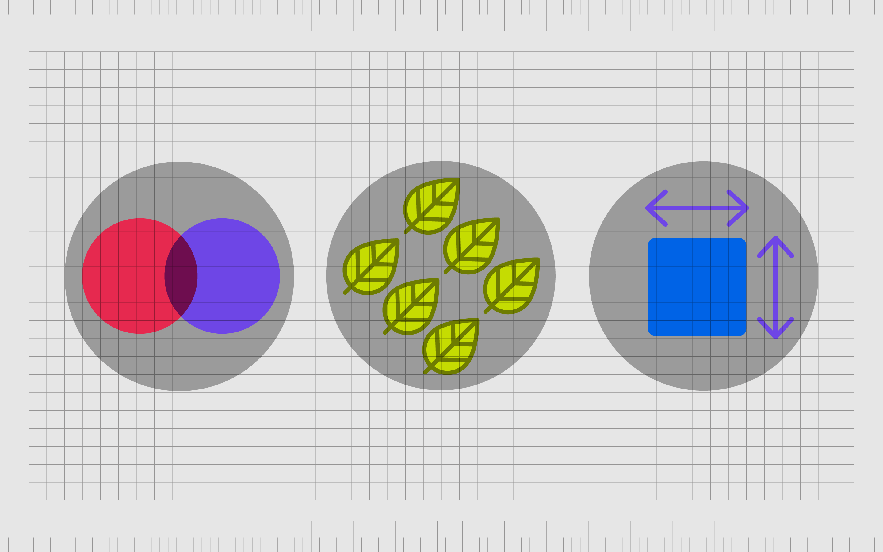
Visual harmony is often achieved through a balance of variety and unity. This could mean choosing complementary or contrasting color schemes to work in collaboration. Crucially, while the elements of the design can contrast, they do not conflict.

Definition of harmony in graphic design
The saying “the whole of an object is greater than the sum of its parts” is mathematically incorrect. However, from a visual design perspective, it makes sense because people are programmed to search for aesthetic comfort, familiarity, and patterns in design.
We combine objects together to create a coherent whole on instinct. When you see a tree, you don’t absorb the leaves, branches, and textures separately. You instantly recognize the tree because of the harmony in all of the elements working together.
Many experts define graphic design as a carefully considered balance of colors, elements (typography, imagery, and space), and even ease of use.
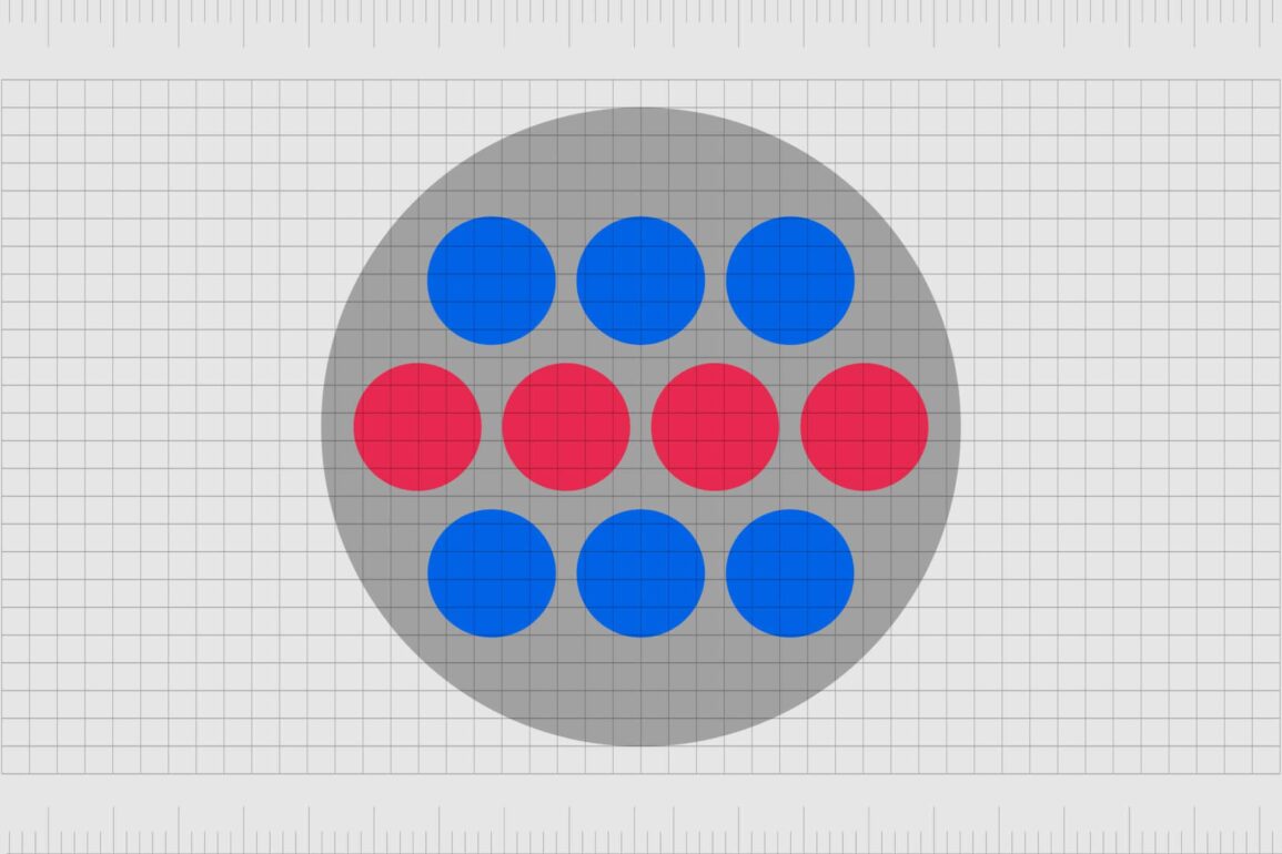
In web design, harmony ensures all of the parts of a website are working well together from a visual perspective. If the blocks of text were overlapping or constantly varying in size without rhythm or pattern, this would be disharmonious.
If every color on a page was in sharp contrast, with no repetition between shades, the image would look chaotic.
In simple terms, we can describe harmony in graphic design as the “opposite of chaos.”
Why is harmony important in graphic design?
Harmony is something we seek naturally as human beings. It affects how we view and understand the world, as well as the various compositions within.
Imagine you were designing your first website. There are plenty of information you want to convey on any site, from your personality as a brand to what you sell. If you dumped all of the information on one page without any rhyme or rhythm, the whole thing would be a mess.
Harmony helps ensures we group different pieces of content together, understand the visual hierarchy of a composition, and essentially consume content as intended.
In music, harmony is achieved when sounds are played in consonance, combining together into an appealing sound. In interface, web, or graphic design, the same harmony is achieved through concepts like typographic rhythm, structure, and relational color schemes.
With harmony in graphic design, experts can:
Send a specific message
Elements working in harmony can help convey an important message. Certain aligned shapes, like lines and rectangles, can create a sense of stability. Harmonious colors like shades of blue can build trust.
Improve user experience
Without harmony, we have chaos and clutter. With harmony, people can enjoy a more relaxing experience.
Align certain concepts
Harmony created between specific elements of a design can link those concepts together with unity and alignment. This lets us see which parts of a composition are related and which are separate.
Improve recognition
Aligned with repetition, harmonious elements can build a sense of familiarity and improve recognition. When we see wood, branches, and leaves combined together, we recognize a tree.
What is the principle of harmony in design?
The harmony principle of design is one of the various design principles to create a composition. Harmony is utilized alongside and as part of the other principles of design to create something compelling.
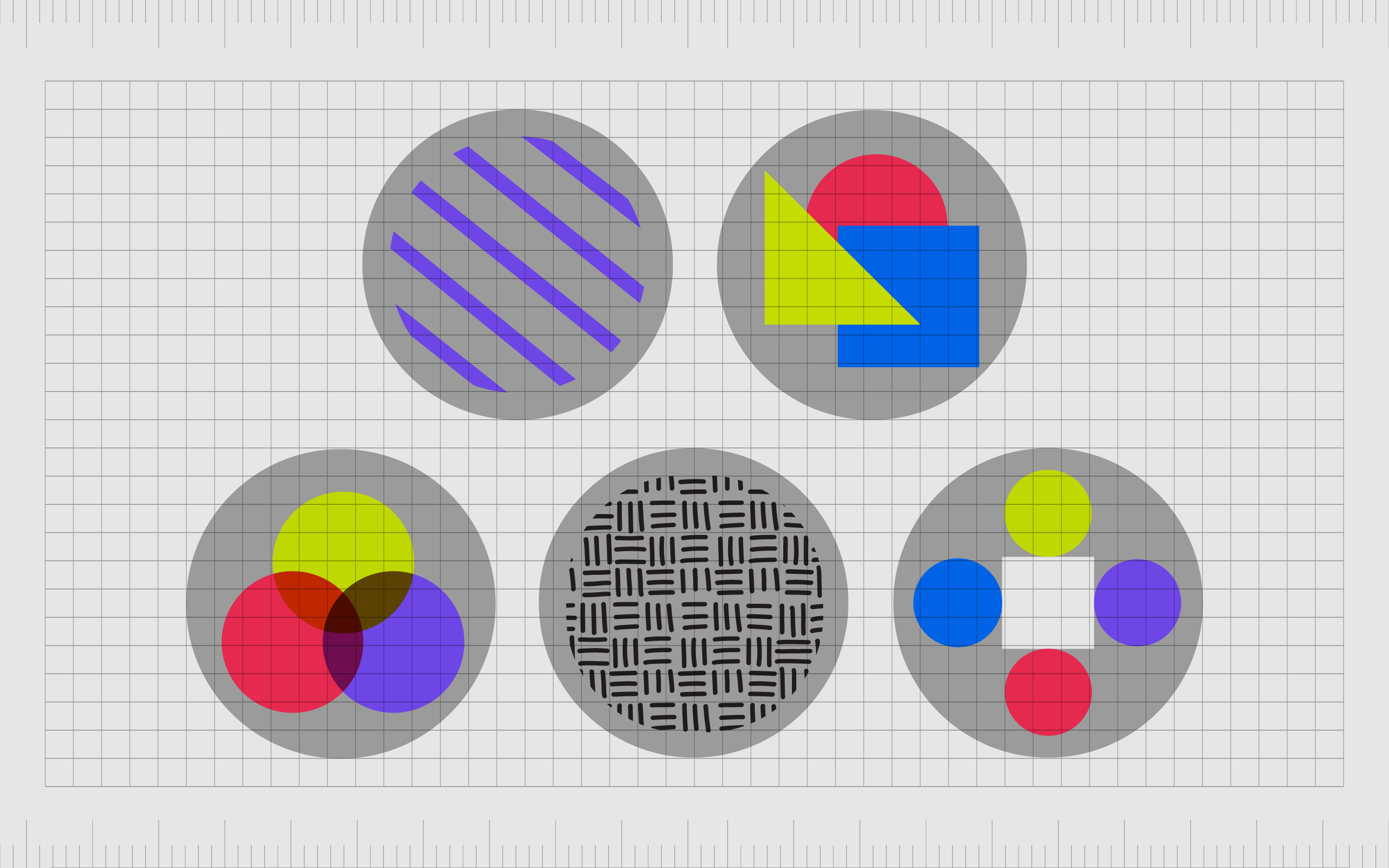
When looking at harmony in graphic design, we often examine multiple components of a piece, such as:
Lines
Lines are common in all forms of graphic design, from logo design to website creation. They can be dashed, crooked, diagonal, horizontal, or vertical, but they must always seem aligned with the rest of the composition to create harmony.
Shapes
Using different shapes can be harmonious or dissonant. A web page with square and rectangular boxes aligned in order will appear harmonious, even if there isn’t a clear pattern. It’s because the shapes contain angles that align them in harmony.
Color
Colors can work harmoniously together too. Though black and white are contrasting, they work well in harmony to create a clearer, more legible image. Certain shades of the same color can also create a sense of unity on a page.
Texture
Some textures feel naturally harmonious, like smooth surfaces and harsher ones working together to create a sense of balance on a page.
Space
This refers to the empty or white space around elements in a design. The right amount of space is crucial for harmony. Without space, elements start to blend together, which means the relationship between them is distorted.
The concept of harmony in design aims to use all of the elements of design, from movement and rhythm to emphasis and balance, together, to create a complete or coherent whole. To achieve this goal, designers need to have a clear vision of what they hope to achieve with a piece.
How is harmony used in graphic design?
Harmony is a special principle of graphic design because it’s something we’re always considering when experimenting with the other elements of design. Even when you’re using a concept like “contrast” in graphic design, ensuring it doesn’t overwhelm harmony is critical.
You might use contrasting shapes on a website page to draw emphasis or attention to certain elements. However, you would still ensure a sense of harmony between the elements, perhaps created through positioning, color choices, and repetition.
Some of the most common ways to leverage harmony in graphic design include:
Repetition
While repetition is a graphic design principle in its own right, it’s also an essential aspect of a harmonious design. Creating harmony means compiling pieces of a composition that appear to be in alignment with each other.
After all, what could work better with another element than a copy of itself?
Repetition grabs our attention and creates a sense of rhythm and comfort in a piece. Correctly using repetition can draw attention to specific elements in a composition while allowing the brain to relax and take in the image as a whole.
Visual echo
The concept of visual echo involves identifying the basic elements of design, like typography, color, and style, and finding a way to tie them together seriously. Visual echo creates a cohesive and clear message which feels appealing to the eye.
As an example, you can establish a color palette for a web page by looking at a company’s logo and extracting its primary colors.
Reflecting the same colors throughout the design, through typography, backgrounds, borders, and other elements, creates a sense of harmony and unity between the pieces. Visually echoing certain elements throughout a composition also provides emphasis.
When you use the same colors repeatedly on a page you emphasize color psychology. The color orange, used frequently throughout a design, even in different shades, will create a harmonious experience connected with excitement, creativity, and youth.
Thematic references
Thematic reference is another common concept used to create harmony in graphic design. This is also an extended version of visual echo. Thematic reference encompasses everything from the symbols and ideas related to your subject matter to the typography, color palette, and more.
If you were designing a leaflet for a company, you would choose a color palette in unison with the colors in the company’s logo. You could reflect those elements in the border of the leaflet, the heading font, and more.
Should the company be a computer brand, you can then draw attention to “technical” concepts throughout the page.
You might arrange the borders on a page to look like wires or make the whole design look like a computer screen. This pulls attention to the theme and aligns various elements to send a specific message about what’s being advertised.
What are the types of harmony in graphic design?
There are various forms of harmony in graphic design. The overall concept is usually referred to as “visual harmony,” but when we dive a little deeper, we discover the various components of harmony working together to create this alignment.
Here are a few examples:
Color harmony in graphic design
Color harmony is one of the most common ways to create relationships between components and make a composition feel whole and unified. There are a number of color theories designers can use to create harmonious color.
One option is to use consistent, complementary colors. If you wanted to create a beautiful, harmonious leaflet, you might use multiple shades of purple throughout the image.
You can also use “split complementary colors” or using a color placed alongside your primary shade within the color wheel. Red and purple work well together, as do purple and blue.
Other designers create harmony with analogous color schemes, featuring colors in close proximity on the color wheel, like red and yellow.
Color associations can also make an impact on visual harmony.
If the choice of color makes sense for the topic, it’s more harmonious. A certain subject or place will have specific color associations. A company associated with nature will more likely be linked to shades of green.
Forms and marks
Experimenting with forms and marks is common in art, especially because the human eye doesn’t see every detail all at once. To ensure the forms and marks in your piece, such as lines and organic shapes, are harmonious, you’d need to consider how the eye moves through a composition.
Designers can move an eye through the page in harmony by using the right amount of white space between elements and using harmony in edges. You may also use hard and soft edges, lost and found edges, and so on to ensure the eye can move naturally from one piece to another.
Soft edges are often used to indicate distance, while harder edges can tell a viewer what to focus on in a composition first. Even related textures in a piece can help to bring harmony to a design.
Using the example of a company associated with nature, we may use patterns of flowers, vines, or even the veins on a leaf.
Shapes and proportions
Shapes with similar characteristics are generally deemed harmonious. Even if the boxes used to display blog posts on a website’s home page are slightly different in size, they still have the same lines and edges. We can also create harmony by using different shapes in consistent proportions.
When we break free from similar shapes and proportions in a design, this creates disharmony. While this isn’t always a positive thing in design, it can be a valuable way to create emphasis. The key is to ensure the disharmonious element still has a link to the rest of the page.
Even if you want a CTA button to stand out by being larger and bolder than the rest of the page, it’s still important to make it looks like it belongs in your design.
How to use harmony in graphic design
Using harmony in graphic design is something you’re likely to find comes easier with time. The more you observe the way elements work together in a composition, the more you can naturally perceive where harmony is and isn’t present.
The important thing to remember is though disharmony can create emphasis in some cases, it’s critical to ensure some level of harmony in most designs. Whether it’s a logo or a website page, harmony can help tie your design together.
A few ways to use harmony in graphic design include:
Focusing on symmetry
Things generally look neater, cleaner, and more harmonious when there are elements of symmetry involved. Creating a balance between the use of symmetrical colors, shapes, and other elements throughout your design can help to boost harmony.
It’s also a good way to give your design a sense of repetition, pattern, and unity. Just be careful not to go too far with symmetry, as this can sometimes make a design look boring.
Be careful with color
Color is often a huge aspect of a successful graphic design. When it comes to visual harmony, it’s important to ensure the shades you’re using work well together. This doesn’t necessarily mean all of your colors need to belong to the same shade, however.
You can also use analogous color schemes and shades next to each other in the color wheel. Contrasting colors can also create harmony in some cases.
Remember thematic reference
When you’re wondering whether the elements of your design work together in a harmonious way, it’s worth thinking about the theme and purpose of the design.
Consider what you want to convey with the image and whether the various components of your piece send the same message.
Barbed wire and flowers wouldn’t necessarily go together harmoniously. However, a lack of harmony, in this case, could have a shock factor which is useful for some brands.
Examples of harmony in graphic design
Simply put, harmony in design refers to the cohesiveness between all elements of a composition.
While the elements in the composition don’t have to be exactly the same, they need to be related in some form. Color palettes and similar textures, shapes, or even the use of white space will create a sense of alignment between objects.
We can see applications of principles of design harmony in any graphic design online. The example below might look like there are a lot of disparate elements at a glance, but the use of similar fonts, shapes, colors, and lines all create harmony in the piece.
Take a look at a page of product listings on any ecommerce site. Although the contents shown for each page may vary, the surrounding elements are consistent.
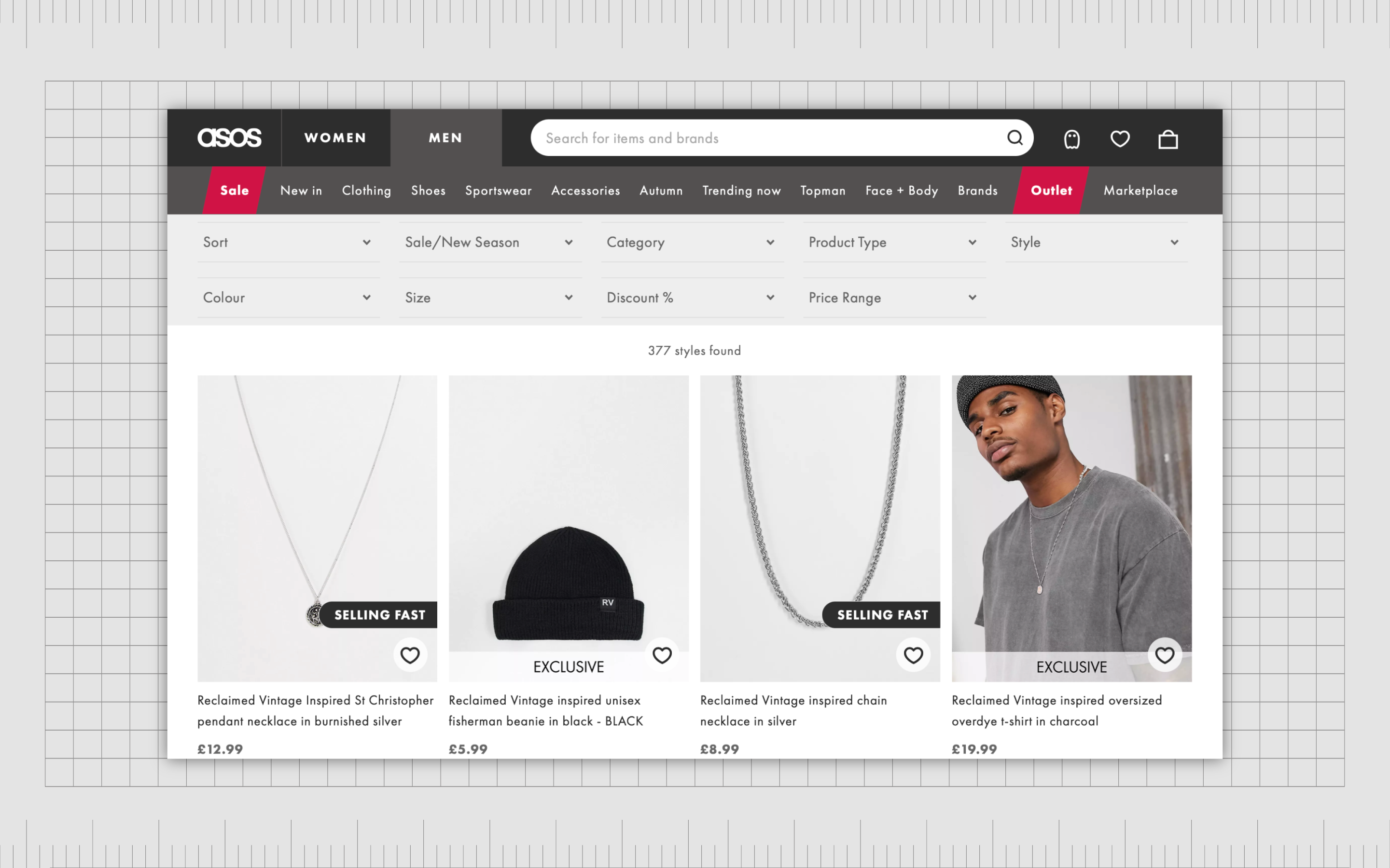
Designers show images in the same shape or size as thumbnails, followed by details that remain the same for each product. You might see a product name and a price with equal white space between them.
Understanding harmony in design
Harmony in graphic design might seem like a complex concept at first. However, it’s actually much simpler than most people realize. The whole purpose of harmony in design is to align the elements of a composition to create a coherent whole and a complete message.
Creators simply need to think about the message they’re trying to communicate to achieve harmony in graphic design. Once the goal or message of the design is established, start making the elements you choose and the principles of design harmony you apply conform to the central theme.
True coherence, unity, and harmony are achieved when every element plays an important part in sending the right message. Everything in your composition should be essential to making the design work.
While creating this sense of harmony isn’t always easy, it’s important to ensure your creation has genuine value.
Fabrik: A branding agency for our times.
Now read these:
—Introducing the principles of graphic design
—Understanding balance in graphic design
—Discover the alignment principle of design
—What is the hierarchy principle of design?
—Exploring the unity principle of graphic design
—Getting to grips with contrast in graphic design
—Understanding the emphasis principle of design
—Discover the repetition principle of graphic design
—What is the pattern principle of graphic design?
—Exploring the rhythm principle of graphic design
—Get ahead with the movement principle of design
—Why variety is an important factor in design
—The principle of white space in graphic design
—How to use the proportion principle in design

Clarity starts with a conversation.
Thanks—we’ll get back to you shortly.
Whether you're navigating a rebrand, merger, or simply need a clearer identity—we’re here to help. No hard sell, just honest advice from people who know the sector.
Let’s start with a simple question…
Prefer to email? Drop us a line.
Fabrik’s been helping organisations rethink and reshape their brands for over 25 years. We’ve guided companies through mergers, rebrands and new launches. Whatever stage you’re at, we’ll meet you there.