How to design a construction company logo: Building an attractive construction brand
Learning how to design a construction company logo is one of the most important first steps in building your own business. Your construction company logo is more than just a way to differentiate your brand from other organizations in your industry.
It also helps you to attract attention from your target audience and form emotional connections with customers.
For most brands, the logo will be the first thing consumers see when searching for the right company to work with. It can instantly convey that your business is trustworthy, credible, and authoritative with the right selection of fonts, colors, and shapes.
However, designing a great construction logo isn’t as simple as it seems. Even the smallest error could mean sending your audience the wrong message. That’s why some of the biggest, most successful construction brands rely on brand strategists and expert designers to help them.
Today, we will look at the steps you’ll need to follow to ensure your construction logo impacts your target audience.
Let’s start building.
What makes a good construction company logo?
Before you can start learning how to make a construction company logo for your own brand, it’s worth defining what makes a logo effective in the first place.
Take a look at some of the most famous construction brands in the world today, and you’ll notice there’s no one-size-fits-all strategy for producing a compelling logo. Some organizations rely entirely on carefully-crafted wordmarks, while others use symbols and shapes to capture audience interest.
Depending on your construction brand, you can experiment with different types of construction company logo ideas. However, regardless of what design method you choose, your logo should usually have the following characteristics.
A great logo needs to be:
Evocative
The best logos have meaning. They tell a story about not just what your brand does but how it does it. In the construction industry, a great logo will tell your audience how credible, authoritative, and trustworthy you are.
It should help you to convince your customers that they can rely on you to deliver amazing experiences.
Unique
Though this might seem obvious, it’s surprisingly common for many construction brands to end up with a relatively generic logo. In an industry with so much competition, you may end up creating a logo that looks too similar to something produced by another brand.
Wherever possible, it’s crucial to make your emblem stand out.
Simple
While complex logos can work well in some industries, most construction customers are looking for simplicity. Avoid trying to be too clever or artistic with your logo. Instead, focus on getting your message across in the simplest way possible.
Versatile
A good logo, just like a great brand name, will grow and evolve with your business. The design you choose shouldn’t be too restrictive. It needs to be versatile enough to adapt to a changing marketplace. Look for something modern and timeless. A great brand logo designer will be able to help you.
Professional
Although it might be tempting to use a very basic placeholder logo to save money on your branding processes, the more “homemade” your logo looks, the more it’s likely to drive away customers. Ensure your design appears to be professionally made, with refined shapes, lines, and colors.
Above all else, the best logos for construction companies will inspire trust and dependability. It should resonate with your target audience, highlight your unique values, and work well across a range of mediums (print, digital, etc.).
How do I design my own construction company logo?
When figuring out how to design a construction company logo, many companies make the mistake of jumping into the sketching and ideation process straight away. It’s tempting to start mocking up designs immediately, particularly if you have a creative mindset.
However, as one of the core elements of your brand identity, your logo design isn’t something you can afford to rush.
You’ll need to start by doing some research to ensure your logo is going to resonate with your target audience and differentiate your company from other competing brands.
Here’s how you can get started.
Step 1: Define your brand identity
A logo isn’t just an eye-catching image. It’s a reflection of what your company is and what it stands for. With this in mind, it’s worth taking some time to think about the kind of identity you want to create for your organization.
In other words, what do you want customers to think and feel when they encounter your logo? Sit down with your team and write a list of words you want to be associated with. You might choose terms like “credibility” or “authority.”
Knowing exactly what kind of personality you want to build for your business will help you to come up with construction company logo ideas that are relevant to your brand. Think about the kinds of shapes, colors, and components that will reflect your core values and vision.
Step 2: Find your target audience
The chances are your construction company operates in a specific niche. There are many different ways to build a construction brand. Some companies focus on remodeling and renovating houses for the residential community, while others offer consultation and support to businesses creating offices.
You should have a basic idea of what your niche is and who your target audience will be as a result.
Creating a set of user personas that outline the goals, pain points, and demographics of your customers can help you to create a logo that’s more meaningful and evocative for them. You might even consider doing some in-depth research with focus groups and surveys.
The more you know about your target audience, the more effective your logo will be.
Step 3: Examine the competition
Competitor analysis can be a valuable tool for logo design for a couple of reasons.
First, it gives you a chance to examine the other businesses in your space and define what your USP is going to be. Ask yourself what’s going to set your organization apart from the other contractors and construction brands in your niche. What’s going to push your customers to choose you over them?
Secondly, a competitor analysis gives you a chance to evaluate the logos of other businesses and ask yourself which elements you want to replicate and which you want to avoid. While it’s fine to seek inspiration from other companies, you’ll need to ensure your logo is unique and specific to you.
Try to avoid using shapes and formats that look too similar to anything else on the market. This could confuse your audience and even lead to legal issues in the long term.
Step 4: Set your logo budget
While it is possible to create a basic logo for free using a logo generator, the chances are you’re going to need to invest at least a little money in getting a great design. Free “generated” logos rarely offer the unique qualities you need to make your business stand out.
If you want your logo to be timelessly engaging and effective, you need to be willing to spend some cash.
Research the cost of working with different logo designers, and ask yourself how much you can reasonably afford to commit to your logo design.
This might be a good time to think about other related costs, too, such as designing a website for your brand, creating letterheads and business cards, or even producing marketing collateral with your new logo.
Step 5: Consider your style preferences
Once you’ve gathered as much information as you can about your target audience, competitors, brand, and budget, the next step is thinking about the style of logo you want to create.
As mentioned above, there are many different types to choose from. You might opt for an abstract logo to highlight a more modern brand or use a combination mark to convey more information.
There’s no one-size-fits-all strategy for choosing the right type of logo.
However, if you’re starting a new brand, it’s worth remembering that having your name in your logo can usually be a good idea. Most of the time, graphic-focused logos are best suited to companies that already have an established presence in their industry.
Adding your name to your logo can be a good way to improve brand recognition and awareness while you’re still growing.
What are the best fonts for construction logos?
Once you’re done with your research, you can begin to look into the components that are going to make up your design. The most common elements of any construction company logo are fonts, colors, and shapes. Let’s start by looking at your font options.
The typeface you choose for your logo is more important than most businesses realize.
Not only does it have an impact on your customers emotionally, but it can also determine how easy it is for people to recognize your emblem. Any great logo font needs to be legible and easy to read in any format. With that in mind, you may want to stay away from overly decorative fonts.
Typefaces can also provide insight into the personality of your company. A sans-serif font is more likely to be perceived as modern and approachable. On the other hand, serif fonts can convey ideas of professionalism, heritage, and sophistication.
In some cases, you might decide to play around with hand-written fonts, which can make your organization appear more fun and friendly.
In most cases, it’s best to stick with a simplistic font palette. Use only a couple of typographies at most, and make sure they’re easy to read. Look at things like contrast (to ensure your font stands out well on any background) and positioning.
You may choose to place your wordmark on two or three lines, depending on the length of your name.
A good logo designer will be able to work with you on things like kerning, spacing, and positioning to make sure your font looks clean and professional.
What are the best colors for construction logos?
Color is one of the most important things to consider when coming up with construction company logo ideas. Color psychology tells us certain shades are associated naturally with specific emotions and feelings.
Most people find blue calming, professional, and reliable. Red is a color typically associated with power and passion.
There’s no perfect combination of construction company colors that work well for every business. The tones you choose should be relevant to your brand identity and the personality you want to convey.
If you’re focused on sustainable construction, you may choose to use colors like green to connect your business to the natural world. If you’re trying to convey a fun and confident personality, you could experiment with shades like orange and yellow.
White and black are some of the most common colors linked to the construction landscape, as they demonstrate control, power, cleanliness, and simplicity.
When choosing your color palette, it’s worth keeping things simple. Avoid choosing too many colors, as this can make your design seem a little overwhelming. Select a handful of shades that work well together, like blue and white or green and black.
Remember, colors come in a range of temperatures and shades, so it’s worth working with a few different designs to see what works best.
Keep in mind contrasting colors are often a good choice for logo designs, as they help to make the overall image more legible and impactful.
How to design a construction company logo: Shapes
Once you’ve figured out your color and font options, the next step is thinking about shapes, lines, and icons. Not every logo will necessarily include shapes, but they can be a fantastic way to provide your customers with extra information about your business.
Some shapes and icons will naturally link themselves to the construction industry. However, it might be a good idea to stray away from generic shapes like houses, hammers, and similar options.
Triangles and squares can be good options for construction company logo ideas because they can evoke specific emotional responses. Triangles convey innovation and forward motion, while squares are associated with stability and organization.
Straight lines can also be extremely useful when you’re figuring out how to make a construction company logo stand out. A line can draw the eye to specific points in a logo design and make the overall image appear complete and more consistent.
Curved and wobbly lines should usually be avoided, as they’re seen as more playful and casual.
When experimenting with geometric shapes and imagery, your goal for a construction company logo design should be to tell a story.
Use the right graphical components to provide insight into your business and what it does. Sometimes, a simple image can be all it takes to convince your audience they’re looking in the right place for the services they need.
Should I add a tagline to my construction logo?
The best construction company logo ideas are designed to provide potential customers and lead with as much information as possible about your business. Usually, selecting the right combination of construction company fonts, colors, and shapes will have the desired effect.
However, many new and established construction brands also experiment with slogans and taglines.
These tools provide a unique way to add some extra detail to your logo, which can differentiate you from competing businesses, and evoke strong responses in your audience. The right slogan can even make your logo more memorable, particularly when it’s used with the correct marketing campaigns.
Adding a tagline to your logo is a way to tell your customers more about your values and visions without implementing too much extra detail into your brand name or logo. If you choose to take this approach, it’s important to ensure your tagline is short, sweet, and straight to the point.
Examples of construction company taglines might include:
- Building a better future. One brick at a time.
- Solid foundations, strong results.
- Building your vision for tomorrow.
- Homes that stand the test of time.
- Make your house a home.
- Quality. Safety. Reliability.
Coming up with a great tagline can be a complex process, so it might be worth looking into getting some extra help. Branding experts capable of offering naming and logo creation services can often assist with slogans and taglines too.
Should I use a free logo generator for my construction logo?
When learning how to make a construction company logo, you’re likely to encounter a handful of online “logo generators” and free logo makers that promise to make the process a lot easier.
If, like most construction business owners, you’re keen to get your business up and running as quickly as possible with minimal investment, you might be tempted to take this route.
Logo generators have a number of pros and cons to consider. They do allow you to create designs a lot faster and often at a fraction of the price of hiring a professional. However, they’re also extremely limited.
Even the best logo generators will only give you a handful of shapes, fonts, and color options to choose from. This means you’re likely to end up with something pretty generic.
In some cases, a logo generator could be a good option for businesses in search of the initial inspiration. They can give you ideas to take with you to an official logo designer, so they have something to build from. However, most of the time, they’re not a good choice for creating an official logo.
When you use a logo generator, you’re really just mashing together a number of the same components countless other companies could also be using. You’ll end up with a design that doesn’t fully represent your brand or help to disconnect you from your competitors.
We’d always recommend considering a professional logo designer instead. While they might cost more initially, they will be more likely to produce a long-lasting, appealing logo for your business that really makes an impact on your target audience.
You could even save money in the long term because you won’t have to rebrand your entire business when you discover your generated logo isn’t having the right effect.
Construction company logo examples
As mentioned above, one of the best ways to start your logo design journey is to check out the competition. Examining other attractive logo designs in the construction landscape can give you an idea of what kinds of shapes, colors, and fonts work best for your industry.
Here’s a handful of construction company logo examples worth checking out:
1. Wates Group
Simple and professional, the Wates Group logo conveys sophistication with the use of a simple, serif-style font. The company has used a combination of green and turquoise colors to deliver a vibe of credibility, growth, and innovation.
By choosing turquoise instead of blue, Wates also separates itself from many of the other construction companies in its industry.
2. Caterpillar Inc
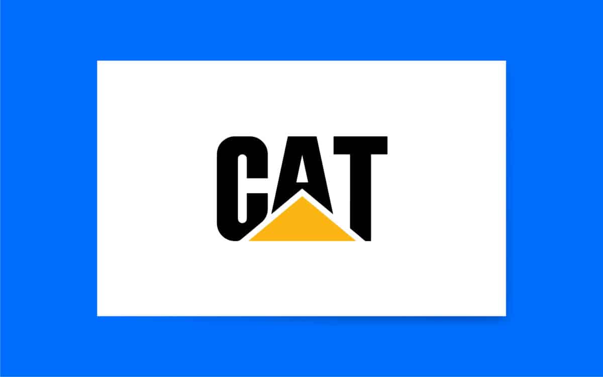
CAT, or Caterpillar Inc, has one of the most recognizable logos in the construction industry. The company’s eye-catching and bold font immediately grabs the attention of its audience.
The combination of black and yellow also links the business to the construction space, and the safety signs are usually leveraged around a building site. The triangle shape conveys strength and organization.
3. Skanska
Swedish construction company Skanska makes a lasting impact with its logo. The color blue is a common choice in the construction landscape, as it’s so often associated with credibility and reliability. This logo is simple and easy to read on any platform.
It takes advantage of a modern sans-serif font, using all uppercase letters to convey stability.
Designing amazing construction company logos
Learning how to design a construction company logo that stands out in your industry can be time-consuming and complex. However, it’s also one of the most important things you can do to ensure you’re setting your business up for success.
The right logo will capture your customers’ attention, strengthen your impact on the industry, and improve your chances of outshining the competition.
If you’re struggling with logo design, the best thing you can do is seek the support of the right experts. A good construction company logo company with expertise in your industry can ensure you create the right image from day one.
Don’t rush through the logo design process. Treat building your visual image carefully, and you’ll benefit from a stronger brand for years.
Fabrik: A branding agency for our times.
Now read these:
—5 step guide to starting a construction business
—Essential tips for construction company naming
—Your guide to branding a construction business
—Effective strategies for construction marketing
—Biggest construction companies and their logos
Clarity starts with a conversation.
Thanks—we’ll get back to you shortly.
Whether you're navigating a rebrand, merger, or simply need a clearer identity—we’re here to help. No hard sell, just honest advice from people who know the sector.
Let’s start with a simple question…
Prefer to email? Drop us a line.
Fabrik’s been helping organisations rethink and reshape their brands for over 25 years. We’ve guided companies through mergers, rebrands and new launches. Whatever stage you’re at, we’ll meet you there.


