When was the Batman logo created?

If you’ve ever asked “when was the Batman logo created?” you’re in the right place. Today, we’re going to explore the history of the Batman logo, and provide the definitive guide to the Batman symbol, and how it’s changed over the years.
Among pop culture icons, few images are as memorable or iconic as the Batman logo. The symbol has become more than just an icon for a comic book superhero over the years.
Like the Rolling Stones logo, or the Pokémon poke ball, the Batman logo has become a symbol of a huge fandom.
While aspects of the Batman logo have remained similar over the years, the symbol has gone through various transformations since we first discovered the caped crusader back in 1939.
Here’s your introduction to Batman logo evolution and history.
History of the Batman logo: Initial designs
Before we can dive into the evolution of the Batman logo, let’s start with a look at its origins. The Batman logo design first appeared on the outfit of Batman himself in Detective Comics Number 27.
The design in the first comic was pretty difficult to follow, with the number of points on the wings changing from one page to another.

During the same year as the original Batman logo’s arrival (1939), the design was updated to something a little more detailed, this time featuring seven points on the bat wings, a small bat head and a set of pointy ears. It was another year before the next change occurred.

In 1940, Batman earned his own comic book series, taking him outside of the Detective Comics series and into a new world. The transition came with a new logo, this time featuring even more details, including an enhanced head on the top of the bat, and blue outlines in the wings.

In 1941, the image simplified again, returning back to the five-point batman wings, this time with a more angular finished look. Clearly, the Batman emblem had a few issues with identity during the early years, and those problems continued to accelerate as the character grew more popular.
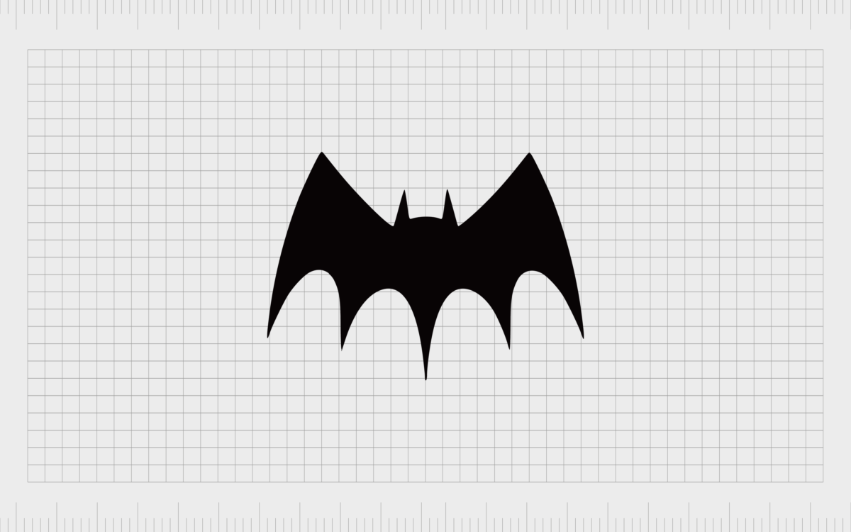
By the time Batman first arrived on screen in 1941, the new Batman symbol was a world away from what most fans were used to. This new image came with interesting outlines and extended points on the wings of the iconic bat.
Though this image isn’t popular among Batman lovers today, it did mark a slowdown in the number of changes to Batman logos for a while.

Batman logo evolution: Discovering the Batman emblem
The evolution of the Batman logo continued in 1946, with the introduction of a design quite close to the one most people became familiar with in the 1960s. This image shared the standard 5-point bat wings of the original logo, with a slightly wider stance.

In the 1950s, the Batman logo design switched to a slightly more curved shape, with the wings angled to appear more as though they were in motion. The image maintained the same sharp ears of the most recent previous logos, along with a strong central point in the middle of the wings.

By 1958, the Batman logo had changed back to its inverted curve on the top of the wings, and the five points of the wings were increasingly spread-out, making them look closer to spikes. The height of the head raised slightly, though only for a short time.

In 1960, perhaps one of the most popular batman logo symbol options emerged – one many people continue to associate with Batman to this day. The wings changed once again, with much less of a sharp gap between each point.

In 1964, the first major change to the Batman logo colors appeared, with the yellow background bringing the symbol to life. At first, the creators just placed a yellow oval behind the traditional batman symbol.
According to the editor, the yellow was to visually distinguish the new “golden era” of Batman from the previous image.

In 1966, the shape of the Batman logo inside the yellow oval changed to fill the space more completely. The result was the most iconic Batman symbol to date.
The head and ears in this emblem became far more pronounced, and the yellow oval remained to help differentiate the new age of Batman.
This was the image which continued to appear in the Batman comics all the way to the year 2000, although various movies, animated series’ and other versions of the Batman brand experimented with different logos.

The Batman logo emblem: A few memorable mentions
Though the official comic book logo for Batman remained the same for a long time after 1966, there were various alterations made to the appearance of the symbol in other media. Adam West’s infamous interpretation of Batman used a similar design, with slightly less defined bat.

In Batman: The Dark Knight Returns (the comic series), Frank Miller allowed the Batman logo to expand to cover the entire chest of the caped crusader.

Batman: Year One, another comic created by Frank Miller also came with a similar logo – this one much sleeker and sharper than the previous design:
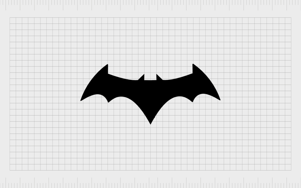
The Batman movies throughout the years included a variety of different variations on the Batman emblem, including:
1989: Michael Keaton’s Batman

1992: Batman Returns

1995: Batman Forever

1997: Batman & Robin

2005: Batman Begins

2008: The Dark Knight & The Dark Knight Rises

2016: Batman v Superman: Dawn of Justice
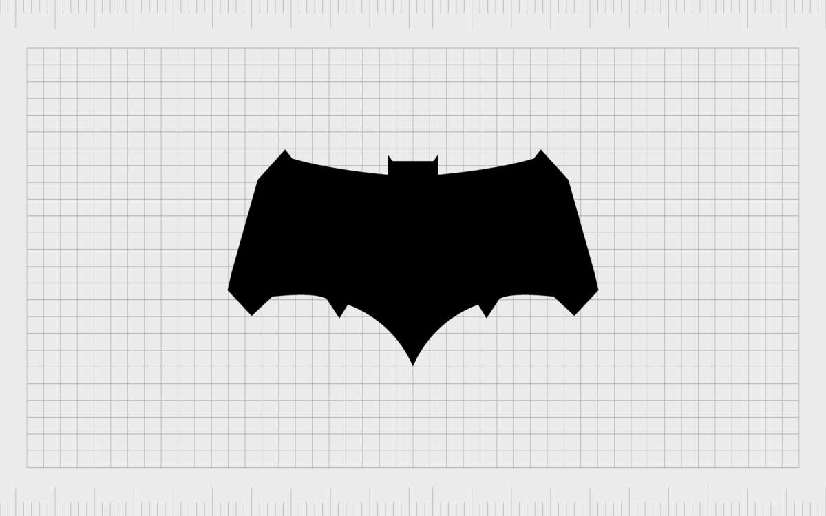
2017: Justice League

Current batman logo font, colors and more
The Bat symbol has evolved countless times over the years, adapting to suit different movies, tv shows, animated series’ comic book collections, and even games.
Currently, the most iconic version of the Batman logo is still the one from 1966, with or without its yellow background.
There have been a few whispers about a new Batman logo coming to the forefront in the cinematic landscape, but it remains to be seen how much of an impact this symbol will have.
No matter which Batman logo you prefer, it’s safe to say the meaning behind the emblem remains consistent anywhere.
The Batman symbol today isn’t just the symbol of a boy who lost his parents and grew up to fight crime with the image of a bat. This symbol is an icon of bravery and strength loved by superhero fans around the world.
You can find a wide range of Batman logo versions here.
Batman logo emblem
The Batman logo also includes the shape of a bat as the central icon, although the shape has changed multiple times. Usually, the Bat graphic is defined by five points on the bottom, with a defined head and pointed ears.
Batman logo colors
The primary color for the Batman logo will always be black. When the yellow background was introduced to separate the new Batman from its predecessor, the color yellow was chosen as a bright beacon of hope, similar to the Bat signal in the comic stories.
Batman logo font
The Batman logo rarely includes a font, though various font options have been explored for the comics, television shows and movies within the brand ecosystem. The font differs drastically from one iteration to the next, but often features block capital letters.
The history of the Batman logo
We’ve only touched on the Batman logo evolution in this article. There are dozens of different versions of this emblem spread across the web, depending on where you look.
We’ve had unique Batman logos for video games in the digital era, as well as unique drawings of the Batman logo in various comic book series and movies.
Even if a new Batman logo is introduced for the movie universe, there’s a good chance the iconic symbol of Batman will remain the same for the people who have already chosen their favorite version.
After all, despite years of changes and variations, it’s the yellow-oval-filling bat shape from 1966 many people still associate most with Batman.
The Batman logo may be an example of one of those rare pieces of which allows everyone to maintain their own unique preference. You may still remember the first time you encountered the caped crusader, and the emblem you saw that day.
Fabrik: A branding agency for our times.
Now read these:
—An in-depth look at the Fortnight logos
—The story of the Pokémon logo symbol
—Understanding the Nintendo Switch logo
—The Microsoft logo history and evolution
—Explaining the Van Halen symbol
—The story of the Rolling Stones logo
—Exploring the Stranger Things logo
—The LA Lakers logo and symbol
Check out these fantastic logo design resources:
Clarity starts with a conversation.
Thanks—we’ll get back to you shortly.
Whether you're navigating a rebrand, merger, or simply need a clearer identity—we’re here to help. No hard sell, just honest advice from people who know the sector.
Let’s start with a simple question…
Prefer to email? Drop us a line.
Fabrik’s been helping organisations rethink and reshape their brands for over 25 years. We’ve guided companies through mergers, rebrands and new launches. Whatever stage you’re at, we’ll meet you there.


