


Understanding the Nintendo Switch logo and symbol

Have you ever wondered where the Nintendo Switch logo came from? More importantly, have you ever considered why the logo looks like it does?
Since its arrival in the gaming landscape, the Switch logo has generated a lot of attention and conversation among brand specialists and visual designers. Why? Because it’s not symmetrical.
Take a closer look at the logo on your Nintendo Switch box, and you’ll discover one of the “joy con” controllers is actually slightly larger than the other. This design decision contrasts with the physical design of the Switch console and its controllers (which are identical in size).
So, why did Nintendo make this controversial decision?
Here’s your guide to the Nintendo Switch logo, and where it came from.
Who created the Nintendo Switch?
Before wee look at the Nintendo Switch logo in depth, let’s take a closer look at the Switch console itself, and where it came from.
The Nintendo Switch is the latest console from Nintendo at the time of writing, having initially released in 2017. The product was created by the Nintendo brand overall, but it was Yoshaki Koizumi who served as the general producer for the Switch console during its initial development.
According to Miyamoto of Nintendo, the Switch’s development was actually overtaken by a lot of younger employees in the team. The youngest members of the Company wanted to put forth and create a new design for the future of gaming, and as such, the Nintendo Switch was born.
Originally, the Switch was going to be called the Nintendo NX, but the name quickly changed to “Nintendo Switch” before the release date in March 2017.
A closer look at the Nintendo Switch logo
Nintendo are no strangers to fantastic logo and product design. For decades, Nintendo has captured the hearts and minds of customers with a simple wordmark placed inside of an oval for their primary trademark.
However, consoles, like the Nintendo Gameboy would also have their own symbol to generate audience attention and familiarity too.

The Nintendo Switch is no exception. Originally released in most regions around the world in March 2017, the Nintendo Switch was the next generation console many gamers had been waiting for.
Perhaps this is why the Nintendo brand decided to use a graphic in the logo to accompany the “Nintendo Switch” wordmark, written in the traditional “Pretendo” style font.
The Nintendo switch symbol sits above the standard “Nintendo” wordmark on the box of your device, and it’s also present on the game console’s controller grip, screen, and charging dock.

Nintendo Switch symbol meaning: What is the Switch logo?
At first glance, the logo simply seems to be a version of the two sides of the Nintendo Switch controller. The detachable joy cons represent the main selling point of the item – it’s something you can use as either a hand-held, or tabletop console.
Nintendo was the first company to successfully bring a two-in-one device like this one to the market. The switch represented a new era of gaming, where users could access high-quality television-based gaming, and handheld play in one system.
It made sense the Nintendo team would want to convey this in the Nintendo Switch symbol design.
The current Nintendo Switch logo was an evolution on the previous “Nintendo NX” concept, debuted alongside the Sonic Forces during a Nintendo conference. Fortunately, Nintendo quickly changed its mind for the name of the device, and the accompanying image.

The present Nintendo Switch logo features the following elements (you can find resources for this logo here):
- Nintendo Switch logo color: The color of the Nintendo switch logo in marketing campaigns is usually a white graphic and font on a red background. This color scheme adapts to suit the color of the devices the logo is printed on.
- Nintendo switch logo font: Nintendo Switch’s font is a custom designed typography, like the word mark for the Nintendo brand. However, the logotype is quite similar to a font called Pretendo, which is available online.
- Nintendo switch logo shape: The Nintendo Switch logo removes the oval usually around the Nintendo lettermark. The icon represents two Switch controllers in contrasting colors (one red with white details, and one white with red details).
Why are the Switch logos asymmetric?
The Nintendo logo chosen for the switch is an obvious example of a company trying to pull attention to the unique selling point of their product. The Switch shook up the handheld console world forever, and the Switch joy con help to demonstrate this.
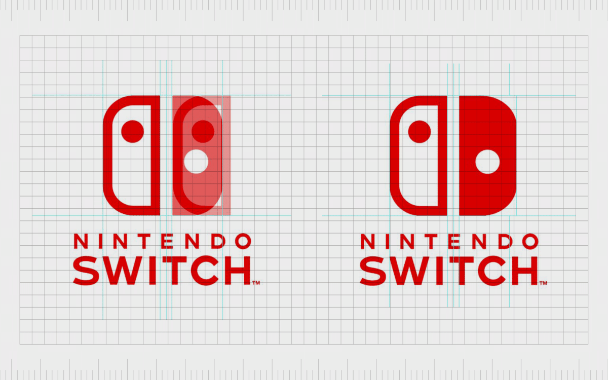
However, surprisingly, the two controllers making up the Nintendo switch symbol aren’t as symmetrical as they’d appear.
If you hadn’t noticed already, take a closer look at your Nintendo switch. David Hellman commented on the asymmetrical nature of the logo in January 2017, attracting a lot of discussion among the design community:
Despite what you might assume, Nintendo didn’t make the controllers different sizes by accident. It seems odd the Company would deliberately design a slightly lop-sided logo.
This is particularly true when you notice the similarities between the Switch logo and the traditional Yin and Yang symbol – which is all about balance.
However, it’s actually “balance” which convinced Nintendo to make this stylistic choice. If you look closely, you’ll see having a controller of the same size in the “red” or block coloring, would actually make the logo look more unusual.
This is because the secondary joy con has more visual weight than the first, because of its “solid” design.
Slightly narrowing the shape of the solid controller means your eye isn’t immediately drawn to the shape on the right. You can instead enjoy the full logo experience. Take a look at how the logo would appear if it was symmetrical, and you’ll notice the difference:
This is an excellent example of the tightrope’s designers have to walk to create the perfect logo for any company. Whether you’re creating a logo for a car or a console, it’s important to consider the bigger picture, and the visual impact you’re going to have on your audience.
Our eyes respond to different images and the use of colors in unique ways. The outline style of the left-hand side controller makes it seem much slimmer than the bulky solid controller. It’s easy to see why Nintendo’s designers decided to slim things down.
Why the Switch logo is a perfect design
The Nintendo logo for the Switch might seem wonky or unusual at first glance, but it’s actually much cleverer than people might think. You would immediately recognize the difference in visual impact between the two controllers if they were symmetrical.
Because of this, it would be harder to enjoy the image and wordmark as a whole.
The goal of any good logo is to purposefully help the viewer get a full experience of a visual element. You’re supposed to be guiding the eye of the viewer to wherever the brand wants it to go. Nintendo wanted to use the Switch logos to showcase the unique features of the Switch.
Having the two joy cons in different colors on the logo was a great way to do this. After all, the initial releases of the Switch often came with two colors of controller.
However, the decision to have one controller in block color, and the other in an outline meant Nintendo had to reconsider their design choices for balances purposes. The current Nintendo logo offers the perfect degree of balance, even though it’s not actually symmetrical.
What do you think about Nintendo’s choice? Check out our other guides to logo design here on Fabrik, to learn more about the emblems taking the world by storm.
Fabrik: A branding agency for our times.
Now read these:
—Your guide to the Hewlett Packard logo
—Google’s logo throughout the years
—The Microsoft logo history and evolution
—An in-depth look at the Fortnight logos
—The old eBay logo to the present day
—The story of the Pokémon logo symbol
—The LA Lakers logo and symbol
Check out these fantastic logo design resources:
No products found.

Clarity starts with a conversation.
Thanks—we’ll get back to you shortly.
Whether you're navigating a rebrand, merger, or simply need a clearer identity—we’re here to help. No hard sell, just honest advice from people who know the sector.
Let’s start with a simple question…
Prefer to email? Drop us a line.
Fabrik’s been helping organisations rethink and reshape their brands for over 25 years. We’ve guided companies through mergers, rebrands and new launches. Whatever stage you’re at, we’ll meet you there.