History of the Google logo

How much do you know about the history of the Google logo? Today, we’re going to explore the evolution of this iconic wordmark, from Google’s first logo to the present day.
For years now, Google has stood as one of the biggest technology brands in the world. More than just a vendor of search engine solutions, Google also produces a host of other products, from Android phones to cloud databases and AI tools.
The Google logo is an instantly recognisable component of all the Google entities. It’s also one of the most talked-about logos in the industry today.
Responsible for around 3.5 billion searches every day, Google’s logo is an instantly recognizable image in the digital landscape. But most people can’t tell you a great deal about where it came from.
If you’re keen to learn how the original Google logo started life, read on…
Google’s first logo: The original Google logo
Today, Google has a host of different versions of its logo, shared every day in the form of “doodles”. There are also countless additional emblems in the Google ecosystem, with logos for things like Google Docs, Google Play, and similar products.
Google’s logo can even show up as a badge of credibility for many companies, like Golang development, demonstrating a tech brands affinity with Google products and software.
Google’s first logo is a world away from the image we know today. If you’ve ever explored the evolution of Google’s logos before today, you’ll know the Company actually started as “Backrub”, a research product at Stanford launched by Larry Page.
Page met a man named Sergey Brin during his education, and the two worked together to create a search engine, complete with the famed PageRank algorithm responsible for making Google so innovative.
During this time, the Google logo was a very basic image of a hand on a back, with the word “BackRub” written over it. Fortunately, this image didn’t stick with Google for long.

The first Google logo: The old Google logo
While some people argue the first of Google’s logos was the Backrub image, others say the official Google logo emerged for the first time in 1998, a year after the name Backrub changed.
Interestingly, there isn’t a lot of information available about who designed the first image in Google logo history. Some people believe it was made by Brin with the GIMP image editor.

This design sparked the evolution of the Google logo over the years, with its changing font options, and the iconic set of four primary colors. The exclamation point appeared in Google’s original design to help it compete with the “Yahoo!” search engine.
In 1999, a mutual friend of Page and Brin introduced them to the Stanford assistant professor, Ruth Kedar, who designed a few protypes for a new design. Page and Brin liked a simpler version of the original logo, with a Chinese finger-trap style pattern between the two “O’s”.

Experimentation with the logo continued, this time sticking to a thin, serif font. Kedar explored different styles and shapes, overlapping the two O’s in the wordmark, and gradually creating an image featured one of the O’s as a magnifying glass.
The original version of the logo, in all capitals, was a little visually overwhelming, so they changed it up, switching the colors and font again.

The magnifying glass changed again, this time featuring a smile in the middle. The following iterations of the Google logo used a similar selection of colors and different fonts to make the image pop off the page.

Eventually, Kedar removed the magnifying glass again, but maintained the shadowing to make the wordmark feel as though it was moving off the page. This version of the logo changed the color order a few times, as well as the position of the second “o”.
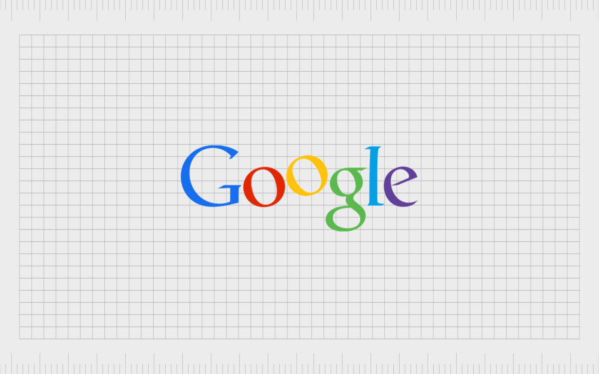
Google’s eventual logo was chosen from Kedar’s wide selection of potential designs. This new image remained the official Google logo through the years from 1999 to 2010. This is still a design many people associate with Google today.

When did Google change its logo?
For a while, the Google business logo and official search engine logo stayed the same. Of course, as the internet evolved and the Company transformed, a Google logo change eventually became necessary once again.
The fast-moving design of the digital world caused Google’s icon to appear somewhat outdated by 2015, so Google took action.
In the quest for a new Google symbol, the Company launched a week-long design sprint in New York with designers from across Google’s ecosystem. The sprint produced a host of Google icons and designs intended to help update Google’s visual identity.
By the end of the sprint, the Google emblem changed dramatically. The distinctive red, orange, blue, and green colors were still present, but the typeface changed to the Product Sans many people know today.
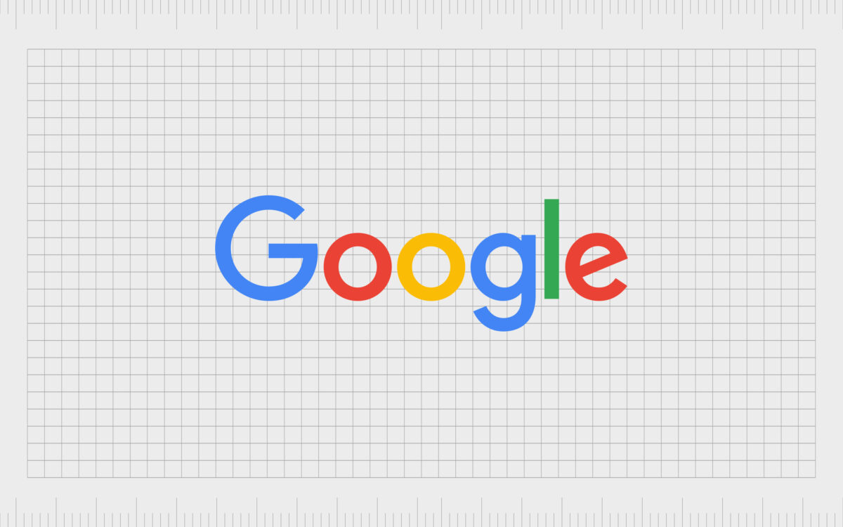
The choice to switch to a sans-serif font was an important one for Google. The new design helped to make the Google logo colors pop, while giving the company a more approachable image.
At the same time, the Google business logo updated with a range of variations, including the new multi-colored G we now know as the smartphone app or favicon for Google websites.
Though reasonably simplistic, the new logo made a huge impact on the technology world. Many companies followed suit in the decision to switch to a sans-serif typeface, in an effort to make their company more approachable too.
The logo from Google today is meant to look fun and young – less like the image of a stuffy organization.
Google logo meaning: The Google doodle
For a while, the Google logo remained the simple sans-serif option we know so well today – and this is still the image you’ll see when using Google on certain days of the year. However, Google’s logo is also far more dynamic today, thanks to the Google Doodle.
Interestingly, though the Google Doodle is commonly thought of as a modern thing, it actually first emerged in 1998, when Google started temporarily uploading new versions of the logo for special days.
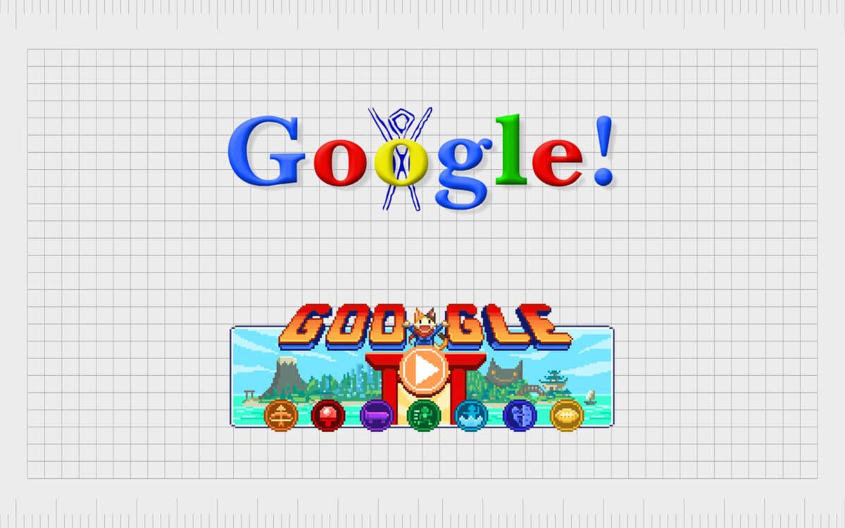
The first Doodles commonly marked well-known holidays, special occasions and birthdays of important people. Now, these Google logo variations are a lot more creative. Google has created doodles for virtually every major event, as well as some lesser-known ones.
The team has created more than 4000 doodles today. At the time of writing, the current doodle for the 2021 Olympics is a full playable game!
Google logo colors: What color are the two g’s in the Google logo?
Google’s logo colors have been a long-standing element of the Google design.
If you examine Google’s logos through the years, you’ll notice most of them use the same selection of colors. These hues aren’t just there to make Google appear more fun and friendly. Each Google logo color has a purpose. Ruth Kedar originally chose the colors for the Google logo.
Ruth explored a range of color options. Initially, she wanted the Google logo to include all primary colors. This was intended to make the Google logo color codes easier to recognize for people from any background.
Finally, the team chose to make the “l” in Google into a secondary color to convey a message: Google is constantly pushing new boundaries.
The two “os” in the Google logo are Google Red: Hex: #db3236 RGB: 219, 50, 54 and Google Yellow: Hex: #f4c20d, RGB: 244, 194, 13.
You can find a list of the Google logo color hex colors here. The resulting image of the Google logo created with the unique selection of colors creates something both eye-catching and memorable.
The Google color code was chosen based specifically to highlight the out-of-the-box thinking of the Company. Google wanted its logo to convey the idea of forward-thinking creativity and transformation subtly but effectively.
What font is the Google logo? Google logo font
The Google logo as we know it today uses the font Product Sans. This was custom-made by the in-house design team for Google. The new font was a delightful change to the old-fashioned serif font, intended to be bold, easy to see, and pixel friendly.
It’s suitable for all screen resolutions, and it’s dynamic too!
Google logo fonts remain the same across the Google ecosystem too. You can see the Google logo typeface in bold in the form of the favicon Google uses for its websites and mobile app. There’s also the same Google font evident in the Google + logo, and the Google Maps logo.

The consistent use of the same Product Sans font combined with Google’s regular use of the same crucial colors in its brand assets helps to make the Company more memorable wherever it reaches its customers.
No matter where you’re looking at the Google logo, you can expect to see something built to be extremely user-friendly, eye-catching, and beautifully designed.
Google logo resources
Still want to check out more Google logo resources?
Today, the Google logo is one of the best-known images in the world, representing not just a single search engine, but the head of an entire conglomerate of tools and services. Google’s logos are far reaching today, including everything from the Google Drive logo to the Google Play Store.
However, each of these designs all stem from the original design brought to life in 2015.
If you’re writing an article about Google’s logos throughout the year, or you want to take a deeper look into the history of the Google logo, the following resources should help:
- Google logo PNG
- High resolution Google logo PNG
- Transparent Google logo
- Google Logo vector
- Other Google logo resources
To learn more about some of the other most iconic logos in the world, check out our other helpful guides throughout the Fabrik website.
Fabrik: A branding agency for our times.
Now read these:
—Your guide to the Hewlett Packard logo
—The old eBay logo to the present day
—The Microsoft logo history and evolution
—Understanding the Nintendo Switch logo
—An in-depth look at the Fortnight logos
—The story of the Pokémon logo symbol
—Evolution of the Amazon Alexa logo
—Explaining the Van Halen symbol
—The story of the Rolling Stones logo
—Exploring the Stranger Things logo
—The LA Lakers logo and symbol
Check out these fantastic logo design resources:
Clarity starts with a conversation.
Thanks—we’ll get back to you shortly.
Whether you're navigating a rebrand, merger, or simply need a clearer identity—we’re here to help. No hard sell, just honest advice from people who know the sector.
Let’s start with a simple question…
Prefer to email? Drop us a line.
Fabrik’s been helping organisations rethink and reshape their brands for over 25 years. We’ve guided companies through mergers, rebrands and new launches. Whatever stage you’re at, we’ll meet you there.


