The Microsoft logo: 45 years of history and evolution

It’s not an exaggeration to say that without Microsoft, society wouldn’t look the way it does today. Together with Google and Apple, Microsoft is one of a handful of companies that helped to launch the cyber-revolution.
Along the way, they remade the entire modern world.
And as with any corporation of such magnitude, maintaining a certain image has always been crucial to Microsoft’s success. That becomes even more apparent as you look closely at the evolution of the Microsoft logo.
Today, we’ll take a deep dive into the history and development of the various Microsoft logo versions over the last 45 years.
And, we’ll also look at how the company’s message evolved with the firm’s changing status and image, how they’ve connected with customers over their four decades of existence, and how the Microsoft logo has echoed the zeitgeist of the times.
A brief history of Microsoft
If you’ve ever used one of the billions of Windows computers in the world, played Xbox, talked on Skype, posted your LinkedIn information, or played Minecraft, you’ve been in the Microsoft ecosystem.
But it wasn’t always this way.
From humble beginnings as a couple of nerds tinkering in a California garage, Microsoft founders Bill Gates and Paul Allen created a company that today employs 166,000 people around the globe. Microsoft also has a leading 17% market share in the SaaS segment.
Microsoft today has assets valued at $310 billion and brings in $143 billion in annual revenue.
In April 2019, Microsoft became just the third company in the history of the world to reach a trillion dollar market capitalization, just behind Apple and Amazon.
In order to control the narrative and portray the corporation in a soundbite – less than a soundbite, really, more of an “eye-bite,” if you will – the Company’s design people have developed over the years a series of logos that are deserving of closer study.
Microsoft logo history
Today we see the ubiquitous four-panel, four-color square everywhere – and if you’re a Windows user, you probably hear the boot-up chime when you picture it as well – and we think that’s just the way the logo has always been for Bill Gates’ trillion-dollar company.
Oh my, no.
Come with us now on a journey through time and space to revisit the old Microsoft logos of the olden times, starting with the long-ago 1970s.
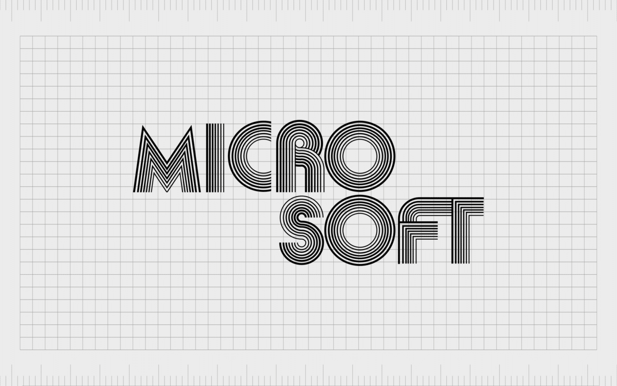
The original Microsoft logo: 1975 -1980
Get out your roller skates, polish up your disco balls, and put on your boogie shoes – here comes a new and funky little disco-era start-up called Micro Soft.
It’s 1975 and Harvard drop-out William Gates and his friend Paul Allen choose to pursue their dream of getting into the burgeoning world of technology. Their company officially launches on April 4, 1975, supported by a logo designed by Simon Daniels.
To modern Windows users, this old Microsoft logo is hardly recognizable.
It’s a monochrome logo in all capital letters that are made up of a series of individual lines. If you look closely, you’ll notice that some of the lines are bolder than others, creating a sense of motion and depth.
The typeface is very much of its era, closely related to the Aki Lines font, projecting a youthful, progressive sensibility. The rounded letters and big, open O’s are very much in keeping with the freewheeling ethos of 1970s California.
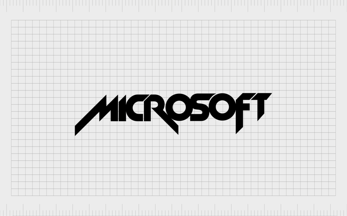
Second Microsoft logo: 1980 – 1982
Enter the 1980s.
The easy-going marijuana haze of the 1970s gives way to the go-go cocaine 1980s. Society enters a sharper-edged, more aggressive phase, and Microsoft logo history is about to be made as company designers follow the trend.
The company decides to do away with the soft, rounded contours of the original Microsoft logo in favor of something completely different:
In just five years’ time, the old Microsoft logo has undergone a radical overhaul. The letters are now formed of bold, single lines instead of the poufy series of fat circles and concentric lines in the original Microsoft logo.
There’s nothing subtle here about Simon Daniels’ second go: the new Microsoft logo is based on the New Zelek font, all aggressive, piercing diagonals.
It’s reminiscent of a heavy metal band’s album cover. Indeed, if you look closely at how the M, R, and F extend past the outline of the rest of the letters, it looks a lot like Metallica’s logo.
Another important change is that now the company’s name is to be written on a single line rather than broken up into Micro and Soft on two different lines as before.
From this new boldness and more assertive public face we can infer the emergence of a company that’s beginning to feel confident in its identity.
However, this first Microsoft logo change wasn’t built to last.
Some typography nerds and computer history nerds are saddened by the fact that this so-called “rock star logo” only lasted two short years.
But it’s a lesson to modern logo designers and companies seeking to make their mark: choosing a timeless design that can stand the shifting sands of fashion is just as important as making a bold statement.
Third Microsoft logo: 1982 – 1987
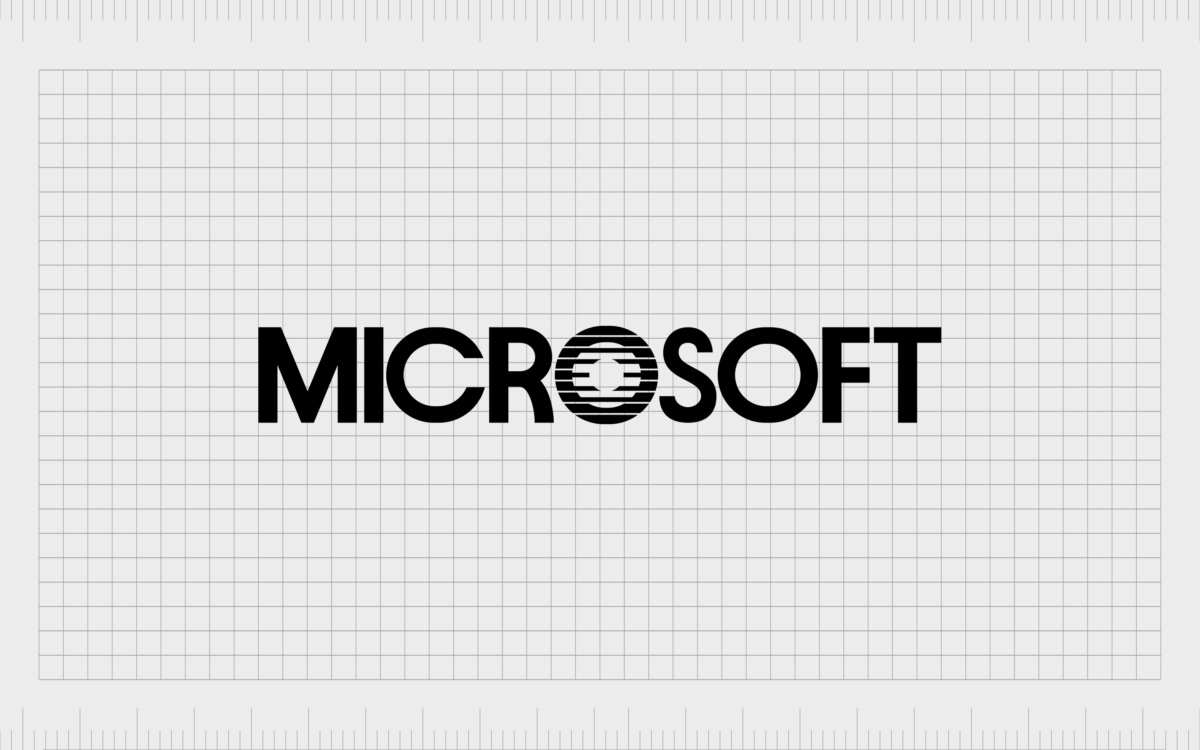
Simon Daniels and his team undertook the next redesign of the Microsoft logo in 1982, sharply dialing back the aggressive nature of the rock star logo.
Here we can see Daniels harking back to the original Microsoft logo, echoing the original font but in a cleaner, simpler version, offering up a much-softened, rounder logo in a very simple sans serif.
The only thing that makes the name stand out at all is the “O” at the center, which has stacks of lines across it meant to emulate the lines on a CD.
This piece of Microsoft logo history was dubbed the “Blibbet” – an informal name that was given to that funky, latticed “O” – and was so beloved by Microsoft employees that they even created petitions begging corporate to reconsider changing it in 1987.
Another important point to make about this version of the Microsoft logo is that it also represents a shift that takes the company fully away from its hippie/disco origins as well as its two-year flirtation with rock-and-roll rebellion.
Now, via the Microsoft logo, the company sought to portray itself in a more conservative light, taking a button-down, grown-up place in the computer and business landscape of the late 1980s and 1990s.
Fourth Microsoft logo: 1987 – 2011
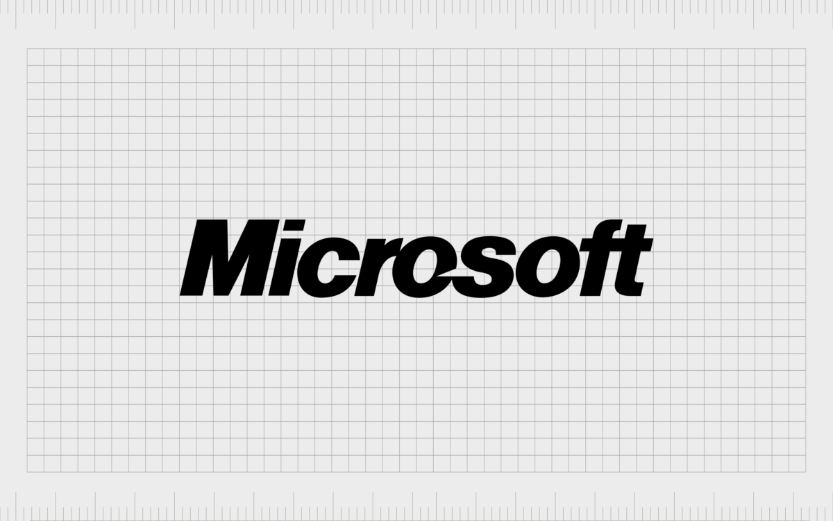
The Microsoft logo revamp of 1987 was to be the longest-lasting of all the Microsoft logos thus far, spanning two decades.
Affectionately dubbed the “Pac-Man logo” for the open slash on the “O,” this iteration was designed by Scott Baker.
Baker has been quoted as saying the slash or open Pac-Man mouth between the “O” and the “S” was meant to evoke a sense of motion and speed, and to emphasize the “Soft” part of the word.
Indeed, the angled lettering does seem to imply a sense of forward momentum, and the bold Helvetica Italic Black font occupies a happy middle ground in relation to the old Microsoft logos: it’s more assertive than the milquetoast Blibbet, but it’s not quite as aggressive as the rock star logo.
It’s a confident, fearless Microsoft logo that fits perfectly with the Company’s continued ascendance and dominance of the software landscape during that period.
Fifth Microsoft logo: 2012 – present
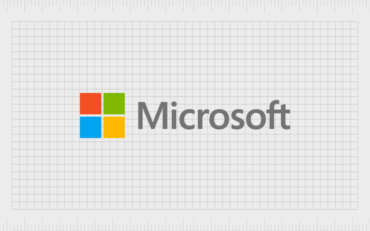
Finally, we come to the completion of Microsoft logo evolution to date, that familiar four-color window next to the word Microsoft in Segoe UI font.
While this Microsoft corporation logo is likely the one we’re most familiar with – and which we likely take for granted – it actually represents a radical change from every iteration of the old Microsoft logo.
Not only does the addition of the colorful windowpane set it apart from the rest of the old Microsoft logos, the softening of the font to the rounded Segoe UI is a dramatic shift from decades of Microsoft logo designs.
Modern Microsoft logo meaning
Of course, the four-color window design is meant to evoke the company’s flagship software product Windows.
However, rumor has it the four colors represent other specific software products as well: blue is for Word (or Office), green is for Excel (or Xbox), red is for PowerPoint, and yellow is for Outlook (or Bing).
Regardless of whether that’s true, it appears that this logo is here to stay. The latest Microsoft logo change is a brilliant demonstration of everything Microsoft represents in one simple yet powerful and descriptive logo created by designer Jason Wells.
With just nine letters and four simple boxes of color, the Company’s mission, product suite, and corporate identity are all projected to the world.
Using the Microsoft Corporation logo today
For more information on how and when you can legally use the Microsoft logo, head over to the Microsoft trademark and legal page.
With that said, here’s an online resource where you can download various old Microsoft logos.
And don’t forget, if you’re thinking about revamping your company’s logo, reach out to Fabrik and our team of designers can set up a consultation to help with some ideas!
Fabrik: A branding agency for our times.
Now read these:
—Your guide to the Hewlett Packard logo
—Google’s logo throughout the years
—Understanding the Nintendo Switch logo
—The old eBay logo to the present day
—An in-depth look at the Fortnight logos
—The story of the Pokémon logo symbol
—Evolution of the Amazon Alexa logo
Check out these brilliant logo design resources:
Clarity starts with a conversation.
Thanks—we’ll get back to you shortly.
Whether you're navigating a rebrand, merger, or simply need a clearer identity—we’re here to help. No hard sell, just honest advice from people who know the sector.
Let’s start with a simple question…
Prefer to email? Drop us a line.
Fabrik’s been helping organisations rethink and reshape their brands for over 25 years. We’ve guided companies through mergers, rebrands and new launches. Whatever stage you’re at, we’ll meet you there.


