


Nintendo logo history: Exploring the iconic Nintendo symbol
For video game and console landscape fans, few emblems are more iconic than the famous Nintendo logo. This unforgettable symbol has helped the company to stand out from its competition for decades, capturing the hearts and minds of endless consumers.
But how much do you know about Nintendo logo history?
After all, the Nintendo company was originally created more than 130 years ago and has created several unique designs for its visual identity over the years. Long before we had the simple red and white wordmark we know today, there were numerous other iterations of the Nintendo logo design.
If you’ve ever wondered about Nintendo’s branding history or simply want to learn more about how gaming companies worldwide choose their remarkable logos, you’re in the right place. Here’s everything you need to know about the evolution of the Nintendo symbol.
Is Nintendo a Japanese brand? Introducing Nintendo
Today, Nintendo is a global brand with a phenomenal presence in regions all over the world, but it is a Japanese company headquartered in Kyoto. The organization was first launched as the “Nintendo Karuta” organization in 1889 and primarily focused on selling handmade playing cards.
The name “Nintendo” is commonly assumed to mean something along the lines of “Leave luck to heaven,” although there’s no real evidence of where the title came from. Initially, the Nintendo brand was an extremely popular card manufacturer, but over the years, the organization’s focus evolved.
In the early 1900s, Nintendo began focusing on the production of various different styles of card-focused games, looking for ways to branch out and connect with new potential audiences.
Later, as card games became less popular, Nintendo began experimenting with board games, domino-based games, and even electronic toys.
It wasn’t until 1973 that Nintendo began producing the consoles it’s most famous for today. After opening an American subsidiary in 1979, Nintendo began the production of its first handheld gaming system and eventually branched out into the arcade game market.
In the early 1980s, the Nintendo Entertainment System was produced, and the rest, as they say, is history.
Nintendo logo history: The Nintendo symbol through the years
As a brand, Nintendo has gone through a number of evolutions over the years, producing a wide range of different products and solutions for consumers. It’s probably not surprising then that the business has also made numerous changes to its logo.
Nintendo logo history first started in 1889, when the brand was still best known for creating handmade cards.
Let’s take a closer look at the evolution.
1889
The original Nintendo logo was a simple design featuring the name of the company in Japanese lettering on a horizontal rectangle. The background of the logo was a light cream shade, with two red triangles placed in the upper corners. The name of the brand was written in blue.
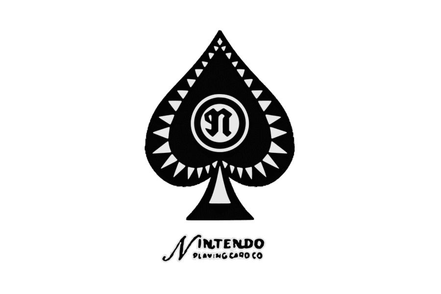
A little over 60 years later, Nintendo updated its logo but still maintained its focus on the card games landscape. The redesign introduced an iconic monochrome badge, showcasing the Spades emblem in black, placed on top of a handwritten-style wordmark.
This time, the name of the company was showcased in English, perhaps to reach a wider audience.
1960
A few years after introducing the Spades logo, Nintendo revealed a new, more simplified design, featuring only its handwritten-style wordmark, with a lot of elegant curves and decorative elements. The dot above the “I” was even made to look like a star.
This design only stayed with the brand for four years, after which the company unveiled a much different logo, featuring white cursive font on a red background. However, the inscription was only with the brand for another year before they decided to change it yet again.
1965
Maintaining their focus on wordmarks for a crisp and easily recognizable visual identity, Nintendo revealed a new design in all uppercase, sans serif font. The rounded corners of the letters and the bold weight of the inscription made the image look more modern and refined.
Also, in 1965, Nintendo started experimenting with a slightly simpler version of this logo, removing the italicized tilt, and thinning the typeface slightly. The new wordmark was also depicted in all uppercase letters, in black.
In 1967, Nintendo updated its logo to feature just the letter “N” and a symbol similar to the number 9. The monogram was included in a thin circular border and depicted in white and red. This color palette soon became the core component of the company’s identity.
In 1967, Nintendo also revealed a different version of its logo, similar in a lot of ways to the one we know today. The blocky Nintendo logotype was introduced, with a square dot above the “I” and a simple, eye-catching font.
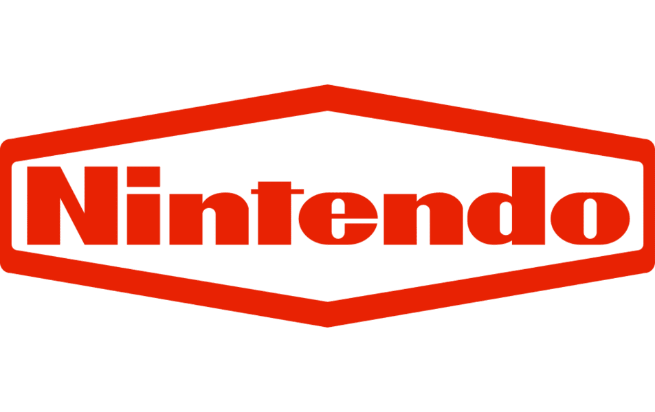
Following the introduction of the new red and white color palette, Nintendo started experimenting with the design of its logo, implementing new elements, like a geometric, hexagonal border around the wordmark. The shade of red on this logo was a little more saturated than the previous one.
In 1970, the company switched the hexagonal frame with a rounded, oval shape, similar to the emblem we know today. The overall structure of the new logo made the company appear more approachable, friendly, and modern.
Within this time period, Nintendo also had another very different logo in circulation. This version of the design featured a rounded inscription on two levels, with “Nintendo” on the top and “Company” on the bottom. The design was depicted in black and white.
1973
For a brief time in 1973, a Japanese logotype was once again introduced by the Nintendo brand. This was only the second version of the Nintendo logo, which hadn’t been designed in English. The monochrome inscription featured numerous bold lines and rounded edges.
A couple of years later, in 1975, Nintendo introduced an English version of the logo, which is still in use in some parts of the world today.
1977
1977 marked the introduction of the monochrome version of the Nintendo logo many people are now familiar with. The design featured the same Nintendo font as many previous iterations, with an oval border around the inscription.
In 1987, the coloring of the logo was replaced with iconic red and white to make the overall design more memorable and unique.
2016
Finally, in 2016, Nintendo introduced two versions of its logo still in use today. Both use the same design overall as the previous logo, with the oval border and the iconic Nintendo typeface. The first variation was introduced in a sophisticated light grey and white color palette.
The second inverted the red and white colors used before to place the inscription and oval shape in white on a red background. This is the image most people are familiar with now.
Nintendo console logos
Alongside its many different brand logos, Nintendo also created a handful of emblems specifically for the consoles it created throughout the years. Here are some of the Nintendo console logos you might be familiar with:
Nintendo 64 logo
The Nintendo 64 logo was one of the brightest and most eye-catching emblems created by the brand. It showcases a 3-dimensional “N” in a range of bright colors like red, yellow, green, and blue.
Above the geometric logo shape, we see the Nintendo name tag, with the characters “64” placed alongside in an orange/red shade. The overall design was bright, vivid, and fun.
Nintendo GameCube logo
The Nintendo GameCube logo introduced a more sophisticated visual design for the brand. Once again, a three-dimensional image was used to shape the “G,” but this time, it was in gradients of blue and grey. The Nintendo name appeared above the word “GameCube” in modern, bold font.
Nintendo Switch logo
Probably one of the better-known Nintendo logos for consoles today, the Nintendo Switch symbol features the iconic colors of the brand. The symbols included in the design are intended to represent the controllers or “joy cons” used in the handheld gaming system.
The Nintendo logo: Colors and fonts
Nintendo has had no shortage of additions to its visual identity over the years. In some cases, the company has even utilized mascots, such as the iconic character Mario, to help advertise the brand. Today, the Nintendo logo is a symbol of passion, excitement, and fun.
The simple but effective wordmark works well across a range of platforms and devices.
If you want to take a closer look at the Nintendo logos, you can find some helpful resources here:
What color is the Nintendo logo? Why is the Nintendo logo red?
The Nintendo logo colors used throughout the company’s emblems over the years have changed a number of times. Most commonly, the company has used either a black-and-white logo or a red-and-white design. However, there have been instances of the Nintendo symbol in grey too.
The official Nintendo color of red is a bright, compelling, and eye-catching shade intended to connect with ideas of passion and good fortune. Red is a common color used in the Japanese branding market, as it’s often associated with positive feelings.
RED
Hex color: #e70009
RGB: 231 0 9
CMYK: 0 100 96 9
Pantone: PMS Bright Red C
What font does the Nintendo logo use?
The Nintendo logo font is unique to the brand and created specifically for the organization. It features beautifully rounded sans-serif letters and a small horizontal line in the middle of the “T.” The dot above the “I” is squared to convey modernity and stability.
The design is similar to the “Pretendo” font found online, which has a number of unique special and thin characters.
Exploring the iconic Nintendo logo
Looking at the Nintendo logo history, we can see the company has gone through several major changes over the years in the search for its iconic visual identity.
As the focus of the business evolved, with the introduction of new electronics and gaming devices, Nintendo gradually moved away from the card landscape and chose a more modern emblem.
Today, the Nintendo symbol is a beacon of fun, passion, and excitement for countless consumers worldwide. Though simple, it represents one of the most memorable logos in the video gaming industry.
Fabrik: A branding agency for our times.

Clarity starts with a conversation.
Thanks—we’ll get back to you shortly.
Whether you're navigating a rebrand, merger, or simply need a clearer identity—we’re here to help. No hard sell, just honest advice from people who know the sector.
Let’s start with a simple question…
Prefer to email? Drop us a line.
Fabrik’s been helping organisations rethink and reshape their brands for over 25 years. We’ve guided companies through mergers, rebrands and new launches. Whatever stage you’re at, we’ll meet you there.