


Famous triangle logos: Exploring brand logos with triangles
There are plenty of famous triangle logos in the market today, from the unforgettable Google “Play” logo, to the wordmark for Fila. These triangle logos use a well-known geometric shape as a crucial component of their aesthetic for an important reason.
Every choice you make with your logo design sends a specific message. Just as a choice of color can make your audience feel a certain way about your company, a shape can have a psychological impact too. Different shapes are naturally associated with different vibes.
Squares generally convey stability and strength, with their bold lines and edges. Circles are welcoming and all-encompassing – ideal for connecting with a community. Triangles are sharp, bold, and even directional at times.
Today, we’re going to be looking at some of the better-known logos with triangles and asking ourselves what these crucial shapes stand for.
What do triangle logos mean? An introduction
Triangle logos can convey a range of different messages. Triangles in Druid and Mason communications were often used to convey mystery, power, and masculinity, while in the Pagan world, triangles are often used to highlight femininity.
Similar to squares, triangles can be a useful way to convey stability, but they’re more commonly used to convey movement and innovation.
Triangles naturally point the eye in a certain direction. Think of how the “Guess” logo points downwards to pull your eye towards yourself, while the Google “Play” movement points to the right, conveying forward motion.
Triangles are one of the more versatile shapes in a logo. Multiple triangles used together can create distinctive patterns, while a single pattern, positioned in a certain way, directs our attention.
Thanks to their link to concepts of discovery and development, triangles are more common in some industries, than others. We see triangles frequently in the technology world, as well as in the industrial and construction space, finance, law, and even fashion.
Let’s take a closer look at some of the most famous triangle logos, and their meanings…
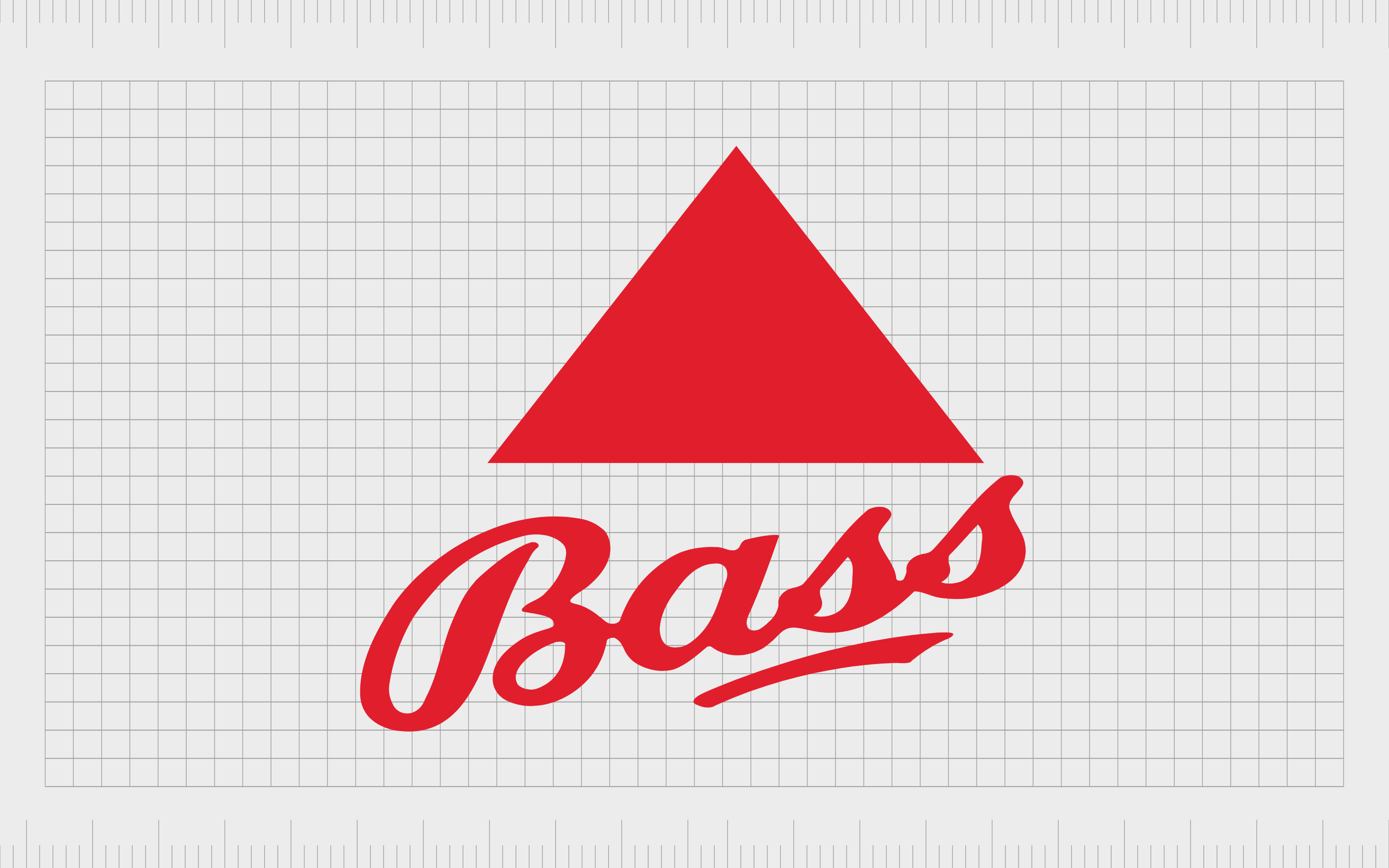
Bass
If you’re familiar with beer brands, you probably know the iconic red triangle of Bass. The Bass brand was first founded in 1777, and is still going strong today, thanks in some part to its phenomenal image.
The red triangle logo was first registered in 1876 and was the first-ever trademark issued by the British government.
The red triangle is intended to make an instant impact thanks to its bold, block-red coloring. The bright red triangle is also pointing upwards, which commonly conveys a sense of creativity and growth.
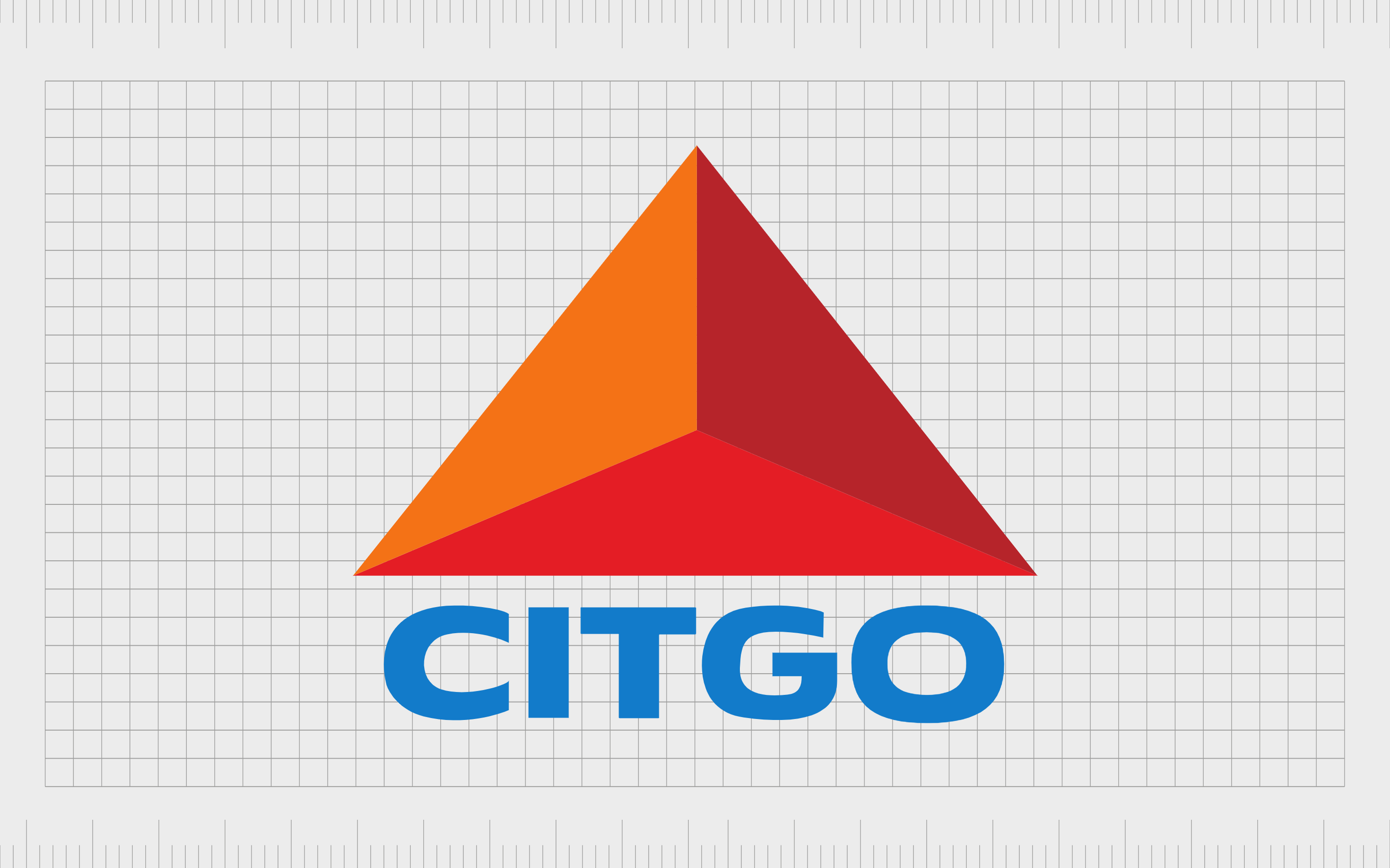
Citgo
Well-known for refining, transporting, and marketing transportation fuels, petrochemicals, and lubricants, Citgo is one of the biggest oil and gas companies in the world. This private company’s triangle logo is apparent all throughout the United States.
More than just a standard block triangle, the Citgo logo actually combines three different-colored triangles together to make a larger chape. This highlights the various directions of the company, and the comprehensive portfolio of products offered.
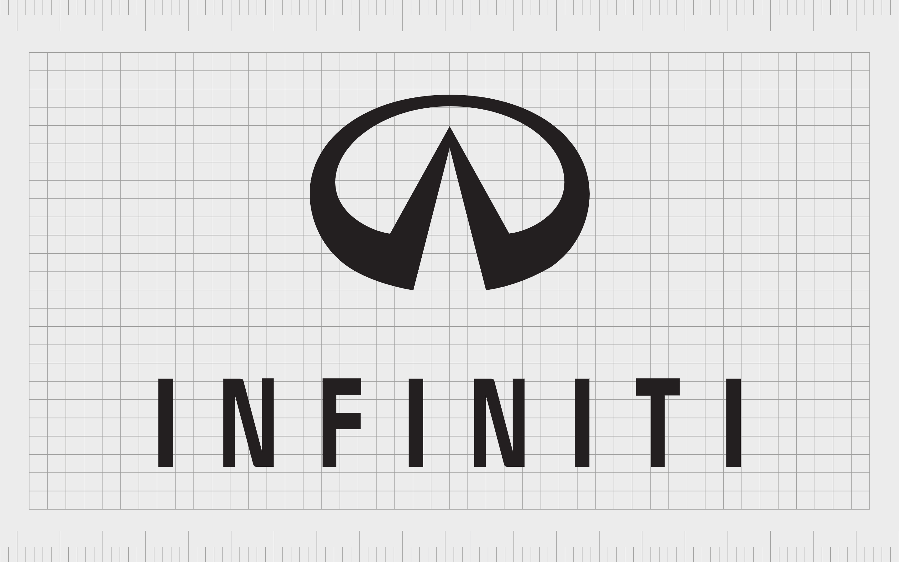
Infiniti
Triangles are an excellent shape choice for automotive company logos because they’re naturally associated with movement and direction. The Japanese Infiniti logo, combines a triangle created in white space, with an oval shape, to convey community and innovation.
The triangle also looks similar to a road stretching into the horizon, demonstrating the company’s commitment to creating ever-more innovative products for its electric and hybrid vehicle line.
Find out more about the Infiniti logo here.

Adidas
The Adidas logo uses a series of consecutive stripes to create the larger image of a triangle. One of the best-known athletic brandmarks in the world, this image has become famous across the globe over the years and continues to appear on shoes to this day.
The triangle shape in the Adidas logo looks similar to the peaks of a mountain, reminding us of the goals we set for ourselves, and the power of being ambitious.
Find out more about the Adidas logo here.
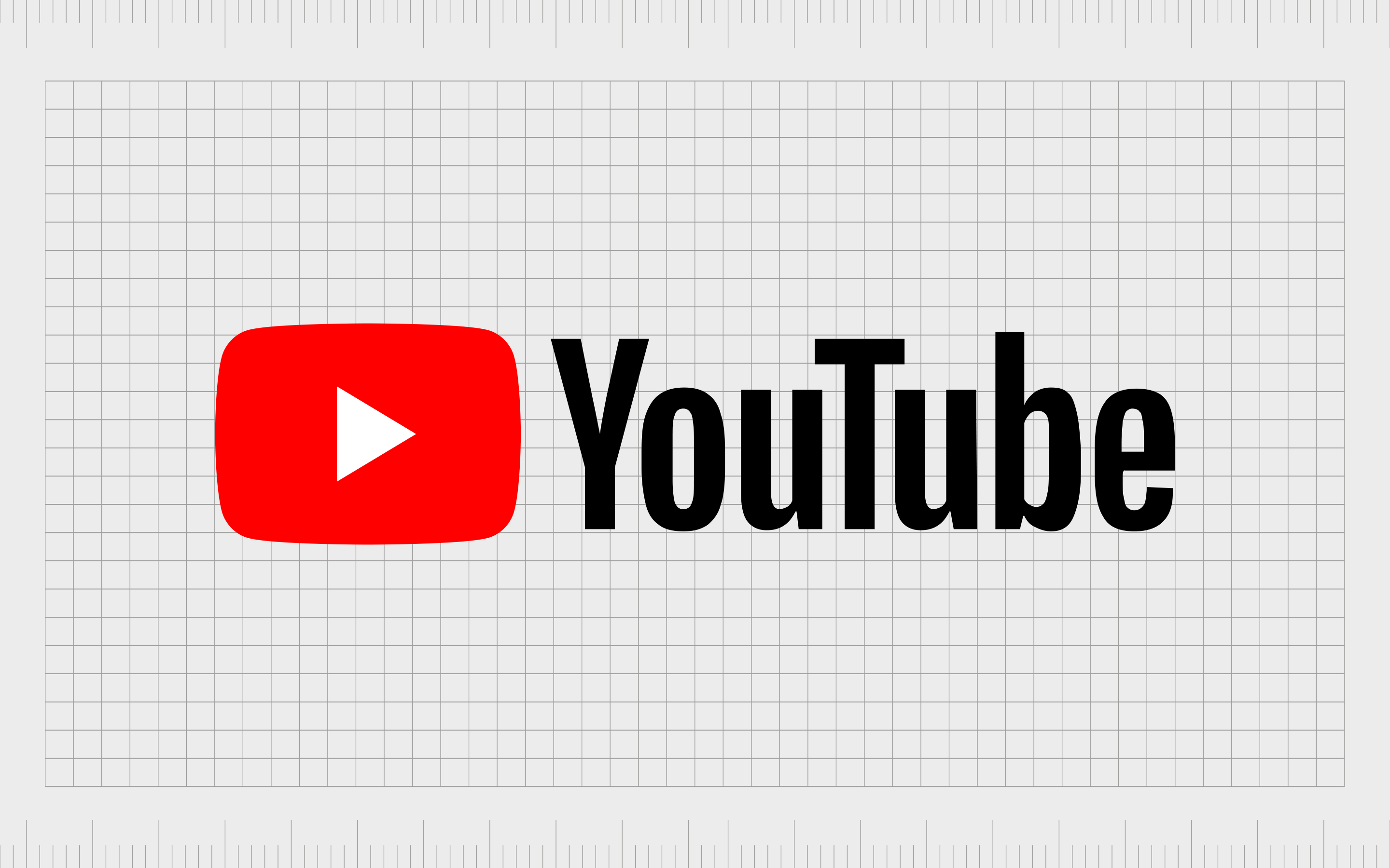
YouTube
Though the YouTube logo doesn’t always use the distinctive white triangle in the red background logo highlighted above, it’s an image most of us will associate with the video-sharing website. This is the graphic you’ll usually see if you download the YouTube app for your phone.
The triangle pointing to the right is a common image in the western world, and something we commonly associate with “progress” or forward motion.

Guess
Bold and eye-catching, the Guess logo is an excellent example of how compelling fashion emblems can be. Though the triangle logo associated with Guess isn’t present on all of the company’s branding, it still appears on a host of the company’s clothing items and advertising campaigns.
The bright coloring and the shape of the logo communicates passion and strength. The triangle also highlights creativity and quirkiness, as it’s pointing downwards, which is less common in logo design.
Even the question mark in the logo has its own triangle.
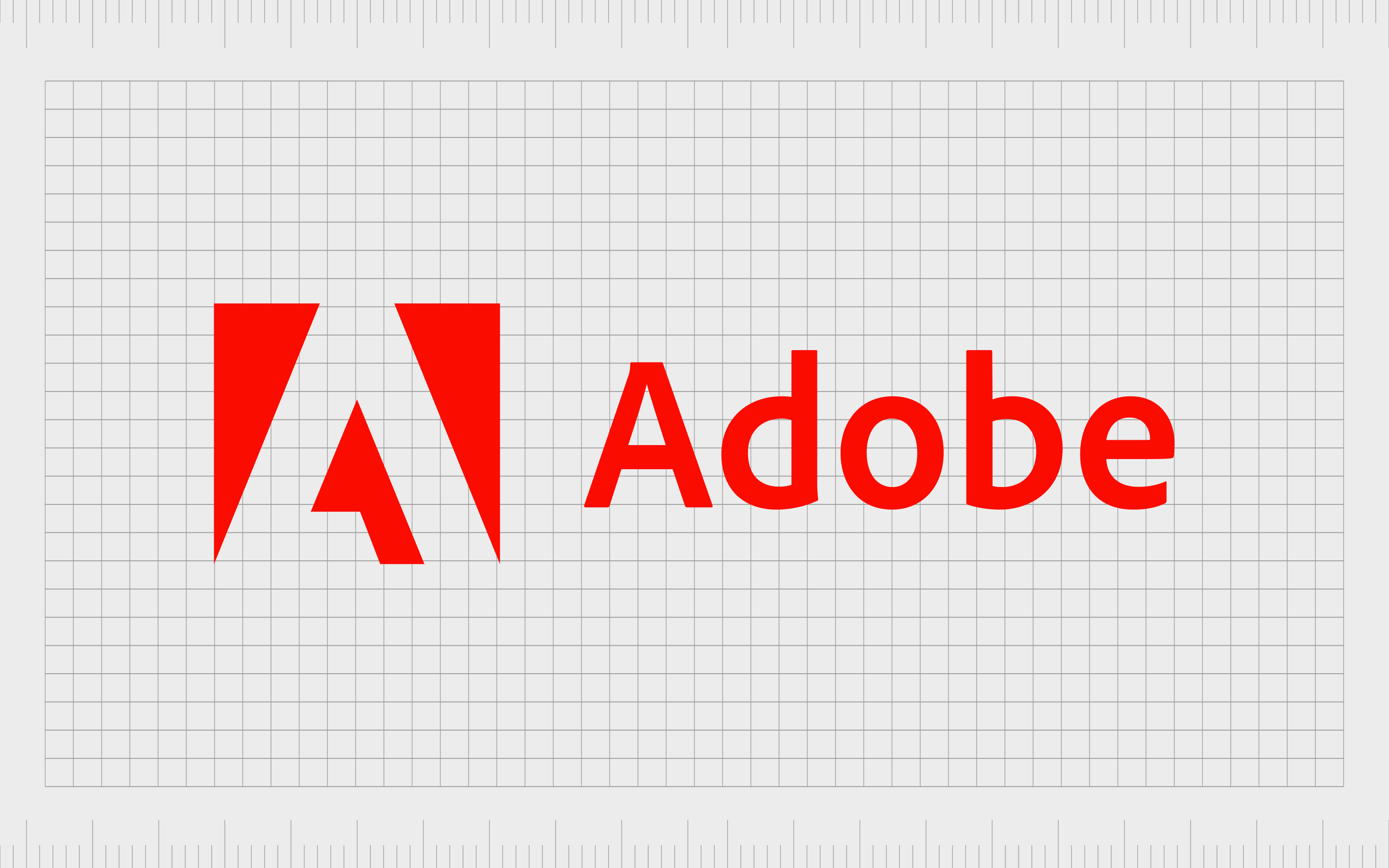
Adobe
If you’re familiar with design, you probably know something about Adobe. This iconic software company is popular throughout the world for producing some of the best-known industry-standard solutions on the market today.
Though the triangle shapes within the Adobe logo are designed to look like an “A” to represent the company’s name, they’re also abstract enough to remind us of an upward-pointing arrow. The idea is to highlight concepts of innovation and creativity.

Metallica
Though not the most traditional example of logos with triangles, Metallica certainly attempts to bring the angular sharpness of the triangle into its emblem. The sharp and pointed nature of triangles means they’re easy to associate with edginess and rebellion.
In this logo, the natural pointed shape of the “A” in the middle of “Metallica” is accentuated, along with the beginning and ending letters of the wordmark. The overall image is gothic and bold.
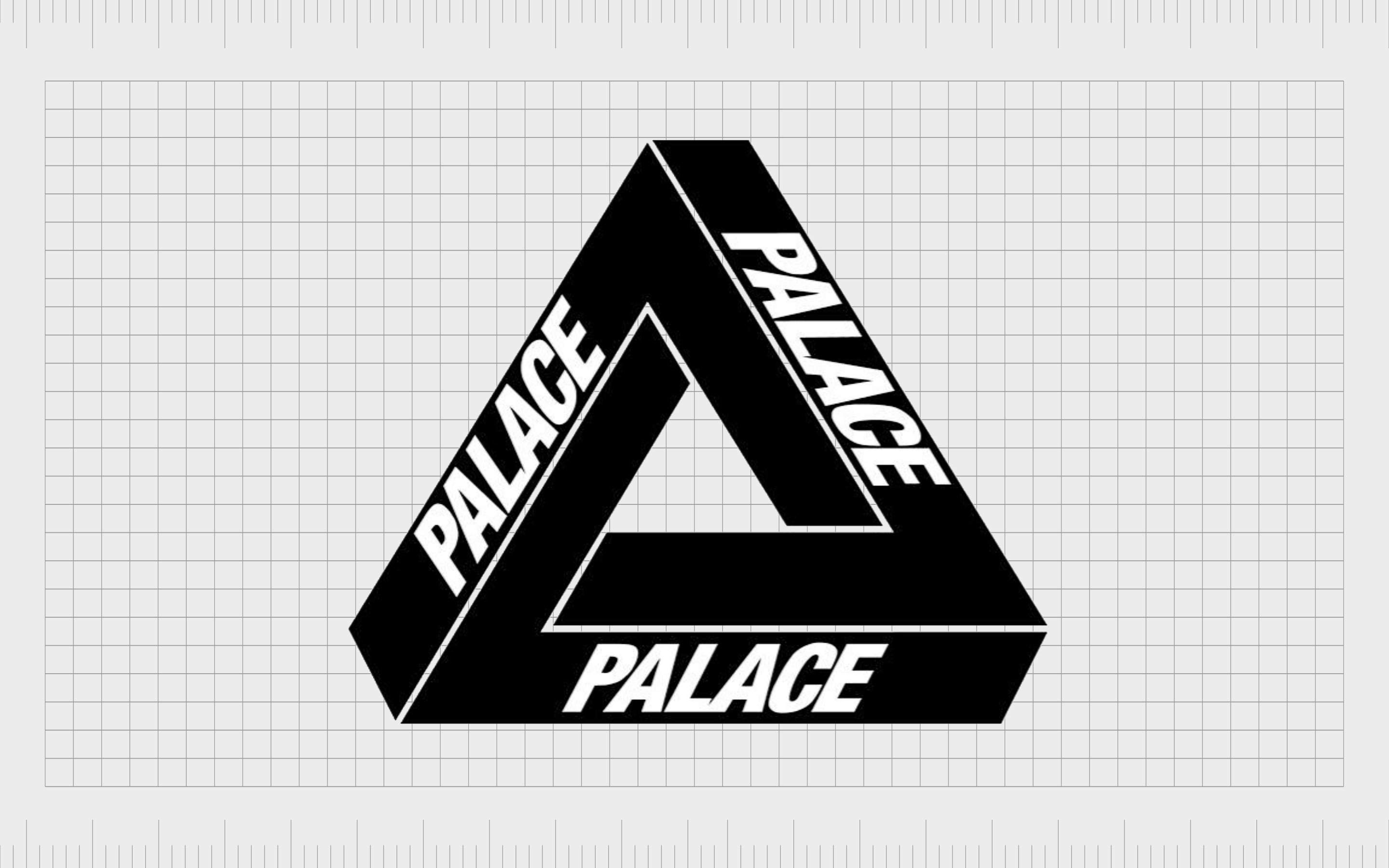
Palace
An interesting example of a triangle logo from the extreme sports landscape, Palace Skateboards reduces some of the edges and sharpness of the traditional triangle. This 3D style logo is fun and creative, just like the company’s customers.
The optical illusion effect draws your eye to the various lines within the image, constantly pulling your focus in a circle of motion. This is a fantastic image for drawing attention and getting the customer’s mind working.
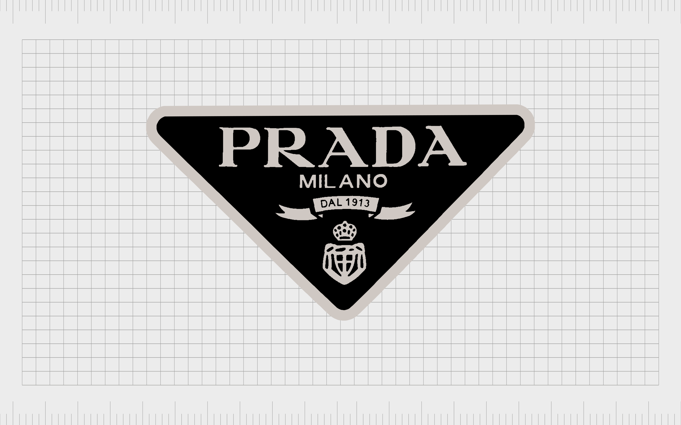
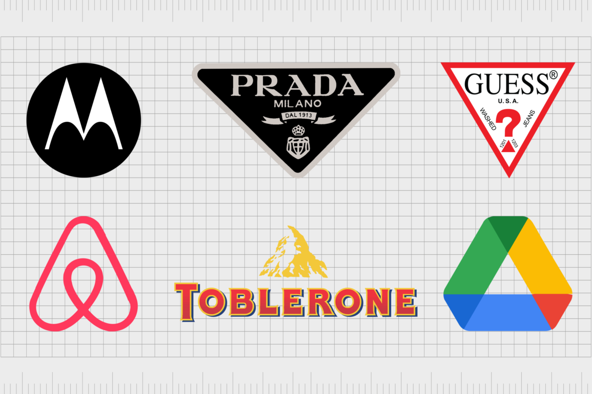
Prada
Like many fashion brands, Prada uses a number of logos and brand marks across their products and branding materials. One well-known emblem features the name of the company, alongside its location and founding date, placed within an upside down triangle.
The inversion of the triangle shape in the logo pulls the viewer’s attention down and towards themselves, or the item of clothing in question. It’s an excellent way to draw attention to the product on sale, while conveying a significant amount of information.
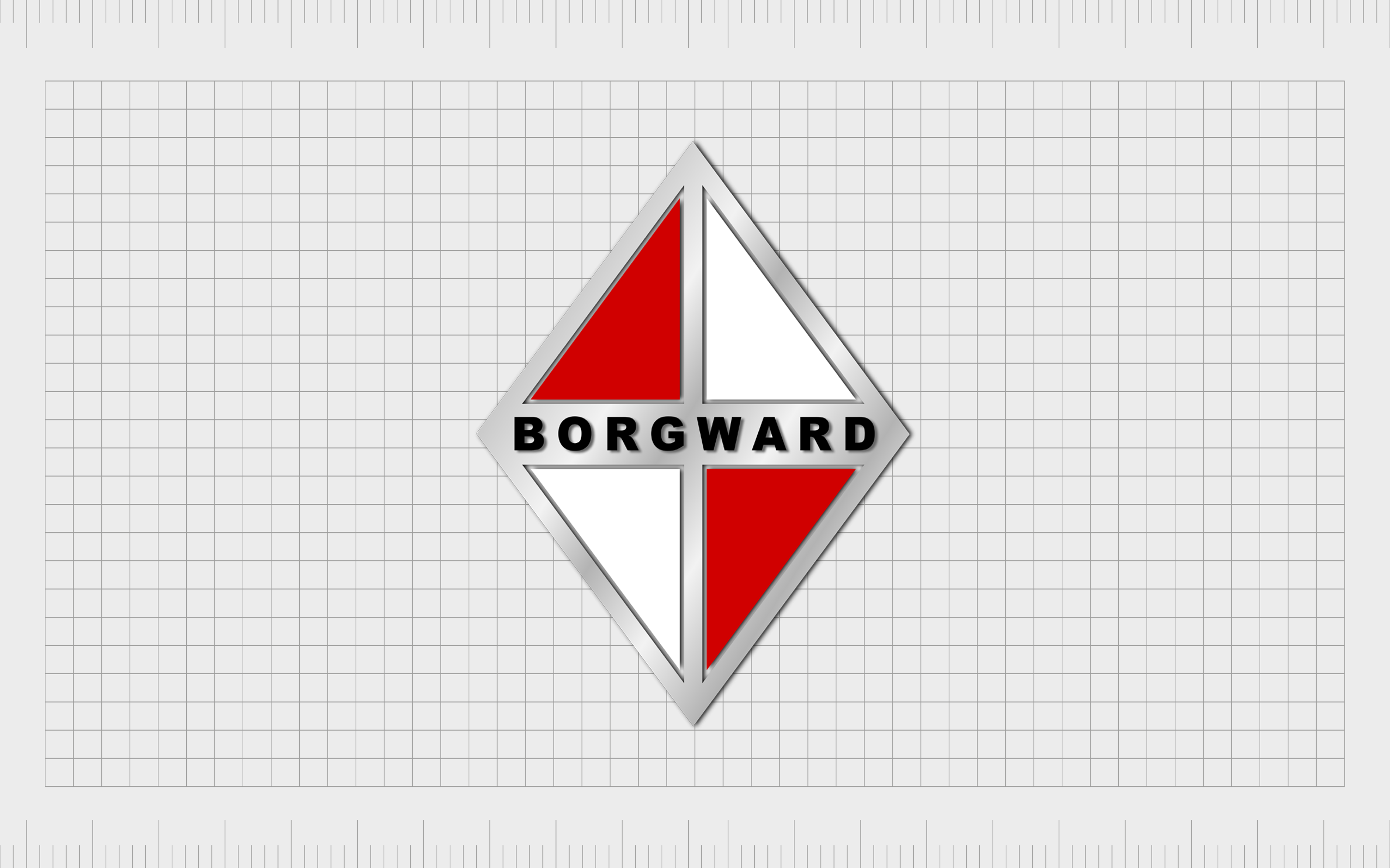
Borgward
The former Borgward Manufacturing Company used a series of triangles combined together to make a diamond in its logo. The use of red and white triangles in this logo symbolizes passion, purity, and versatility. The wider diamond shape helps to convey luxury.
Though the Borgward Company might not be operational today, its logo continues to offer an excellent insight into the power of triangles.

DS Automobiles
At first glance, the logo for the DS Automobiles premium car manufacturing company just looks like a “D” and an “S” from the brand’s name. However, on closer inspection, we see this powerful logo actually includes a number of triangles.
The triangular shapes combined to form letters create a unique geometric appeal for the company and showcase its creative nature.

Volcom
Identified as a “lifestyle” brand, Volcom’s triangle logo has its own name “the stone”, and it uses a number of geometric shapes in black and white to create a powerful 3D design. The logo features two triangles, both pointing down, around the outside of a diamond.
The Volcom logo is engaging and eye-catching, with a slight edge to it. This “Stone” logo is ideal for a company associated with extreme sports like snowboarding and skating.
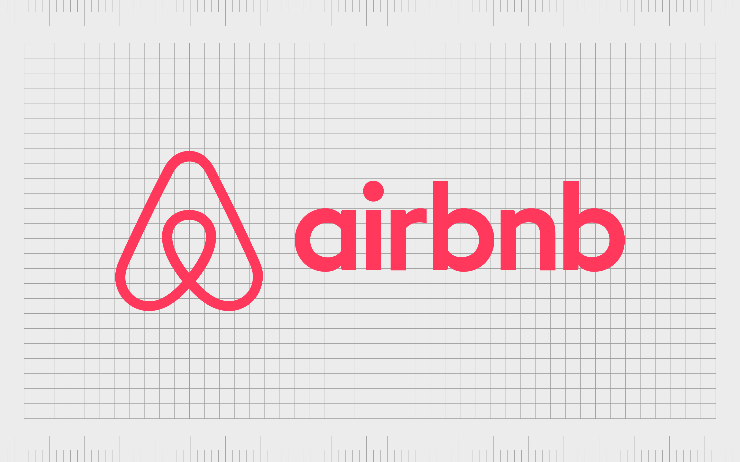
Airbnb
One of the most famous triangle logos in the world today, Airbnb takes a slightly different approach to its triangular brandmark. The shape is similar to an upside-down heart, with the points of the triangle curved to make the image more welcoming and appealing.
The soft triangular design is intended to represent a feeling of belonging, and there’s even shape in the middle of the arrow which looks like a tack on a map, pointing to the place where you’re meant to be. The shape also looks similar to an “A”.

Reebok
Reebok has used a number of triangles in its logo design over the years. The iconic slashes on many Reebok shoes even have their own triangle elements. There’s also a more recent Reebok logo, known as the “Delta” emblem, which combines three geometric shapes to create a triangle.
This logo is a little softer in style than some of the triangle logos on this list, but it still conveys a sense of innovation and growth. The cut-off edges of the triangle help the company to appear more welcoming.
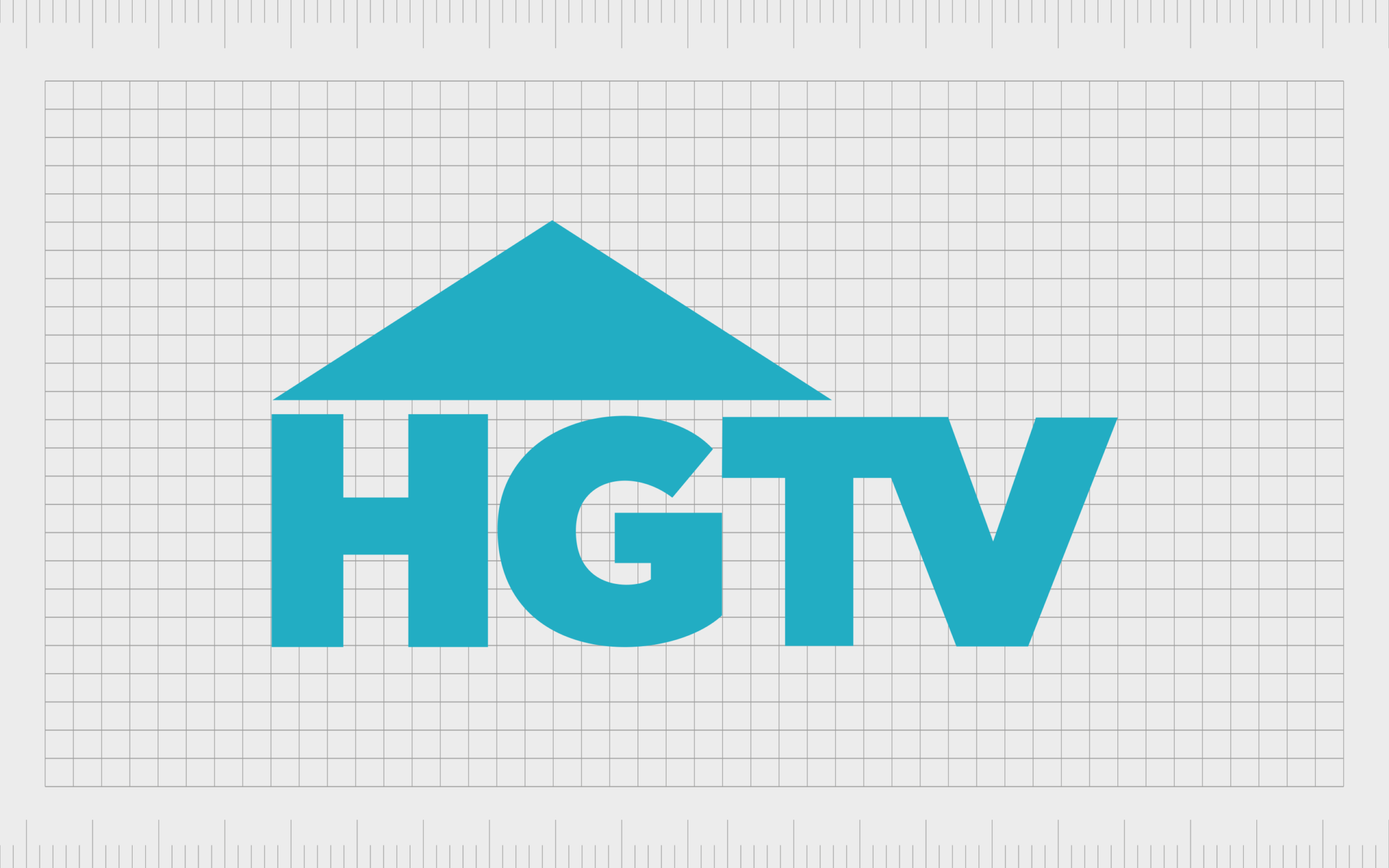
HGTV
An initialism for “Home & Garden Television”, HGTV is an American television channel owned by the Warner Company and Discovery. The channel focuses heavily on programs about home improvement and real estate.
The triangle in this logo plays an important role, it sits just on top of the wordmark for the image, like a triangular roof on top of a house. The arrow also points upwards, to express ideas of opportunity, development, and growth.
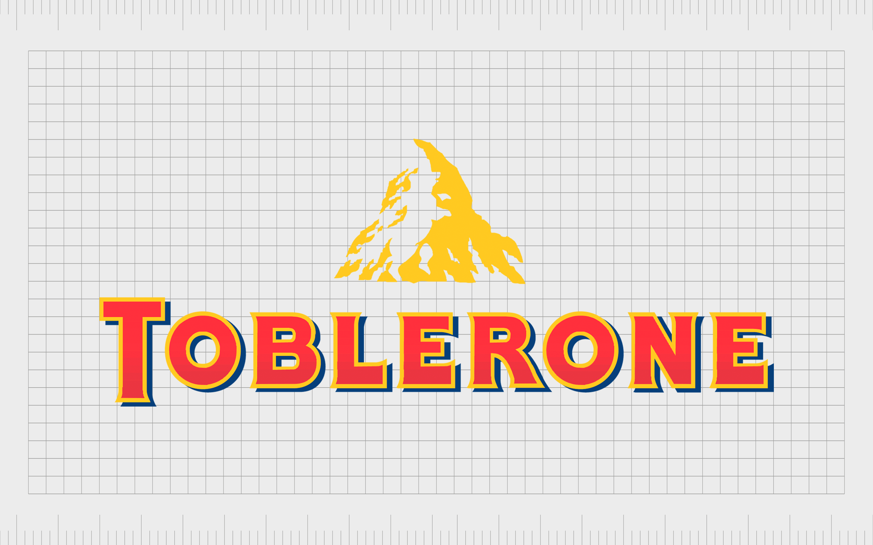
Toblerone
Triangles are commonplace in nature. We see them in mountains, hills, as well as in man-made creations like bridges and buildings. Used correctly, the right triangular shape can draw the mind to an image we already known.
The Toblerone logo, for instance, includes a golden triangle-shaped mountain, which is actually the Matterhorn, from Switzerland.
The design reminds us of the origins of Toblerone, as well as the natural ingredients present within the company’s confectionary.
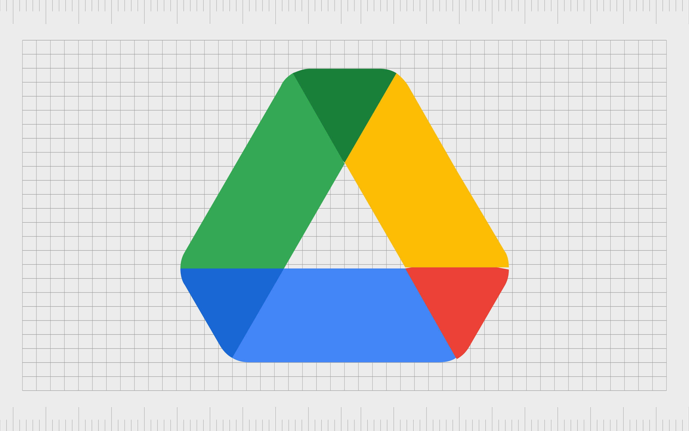
Google Drive
At first, the Google Drive logo looks like a single triangle with the edges filed off. However, on closer inspection, we also see a triangle in the middle of the design, and three triangles connecting the different colors of the lines in the shape.
The different colors and shapes are designed to represent the various products within the Google ecosystem, including Google Docs, Sheets, and Slides.
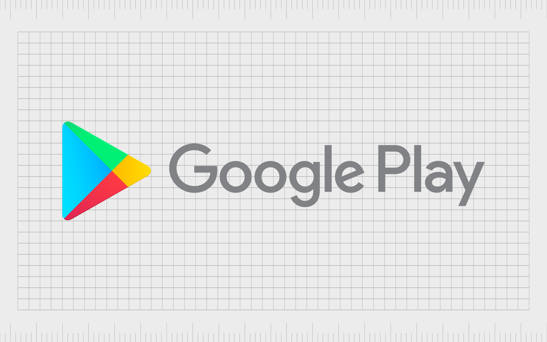
Google Play
Triangles are a common theme throughout Google’s aesthetic. The company uses triangles not just in the “Drive” emblem, but in the “Google Play” symbol too. Here, the shape is intended to remind us of the “play” button on most television remotes and radios, similar to the YouTube logo.
The triangle pointing towards the right is a common symbol throughout the world, associated with motion and activity.
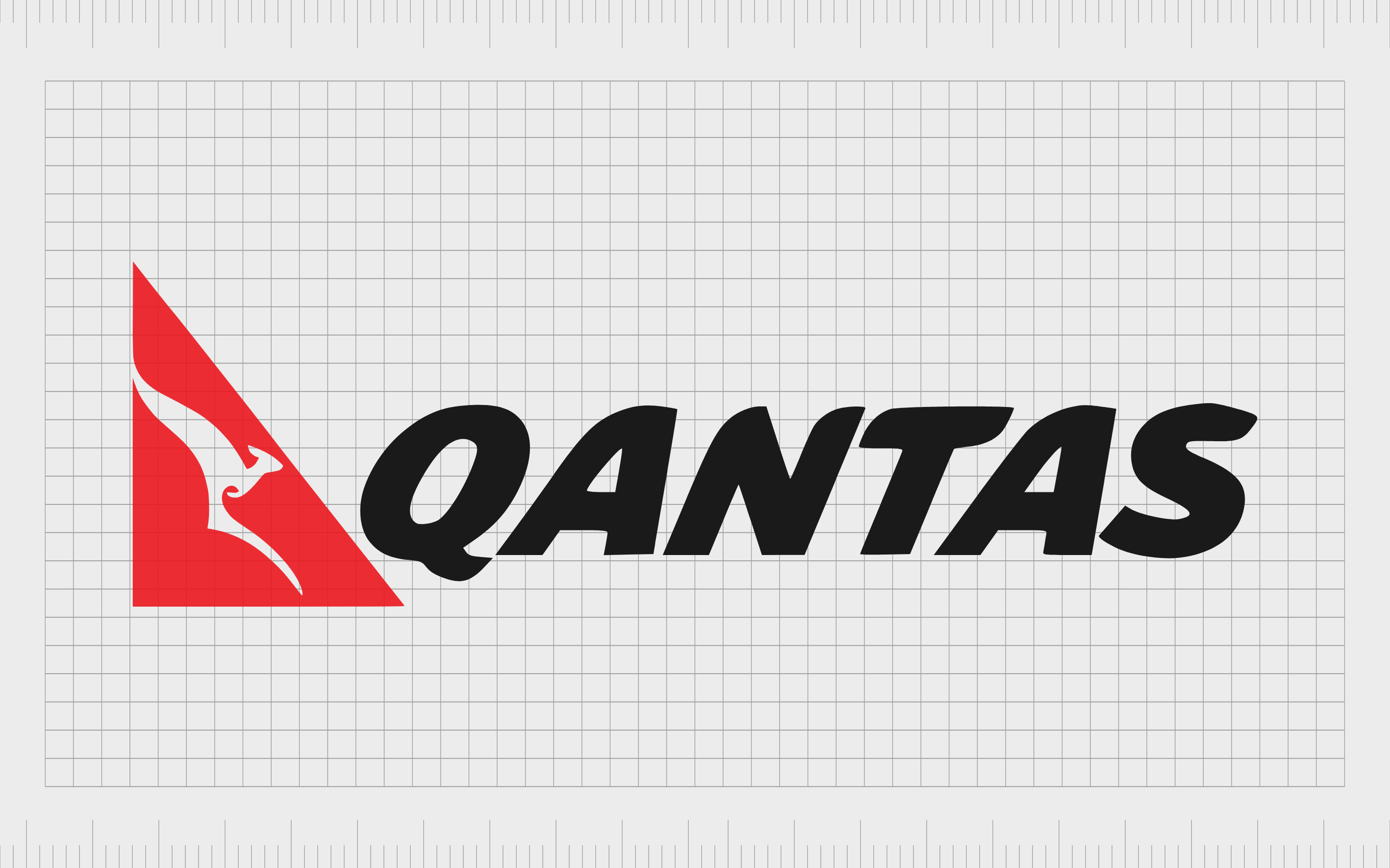
Quantas
The Quantas logo uses a somewhat abstract version of a triangle, with the top of the shape curved to create another line – making more of a rhombus shape. However, this triangular element within the logo still plays an important role in the company’s message.
The emblem is intended to remind us of the tail on the Quantas plane. The top point of the triangle is also pointing upwards, towards the sky.

CAT
Probably one of the most famous triangle logos in the construction industry, the “CAT” logo includes a large yellow triangle overlaid onto the company’s wordmark. This yellow triangle is creative and eye-catching.
Often, we associate the color yellow with joy and discovery.
Single triangles are essential in architectural design; it also makes sense to use this shape for a company responsible for creating building site equipment.

Fila
Italian clothing company Fila offers an excellent insight into how designers can incorporate shapes into the typography used for a wordmark. The interesting design of the “A” at the end of the wordmark makes it look closer to a triangle than a letter.
According to experts, the shape at the end of the wordmark is actually intended to be representative of the Alps, where Fila originally made clothing for its first customers.
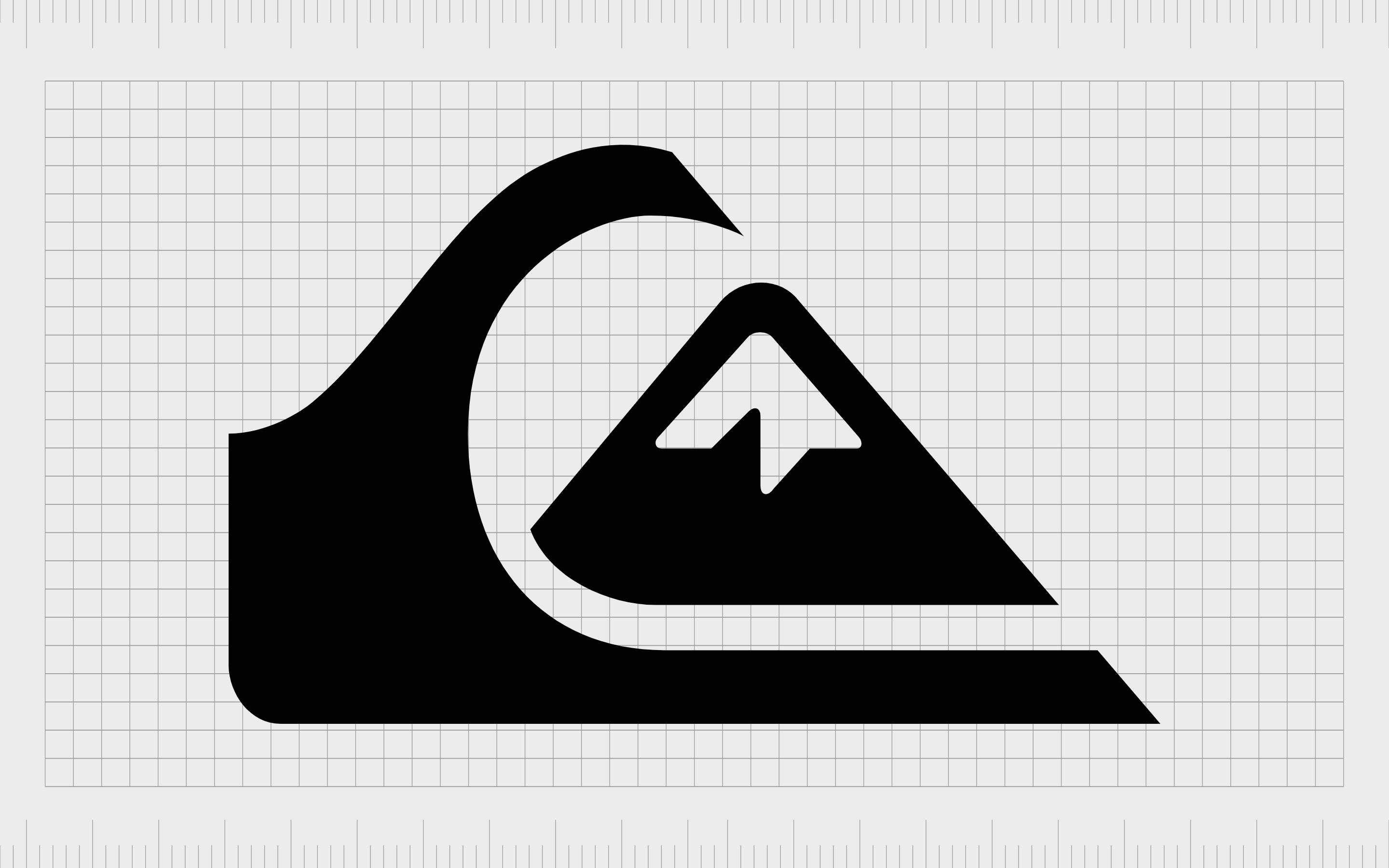
Quiksilver
A brand known for creating surf-inspired apparel for a niche group of athletes and individuals, Quiksilver was first founded in 1969. Today, the company sells products to customers all over the globe.
In the Quiksilver logo, we can see a number of stylized triangles, creating a shape similar to a mountain – reminding us of the power of nature.
The arrows in the Quiksilver logo are also pointing upwards, highlighting the innovative nature of the company, and the commitment of the brand to promoting ambition.
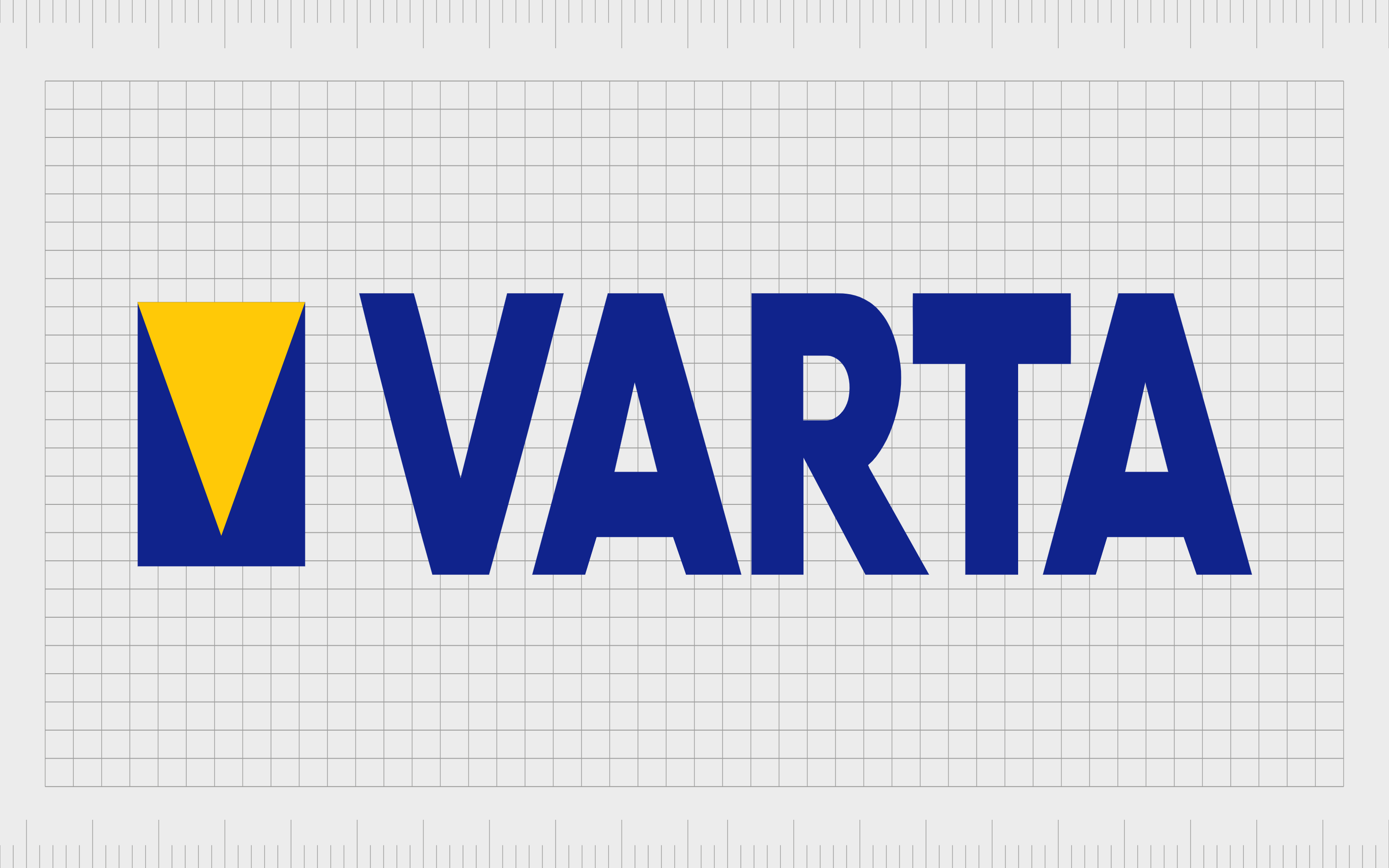
Varta
A long-standing German company responsible for the manufacturing of batteries for the industrial, consumer, and automotive markets, Varta might not be as well-known as some companies on this list.
However, the company’s triangle logo is definitely worth mentioning.
The inverted yellow triangle on the company’s symbol is representative of the letter at the beginning of the company’s name “V”. It also looks like the beam of light created by a torch – one of the many products a battery might power.
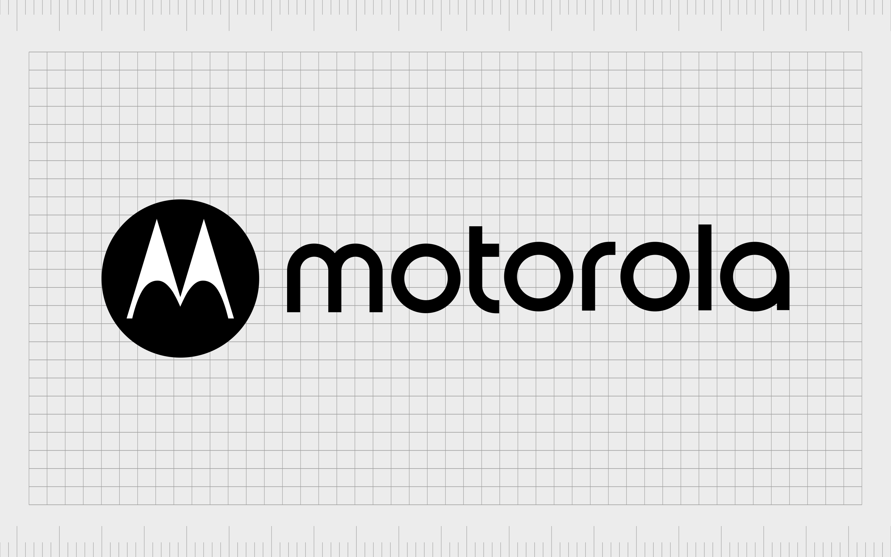
Motorola
The stylized “M” in the Motorola badge is a deliberate aesthetic choice for the company. The two bold points of the “M” remind us of mountains, highlighting thoughts of ambition, growth, and power.
There’s even another triangle evident in the white space between the two peaks of the “M”.
The use of triangles in this logo identifies the company as edgy, forward-thinking, and innovative. It also sets the brand apart from a number of other telephony companies without an identifiable shape.
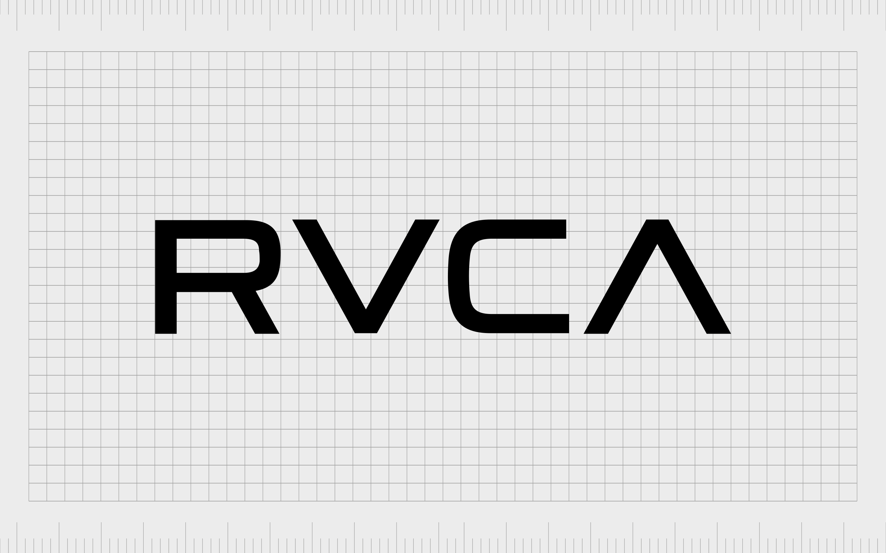
RVCA
Launched in 1999, RVCA is a California-based clothing company. The logotype for this company is interesting because it emits the upper lambda in the middle of the “A”, making the character look like an upside-down “V”, or a triangle.
Notably, the use of the “V” and “A” reflecting each other in this logo aims to highlight the brand’s ethos, which champions the balance of “opposites”.
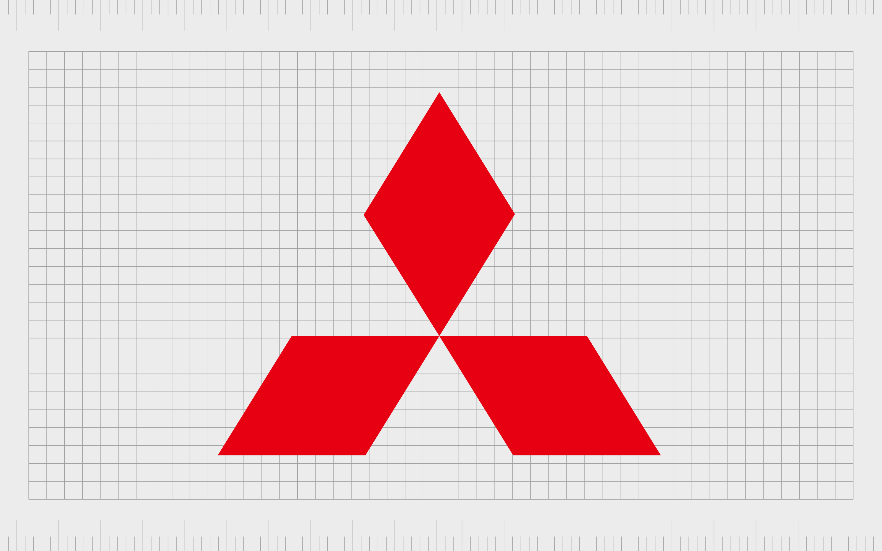
Mitsubishi
You’d be forgiven for thinking the primary shape of the Mitsubishi logo is simply a selection of three diamonds. However, it’s worth paying attention to the white space between the red shapes too.
These separate triangles all point together into the middle of the combined shape to create a sense of unity.
Consumed as a while, the three separate diamonds also create a triangular shape of their own. The main point of the shape is directed upwards, towards the sky, indicating a sense of growth, forward-thinking discovery and transformation.

Delta Airlines
Delta is one of the better-known companies in the air travel landscape, thanks in large part to its instantly recognizable logo. While Delta has moved through a number of logo redesigns over the years, the triangle shape has remained a common theme in the brand’s identity.
The arrow points towards the sky, reminding us of the company’s purpose. Notably, the name of the company also represents the letter “Delta” from Greek, which is symbolized by a triangle.
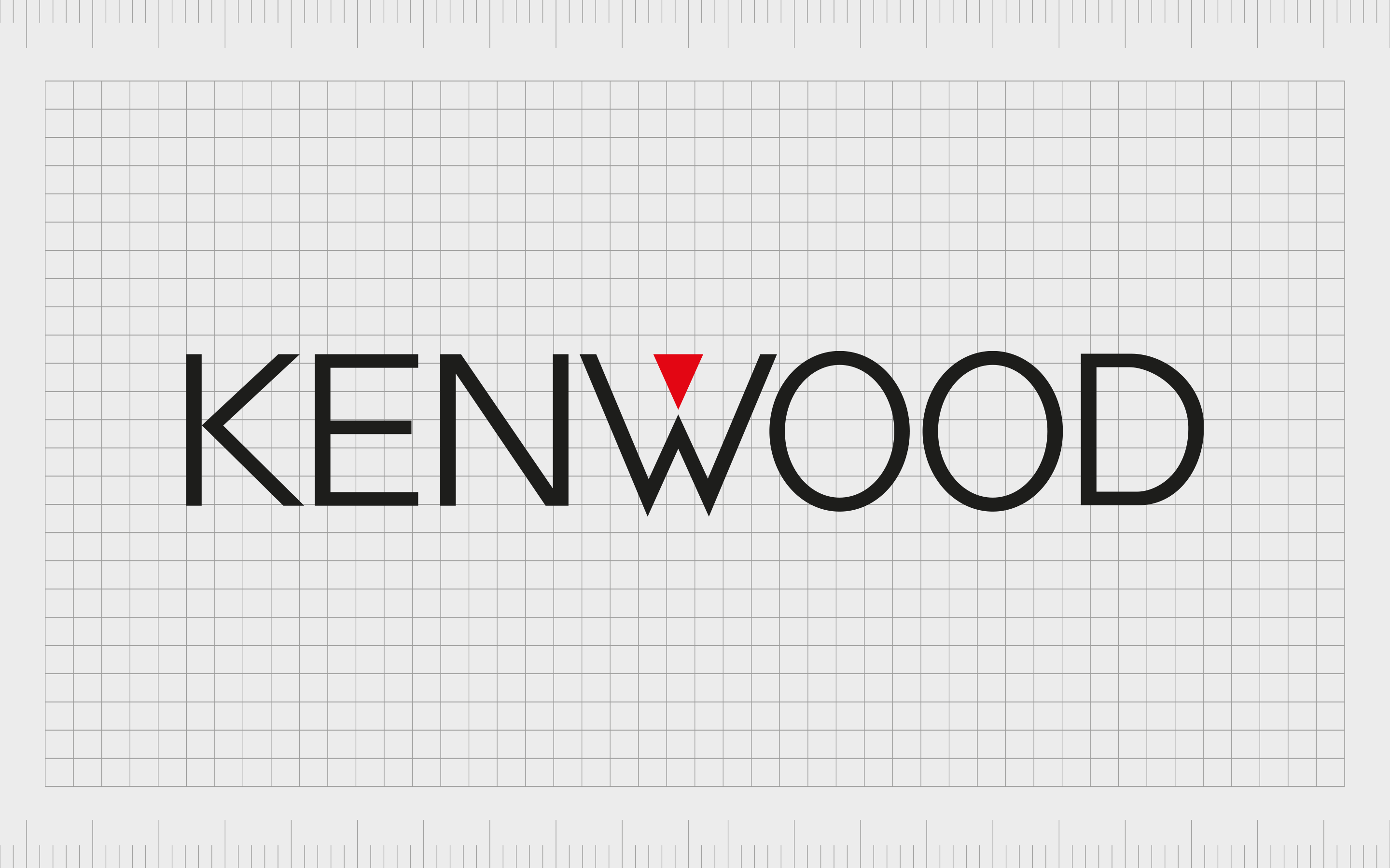
Kenwood
Kenwood’s logo might be simple, but it’s wonderfully eye-catching for such a minimalist design. Combining a basic sans-serif wordmark with a bold red triangle helps to draw attention to the center of the logo and sets the company apart from its competitors.
The triangle in this instance reminds us of innovation, performance, and stability. The shape is balancing perfectly on its point.
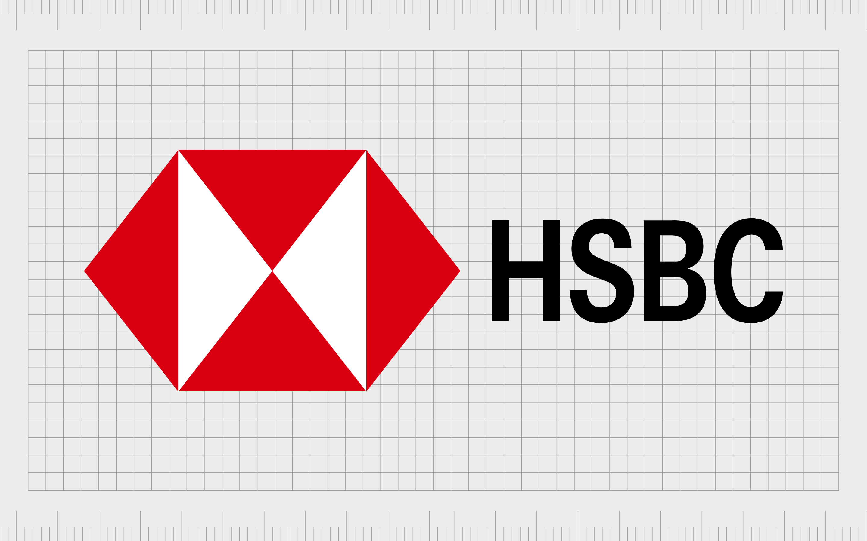
HSBC
At a glance, the HSBC logo looks like a random geometric shape. However, on closer inspection, we can see the image is constructed of several triangles (6 to be exact). The design helps to create a unique image, which looks almost like a box opening its lid.
The use of red and white-colored triangles in the HSBC logo symbolizes the creativity and passion of the brand. The decision to combine a number of triangles to make a square shape also helps to create a sense of stability and strength.
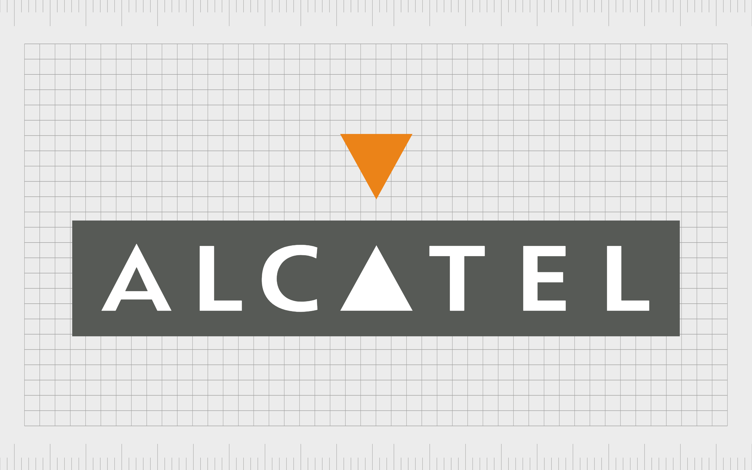
Alcatel
Alcatel actually has two separate triangles in its logo. The first is a yellow/orange triangle which points down towards the name of the brand. This shape is reflected in the letter “A” within the wordmark, which has been replaced with a simple white triangle.
The overall image is one of symmetry and balance. It also helps to create a sense of “connectivity” and communication, ideal for a company which sells communication equipment.
Using logos with triangles
As you can see from the famous triangle logos above, the use of this instantly recognizable shape in your brand image can be an excellent way to convey a wide range of different messages and ideas.
Notably, it’s worth taking the time to think about how you’re positioning and use of triangles in your logo can influence your brand’s image.
Triangles with sharp points and edges are generally used to convey bold confidence and innovation, while triangles with softer points and edges are more welcoming and inclusiveness.
The point of your triangle, and the direction it appears to be facing will also give your customer’s extra information about your brand, and your vision.
A triangle which appears to be clearly pointing towards the right will usually convey ideas of forward motion and progress, while a triangle pointing upwards depicts growth and innovation.
If you’re not sure how to use triangles effectively in your brand logo, the best thing you can do is speak to a specialist graphic design company. A professional logo design team will be able to determine what kind of shape is best for your brand.
Fabrik: A branding agency for our times.

Clarity starts with a conversation.
Thanks—we’ll get back to you shortly.
Whether you're navigating a rebrand, merger, or simply need a clearer identity—we’re here to help. No hard sell, just honest advice from people who know the sector.
Let’s start with a simple question…
Prefer to email? Drop us a line.
Fabrik’s been helping organisations rethink and reshape their brands for over 25 years. We’ve guided companies through mergers, rebrands and new launches. Whatever stage you’re at, we’ll meet you there.