


Atari logo history: From pixels to the present-day Atari symbol
You might be familiar with the Atari logo if you’re an avid video game and console fan. But how much do you know about the Atari logo history?
Like many famous companies, the Atari organization has made several updates to its visual design over the years, the most recent in the early 2000s. Each new iteration has further cemented the brand’s unique identity.
Though Atari is focused more on the cryptocurrency and hospitality landscapes today, it’s impossible to ignore the impact Atari had on the gaming industry. Responsible for producing some of the world’s most popular gaming consoles, Atari changed how we look at home entertainment.
If you’ve ever wondered how game brands designed their pixel-perfect logos, you’re in the right place. Today, we will be taking a closer look at the phenomenal evolution of Atari’s visual identity throughout the decades.
Does Atari still exist? An introduction to Atari
The Atari brand was originally introduced in 1972, a little over 50 years ago. It was founded in Sunnyvale, California, by Ted Dabney and Nolan Bushnell. Although the company is American in origin, it’s often confused with being Japanese because of its name.
The word “Atari” is a term commonly used when playing the ancient board game “Go.”
Introduced at a time when video games had yet to take the world by storm, Atari quickly became a pioneer in its field. The company’s products, such as the Atari 2600 console and “Pong,” the famous video game, helped to define the industry for electronic entertainment in the early years.
In 1984, following a major market crash for video games, the computer and console divisions of the original Atari company were sold to “Tramel Technology Ltd,” which rapidly renamed itself the “Atari Corporation.” Meanwhile, the original brand became “Atari Games.”
In 1996, Atari reverse-merged with a disk-drive company named JT Storage, and in 1998, the company was purchased by Hasbro Interactive, creating the new “Atari Interactive” subsidiary.
Throughout the 2000s, the ownership of Atari was passed over to IESA, and IESA renamed itself Atari SA in 2009. As of 2022, the current version of the Atari brand is mostly pursuing business opportunities outside of gaming, with video-game-themed hotels and cryptocurrency offerings.
Atari logo history: The Atari symbol over the years
The visual identity of the Atari brand hasn’t changed too much since the company took on the official name “Atari.” For a brief period between 1972 and 1973, the company made a number of changes to its visual identity, experimenting with different wordmarks and symbols.
However, following 1973, most of the Atari logos shared similar components.
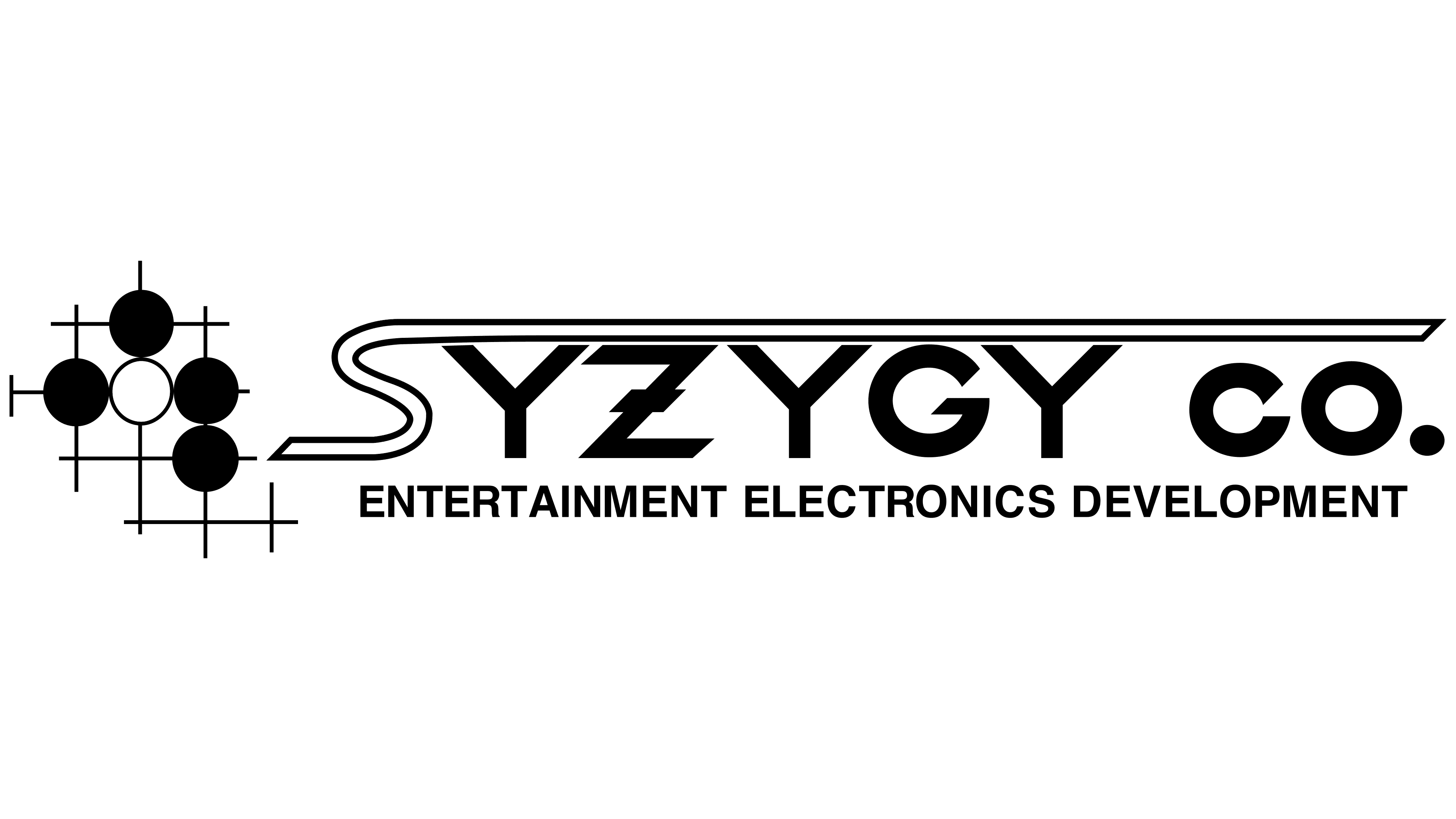
Before Atari chose its new name in 1972, it was initially known as Syzygy Co. This company had its own unique logo, depicted in the form of a combination mark. The name of the brand appeared in a bold sans-serif font, with the “S” stretched out across the top of the other letters.
To the left of the wordmark were five dots, one white and four black.
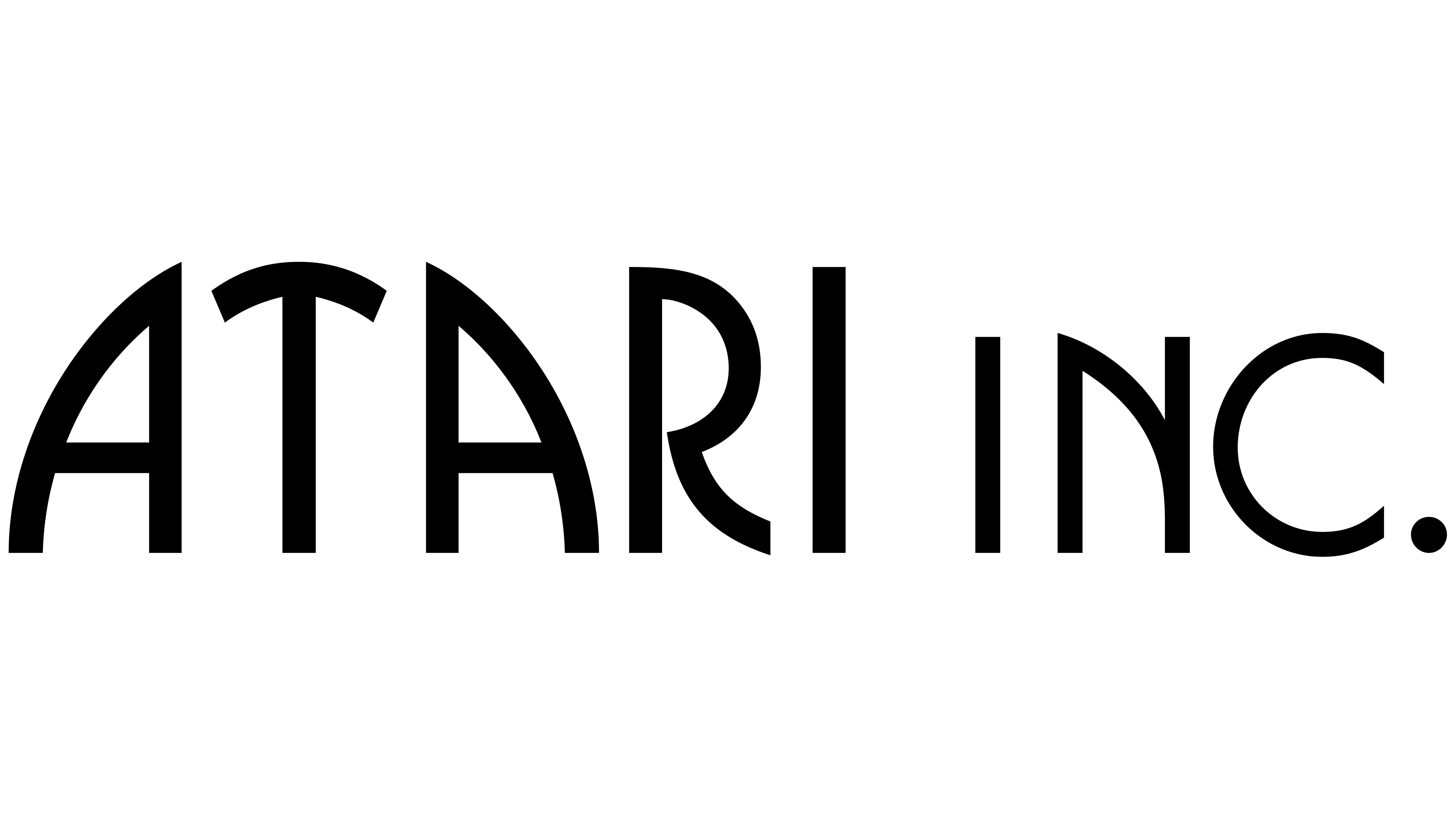
When the new name was chosen and Atari was incorporated in 1972, an updated logo was designed.
The modern, almost art-deco-style logo featured only letters with no decorative elements. The two “As” in Atari seemed to arch towards each other around the “T.” The “Inc” component was added at the end to balance the image.
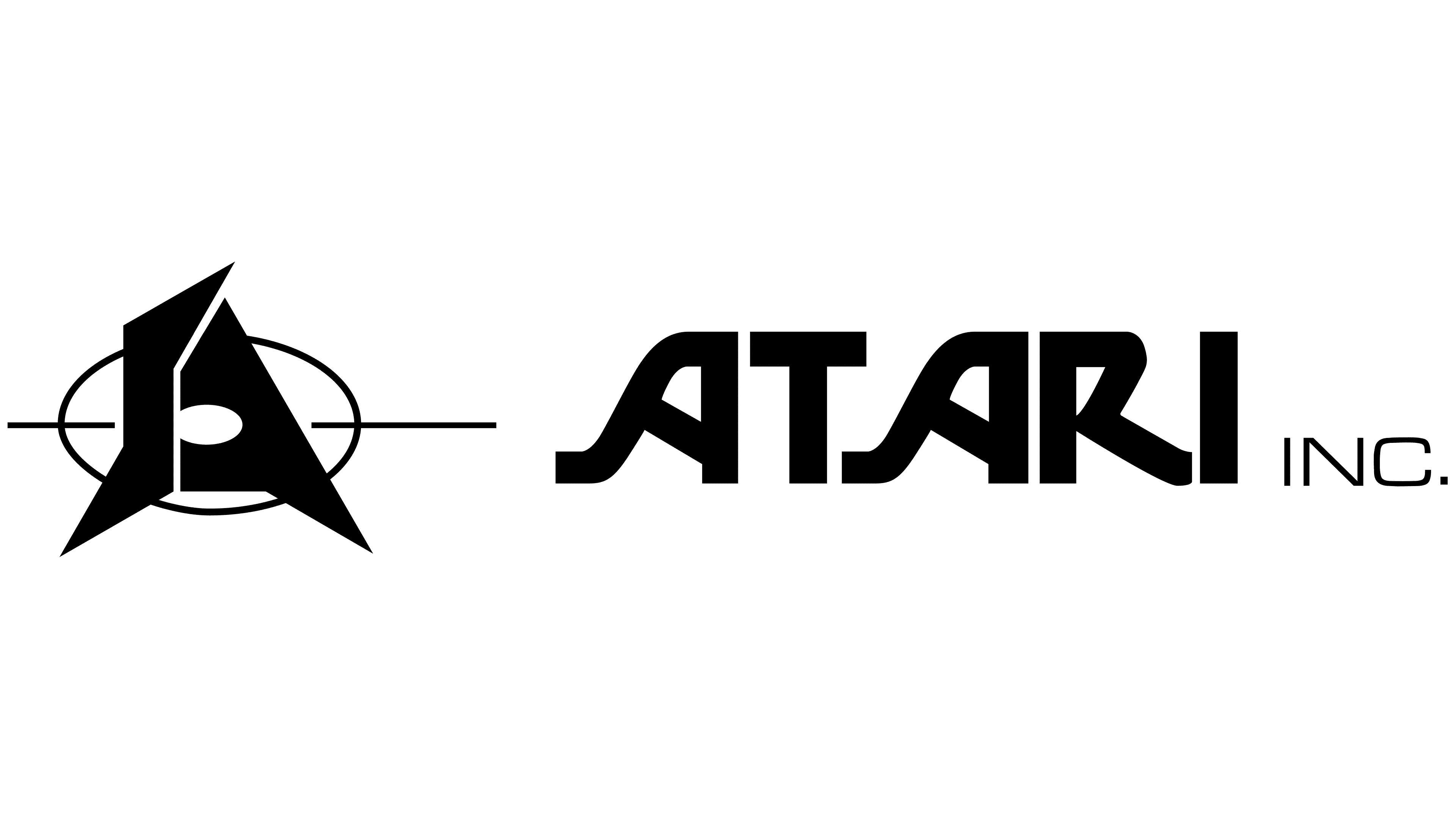
1973 marked a year of experimentation for the Atari logo design team. Initially, in June, a logo was introduced featuring a stylized “A” shape, seemingly combined with the letter “S,” perhaps in reference to the company’s previous name.
An oval shape was placed behind the design, with a line through the center, making it look like the letters were in the middle of a target.
Later in the same year, a new design was introduced, combining this symbol with a wordmark, featuring two stylized “As” throughout the word “Atari.” The inscription was bold and smooth, once again depicted in black and white.
After a short time, the company removed the symbol from the previous design and used only the wordmark for a couple of months, creating a slightly more modern brand image.
Despite all this experimentation, the new logo was quickly scrapped and replaced with something new. The Atari logo introduced in 1973 launched the use of the “Fuji” logo, created by George Opperman, and has been used by Atari ever since.
This 1973 logo featured a more refined wordmark for the video game company, with modern, agile, and somewhat blockier letters. The curves and flourishes were removed from the “A’s,” and the “R” was stretched slightly, making it a little more legible.
The Fuji symbol, featuring a line in the middle with two curved lines angling in from either side, sat alongside the wordmark.
The design was updated yet again in the same year shortly after. While the Fuji symbol remained the same, the Atari letters were smoothed, straightened, and elongated.
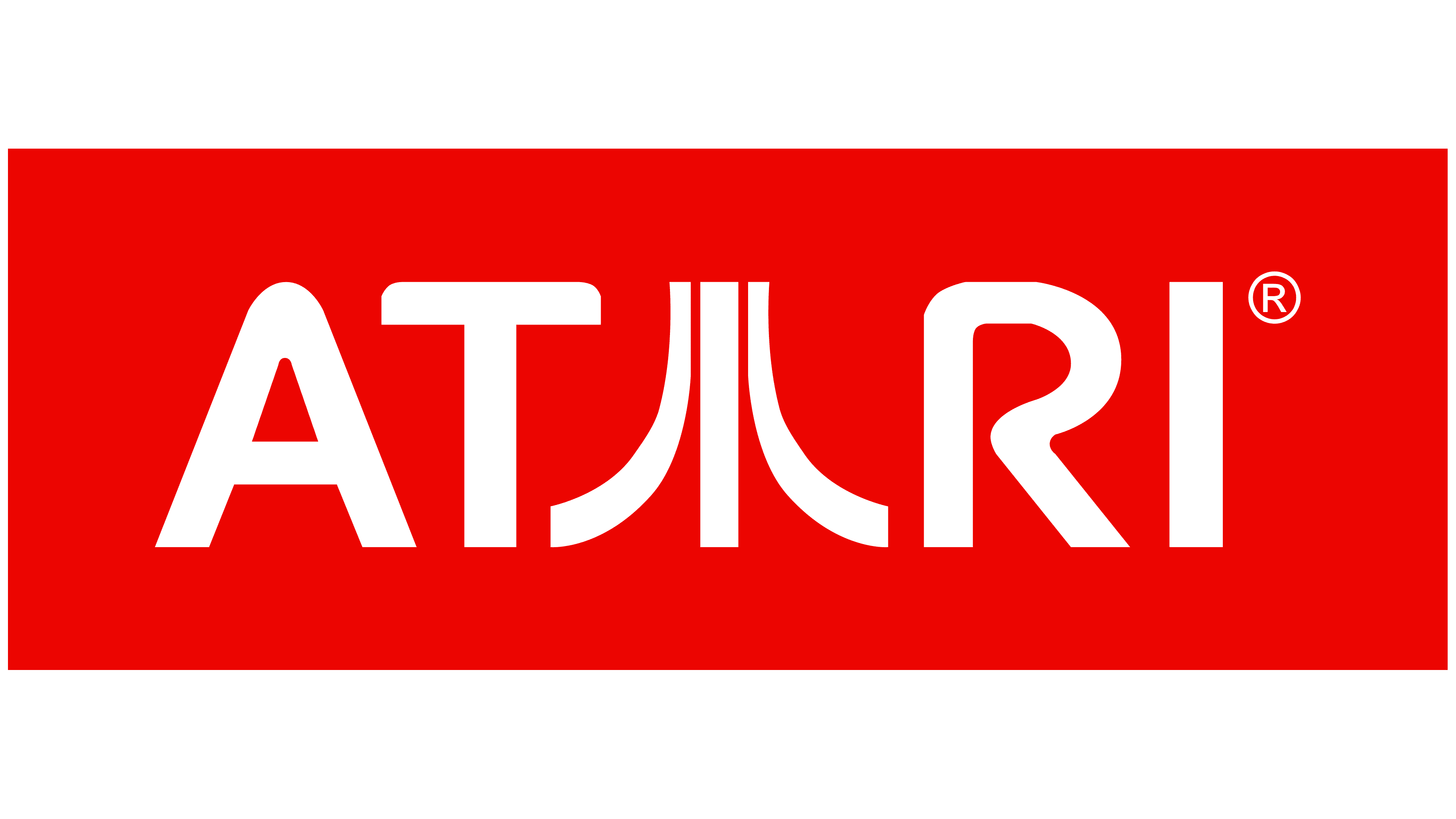
After making so many changes in such a short space of time, Atari stuck with a relatively consistent logo for almost 30 years. However, in 2002, the company decided to refresh its visual brand once again with the use of some new coloring.
The color palette was switched from black and white to red and white. Additionally, the symbol was moved from the beginning of the logo into the center of the wordmark to replace the second “A.” The typeface was almost exactly the same, but it did appear slightly shorter and bolder.
In 2003, Atari made the most basic of changes to its logo by updating the red color palette. The brightness of the red hue was increased, making the white letters even more eye-catching. The bottom of the middle line in the Atari symbol was also widened, making it look a little like an inverted horn.
In 2009, Atari introduced a new version of its logo, removing the symbol from the middle of the wordmark and placing it above the inscription instead. In this Atari logo, the symbol is the core focus of the image, taking up the majority of the red square it sits on.
Underneath the square, we see the Atari website URL, perhaps used to help market the brand. The expanded bottom portion of the middle line within the Atari symbol was removed.
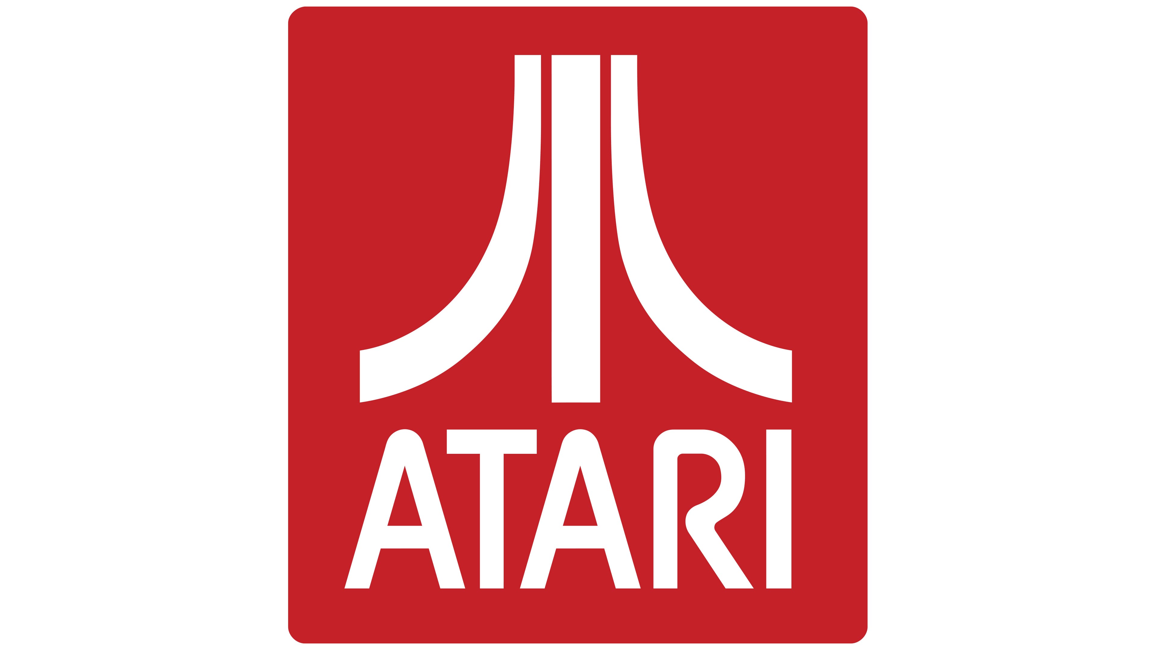
In 2012, the most recent version of the Atari logo was revealed. The image is very similar to the previous design; however, the letters in the wordmark are a little taller and more rounded. They also appear to be slightly closer together.
The lines in the symbol seem slightly thicker and more refined, and the red background has been darkened somewhat. The Atari URL was removed here too.
What does the Atari logo mean?
So, what does the Atari logo mean? Since moving away from the original Atari symbol, the company has almost consistently used the same graphic, referred to as the “Fuji” by fans. However, not everyone agrees on where this design actually came from.
The company offers no single explanation for the meaning of its logo. However, Opperman, who created the Fuji symbol, said he wanted to create something that looked similar to an “A” for Atari but still had its own distinctive style.
At the time when he was creating the design, the most popular product offered by Atari was the game Pong.
According to Opperman, the central line in the game inspired him to create the Fuji symbol. Adding the additional curved lines to create the “A” structure apparently led to the Atari symbol we know today.
However, Opperman has given other explanations for his designs in the past too. The designer has also said he wanted to create something that looked like a Japanese character or symbolized Mount Fuji – a famous location in Japan.
Exploring the Atari logo: Colors and fonts
The Atari logo today stands as an iconic symbol for retro video game and console lovers around the world. It’s an instantly recognizable image created through years of experimentation and innovation.
Whatever the “A” symbol is intended to represent, it certainly helps to differentiate the company from other competitors in the video game landscape. The uncertain origins of the design could even allow fans to apply their own meaning to the symbol if they choose.
The color palette of red and white is also evocative in its own way. White is often associated with purity and innocence, which we might connect to our childlike love of video games. Red is a color often associated with passion, love, and courage.
If you want to take a closer look at the Atari symbol, you can find some useful resources here:
What color is the Atari logo?
For most of the company’s lifespan, the Atari logo colors were primarily black and white. It was only in the 2000s that the brand decided to update its color palette with a more eye-catching shade of red. Today, variations of the Atari logo still exist in a white-and-black format.
However, the official Atari color palette includes bright red and white.
The red color codes are:
RED
Hex color: #E5141E
RGB: 229 20 30
CMYK: 0 91 87 10
Pantone: PMS Bright Red C
What font does the Atari logo use?
Unlike many aspects of the Atari logo, the font choice is something that has changed quite a few times during the company’s history. The typeface is unique to the brand, but it’s similar in a lot of ways to the SF Atarian System font, found here.
The Atari logo font is a simple, sans-serif typeface with bold and geometric elements, which help it to appear modern and youthful.
The impressive evolution of the Atari logo
The Atari logo is one of the most iconic emblems in the video game landscape – for a good reason. Though relatively simple, this powerful logo has captured the hearts and minds of fans worldwide.
Even years after the company stopped producing its famous video games and consoles, people still recognize the Atari logo anywhere.
Although the inspiration behind the Atari logo might be difficult to pin down, it’s safe to say the Fuji symbol has helped the brand to stand out for decades in its industry.
Fabrik: A branding agency for our times.

Clarity starts with a conversation.
Thanks—we’ll get back to you shortly.
Whether you're navigating a rebrand, merger, or simply need a clearer identity—we’re here to help. No hard sell, just honest advice from people who know the sector.
Let’s start with a simple question…
Prefer to email? Drop us a line.
Fabrik’s been helping organisations rethink and reshape their brands for over 25 years. We’ve guided companies through mergers, rebrands and new launches. Whatever stage you’re at, we’ll meet you there.