


The ultimate guide to the best architecture firm logos
Architecture firm logos come in a range of different shapes and styles. More than just a mark of differentiation, these eye-catching emblems ensure architecture firms can connect with their target audience and drive new business opportunities.
With more than 74,000 architecture businesses already operating in the US today, there’s a lot of competition for modern designers.
The right architecture logos ensure businesses can capture the attention of their customers, build lucrative relationships, and increase their visibility in an increasingly cluttered market.
However, as any architectural company will know, there’s no one-size-fits-all strategy for designing the perfect logo. Designing an emblem capable of making your business stand out takes time, focus, and expertise.
If you’re looking for inspiration for your own company or simply want to learn more about the architectural firm logos leading the industry today, you’re in the right place.
Let’s take a closer look at some of the most compelling logos in the industry.
Features of the best architectural company logos
As you’ll see from the list of architecture firm logos outlined below, companies in this industry can leverage a range of different strategies to connect with their target audience.
Some of the most modern architecture firm logos are geometric emblems intended to highlight the innovation and creativity of the brand. Other architect logos are more traditional, consisting largely of wordmarks.
The key to designing the perfect logo for an architecture firm or any other brand is knowing how to convey your organization’s unique personality and values in a visual format.
Many of the most famous architectural firms work with professional logo designers and graphic artists to ensure they’re sending the right message to their customers.
While all architecture logos can vary, you may notice some of the following commonalities between the world’s biggest brands:
Color
Architectural companies, like many organizations, use color psychology carefully in their branding. Common colors used throughout the industry include white and black, which demonstrate precision and focus.
However, you may also see numerous shades of blue for reliability, green for sustainability, and purple for luxury.
Font
Font choices are a common concern in architectural logo design. Many of the top architecture firms use wordmarks as a core component of their logo. This means they need to carefully choose the right typeface for each design.
Some opt for easy-to-read sans-serif logos, while others embrace the sophistication of serif fonts.
Shapes
A common tool in logo design, shapes can send an important message about the abilities and values of a brand. In the architectural landscape, geometric shapes such as squares, rectangles, and triangles are often very common. Many of these brands also use straight lines to demonstrate precision and care.
The top architecture firm logos in the world today
The most famous architecture firms throughout the world today have built long-lasting relationships with clients through not just their exceptional service but also their compelling brands.
For many organizations, succeeding in a competitive industry starts with choosing the right logos. Here are some of the most inspiring architecture firm logos worth exploring today.

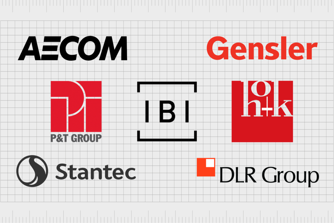
Gensler
Gensler is one of the better-known architecture firms in the world. First founded in 1965 in San Francisco, California, Gensler was created by husband-and-wife team Drue and Art Gensler, alongside their associate, James Follett.
The company originally focused on corporate interiors and office buildings. Today, however, Gensler serves a wide range of customers in more than 100 countries around the world.
The Gensler logo is a simple but effective wordmark. The name of the brand is depicted in a sleek, sans-serif font with smooth contours and lines. The “G” in Gensler features an arrow shape intended to represent the forward progression of the brand. The full design is depicted in red.

AECOM
One of the world’s biggest multinational infrastructure consulting and architecture firms, AECOM first launched in 2012 in Dallas, Texas. The company traces its origins back to the Ashland Oil & Refining Company, which grew out of another brand founded in 1910.
AECOM now stands as a key player on the Fortune 500 list.
Powerful and confident, the AECOM logo is a sleek wordmark written in all uppercase letters with bold, sharp lines. The sans-serif font choice ensures the design is easily legible on any background, particularly when combined with black coloring.
The “E” has been transformed into a series of 3 lines to demonstrate development and innovation.
MVRDV
Dutch architecture company MVRDV stands as one of the most famous architecture companies in the world. The brand was founded in 1993 by a trio of architectural experts. The firm’s first commission was for the public broadcasting company VPRO.
Like many of the top architecture firm logos, MRVDV chose a basic wordmark for its logo, intended to showcase the company’s stability, strength, and confidence. The carefully positioned letters in the logo demonstrate a sense of sophistication and consistency.
IBI Group
Based in Canada, the IBI Group was founded in 1974 and has since evolved into one of the largest architecture and engineering firms in the world. The company has more than 60 offices located across six continents and also offers a range of consulting services.
Positioned in a square badge, the IBI Group logo is modern and simplistic. The letters “IBI” are evenly spaced between two sections of a disconnected square. The overall design reminds viewers of development and innovation. IBI stands for “Intelligence, Buildings, and Infrastructure.”
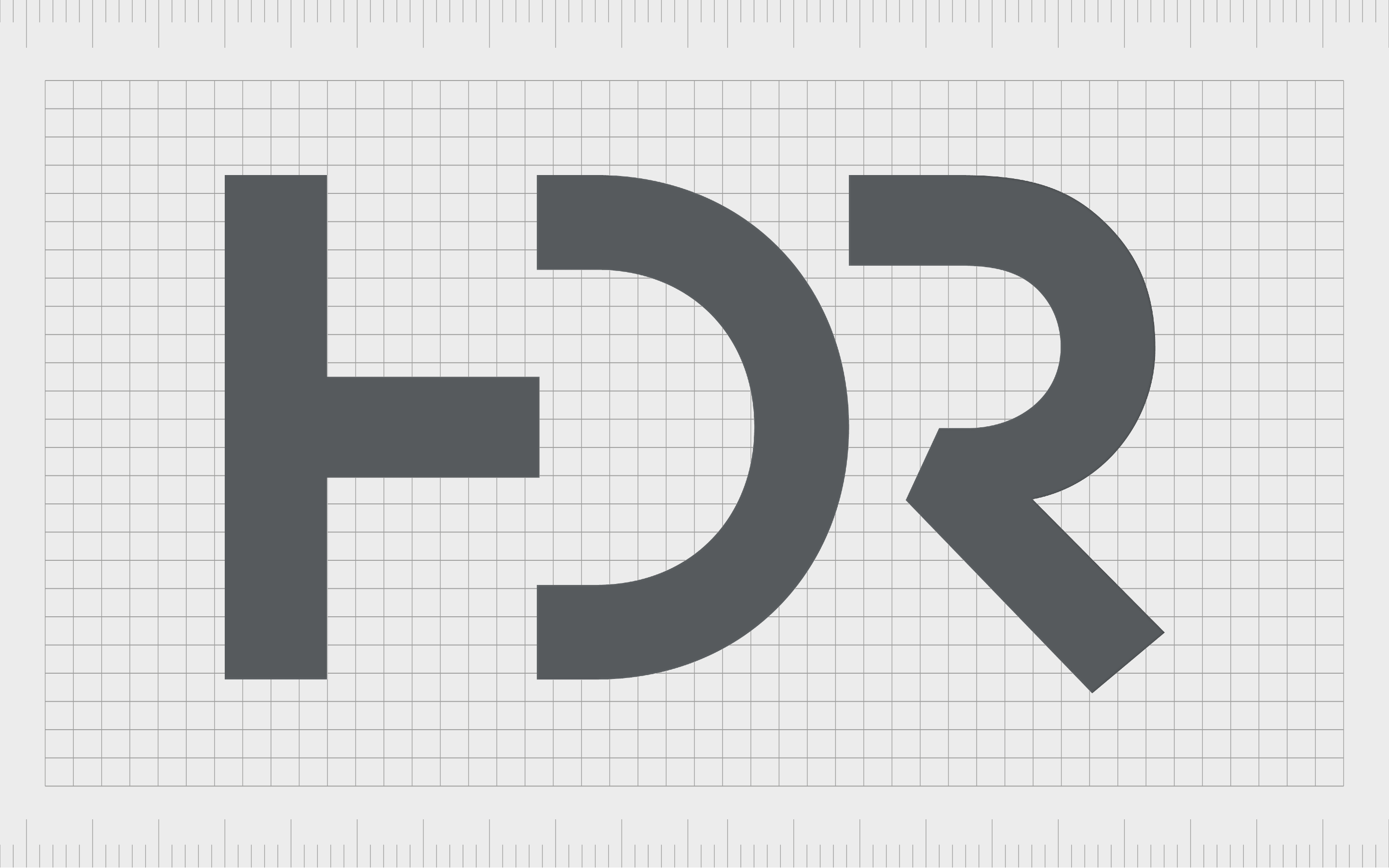
HDR Inc
One of the most modern architecture firm logos on our list comes from HDR Inc. This employee-owned design firm was launched in 1917 and focuses on engineering, environmental, architecture, and construction services.
It has worked on projects in all 50 US states, as well as 60 countries worldwide, including notable projects like the Hoover Dam Bypass.
The HDR monogram logo cleverly removes certain lines from each letter to make the overall emblem look like a collection of lines and shapes. The design is fun and interesting, depicted in grey coloring to highlight sophistication and professionalism.

Nikken Sekkei
Offering a combination of planning, engineering, and architectural services, Nikken Sekkei is a company based in Japan, which first launched in 1900. The company has contributed to more than 25,000 projects across 50 countries, with various worldwide offices.
Sleek and sophisticated, Nikken Sekkei’s logo is a wordmark with its own tagline placed underneath. The elongated letters in the company’s sans-serif wordmark balance perfectly with the slogan underneath: “Experience, Integrated.”
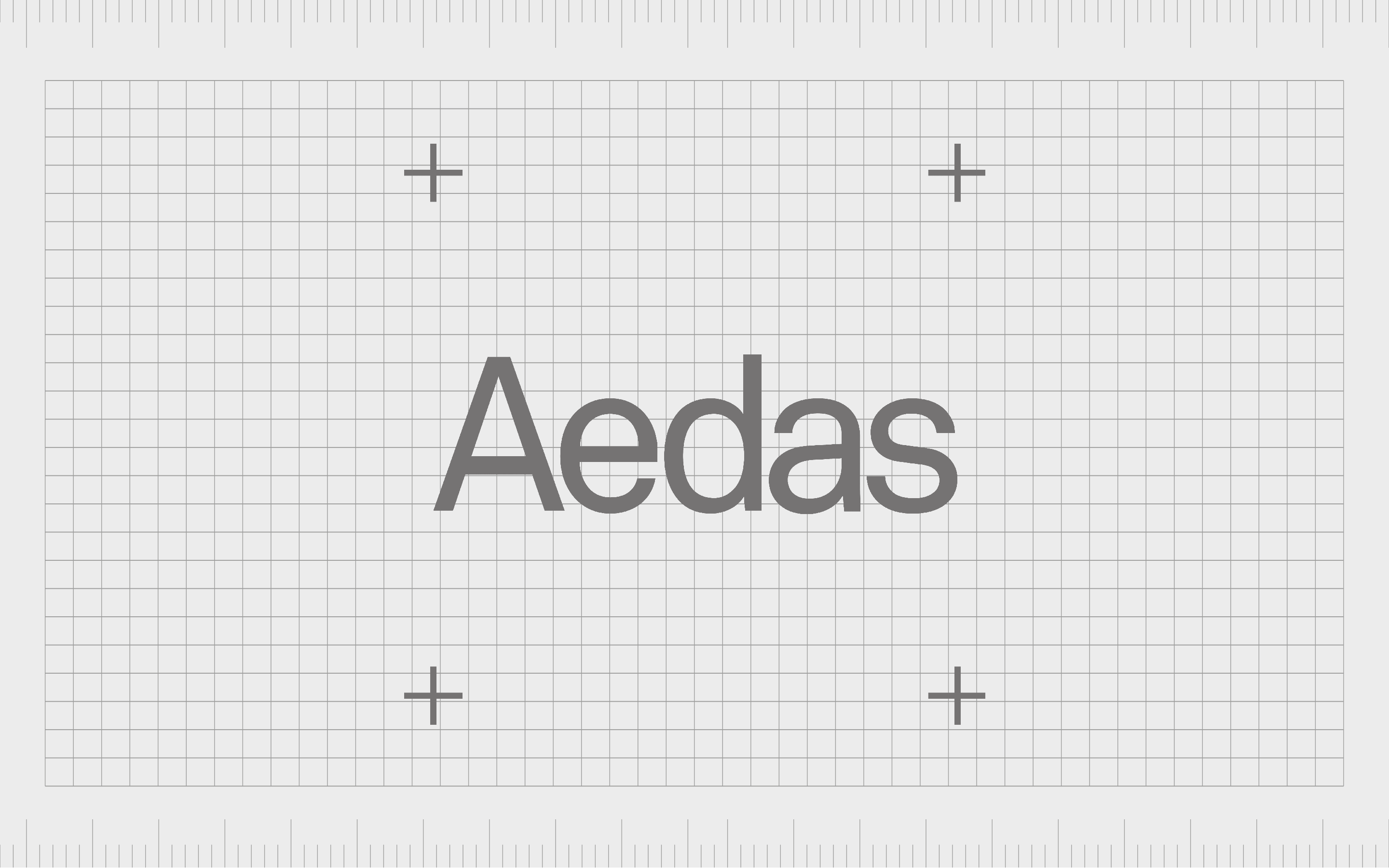
Aedas
With a name taken from the Latin word for “building,” Aedas has created an evocative and meaningful brand presence over the years. The architectural firm was founded by Keith Griffiths in 2002 and operated primarily in China.
Aedas offers architectural services alongside landscaping, interior design, and urban planning solutions.
The combination mark used for the Aedas logo presents the name of the company in sans-serif, the grey font in the center of a white square. At each edge of the square, there’s a cross in a matching shade. The overall design looks sleek, modern, and sophisticated.
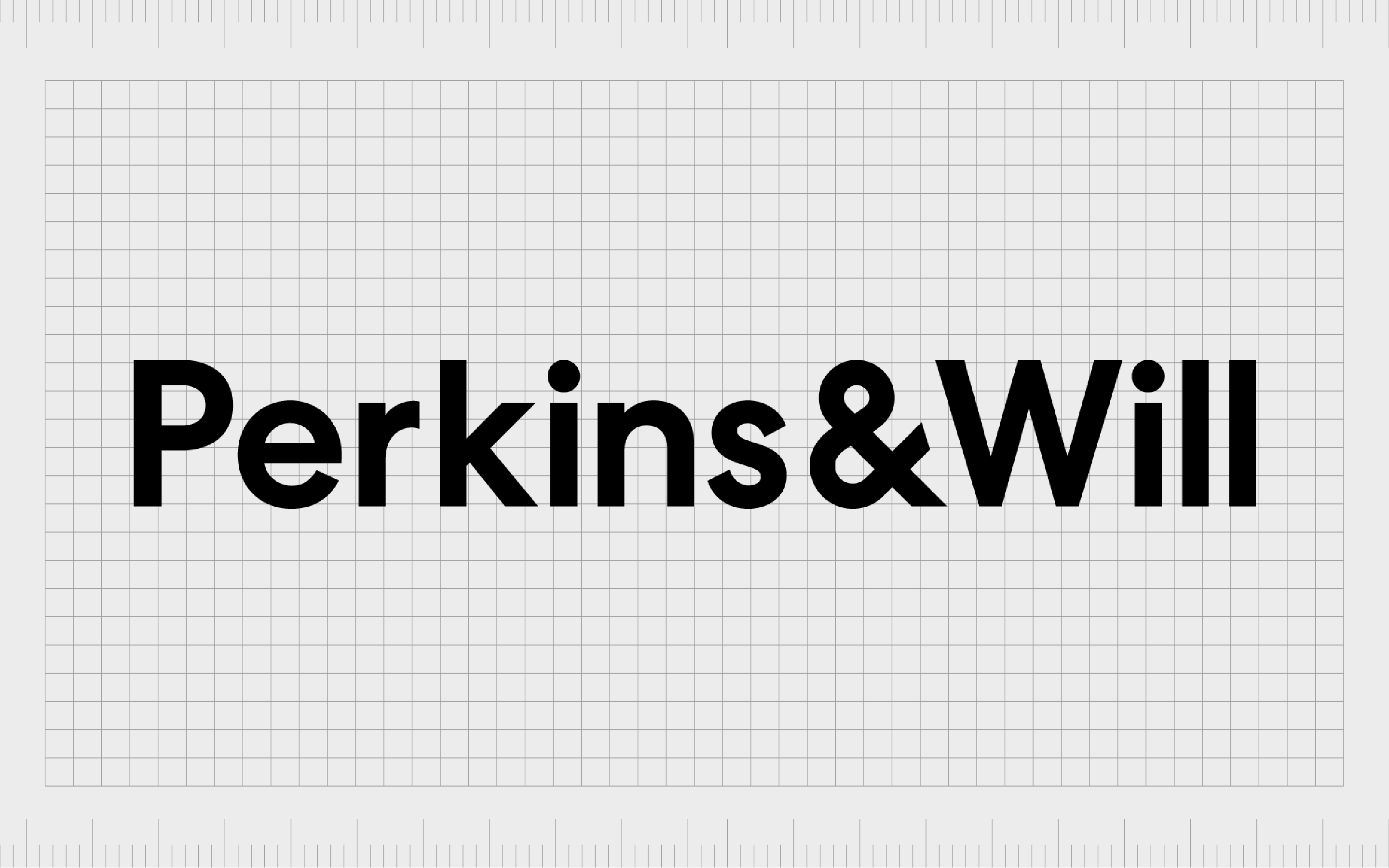
Perkins and Will
One of the simplest architecture firm logos on our list belongs to Perkins and Will. This company, which launched in 1935, was named after its two founders, Phillip Will and Lawrence Perkins. The company has become one of the biggest architectural brands in the world in recent years.
Streamlined and balanced, the Perkins and Will logo features the name of the company, with an ampersand in place of the word “and.” The sans serif font choice is easily legible in any environment, while the colors of black and white highlight the company as detail-oriented and professional.
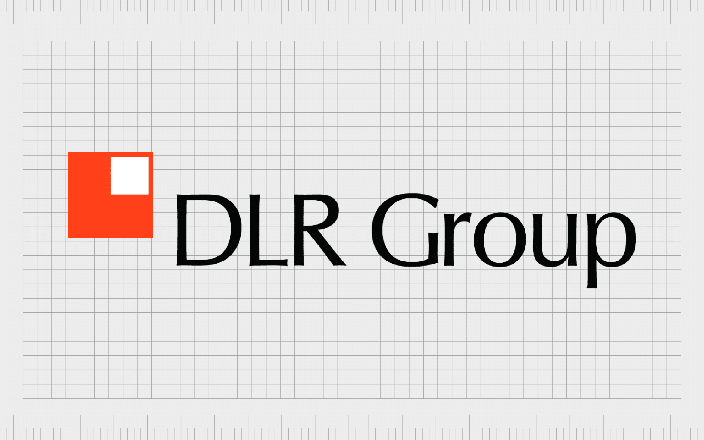
DLR Group
An employee-owned integrated design firm, the DLR Group specializes in architecture, planning, engineering, and interior design. The company’s brand promise revolves around elevating the “human aspect” of the design process. The organization also advocates for sustainable design.
Combining a wordmark with a simple geometric design, the DLR Group logo is easily recognizable and eye-catching. The company chose a sans-serif font in a dark grey shade for the core of its logo, accompanied by a red square with a white block in the top right corner.

CannonDesign
Another example of a modern architecture firm logo comes from CannonDesign. This global engineering and consulting practice serves a wide range of customers around the world. Launched in 1945 in New York, CannonDesign focuses on living-centered design.
Although the CannonDesign logo may seem like a simple wordmark on the surface, it has some unique elements. Removing certain lines from specific letters allows the characters in words to blend together, creating a highly connected and innovative emblem almost.
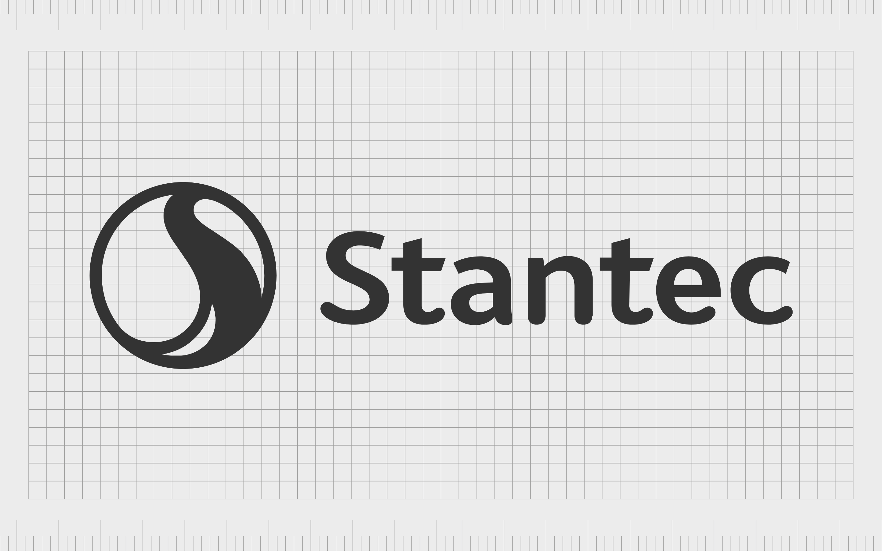
Stantec
One of the most famous architecture firm logos from the United States belongs to Stantec Inc. This company, founded in 1954 by Don Stanley, provides professional planning, engineering, architecture, and interior design consulting services alongside other solutions.
The compelling Stantec logo is a combination mark featuring a dark grey wordmark to the right, depicted in a sleek, sans-serif font. On the left, we see a circular emblem with a swirling shape in the middle. The design is meant to represent innovation, community, and growth.
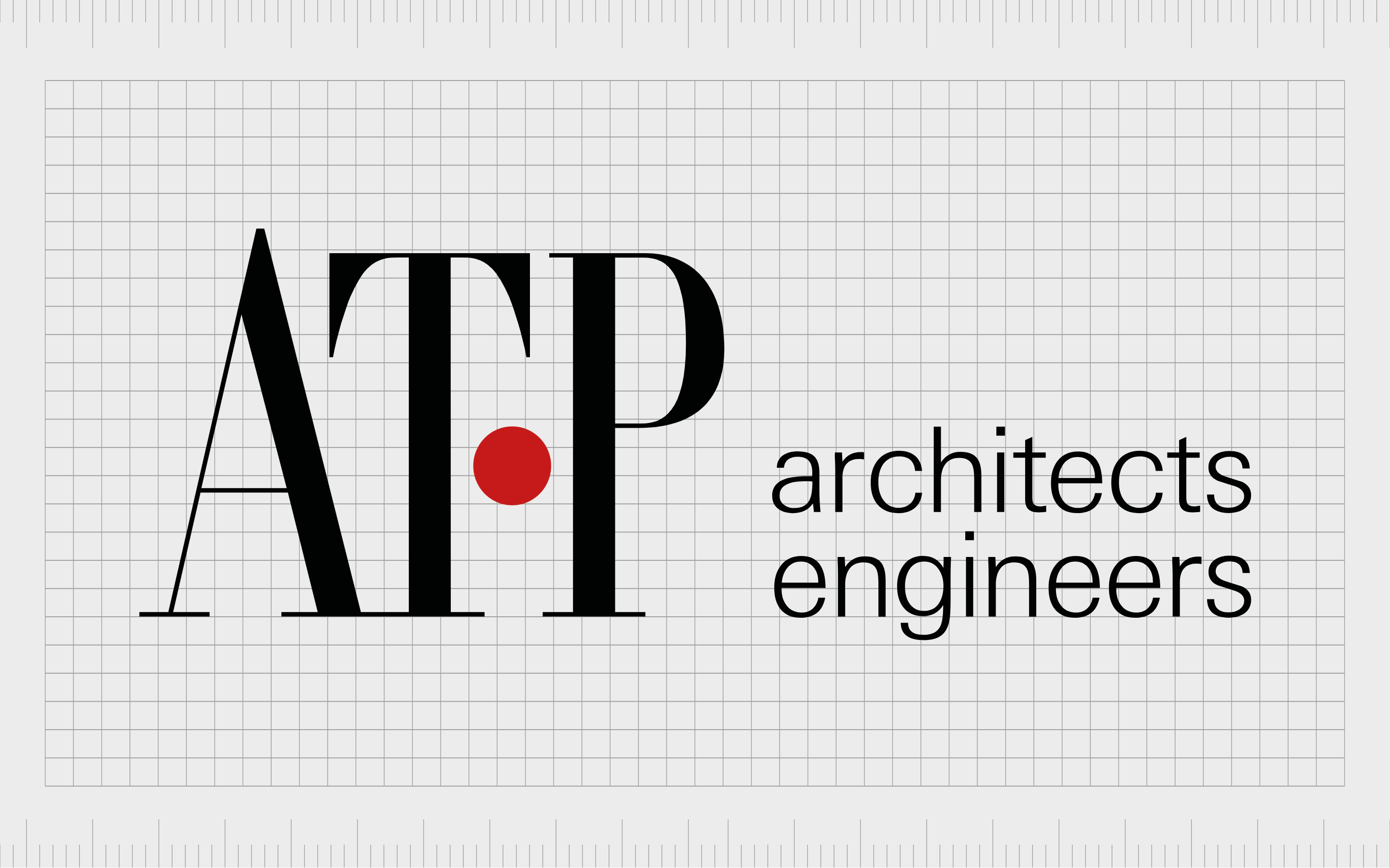
ATP Architects Engineers
One of the more traditional architecture firm logos on our list comes from ATP Architects Engineers. This international company launched in 1951 and focuses primarily on integrated design. The company has more than 1000 employees across 38 countries worldwide.
Like many famous architecture firm logos, the ATP emblem is a wordmark, conveying the letters “ATP” in a large serif typeface, with a red dot between the T and P to symbolize passion. Next to the letters, we see the words “architects, engineers” in a sans-serif, smaller font.

HOK
Previously known as Hellmuth, Obata + Kassabaum, HOK is an American design and architecture firm founded in 1955. The company was the largest US-based company in the architectural landscape in 2018 and the fourth-largest interior design firm.
The HOK logo is quite unusual compared to other options in the architectural landscape. It consists of a red square, with lowercase letters distributed in an interesting manner in the top center of the design. The “O” seems to hover slightly above the “o,” making the company appear more fun and creative.
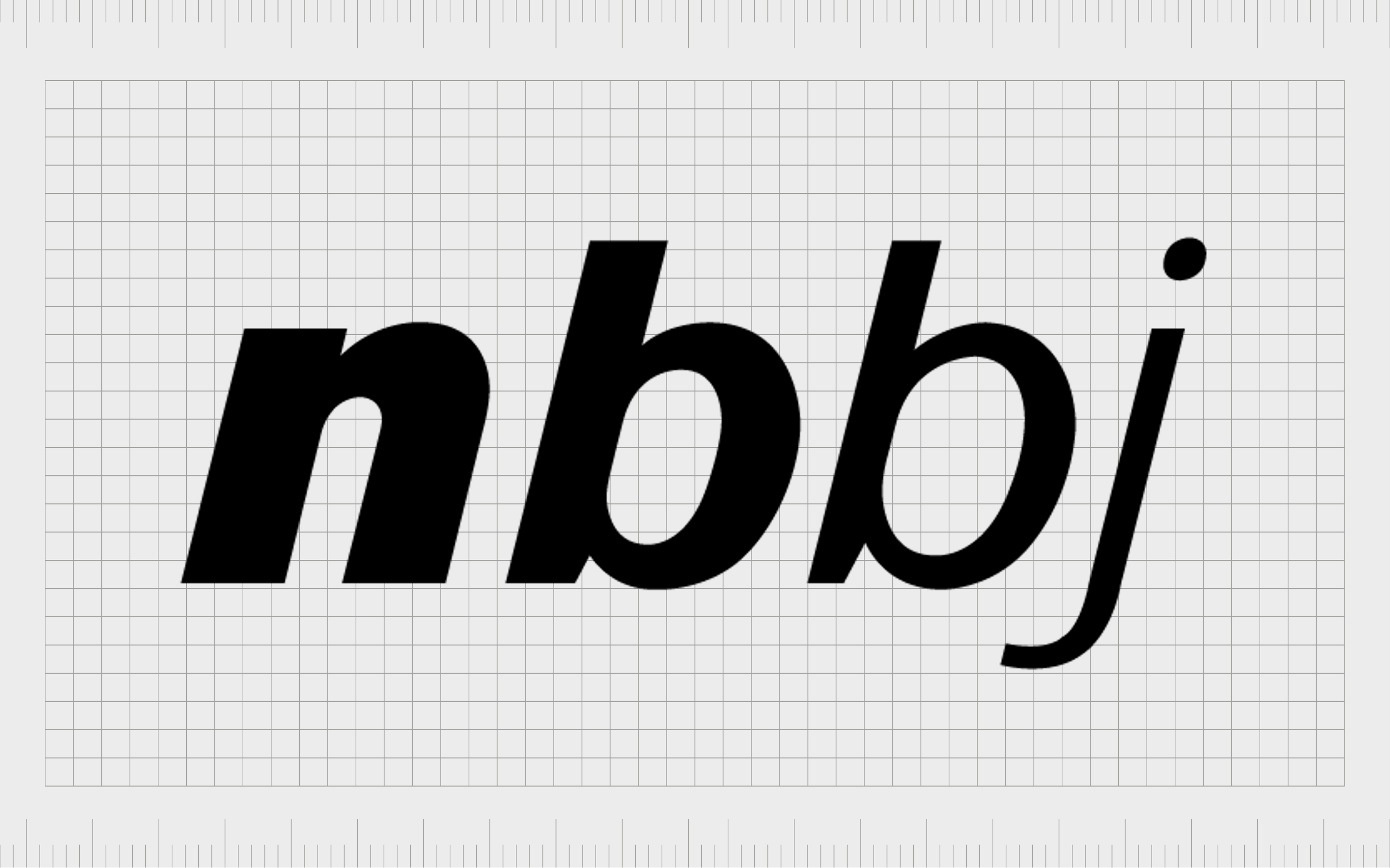
NBBJ
Launched in 1943, NBBJ is a global architecture firm based in America. The company offers a range of services in architecture, planning, interiors, and urban design. It was also named one of the most innovative firms in the industry by Fast Company and one of the fastest-growing firms of all time.
NNBJ’s logo features the letters of the company’s acronym name depicted in lowercase, white font on a black background. What’s interesting about this logo is the way the letters become increasingly thinner towards the right-hand side. The “n” is much thicker than the “j,” symbolizing refinement.

SmithGroup
American architectural and engineering firm SmithGroup is one of the better-known architectural firms in the world. This company ranks as one of the top 50 architect firms in the world, and it’s one of the largest companies in the US too.
Focusing on conveying stability, strength, and professionalism, the SmithGroup logo is a simple, sans-serif wordmark depicted in all uppercase letters. The company chose the letter grey to symbolize sophistication and elegance.

B+H Architects
Previously known as Bregman + Hamann Architects, B+H is named after its original founders, who launched the company in 1953. The Canadian architectural and engineering firm is one of the biggest in the world and also acts as a member of the Surbana Jurong Group.
Sleek and sophisticated, the B+H logo is depicted in a deep blue shade to convey reliability, credibility, and trustworthiness. The blocky, bold letters in the emblem symbolize the strength and stability of the brand, while the minimalism of the logo highlights their focused design strategy.
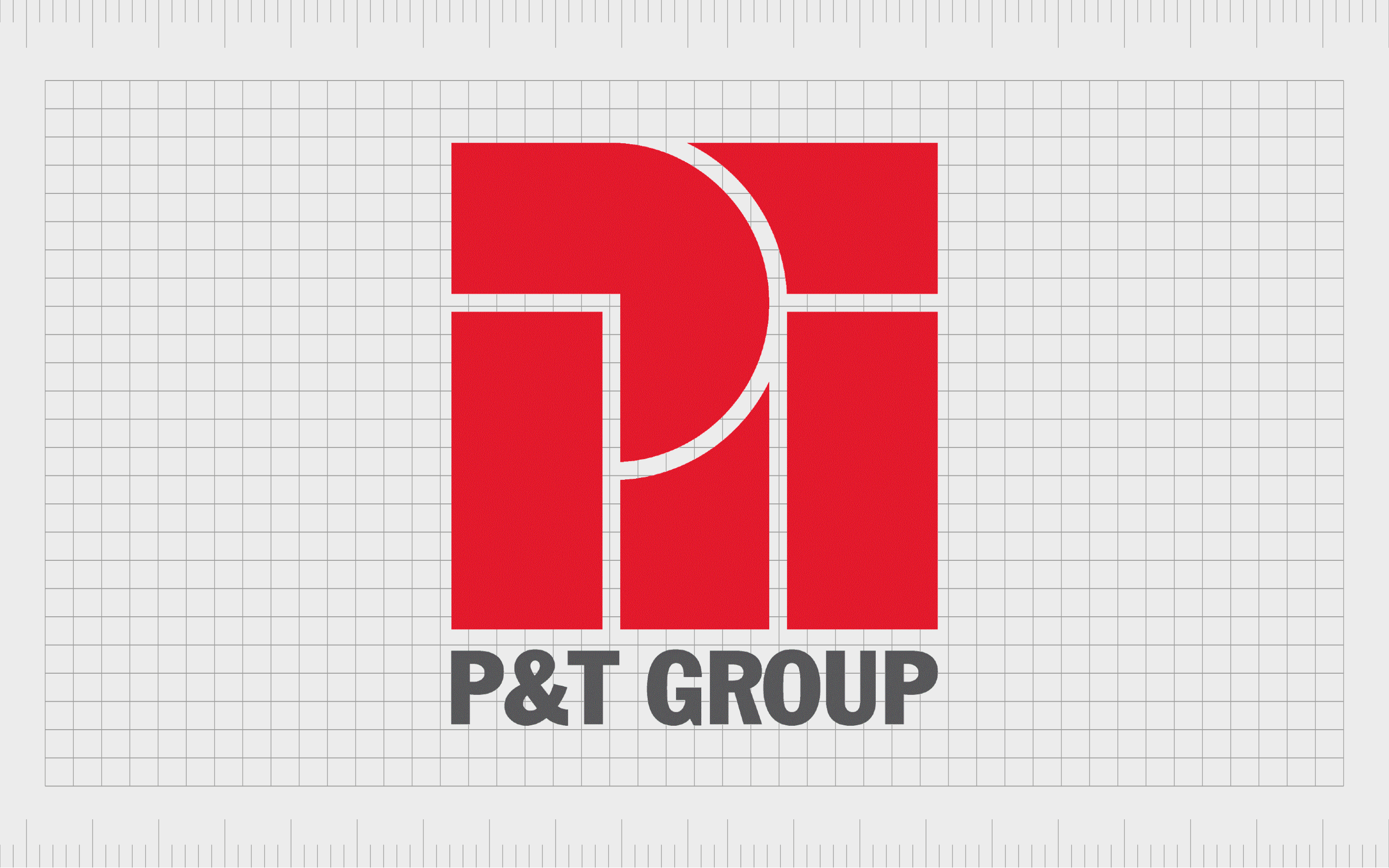
P&T Group
Known to some as the Palmer and Turney Group, the P&T Group has one of the most impressive architecture firm logos around. It’s one of the oldest and most famous architectural companies in the world and has designed a host of landmark buildings throughout Hong Kong, Asia, and Shanghai.
The geometric logo used by the P&T group combines an interesting red square with various white lines throughout, with a grey wordmark. The shapes in the emblem almost look like the sun rising behind two buildings. This sleek and sophisticated emblem conveys creativity and vitality.

Foster + Partners
One of the most famous architectural firms in the UK, Foster + Partners, was founded in 1967 and quickly became the largest architectural company in the United Kingdom. Established initially as Foster Associates, the name was shortened and enhanced in 1999.
Today, the Foster + Partners logo is a minimalistic logo, depicted in the popular shade of grey, to symbolize sophistication and strength. The plus symbol in the middle of the logo is a little thinner and larger than the other characters in the design to highlight the company’s focus on collaboration.
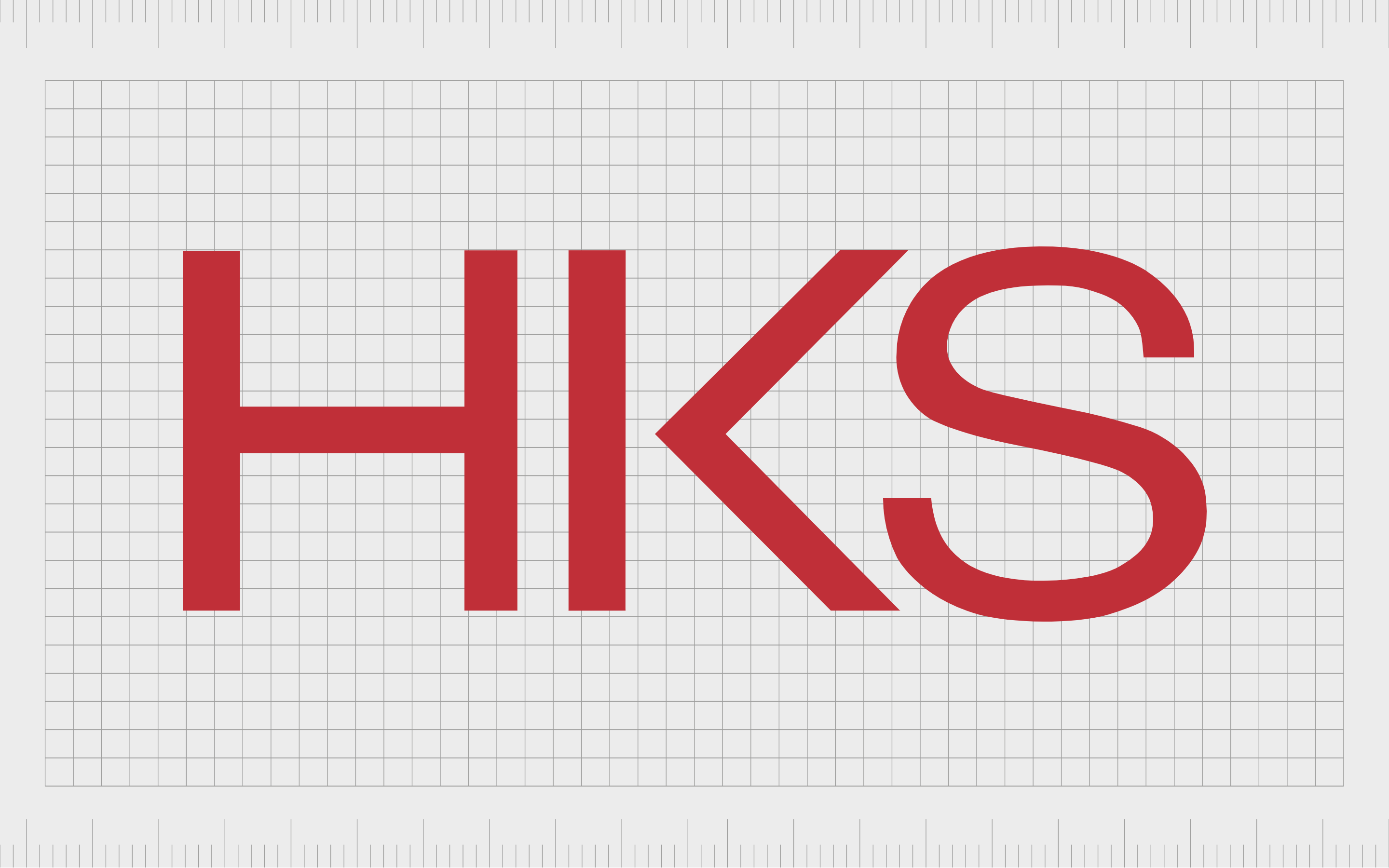
HKS
Headquartered in Dallas, Texas, HKS was established in 1939 by Harwood K Smith. The letters for the company’s name come from the initials of the founder. The brand has 27 locations across the US and stands as one of the major architectural firms in America.
Choosing the color red as the core aspect of its logo, HKS highlights the passion and vitality of its company with its design. The bold, streamlined letters are easily visible in any environment, helping the organization to stand out from the competition in its space.
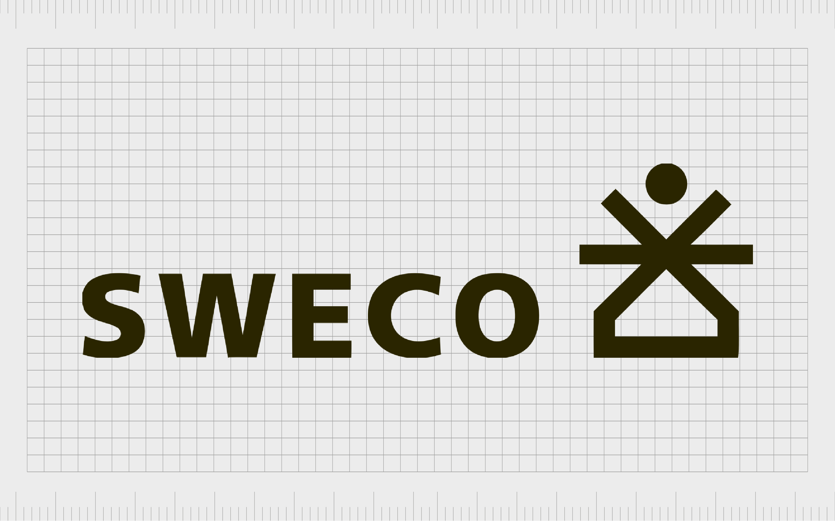
Sweco
Headquartered in Stockholm, Sweco is one of the leading architectural firms in Europe. It serves around 13 different countries and has over 22,000 employees worldwide. The company is heavily committed to sustainable design and resilience.
The Sweco emblem is one of the most interesting in our list of architecture firm logos. Alongside a simple black wordmark, the design includes a compelling graphic made up of a house-shaped component with various lines above it, as well as a hovering black ball, perhaps representing the sun.
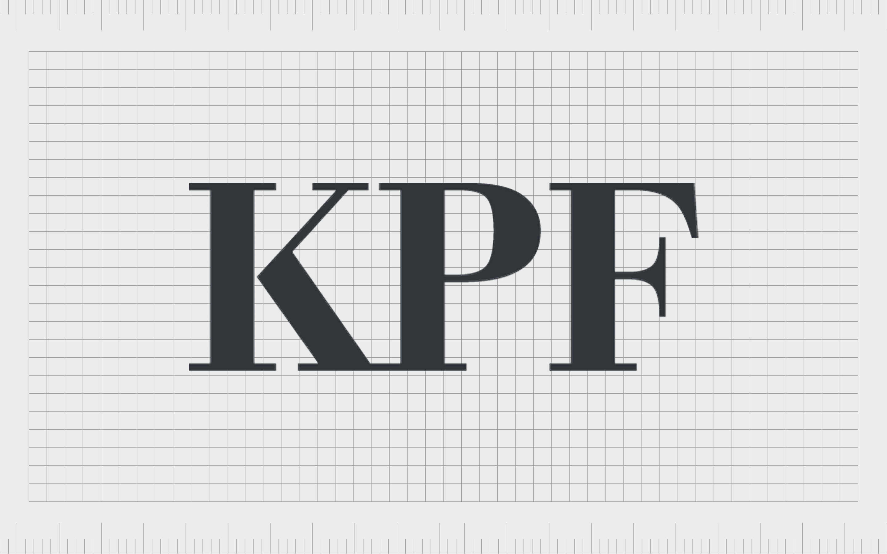
Kohn Pedersen Fox
Like many architectural company logos, the Kohn Pederson fox emblem is a relatively straightforward and sophisticated symbol. This American company was founded in 1976 and serves both the public and private sectors.
It’s one of the biggest companies in New York, where the headquarters of the organization resides.
Though relatively straightforward compared to other famous architectural company logos, the Kohn Pedersen Fox emblem is still eye-catching. It features a simple acronym wordmark in a serif font with bold lines and slim serifs. The color grey represents sophistication.
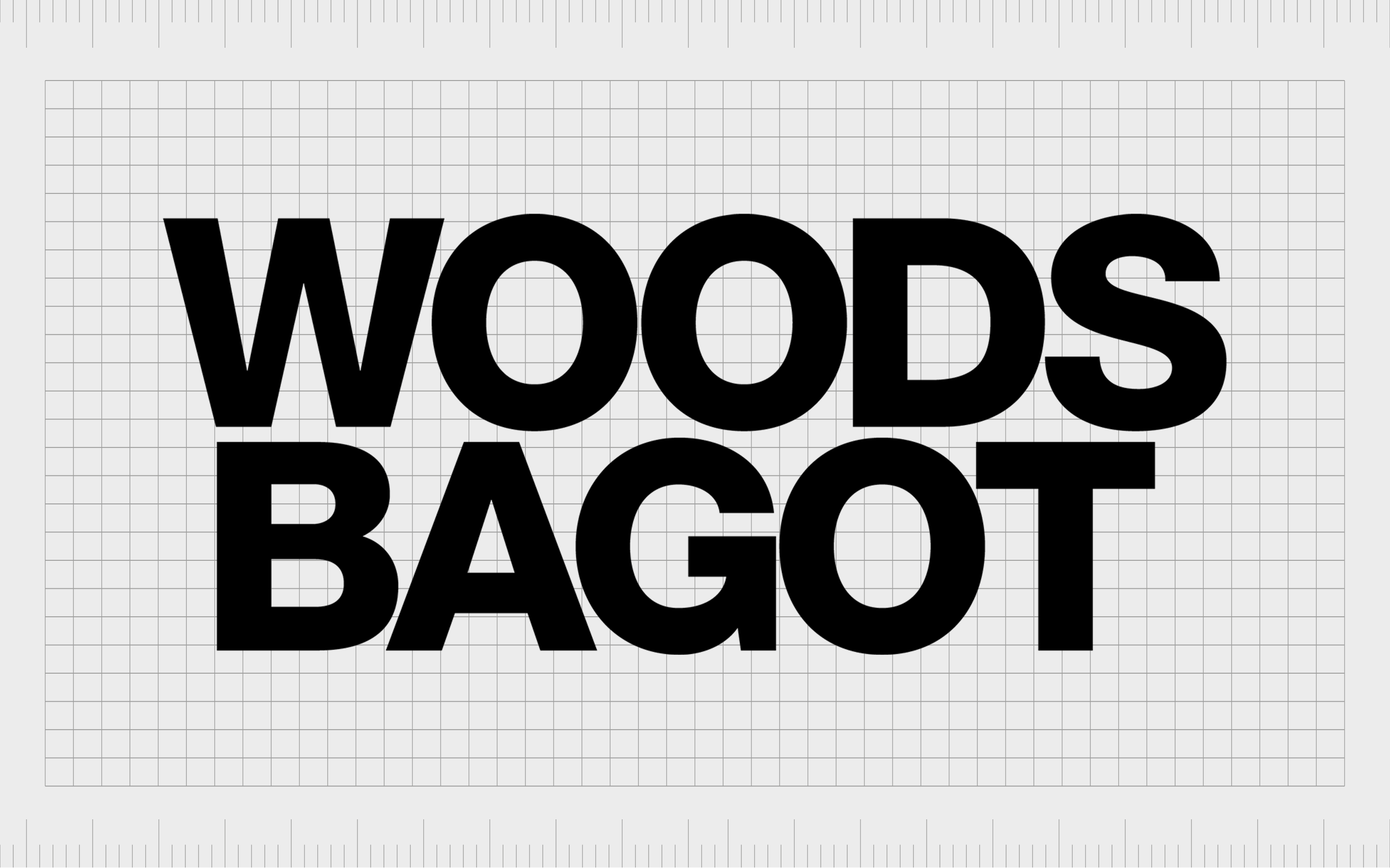
Woods Bagot
Founded in Australia in 1869, Woods Bagot is named after its two founders, Walter Bagot and Edward John Woods. The company specializes in the design and planning of buildings across a range of different disciplines and sectors and is established worldwide.
This architecture firm logo follows the trend of using a wordmark as the core image for the business. Depicted in sans-serif font across two levels, the name of the company is written in black on a white background. The balanced nature of the design helps to convey sophistication and credibility.
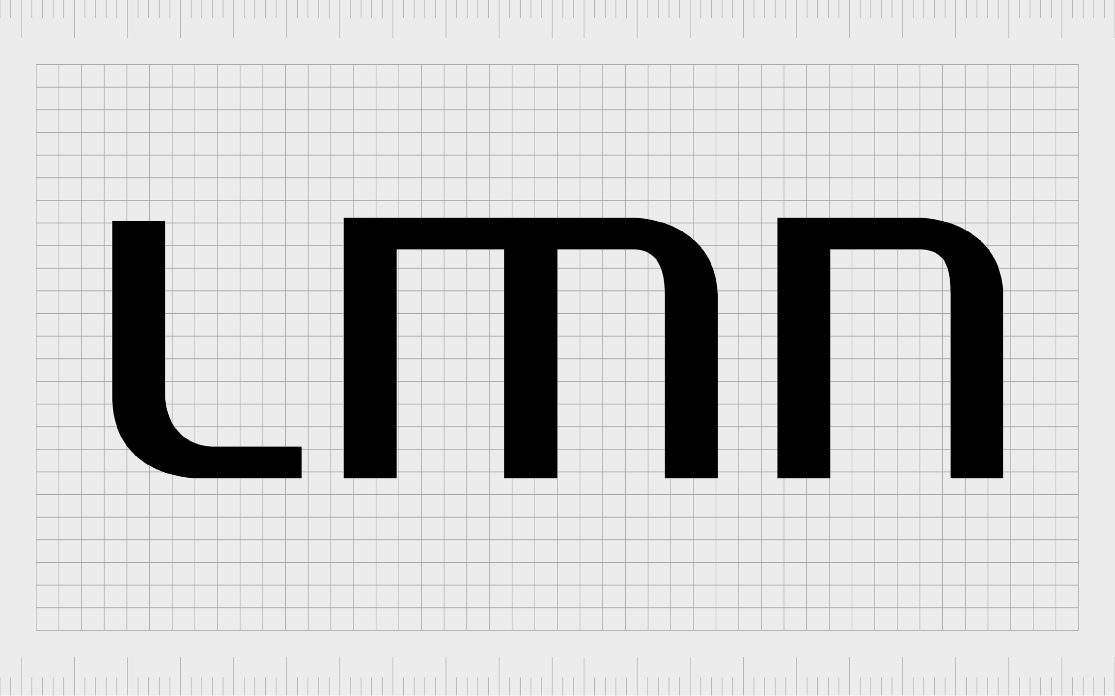
LMN
Otherwise known as LMN Architects, LMN is an American architectural firm in Washington. The company was first launched in 1979 and focuses on planning and design services for the arts, convention, and higher education sectors.
LMN’s logo might seem a little simplistic compared to other designs we’ve looked at so far, but it’s still one of the more compelling architecture firm logos around. The geometric-style font choice chosen for the letters conveys a sense of stability and strength.
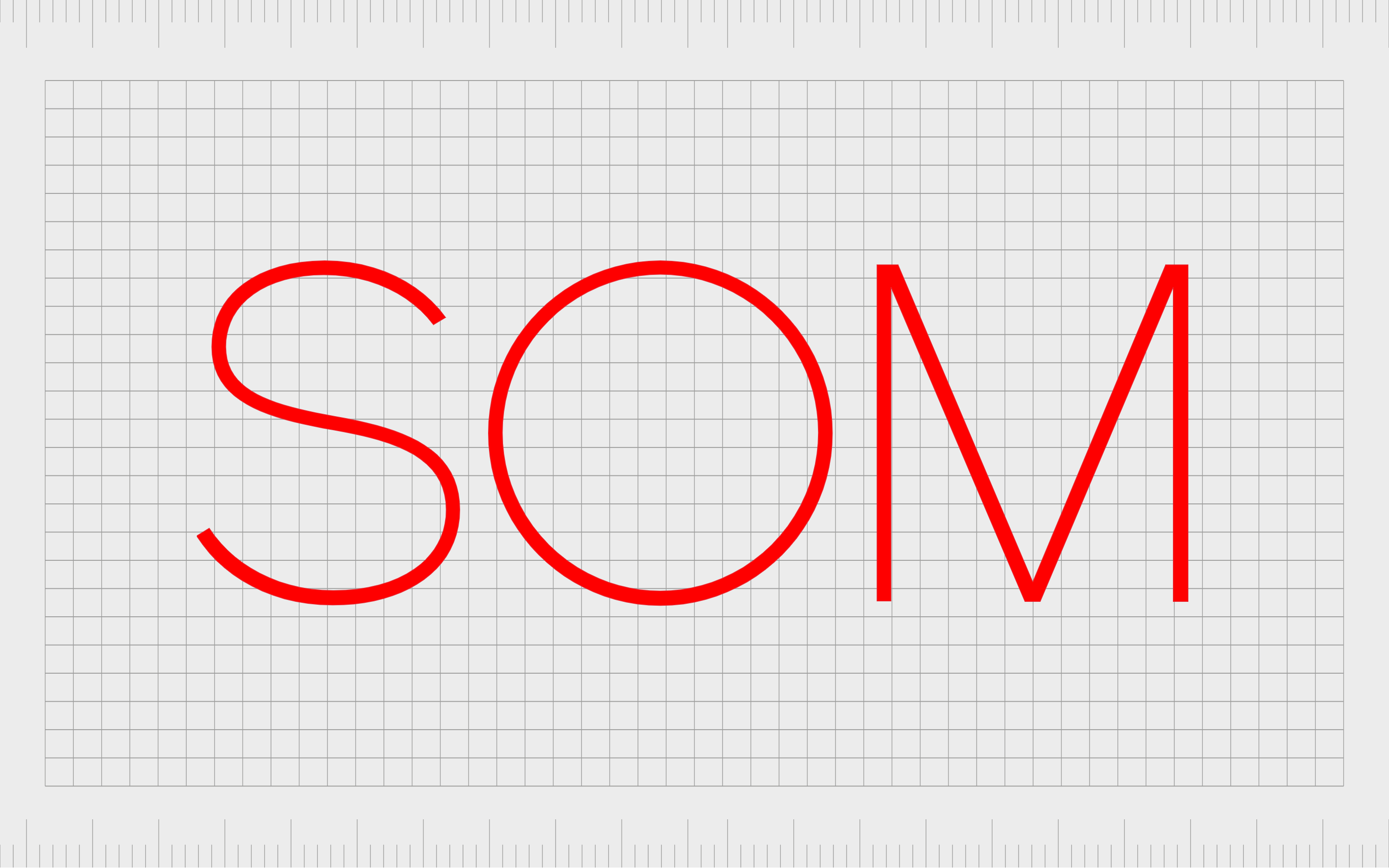
SOM
Skidmore, Owings & Merill, or “SOM,” is an American architectural, urban planning, and engineering firm, first founded in 1936. The company has built a portfolio of thousands of projects across 50 countries, making it one of the most recognizable companies in the world.
It even created the headquarters for the Walt Disney Company.
Sleek and streamlined, the SOM logo features the acronymic name of the brand in thin, sans serif font. The color red is used as the primary shade in this logo to demonstrate confidence, vitality, and passion – the core values of the brand.

Corgan
One of the most famous architecture firms in the world today, Corgan creates buildings and projects across the globe, focusing on functionality, technicality, and aesthetic excellence. The company has a decades-long reputation for exceptional customer service.
The Corgan logo is a bright and eye-catching emblem featuring a simple yellow square on the right to convey ideas of joy and innovation. On the left, we see the name of the company in a sleek, sans-serif font with refined contours and lines.
What is the most famous architecture firm?
As you can see from the architecture firm logos above, there’s no one right way to design a compelling emblem for an architectural business. The most famous architecture firm in the world today is probably the Gensler brand, which chose a simple red wordmark for its logo.
However, when creating your architecture logos, you can experiment with many styles and components. Today’s most interesting architectural logos combine wordmarks and letters with carefully chosen colors and shapes.
If you’re struggling to design your architectural logo, the best option is to seek assistance from an experienced branding expert. Reach out to Fabrik today to see how we can help you produce the perfect logo for your company.
Fabrik: A branding agency for our times.
Now read these:
—The steps to starting an architecture firm
—Essential marketing strategies for architects
—How to name an architectural company
—Branding considerations for architect firms
—Your guide to architecture firm logo design

Clarity starts with a conversation.
Thanks—we’ll get back to you shortly.
Whether you're navigating a rebrand, merger, or simply need a clearer identity—we’re here to help. No hard sell, just honest advice from people who know the sector.
Let’s start with a simple question…
Prefer to email? Drop us a line.
Fabrik’s been helping organisations rethink and reshape their brands for over 25 years. We’ve guided companies through mergers, rebrands and new launches. Whatever stage you’re at, we’ll meet you there.