What is a geometric logo? Your guide to geometric logo design
What is a geometric logo? Today, we’re going to discover everything you need to know about geometric logo design and we’ll also provide examples of logos with geometric shapes. If you’re ready, let’s get started…
Geometric logo design is a popular practice in the modern world.
Geometric shapes are clean, eye-catching, and modern. The right geometric logos also help to convey complex ideas in a simple, versatile format. From the concentric circles of the Target logo to the squares of the Windows logo, there are plenty of examples out there.
Geometric shapes are easy to work with, and wonderfully recognizable. These logo components also have the flexibility to scale up or down to suit a range of environments – making them excellent for the digital age, and an era of smartphone browsing.
The biggest question is, how do you design an engaging, memorable, and meaningful geometric logo?
The following guide will shape your knowledge of geometric logo design…
What is a geometric logo? Exploring geometric logos
A geometric business logo is an iconic image intended to identify a brand. Like most logos, these marks demonstrate underlying meaning and purpose.
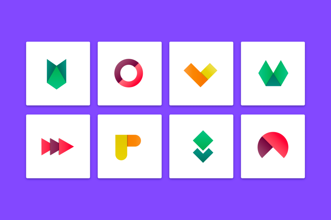
A geometric logo is unique in its focus on simple, clean shapes. Geometric shape logos can feature complex patterns of interconnected circles and squares.
Alternatively, there are also plenty of simple geometric shape logos too, like the memorable red cross.
The great thing about using logos with geometric shapes, is they’re often flexible, simple, and versatile. It’s easy to adapt a geometric logo for any screen and a range of colors. Plus, the logo is usually easy to remember, because it’s built with familiar shapes.
Though geometric logo shapes may seem simple, they frequently have a lot of deeper meaning to discover. The use of geometric shapes in logos helps companies to tell a story with their logos, without creating an image that’s too complex.
Geometric logos are easy to remember, convenient, and meaningful. These designs are particularly valuable in the new digital age, because most simple shapes can scale up or down to suit different formats and devices.
What are the basic geometric shapes?
Just as colors in logo and website design evoke emotion, certain shapes and patterns can prompt responses too.
Geometric shapes are one of three variations of shapes:
- Abstract shapes
- Organic shapes, and
- Geometric shapes
The common geometric shapes include:
Circles
Circular shapes are some of the oldest known to man, and they’re found in every culture. Many communities consider the circle to be a symbol of protection, enlightenment, and unity. Circles can enclose design elements or form the heart of a logo’s design.
Used correctly, circles can also convey focus and precision, like with the Target logo.
Curved shapes, including circles, are generally considered feminine by a lot of designers, though interlocking circles and rings often indicate solidarity and strength.
Circles make excellent geometric logo shapes for all kinds of companies hoping to demonstrate commitment, community, and friendship.
Squares and rectangles
Squares and rectangles are sturdy and strong. These geometric shapes often feel solid and stable, giving them a reliable essence for brands hoping to gain customer trust. Squares and rectangles can also convey technology or creativity.
In a geometric logo, shapes breaking out of a square often represent a company thinking outside of the box.
Any brand looking to send a message of solidity and sophistication can benefit from squares and rectangles in their logo. Because these shapes are sometimes considered sharp or harsh due to the pointy edges, there’s a tendency to curve the edges to create a more welcoming image.
Triangles
Triangles have a lot of symbolism to offer too. In some cases, they‘ll convey feelings of energy and power. In other situations, a triangle can indicate direction. Flipped on the side with the point facing to the right, triangles demonstrate a forward-moving idea.
Triangles can also indicate connectedness when linked together. The YouTube triangle inside the rounded rectangle looks like a “Play” button, but it also demonstrates forward-thinking innovation.
Triangles are perfect for representing a sense of movement, and some designers consider them to be “masculine” in their aesthetic, thanks to a connotation with sharp objects, like arrowheads.
Other geometric shapes
Notably, there are other geometric logos beyond the three options above, such as diamonds, and ovals, though most are considered variations of the three primary geometric designs.
Depending on the use of color and shading, a diamond can be two connected triangles, or a singular shape, conveying ideas of luxury and elegance.
Ovals are often seen as similar to circles, as softer, feminine shapes, they can demonstrate some of the strength and stability of rectangles too.
Geometric logo shapes explained
Geometric logo shapes are both meaningful and subtle at the same time.
Frequently appearing among companies targeting younger demographics, geometric shapes combine a timeless elegance with a modern, minimalist approach. Compared to the complex and intricate images of older brand logos, geometric shapes are much simpler.
One of the many reasons geometric shape logos work so well, is they’re often seen as “design constructs”. The various shapes in geometric business logos can connect to show how pieces of a company’s identity come together to create a comprehensive whole.
Many popular geometric patterns and logos feature shapes fitting together.
The colored rectangles connecting into an abstract shape demonstrate various parts of the Google drive ecosystem connecting: Google Docs, Sheets, and so on.
There are various other ways for a company to use seemingly simple geometric logos to demonstrate important ideas about a brand, and influence audience perception.
Geometric logo ideas and examples
Geometric logo design is an effective combination of subtle meaning and history. Though these images are both simple and memorable, they’re also fantastic at demonstrating ideas. Let’s have a quick look at some of the ways companies can use geometric logo design ideas.
Simple geometric logos
Increasingly, companies are discovering the benefits of using simple shapes to tell their story. Well-crafted geometric logos summarize the identity and purpose of your brand in a succinct, minimalist image. The simpler the logo, the more memorable it becomes.
A simple geometric logo often uses one or two shapes, like the three diamonds of the Mitsubishi logo:
Modern geometric logos
Many modern geometric shape logos feature a combination of lines and simple shapes. The design looks modern because it’s similar to modern art. People often see these logos as futuristic because they’re almost mathematical in structure.
Every line and component add up to a comprehensive image – like the Layerneer logo:
Symmetrical and balanced geometric logos
As mentioned above, logos with geometric shapes are excellent at conveying connected components of a brand or business. Companies focused on mindfulness, good health, or society often use geometric logos to show the alignment in their efforts.
Symmetrical designs are powerful in logo design because they’re familiar, balanced, and safe.
3D geometric logos
Because geometric logos are made up of simple shapes, knowing how to shade them correctly opens the door to layering and multi-dimensional shapes. Even monochromatic logos with geometric shapes can create a sense of depth.
Look at how the simple squares in the Dropbox logo are perfectly positioned to look like an opening box:
Famous geometric logo examples: Popular geometric logos
As you can see, there are plenty of ways to use geometric logo design as a crucial branding tool for your business. Learning how to use simple shapes correctly can transform any logo design.
To help take your insights into geometric shapes even further, here are some famous geometric logos to explore.
1. Spotify

Spotify’s logo is a combination of geometric shapes, and a simple, sans-serif wordmark. In many situations, you’ll see the geometric part of the logo standing alone. This design is wonderfully simple, and evocative at the same time.
The circle creates an idea of community and friendliness, while the curved lines inside remind us of soundwaves.
2. Adidas
The Adidas logo features three slanting rectangles, gradually increasing in size. At first glance, this design may not seem to mean much. The shape actually represents the mountain athletes need to climb when they’re striving to become the best.
This unique illustration demonstrates the focus, determination, and spirit of Adidas.
3. Google Chrome
Google Chrome’s logo is a combination of curved rectangle-like shapes, designed to form a circle. The colors of the logo are the same as the overarching Google brand. According to Google, the design conveys the key values at the heart of the Chrome ecosystem: security, speed, and stability.
The circle within a circle design also reminds views of a button.
4. Microsoft
Microsoft’s logo combines a series of four colored squares into a grid-like pattern. The design overall looks similar to a window – reminding customers of Microsoft’s flagship product.
According to the team, the colors of the corresponding squares represent all of the major product lines of Microsoft. Green is for Xbox, Red is for Microsoft Office, Blue is for Windows, and yellow is for Surface.
5. Target

When it comes to famous geometric logo examples, there are few more memorable than the Target icon. Though simple, the central red circle surrounded by the accompanying ring is the perfect visualization of a minimalist target.
The familiar and memorable meaning behind the logo means Target can use nothing but a simple geometric design to immediately gain brand recognition.
How to design a geometric logo: Top tips
So, how do you create a logo using geometric shapes?
There’s no set of perfect guidelines to tell any company which kinds of geometric shapes will look best in their logo. If you’re struggling with geometric logo ideas, your best option is usually to seek out a professional designer.
Working with a specialist on your geometric logo will help you to determine which shapes make the most sense for your brand personality.
To help with your initial brainstorming session, here are some questions to answer when you’re wondering how to make a geometric logo.
1. What shapes make sense for your industry?
As mentioned above, geometric logos have a psychological impact on consumers. It’s common to see some shapes more commonly associated with certain shapes.
Because squares are regarded to be stable, safe, and solid, they’re common in environments where companies need to generate trust from their target audience as quickly as possible.
A lot of financial, insurance, and conservative companies use squares and rectangles to indicate trust. Alternatively, triangles are more likely to appear among companies hoping to convey innovation and forward-thinking ideas.
If you’re not sure where to start when looking for relevant shapes in your industry, a little competitor analysis will often be very useful. Examine what your competition is currently using for their logos and ask yourself whether you want a similar image or something different.
2. Consider shape combinations carefully
The simplest geometric logos often include a single shape. However, it is possible to use multiple shapes if you’re looking to convey multiple ideas about your brand. On its own, a square looks stable and strong, ideal for authoritative companies – but it’s not always the most welcoming design.
Combine a square with a surrounding circle, and your logo suddenly becomes about stability, community, and inclusion. Similarly, a company with an energetic shape as their central image (like a triangle), might decide to strengthen their image with a rectangle or square.
When combining shapes in a geometric logo design, it’s important to ensure the image doesn’t become too complex. Too many shapes combined can make the underlying meaning of the logo difficult to define.
3. Combine color and shape correctly
Sometimes, the toughest part of mastering geometric shapes, isn’t learning how to make a geometric logo in Illustrator, or experiment with line width in Photoshop. Geometric shapes, like colors, have an emotional impact on your audience.
This means your logo design sketchbook needs to include carefully chosen combinations of colors and shapes.
Choosing the right colors to accompany your geometric shapes is crucial to having a memorable impact on your audience. Bright colors like yellow can indicate sunshine when paired with a circle or showcase retro vibes when combined with triangles and lines.
Sophisticated and reliable colors like blue can partner well with solid shapes like squares, while red is a bold choice for a rectangle.
4. Remember typography
In a lot of cases, geometric shapes are combined with typography to create the overall logo. The font you choose is an important element in logo design because it once again demonstrates important ideas about your company and personality.
A sans-serif logo is naturally friendly and looks fantastic placed next to a circle. Of course, it can also demonstrate modernity when paired with a triangle.
With square geometric logo shapes, companies can strengthen their image of sophistication and professionalism using a serif font. Alternatively, a sans-serif, handwriting style, or otherwise modern font allows companies to break free from the traditional nature of square designs.
Once again, working with a professional logo designer on the right combination of shapes, colors, and typography is essential. Your professional should help you to choose the best font for geometric logo design.
5. Keep it simple
Finally, geometric logos are often effective because they’re simultaneously meaningful and simple.
The right geometric shapes, combined, or used on their own, deliver important messages about your brand, without making it difficult for companies to scale their logos to different sizes or use them in various digital environments.
Simplicity is one of the most important elements of logo design, but it’s particularly crucial with geometric shapes, where your customers will be expecting something minimalist, modern, and straightforward.
The fewer elements you can use to get your message across with geometric logos, the better the result will be.
Once you’re done designing your geometric logo, look at it carefully with your team and ask yourself if every element really needs to be there.
Geometric logo design: The basics
There’s more to successful geometric logo design than learning how to draw a geometric logo. Anyone can experiment with putting squares, circles, and triangles together in a variety of ways.
However, it takes something special to create a logo with genuine impact. As mentioned above, the easiest way to ensure you’ll get the right results from your geometric logo design is to work with a company or agency with experience in these creations.
The good news is geometric logos can be simpler to create than you might think. These icons prove a brand logo doesn’t have to be complex to tell a company’s story.
Rather, simple geometric shapes can easily and effectively summarize the identity of your brand into a familiar image any customer can understand. The result is an image you can take with you anywhere.
Remember, when experimenting with geometric logo design, it’s worth looking into the meaning of different shapes and images for various cultures. The impact of a logo made out of squares and circles in the Western world may be different to the meaning in the Eastern landscape.
Reach out to Fabrik today for help creating the perfect geometric logo.
Fabrik: A branding agency for our times.
Clarity starts with a conversation.
Thanks—we’ll get back to you shortly.
Whether you're navigating a rebrand, merger, or simply need a clearer identity—we’re here to help. No hard sell, just honest advice from people who know the sector.
Let’s start with a simple question…
Prefer to email? Drop us a line.
Fabrik’s been helping organisations rethink and reshape their brands for over 25 years. We’ve guided companies through mergers, rebrands and new launches. Whatever stage you’re at, we’ll meet you there.

