Logo evolution: Famous logos that have changed over time

Plenty of examples of logos have changed over time in today’s world. While maintaining a consistent visual identity is important in the branding landscape, logo evolution is also relatively common.
Logos changing over time symbolize a company’s commitment to adhering to changing trends, customer preferences, and transforming marketplaces.
After all, a logo is primarily an opportunity for a company to form an emotional connection with its target audience. If your emblem looks outdated, irrelevant, or overly complex, this harms the overall perception of your brand.
While some logo changes companies make are relatively simple, others form a component of a comprehensive rebranding strategy.
Legacy brands and huge corporations that have been around for decades generally make numerous alterations to their logos to ensure they can continue to compete in their marketplace.
Today, we will be taking a closer look at the logo evolution of famous brands and why these visual identity changes have been so beneficial to a range of organizations.
Why do logos change over time?
Before we start exploring some examples of major logos that have changed over time, it’s worth explaining why “logo progression” happens in the branding space. Ultimately, when you design a logo for your company, the aim is to create something as timeless as possible.
You’ll want a compelling image that can evolve with your company and engage your target audience.
However, even with the best foresight and market research, it’s impossible to know for certain how trends will change in a marketplace. As new logos emerge and new companies appear in your industry, there’s always a chance your old logo could start to look a little outdated.
Making simple logo changes can sometimes be a great way to stay relevant.
Logo redesigns can be used as a strategic part of a brand refresh strategy, intended to make your message more impactful to an evolving target audience. They can also be a great way to reflect a fundamental change in your business.
If you merge with a new company, start selling different products, or explore a different market niche, your old logo may appear less relevant.
Many mature and evolving companies redesign their logo when their marketing strategy or brand positioning evolves. Alternatively, you may choose to make updates to your logo if you feel your existing design is no longer capable of effectively representing your brand values.
While logo redesigns aren’t something you should take lightly, logos changing over time is relatively common. The right logo evolution can improve brand equity, enhance relationships with customers and boost differentiation.
Let’s take a look at some examples.
Old and new logos from famous brands
Logo evolution examples
Since logo evolution is commonplace in the branding world, there are virtually endless examples worth looking at. Virtually every company that has been around for a little while has made at least one change to its logo in the past.
Today, however, we’re going to be focusing on the logo evolution of famous brands, concentrating on the best-known companies in the world.
Let’s dive into our overview of some of the best logos that have changed over time.
1. McDonald’s
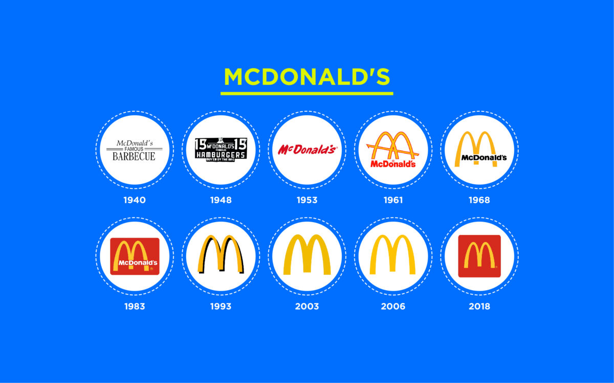
Today, it’s almost impossible to imagine a world without the golden “M” of the McDonald’s fast-food brand.
However, even this iconic company didn’t find the perfect logo straight away. Initially, McDonald’s experimented with a variety of logos, typically showcasing the full name of the company. Then, as the brand became more iconic, the team began to simplify its logo.
McDonald’s first discovered its golden arches symbol in 1960 and began refining it in the years following, using the “M” not only to represent the brand name but also to highlight the architectural design of many McDonald’s locations around the world.
2. Amazon
Amazon is another example of a brand that has made a big change to its visual identity over the years. Initially, the original version of the Amazon logo featured an “A” shape with an interesting wavy line in the middle, similar to a road.
Unfortunately, Amazon didn’t feel this emblem really conveyed what the organization was all about.
After experimenting with various versions of its logo, Amazon eventually discovered the perfect emblem, a wordmark with a simple arrow motif underneath. The orange underline on the logo now connects “A” to “Z,” showing the diversity of the company’s product collection.
It also looks a little like a smiley face, helping to convey Amazon’s commitment to excellent customer service.
Find out more about the Amazon logo here.
3. Coca-Cola
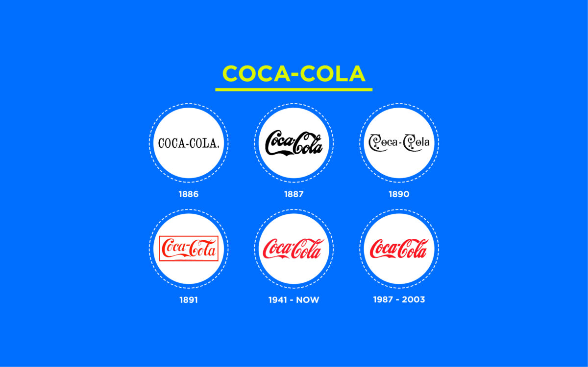
We all know the sleek and sophisticated Coca-Cola logo today. However, it might surprise you to learn that the owners of Coca-Cola experimented with a host of different font types and styles before settling on the design they have now.
The first Coca-Cola logo was a simple, serif wordmark on a white background. As the brand evolved, it explored more decorative font styles.
By 1891, Coca-Cola had discovered the foundations of the famous design it would use for decades to come. Since then, Coca-Cola has only made minor changes to its logo, retaining its iconic red coloring and the swooping, elegant lines of its font.
The company’s logo today is a symbol of creativity, authenticity, and fun.
4. Pepsi
We can’t mention Coca-Cola without also paying homage to Pepsi.
The Pepsi beverage brand has made countless changes to its emblem over the years. Starting with a simple wordmark for “Brad’s Drink,” the Pepsi brand gradually updated its visual identity by experimenting with different color combinations, font styles, and shapes.
The circular design of the Pepsi logo, featuring the colors red, white, and blue, has been a component of the Pepsi logo for quite some time. However, it wasn’t until the 2000s that Pepsi started making full use of this design.
Today, the Pepsi emblem uses the white stripe in its circular badge to represent a smile, conveying joy and refreshment. The visual brand identity is now more youthful, modern, and engaging than it was decades before.
5. BMW
Looking back through BMW’s logo history, you can see this company’s logo evolution has been relatively structured. A lot of the components of the design have remained largely consistent, from the circular badge shape to the checkered internal component.
While BMW didn’t change its visual identity completely, designers did make a number of modifications to the design over time.
Like many logos changing over time, the BMW emblem has grown increasingly minimalistic, modern, and refined. The colors have been updated to reflect the core identity of the brand and deliver a greater level of contrast and clarity.
Find out more about the BMW logo here.
6. Nike
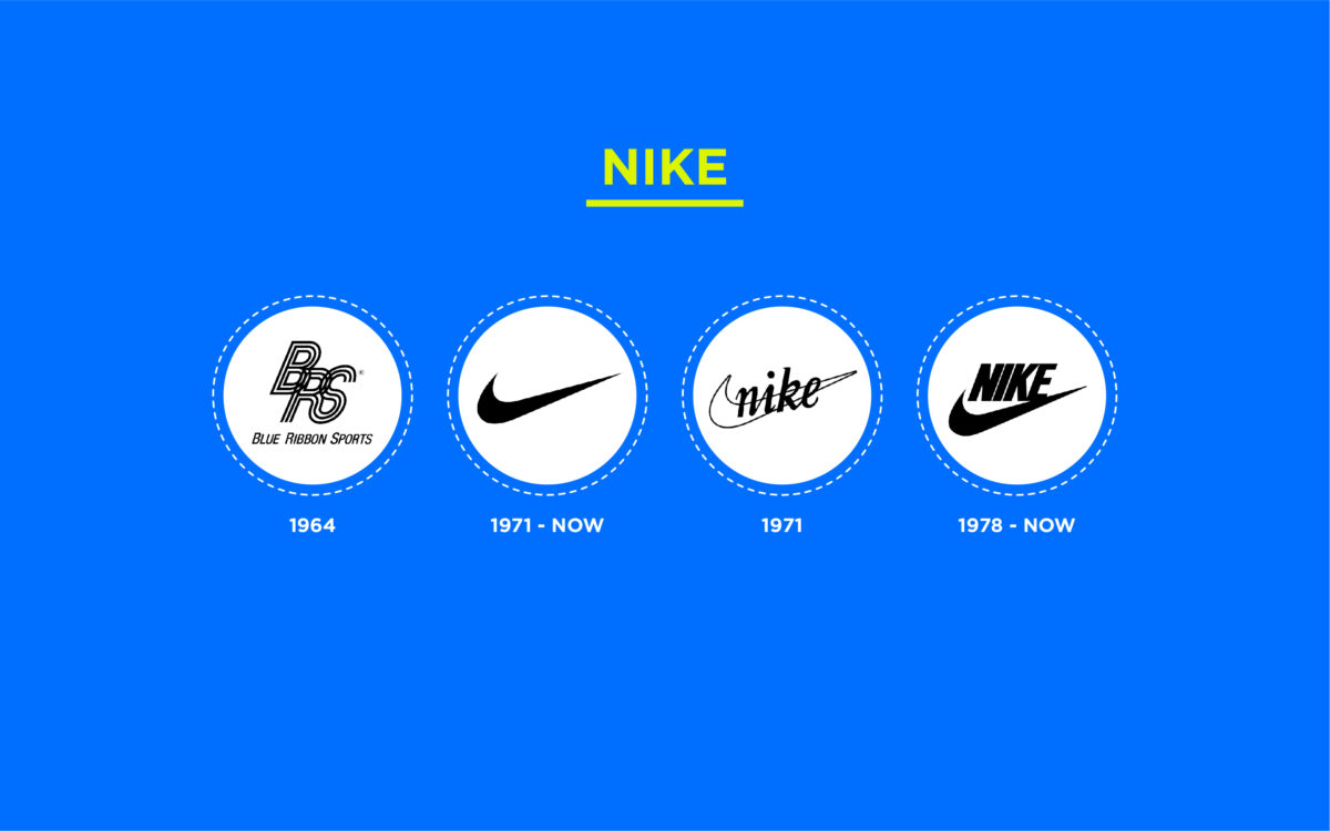
Perhaps one of the most famous examples of the evolution of logos in the sporting landscape comes from Nike. Today, we’re all familiar with the iconic Nike Swoosh. However, this element wasn’t introduced to the brand’s visual identity until 1971.
Originally, the company had a completely different name, “Blue Ribbon Sports.” When the brand was updated to “Nike,” the swoosh logo was designed to represent the wing of the goddess Nike.
However, interestingly, Phil Knight, the co-founder of the Nike brand, actually didn’t like this design. Fortunately, this didn’t stop it from becoming one of the most famous logos in the world.
Find out more about the Nike logo here.
7. Shell
Jumping over to the petroleum industry, we can see the Shell logo is a fantastic example of logos that have changed over time. Notably, the core “symbol” of the Shell logo has remained consistent since the launch of the company in the 1900s.
However, the design of the shell emblem and the colors used have all been upgraded to make the company appear friendlier and more progressive.
Thanks to advances in print and advertising tools over the years, Shell was able to bring its emblem to life with brighter, more engaging shades. The yellow and red color palette demonstrates joy and passion, helping to connect the company with more positive ideas.
8. Apple
We just can’t have an article about logo evolution without mentioning Apple. The computing company made some seriously radical changes to its logo over the years.
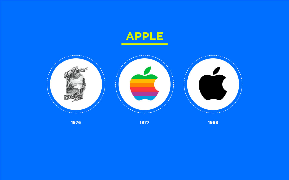
In fact, Apple started out with one of the most complex logos on the market, featuring Isaac Newton under an apple tree and a host of decorative elements. In 1977, the company discovered a much simpler emblem.
The unforgettable image created by Rob Janoff became the foundation of the official logo we know today.
Though the image started as a multi-colored emblem, it eventually became a single-colored icon of an apple, perfect for the ever-evolving digital world. The apple still represents the deeper symbolism behind the company’s name, relating to nourishment, discovery, and evolution.
9. Starbucks
Like Apple, Starbucks is often mentioned as one of the most famous examples of logos that have changed over time. The coffee company started with a relatively complex yet traditional emblem based on the image of a mythological creature (the siren).
The monochromatic design of the siren evolved over time, becoming cleaner and simpler.
Over the years, the logo adopted new elements, such as a circular badge shape to convey community and green coloring to represent the natural world. For a long time, the company used the words “Starbucks Coffee” in its logo.
However, as the siren symbol became more well-known, Starbucks was able to remove the script from its emblem entirely.
Find out more about the Starbucks logo here.
10. Adidas
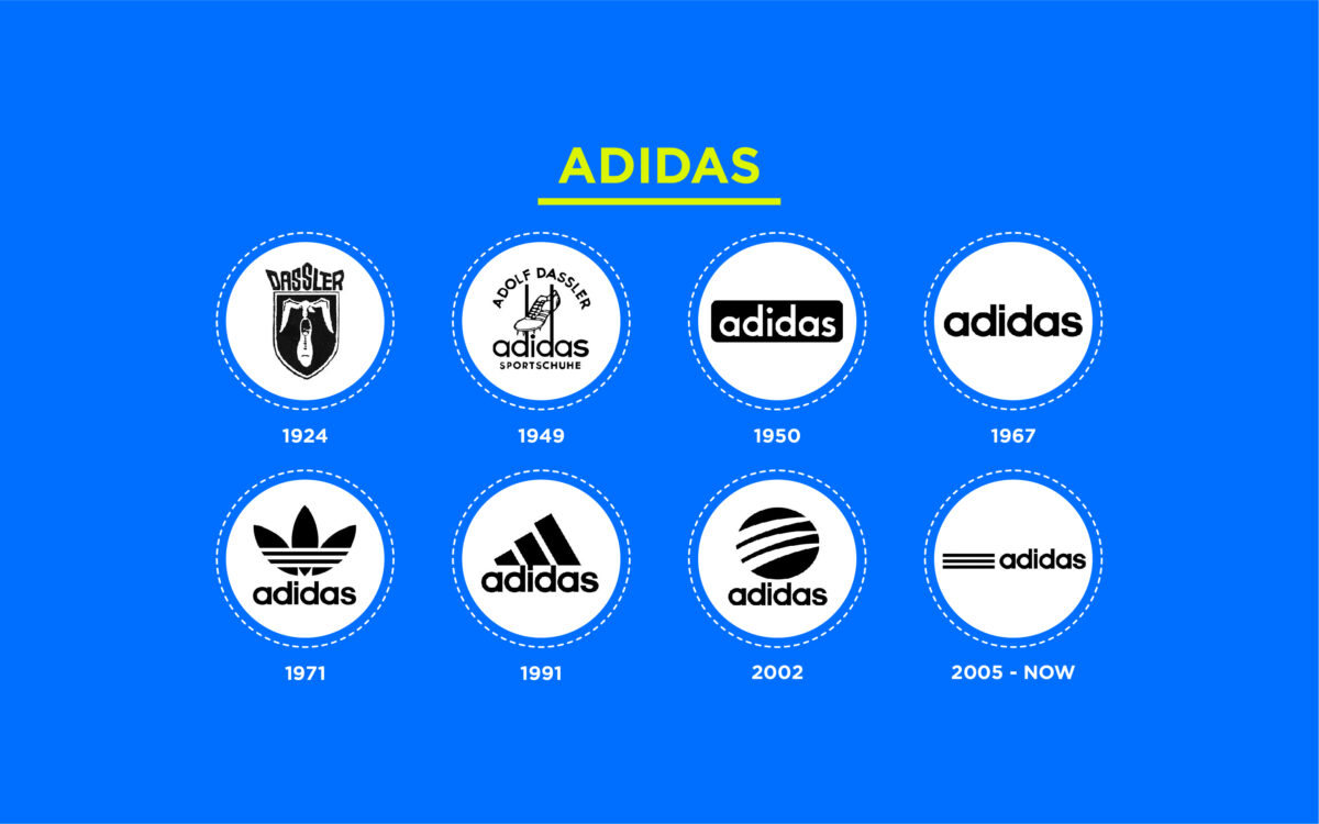
First launching in 1924 as “Dassler,” the Adidas company has invested in a number of logo updates over the years.
For decades, the company has focused on the development of a relatively simple combination mark, one which focuses heavily on the use of a monochromatic color palette and a simple sans-serif wordmark.
Adidas has experimented with various shapes throughout the years to accompany its wordmark, from a triangular design similar to a mountain to the iconic trefoil design. Today, the simplistic emblem conveys speed, excellence, and sophistication.
Find out more about the Adidas logo here.
11. Google
Google is probably one of the best examples of logo evolution for a number of reasons. Not only has the official logo of the company gone through some drastic changes over the years, but the brand continues to build on its identity by allowing designers to constantly change the emblem.
Today, new versions of the Google logo appear on the search engine almost every day.
Interestingly, it wasn’t until 1998 that we were introduced to one of the first versions of the Google logo as we know it today, featuring the multi-colored wordmark.
In the decades following, Google experimented with a number of simplistic logos, using a similar theme but new, more refined fonts. Today, the sans serif emblem identifies the company as a modern, forward-thinking brand.
Find out more about the Google logo here.
12. Microsoft
Like Google, Microsoft is another famous tech brand that’s no stranger to logo evolution. Since its inception, Microsoft has retained a relatively simplistic image, focusing mainly on drawing attention to its unique name rather than any complex graphics.
While some of its earlier logos were still relatively impactful, the most recent Microsoft logo is certainly one of the most impressive.
The soft grey of the wordmark makes the emblem feel a lot friendlier and less harsh. The cubed window is also particularly compelling, as it represents each of Microsoft’s major product segments. Blue stands for Windows, red for Microsoft Office, Green for Xbox, and so on.
Find out more about the Microsoft logo here.
13. Baskin Robbins
If you’re familiar with the ice cream industry, then you probably know all about the Baskin Robbin’s logo. In the early years, like many older companies, Baskin Robbins relied on a relatively complex logo design featuring the full name of the company, with a dash connecting the two words.
Interestingly, throughout the logo evolution of the Baskin Robbins emblem, the company focused heavily on retaining some of its history.
For example, the “31” symbol, used to highlight the wide range of flavors the company offered to customers, isn’t as evident in the logo today, but it’s still present in the pink components of the “BR” letters.
This is a callback to the unique selling point that made the organization so well-known across the United States when it first launched.
14. Levi’s
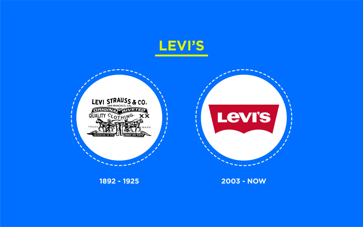
While maintaining a current logo is important for any business, it’s often particularly important for those in the fashion industry. Levi’s is a great example of how logo evolution can refine and strengthen a brand’s visual impact.
The original design of the Levi’s logo might have been fine at the time, but it was much more too complex for the modern world.
As a result, like many big brands, Levi’s decided to simplify its logo over the years, opting for basic shapes and a compelling wordmark to connect with its audience. The new logo is far more versatile and suitable for printing on small tags and labels.
The red coloring also ensures the design can stand out among a range of other fashion brands.
15. Buick
Another of the most famous brands to make some major changes to the overall look of their company over the years is Buick. When Buick launched in the 1800s, its logo was relatively normal for the day. The complex, detailed emblem featured a man walking across a globe.
However, as the car manufacturer evolved, it needed to find a way to resonate with a newer audience.
Like many other big brands, Buick has reinvented itself dozens of times. Eventually, however, it found the shield emblem that would become a common part of its brand identity. The three shields in the Buick logo have appeared in numerous familiar colors over the years.
However, today, the emblem typically appears just in a silver, metallic format, demonstrating strength and authority.
Find out more about the Buick logo here.
16. Walmart
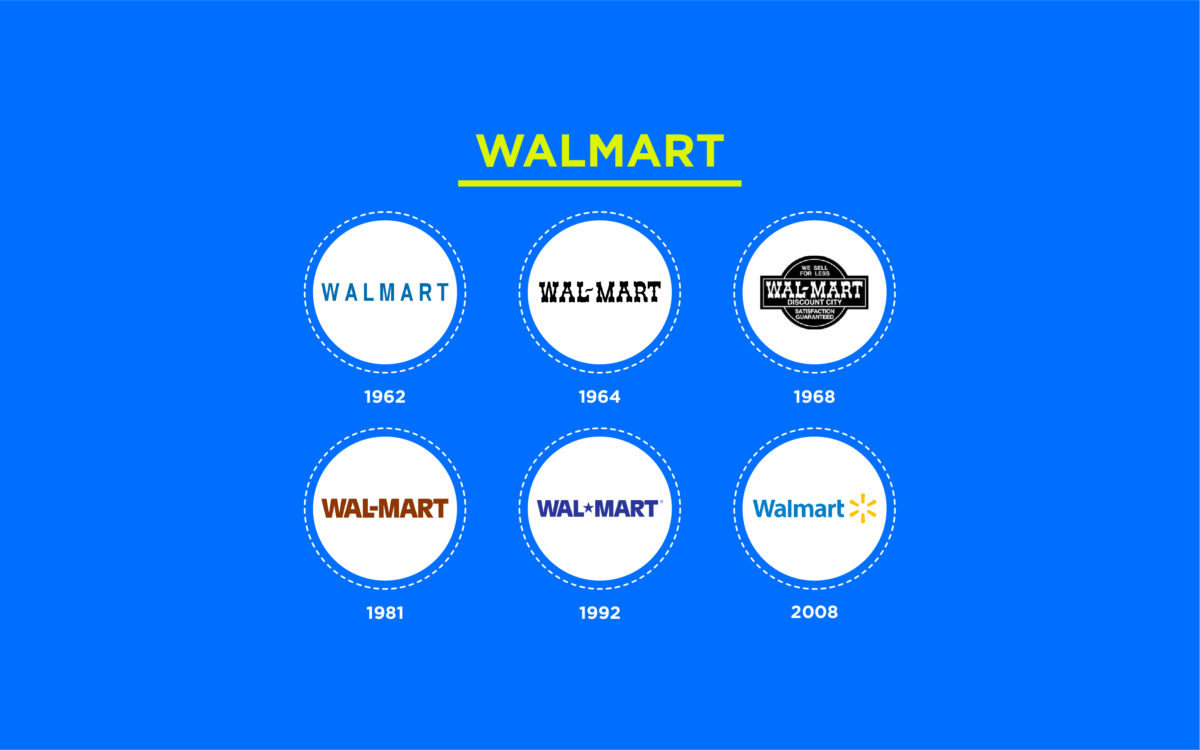
Walmart has experimented with a handful of different logos across the decades. The brand originally wanted to present itself as a friendly, local store for customers and leveraged a number of different font styles to highlight its “homegrown” personality.
However, as customer preferences changed, Walmart found itself searching for a better way to connect with a wider audience.
Today, the Walmart logo is a great example of how a simple emblem can connect with customers on an emotional level. The yellow star-like symbol in the emblem conveys joy and quality, bringing a smile to the faces of its customers.
The blue coloring of the Walmart wordmark also highlights ideas of trustworthiness and credibility.
Find out more about the Walmart logo here.
17. Chevrolet
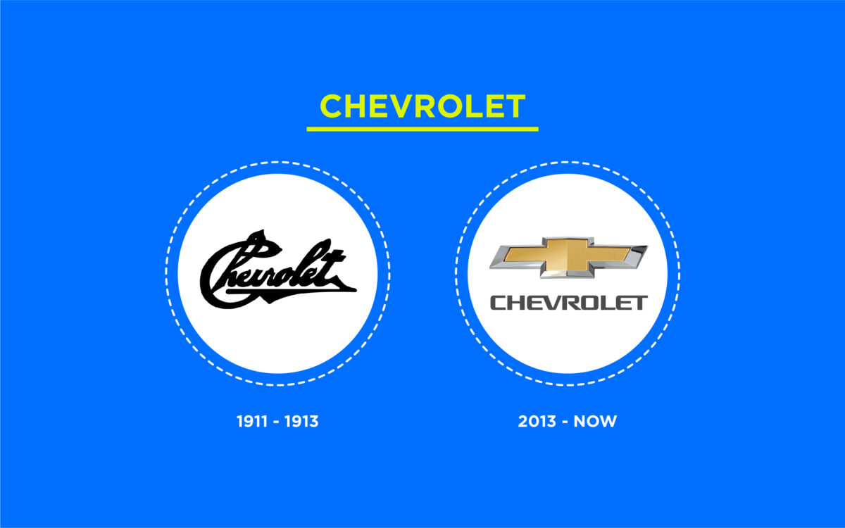
For most car lovers, the Chevrolet cross is an unforgettable and easily recognizable symbol. However, the Chevy logo hasn’t always been as iconic as the emblem we know today.
Initially, the company experimented with different logos, showcasing the name of the company in a script-style font. The cursive, almost handwritten wordmark was intended to convey authenticity.
Eventually, the famous cross emblem, inspired by a wallpaper the Chevy co-founder saw in a Paris hotel, emerged as the ultimate symbol of strength and reliability.
The design has undergone some minor modifications over the years, but the core essence of the emblem has remained relatively consistent since the cross was discovered.
Find out more about the Chevrolet logo here.
18. Canon
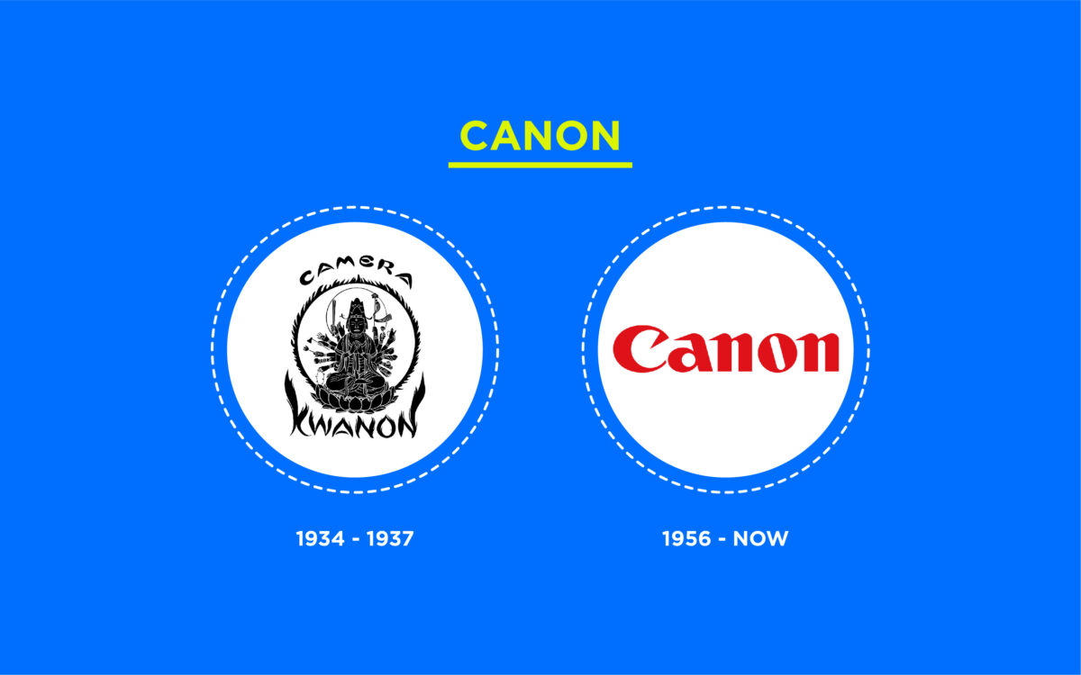
Most people naturally assume that the name “Canon” for the camera brand came from the word “cannon,” as older cameras often had a cannon-shaped lens on the front. However, the term actually comes from a Chinese goddess in Buddhist mythology.
With that in mind, it makes sense that one of the oldest and most iconic logos in Canon history features a complex Buddhist image.
Over the years, however, Canon decided it needed to simplify and transform its logo to appeal to a wider audience. The religious imagery didn’t resonate well with American markets, so the company decided to switch to a simple wordmark instead.
In the last century, the logo format for the Canon brand has remained relatively consistent, with a few simple changes to the typeface.
Which famous brands have changed their logos?
Ultimately, many examples of logos have changed over time in the world today. As companies grow and their audience evolves, it’s natural for brands to want to update their visual image.
Even some of the most recognizable logos worldwide have undergone numerous changes before becoming the emblems we know today.
On top of all the great examples covered above, you can see examples of successful logo redesigns from countless other brands. For instance, look at the Lego logo, Mozilla Firefox, Burger King, Pizza Hut, or Kodak.
While many older logo designs for famous brands have positive attributes, refining and enhancing these emblems often has positive results.
Logo evolution can be a great way to enhance the overall image of any brand and ensure companies can continue to compete in a changing landscape.
If you need help updating your logo to a more current version, contact Fabrik today to learn how we can help you enhance your logo for the new world.
Fabrik: A branding agency for our times.
Clarity starts with a conversation.
Thanks—we’ll get back to you shortly.
Whether you're navigating a rebrand, merger, or simply need a clearer identity—we’re here to help. No hard sell, just honest advice from people who know the sector.
Let’s start with a simple question…
Prefer to email? Drop us a line.
Fabrik’s been helping organisations rethink and reshape their brands for over 25 years. We’ve guided companies through mergers, rebrands and new launches. Whatever stage you’re at, we’ll meet you there.


