


Popular symmetrical logos: A guide to logos with symmetry

There are plenty of examples of popular symmetrical logos in the world today. In fact, symmetry in logo design is one of the most common aesthetic tools companies use to capture audience attention.
After all, the main purpose of a logo is to give your business a strong visual appeal, and an aesthetic capable of showcasing your unique personality.
Symmetry naturally makes a visual element feel more balanced and comforting. As human beings, we’re naturally drawn to patterns and harmony in images. We like designs which look purposeful, clean, and complete. As such, symmetry is often a powerful tool.
While a symmetrical logo might not appeal to every customer, or work for every brand, it’s a commonplace practice for many branding strategies. Symmetrical logos are easy to process, versatile, and often generate positive perceptions of a business.
Today, we’re going to be exploring the trend of symmetrical logo design, looking at the different types of logos with symmetry, and how they support different brands.
What are symmetrical logos? An introduction
Symmetrical logos are a specific type of logo designed with a focus on visual balance. In the design world, symmetry refers to when components of an object are the same. This could mean that an image looks as though it’s reflected from one side to another.
Or it could indicate a repetition of a pattern.
In branding, logos that have symmetry are often used to demonstrate harmony, capture the attention of an audience, and ensure visuals are easy to process.
According to the Harvard Business Review, symmetry is one of the most commonly used design strategies for brands. In fact, when conducting an analysis of 423 major companies, HBR found 95% had elements of symmetry in their logo.
Notably, Harvard also found while symmetrical logos are popular and engaging in some cases, they’re not always the most effective tool for a company. Symmetrical logos might be visually relaxing, but they don’t often generate a sense of “excitement” among customers.
This could mean symmetrical logos are best suited to companies looking to put their consumers at ease, rather than those attempting to highlight themselves as being disruptive and unique.
Notably, there are various different forms of symmetry a designer can use in a logo.
Let’s look a little more closely at the options…
What are reflection symmetry logos?
When most people think of popular symmetrical logos, the first thing they think of is “reflectional symmetry”. Reflectional symmetry refers to a mirror effect between two parts of a logo. For instance, if you were to split the image in half, both sides would look the same.
While logos that have symmetry with a reflectional element are quite simple, the impact can be fantastic for some companies.
One of the most common examples of reflectional symmetry in logos can be seen in the “McDonalds” emblem. The golden arches are designed to be exactly the same on either side, producing a mirror image.
We can also see reflectional symmetry in the Red Bull logo, where the two bulls above the wordmark appear to be reflections of eachother.
What are rotational symmetry logos?
Rotational symmetry in logos takes a slightly different approach to repeating a pattern. In a rotational symmetry logo, an image continues to look the same, no matter how you rotate the visual in different directions.
Think of common geometrical shapes like stars, circles, or hexagons. No matter how you adjust or turn the image, it appears the same.
While reflectional symmetry in logos is a fantastic way to show a sense of harmony and balance, rotational symmetry makes a company seem more universal and all-encompassing. In the psychology of shapes, designs with rotational symmetry appear more accessible and welcoming.
A good example of a rotational symmetrical logo comes from the BP company. The organization’s flower-style logo maintains its visual impact from every angle. We can also see rotational symmetry in the Target logo, or the Walmart emblem.
What are translation symmetry logos?
Translational symmetry in logos is a little different to most forms of symmetry. In this instance, the image isn’t reflected, or easy to rotate. However, there’s a repeating element of a design which demonstrates a sense of consistency in the visual.
A translational symmetry logo moves one component of the design to another area, without changing any properties. For instance, in the Audi logo, the same circle is overlapped four times, to reference the four companies which merged to create Audi.
The PBS or “Public Broadcasting Station” also has a logo with translational symmetry. The image of the face appears to be reflected a number of times in the emblem, indicating a sense of community and togetherness.
Translational symmetry can even be used with a single element, like the “X” character in Exxon Mobile.
What are glide-reflectional symmetry logos?
Perhaps the most complex example of symmetry in logos comes from glide-reflectional symmetry. Here, the reflection is somewhat less aligned than with reflectional symmetry, making the image seem more abstract and unique.
Glide-reflection symmetry involves taking half of an image, and flipping it to create a reverse version on the other side.
For example, if we look at the BMW logo, we see a series of white and blue shapes within the inner circle. The design is flipped from one side to the other, to create a more complete image.
This means one side has blue on the top and white on the bottom, while the other has white on the top and blue on the bottom. Some designers consider this to be a form of “asymmetry”, while others define asymmetry as two sides of an image being completely different.

Why are logos symmetrical?
As most business leaders know, logos are among the most important elements in any company’s visual identity. They help to instantly define a business in the eyes of its consumer, and separate it from the competition.
Used correctly, logos can increase not only brand awareness, but also opportunities for loyalty and customer trust.
Symmetrical logos are pleasant to look at. They feel balanced and visually complete, which can help to enhance a brand’s image in the right circumstances. Our eyes are naturally attracted to symmetry, which is why so many companies have adopted this practice in logo design.
Some of the biggest benefits of symmetrical brand logos include:
Aesthetic appeal
As a design construct, symmetrically is naturally appealing. It’s easy on the eye, and doesn’t require a lot of cognitive effort to understand. We can absorb the image quickly, and we often enjoy what we’re looking at.
Balance
As mentioned above, symmetrical logos feel balanced, harmonized and in proportion. A good level of symmetry is naturally appealing, and ideal for highlighting the stability and consistency of a brand.
Simplicity
Designing the ideal logo can be a lot more challenging than most companies realize. Using a sense of symmetry means it’s possible to repeat elements or patterns in a design, which can make the process much simpler.
Order
According to the Gestalt theory of design, the mind naturally looks to organize objects, visuals, and groups to make sense of stimuli. Symmetry is one of the ways we commonly group objects, which gives the visual more order.
A list of popular symmetrical logos
To better understand the impact symmetrical logos can have on branding and customers, it’s often a good idea to examine some of the most popular symmetrical designs already present in the landscape. Here are some of the most well-known symmetrical logos.
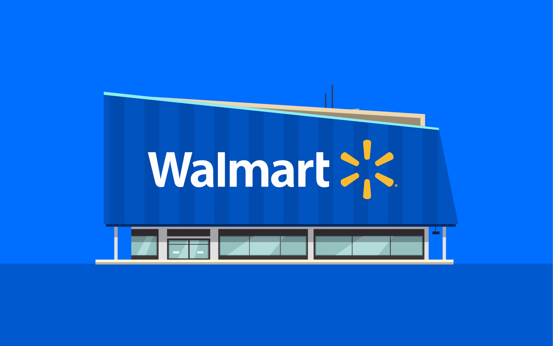
Walmart
The Walmart logo is one of the prime examples of rotational symmetry. When the company transformed its logo in recent years to make it more friendly and appealing, they embraced symmetry as a way of conveying balance.
The six components of the “starburst” or “spark” design above the Walmart wordmark are all identical, in the same color, and evenly spaced.
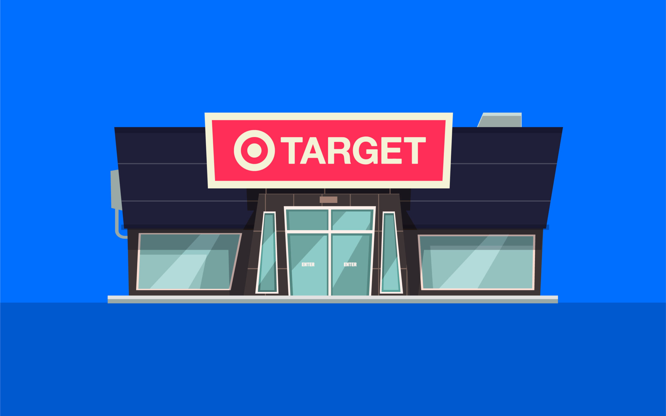
Target
Another fantastic insight into rotational symmetry comes from the Target logo. Circles are an excellent shape to use for symmetrical logo design. They naturally look the same from every angle, and feel pleasant to the eye.
The bullseye design makes perfect sense for Target’s brand identity too. It’s easy to remember, and it’s great for bringing the name of the business to mind.
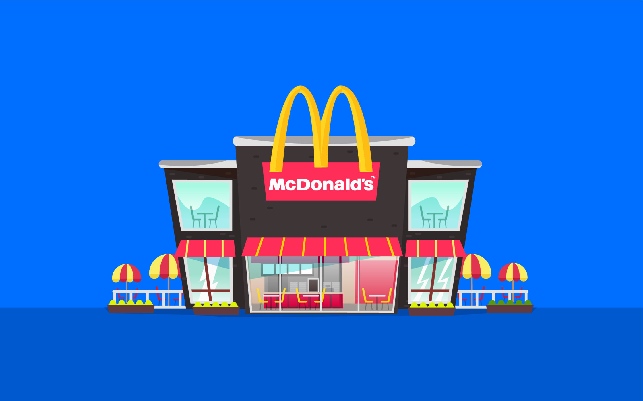
McDonalds
As mentioned above, McDonalds has one of the most effective examples of logos with symmetry which use the art of reflection. The golden arches are evenly paired, with the same level of white space in each arch.
The design feels buoyant and fun, while the golden yellow coloring makes us think of joy and excitement.
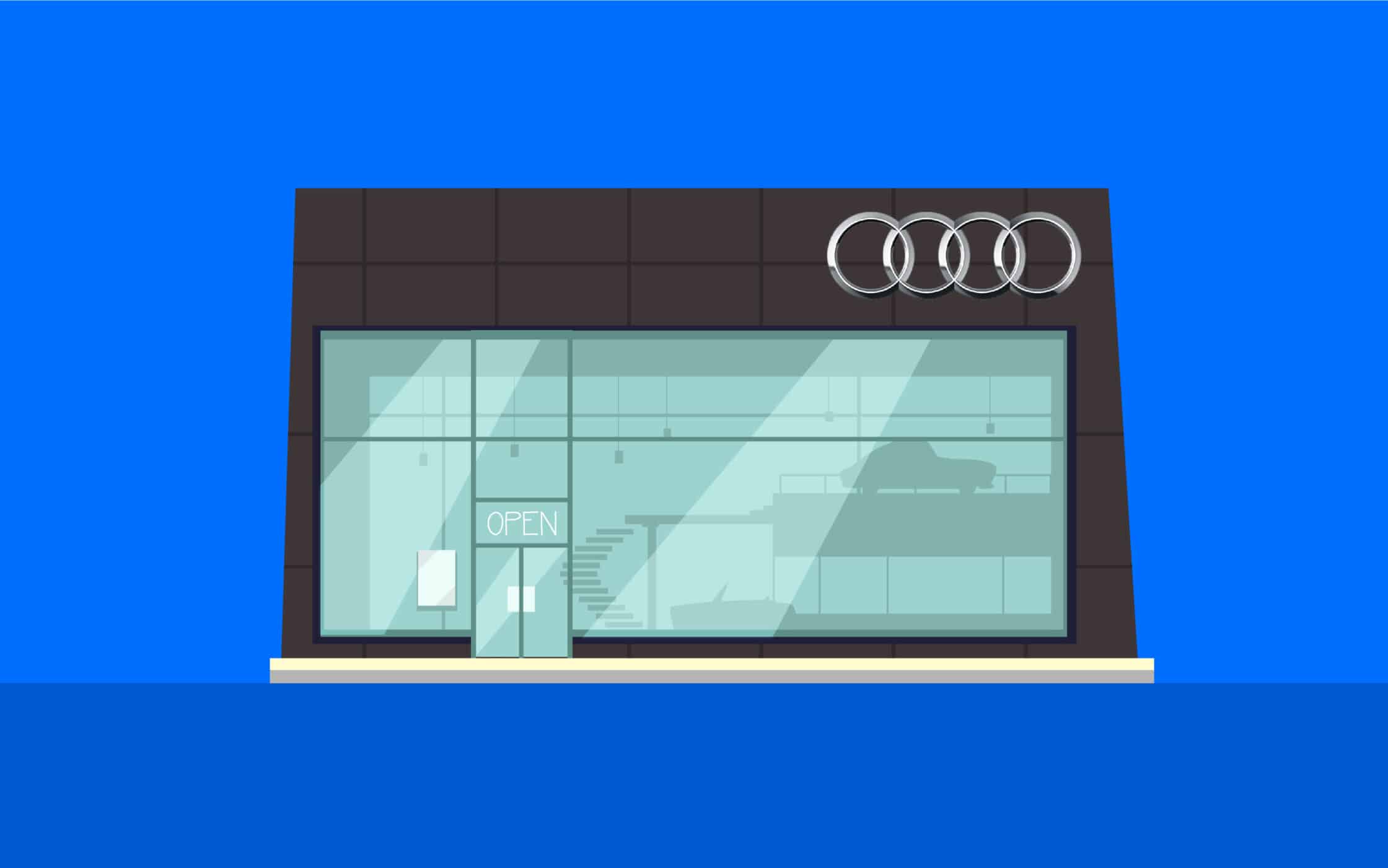
Audi
A common example of translational symmetry in logos, Audi has captured the attention of countless customers with its four-ring design. By repeating the shape of the circle a number of times, Audi creates a consistent and well-balanced image.
The four rings also have a deeper meaning which draws attention to the history and heritage of the business.
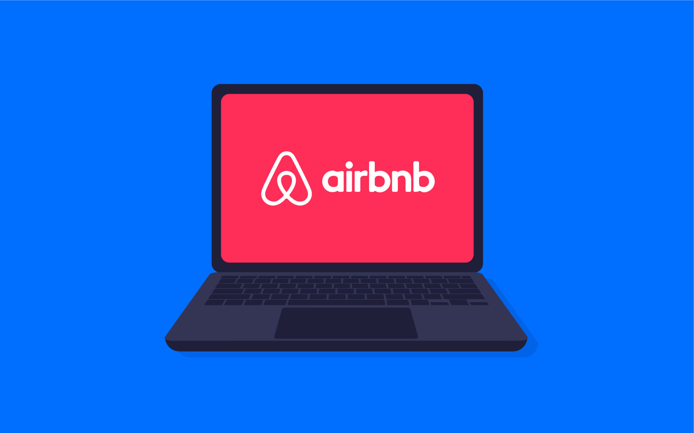
Airbnb
The Airbnb logo is one of the most attractive in the digital landscape today, and an excellent example of a “simplified” logo design. The shape of the Airbnb logo works for a number of reasons.
It’s a reference to a “location” icon we’d typically see on a digital map. It also looks like an upside-down heart, highlighting the compassion of the business.
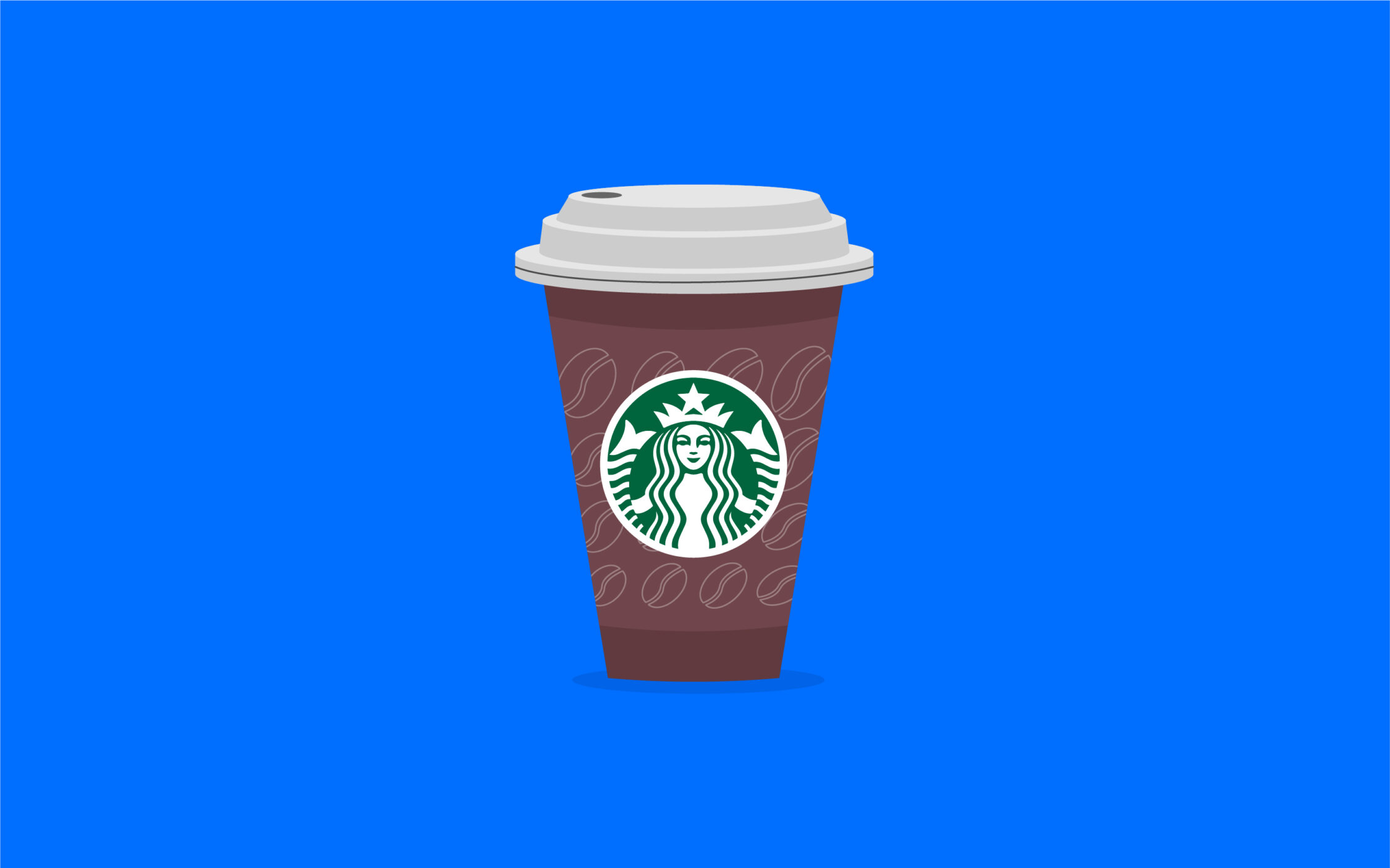
Starbucks
Though it may seem a little more complex than some of the other examples of popular symmetrical logos we’ve looked at so far, the Starbucks logo still has excellent symmetry. All of the components of the piece are “reflected”, so one side of the image is exactly the same as the other.
Even as Starbucks’ logo becomes increasingly simplified, it maintains its symmetry.
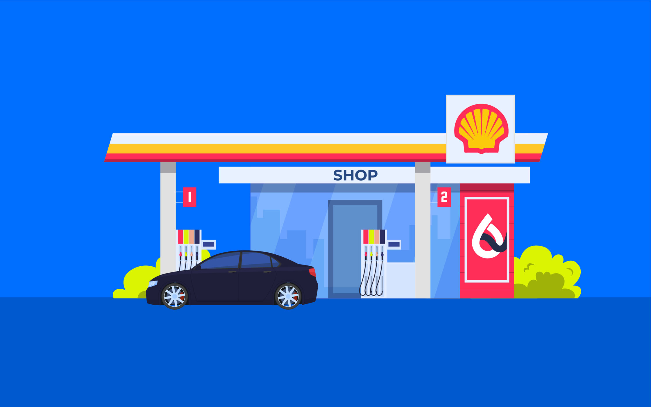
Shell
The Shell logo is another fantastic insight into logo symmetry. The image is perfectly reflected, with a simple, and eye-catching design.
According to the Harvard Business Review, the Shell logo is actually a great example of symmetry used effectively in brand design, as it helps to show the simplicity of the company.
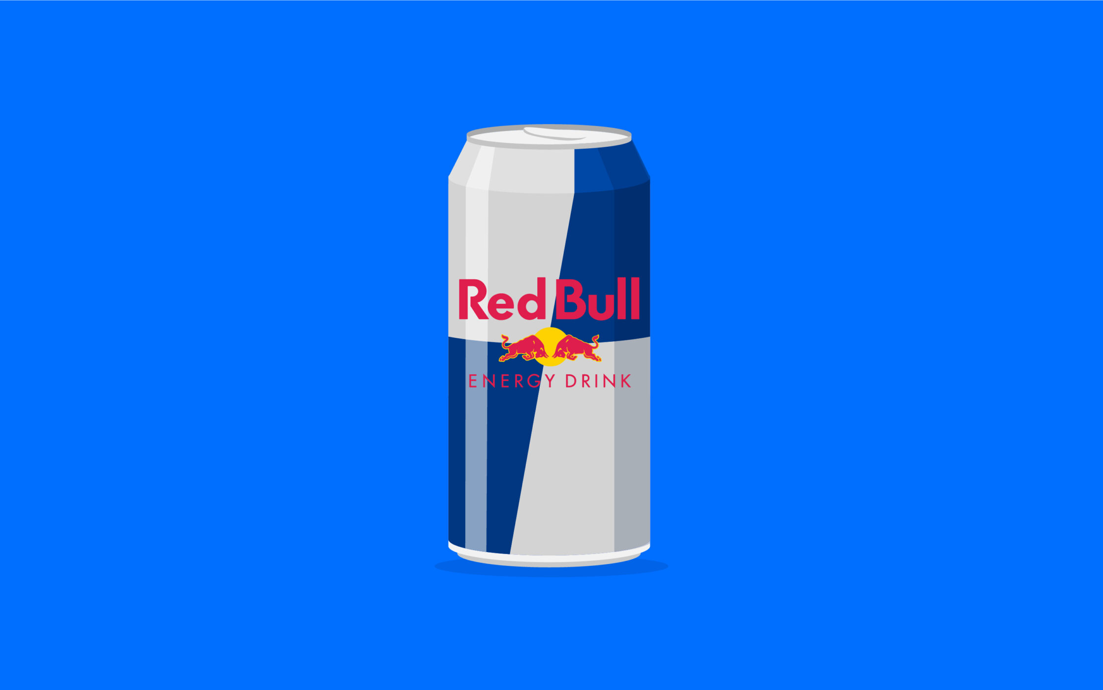
Red Bull
Another insight into reflective symmetry in logos comes from Red Bull. While there may be no symmetry in the wordmark of the company, the image above the font is completely mirrored. The two bulls look exactly the same, and they both have the same coloring and sizing.
From a distance, the two bulls might even be mistaken for wings, which is a reflection of the company’s tagline, “Redbull gives you wings”.
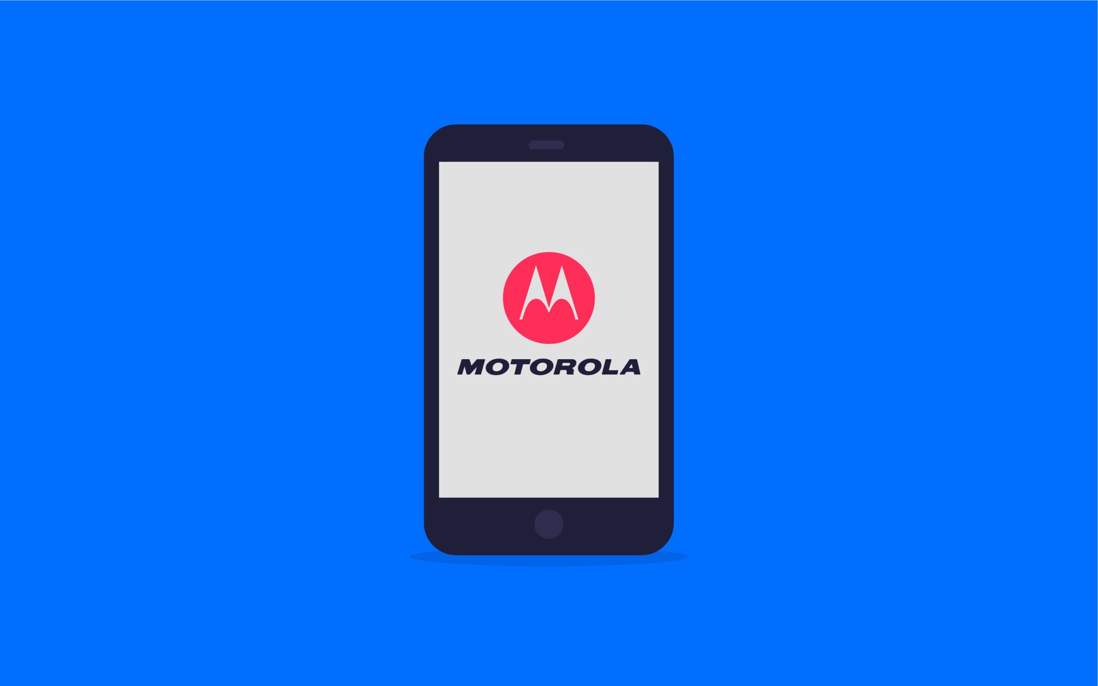
Motorola
The “M” monogram used within the Motorola logo is a reflective symmetry image. The “M” is composed of two arrow-style shapes, combined together. If you split this circular emblem in half, you’d see the exact same image on either side.

BP
The British Petroleum Company has one of the most attractive examples of a rotational symmetrical logo. No matter how you look at the image, or how much you rotate it, the design continues to be consistent.
BP’s logo is also effective because it highlights the natural focus of the company. The shape looks similar to a flower, which draws attention to the natural world.
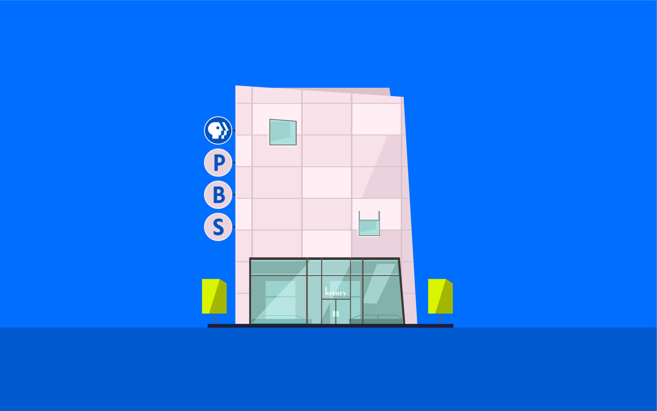
PBS
Commonly referred to as an example of translational symmetry, the PBS logo uses the shape of three repeating profile “faces” in its image. This design is easily recognizable and consistent. The use of a pattern of blue and white also delivers a sense of balance to the logo.
The overall image helps the company to stand out as one committed to delivering a great experience to every audience.
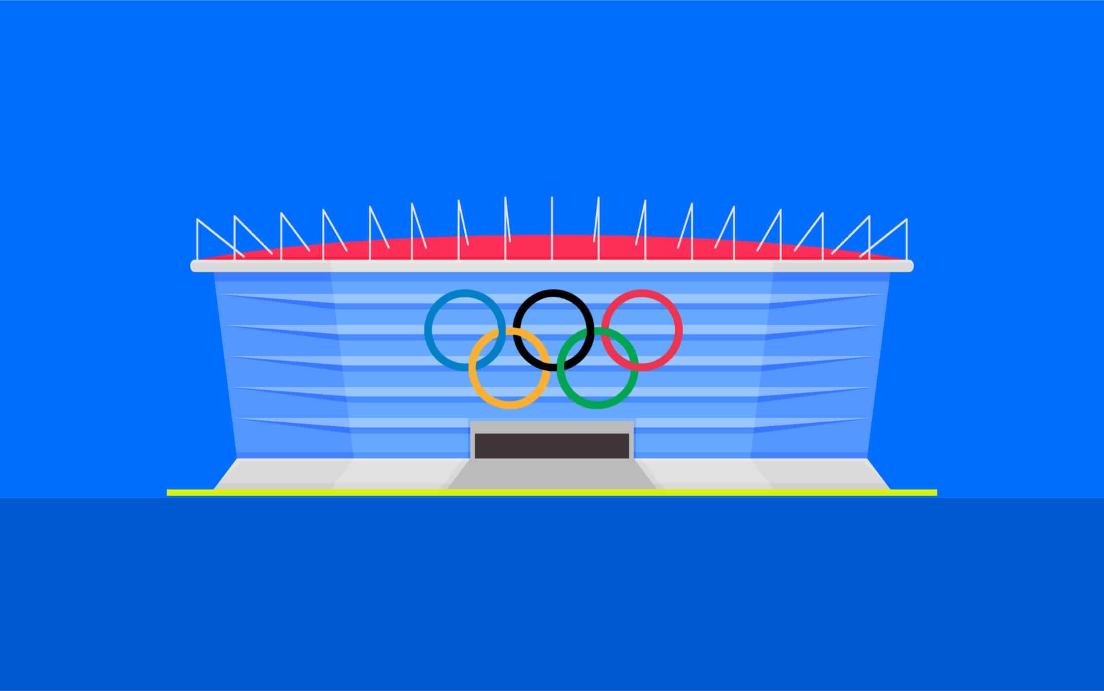
The Olympics logo
First designed in 1913, the Olympics logo is a long-standing example of translational symmetry, with 5 repeating rings.
The symmetry here isn’t quite as consistent as in other logo designs, because the rings are different colors, to highlight the different parts of the world competing in the games when they were first introduced.

Volkswagen
The Volkswagen logo is a beautiful example of how symmetry is used in the automotive industry. The two sides of the image are completely reflected, with the same lines and shapes on either side. The overall design looks comprehensive and welcoming, thanks to the circular shape.
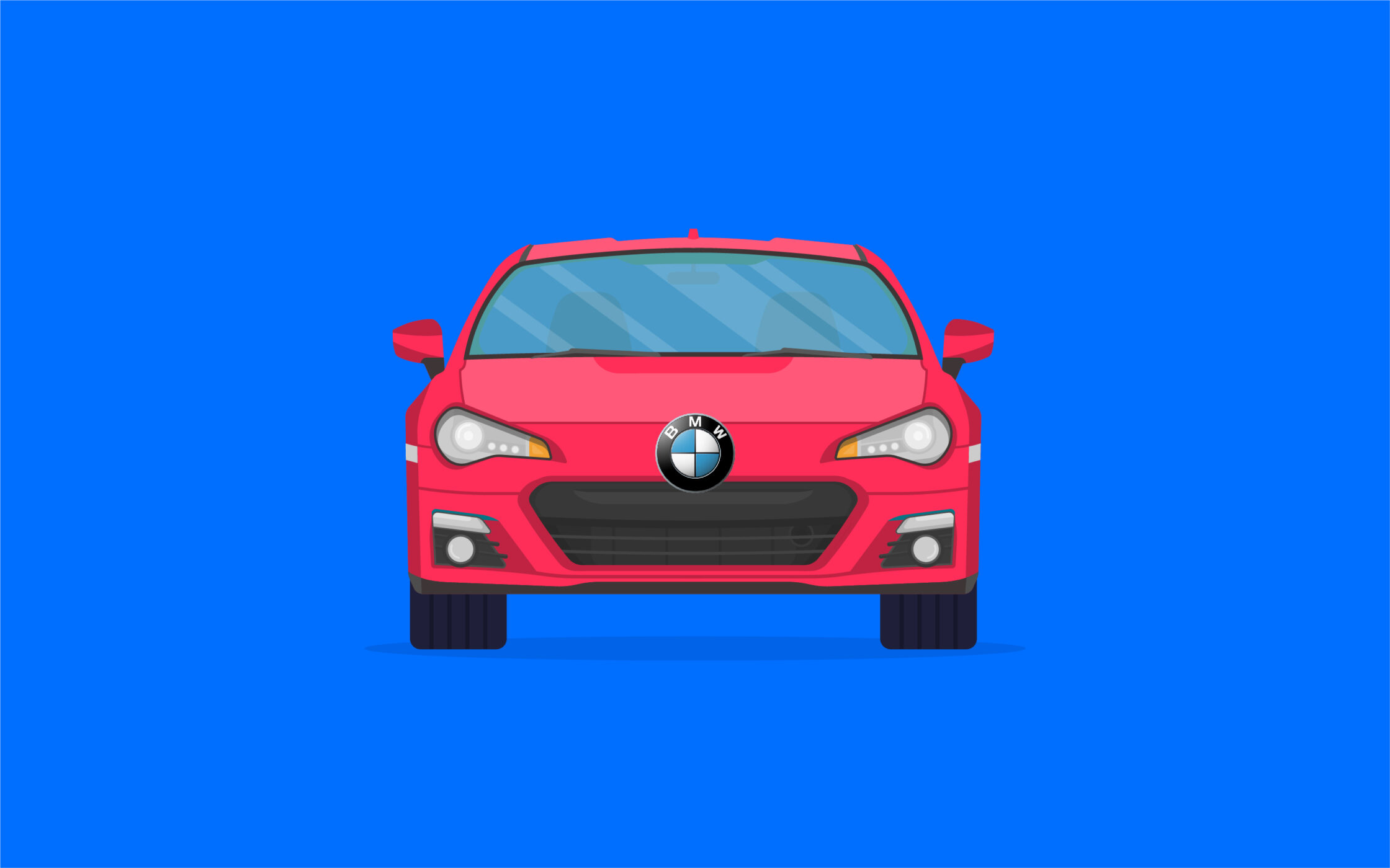
BMW
The BMW logo is a unique example of a symmetrical logo, as it doesn’t follow the guidelines of most standard forms of symmetry. However, there are repeated elements in this logo which can give it a sense of symmetry, such as the use of different segments of repeated colors.
How important is symmetry in a logo?
There’s no one-size-fits-all strategy for designing an effective logo. Some companies believe a symmetrical logo is the best way to demonstrate their brand identity. Others consider symmetrical logos to be too commonplace to allow for true differentiation.
From a design perspective, a symmetrical logo can be a fantastic way to capture audience attention, because people are naturally drawn to symmetrical images.
This could mean a good level of symmetry in your logo makes it easier to remember and recognize, boosting brand awareness, and strengthening the foundations of customer loyalty.
However, every form of logo design comes with its own unique impact for your business. A symmetrical logo design conveys certain traits, like stability, consistency, balance, and harmony. It may be the ideal choice for a banking brand, looking to put their customers at ease.
However, a symmetrical logo may not be as effective for a technology brand focused on innovation.
If your company is edgy, creative, and modern, an asymmetrical logo design may draw more attention. Asymmetry can also be an excellent way to differentiate your brand, as people are more accustomed to seeing symmetry in branding assets today.
An unusual logo can be more memorable, and give your audience more to talk about.
Ultimately, whether logos with symmetry are important to your brand will depend on your target audience, the brand image you’re trying to create, and your competition.
How do you make a symmetrical logo?
Creating a symmetrical logo starts with some careful research and evaluation.
You’ll need to start by assessing your brand assets, and building a set of guidelines for what you want your business to look and feel like.
Here are some of the steps you can consider when designing your own symmetrical logo:
Create your brand identity
If you haven’t already, you’ll need to develop a clear set of brand identity guidelines. These should outline the personality of the company, the kind of colors and shapes you want to use in your branding, and any typography elements you’re interested in.
It may be worth listing some symmetrical logos you like, and dislike, to give your company or designer more direction.
Do your research
Once you understand your brand, it’s time to research your target audience and the surrounding marketplace. Ask yourself what kind of images and visuals are most likely to appeal to the specific customers you want to reach.
It can also be helpful to conduct a competitor analysis at this point, to get a feel for the other types of symmetrical logos being used throughout your industry. You’ll need your image to stand out, but you can take some inspiration from other brands.
Choose a logo designer
While there are some tools and software solutions out there which can help companies to build their own logos, they don’t produce the most unique images. To create a truly compelling logo, you’ll need to think about working with a professional.
Decide whether you’d prefer to work with an agency, or an individual freelance creator. You can also ask yourself whether you need help with just logo design, or whether you’re in search of assistance with other branding elements, like color palettes.
Create a design brief
Using all the information you’ve collected about your brand identity, target audience, marketplace, and competitors, create a brief outlining what you want to accomplish with your logo design. The experts you work with might have a template for you to follow when creating this brief.
The more information you can provide at this stage, the more likely it is you’ll end up with the right logo fast, without the need for multiple revisions.
Test your logo
Finally, once you’re happy with the end result of your logo, share it with your stakeholders, and put it to the test with team members and other members of staff.
If the logo seems to make the right impression and generates the correct emotional response, you’ll be able to implement it into your branding assets.
After the testing stage is complete, make sure you use your logo consistently across your website, social media, email marketing campaigns, and any other marketing tools.
Exploring logos that are symmetrical
Symmetrical logos can certainly have their benefits in the right circumstances. Symmetry in a logo is aesthetically pleasing, and can make an image easier to consume. It’s also a great way to demonstrate balance and harmony, if those values are key to your company’s identity.
However, symmetrical company logos don’t work for every business. A brand’s emblem doesn’t need to be symmetrical to be effective. In some cases, asymmetry will work better at showcasing the unique personality and vision of a company.
If you’re not sure whether an asymmetrical logo is right for you, the best thing you can do is seek guidance from a professional. Specialists in logo design and branding can give you a behind-the-scenes insight into what kinds of logos will generate the best responses from customers.
Fabrik: A branding agency for our times.

Clarity starts with a conversation.
Thanks—we’ll get back to you shortly.
Whether you're navigating a rebrand, merger, or simply need a clearer identity—we’re here to help. No hard sell, just honest advice from people who know the sector.
Let’s start with a simple question…
Prefer to email? Drop us a line.
Fabrik’s been helping organisations rethink and reshape their brands for over 25 years. We’ve guided companies through mergers, rebrands and new launches. Whatever stage you’re at, we’ll meet you there.