


Target logo history and evolution
Target logo history is a common topic of conversation among design communities. Budding branding experts have a lot to learn from the simple yet meaningful Target symbol. Indeed, though aspects of this logo have changed over time, the essence of the brandmark remains consistent.
For many, the Target bullseye logo is one of the most recognizable graphics of all time. So, where did the iconic image come from?
How did Target come up with an image which shoots straight into the minds and hearts of customers across the US, and around the world?
Where did the inspiration for this brandmark come from?
Today, we’re going to take you on a journey to discover the history and meaning of the target symbol.
If you’re eager to learn more about the history of the Target logo, and how the Company’s marketing team hit the branding bullseye, you’ve come to the right place.
Let’s begin…
Who created the Target logo? Target logo history
While many historic logos link back to a specific artist, the target logo is a little different.
In 1962, it took several weeks and a full team of professionals to sift through hundreds of monikers before finding the perfect name for the company. As soon as the team found the brand’s name, the idea for a logo sprung to mind.
The word target instantly conjures visions of red bullseyes, and the Target Corporation decided this image was the perfect choice for them. Originally, the target was slightly more complex, with 3 circles instead of the circle and dot we know today.
Today, the most memorable components of the target logo include:
The graphic
The 1962 target featured 3 circles and an italic font for the Target logo. This was quickly simplified in 1968 to a single circle and a central dot. Simplifying the image helped Target to differentiate its image from the bullseyes typically used by marksmen.
The font
The most recent version of the Target symbol doesn’t always feature a wordmark. When the font is present, it’s in Helvetica Neue bold. The typography for Target has changed drastically over the years.
Initially, the Company used an italic font interlaced with the bullseye logo. For decades, the font changed to a typeface featuring only capital letters. In 2018, the Target Corporation switched to a lowercase font.
Color
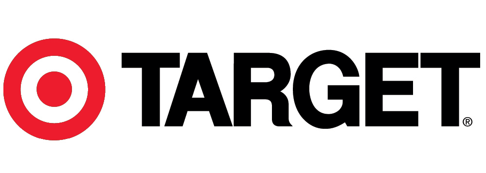
Red, black, and white are the primary colors of the Target logo. The exact shade of red varies depending on the year. However, the Target emblem always replicates a standard “bullseye”.
The amount of red, black, and white in the Target logo has differed throughout the years.
What does the target logo mean?
The Target symbol meaning
One of the factors making the Target logo so appealing, is its simplicity. Memorable logos are quick to convey meaning, and easy to understand. Because the Target corporation chose its logo as a reflection of its name, the meaning is easy to identify.
Few people would ever need to ask, “What does the Target logo mean?” as the bullseye image is easily identifiable throughout every environment where Target sells. The bold red of the graphic correlates with the red coloring on a traditional archery target.
Fortunately, the image is still distinct enough to be confused for anything other than a brand identity.
Though simple, the Target logo can also take on other meanings. For some, it represents a location they’ve been searching for, like a pinpoint on a map. For others, the bullseye’s correlation with success and achievement creates ideas of prosperity, profit, and accomplishment.
Since the extra-large Target logo is so basic, you could even argue Target makes achieving things easier.
The red and white color scheme is an excellent choice here, not just because of its traditional image. This symbol is easy to see and remember. Although Target has used type and wordmarks alongside the bullseye image from time to time, it’s common to see the graphic alone too.
A timeline of the Target bullseye logo
The target emblem was a natural choice for the company, from the moment the team found its name. However, there have been a few adjustments to the visual over the years.
When Target originally opened the doors to its Roseville Minnesota store in 1962, the logo was slightly more complicated than it is today.
1962
The original emblem depicted 3 circles with white spaces between them. The wordmark for this logo was a black bold italic font:
The original Target emblem is the most detailed version of the logo to date. It offers an excellent insight into what the team was thinking when it came up with its initial branding assets. Though this image was relatively memorable, it lacked some of the clarity of later logo designs.
The legibility of the original Target bullseye logo was a problem due to overlapping elements, and the italic font. When shown in black-and-white print, the image became a little more complicated, and less recognizable.
1968
In 1968, the Target team updated its logo to the symbol most of us are familiar with today. The Target wordmark disappeared from the image, eliminating the legibility problem. When Target did use font on its logo between 1968 and 1974, it was placed alongside the simpler target image.
Now, the bullseye as a red dot surrounded by a thick red circle, with only one ring of white between the two.
The wordmark, when evident, was in capital letters. The lettering was mostly white with a black outline for easy legibility.
1974
After several years using just the bullseye image without the font in most marketing assets, Target eventually added its name back to the logo. The target font here was the iconic Helvetica Neue bold most people remember today.
To avoid problems with clarity, the company placed the wordmark beside the bullseye image. White letters with a black outline were replaced with solid black, and Target also added a copyright mark to the image, perhaps to boost credibility.
2004
As the world grew increasingly digital, and brand marks grew more simplistic, the Target Corporation changed its logo again. In 2014, the wordmark for Target shifted underneath the bullseye symbol, becoming a lot smaller. The black font switched to red for a more consistent image.
2018
In 2018, the Target emblem changed slightly yet again. This time, the Company was following in the footsteps of some other major brands of the time, like Facebook, Amazon, and Xerox.
During this shift in branding trends, many companies were using lowercase letters rather than capitals for their logos.
Lowercase letters executed a more casual, and friendly vibe, helping to strengthen connections with the target audience. In many stores, capital letters switched out for a softer, lowercase type.
Many of Target’s digital assets dropped the wordmark entirely again. The website for Target, and its app, only use the single bullseye image.
Remembering the Target Corporation
Like many memorable brands, Target ensured that it could build a connection with its target audience through carefully chosen visual assets. Although the Target logo is just one of the things that makes this company special, it has helped to make Target more memorable over the years.
Unlike many of the leading companies today, Target’s logo has remained largely consistent over the years. The design of the iconic bullseye has only changed once throughout decades of retail history.
While Target’s initial logo was a little cluttered and complicated, it’s a great example of how companies can enhance their image by focusing on simplicity.
The memorable color scheme, simplicity, and instant memorability of the Target logo makes it one of the most well-known corporate marks in the world today. It’s hard to find anyone in the USA who couldn’t easily draw the target logo from memory.
Do you need some help coming up with a logo which hits the bullseye like Target? Reach out for the Fabrik team to get designing.
Fabrik:A branding agency for our times.
Now read these:
—Behind the wheel of the Jeep symbol
—The history of the Chevrolet emblem
—Harley Davidson logo emblem evolution
—Exploring the UPS shield and logo
—Tidal Music symbol and logo story
—What does the Walmart symbol mean?
—The Nike logo history and evolution
—Taco Bell logo history and meaning
Check out these brilliant logo design resources:
No products found.

Clarity starts with a conversation.
Thanks—we’ll get back to you shortly.
Whether you're navigating a rebrand, merger, or simply need a clearer identity—we’re here to help. No hard sell, just honest advice from people who know the sector.
Let’s start with a simple question…
Prefer to email? Drop us a line.
Fabrik’s been helping organisations rethink and reshape their brands for over 25 years. We’ve guided companies through mergers, rebrands and new launches. Whatever stage you’re at, we’ll meet you there.