Jeep logo history and meaning

Some logos simply define a company; others act as a badge of honor for an entire community. So, where exactly does the Jeep logo stand? In this article, we’ll be exploring the Jeep logo history, and what it means to its followers.
You don’t have to be an automobile enthusiast to know the Jeep symbol. This brand has captured the hearts of outdoor adventurers around the world.
Jeep is now a household name among fans of four-wheel-drive, and it’s one of the most popular vehicle companies in the world.
Part of what makes Jeep so memorable is its defining logo. The Jeep logo – a simple but effective wordmark – even appears on certain apparel and accessories for fans today.
Today, we’ll be exploring the Jeep emblem, and the story behind it. So, let’s begin…
Jeep logo history: The Jeep car logo
Jeep is a division of the FCA US LLC (formerly the Chrysler Group) and a subsidiary of the Fiat Chrysler Auto Group. The former Chrysler Corp acquired the Jeep brand back in 1987. However, the original Jeep first emerged as a prototype in 1941, designed as a military vehicle.
Today, Jeep is the oldest four-wheel vehicle to ever be mass-produced. The founding fathers of Jeep were Arthur Herrington, Karl Probst, and various other specialists working on a lightweight vehicle for off-road driving.
The name of the brand actually came from an abbreviation: GP.
GP meant “General Purpose” vehicles – intended for versatile use. The designation gradually transformed into Jeep, which helped to identify the world-changing vehicle as it began to grow in popularity.
Since 1941, the Jeep brand has been producing powerful vehicles for all kinds of uses. The Jeep logo is now recognized across the globe.
When it comes to the Jeep emblem and Jeep grill history, there’s not a lot of information recorded about the Company’s image. For some time, no logo appeared on the Jeeps produced at all.
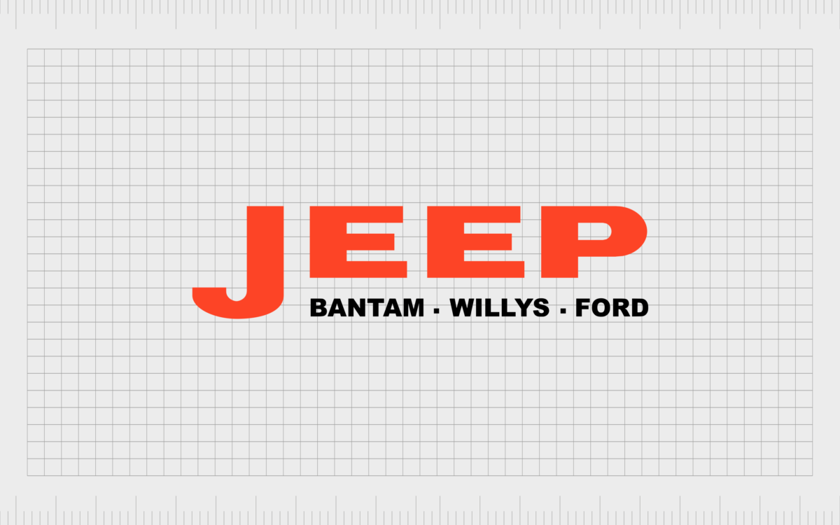
The Company simply used the “Jeep” word for most of the early years of the brand, with the first iteration also including “Bantam. Willys. Ford.”
Jeep logos throughout the years
The Jeep wordmark remained the most popular choice for Jeep logos throughout most of the Company’s history. Although there is a full Jeep grill logo today (which we’ll discuss soon), it’s typically only used for marketing purposes.
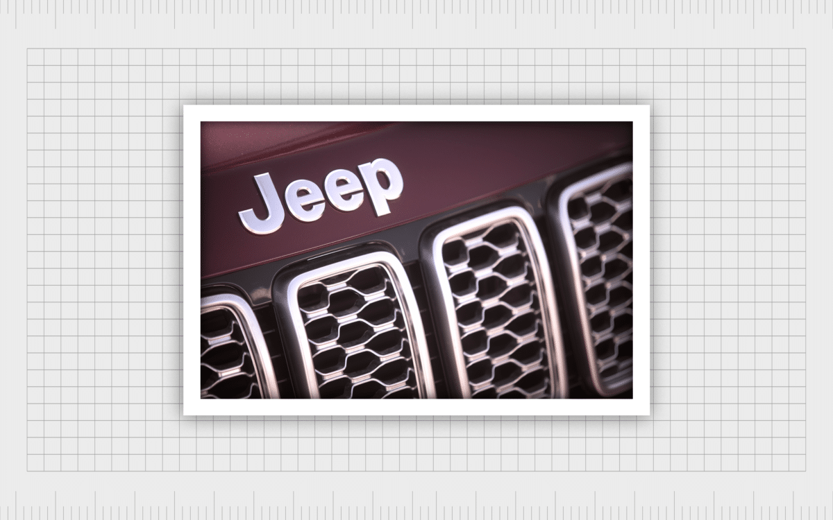
Many of even the most recent Jeep models only use the brand name on the badge of the vehicle.
The decision not to include a full logo on the vehicle likely comes from the Company’s awareness of how well-known the Jeep name became over the years. Thanks to the manufacturers’ involvement in the World Wars, the name quickly become synonymous with strength, patriotism, and durability.
When it came to marketing their designs, Jeep had to do little more than feature their name.
The brand and logo have enjoyed significant success over the years, going through a few simple changes.
Here’s a quick rundown of the Jeep logo timeline…
Between 1941 and 1945, Jeep used the wordmark in block, sans-serif capital letters. The names Bantam, Willys and Ford were situated beneath in a slightly narrower font.
Between 1945 and 1963, the design changed slightly. The subtitle with the names underneath “Jeep” disappeared. The font also evolved, switching to a serif design, with a capital letter, followed by lower-case.
The coloring also changed, from red and black, to a simple black font.
In 1963 to 1970, the first Jeep emblem emerged. The Jeep logo color changed again and came with a surrounding circle. Gold and red were the primary colors of the emblem, along with various silver elements, perfect for the badge of a car.
From 1970 to 1987, Jeep reverted to the sans-serif font choice, though this time the letters were a combination of upper and lower case. The Jeep wordmark was also accompanied by a series of geometric shapes as a kind of emblem.
In 1987 to 1993, the Jeep logo placed the Jeep wordmark within a black box with curved corners. Above the logo in white was a pentagon showcasing an internal star.
Finally, the Jeep logo switched again in 1993, and has remained largely the same since. This new logo was a simple, sans-serif word mark, in a camouflage-type green, perhaps designed to draw connections to the military.
Often, this logo is used on its own, without any emblem. However, there is a version of the Jeep symbol which comes with an image too.
Notably, Jeep has experimented with a few other ideas over the years, including a variety of logos in red and gold. However, the examples above represent some of the most long-lasting iterations of the Jeep emblem.
The Jeep grill logo: Jeep grill meaning
The Jeep grill logo is a slightly lesser-known version of the Jeep emblem. As mentioned above, the Company usually sticks to using just the wordmark on most of its content. However, Jeep’s full emblem does frequently appear in marketing campaigns.
The Jeep symbol meaning is simple enough to understand. As a pioneer of off-road vehicles, Jeep chose the grill of a four-wheel drive car as the main symbol of its brand.
Although the Jeep team experimented with a few different shapes and styles over the years, it’s this grill that remains the go-to symbol for Jeep today.

The full Jeep emblem shares the same primary colors as the Jeep wordmark: white and green. The military style green is an excellent reference to the army influence of Jeep in the decade’s past. The grill shape is simple, with a circle either side to represent headlights.
Let’s take a look at the Jeep logo elements, which you can find here:
Jeep logo colors
Jeep’s most commonly used colors are “Jeep green” or “Jeep black”. The exact color green used in the Jeep grill logo is unique to the brand, though it may look very similar to the military colors most of us associate with the army.
Jeep logo font
Despite a few changes over the years, Jeep settled on a sans-serif font in the 1970s and has stuck with the same typography since. The wordmark is in Helvetica bold, making it instantly recognizable. It’s also extremely easy to read – even when emblazoned onto the badge of a car.
Jeep logo shape
The shape of the Jeep logo includes a series of curved-end lines intended to represent the grill of a vehicle. The grill is bookmarked on either side by two circles, representing headlights. The design of the logo places the wordmark above the emblem.
Jeep slogan
Jeep sometimes includes a slogan under its logo, particularly in marketing campaigns. This slogan is “Go Anywhere. Do Anything”. According to the promotional team, Jeep believes this saying is a “Way of life”.
Celebrating Jeep logo history
Compared to many of the most popular logos in the world, Jeep’s emblem might seem quite simple. There’s not a lot to discover here, beyond the word mark and the basic grill design.
The combination of the image and logo font is rarely used at the same time. Most of the Jeep cars you see today will only include the name in the badge and nothing else.
However, despite using the name for most of their branding on its own, Jeep still recognizes the need for an iconic symbol. The Jeep grill logo still makes an important impact when Jeep wants to reach out to its customers and connect with a huge community of fans.
Jeep is an excellent example of a company which doesn’t have to saturate its advertising materials with symbols and emblems.
The Jeep name on its own is recognizable enough to capture the hearts and minds of people all around the world – not just Americans. Although Jeep rarely showcases the full logo in action, it’s still one of the most well-known companies in the world, and a massive part of American history.
Now read these:
—Which car companies own which car brand?
—Famous car brands, their names and logos
—The ultimate list of French car brand logos
—The 50 best-known car logos with wings
—The definitive guide to German car logos
—Famous car logos and emblems with stars
—Top American car brands and their logos
—Your ultimate guide to Italian car brands
—American car companies that went bust
—The conclusive guide to British car logos
—The essential list of Japanese car logos
—A decisive guide to car logos with circles
Fabrik: A branding agency for our times.
Check out these fantastic logo design resources:
Clarity starts with a conversation.
Thanks—we’ll get back to you shortly.
Whether you're navigating a rebrand, merger, or simply need a clearer identity—we’re here to help. No hard sell, just honest advice from people who know the sector.
Let’s start with a simple question…
Prefer to email? Drop us a line.
Fabrik’s been helping organisations rethink and reshape their brands for over 25 years. We’ve guided companies through mergers, rebrands and new launches. Whatever stage you’re at, we’ll meet you there.


