


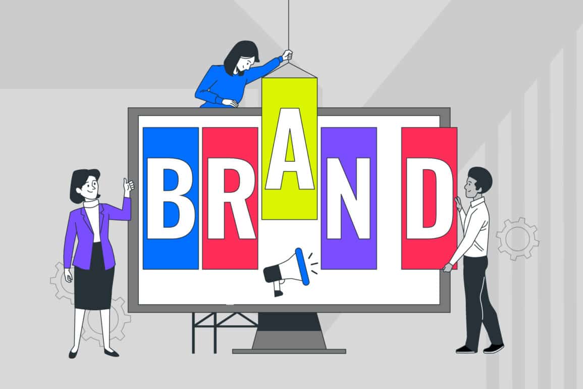


Finding your “type”: Font psychology and typography inspiration in logo design

Let’s face it, communication is essential to everything we do.
Whether you’re trying to create relationships with your audience as a budding brand, establish yourself within a growing industry, or simply connect with others on a personal level, communication is key. However, there’s a lot more to communication than simply speech. In fact, the “Mehrabian” rule suggests that 93% of our contact with other people is non-verbal.
This is certainly true when it comes to brand and logo design, where creative experts attempt to convey multiple complicated messages, ideas and values in the simplest form possible.
While most people are familiar with the concept of colour psychology, and how certain shades can make us think and behave differently, what you may not know, is that we’re also affected by font psychology. Our associations with different inspirational typography trigger powerful ideas and emotions. For companies, this means that choosing the right typography in logo design could help you to fill the gaps in your brand personality.
Whether designing a logo with a typeface that’s serious and sober to define a “formal” brand, or choosing something more upbeat and edgy, fonts can be key to effective brand recognition. Once you understand that each font has its own distinct characteristics, and you clarify what those are, you can choose the options that share the features that best represent your business.
So, let’s get started on finding your “type”.
Font psychology: What your “type” says about you
Thanks to something called the “picture superiority effect”, human beings are more likely to recall visual stimuli than anything else. This means that if you want your brand to be remembered, you need to enhance its visual appeal, and that’s where typography psychology comes in.
Before we dive into the details of typography in logo design, and graphic design, and how font psychology can impact your audience, it’s worth exploring why certain typefaces have such a significant emotional appeal.
While we have you here, check out these brilliant design resources on Amazon:


You’ve probably noticed the inherent influence of different fonts in the past. For instance, if you saw a financial company with a logo written in comic sans, you’d probably comment on just how unprofessional that business appeared to be. Yet, if you saw the same brand name written in a traditional Serif font, you’d instantly feel a greater level of trust.
According to the “Gestalt Theory“, people typically view different parts of something as a unified whole when possible. In other words, we deliberately try to find meaning in things, even when no obvious meaning is apparent. The Gestalt theory tells people in the design world that they can convey meaning by ensuring all parts of a unified whole work together.
In a logo, this means that the colours, shapes, and even the fonts need to work together and relate to each other in a harmonious way, while displaying the unique values of the company. Even if you get the brand name, colours, and even the iconography around your logo perfectly right – the wrong font could destroy the credibility of your brand.
The question is, which typography should you pick?
The simple answer, is that it depends on the brand identity you’re trying to create. As we’ll cover in just a moment, serif fonts can project a sense of tradition and respectability, while sans serif fonts feel crisp and friendly. Script fonts offer the beauty of handwriting, while modern fonts are futuristic.
It’s all about finding the inspirational typography that works for you.
Typography psychology: The 6 different font styles
Just as people have certain feelings and associations that they link to specific colours, the same can be said when it comes to font psychology. We automatically react differently to the way that text is written. In other words, it’s not just what you say, but how you say it.
For instance, if you’re interested in conveying the idea that your business is respectable or traditional, then you’d choose a font style that’s rooted in ideas of heritage. On the other hand, if you want people to see your business as stable and welcoming, then you might choose a less formal, sans-serif typeface.
Let’s look at typography in logo design, and how each font can communicate different things.
1. Serif font psychology
Starting with the most traditional font option, serif fonts promote feelings of class and heritage, making them ideal when you want to create a company that feels “established”. Due to their classical nature, serif fonts carry feelings of trust and respectability, making them perfect for brand identities that revolve around authority and grandeur.
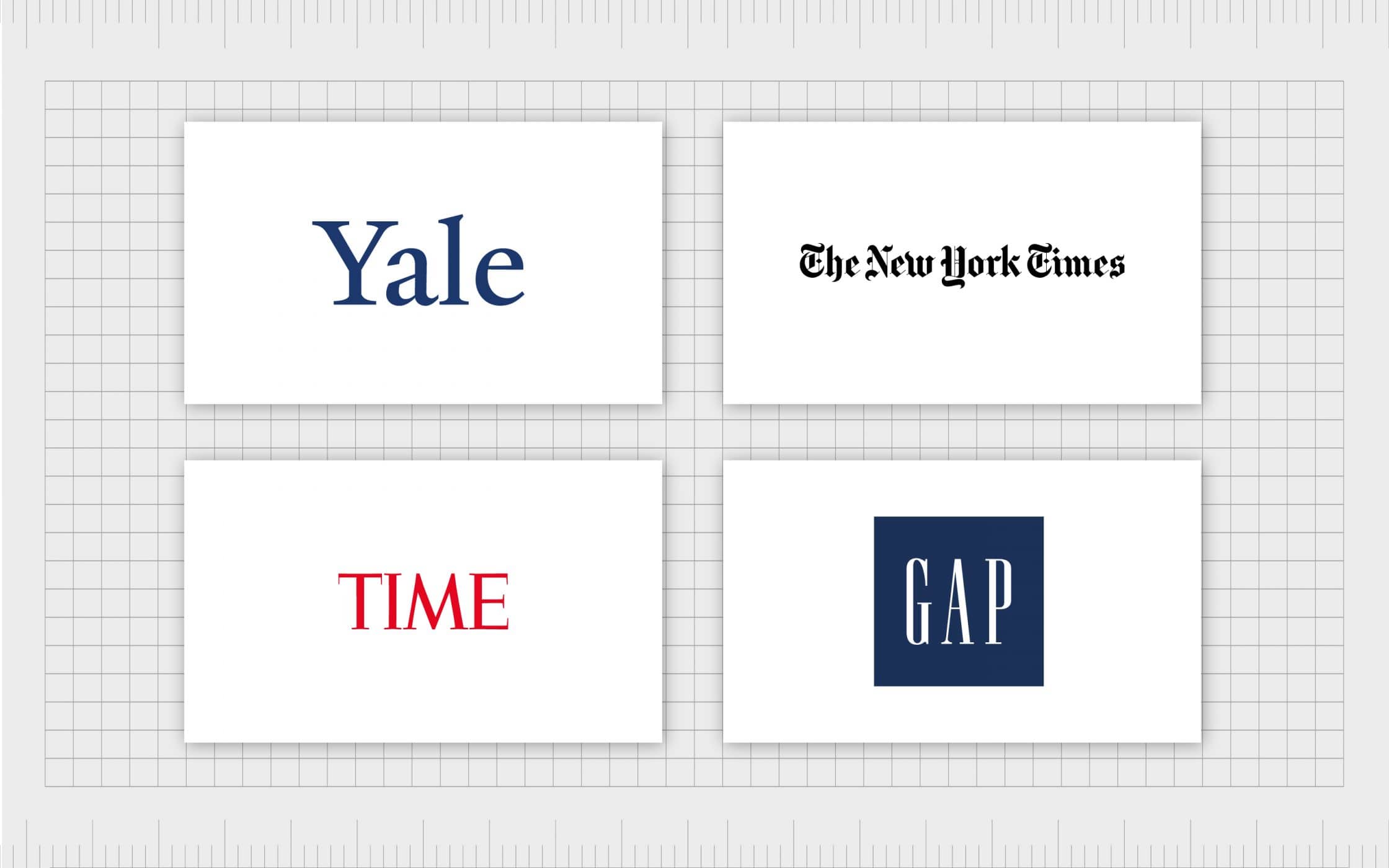
Serif fonts work best in “formal” situations. They’re perfect for companies who want to build brand awareness, while demonstrating their trustworthy nature. Often, serif types are ideal for financial companies, academics, broadsheets, and editorials. Some of the most popular options are:
- Times New Roman
- Georgia
- Garamond
2. Slab serif font psychology
Often regarded a “sub-set” of serif fonts, slab serif typefaces look like serifs, but have specific slab sections in them. They’re associated most frequently with confidence, solidity, and a sense of bold attitude.
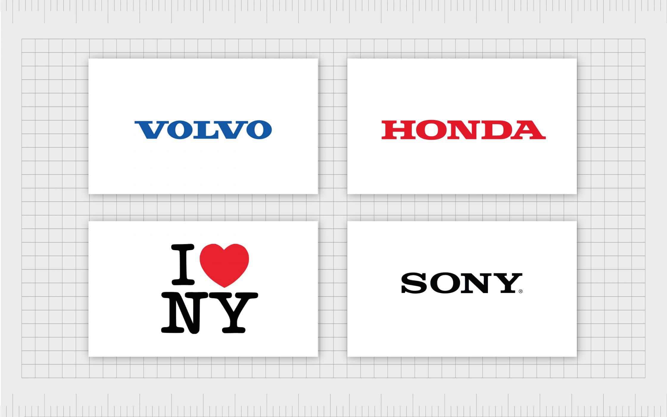
Generally, slab serif fonts are best used by companies who want to make an impact on the market, either with an innovative new idea, or an intuitive product. They’re frequently used by car and technology brands who want to install confidence in their customers, while showing off some modern creativity. Favoured options include:
- Courier
- Rockwell
- Museo
3. Sans serif font psychology
Sans serif fonts are clean, modern, and engaging. They’re used by brands who want to demonstrate a straight-forward, simple, and no-nonsense attitude. When it comes to typography in logo design, sans serif solutions indicate a sense of honesty and sensibility. There are no decorative elements distracting the eye or clouding the message.
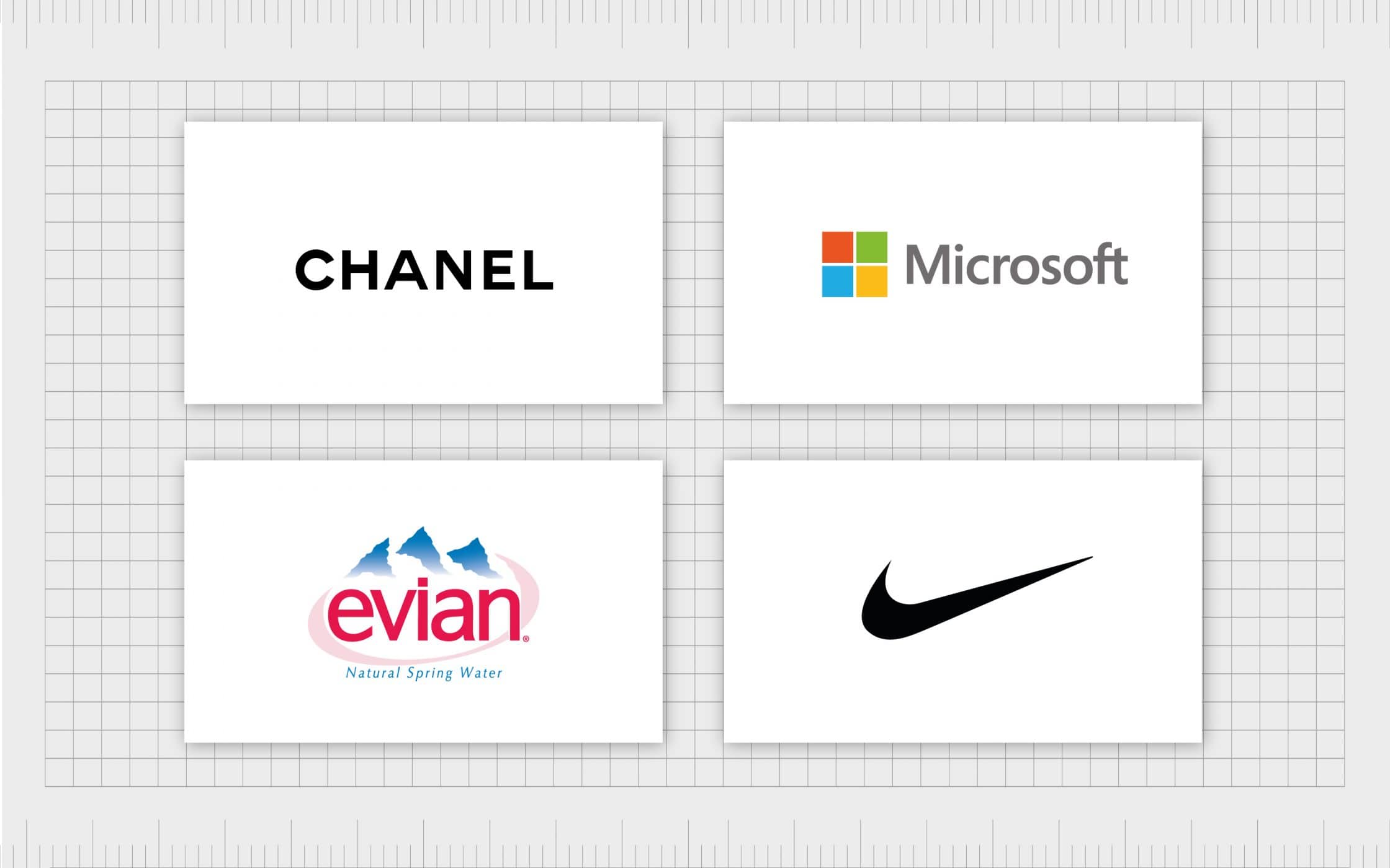
The simple, yet effective nature of sans serif fonts make them perfect for brands who want to put clarity first when designing their company logo. Often, you’ll find these typefaces on clothing brands, technology companies, and businesses that are focused on “forward-thinking” ideals and brand purposes. A few of the best sans-serif fonts are:
- Arial
- Century Gothic
- Helvetica
4. Script font psychology
Script fonts are generally a lot fancier than their serif counterparts. They’re intended to provoke ideas of femininity, elegance, and creativity, thanks to their hand-written nature. If you want to make your company feel more personal, and improve your chances of earning that all-important customer affinity, then script typefaces could be the perfect option. However, it’s important to make sure that the script you choose is legible.
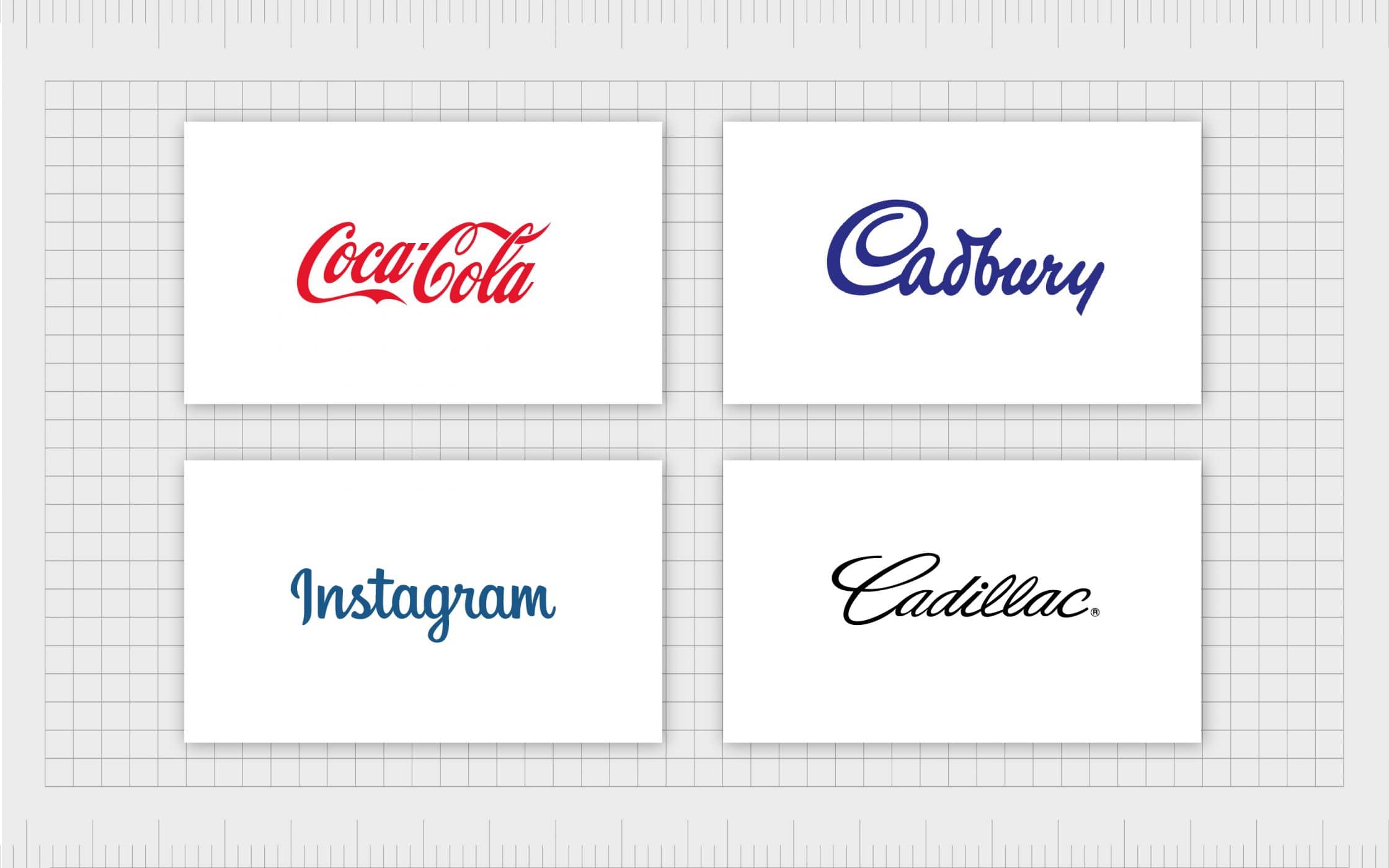
When it comes to typography psychology, script fonts are probably the ones most likely to inspire emotional and creative ideas. They’re perfect for when you want to convey feeling, history, or experience, and can be particularly useful for “visual” brands who want to show off their creative side. The key is to use script fonts with caution. While they look artful and fancy, they can also be difficult to read in certain contexts. A couple of options to try might be:
- Lucida Script
- Lobster
- Zapfino
5. Modern font psychology
“Modern” typography sounds like it should be the most futuristic of the bunch. However, the truth is that it’s been around since the eighteenth century. Designed to be simple and legible, modern fonts come with thin and thick transitions in the strokes between letters, and they can also have thin horizontal serifs.
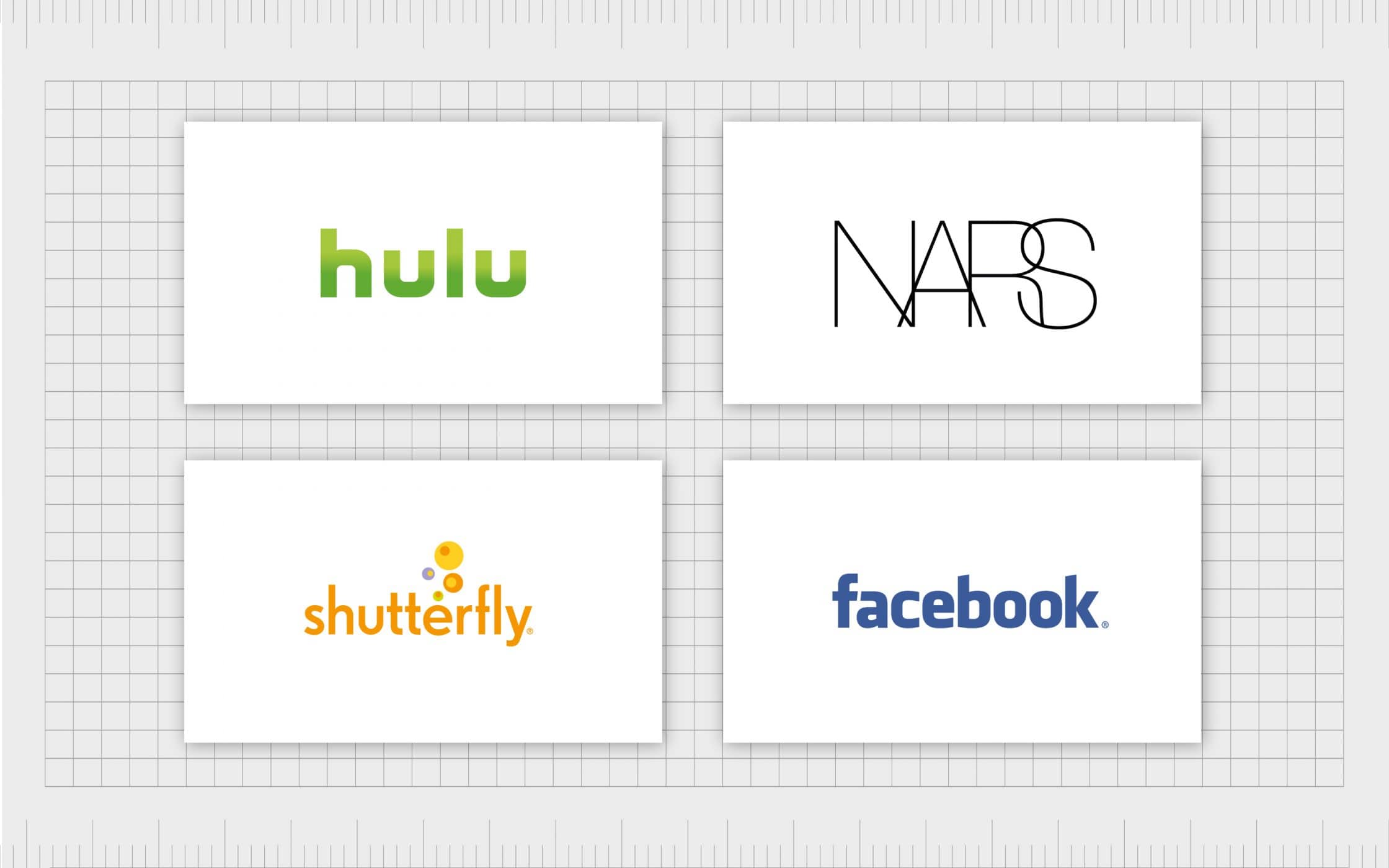
When using typography in design for logos, modern fonts are used to convey feelings of exclusivity, intelligence, and style. If you’re hoping to showcase your brand name in a way that’s easy to read, and brimming with modern flare, then this font type could be just right for your brand. It’s fantastic at attracting the attention of millennials, thanks in part to its association with Facebook. Here are some modern fonts to explore:
- Matchbook
- Politica
- Klavika
6. Display and decorative fonts
Finally, if you’re looking for typography logo design inspiration, you can’t get more creative than display or decorative fonts. These are unique, and sometimes customised typefaces that are far removed from the norm, and used most frequently in logos. Highly unique and stylised, these fonts add personality to your business, but it’s important to consider the emotional response your audience will have to them carefully before you commit to a specific choice.
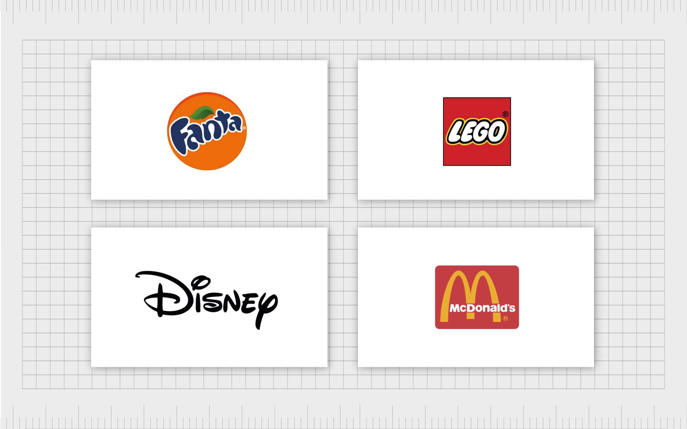
Decorative or display fonts can be ideal for almost any business logo, because you can easily convey whatever personality is right for you. By tweaking, twisting, and fine-tuning your fonts, you can demonstrate your business as being casual, direct, fun, or unique. Some of the most common display fonts include:
- Bombing
- Gigi
- Jokerman
However, decorative fonts can easily be designed from scratch, meaning that you can produce your very own custom typeface.
Incredible typography: Logo design inspiration
Understanding font psychology, and how different typefaces can provoke different emotions, is key to figuring out which typography you need to use to communicate the right things about your brand. In fact, the font you use for your logo could even be a part of your differentiation strategy.
While we have you here, check out these brilliant design resources on Amazon:

Of course, choosing the perfect font isn’t always as simple as it seems. Not only do you have to find something that will help you to stand out in the marketplace, but you also need to browse through thousands of potential pre-existing fonts before you can begin to consider whether choosing a custom option is right for you.
One of the simplest ways to get started when using typography in logo design, is with a little inspiration from some of the biggest brands in the world. By checking out some of the major competitors in the marketplace, you can see how other companies have used inspirational typography to their advantage.
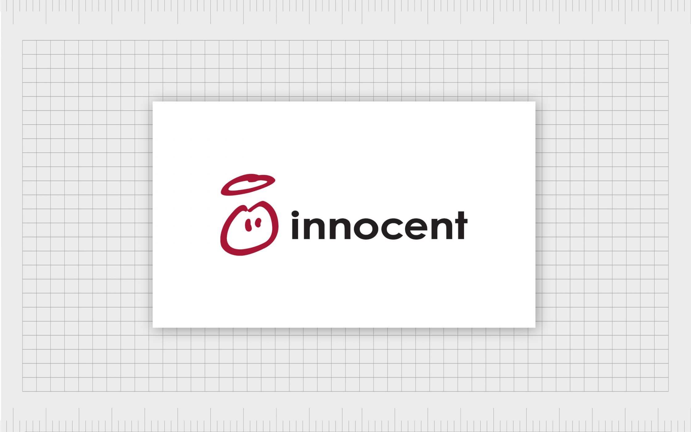
1. Innocent Smoothies
When it comes to typography logo design inspiration, Innocent Smoothies are a perfect example of a company who have used the friendly nature of “sans serif” font to their advantage. Promoting themselves as creators of drinks that are healthy and environmentally conscious, Innocent have chosen a smooth, simple, and effective typeface that portrays a straight-forward sense of goodness.
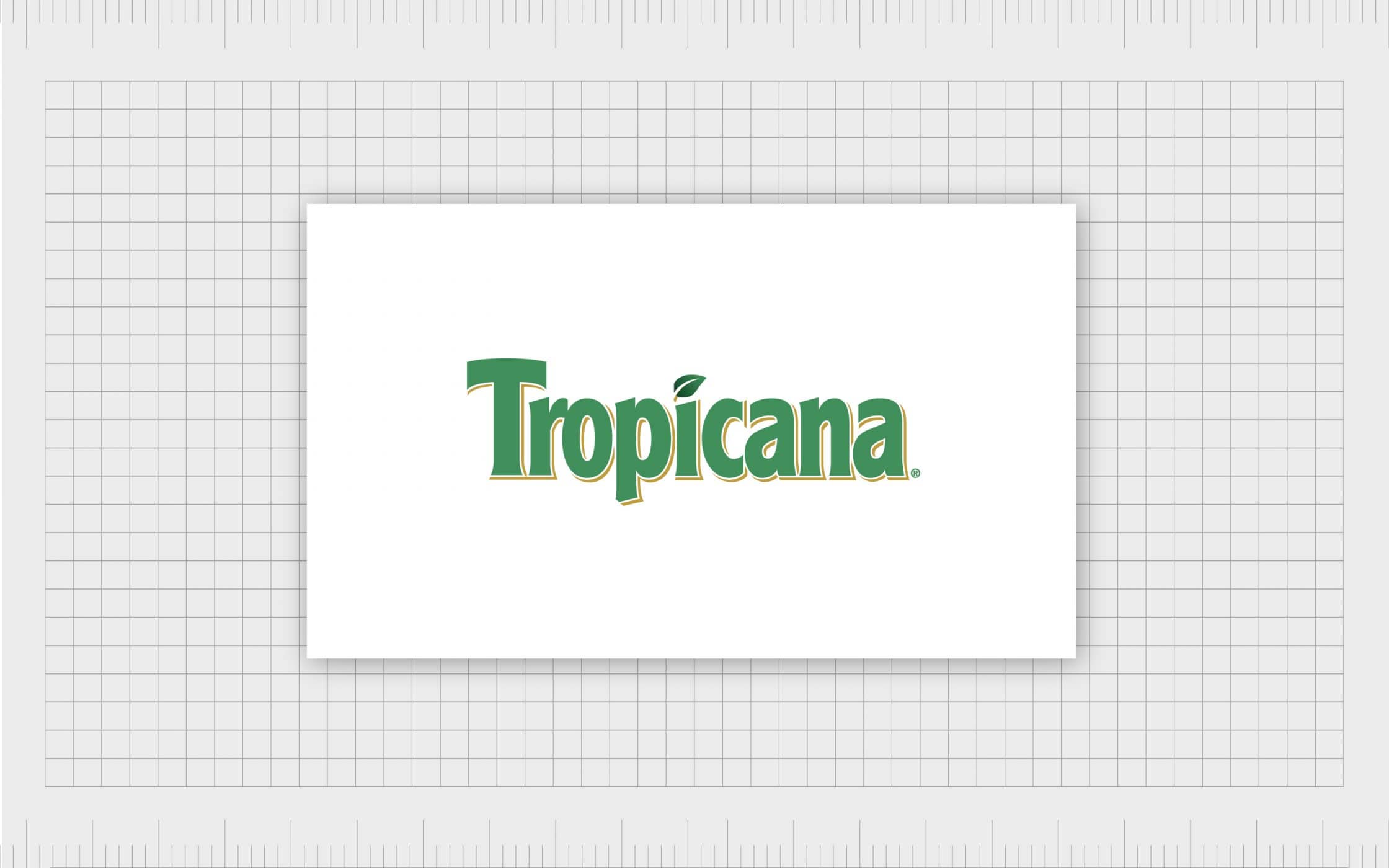
2. Tropicana
Another beverage-based brand, Tropicana have chosen a decorative font to portray themselves as being fun and interesting, as well as healthy. The combination of the green colouring in their logo, the leaf accent, and the bouncy, unique typography helps Tropicana to showcase a natural, but engaging brand to their customers.
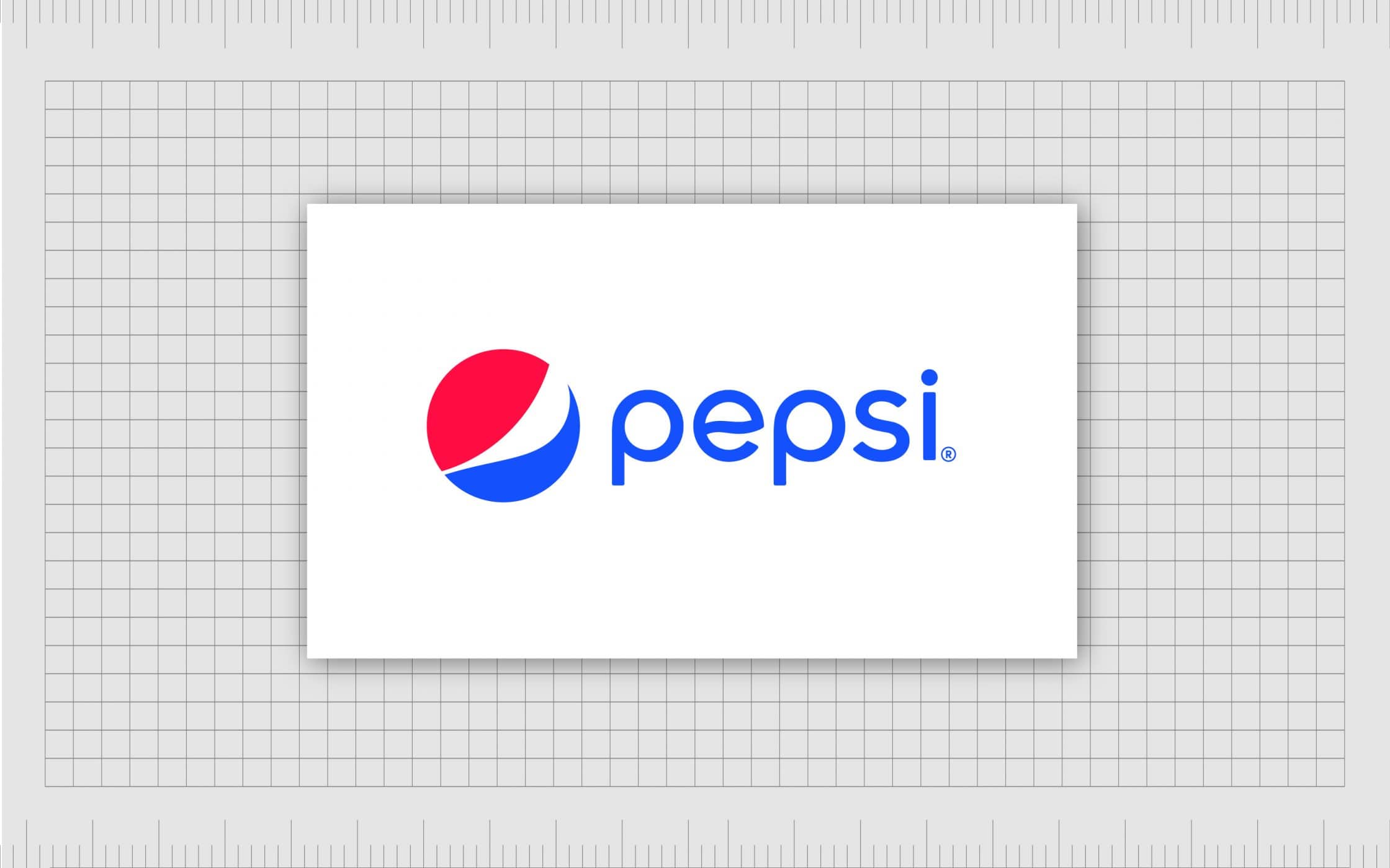
3. Pepsi
A perfect insight into how simple typography in logo design can be combined with custom flairs, Pepsi’s typeface and logo are instantly recognisable. The subtle wavy cross on the “e”, evokes thoughts of a glass of refreshing Pepsi, while showing off the company’s fun personality. It’s no wonder that Pepsi have changed their logo very little over the years.
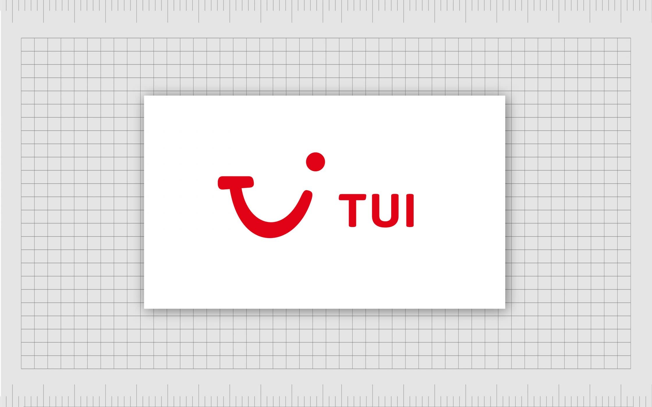
4. TUI
For their foray into the world of typography psychology, TUI (formally known as Thomson) chose a sans-serif font in bright bold red. The font is authentic, and simple with chunky letters that convey the fun behind the idea of travel. The smiley-faced graphic beside the name reminds customers of the joy that comes with family holidays, while the bold typography indicates a sense of stability and safety – reassuring clients that TUI can keep you safe on your adventures.
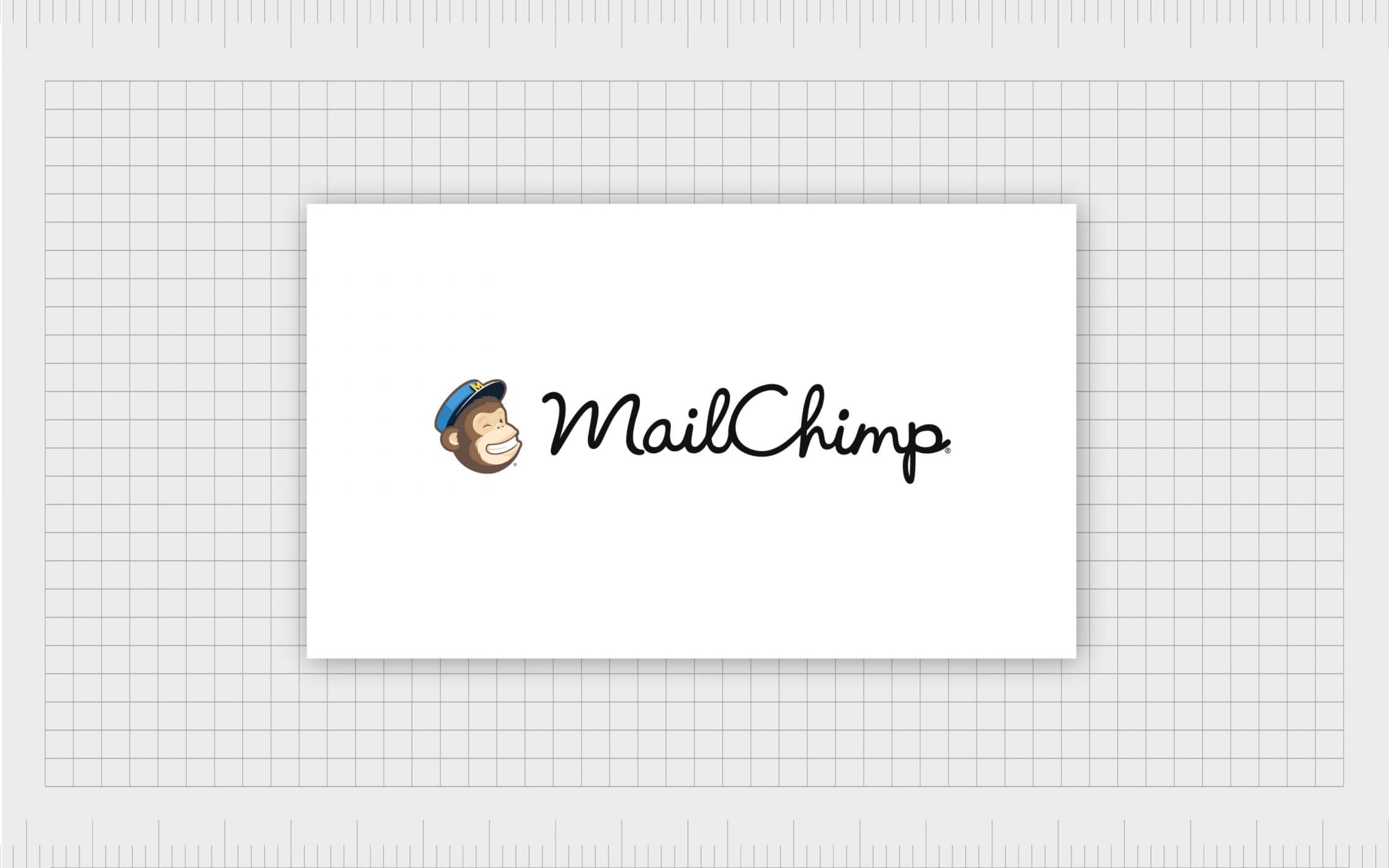
5. MailChimp
The handwritten script logo of MailChimp reflects the informal and friendly nature of the brand, which works perfectly alongside the adorable monkey mascot that they often include in their logo. MailChimp is a great example of typography logo design inspiration, because it shows how a simple piece of text can be used to convey fun, creativity, and community – everything that MailChimp represents.
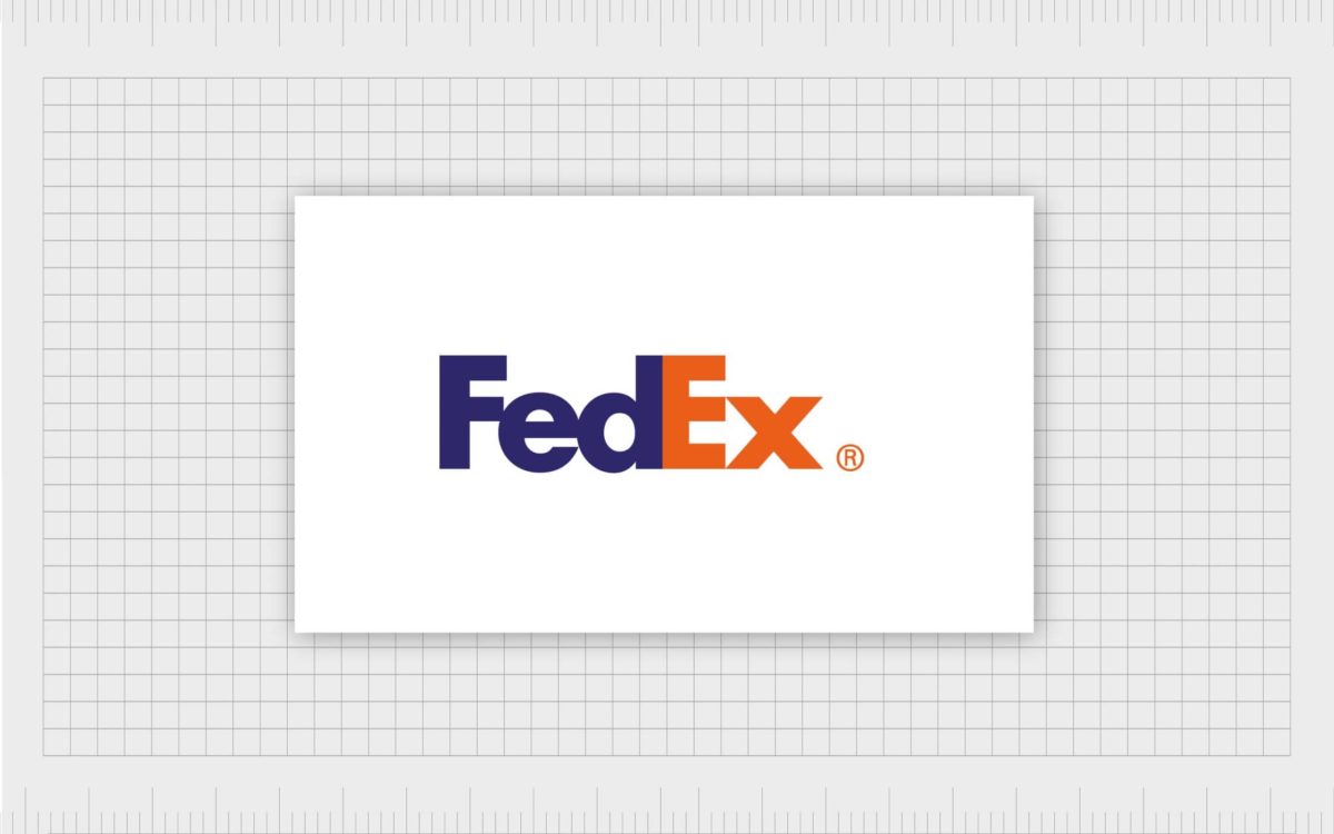
6. FedEx
Finally, it’s hard to create a list of typographic logos without paying some attention to the “FedEx” icon. Designed in 1994, the FedEx logo has remained largely unchanged throughout the years, acting as proof that clever, yet simple type-based logos can continue to be just as effective as the decades pass. One of the most appealing parts of this use of font psychology, is the arrow shape in the white space between the E and the X, which demonstrates the company’s commitment to speedy delivery.
How to choose typography in logo design
By this point, you should have plenty of typography inspiration, and background into font psychology that you can use to help you design the perfect logo. However, there may be a little more that you need to think about before you can rest assured that you’ve chosen the ideal font.
Many businesses are tempted to jump head-first into choosing a typeface that’s unique and fun, but differentiation is just one of the qualities that you need to keep in mind. A font needs to be more than just beautiful in your logo, it also has to be readable, and meaningful too.
Many experts agree that selecting the right font is key to creating a beautiful logo. With the amount of options available reaching somewhere in the hundreds of thousands, it’s a good idea to have a few tips in mind when you’re narrowing down your options. Let us get you started.
While we have you here, check out these brilliant design resources on Amazon:


Step 1: Clarify the identity of your brand
Before you can begin browsing through font options, you need to make sure that you fully understand your brand identity, and the image you’re trying to portray. Ask yourself what you want your customers to feel and think when they’re looking at the imagery around your company. What thoughts do you want to elicit with nothing more than your name and logo?
Even a basic understanding of your brand identity should be enough to help you decide which fonts simply aren’t appropriate for your company. For instance, a corporate law firm won’t choose the same font as a fashion company for young women. Defining your image is the first step to making logo design much simpler.
Step 2: Identify your target audience
If you want to choose and create the perfect logo, then you need a thorough understanding of your customers, and their preferences in terms of shapes, styles, and colours. One of the easiest ways to make sure that you’re going to have the right impression on the right audience, is to look at your existing fans, or consider creating a user persona.
A close examination of your target market should help you to choose a few words that describe them best. This might seem like hard work, but remember that most successful branding comes from appealing to your target market and your own personal sense of style at the same time.
Step 3: Consider what your competitors are doing
Generally, it’s a good idea to be aware of what your competitors are doing – regardless of whether you’re designing a new website, or creating a logo. This isn’t because you should be stealing their ideas, but because you want to make sure that you’re setting yourself apart from them in the market.
Analysing your competitors can also help you to learn more about what they’ve done right, or wrong in the market, so you can take advantage of their missed opportunities. Try looking at some of the major people in your industry, and ask yourself what you can learn from their use of font psychology.
Step 4: Keep your choices simple and timeless
Typography psychology might be complicated, but your font shouldn’t be. In fact, readability or “legibility” is essential when designing your logo. After all, if your customers don’t have any idea what the name of your business is, they might decide to avoid doing business with you entirely. While you want your logo to look beautiful, readability should always come first.
Make sure that you don’t get caught up in any passing fads either. Some of us will remember the “disco” fonts of the late 70s that looked more like balloon animals than letters. They were all the rage for a couple of years, but they also disappeared without a trace. You want your logo to be as timeless as possible, so keep that in mind when looking for typography inspiration.
Step 5: Think about how your logo will look in different media
Finally, once you’ve narrowed your options down as much as possible, you’ll need to see how they look when displayed in different formats. Inspirational typography doesn’t just appear as part of your online presence, it will also be printed on brand communications and brochures, stationery, across your advertising campaigns and even billboards in some scenarios.
Certain fonts won’t look as attractive when they’re plastered across a building as they do when they’re narrowed down into a tiny icon. Ideally, you should play around with different options, and ask the design agency you work with to consider how your logo will appear on different media to limit your risk of long-term problems.
Inspirational typography: Finding your font
Designing a beautiful, recognisable brand logo that resonates with multiple audiences across various platforms and media is an incredibly daunting task. With so many different decisions to make, it’s easy to overlook one of the most important details in your design: the font that will convey your unique brand identity.
Though typography might not be considered as often as colour and shape when it comes to logo design, the truth is that it can be just as important. Just look at Coca-Cola, for instance, a company that’s managed to transform simple sweeping script into the perfect representation of one of the world’s favourite carbonated drinks.
If you want your name to stand out on your logo, then it’s crucial to remember that the appearance of the text is almost as important as the word itself. While your name has a part to play in brand awareness, if the style and shape of your letters can’t pique your customer’s interest, then you might lose out on the brand recognition you crave.
In a world where your logo is often the first point of contact you’ll have with your audience, you can’t afford to miss out on choosing the perfect font. Understanding typography psychology, the personality that different styles convey, and how you can impact customer feeling with your choice of text could mean that you instantly outshine your competitors. Choose your type wisely.
If you enjoyed this article, you might enjoy these too:
— Get your brand in shape: The psychology of logo shapes
— Show your colours: The psychology of colour in branding

Clarity starts with a conversation.
Thanks—we’ll get back to you shortly.
Whether you're navigating a rebrand, merger, or simply need a clearer identity—we’re here to help. No hard sell, just honest advice from people who know the sector.
Let’s start with a simple question…
Prefer to email? Drop us a line.
Fabrik’s been helping organisations rethink and reshape their brands for over 25 years. We’ve guided companies through mergers, rebrands and new launches. Whatever stage you’re at, we’ll meet you there.