Logos that last: Famous corporate and brand logo design

A logo is more than just something you use to spruce up your website, brand communications and marketing campaigns. Your logo is your visual identity, simplified and refined into a simple, yet effective icon.
In this crowded world of competing companies, your logo can be the element that captures the eye of your intended audience, inspires loyalty, and ensures that you continue to generate sales, no matter how saturated your niche might become.
Throughout an organisation’s history, a logo can signify countless things, from your distinct values and vision to the innovation your brand invests in. While some brands come and go, truly incredible logos stay in the hearts and minds of their viewers for decades.
It was a tough job, but we managed to pull together 30 of our favourite corporate brand logos from around the world, to give you an insight into some of the most memorable brand marks.
1. The Apple logo
Let’s start with one of the most famous brand logos in history. The iconic Apple design began with co-founder Ronald Wayne, who drew a picture based on the historic day when Isaac Newton discovered gravity. The logo included a quote from Wordsworth, which though inspirational, made it pretty bulky for all intents and purposes. In 1977, Rob Janoff created a simplified version of the Apple logo from a rainbow-striped apple illustration.
The 1977 rendition featured the “bite” in the fruit, and it was intended to appeal to younger people (while distinguishing the graphic from the similar shape of a cherry). Over the years, the colours and shading in the Apple logo have changed, but the distinctive symbol remains the same.
2. The FedEx logo
Back in 1971, the logo for FedEx was the company’s full name “Federal Express”, written in blue and red font. The symbol was supposed to be patriotic, and symbolic of the US government, and it helped FedEx to achieve some of the success it holds today. However, in 1994, the new logo was created to give the brand a more “modern” feel.
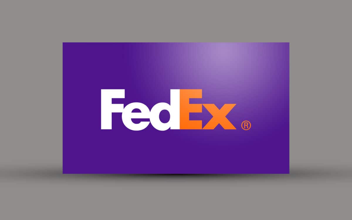
Today, FedEx is one of the best known American brands, and its corporate brand logo is referenced by designers around the world for its incredible use of bold colour and negative space. The arrow between the E and X represents the company’s dedication to accuracy and speed.
3. The IBM logo
Originally introduced in 1924, the IBM Logo came about when the Computing Tabulating Recording company rebranded itself as “International Business Machines”. The new name highlighted the brand’s attempt to modernise, and the logo was an updated version of the 1911 logo used by CTR. The intricate typography of CTR was replaced by the bold lettering of the International Business Machines name, configured to look like a globe.

In 1946, the company continued to upgrade its technology, and simplify its brand with a basic “IBM” mark, which continues to represent the business today. In 1956, Paul Rand transformed the outlined logo into a solid black font to demonstrate stability, then in 1972, the lines were introduced to indicate dynamism and speed.
4. The Shell logo
While oil and gas companies have a worse reputation today than they had a few decades ago, the classic Shell logo ensures that this brand can continue to earn the attention and respect of its customers. Virtually unchanged since 1971, the longevity of the Shell logo speaks to the consistency that customers are looking for in their favourite brands.

When it comes to an energy giant, “reliability” is the name of the game, and the Shell logo provides a sense of traditionalism that delivers just that. What’s more, the minimalism of the graphic means that it doesn’t look dated, even fifty years after creation. The shell is a literal representation of the company’s name. When Shell began, it transported oriental seashells around Western countries. Now, as a fossil fuel distributor, the shell is still relevant.
The bright colours help the logo to stand out on the road, and they’re also linked to the Spanish flag, which was important to the company when it first began.
5. The Nike logo
Originally known as “Blue Ribbon Sports”, Nike didn’t find its iconic name until 1971, when the company started to produce its own footwear. As corporate brand logos go, the swoosh is one of the most recognisable symbols on the planet.

Created by Carolyn Davidson, who only received $35 for her design, felt inspired by the Greek Goddess of victory “Nike” when she designed the swoosh to imply speed and movement. The logo has been updated throughout the years to remove the name of the brand completely. Now, the unique design is beloved all around the world.
6. The Volkswagen logo
The original logo for Volkswagen came about when Porsche launched an in-office competition to see who could come up with the best design. The winner was Franz Reimspiess, who was responsible for the Beetle engine in the 1930s. The first black and white logo included the VW for Volkswagen, along with the swastika in accordance with Hitler’s regime.
After the war, the British took over the company and designed a new logo as a result. They kept the VW and removed everything else related to the Nazi flag. The most recent logos are blue and grey, a softer version of the harsh logos of the past.
7. The Google logo
Another example of one of the most famous brand logos in the world, the Google mark was first envisioned by a man called Sergey Brin in 1988. As one of the founders of the company, Brin used the graphics program “GIMP” to produce the unpolished classic logo, with a little exclamation mark at the end to mimic the Yahoo! Design.
The refined version of the logo was introduced in 1999 by Ruth Kedar, sans the exclamation mark, and it stayed in use until 2010. On the 6th of May 2010, Google launched a new updated logo, but over the years, the image hasn’t changed much from Kedar’s design. Of course, today, you can see new adaptations of the Google logo every day from the search giant, which is a great testament to their creativity, and wide-spanning reach.
8. The Mercedes-Benz logo
The original logo for Mercedes-Benz was a logotype of “Mercedes” written inside an oval. The product name was selected by DMG (Daimler Motors Corporation) because the founder’s daughter was called Mercedes.

In 1909, the founder, Gottlieb Daimler, registered a four-pointed, and three-pointed star as company trademarks. Eventually, the three-pointed star was selected as one of the most famous corporate brand logos in the world, as a symbol for Daimler’s ambitions for motoring on land, in water, and in the air. From 1910, every DMG car had a three-pointed star on the radiator.
9. The Warner Bros logo
The Warner Bros logo feels like it’s always been around. Introduced in 1923, the original mark featured a photo of the studio, and the letters WB, inside of a shield. The picture remained until 1929 when the logo simply became the “WB” marks curved to fit the shield with the words “Warner Bros. Pictures” curved above.
There have been a couple of changes to the Warner Bros graphic over the years, but the overall design has remained the same, including the same iconic shape, and the stunning gold and blue colouring. During recent years, the production company has gone through a trend of tweaking the logo to suit each movie, so there are countless variations of the classic animation.
10. The Audi logo
The original logo for Audi was first designed in the Art Nouveau trend. A similar representation of the image has remained in use from the foundation of the company in 1919 when Lucian Bernhard created his own modern design for the logo. The unique image went on to define the brand all the way up until 2009 when the company updated the print.

The four interlaced rings that represent Audi’s devotion to community and innovation were introduced in 1932, when Audi merged with Wanderer, Horch, and DKW. There’s one ring for every company, and although they were removed between 1978, and 1992, from the logo itself, they were still featured on the grill of every Audi car. To celebrate 100 years in the industry, Audi introduced an updated logotype in 2009, with a sleeker, modern image.
11. The BBC logo
The British Broadcasting Corporation has a bit of a chequered past when it comes to corporate brand logos. The graphic we’re familiar with today – the three bold letters encased in separate squares, has essentially been the same since 1960.

It works well as a representation of the company because it’s clear and sophisticated. Since it’s launch in 1922, the BBC has hoped to “inform, educate, and entertain”. Today, people around the world really appreciate the BBC’s focus on balanced news, culture, arts, and drama. The logo is formal, geometric, and reflects the company’s confidence in its mission.
12. The General Electric logo
The General Electric graphic is one of the best and most famous brand logos in the world, in part because it’s somewhat surprising. The art nouveau style is very ornamental, which might not be what you would expect from an innovative and inventive company. However, some people feel that the image looks a lot like a washing machine going through a spin cycle. This would make sense considering washing machines are one of GE’s most popular product lines.
Like many of the corporate brand logos on this list, the General Electric mark has remained largely the same since 1892. The sleek script and the unique styling is attractive and effective – exactly what you want out of a home-based product company.
13. The Amazon logo
When it comes to designing the best brand logos, many companies choose a graphic that represents their values as an aspiring company. Amazon is a brand that has quickly become one of the most recognisable in the world. Their logo not only showcases their memorable name but also their devotion to selling a broad collection of unique products.

The arrow travelling all the way from the A, to the Z in “Amazon” is a bit of subliminal trickery intended to remind you that you can get almost any product you can think of from this marketplace seller. It also demonstrates the quick shipping ethos of the company too. The arrow and the placement of the font also looks a lot like a happy face, which indicates the brand’s focus on customer satisfaction.
14. The Cisco logo
Cisco is one of the world leaders in technology and telecommunications. The company is named after the location of the headquarters in San Francisco. Not only does the Cisco logo look modern and innovative thanks to its bold sans-serif font, but the blue lines also generate ideas of broadband connections or Wi-Fi.

Apparently, the blue stripes not only represent an electromagnet, drawing attention to the company’s technical focus, but also the Golden Gate Bridge in San Francisco too. This is clearly a brand with a love of its hometown.
15. The Unilever logo
An Anglo-Dutch company that has achieved brand awareness across the globe, Unilever is responsible for a huge portfolio of well-known companies within the areas of personal care, hygiene, and nutrition. They asked a man called “Wolff Olins” to help develop the brand for their company, intended to showcase its mission of vitality and customer care.

Within the “U” for Unilever, the logo includes 25 carefully-drawn icons intended to replace the old logo and demonstrate each of the things that Unilever does. On the Unilever website, you can find the meaning and story behind every icon. It’s no wonder this complex mark is one of the most famous corporate brand logos out there.
16. The Indesit logo
Originally founded in 1953 under the name “Siprea”, Indesit was a company that started off making coolers. In 1956, the brand changed its name twice, first to “Indel” then to Indes. The logo was an ellipse, topped by a shield where the acronym was inscribed onto the shape.

In 1961, the company name “Indesit” came to life, to emphasise the Italian heritage of the company, and the logo lost the ellipse and dots. The initial, followed by a red punctuation mark was placed into a rhombus instead. Now, the lowercase “I” of the Indesit logo looks a lot like the typical knob fitted to electrical applications, making it a memorable icon for homeware.
17. The HSBC logo
A great example of how fantastic corporate brand logos in the banking world can be, the current HSBC logo was uncovered by the Shanghai and Hong Kong banking corporation in 1983. It was designed by Henry Steiner, a famous graphic designer in Australia who had also designed graphics for Dow Jones, Unilever, and the Hilton hotel in the past.

The HSBC logo is made up of a hexagon shape to symbolise strength and security. The highly recognisable image was influenced by the traditional flags of the Hong Kong company in the 19th century.
18. The Deutsche Bank logo
If you want to stand out in the world of finance and banking, then you need a logo that tells your customers they can trust you. Everything from the colours of the graphic, to the shapes you choose can have a significant impact on your consumer. In July 1972, the Deutsche Bank hired seven different designers to come up with a new visual identity for their brand.

After being given a choice of several new designs, the bank decided on a symbol that was created by a man called Anton Stankowski. His “slash in a square” graphic was intended to represent a premium brand, and the square shape was supposed to portray security and control.
19. The Bluetooth logo
The logo for Bluetooth is one that we all know and love today. Though it may not be the first thing that comes to mind when you think of corporate brand logos, it’s plastered on almost every tech device around the world. The mark comes from a combination of the letters “H” and “B” written in Viking runes. The “H” and “B” refer to the man behind Bluetooth, Harold Bluetooth.
No-one’s totally sure what earned King Harold of Denmark the nickname “Bluetooth”, but there was clearly something impressive about him. The blue colouring is simply an obvious choice to represent the name of the device.
20. The Chanel logo
The Chanel logo is a must-have wardrobe staple for many fashion lovers. However, what most of these people don’t know, is where the interlocking “C” graphic comes from. Though the two C’s obviously stand for the name of the designer “Coco Chanel”, the full design was inspired by the artist’s visit to the Chateau de Cremat in France, where the architecture for the arches closely resembles the interlocking C’s.

Throughout her life, Coco Chanel was invited to visit the Chateau many times, which helped her to build a connection with the stunning structure. The resulting brandmark is an expression of Coco’s nostalgic love towards the building, which was built in 1906 in Nice.
21. The Twitter logo
It’s tough to talk about famous brand logos without looking at everyone’s favourite fast-paced social media platform, Twitter. The original mascot for the platform was a bird on iStock that Simon Oxley created. The rights for the image were purchased for $15, but Twitter got bored of the design quickly and decided to replace it with one drawn by a co-founder called Biz Stone.

The cartoonish creation evolved several times over the years, and now, the bird does a lot more than simply represent the company through a basic shape. According to the people behind the brand, the graphic resonates with its audience on numerous levels, even evoking the “sound” of the company name. Additionally, the position of the bird now makes it look as though it’s taking flight, which represents the fast-paced and social nature of the interactive platform.
22. The PlayStation logo
Technology innovator Sony has done plenty of great things throughout the years. However, few of their creations are more innovative and popular than the PlayStation. One of the most interesting things to note about the PlayStation is its corporate brand logo design. Designed by a graphic artist called Manabu Sakamoto (the man who also designed the Sony VAIO logo), PlayStation’s mark has become the emblem of a generation.

Today a whole demographic of avid gamers feel an affinity towards a simple image, which consists of a letter P on top of a letter S. The S is placed like a shadow, with the P standing tall above it. The three-colour pattern of yellow, green and blue for the original PlayStation logo design was a deliberate choice for Sakamoto. Apparently, those hues are supposed to stand for “passion, brilliance, joy, elegance, and charm.”
23. The Premier League logo
The corporate brand logos for the Premier League have seen some changes over the years, particularly after the organisation was engaged in a clash with extremist political party “UKIP”. In 2016, the group changed their original lion mascot slightly, by focusing on just the head of the animal, rather than the full body. Although the previous version was fine, the people behind the transformative logotype feel that the update is more regal and confident than its predecessor.

The football that was previously featured in the image has been removed completely – no doubt because the company believes that they’re famous enough now that they don’t need to explain what they do to their crowd. What’s more, the bright colours of the Premier League design are bound to stand out in any walk of life.
24. The Allianz logo
The Allianz logo began with a careful choice of the “Reich” eagle, along with the Munich Kindle and the Berlin Bear on the top bottom left and right corners. The logo was more like a flag than a brand mark when it first began, and many of the original elements were eliminated completely in 1923 when the company rebranded to embrace ideas of unity and growth.
The new logo showed a single mother eagle over three smaller eagles, while the contours of the image were designed to be softer, and more appealing to a wider crowd. In the 90s, the three parallel lines of the Allianz graphic were introduced, intended to depict the eagles without as much detail.
25. The Mitsubishi logo
When it comes to corporate brand logos, there are plenty of options out there in the technology industry. The “Mitsubishi” image is one of our favourite options and one of the most famous brand logos in the world too.

The word “Mitsubishi” comes from a combination of the word “Mitsu” and “Hishi”, the term “Mitsu” means three, while “Hishi” means water chestnut, and it’s supposed to demonstrate a diamond or rhombus shape. Yataro Iwasaki, the founder of the original Mitsubishi organisation was the man who decided on the three-diamond mark for his company. Apparently, the logo is supposed to be an arrangement of two different family crests. The first crest is for the Iwasaki family, while the second is for the Yamauchi family.
26. The AstraZeneca logo
The AstraZeneca logo is an incredible example of how colour, typography, and shape can be used together to demonstrate the vision or purpose of a brand. As a Swedish multinational company with a background in medical science and pharmaceuticals, it makes sense that the AstraZeneca corporate brand logo would be one that demonstrates the company’s ideals of innovation and growth.

The modern sans-serif font is an ideal way for the business to show off its trustworthy and innovative nature, while the combination of deep blue and gold colours demonstrate a unique combination of positivity, creativity, and sophistication. The squiggly graphic next to the AstraZeneca typography could be a perfect representation of the complexity of biology.
27. The TFL logo (Transport for London)
If you have ever travelled to London, then you’ll know the “Transport for London” or TFL logo. Otherwise known by some as the “subway” logo, the circle with a line through it is the symbol for the transport authorities in London. The company was originally called “London Transport” from 1933, and the “roundel” logo was introduced to make it easier for customers to pinpoint the TFL.

The roundel logo is intended to highlight the universal nature of the transport system, which can take passengers to all parts of London. The design is clean, simple, and easily recognisable for the modern explorer.
28. The Movistar logo
First launched in 1995, the Movistar company is a telecommunications organisation owned by Telefonica, one of the largest phone operators in the world. The Movistar brand was created for the Spanish-speaking market, and it operates in 14 countries today, where it’s the largest phone operator.

The most recent update to the corporate brand logo, which has become one of the most famous brand logos in the world, was designed by someone called Lambie Nairn. Lambie-Nairn designed the new identity for the brand as an “evolution” intended to symbolise the modern positioning of the business as a flexible, vibrant, and digital company.
29. The Dropbox logo
The Dropbox logo has seen a few reiterations over the years, but its simple and effective design makes it one of the most memorable corporate brand logos for the digital era. The original logo was a blue box that indicated how useful the application was for storing information and documents. Today, the updated illustration is supposed to show a new personality, rife with creativity and development for the brand.

Apparently, the new logo is supposed to suggest that Dropbox is more than just a great place to share things. The bright “collection of surfaces” in the graphic can be animated, and take on other colours besides the original “blue”. While some people feel uncomfortable with the change in pace for the company, others have shared their appreciation of how versatile the style can be.
30. The Vodafone logo
Last, but not least, the Vodafone logo was first designed by Gary Broadbent, while working as Creative Director for the international agency, Springpoint. The “speech mark” emblem symbolises conversation and voice. The shape is a fantastic icon for a telecoms brand who wanted to show their devotion to inspiring simpler and more effective conversations between customers.
The latest Vodafone identity is a re-imagining of the first logo, created for the modern age. Apparently, the red colouring is supposed to represent sound and passion, while the custom typeface shows off the modern nature of the business.
Learning from corporate brand logos
In a world drowning in competing brands, thousands of logos beg for our attention daily. Though you might not always notice the famous brand logos that surround you each day, there might be a few graphics out there that hold a special place in your heart. In fact, some of the best brand logos are so popular, that a change to them would be enough to spark a public outcry.
When it comes to creating a logo of your own, an insight into the examples above could be enough to inspire you into creating something fresh, innovative, and memorable through your brand consultancy. While there’s no one-size-fits-all method to creating a great graphic, most experts agree that a brand mark should be distinct, recognisable, and timeless.
Whether it’s an image that’s deceptively simple, such as the Dropbox surfaces, or something that comes with multiple layers attached, like the iconic Apple icon, your logo should distill the heart and soul of your company into a symbol that your customers will cherish. In a world where everyone is struggling to earn loyalty and recognition, the staying power of truly amazing logo should never be overestimated or under-appreciated.
If you enjoyed this article, you might enjoy these too:
— Get your motor running, the Harley Davidson story
— How Dyson cleans up when it comes to marketing
Clarity starts with a conversation.
Thanks—we’ll get back to you shortly.
Whether you're navigating a rebrand, merger, or simply need a clearer identity—we’re here to help. No hard sell, just honest advice from people who know the sector.
Let’s start with a simple question…
Prefer to email? Drop us a line.
Fabrik’s been helping organisations rethink and reshape their brands for over 25 years. We’ve guided companies through mergers, rebrands and new launches. Whatever stage you’re at, we’ll meet you there.


