Nike logo history and evolution

We’re all familiar with the Nike logo. With a value of around $34.8 billion, Nike is one of the best-known athletic brands in the world. It’s also one of the most recognizable companies, thanks to its unique emblem.
On the foundations of a timeless, simple, and memorable logo, Nike builds an identity impossible to forget. So, where did this amazing symbol come from?
Surprisingly, the story starts with a $35 suggestion from graphic design student Carolyn Davidson in 1971.
Here’s your guide to the Nike swoosh and how a logo worth less than $50 took the world by storm.
The Nike logo
What you need to know…
At first glance, the Nike logo doesn’t seem like a world-changing design.
Otherwise known as the Nike swoosh, this image looks a lot like a fluid checkmark, perfect for conveying Nike’s “just do it” attitude. However, the meaning behind the Nike symbol goes deeper.
According to Carolyn Davidson, the image represents the wing of the Greek goddess Nike – the deity of victory. Nike was thought to deliver strength to warriors on the battlefield.
The great thing about the Nike logo is even if you know nothing about Greek mythology, the symbol still has the right impact. Nike’s swoosh is instantly recognizable as a positive, fast-paced, and modern image.
When you know the deeper meaning, it only adds to the strength of an already powerful design.
Like many minimalist logo designs, Nike’s swoosh stands the test of time. It’s exciting, timeless, and easy to understand. The emblem promotes drive, ambition, and potential.
The Nike logo design elements include:
- Shape: A fluid check mark image denoting the wing of Greek Goddess, Nike. Carolyn said she wanted to mimic the wing of Nike, although many people see the swoosh as a simple check today.
- Color: The Nike logo appears in various colors around the world. Red and white are commonly associated with Nike. The color red has the longest history with Nike, but today, it’s easy to imagine the swoosh in a range of colors.
- Font: Nike’s logo and font aren’t always connected. You may occasionally see the word Nike along with the graphic image, or the motto “Just do it” displayed on Nike assets. The text uses Futura Bold Font, while the Nike name is always in bold capital letters, helping to emphasize the brand. The “K” in Nike is slightly slanted to make it more visible.
- Additional logos: Nike sometimes creates standalone logos for specific product lines. The Nike Skateboarding brand (Nike SB) places an “SB” under the swoosh. The Nike Air logo uses the word “Air” under the swoosh.
Nike logo history
When did Nike change its logo?
Nike’s swoosh logo first appeared thanks to Carolyn Davidson, a graphic artist suggesting images for the brand in 1971. Phil Knight, the co-founder of Nike wasn’t fond of the logo.
Knight was teaching a class in Portland State University when he heard Carolyn talking about not having enough money to take an oil painting class. Phil offered Carolyn $2 per hour to design some signs.
The Nike logo evolution
The Nike symbol wasn’t always the swoosh we know today, and the Company wasn’t originally called Nike.
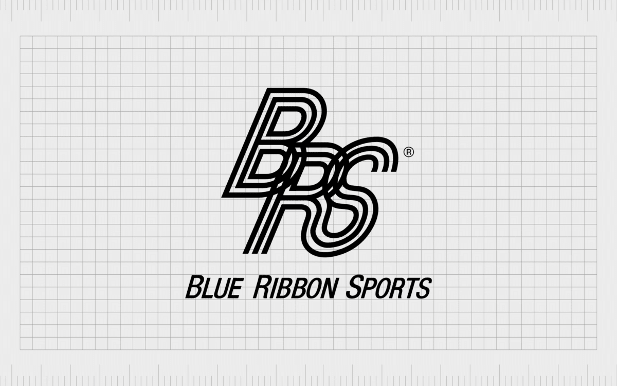
In 1964, Nike was “Blue Ribbon Sports”. The logo for this company was a set of interlacing letters (BRS) with the name of the brand underneath. Though the logo wasn’t the most legible on the market, it served the company for a few good years.
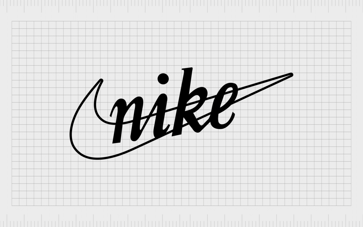
In 1971, the basic Nike swoosh was introduced for the first time. Carolyn Davidson introduced this image with some other proposals for Nike’s new logo. The standard swoosh was offered alongside a slightly more cluttered version of the design.
This version had the word Nike written over the swoosh in lower-case font.
The Nike logo launched Carolyn Davidson’s career. Although the emblem has changed slightly over the years, the central Nike swoosh has remained consistent throughout the decades. Nike has frequently experimented with adding the word Nike to the logo, along with the tagline “Just do it”.
For a decent amount of time, Nike used the name of the brand with the Swoosh to help strengthen recognition for customers.
In 1978, the Nike logo looked like this:
For a while after 1985, Nike placed its logo in a red square, using white as its central color. Many people are still familiar with the red and white Nike logo color, though the company quickly switched back to a more simplified version of the symbol.
Today, the Nike logo is as minimalist as it gets. The company prefers to use the solo swoosh rather than adding the brand name or slogan into the mix. Fortunately, Nike’s brand is so well-known it’s easy to recognize the symbol with no name at all.
You may notice Nike occasionally adding stylized versions of the logo onto its products. Shoes, bags, and other garments sometimes feature the swoosh in a variety of colors. Nike consistently adds its logo to every product it makes.
How much did Carolyn Davidson get paid?
The Nike logo is so well-known across the globe, it’s easy to assume it cost thousands of dollars and required an entire design team. The amazing truth is graphic student Carolyn Davidson only received an initial $35 for creating one of the world’s best-known logos.
That’s a little over $200 when you adjust for inflation. The $35 payment came from Phil Knight offering Carolyn $2 per an hour for original design work.
The good news? The success of the Nike symbol meant the company could continue to reward Carolyn over the years. In 1983, Davidson went to a company lunch, where she received a diamond ring, and some of her own Nike shares.
Though Carolyn isn’t a millionaire (yet), she lives very comfortably thanks to her Nike logo design.
Why did Nike choose its logo?
When Nike decided to change its name from Blue Ribbon Sports, a new logo was a must-have. It’s sheer luck Nike managed to stumble across the perfect designer at the right time.
When Phil Knight asked Davidson to make the logo, he requested something “inspired by the Adidas brand” intended to convey a sense of speed and movement. Carolyn produced a selection of proposals, and though Phil wasn’t enamored with the swoosh logo at first, he eventually chose it.
The minimalist swoosh logo seemed to be the best choice thanks its timeless simplicity, memorability, and deeper meaning. The heritage and impact of the logo ensure it stays with customers – a crucial thing for gaining brand awareness.
Over time, Nike eventually added new elements to the logo, from the iconic Nike font and the Nike name (always in bold capital letters), to the “Just do it” slogan.
There was even a point where Nike introduced a jumping man in 1984 for the Nike Air Jordan, representing the silhouette of Michael Jordan, the famous basketball player.
The incredible history of Nike
The Nike logo history may have humble beginnings, but that’s part of what makes it so compelling. Today, the Nike symbol continues to stand out as one of the most memorable in the world.
The Nike logo shape appears across all of Nike’s assets, conveying a sense of inner strength and resilience to today’s would-be athletes.
Nike has built an entire personality about the positivity and affirming nature of its logo. Today, Nike is a company best-known for its ability to transform anyone into an athlete.
The Nike emblem isn’t just powerful for its minimalism and timelessness. This symbol acts as inspiration to anyone who wants to achieve something new.
It’s amazing to think the Nike logo history and evolution started off as something so simple – an idea from a student.
Want help designing your own logo? Reach out to Fabrik to begin your brand journey.
Fabrik: A branding agency for our times.
Now read these:
—Behind the wheel of the Jeep symbol
—The history of the Chevrolet emblem
—Harley Davidson logo emblem evolution
—Exploring the UPS shield and logo
—What does the Walmart symbol mean?
—KC Chiefs symbol and its meaning
—What does the Target logo symbolize?
—The LA Lakers logo and symbol
—How to become a Nike brand ambassador
—Exploring the Nike brand positioning strategy
—The shoe brand with the Jumpman logo
Check out these fantastic logo design resources:
Clarity starts with a conversation.
Thanks—we’ll get back to you shortly.
Whether you're navigating a rebrand, merger, or simply need a clearer identity—we’re here to help. No hard sell, just honest advice from people who know the sector.
Let’s start with a simple question…
Prefer to email? Drop us a line.
Fabrik’s been helping organisations rethink and reshape their brands for over 25 years. We’ve guided companies through mergers, rebrands and new launches. Whatever stage you’re at, we’ll meet you there.


