Kansas City Chiefs logo and history

Emblems like the Kansas City Chiefs logo are some of the most influential icons in the world. Designed to inspire pride and loyalty among sports fans, these logos are more than just images; they’re symbols of devotion and passion, similar to political party logos.
Many of the most compelling sporting logos have been around for decades. Though certain colors and shapes might change over the years, it’s common for the overall aesthetic to stay mostly consistent, until a team moves to a new location.
The Kansas City Chiefs’ logo belongs to a national football league team who have been in the industry for several years (since the 1960s). Today, we’re going to provide a deep dive into Kansas City Chiefs logo history to show you where this identifier came from, and what it means.
Chiefs’ logo history
Where did the Kansas City logo come from?
The KC Chiefs logo is the identifying icon on of the Kansas City professional football team. The team, now based in Kansas City, originally emerged in 1960s, thanks to founder Lamar Hunt.
Initially, the name of the team focused on its original location in Dallas.
During 1959, Lamar Hunt was struggling to get a professional football license in the NFL. He decided to establish the American Football League as the solution and served as its initial president when eight teams began to play in the 1960s.
Hunt created his new team the “Dallas Texans”, based in his hometown, (not associated with the previous Dallas Texans team).
In 1963, the “Dallas Texans” picked up and moved to Kansas City, where they were rebranded as the Chiefs. Despite competition from the NFL, the Dallas Texans quickly emerged as one of the top football teams in America, earning attention from countless fans.
Hugely popular in the modern football world, the Chiefs have earned several championship victories and awards over the decades. The franchise behind the KC Chiefs symbol and team is one of the strongest in the American Football League.
Many credit the Kansas City Chiefs as the reason for Hunt becoming a central figure in negotiations with the NFL for an AFL-NFL collaboration.
The Kansas City Chiefs symbols
Chiefs symbol history
The original Kansas City Chiefs symbol wasn’t for the Chiefs at all. This initial icon, launched in 1960s, was designed for the Dallas Texans – the original name of the popular football brand. This Chiefs’ symbol was one of the most complex in the football team’s history.
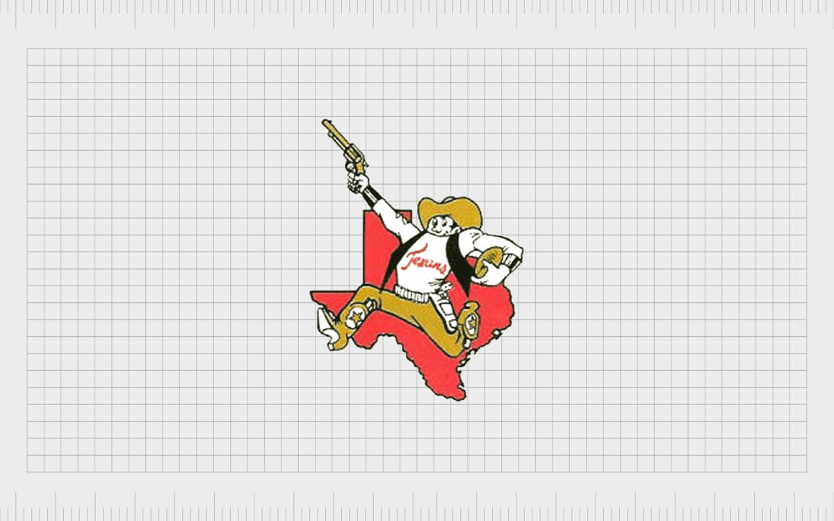
The original Kansas City Chiefs symbol featured a running gunslinger with a wide-brimmed hat, a pigskin football in one hand, and a gun in another. The gunslinger, wearing cowboy boots and a short reading “Texans” was placed in front of the image of the Texas state on a map.
The image was somewhat complicated, but it stayed with the Texans until 1963, when the logo was replaced with a new one, featuring a Native American, rather than a gunslinger.
Similar to the previous logo, this one featured a man running in front of a map-style image of Texas. The Native American still had a pigskin under one arm, but the hand previously holding the gun was now equipped with a small red axe.
The red of the background state was also replaced with a white and black outline.
The colors of yellow and red were very prevalent in this new logo, which also included an interlocking set of initials “KC” on the loincloth of the running man.
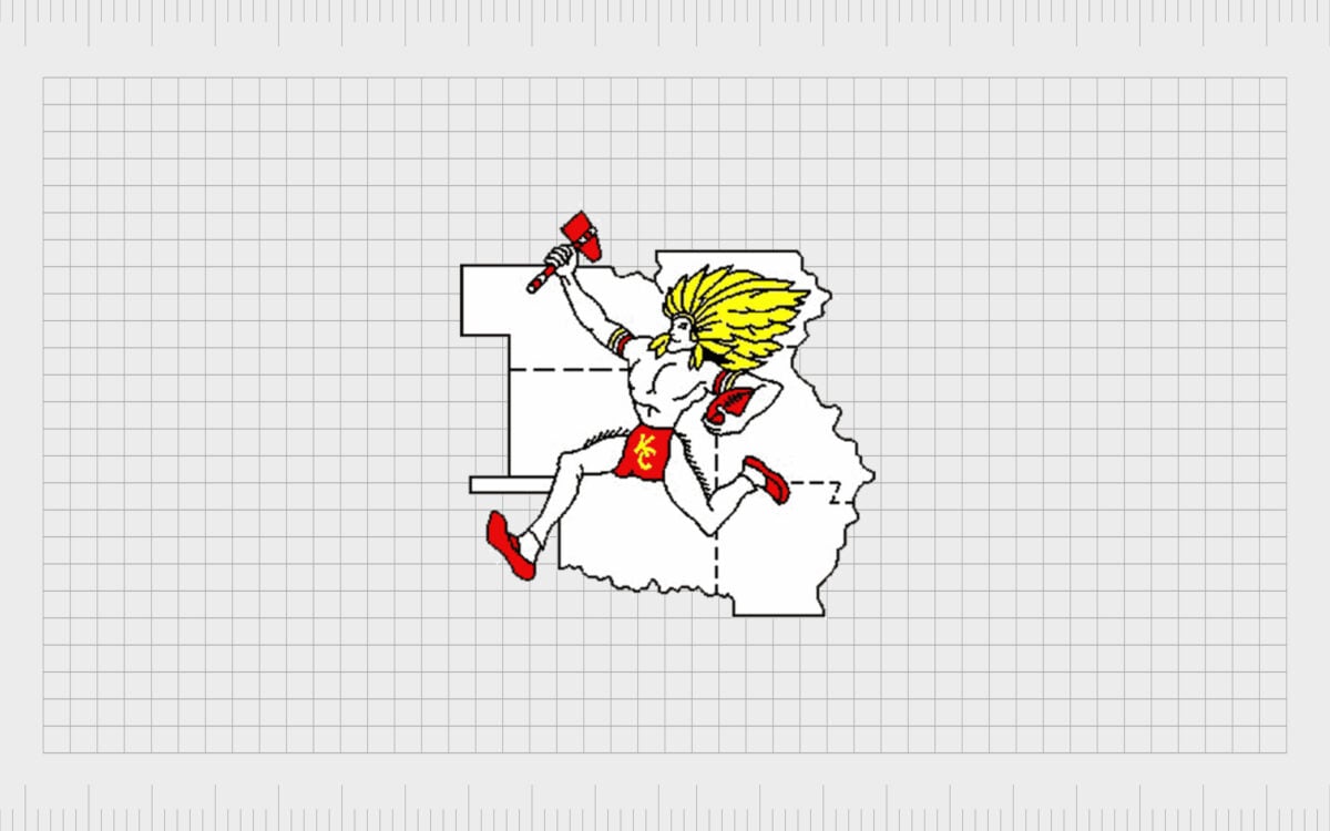
The logo, very similar to the old Chiefs’ logo, aimed to show the vigor and determination of the team, as well as their agility and strength. This was the first original Kansas City Chief logo to feature the official KC Chiefs colors as they would stand in the years to come.
The map in the background depicted Nebraska, Oklahoma, Missouri, Arkansas, and Iowa.
The KC Chiefs emblem today
The Chiefs emblem today is much simpler than the old Kansas City Chiefs logo. The new Kansas City Chiefs emblem debuted in 1972 removed the running man entirely, as well as a lot of the other details, like the background map image.
Instead, this new logo focused heavily on a single shape, and the KC Chiefs logo font, with two intertwining letters.
The new version of the logo almost completely ignores the connection of the team with its Native American heritage. The only component remaining from the previous image is the arrowhead design, which links back to the Native American imagery.
The simple arrowhead outline features a set of two letters in the middle “K” and “C.” Both letters are in a bold serif font, in a red color with black outlines. The use of bold elements in the outlines creates a 3D effect.
There are multiple versions of the Chiefs’ font with the interlocking letters out there. It’s believed the C created for the emblem was actually sketched by Hunt way back in 1963 when he was first coming up with ideas for the Chiefs’ image.
Kansas City Chiefs colors, font, and shapes
The KC Chiefs symbol today is a much simpler image than previous designs and something much more likely to appear on merchandise for the team.
These days, fans of the Kansas City Chiefs can access all kinds of branded products, from 3-piece tailgate kits, to throws to keep them warm in the winter.
Virtually every KC Chiefs product will feature the central colors of yellow/gold, red, white, and black – the shades often associated with the team.
As you can see from resources on the Kansas City Chief logo today, the image hasn’t changed a great deal since its redesign in the 1970s. There have been a handful of alternative logos in different colors and styles, but the primary image remains the same.
Elements of the Kansas City logo include:
Kansas City Chiefs colors
The colors of the KC Chiefs logos are usually red, yellow, white and black. As mentioned above, there can be some slight differences in shades and color use from one football season to the next. Largely though, the KC Chiefs colors will usually stay the same.
Kansas City Chiefs logo font
The font of the KC logo drew inspiration from the San Francisco 49ers, which also has an interlocking S and an F inside a shape. The typography itself is a bold serif font used in all capitals.
Some people think the C came from the design Hunt doodled when coming up with ideas in the 1960s.
Kansas City Chiefs logo symbol
The iconic symbol of the Kansas City Chiefs logo is an arrowhead, often drawn as a thin black and white outline, with the letters placed on top. This logo apparently also came from the founder of the team, who drew the arrowhead on a napkin on his trip back to Kansas City.
Celebrating the Kansas City Chiefs logo
From the memorable Kansas City Chiefs team colors, to the iconic arrowhead still present on branded products today, the KC Chiefs design has captured the hearts and minds of sports fans worldwide.
Today, it’s one of the most memorable and well-known images in the world.
The Kansas City Chiefs logo is simple and effective, bringing to mind the idea of Native Americans without being overly obvious. Compared to the original logo, the more modern emblem of the 1970s is definitely much easier to remember, and far more suited to the evolving sports space.
To learn more about other iconic logos from sports, companies, and political parties around the world, make sure you check out our other articles here on the Fabrik blog.
Fabrik: A branding agency for our times.
Now read these:
—Understanding the Nintendo Switch logo
—An in-depth look at the Fortnight logos
—The story of the Pokémon logo symbol
—The old eBay logo to the present day
—Explaining the Van Halen symbol
—The story of the Rolling Stones logo
—History of the Gucci logo and symbol
—Exploring the Stranger Things logo
Check out these fantastic logo design resources:
Clarity starts with a conversation.
Thanks—we’ll get back to you shortly.
Whether you're navigating a rebrand, merger, or simply need a clearer identity—we’re here to help. No hard sell, just honest advice from people who know the sector.
Let’s start with a simple question…
Prefer to email? Drop us a line.
Fabrik’s been helping organisations rethink and reshape their brands for over 25 years. We’ve guided companies through mergers, rebrands and new launches. Whatever stage you’re at, we’ll meet you there.


