


The story of the Pokémon logo symbol

The Pokémon logo ranks among emblems like the Gucci or Chevrolet symbol as one of the most recognizable images in the world. It’s hard to find anyone (child or adult), who isn’t familiar with Pokémon.
However, there aren’t many people who know where the Pokémon logo comes from.
The English version of the Pokémon symbol, displayed in yellow and blue, is probably the most common worldwide.
Over the years, however, countless new iterations have appeared, including the new Pokémon Go logo, the Pokémon Sword and Shield logo, or the Pokémon Sun and Moon logo.
There’s also Pokémon Japanese logos to consider, which are similar to their English counterparts, with a few simple differences.
Let’s dive into the origins, history, and evolution of the Pokémon logo.
Defining the Pokémon logo: Pokémon Japanese logos
Pokémon is the highest grossing franchise in the world, with around $100 billion in revenue.
Developed by Satoshi Tajiri in 1996, Pokémon features everything from video games, to toys, trading cards, books, anime cartoons, movies, and comics. The world is completely saturated in Pokémon merchandise, and demand for the Company’s products has remained strong over the years.
The Pokémon logo is simple enough, as a recognizable wordmark, designed in bright colors to capture the attention of any target audience.
The Pokémon logo in English combines funky, jaunty letters in shades of blue and gold. The blue stands for excellence and class, while the golden yellow is all about optimism and joy.
The Pokémon Japanese logos are a little different. The colors are similar, but the lettering has a slightly slimmer border, with a lighter blue shade.

The Pokémon logo colors also change depending on the Pokémon game, series, or sub-section of the brand they represent. For instance, the Pokémon Sword and Shield logos have elements of red and blue. These help to define the different versions of the game.
The official Pokémon symbol was first designed by the incredible Sugimori Ken, who also helped to design some of the original Pokémon characters too!
The Pokémon symbol through the years
The fundamental Pokémon yellow logo with its blue outline hasn’t changed at all over the years. Although there are dozens of versions of the logo custom made for different elements of the franchise.
Here are a few examples of Pokémon logo images for different assets:
The Pokémon Go logo
The Pokémon Go logo combines the traditional Pokémon wordmark with the word “Go”. The “Go” includes a poke ball design in the center of the “o”, and there’s a stary background in the word, as well as a curved line to represent the world.

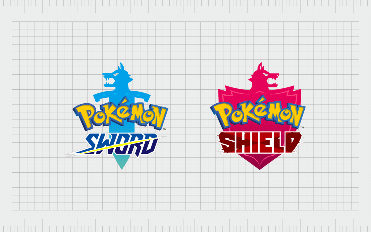
The Pokémon Sword and Shield logo
Most Pokémon games come with two versions to choose from, like Pokémon Gold or Silver, and Pokémon Sun and Moon logo. The Sword and Shield logos both have the standard Pokémon logo, as well as a secondary wordmark for either “Sword” or “Shield”.
Shield features strong, blocky letters to represent a shield. The word is written in red and imposed over a red shield design in the background. Sword is an italic wordmark with a slack through it, representing a sword.
There’s also a blue sword in the background to match the blue wording.
The Pokémon Sun and Moon logo
The Pokémon Sun and Moon logos are similar to Sword and Shield, with an option in red, and one in blue. Sun has the image of a sun in the background, where Moon has a moon. There’s also the traditional Pokémon wordmark on both.

When Pokémon updated the Sun and Moon franchise, they created a new Pokémon Ultra Sun logo and Ultra Moon logo. These two products use slightly different coloring, with more yellow in Ultra Sun, and less purple in Ultra Moon.
The symbols of the Sun and Moon are slightly different too, with black elements included to make them stand out.
Why Pokémon logo images look so similar
Pokémon is now celebrating 25 years as a franchise, after launching with the original Pokémon blue logo and Pokémon red version back in 1996. Although elements of the logo included for each game change to suit the nature of the title, the central wordmark stays the same.

The original Pokémon emblem is the perfect fun, fresh, and youthful design for a franchise constantly evolving to suit the needs of new generations.
The fact Pokémon’s designers can simply add another element to Pokémon logo images to make it more suitable for different products or franchises makes the concept incredible flexible.
While the games, trading cards, and other elements of the Pokémon franchise maintain the same logo, there are other sub-brands within the Pokémon ecosystem which have taken on their own designs over the years.
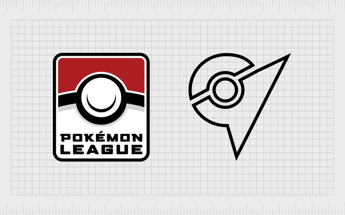
For example, the Pokémon league logo, which is often present during worldwide Pokémon trading card tournaments, doesn’t always include the Pokémon logo font, but it’s still instantly recognizable, as it matches the kinds of badges fans can earn in game.
There’s also the poke ball embedded into this logo – making it more iconic.
Pokémon also has a habit of bringing characters from the franchise into its logo designs. To celebrate the Pokémon 25th anniversary in 2021, the Company created a new logo based on the iconic character of Pikachu – one of the main creatures from the game and anime.

The massive world Pokémon has created for its franchise means the company has unlimited opportunities to capture the hearts and minds of fans with new images and emblems.
However, it will always be the central Pokémon wordmark which stands as the most iconic symbol for the brand, and an image fans will celebrate throughout the decades.
Pokémon logo font and design elements
As you can see from the examples above, there are tons of unique Pokémon logos available today, depending on what part of the franchise you’re celebrating. For the purpose of this article, let’s look at the most meaningful elements from the Pokémon wordmark.
You can find aspects of the Pokémon logo here if you want to learn more.
The Pokémon logo symbol
Depending on who you ask, some fans of Pokémon may argue the official symbol of the brand isn’t the wordmark at all. Some people assume the Pokémon logo is actually the iconic poke ball, or the image of Pikachu – the best-known character from the game and anime.
In terms of consistency, however, it’s the Pokémon wordmark appears most across every part of the franchise.
The Pokémon logo font
The Pokémon logo font is a special, custom-made typography, specially designed for the franchise. Even when you’re viewing this logo font in other languages, it maintains its jaunty, fun, and youthful appearance.
The mixture of capital letters and lower-case characters give the font a quirky appeal. The o’s in “Pokémon”, also look a little like eyes, which may be a hint to the story of the franchise, which revolves around “pocket monsters”.
The Pokémon logo colors
The most common colors used in the Pokémon font are bright yellow and blue. You’ll also notice elements of slightly dark blue and gold in most cases to give the font a 3D effect.
You can also find a Pokémon transparent logo online, which often comes combined with the Pokémon slogan, “Gotta catch ‘em all”.
Most Pokémon logos for the games, movies, and other parts of the franchise also come with secondary colors to define the name of the game or product.
For instance, the Pokémon blue logo has the word “blue” in blue font, as well as the image of a Squirtle (the first character in the game), in blue.

Celebrating the Pokémon logo for 25 years
For 25 years now, Pokémon has been an icon for children, delivering incredible games, anime cartoons, books, and toys around the world. Today it’s a symbol of nostalgia for adults, with many fans collecting the traditional games and movies.
Pokémon also continues to evolve with new games and experiences for a younger generation. With each new idea comes a new iteration of the Pokémon symbol, though the official Pokémon logo font remains a consistent part of the Company’s image.
Fun and youthful, the Pokémon wordmark is a symbol of joy, excitement, and fun, with a dark blue border that helps the inner bright yellow lettering to grab attention in an instant. The franchise name even curves a little, like a rainbow, to help it appear as though it’s leaping out of the page.
To learn more about some of the world’s most iconic logos, make sure you check out our other wonderful guides to logo history.
Fabrik: A branding agency for our times.
Now read these:
—Your guide to the Hewlett Packard logo
—KC Chiefs symbol and its meaning
—Understanding the Nintendo Switch logo
—Exploring the Stranger Things logo
—The Microsoft logo history and evolution
—The story of the Rolling Stones logo
—An in-depth look at the Fortnight logos
—Explaining the Van Halen symbol
—The LA Lakers logo and symbol
Check out these fantastic logo design resources:
No products found.

Clarity starts with a conversation.
Thanks—we’ll get back to you shortly.
Whether you're navigating a rebrand, merger, or simply need a clearer identity—we’re here to help. No hard sell, just honest advice from people who know the sector.
Let’s start with a simple question…
Prefer to email? Drop us a line.
Fabrik’s been helping organisations rethink and reshape their brands for over 25 years. We’ve guided companies through mergers, rebrands and new launches. Whatever stage you’re at, we’ll meet you there.