NHL logos: All the national hockey league team logos
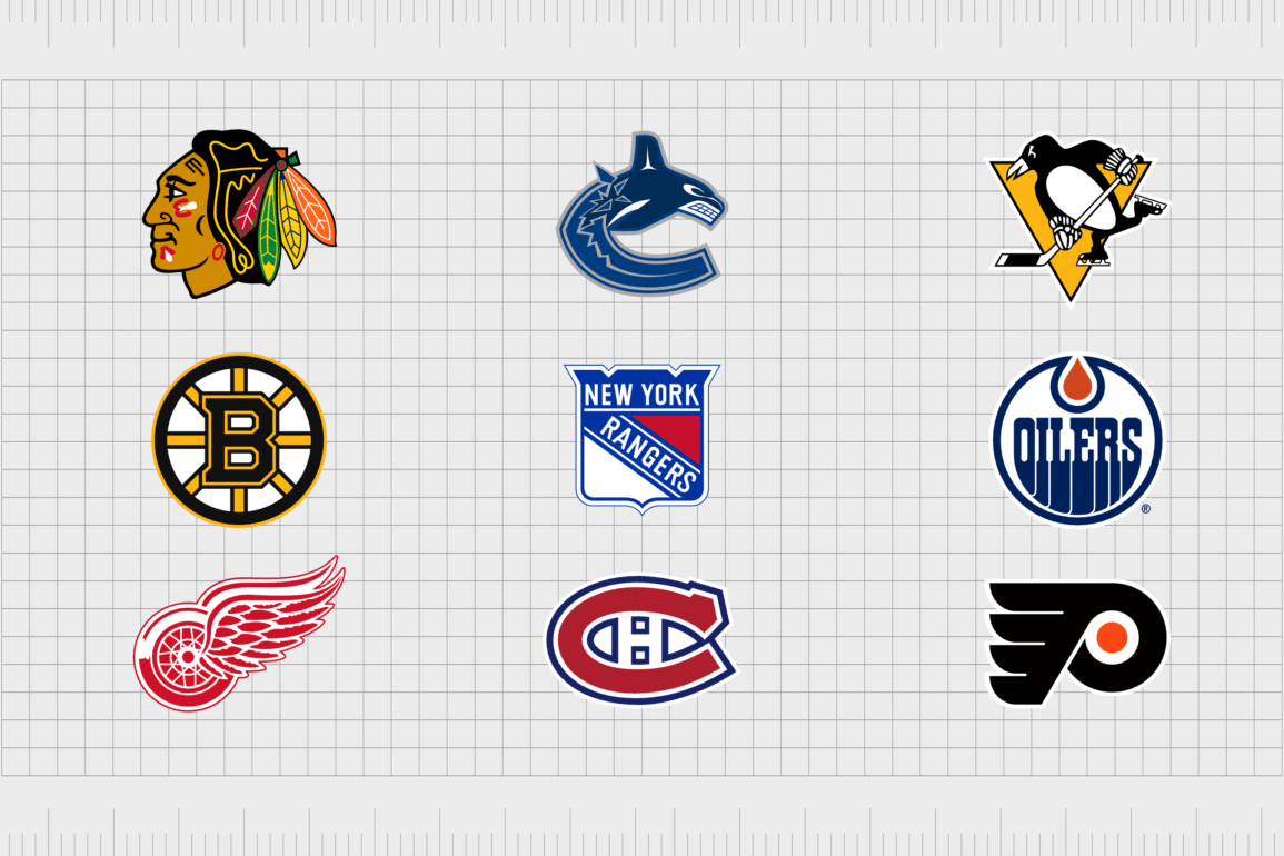
Even if you’re not a dedicated major league hockey fan, you’re probably familiar with a handful of NHL logos. Similar to the emblems of other sporting legends, NHL team logos are designed to not only highlight the history and heritage of the team, but inspire and engage a global network of fans.
Many of the NHL hockey team logos we’ll examine today have evolved over the years as teams have modernized and refined their branding. However, many of these unique designs are still steeped in history and meaning.
The right logo has the power to instantly invigorate an audience, inspire loyalty, and even give hockey players an incredible sense of pride.
Today, we’re going to be looking at all NHL team logos in circulation today, examining the history behind the team, and the deeper meaning behind their branding choices.
Here’s your complete guide to all NHL logos.
An introduction to NHL hockey team logos
Before we start exploring some of the unique logos of professional hockey teams in the “NHL”, it’s worth taking a moment to discuss the history of the league itself.
The National Hockey League, or the “NHL”, is the world’s leading professional ice hockey league, situated in North America. Today, it’s made up of a total of 32 teams, 25 of which are from the United States, while 7 come from Canada.
It’s one of the four major professional sports leagues in the US and Canada, and awards the “Stanley Cup”, the oldest professional sports trophy to one team each year. Originally, the NHL was established in 1917, after the “National Hockey Association” shut down.
At its inception, the NHL only hosted four teams, all in Canada. However, it quickly expanded to the United States, and began adding new teams to its roster throughout the years.
The NHL is now the fifth-wealthiest professional sport league in the world by revenue, and it sources skilled players from all over the world.
NHL team logos: All NHL logos in hockey today
As mentioned above, while the NHL initially had a relatively small roster of teams to begin with, it has expanded significantly over the years, adding numerous new expansion teams into the mix.
Over the years, the growth of the National Hockey League has served to increase the importance of each team’s unique logo. Today, every NHL logo gives its team an opportunity to differentiate itself from its competitors, and inspire loyalty in its target audience.
Here’s your guide to all NHL logos in circulation today.
1. Anaheim Ducks
First founded in 1992, the Anaheim Ducks was formed by the Walt Disney Company, originally with the name, the “Might Ducks of Anaheim”. During its early years, the team relied heavily on the use of a mascot in its logo and branding, before switching to a more simplistic emblem.
Today, the Anaheim Ducks’ logo features a large, webbed foot (inspired by a duck), forming the letter “D”. The text is depicted in gold with orange and black accents, demonstrating excellence, creativity, and professionalism.
It’s a powerful design with sharp edges, instantly recognizable worldwide.
2. Arizona Coyotes
Based in the Phoenix metropolitan area, the Arizona Coyotes were founded in 1971, as the “Winnipeg Jets”. In 1996, the team moved to Phoenix, and were renamed the “Phoenix Coyotes”, before switching their name to “Arizona Coyotes” in 2014.
The Coyotes have one of the most interesting NHL logos on this list, featuring a coyote mascot made up of brightly colored geometric shapes. The design features the various unique colors used in the Coyote’s uniform, as well as bold lines and contours.
3. Boston Bruins
First established in 1924, the Boston Bruins is the third-oldest active team in the NHL today, and the oldest team to be based in the United States. This group formed one of the “Original Six” NHL teams, and has won six Stanley Cup champions, tying for the fourth-most wins with the Blackhawks.
The Boston Bruins logo hasn’t gone through many changes over the years. The “spoked B” has been a part of the group’s visual identity since its inception. The colors of the logo, gold and black, represent the team’s uniform colors, as well as the concepts of excellence and professionalism.
4. Buffalo Sabres
Competing in the Atlantic Division of the National Hockey League, the Buffalo Sabres were established in 1970, when the league expanded to include 14 teams. The team, along with the Canucks, are one of the oldest NHL franchises to never win the Stanley cup.
Bright and eye-catching, the Buffalo Sabres logo is one of the most compelling NHL team logos today, featuring a blue circular badge with a golden border. In the middle of the emblem, we see the outline of a running buffalo, the team’s mascot, and a pair of crossed sabers.
5. Calgary Flames
Based in Calgary, Alberta, the Calgary Flames were first established in 1972, and they’re the third professional ice hockey team to represent the region. The Flames have won two President Trophy’s, as one of the NHL’s top regular-season teams, and have claimed eight division championships.
One of the simplest NHL logos on this list, the Calgary flames emblem features a stylized letter “C”, with flames spreading from the back portion of the character. The image is depicted in a passionate shade of red, with a yellow outline.
6. Carolina Hurricanes
Colloquially known as the “Canes”, the Carolina Hurricanes were first formed in 1971, with the name “New England Whalers”.
Over the years, the team relocated to North Carolina and rebranded themselves as the “Hurricanes” before advancing to the Stanley Cup finals for the first time in 2002.
The Hurricanes use a relatively simplistic logo, featuring a swirling vortex of white, black, and red, the team’s core colors. There’s also a simple silver outline around the geometric image. The design almost looks like an eye, giving it a daunting aesthetic.
7. Chicago Blackhawks
First founded in 1926, the Chicago Blackhawks are one of the best-known groups in the National Hockey League. They were one of the “Original Six” NHL teams, and have won a total of six Stanley Cups since they were originally formed.
The Chicago Blackhawks emblem is one of the most colorful NHL team logos on this list, featuring a native American mascot, with a series of feathers in his hair. The brightly colored logo present today is based on the first ever emblem produced for the team in 1926.
8. Colorado Avalanche
Known by fans as the “Avs”, the Colorado Avalanche NHL team is based in Denver, and was first formed in 1972. The team was one of the charter franchises brought to the NHL out of the World Hockey Association, during the NHL-WHA merger.
Elegant and sophisticated, the Colorado Avalanche logo features a stylized “A” in a dark shade of maroon, with an oval shape in the background. There’s also a curved line across the image, intended to look like an avalanche of snow.
9. Columbus Blue Jackets
Referred to simply as the “Jackets” by most fans, the Columbus Blue Jackets are one of the newest members of the NHL, added as an expansion team in 2000. The Blue Jackets are one of the first teams in NHL history to sweep a President Trophy winner during the first round.
A somewhat patriotic emblem, the Columbus Blue Jackets logo features a large silver star, with five points, and a swooping flag shape over the top. The design, and the team’s name is inspired by Ohio’s history with the civil war.
10. Dallas Stars
Founded during the 1967 NHL expansion as the Minnesota North Stars, the Dallas Stars have won eight division titles, as well as two Presidents trophies. They’ve also won the Stanley Cup and the Western Conference Championships a total of three times.
Though one of the simpler NHL logos on this list, the Dallas Stars’ logo is impactful, featuring a bold silver, black, and green star, with a capital letter “D” on top. The design features all of the core colors of the team’s uniform, and uses sharp edges to convey power.
11. Detroit Red Wings
The Detroit Red Wings, otherwise known as the “Wings”, are one of the most famous teams in NHL history. They were formed as one of the “Original Six” teams of the league in 1926, though they were originally known as the “Detroit Cougars” and then the “Detroit Falcons”.
The winged wheel logo of the Detroit Red Wings hasn’t changed much since 1932, and it was even voted one of the best logos in the league during 2008. The design features a wheel, similar to that of a motorcycle, with a set of detailed red and white wings.
12. Edmonton Oilers
Founded in 1972, the Edmonton Oilers are one of two NHL franchise teams based in Alberta, and have a fierce rivalry with their competitor, the Calgary Flames. The Oilers have won the Stanley Cup on five occasions, and are tied for the top spot of most championships won by any team.
The modern Edmonton Oilers logo has something of a retro vibe, with bold letters that appear to blend into the bottom half of the badge. The orange shape at the top of the design is intended to look like a drop of oil, referencing the team’s name.
13. Florida Panthers
Established in 1993, the Florida Panthers are the southernmost American team in the NHL. They’re also affiliated with two minor league teams in the hockey world. The team has made two appearances in the Stanley Cup finals, but have not yet won a cup.
One of the more detailed Hockey team logos on this list, the Florida Panther’s emblem features the image of a panther, made up of bold geometric shapes, placed within a shield design to symbolize heritage and strength.
14. Los Angeles Kings
Based in California, the Los Angeles Kings were established in 1966, and became one of the six new teams to play as part of the 1967 expansion. The Kings have always utilized the image of a crown in their logo, though the design has changed drastically over the years.
The current Los Angeles Kings’ logo features a geometric shield-shaped badge, with the letters “LA” in the top segment, and a silver and white crown at the bottom.
15. Minnesota Wild
Introduced in 2000, the Minnesota Wild team won their first game to the Mighty Ducks of Anaheim, but have yet to achieve any significant trophies in the NHL. As one of the most complex NHL logos in this list, the Minnesota Wild emblem features a number of elements.
The badge is shaped to look like a large cat, with sharp teeth. In the design, we can see a landscape, consisting of a shooting star, a sun, a series of trees, and a red sky.
16. Montreal Canadiens
Founded in 1909, the Montreal Canadiens are currently the longest continuously operating ice hockey team in the world today. They’re also the only NHL team to pre-date the founding of the league. The Canadiens have won the Stanley Cup more times than any other franchise to date.
Though simple, the Canadien’s logo is memorable. It features a large letter “C”, with a “H” for Hockey in the middle of the curved section.
17. Nashville Predators
Commonly referred to as the “Preds”, the Nashville Predators were introduced to the NHL in 1998, after being founded a year before. The team has yet to win a Stanley Cup, but did win its first President’s Trophy in 2018.
Perhaps the most aggressive of the hockey team logos on this list, the Predator’s emblem features the image of a saber-tooth tiger mascot, with large, sharp teeth.
18. New Jersey Devils
Founded as the Kansas City Scouts in 1974, the New Jersey Devils have reached the Stanley Cup finals five times, and won three times. They’re known for their defense-first approach to games, and were one of the teams credited with popularizing a strategy known as the “neutral zone trap”.
The fun logo of the New Jersey Devils features an anthropomorphic “J”, designed to look a little like a cartoon devil, with a pointed tail.
19. New York Islanders
Known as the “Isles”, the New York Islanders were founded in 1972, as part of the NHL’s efforts to keep the World Hockey Association out of a newly built coliseum in New York. The Islanders won four Stanley Cup championships in a row during 1980 and 1983.
A relatively simple design among NHL logos, the New York Islander’s badge features a blue circle with an orange border. The “Y” in “NY” has been stylized to look like a hockey stick.
20. New York Rangers
Another NHL team based in New York, the New York Rangers were established in 1926, as one of the “Original Six” NHL teams. Several members of this team have been inducted into the Hall of Fame for the Hockey world over the years.
Simple and patriotic, the New York Rangers logo features a shield-style badge, with the name of the team situated both across the top, and diagonally across the middle. The colors blue, red and white convey passion, credibility, and excellence.
21. Ottawa Senators
Founded in 1992, the Ottawa Senators were founded and established by a real estate developer, and are the second NHL franchise to use the “Senators” name. The original senators had quite a strong history in the NHL, winning the Stanley Cup 11 times.
Relatively traditional in its design, the Ottawa Senators logo features a circular emblem, with the image of a Roman general in the center.
22. Philadelphia Flyers
Introduced as part of the 1967 NHL expansion, the Flyers are one of the first expansion teams in the era after the “Original Six” to win the Stanley Cup. The Flyers has the third-best percentage score in the NHL, falling just behind the Montreal Canadiens, and the Vegas Golden Knights.
The modern emblem used by the Philadelphia Flyers features a stylized “P”, with wings on the vertical line, and an orange circle in the center, intended to make the shape look a little like a bird.
23. Pittsburgh Penguins
Known to fans as the “Pens”, the Pittsburgh Penguins are a professional ice hockey team first founded in 1967. The team has qualified for the Stanley Cup final six times, and won the cup five times, meaning they’re tied for the most Stanley Cup champions among non “Original six” teams.
The cartoonish emblem of the Pittsburgh Penguins features the group’s mascot, a penguin, with a hockey stick and skates, atop an inverted triangle background.
24. San Jose Sharks
Introduced in 1991, the San Jose Sharks have only advanced to the Stanley Cup finals once, but have won the President’s Trophy, as the team with the best regular season record during 2008 and 2009.
The logo features a triangle to reference the Bay Area, known as the “Red Triangle”.
The core component of the San Jose Shark’s logo is the memorable shark mascot, depicted in teal and black with glowing orange eyes, chomping down on a hockey stick.
25. Seattle Kraken
One of the newest NHL teams to enter the league, Seattle Kraken group was introduced in 2021, and was the first team to play from Seattle since the Seattle Totems. The team has a relatively modern and sleek logo, featuring a large letter “S”.
The design of the character in the logo is intended to look a little like the tentacles and eye of the mythological beast, the “Kraken”.
26. St. Louis Blues
Established in 1967, the St. Louis Blues were introduced to the NHL during the 1967 expansion, and were named after the W.C. Handy tune, “Saint Louis Blues”. This musical origin also influenced the creation of the team’s logo, which features a musical note.
The Blues have a relatively simple logo, featuring a blue musical note, with a golden, white, and blue outline. The vertical line of the note features a set of wings, symbolizing speed, and motion.
27. Tampa Bay Lightning
Another popular NHL team to emerge in 1992, Tampa Bay Lightning has won three Stanley Cup championships, and reached the finals 5 times in total. The logo of the Tampa Bay Lightning team hasn’t changed much over the years.
Since its inception, the team has always used a lightning bolt as a core icon in its visual identity, although the emblem has been simplified and refined in recent years.
28. Toronto Maple Leafs
Originally founded in 1917 as just “Toronto”, the Toronto Maple Leafs are one of the oldest teams in the NHL, and have won the second most Stanley Cup championships of any group in the league. The Maple Leafs have a particular rivalry with the Buffalo Sabres.
The Toronto Maple Leafs use a simple maple leaf badge as their emblem, with white embellishments, and the name of the team written in blocky, sans-serif font.
29. Vancouver Canucks
Colloquially known by most as the “Nucks”, the Vancouver Kanucks joined the league in 1970, as an expansion team, and has advanced to the finals of the Stanley Cup three times. They’ve also won three division titles, and 2 President’s trophies.
The team has gone through four primary logo designs over the years, and today uses a stylized “C” designed to look like a whale jumping out of a body of water.
30. Vegas Golden Knights
Known to most as the “Knights”, the Vegas Golden Knights are based in the Las Vegas area, and were first established in 2017. They’re also the first major sporting franchise to represent Las Vegas. The team qualified for 4 Stanley cup playoffs in their first seasons.
One of the most traditional NHL team logos, the Knights’ logo features a knight’s helm in gold and grey, placed atop a black shield with a golden border.
31. Washington Capitals
Referred to as the “Caps”, the Washington Capitals joined the NHL as an expansion franchise in 1974. The team holds an association with various individuals throughout history to be inducted into the Hockey Hall of Fame.
The Capitals have one of the most interesting NHL logos in this list, featuring a stylized wordmark set across two levels, with a set of red stars on the top.
32. Winnipeg Jets
Introduced in 1999, the Winnipeg Jets originally used the name the “Atlanta Thrashers” before they relocated to Winnipeg. The new name was chosen based on Winnipeg’s original NHL/WHA team, which relocated after the 1995-1996 season.
The Jet’s logo features a white badge, with a thick blue and silver background. In the middle, we see a maple leaf to represent Canada, and the image of a jet in flight.
What’s the oldest logo in NHL?
Many of the most famous NHL team logos haven’t changed much over the years. The majority of these emblems are steeped in history, though many have experienced a slight change or two over the years, as the landscape has become more modernized.
As the oldest professional hockey team in North America, the Montreal Canadiens has one of the oldest logos in the NHL, and perhaps the most fame in the hockey world.
Learning from hockey team logos
The amazing NHL logos above provide an interesting insight into the power of sports logos.
Like company logos or personal logos, sports logos send important messages about the groups or entities they represent. However, unlike most emblems, sports logos tend to connect with fans on a deeper, more emotional level.
The NHL team logos we’ve looked at today are all iconic emblems, embraced by fans as symbols of their support for specific groups. There are even people who tattoo hockey league logos onto their bodies, or purchase garments covered in the colors and unique logos of their favorite teams.
Are you inspired by the NHL team logos above? Reach out to Fabrik today to learn more about creating your own iconic emblem.
Fabrik: A branding agency for our times.
Clarity starts with a conversation.
Thanks—we’ll get back to you shortly.
Whether you're navigating a rebrand, merger, or simply need a clearer identity—we’re here to help. No hard sell, just honest advice from people who know the sector.
Let’s start with a simple question…
Prefer to email? Drop us a line.
Fabrik’s been helping organisations rethink and reshape their brands for over 25 years. We’ve guided companies through mergers, rebrands and new launches. Whatever stage you’re at, we’ll meet you there.


