


From nautical to mermaid: Tracing the Starbucks logo history
You don’t have to be a huge fan of coffee to be familiar with the Starbucks logo. Perhaps one of the best-known emblems in the world, the Starbucks logo has appeared all over the globe, capturing the minds of countless consumers. But where did the Starbucks logo history begin?
Over the years, Starbucks has updated its logo several times, creating an ever-more simplistic yet increasingly modern version of its visual identity. While the Starbucks symbol may be more simplistic today, it continues to have a compelling impact on consumers, inspiring intrigue.
The Starbucks siren, sometimes called the Starbucks mermaid, has become a cultural phenomenon, with countless influencers showcasing the Starbucks symbol with its eye-catching star on social media.
Today, we will be taking a closer look at the evolution of the Starbucks logo.
The Starbucks siren: Introducing Starbucks
Before we begin our exploration of Starbucks logo history, let’s start with an introduction to the brand. Starbucks is a multinational chain of coffee stores with locations all over the globe. By 2021, the organization had a presence in more than 80 countries, with 33,833 stores in total.
Starbucks was originally founded in 1971 by Gordon Bowker, Zev Siegl, and Jerry Baldwin. During the early years of the 1980s, the group sold the company to Howard Schultz, who decided to convert the store from one best known for selling coffee beans into a company selling espresso-based drinks.
Over the years, Starbucks increased its menu, expanding on the standard coffee selection to offer a range of teas, cold and hot beverages, and food items. Starbucks even created a number of “Evening” locations, which sell wine, beer, and appetizers.
Plus, the organization has partnered with supermarkets to sell pre-packaged coffee products in a range of locations.
Today, Starbucks is credited with creating the second wave of coffee culture, inspiring a deep love for on-the-go coffee products among modern consumers. Starbucks also builds on its branding by creating modern, comfortable, and laid-back environments for consumers.
Starbucks logo history: An evolution
Throughout Starbucks logo history, the emblem of the famous coffee brand has changed a handful of times, becoming increasingly more modern and simplistic. However, while aspects of the logo have been updated over the years, many of the brand’s core identity markers remain.
The double-tailed Starbucks siren has always been the “mascot” of the Starbucks brand.
1971
When Starbucks first launched in 1971, it did so with a relatively complex logo featuring a significant amount of detail. The original Starbucks logo featured a circular badge with an image of a two-tailed siren in the middle.
There was also a wordmark included around the perimeter of the badge. The siren herself included numerous details.
The design was extremely ornate and traditional, while the inscription was written in clean, capital letters, commonplace at the time. The upper part of the frame included the Starbucks inscription, while the bottom half featured the products sold by the brand, namely Coffee, Tea, and Spices.
In 1987, the old Starbucks logo was updated somewhat to make it more appealing on store signs and cups. The badge was modernized, with a large wordmark printed in sans-serif capital letters on the top and bottom of a green circular badge. The words were separated by two stars.
The Starbucks mermaid was refined, featuring fewer details than in previous iterations. She also acquired a crown with a star on the top to represent her as the queen of the sea. The green coloring introduced to the logo has remained with the brand for the rest of its history so far.
During the 90s, Starbucks made a few slight changes to its logo, once again refining the badge to make it more modern and minimalistic. Overall, the Starbucks sign in the 90s was very similar to the logo in previous decades. However, less of the Starbucks siren was visible.
The typeface was also modernized, making the letters wider and more impactful. Although the typeface was very similar in style to the previous design.
2011
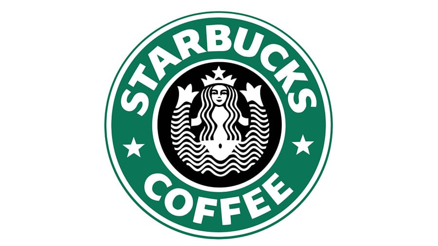
Starbucks introduced the most recent version of its logo in 2011. This emblem removed the wordmark entirely, highlighting just how recognizable the Starbucks mermaid had become. The emblem now features the iconic siren in white on a green circular background.
While the overall shape and positioning of the siren in the latest logo are the same as it was in previous variations, the green coloring does make her seem a little different visually.
The Starbucks logo: Fonts and colors
Though there have been a handful of changes to the official Starbucks logo over the years, the overall visual identity of the company has remained relatively consistent. Since choosing the Starbucks siren as its core mascot, the company has retained this unique visual over the decades.
Today, the smiling siren is a symbol of beauty and seduction for the brand.
The Starbucks mermaid aims to symbolize the compelling draw of the delicious coffee the company serves in regions around the world. The green coloring helps to connect the brand with ideas of wealth, excellence, and growth.
You can find some useful examples of the Starbucks logo here:
What color is the Starbucks logo?
Originally, the Starbucks logo was a complex emblem featuring a number of different shades of black, white, and grey. Throughout the early years of the company’s evolution, the brand eventually chose to implement a deep shade of green into its symbol.
Now, the Starbucks logo colors primarily feature this shade of green combined with white.
The Starbucks logo color code in hex values is #036635. It’s a dark shade of green, which connects the company to nautical themes, as well as concepts like wealth and growth.
What font does the Starbucks logo use?
At present, the Starbucks logo font has been entirely removed from the official logo, as the company no longer needs to include its name in its image. When the font of the Starbucks company does appear on products, it’s usually a sans-serif, uppercase inscription.
You can find a similar design online called Santana Black by Manfred Klein.
The Starbucks mermaid: Who is the lady on the Starbucks logo?
While aspects of the Starbucks logo have evolved over time, the Starbucks siren is perhaps the most compelling and memorable aspect of the emblem. According to Starbucks, the siren is the “muse” of the company, intended to represent desire and beauty.
The mythological creature on the logo was inspired by the name of the organization, Starbucks, which was taken from the Moby Dick novel by Herman Melville. The company chose a nautical theme for their organization and quickly found the siren to be the ideal mascot.
Since the original home of Starbucks was Seattle, where coffee beans were transported overseas on large ships, the siren and the nautical theme seemed to make sense for the organization. The logo has undergone various changes, but the Starbucks mermaid has remained.
Why does Starbucks have a siren as its logo?
The Starbucks siren has been a part of the Starbucks visual identity from the beginning. The emblem was designed by Terry Heckler, who took his inspiration from Moby Dick and the nautical theme chosen for the brand.
Is the Starbucks logo a mermaid?
Starbucks refers to its famous mascot as a siren, but you can also call her a mermaid. She’s intended to highlight the nautical name of the company. However, the siren is also a creature associated with allure and seduction.
What does the Starbucks logo mean in Greek mythology?
The twin-tailed siren on the Starbucks logo is inspired partially by Greek mythology. In these stories, the siren was a mythological creature that lured sailors to death. Today, Starbucks uses the mythological creature’s alluring nature to showcase their coffees’ seductive nature.
Fabrik: A branding agency for our times.

Clarity starts with a conversation.
Thanks—we’ll get back to you shortly.
Whether you're navigating a rebrand, merger, or simply need a clearer identity—we’re here to help. No hard sell, just honest advice from people who know the sector.
Let’s start with a simple question…
Prefer to email? Drop us a line.
Fabrik’s been helping organisations rethink and reshape their brands for over 25 years. We’ve guided companies through mergers, rebrands and new launches. Whatever stage you’re at, we’ll meet you there.