


Buick logo history and symbol meaning
Unless you’re a big fan of the brand, or a design expert, you probably don’t know much about Buick logo history. While the Buick car logo today is a highly recognizable symbol around the world, many people couldn’t tell you where the emblem originally began.
Launched more than 118 years ago, in 1903, Buick has made a number of changes to its brand image over the years. The evolution of different logos in the Buick branding strategy has helped the company to move into a range of new markets and capture the attention of its target audience.
Today, Buick has established itself as a premium automobile brand, selling high-quality vehicles not just in its primary North American market, but in a host of different landscapes all around the world.
In fact, the biggest market for Buick today is China, where it sells 80% of its vehicles.
Let’s take a closer look at Buick history.

Buick: Brand overview
| Founded: | 1903 (or 1899 as the Buick Auto-vim and power brand) |
| Founder: | David Dunbar Buick |
| Headquarters: | Detroit, Michigan, America |
| Website: | www.buick.com |
| Logo downloads: |
Before we begin our exploration of the three shield car logo and where it came from, let’s take a closer look at the Buick business. Buick first came to life in 1899 as the Buick Auto-vim and power company, before eventually morphing into an automobile company.
The name of Buick, and the Buick symbol is actually based on the name of the company’s founder, David Dunbar Buick. David created one of the first marques of automobiles in America.
In fact, Buick went on to establish General Motors in 1908 – one of the largest automotive conglomerates in the world.
Buick is one of the oldest vehicle brands in the world, responsible for creating some of the most pioneering products in the industry.
The company has largely marketed itself as a luxury vehicle company, positioned above some of the more mainstream brands in the GM roundup, but lower than the flagship luxury brand – Cadillac.
Buick logo history: Buick logo evolution
The Buick car symbol dates back over 100 years, to the original launch date of the famous business. As one of the first car brands in America, and the world, the company experimented a number of times with different Buick logos and emblems, to find its brand image.
Buick emblems were redesigned more than a dozen times, implementing everything from shields and wordmarks to animals (like the hawk). In virtually every variation of the Buick logo, we see a powerful and unique brand.
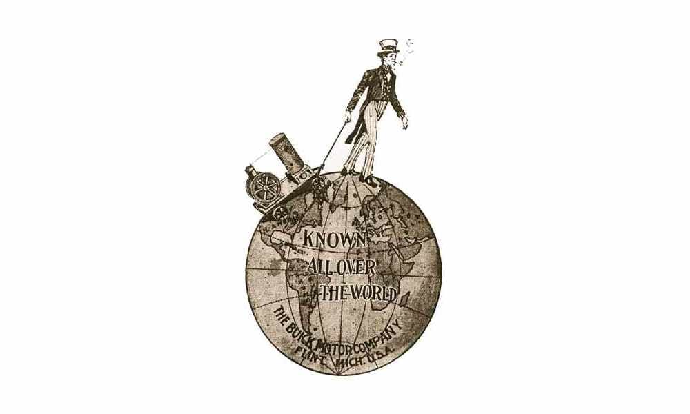
The first variation of the old Buick logo was a complex symbol featuring a man walking across a globe. Executed in a sepia palette – common among the companies of the time, the initial logo only stayed with the brand for a year.
1905
A much simpler Buick logo appeared for the brand in 1905, featuring a circular emblem with a thick frame depicting the words “The Car of Quality”. The wordmark in this logo leverages a custom hand-drawn typeface, with a swirling flourish on the letter “B”.
1911
Unusual but eye-catching, the version of the Buick logo introduced in 1911 featured the name of the company with a huge “B” in the background, and all the remaining letters placed inside. This interesting design didn’t start with the company for long, perhaps due to legibility issues.
1913
Far more contemporary, but still with a retro vibe, the 1913 Buick emblem placed a white wordmark diagonally on a blue and white square. This flashy and compelling logo was excellent for bringing a sense of elegance to the company’s image.
The colors of white and blue also depicted a sense of elegance, reliability, and trustworthiness – perfect for a budding car brand.
1930
In 1930, the Buick color palette changed, and the wordmark also evolved slightly. The blue and white background disappeared, making the main focus of the emblem the name of the company. The cursive wordmark for “Buick” was depicted in red with a silver outline.
1937
In the late 1930s, Buick began experimenting with methods of creating heritage and sophistication for its brand image, using a crest.
The shield style here was based on the coat of arms belonging to the company’s founder. The crest featured an orange field with a thick diagonal line of checked white and black squares. The upper right corner featured a deer, while the lower left corner showed a golden cross.
In 1939, the coloring and shape of the crest were adjusted slightly. The background was now a darker red, and the crest itself was much narrower.
During 1942, the crest was widened again and placed on a black background, with various golden flourishes around it. The monochrome checkers across the middle of the shield were also replaced with blue and white diamond patterns.
1947
In the late 40s, Buick updated its pattern again, removing the circular background and refining the various elements of the shield. The color of the crest’s background also returned briefly to a more orange shade, before switching back to red in 1949.
During 1949, the golden tones on the shield were replaced with silver – ideal for a modern vehicle design. The frame around the crest was also a great deal thicker than in previous variations.
1959
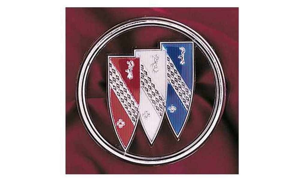
1959 marks the first time we saw the three shield car logo from Buick. This design involved replacing the crest with a series of three narrow shields, each in its own tone – designed to celebrate the three car models available on the market at the time.
1975
The visual branding of Buick changed entirely in 1975 to feature a hawk, a proud symbol intended to depict speed and power. The company wanted to experiment with the hawk image because the Buick “Skyhawk” model was being introduced in the market.
During 1976, the Buick brand experimented with making the hawk more detailed and placing a wordmark on the logo, executed in white. This design stayed with the company for a few years, before it returned to the three shields car logo.
1980
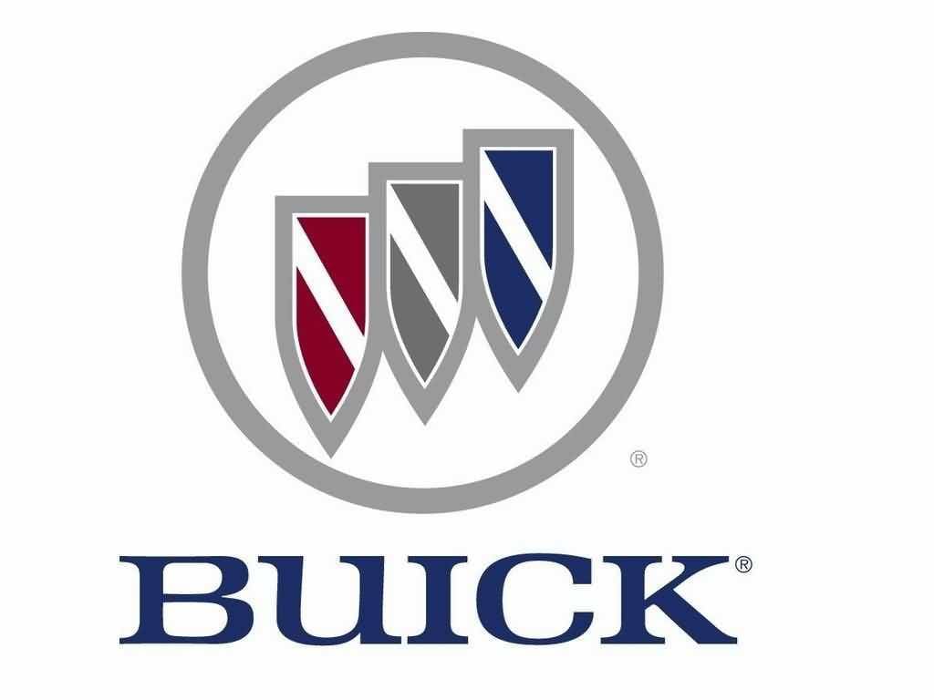
One of the longer-lasting variations of the Buick logos over the years, a simplified variation of the three shields logo appeared in 1980, featuring much of the same elements of the previous design, without the detail.
This variation of the design included the word “Buick” written in a serif font underneath the circular three-shield badge.
2002
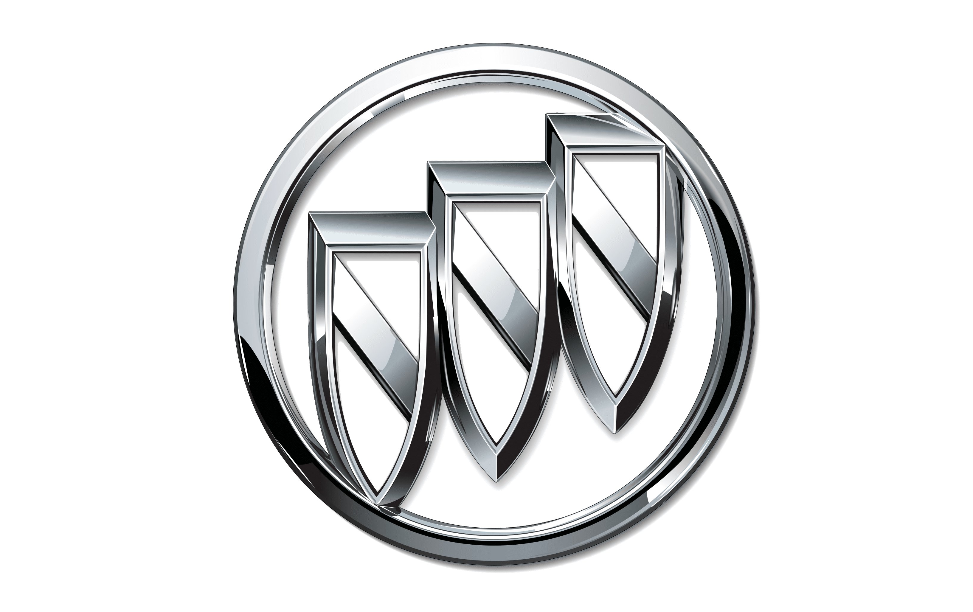
In 2002, Buick embraced a modernized version of its image with a bright and eye-catching chrome variation. This three-dimensional silver logo was simple and effective, perfectly suited for placement on a car hood or bonnet.
2015
The most recent version of the Buick logo is an upgraded version of the silver variant, which includes the previous colors associated with the three shields too. This design also adds a crisp sans-serif wordmark, perfect for showing the modern nature of the brand.
Buick symbol meaning: The new Buick logo
The Buick symbol today is intended to be a symbol of prestige and history. The logo can be traced back to the original Scottish coat of arms used by the family of David Dunbar Buick, the man who founded the Buick brand.
The coat of arms inspired the decision to use a shield with a diagonal line across it in the image of the Buick brand.
Over time, the company experimented with this approach, and eventually created a variation of the Buick logo which included three shields, each representing one of the major initial cars released by the Buick company.
The different colors were intended to represent the specific models championed by the business at the time.
What font is the Buick logo?
The Buick logo font today is a simple sans-serif solution designed to show the modern nature of the brand. This font is a custom sans-serif typeface for the company, intended to be very simple, crisp, and easy to read.
The latest variation of the font is a world apart from the company’s previous designs, which often used serif fonts.
Buick logo colors
The Buick logo color choice has changed a number of times over the years, just like the font in the brand’s image.
The logo colors in use today are:
Grey:
Hex: #9A9A9A
RGB: (154, 154, 154)
Red:
Hex: #860025
RGB: (134, 0, 37)
Blue:
Hex: #1C2C67
RGB: (28, 44, 103)
Celebrating the Buick logo today
Today, the Buick logo is an instantly recognizable emblem in the automotive industry, often associated with concepts of class, sophistication, and excellent performance.
Buick is one of the oldest companies in the automotive landscape, and its heritage is still visible within the company’s logo choice.
Although Buick experimented with a number of emblem designs over the years, the Buick logo today is an excellent insight into what makes the company so special.
Fabrik: A branding agency for our times.

Clarity starts with a conversation.
Thanks—we’ll get back to you shortly.
Whether you're navigating a rebrand, merger, or simply need a clearer identity—we’re here to help. No hard sell, just honest advice from people who know the sector.
Let’s start with a simple question…
Prefer to email? Drop us a line.
Fabrik’s been helping organisations rethink and reshape their brands for over 25 years. We’ve guided companies through mergers, rebrands and new launches. Whatever stage you’re at, we’ll meet you there.