


The biggest construction companies in the US (and the world) and their logos

The biggest construction companies in the world teach us a lot about the power of great branding. With the right construction company logos, compelling marketing campaigns, and a careful approach to customer service, these brands have earned billions in revenue over the years.
While there’s more to developing successful construction companies than investing in an eye-catching and compelling brand, the right personality and design can go a long way. After all, there are millions of active construction companies across the globe today, all fighting for similar customers.
With strategically chosen logos, names, and brand strategies, construction businesses can ensure they not only differentiate themselves from the competition but resonate with their target audience.
If you’re looking for inspiration to create your own compelling logo or simply want to learn more about the branding styles of the largest construction brands, you’re in the right place.
Today, we will take a closer look at what makes the world’s top construction companies stand out.
What do construction company logos have in common?
Construction is one of the largest and most important industries in the world. Without construction companies, we wouldn’t have beautiful homes to live in, office buildings to work at, or even the hospitals, schools, and roads we rely on each day.
In the U.S. alone, there are more than 3.7 million active construction organizations serving a wide audience of customers.
Take a closer look at the construction landscape, and you’re sure to see a huge variety of different logos produced in a variety of styles. There’s no one-size-fits-all strategy for producing an amazing logo, and companies can experiment with everything from color to shape choices.
However, there are some commonalities you may notice if you begin evaluating construction company logo design. For instance, most construction company logos are:
Meaningful
The best logos in any industry should always evoke emotional responses from your target audience. Engaging construction company logos use a combination of carefully chosen shapes, colors, and typefaces to demonstrate credibility and authority.
Sophisticated
Construction company logos can be modern, abstract, and artistic, but most of the time, leading companies will focus on conveying an air of professionalism. The majority of the biggest construction companies will use logos that feel sophisticated and authoritative.
Informative
Like many brands, the top construction companies work hard to infuse their logos with valuable information. The shapes and words used are intended to give consumers an insight into what they can expect when working with the company.
Simple
While construction company logos can include long names and a number of different elements, they’re often quite straightforward and simplistic. This helps to ensure they can connect with a wider audience and work across a range of mediums.
What are the biggest construction companies in the U.S.?
Construction is a worldwide industry with a huge presence in virtually every country. However, many of the most valuable and lucrative construction companies can be found within the United States.
After all, the U.S. is always building practical and stunning environments for its citizens. Let’s take a closer look at the biggest construction companies in the U.S. and their logos.

1. Turner Construction
Launched in 1902, Turney Construction is an American company with a presence across 20 countries. As of 2020, it’s the largest domestic contractor in the U.S., with an average annual revenue of more than $14 billion.
Named after its founder, Henry Turner, the Turnery Construction brand has contributed to the development of countless important structures throughout the years.
From a logo design perspective, the Turner Construction brand keeps things simple with an attractive serif-style logo written in a modern font. The company uses bold letters to convey stability and strength, as well as a dark shade of blue to highlight its credibility.

2. Bechtel
American engineering, construction, procurement, and project management brand Bechtel is also one of the biggest construction companies in the U.S. and the world. Launched in 1898, Bechtel is named after its founder, Warren A. Bechtel.
Today, the company is ranked as the second-largest construction brand in the United States and even owns a number of subsidiary brands.
Bechtel’s logo is a unique design intended to highlight its global presence. The image of a globe, depicted in red and grey, conveys sophistication, passion, and accessibility. The Bechtel wordmark, slanted up and towards the right, demonstrates forward motion and progression.
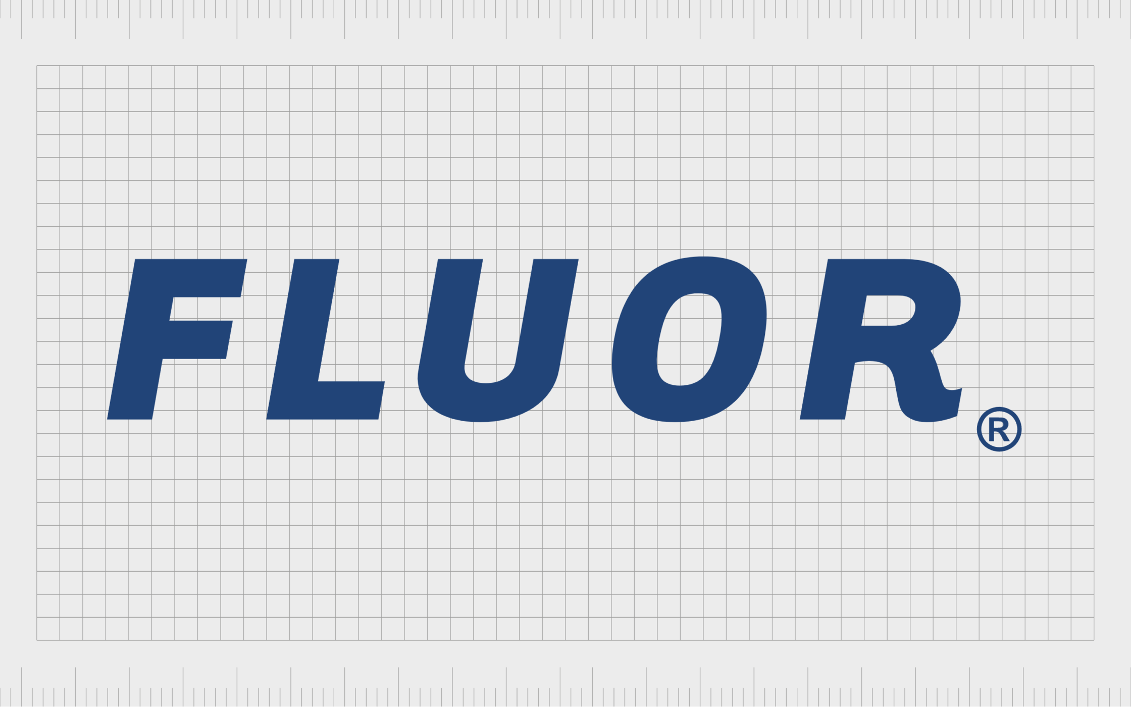
3. Fluor
Multinational engineering and construction firm, Fluor, provides services through subsidiaries connected to the industrial, infrastructure, government, power, oil, and gas sectors.
It’s one of the largest publicly traded construction companies in the Fortune 500 today and has been in operation since 1912. Fluor is named after its founders, too, and uses a simplistic wordmark as a logo.
The Flour wordmark is carefully spaced to ensure it’s easily legible across all mediums. It also includes a slight flourish on the “r” to demonstrate creativity. The use of the color blue highlights the company’s commitment to credibility and sophistication.

4. Kiewit Corp
One of the better-known top construction companies in the world today, the Kiewit corporation was founded in 1884 by the Kiewit brothers. It’s an employee-owned company named one of the largest organizations in North America.
The brand has one of the brightest and most eye-catching logos in the industry, depicted in black and yellow.
The color choices connect Kiewit directly to the construction industry, which often uses black and yellow on safety signs and materials. The design features the name of the company in a simple sans-serif font to demonstrate stability.
It also includes a badge displaying the date when the business was founded, giving it a sense of history and heritage.

5. Whiting-Turner Contracting
The Whiting-Turner Contracting Company provides integrated project delivery services, general contracting, and construction management services to a huge range of companies. The brand has more than 50 locations throughout the United States and holds numerous subcontractor relationships.
Whiting-Turner, first launched in 1909, uses a relatively modern emblem for its logo, depicted often in orange and white. The color orange is somewhat unusual in the construction industry, but it helps to connect the company to concepts like creativity and freedom.

6. Tutor Perini
Formerly known as the Perini Corporation, the Tutor Perini group is one of the largest general contractors within the U.S. Launched in 1849, the company works on construction projects throughout North America, including bridges, tunnels, airports, and buildings.
Tutor Perini, like many of the biggest construction companies, uses a wordmark for its logo, featuring the name of the organization in grey and green. The color grey is often associated with sophistication and professionalism, while green represents growth and sustainability.
The sans-serif font makes the design appear more approachable and friendly.

7. AECOM
American engineering, infrastructure, and consulting firm AECOM has approximately 51,000 employees across the United States. The company is one of the biggest in America, with a strong impact on the urban planning, engineering, and construction landscape.
AECOM takes a modern approach to logo design with a stylistic wordmark logo.
The color black conveys the sophistication and professionalism of the brand. The disconnected “E” in the logo is presented as a series of lines – perhaps showcasing the company’s commitment to driving other businesses and locations toward the future.
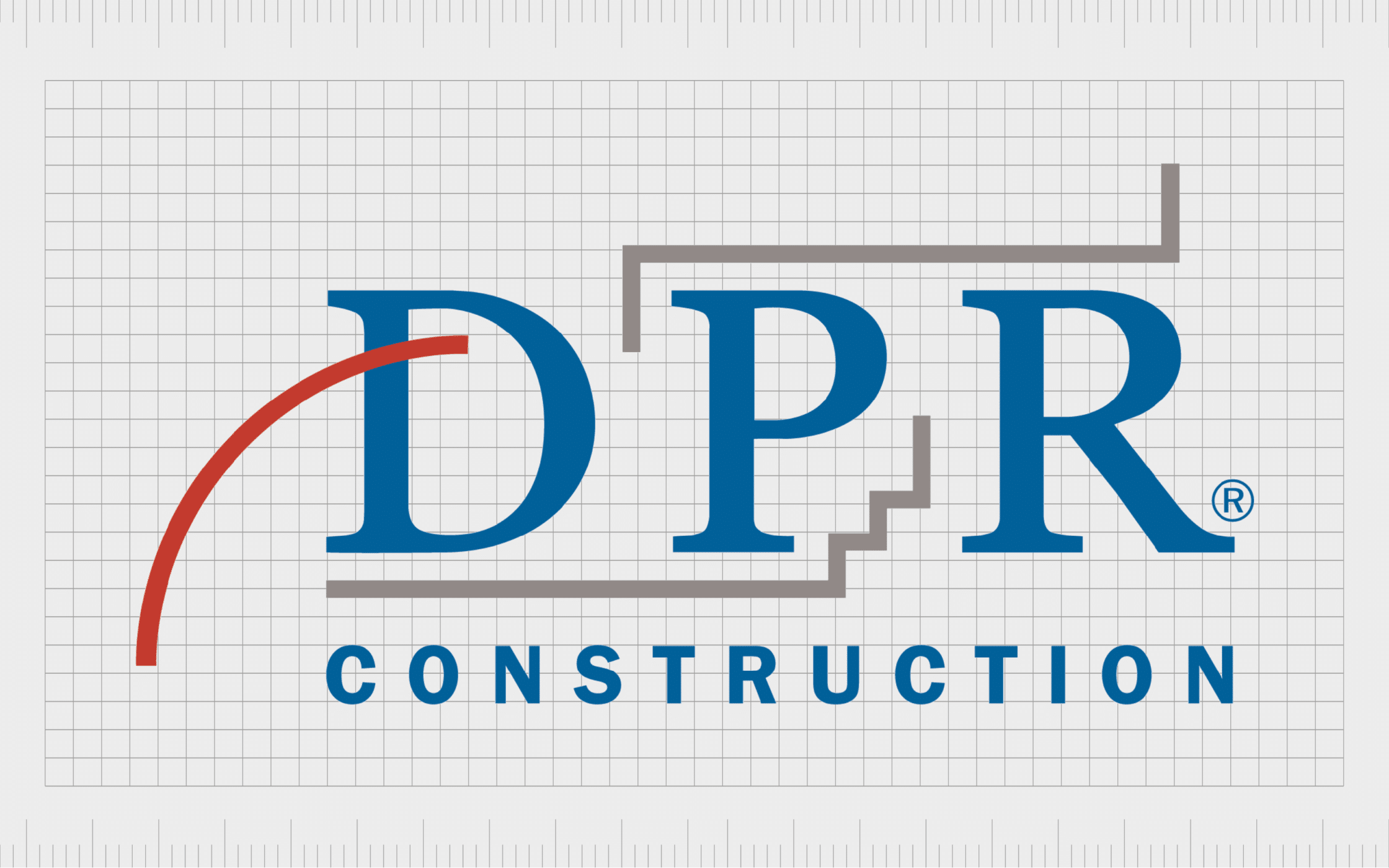
8. DPR Construction
A commercial general contractor and construction management firm from California, DPR Construction was founded in 1990 and already had 30 offices throughout the United States.
The company specializes in sustainable building projects for life sciences, healthcare, commercial companies, and higher education.
DPR showcases its modern and progressive values in its combination logo. The wordmark for the company is depicted in both sans-serif and serif fonts to highlight modernity and professionalism. The lines in the logo symbolize progression and development.
The use of colors like red, blue, and grey demonstrate passion, sophistication, and credibility.

9. Clark Construction
Founded in 1906, Clark Construction is one of the largest civil and commercial contractors in the United States. This construction firm is responsible for building some major developments over the years, including the Capital One Arena.
Clark Construction keeps things simple and sophisticated with its logo. The design features the name of the company in a combination of serif and sans-serif fonts, on a blue background. The combination of white and blue highlight stability, excellence, and trustworthiness.
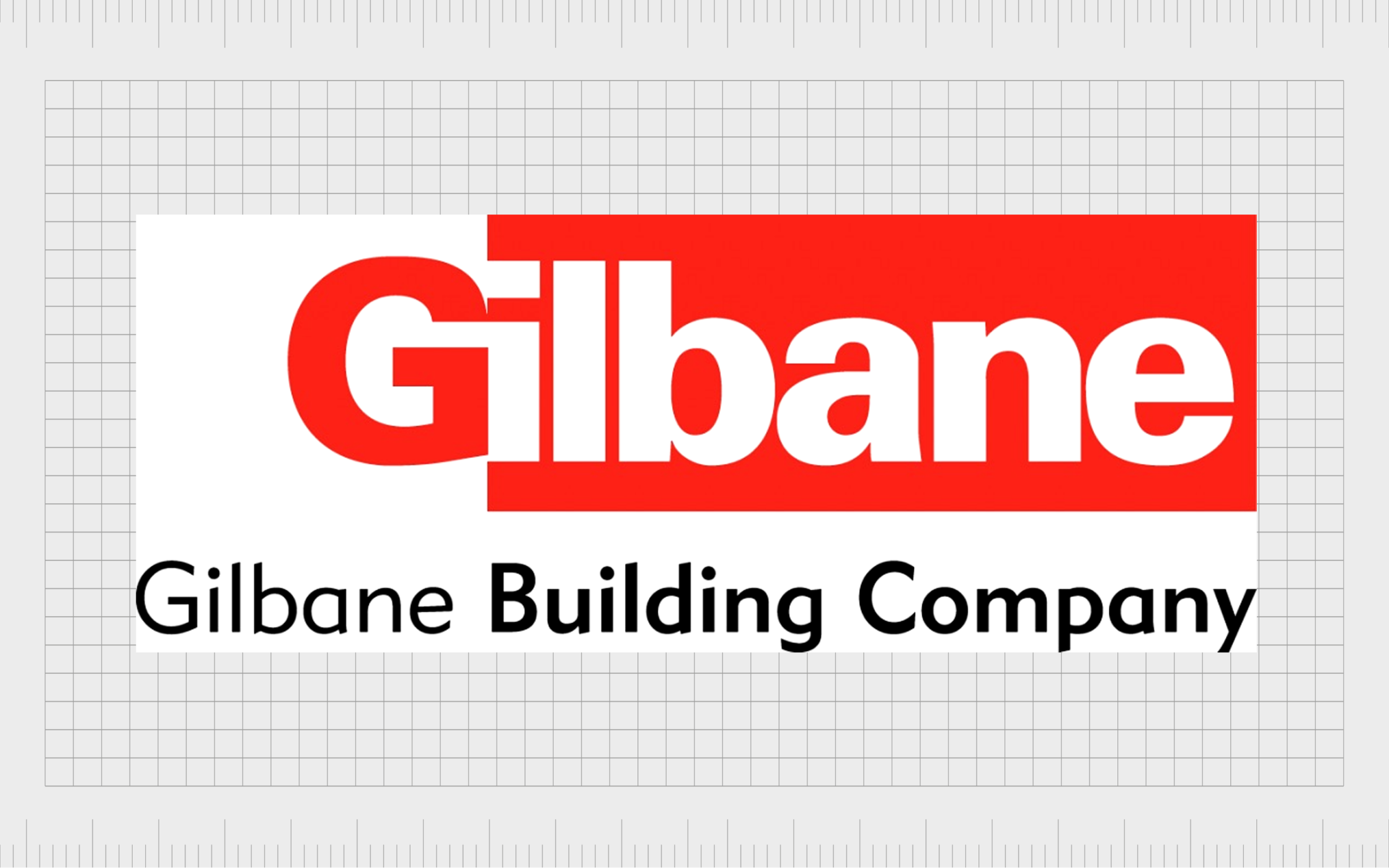
10. Gilbane Building Company
Another of the biggest construction companies in the United States, Gilbane, was launched in 1870 and founded by William H. Gilbane and his brother. The organization has remained a family business for several generations and currently stands as one of the top privately held businesses in the country.
Gilbane chose red, white, and red as the core colors for its logo, symbolizing passion, confidence, and sophistication. The attractive logo uses contrast in the wordmark to draw attention to the name of the brand, with bold, sans-serif letters.
What are the biggest construction companies in the world?
While many of the biggest construction companies in the U.S. are also competitors in the global market, there are still a number of excellent brands from other countries worth exploring.
If you’re looking for inspiration from the biggest construction companies in the world, here are some great options to check out.

1. Daiwa House Industry
Perhaps the largest home builder in Japan, Daiwa house was launched in 1955 and specialized in the construction of prefabricated houses. The company also contributes to the development of healthcare facilities, shopping centers, and factories.
The attractive and modern logo of the Daiwa house brand is intended to highlight its compassion and care for its customers. The circular shape of the design above the wordmark is adjusted slightly to make it look a little like a heart.
The colors red and black demonstrate passion, sophistication, and commitment.

2. Hochtief
Among the biggest construction companies in Germany, Hochtief AG is based in Essen and was first launched in 1873. The company also ranks as one of the biggest construction companies in the U.S. through the “Turner” subsidiary.
This brand is responsible for producing some of the most phenomenal buildings and structures in the world.
Hochtief has a relatively simple combination mark as a logo. The triangle and line emblem on the right-hand side of the wordmark is intended to represent a building or structure. The overall Hochtief logo uses the colors blue, white, and black, to demonstrate seniority, authority, and trust.

3. Vinci
A French concessions and construction company, Vinci was founded in 1988, initially with the name Société Générale d’Entreprises S.A. The brand has become one of the biggest construction companies in the world over the years, with a host of different divisions to serve various customers.
Vinci’s logo is quite modern in style. There’s a unique sans-serif wordmark on the left-hand side, depicted in bold capital letters. On the left, we see two geometric shapes intended to highlight connectivity and growth. The colors red and blue stand for reliability and passion.

4. Strabag
Strabag is an Austrian construction brand, first launched in 1835.
Today, it stands as the largest construction company in Austria, as well as one of the biggest businesses in the world. With a presence across Europe, Strabag has helped to build some of the most important structures in the world. It’s even responsible for some major historical buildings.
Like many of the top construction company logos, Strabag’s design is a wordmark featuring the name of the company in a bold, sans-serif font. The first line of the wordmark is depicted in red to convey passion and confidence. The second line is in grey to highlight sophistication.

5. Ferrovial
A Spanish multinational company first founded in 1952, Ferrovial is involved in the design, operation, construction, and financing of transport and urban infrastructure. The publicly traded company was founded by Rafael del Pino y Moreno, and its name comes from the Spanish word for “railroad.”
Like many construction company logos, the Ferrovial wordmark is quite friendly and modern. The company has chosen a completely lowercase wordmark for its design, depicted in a deep golden yellow. The image conveys ideas of joy and youth.
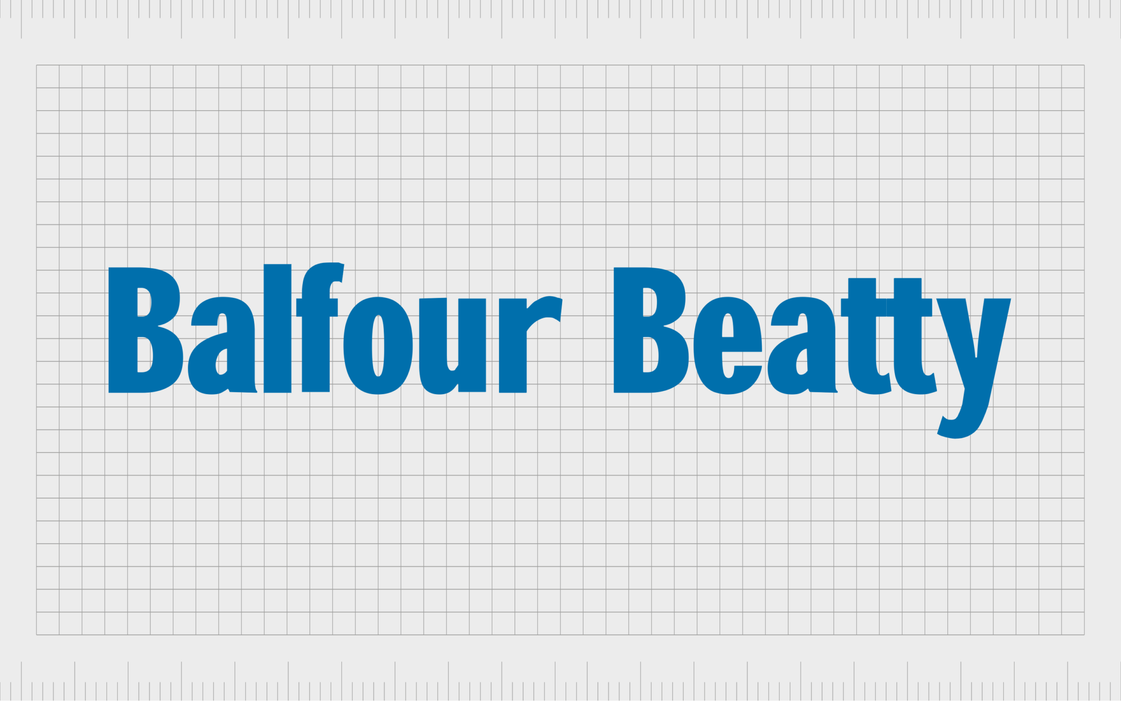
6. Balfour Beatty
Based in the United Kingdom, Balfour Beatty is an international infrastructure company with a focus on support services, construction, and infrastructure. Aside from being the biggest construction contractor in the U.K., the company also has a presence across the U.S. and Hong Kong.
First introduced in 1909, Balfour Betty is named after its initial founders. The name of the company is conveyed in its simple but attractive logo, written in a sans-serif font. The bold typography, combined with the color blue, conveys ideas of stability, strength, and reliability.

7. Skanska
Another of the biggest construction companies to use a wordmark as its logo is Skanska. This Swedish multinational construction company is currently the fifth largest brand in the industry worldwide, according to leading publications.
The brand has even worked on major projects like the World Trade Center and United Nations Headquarters.
Skanska conveys ideas of sophistication and credibility in its logo. The design is a simple wordmark written in all uppercase letters in a sans-serif font. The dark shade of blue highlights the company’s commitment to credible, reliable service.

8. Larsen and Toubro
Also known as L&T, Larsen and Toubro Limited is an Indian multinational construction company counted among the world’s top five construction brands. It was founded by two Danish engineers taking refuge in India in 1946.
The simple but eye-catching logo for the Larsen and Tourbo brand helps to separate it from the competitors in its field. Rather than a full wordmark, the company has chosen to use a monogram of the letters “L” and “T,” designed to look almost as though they’re connecting within a circular frame.
The colors blue and white are once again used to highlight credibility.

9. Laing O’Rourke
Currently the largest privately owned construction company in the United Kingdom, Laing O’Rourke was founded in 1978 and focuses on both civil engineering and construction. Originally, the business was known as R. O’Rourke and Son, founded by Ray O’Rourke.
Modern and eye-catching, the Laing O’Rourke logo is a rectangular design, with the name of the company written in all upper case across the center, in a white, sans-serif font.
The wordmark is surrounded by a yellow line at the top to symbolize joy and creativity, and a red line at the bottom, for passion and confidence.

10. Kajima
One of the largest construction companies in Japan, and one of the oldest, Kajima Corporation was founded in 1840 in Tokyo. The company offers services connected to engineering, real estate development, design, and construction. It’s also involved in the environmental sector.
The Kajima corporation has a compelling logo, which showcases the name of the business in both Japanese and English. The colors red and grey are used throughout the design to convey ideas of passion, confidence, and strength.
A sans-serif font choice helps this emblem to appear more modern and forward-thinking.
Learning from the top construction companies
As you can see from the list of the biggest construction companies in both the U.S. and around the world, there is no shortage of different ways to construct a stunning logo.
While many of these logos have commonalities, they have all been created to convey the unique brand identity of the business they represent. If you’re planning on designing your own construction company logo, it’s worth taking the following tips into account:
Know your audience
Before you start working on any designs, it’s important to make sure you understand your niche and target audience. Get to know the preferences of your ideal customers, and ask yourself what you want to convey.
The best logos of construction companies are designed to resonate with a specific group.
Assess the competition
Examining the competition in your industry can be the best way to ensure your construction company logo stands out.
Not only will you gain inspiration and insights by looking at other designs, but you can also pinpoint which images, fonts, and color choices you should avoid, making your design more unique.
Choose font carefully
Most of the top construction companies include their name in their logo.
With that in mind, it’s important to think carefully about your typeface choices. Sans-serif logos are often seen as more modern, but serif typefaces can be seen as sophisticated and professional. Make sure your font choice is easy to read on any platform.
Consider colors
Alongside font choices, colors are some of the most important components in any logo design. The right shades will help your logo to resonate with your target audience on an emotional level. Blue is great for conveying credibility and trust.
However, you can also experiment with shades like yellow, green, grey, black, white, and red.
Consider shapes
Geometric elements are a great way to make a construction company logo more unique and compelling. Triangles and squares are common in the construction industry because they’re associated with stability, organization, and practicality.
However, a circular shape can also highlight the community.
The amazing logos of the biggest construction companies
By examining the biggest construction companies in the world, we can get an insight into how some of the top leading brands have used branding to connect with their target audience. The right construction logos can make a huge difference to your impact on your market.
They also help to differentiate your brand and strengthen emotional connections with customers.
If you’re thinking of building your own construction company logos, checking out some of the top brands in the industry is a great start. However, you might also want to consider seeking extra help and support from a branding and design specialist.
Fabrik: A branding agency for our times.
Now read these:
—5 step guide to starting a construction business
—Essential tips for construction company naming
—Your guide to branding a construction business
—How to design a construction company logo
—Effective strategies for construction marketing

Clarity starts with a conversation.
Thanks—we’ll get back to you shortly.
Whether you're navigating a rebrand, merger, or simply need a clearer identity—we’re here to help. No hard sell, just honest advice from people who know the sector.
Let’s start with a simple question…
Prefer to email? Drop us a line.
Fabrik’s been helping organisations rethink and reshape their brands for over 25 years. We’ve guided companies through mergers, rebrands and new launches. Whatever stage you’re at, we’ll meet you there.