What is a combination mark? Brilliant combination mark logos examples

What is a combination mark, and when should you use it in your brand’s identity? When designing an effective logo, businesses have various options to choose from with how they present their image.
Some organizations, such as Coca-Cola or Google, focus exclusively on an eye-catching wordmark. Others build their visual identity around a shape or image, like Apple.
Logos can be simple or complex, depending on the nature of the business and its goals. They can also combine multiple elements into one eye-catching mark. This is the case with the combination mark.
A combination mark is among the most popular logotypes for many budding brands and well-known organizations. Rather than relying exclusively on a word or an image to tell your audience everything they need to know about your business, a combination mark allows you to use both.
Today, we’re going to explore the benefits and impact of the combination mark logo and help you determine when it might be the right choice.
What is a combination mark logo? An introduction
Let’s start with the basics: what is a combination mark?
Designing a logo is one of the first things any business will do when working on its brand identity. While your logo is only one part of what makes your company stand out to your target audience, it’s often the first thing a customer will associate with your brand.
Because of this, organizations need to ensure they’re conveying a powerful message with their logo.
There are several ways to convey your brand identity to your audience. The first option is to use text or a “logotype” to highlight your brand name or initials. This is often the number one choice for companies who want to build recognition for their name.
The second option is to use an icon or illustrative element to represent your brand. A specific shape can be excellent for telling your customer what your business is about, such as with the Nike logo.
A combination logo takes these two core components and links them together.
You have both the wordmark showing your name and the image you want customers to associate with your brand. This is an excellent way to enhance brand memorability and give your audience as much information as possible about your business.
The combination mark is one of the most popular logo types among all brands. Major companies like Adidas, Burger King, Doritos, and Lacoste use their combination logo.
How do you make a combination mark logo?
There are a few different ways to approach the design of a combination mark logo. As with all logo design forms, if you don’t have experience creating your brand mark, you might find it easier to work with a professional on building the perfect emblem.
These companies will be able to work with you on making your design as eye-catching and meaningful as possible.
Start as you would with any logo design, diving into the details of your brand personality and mission. You’ll need to think carefully about what pictures and typography style will best represent your organization.
If you’re a sophisticated, professional brand, you may choose a bold, serif wordmark with a unique geometric shape.
If you’re a fun and friendly younger company, you might consider a sans-serif or decorative font combined with an abstract image. Once you’ve identified the components most crucial to your company’s identity, you’ll need to consider how you will connect them.
The most common forms of combination marks include:
Horizontal combination marks
Horizontal combination marks such as Microsoft’s logo or the Freelancer.com logo place the image and the wordmark side by side. This can be one of the simplest ways to align two elements for your logo, but you’ll need to think carefully about how much space the image will take up on a page.
If you have a particularly long business name, you may have a harder time fitting everything into one compact space. Alternatively, this design should work well if you have quite a short name.
Stacked or vertical combination marks
If placing the two elements of your logo side-by-side doesn’t look right for your business, you might consider putting one on top of the other. This can be an excellent choice if you want to create a more condensed and compact logo.
The key to success here is thinking about how you will align your logo elements.
The most common option is to have the image for your design in the center of the wordmark, either above or below the text itself. The wrong alignment can make an image look unusual or disjointed.
Integrated combination marks
Another option is to combine the text and the image by layering them on top of each other or including visual elements within the wordmark. This can create a far more cohesive look. Consider Burger King or Lay’s; these companies use an integrated mark.
When designing your logo for an integrated image, make sure bringing the two elements together doesn’t create an emblem that’s too complex. You’ll still need to ensure the design is visually pleasing and flexible enough to adhere to various media types.
The benefits of a combination mark logo
Now you know the answer to “what is a combination logo?” you might be wondering whether it’s the right strategy for your brand image. As mentioned above, combination logos can be an excellent choice for many brands.
They’re excellent for conveying a lot of information in a small space and can help make different components of your identity more memorable.
In most cases, the first thing a customer will become familiar with when learning about your brand is your name, followed by your logo or brand image. Combining both a compelling image and your name into one design is a great way to boost brand recognition.
Because combining multiple elements also creates a more distinctive image, it’s also a little easier to ensure your brand identity is different from that of other companies.
Some of the most significant benefits of choosing a combination logo include the following:
Emotional impact
Combination marks tell a story about your brand and what you stand for as a company. They’re an excellent way to connect with your audience on a deeper level and provide more significant insights into your business.
Flexibility
Once you create a combination mark, you can use two elements to identify your brand. In some cases, companies might use the image or the wordmark on its own when the situation allows for this.
Memorability
Combination marks give your customers more ways to remember your company. Even if they don’t fully remember your name straight away, they’ll be able to recall your visual, and vice versa.
Differentiation
A combination mark can give you more ways to separate yourself from other companies. You can get creative with a combination of different stylistic elements and boost your chances of outshining the competition.
Combination mark logo examples
Combination logos have a lot of benefits to offer in the right circumstances, which is one of the reasons why they’re so popular among world-renowned brands.
If you’re not sure whether a combination mark logo is the right choice for you, it might help to check out some inspiration. Here are some of the best-known combination logo examples around the world today.
1. KFC
First launched in 1930, KFC has evolved from a simple fried chicken supplier to one of the world’s best-known fast food restaurants. The company is the world’s second-largest restaurant chain, following McDonald’s, and has more than 22,000 locations worldwide.
The KFC logo has evolved many times over the years as the company has worked on finding its unique identity. However, the combination mark logo has always been famous for this brand.
The current image features the face of Colonel Sanders with the letters “KFC” in serif font. The complete design is placed into a rectangular shape intended to represent a KFC bucket.
2. Puma
One of the most famous athletics companies of all time, Puma was created by Rudolf Dassler in 1924. His brother, Adolf Dassler would also go on to create the Adidas brand – another company with its own combination mark.
The Puma brand is currently the third-largest sportswear manufacturer in the world, and its image is instantly recognizable.
The picture of the Puma cat on its own is enough to identify this company. But placing it as though it’s jumping over the wordmark helps to draw attention to the organization’s athletic focus, giving the design more depth.
3. Taco Bell
Like KFC, Taco Bell is another major fast food company with a strong combination logo. The American fast-food restaurant chain was founded in 1962 by Glen Bell and has always used the image of a bell in its design.
Though the emblem has changed significantly over the years, Taco Bell has frequently embraced combination logos.
Today, the design features a bell crafted out of the white space between various purple geometric shapes. Underneath the image is the Taco Bell wordmark, written in sans serif font to make the company appear more accessible and friendly.
4. Doritos
One of the most complex examples of a combination logo on this list, the Doritos emblem is brimming with detail. Doritos is a company belonging to the PepsiCo brand, first launched in 1964.
For years, the organization has attempted to bring the triangle shape into its image to highlight the unique structure of its tortilla chips.
Today’s Dorito’s logo is a bold and eye-catching image, with a bright colored triangle that threads through the two o’s in the brand’s name. The shape is a dynamic structure made out of light, giving the image more movement and impact.
5. Godiva
One of the world’s better-known chocolate manufacturers, Godiva was first launched in 1926, inspired by the tale of lady Godiva and her impact on the movement toward woman’s rights. The brand’s image is inspiring and eye-catching, ideal for an emotionally driven brand.
Godiva’s logo features the name of the company and the profession, written in a combination of italic and block font. Above the wordmark, we see a simple design of Lady Godiva atop her famous horse, drawing attention to the history of the company.
6. Microsoft
Microsoft is currently one of the most popular technology companies in the world. Launched in 1975, the brand was famous for introducing the world to a range of microprocessors, software, and new consumer electronics.
The organization’s name comes from the words microprocessor and software and draws attention to the venture’s focus.
The Microsoft combination logo is simple and effective. Alongside an attractive sans-serif wordmark, we see four colorful squares which look similar to a window, representing Microsoft’s “Windows” product. The four squares are also colored to represent the different focus areas of the brand.
For example, blue is for Windows, and red is for Office.
7. Timberland

If you know the footwear and clothing space, you probably know Timberland. The company launched in 1952 to deliver outdoor footwear and fashion products to customers throughout America. Today, the organization has a massive presence throughout the globe.
This classic combination logo uses a leafless tree in its image to represent timber and draw attention to the outdoorsy focus of the business. The Timberland logo also features an eye-catching serif font intended to convey confidence and style.
8. Burger King
One of the most famous combination logos in our list, Burger King is an American fast food restaurant headquartered in Florida. The company first launched in 1953 and has impacted the food service market ever since.
Although Burger King has changed its logo several times throughout the years, it has frequently used both an image and a wordmark. Today, the design combines the company’s name with two geometric shapes designed to look like buns.
9. Nestle

A classic example of a combination logo, the Nestle logo features a combination of an attractive image and a stylized wordmark. Since the brand launched in 1866, it has updated and refined its image many times, making both parts of the design more modern.
Today, the Nestle logo features a mother bird sitting on a nest, watching over her two children. The image comes from the family crest of the company’s founder, Henri Nestle. Alongside the design, we also see the wordmark for the company written in a unique sans-serif font.
10. Lamborghini

Ranked among the world’s top luxury sports car companies, Lamborghini has one of the most eye-catching combination logos on this list. The design features the company’s name placed inside a large black shield emblem with a golden outline.
Underneath the wordmark, we see a rather detailed image of a bull, intended to draw attention to the strength, elegance, and power of the vehicles created by the business. Lamborghini is one of many automotive companies using an animal in its logo.
11. Slack

One of the world’s top collaboration tools in the market today, Slack is a messaging and communication software intended for office use. The company first launched in 2013 and has been growing, thanks in large part to its ease of use and excellent branding.
The company uses a simple wordmark in sans-serif font, written in all lowercase, to make the design appear more youthful and friendly. Next to the text, we see a unique geometric design, with various colored shapes coming together to form a cross.
This represents the convergence of different people and teams in the Slack workspace.
12. Swarovski
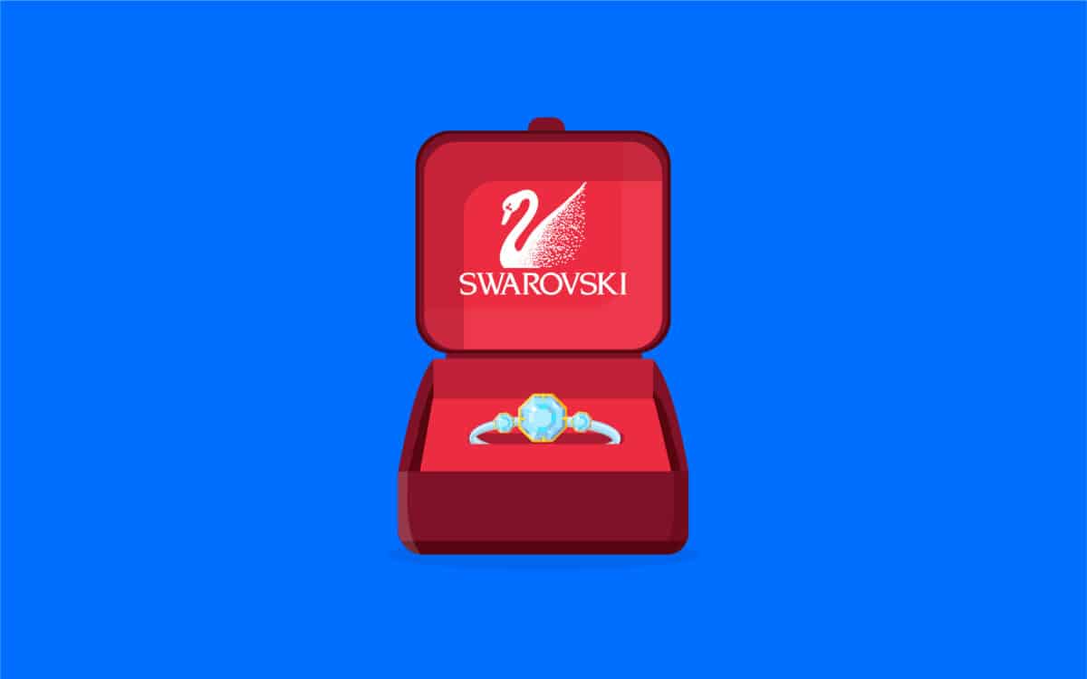
Swarovski is another fantastic example of a combination logo. The company, launched in 1895, is best known for producing stunning crystal gems, jewelry, and accessories. Within the logo, the brand aims to draw attention to its unique selling point and personality.
The image combines a sophisticated serif wordmark with a mascot for the company in the form of a stylized swan. The swan conveys elegance and beauty. On closer inspection, we can see it’s constructed of hundreds of dots intended to represent the gems of the organization.
When should you use a combo logo?
There’s no one-size-fits-all strategy for choosing the perfect logo. Ultimately, whether a combination mark is right for your business will depend on the image you’re trying to create for your brand.
Often, combination marks are considered highly versatile images, capable of conveying significant information about an organization’s personality and vision.
However, there are cases wherein a combination mark might be considered too complex. For example, many app and technology companies resort to using just one logo component in their branding and marketing, as they need to ensure their images can thrive on any platform.
Some of the reasons to use a combination mark logo include:
Versatility
A combo logo gives you a little more freedom to combine multiple ideas into a single brand image. You can appeal to customers by providing them with a comprehensive insight into your personality while also drawing attention to your company’s name.
Recognition
It’s often easier for customers to remember a brand when they see both the name and the image of the organization at the same time. This is particularly useful for younger companies still emerging in their chosen industry or space. A simple illustration may be confusing without any additional context.
Experimentation
A brand logo with a wordmark and an image gives you room for experimentation. You can even choose to use one component or another from your logo in different marketing and branding materials.
Depth
A combination logo allows you to share extra information about your business. Let’s look at simple shapes. Combining a simple shape with a sophisticated serif logo helps to add an element of professionalism to your company’s brand assets.
Exploring combination marks in logo design
Now you know the answer to “what is a combination mark?” you can begin to think more carefully about whether this logo style suits your business. Compared to other logo designs focusing exclusively on text or images, a combination mark can be extremely versatile.
With the correct combination of logos, businesses have achieved exceptional brand recall, recognition, and awareness. What’s more, it’s always possible to reduce the components of your company’s image into something simpler as your business grows.
As always, if you’re struggling to determine what kind of logo is best suited to your business, you might find it helpful to work with an agency that can help you to choose the right design for your needs.
Logo design companies can do the due diligence and research required to determine which logo style will significantly impact your audience.
Fabrik: A branding agency for our times.
Clarity starts with a conversation.
Thanks—we’ll get back to you shortly.
Whether you're navigating a rebrand, merger, or simply need a clearer identity—we’re here to help. No hard sell, just honest advice from people who know the sector.
Let’s start with a simple question…
Prefer to email? Drop us a line.
Fabrik’s been helping organisations rethink and reshape their brands for over 25 years. We’ve guided companies through mergers, rebrands and new launches. Whatever stage you’re at, we’ll meet you there.


