Nestlé logo history and meaning

Nestlé logo history goes back to the 1800s, when the company first began producing its wares for the masses. Today, the Nestlé symbol is a legendary icon and a major part of what makes the brand so memorable.
The Swiss multinational brand has evolved drastically over the years, adapting both its brand image and its range of products to suit an ever-increasing customer base. Nestlé is the largest food company in the world, measured not just by revenue, but various other metrics too.
More than just a confectionary company, Nestlé now sells everything from baby food and coffee to breakfast cereals, dairy products, pet foods, ice cream, and bottled water.
Today, we’re going to take a closer look at the Nestlé logo.
Nestlé history: the start of the Nestlé trademark
The start of the Nestlé icon begins with the phenomenal arrival of the Nestlé brand way back in 1866. Interestingly, the business began in the 1860s, when two separate Swiss organisations were founded, which would later form the Nestlé Corporation.
The competing enterprises spread their businesses throughout both Europe and the United States.
Back in 1866, a man named Charles Page, the US Consul to Switzerland, established the Anglo-Swiss Condensed Milk Company. A year later, Henri Nestlé produced a milk-based baby food company.
Nestlé retired his company, under new ownership in 1875, and Anglo-Swiss eventually added milk-based baby foods to its products in 1877.
The Nestlé Company, under new ownership, also added condensed milk to its portfolio, making the two firms rivals. In 1904, Francois-Louis Cailler, Daniel Peter, Henri Nestlé, and Charles Kohler all participated in creating a new Swiss chocolate – Milk Nestlé.
By 1904, Anglo-Swiss and Nestlé had officially joined forces.
The Nestlé logo today is based on the name of Henri Nestlé, whose company was one of the initial parts of the Nestlé Corporation.
Nestlé logo history: Nestle logos throughout the years
Just as the Nestlé brand has evolved throughout the years, the Nestlé icon has transformed with it. We haven’t always had the Nestlé birds we know today. Let’s take a look at some of the Nestlé logos which came before the official icon we know now.

1866
The official first version of the Nestlé logo was introduced in 1866, based on the name of the founder of the Swiss Henri Nestlé Company. The name “Nestlé” actually translates from German to mean “The Nest”, which is part of what inspired later iterations of the Nestlé symbol.
The original logo featured the Nestlé family crest, which denoted a traditional shield with an image of a bird sitting in the nest in the middle. The crown atop the crest was replaced with a metal helmet featuring large pieces of plumage.

1868
A variation of the Nestle bird logo we know today appeared in 1868. This was a unique design, specially created for the brand, with inspiration taken from its founder. The design featured the image of a nest with four birds in it.
This logo was quite a detailed design back in the day, where it was possible to see every element of the branches in the bird’s nest.

1938
During the 1900s, the Nestlé brand refined its logo slightly, taking some of the detail away from the picture of the birds, and placing a large wordmark on top. The bold black wordmark was written in all capital letters, highlighting the strength of the company.
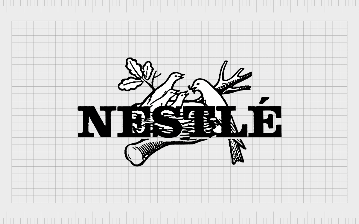
In 1966, the Nestlé Corporation adjusted the design slightly again, further removing more elements of detail from the Nestlé birds while sharpening the letters of the serif font. The image was a lot more modern and refined, better-suited to the time.

1984
In the 1980s, Nestlé decided to move the positioning of its logo wordmark, placing it underneath the image of the birds in the nest instead. This helped to draw attention to the distinct elements of the logo and made the image more modern and engaging.
In this logo, the Nestlé birds also changed slightly, with two baby birds sitting in the nest rather than three, and fewer details overall. The wordmark was also replaced, using a sans-serif font with a line through the top of the wording.
The letters were also depicted in lower case.
The variation of this Nestle logo was updated slightly again in 1995, further simplifying the lines of the Nestlé bird, and adding more detail to the wordmark. The lines became sleeker and cleaner, and the wordmark was thickened slightly.
2015
There are two variations of the Nestlé logo in use today. The first is a variation of the graphic and wordmark the company has evolved over the last several decades, depicted in a soft, engaging shade of blue. The blue shading is ideal for creating a sense of trustworthiness.

There’s also a version of the Nestle logo depicted in a soft grey, intended to show sophistication, heritage, and modernity. In this variation, the wordmark is placed alongside the graphic, rather than underneath it.
Nestlé logo meaning: The Nestlé icon today
While there are several Nestlé product logos within the sub-brands the company has created, the overall Nestlé logo has maintained a lot of the same elements for several years. All of the Nestlé brand logos over the years have been based on the name of Henri Nestlé.
As mentioned above, the logo with the birds and bird nest actually comes from the Nestlé family crest. It’s difficult to say for certain why we now have the logo with the 3 birds, rather than the four birds we saw initially with the Nestlé symbol.
The decision to use three birds may have something to do with the formulation of the brand. The Nestlé official company (the large bird) was created by the merger of two smaller companies (the baby birds).
The official three birds in a nest logo hasn’t been fully explained by Nestlé. However, the company has said they maintained the logo to showcase a nurturing personality.
Elements of the Nestlé logo
The Nestlé logo today is an extremely memorable design, created to capture the hearts and minds of consumers all around the world. The symbol introduced in 2015 is still the one most of us know today, although the coloring is sometimes a little different.
You can find some helpful Nestlé logo resources here:
- Nestlé logo PNG
- Nestlé logo vector
- Nestlé logo transparent
What font does the Nestlé logo use?
The Nestlé font is unique to the company, but it’s very similar in style to the Helvetica rounded bold font, which is a sans serif font designed by Max Miedinger and Eduard Hoffmann.
The sans-serif font was likely chosen to make the Nestle brand appear more approachable and accessible, as previous versions of the wordmark were much bolder and more aggressive. The Nestle font today also continues to use an elongated line connected to the “N”.
What color is the Nestlé logo?
There are various Nestlé logo colors in-use today, including:
Blue:
HEX: #005695
RGB: (0, 86, 149)
Nestlé brown:
PANTONE: PMS 7532 C
HEX COLOR: #63513D
RGB: (99,81,61)
Celebrating the Nestlé logo
One of the most memorable brand images in the world today, the Nestlé mark has evolved over the decades to become a true icon of branding. This fantastic logo has significant depth and meaning.
Not only does it relate to the name of the founder, but it also evokes ideas of nurturing and mothering, from a company known to create a lot of essential items.
If you’d like to learn more about some of the most incredible logos in the world today, you can check out more Logofiles here on Brand Fabrik.
Fabrik: A branding agency for our times.
Clarity starts with a conversation.
Thanks—we’ll get back to you shortly.
Whether you're navigating a rebrand, merger, or simply need a clearer identity—we’re here to help. No hard sell, just honest advice from people who know the sector.
Let’s start with a simple question…
Prefer to email? Drop us a line.
Fabrik’s been helping organisations rethink and reshape their brands for over 25 years. We’ve guided companies through mergers, rebrands and new launches. Whatever stage you’re at, we’ll meet you there.


