


Doritos logo history: Exploring the icon Doritos symbol and its meaning
How much do you know about Doritos logo history? For a fan of graphic design or branding, it’s easy to start wondering about where the iconic Doritos symbol came from when munching your favorite snack. After all, the Doritos logo is part of what makes the snack brand so memorable.
Doritos is probably the best-known brand of tortilla chips in many parts of the world today. Manufactured by the larger Frito-Lay brand, the label was originally introduced in 1964, and has been growing ever since.
Similar to many well-known brands, the company has introduced a variety of Doritos logos over the years, intended to highlight the unique appeal of their product.
Here’s your guide to Doritos logos and where they came from.
Doritos history: Why did Doritos change its logo?
While many snack companies have preserved a reasonably consistent image over the years, Doritos has been a lot more experimental with their choice of branding.
Since the organization began in 1964, it experimented with a range of different logos, intended to highlight the fun nature of the company, and its unique range of products.
When looking at the Doritos logos over the years, most people are drawn to the major Doritos rebrand which happened during the early years of the company’s growth.
Most of the logos throughout the brand’s history are separated into the “square-focused” designs, and the emblems created to highlight the triangular shape of Doritos chips.
While the triangle first appeared in the Doritos logo during the 1980s, it wasn’t until the 90s when the most significant Doritos logo change occurred.
According to the company, the rebrand was intended to highlight one of the most unique differentiating factors of the tortilla chips created by Doritos – their triangular shape.
Doritos logo history: Doritos logos over the years
Doritos logos have always had one specific aspect in common: the presence of a wordmark. Similar to many of the most famous food brand logos throughout history, Doritos has almost consistently included their name within their brand image.
However, there was a brief period when the company experimented with removing their name from their logo, to highlight the iconic nature of the brand.
1964
The original Doritos logo is very different from the image most of us know today. This was the first iteration of the “square” logo – a playful geometric banner executed in orange, yellow, and red.
The design of the squares which held each of the letters of the wordmark made it seem like they were jumping up and down with excitement.
The font for this wordmark was a bold, serif design, with curved lines, and distinct serifs, intended to highlight a sense of sophistication and fun at the same time.
1973
In the 70s, Doritos updated the spacing and coloring of the old Doritos logo, but many elements remained the same. In the first version, introduced in 1973, the color of the font was switched to brown, and the squares in the background took on more muted colors.
Later, in 1979, the company updated the image yet again, changing the spacing so the “Doritos” name was no longer placed with each letter in an individual colored box.
The font became bolder, and more sophisticated, while the coloring of the boxes in the backgrounds changed again, taking on a tone similar to a tortilla chip.
In the 1979 Doritos logo, the company added the “Tortilla Chips” tagline to the image.
1985
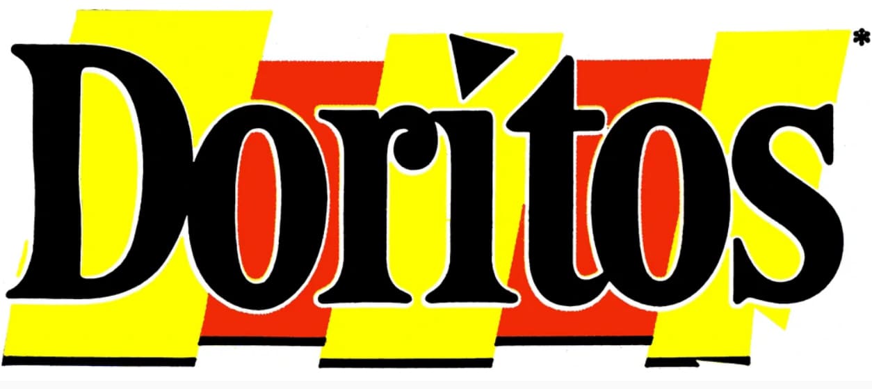
In 1985, the Doritos logo regained some of its fun and light-hearted personality, with much brighter colors, and a unique black typeface. The most memorable part of this logo change for a lot of people was the introduction of a triangle above the “I” in “Doritos”.
The triangle replacing the dot on the “I” was the first example of the iconic shape of the tortilla chip appearing in the brand logo.
1994
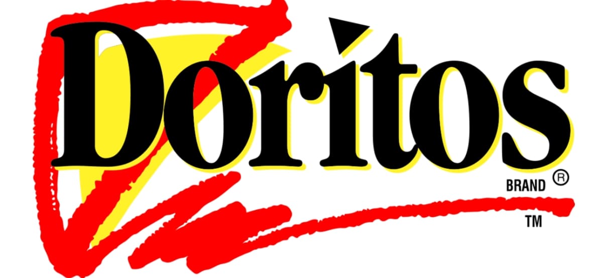
The 90s introduced the first major rebrand of the Doritos symbol. The square background disappeared entirely, and the wordmark became sleeker and more refined.
The black serif inscription was outlined in yellow, and accompanied by a red and yellow triangle, designed to look as though it was hand-drawn.
This new image drew attention to the unique shape of the famous chips, creating a sense of connection between the Doritos brand and the triangle shape. The emblem marked the start of a new identity for Doritos.
1999
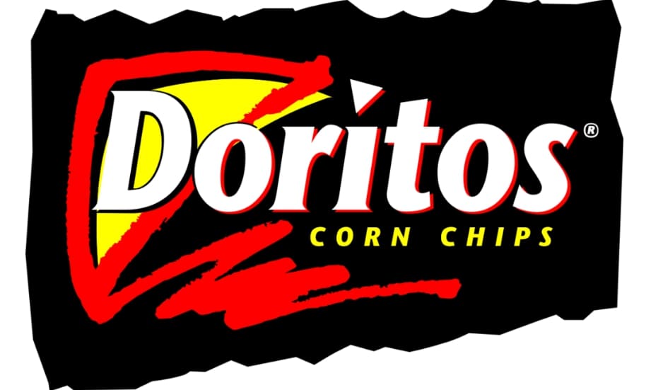
In 1999, Doritos updated its logo a little once again, this time changing the coloring of the font, so it was white on a black background. The majority of the elements from the previous Doritos logo remained the same, with the addition of “Corn Chips” in all capitals under the wordmark.
The red underline for the wordmark was also shortened slightly.
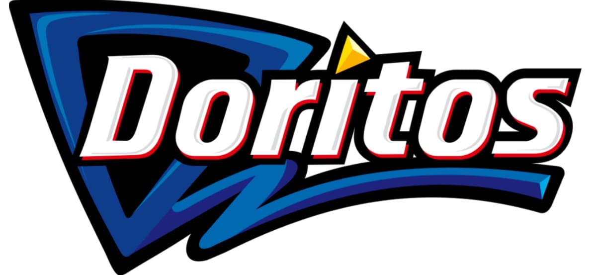
2000
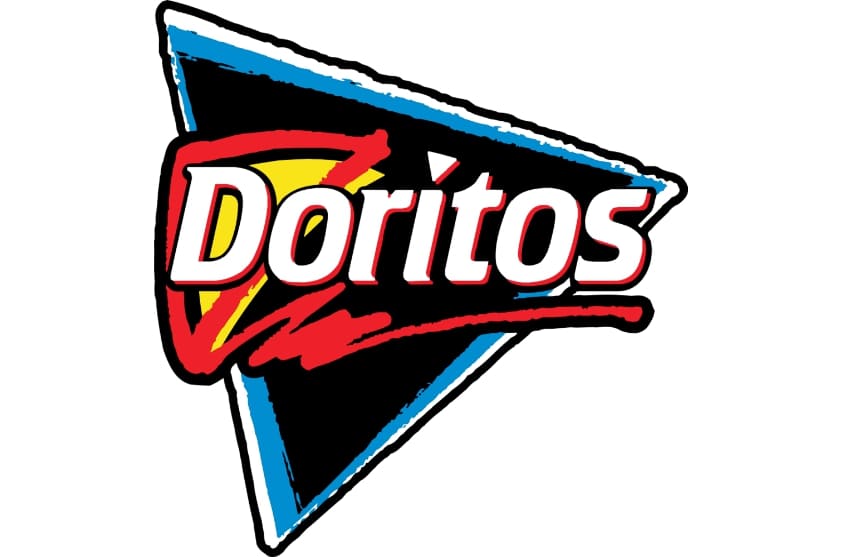
During the year 2000, Doritos experimented with adding even more triangular shapes to the Dorito emblem. Now, the wordmark for the company appeared on a black triangle background with a blue and white border.
The look was grungy and stylish for the time period.
2007
In 2007, Doritos upgraded its logo again, using a slightly different style of font, with all the contours modernized, enhanced, and thickened. The triangle received a bold blue outline, and the inscription adopted a modern, italicized sans-serif type.
To further draw attention to the unique nature of Doritos chips, the triangle above the “I” was now colored in yellow.
2013
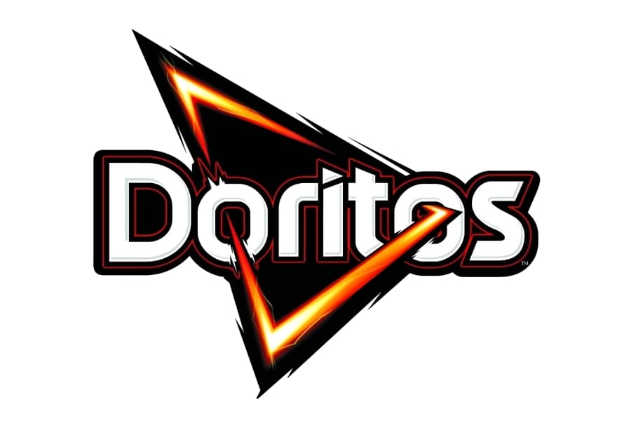
Finally, in 2013, Doritos introduced a brand-new logo, with an updated wordmark, and a bold, orange triangle cutting through the two “O’s” in the name. Created to look modern and powerful, the design included the colors of black, yellow, orange, and red most people knew for the Doritos brand.
The gradient-style triangle looks almost like a flame or a beam of light moving through the wordmark, showing the confidence of the brand.
Doritos logo meaning: The new Doritos logo
The new Doritos logo focuses heavily on the use of the triangle image as an iconic feature of the brand’s identity. Over the years, the Doritos brand has experimented more and more with bringing the triangle shape into their logo design, as a representation of their product.
Initially, the company began by replacing the dot for the “I” in “Doritos” with a triangle – something we can still see today.
The triangle has become so synonymous with Doritos as a defining factor of the brand the company even introduced a version of their logo with no name or other defining symbols, besides a triangle
This was part of a social media campaign intended to highlight the iconic nature of the product.
What color is the Doritos logo?
The Doritos logo colors have changed a number of times over the years, as the company has continued to experiment with its image. Today, there are six colors in total in the Doritos logo, including black, red, yellow, and white.
The design of the Doritos logo color choices is intended to make the company look bold, confident and modern.
Black
Hex: #000000
RGB: (0, 0, 0)
Red devil
Hex: #86080D
RGB: (134, 8, 13)
Ferrari red
Hex: #DF2A00
RGB: (223, 42, 0)
Shandy
Hex: #FFEB6A
RGB: (255, 235, 106)
White
Hex: #FFFFFF
RGB: (255, 255, 255)
Gainsboro
Hex: #D5DFDF
RGB: (213, 223, 223)
What font does the Doritos logo use?
Similar to the Doritos color scheme, the Doritos logo font has changed a few times during the course of the company’s history. The most eye-catching part of the wordmark today is the triangle above the “I”, and the way the letters on the word grow bigger towards either end.
The Doritos logo font is a custom creation, designed over a number of years of experimentation by the brand.
You can find some more resources to help with your education on the Doritos logo here:
Celebrating the Doritos logo
The Doritos logo is an excellent example of how a company can find its visual identity over the years. Thanks to the use of the triangle in its logo, Doritos has managed to create a synergy between its brand and a well-known shape, excellent for building brand recognition.
Although Doritos might have gone through a number of logos over the years, it eventually found the image which helped it to come out on top.
Fabrik: A branding agency for our times.

Clarity starts with a conversation.
Thanks—we’ll get back to you shortly.
Whether you're navigating a rebrand, merger, or simply need a clearer identity—we’re here to help. No hard sell, just honest advice from people who know the sector.
Let’s start with a simple question…
Prefer to email? Drop us a line.
Fabrik’s been helping organisations rethink and reshape their brands for over 25 years. We’ve guided companies through mergers, rebrands and new launches. Whatever stage you’re at, we’ll meet you there.