


Companies with red logos: The most famous red logos
Close your eyes for a moment and try to picture a handful of famous red logos. There’s no doubt plenty of iconic brands come to mind, from Coca-Cola, to Adobe, and even the Netflix wordmark. Red is clearly one of the most popular shades for an eye-catching logo.
Red is a naturally eye-catching hue, brimming with vigor. It’s the color we associate with blood, passion, and life, as well as anger and excitement. The color red can immediately grab attention, like a “stop” or “warning” sign.
It’s also a shade which takes on different connotations in various parts of the world. This means companies need to be extra cautious when branding with red.
For organizations in search of an intense, unforgettable brand image, the color red can be an excellent choice. Today, we’re going to be exploring some of the most memorable companies with red logos, focusing on how each uses the shade to send an important message.
Here’s everything you need to know about popular companies with red logos.
Why do companies use red in their logos?
The right color palette can make or break any brand. Thanks to color psychology, we’re naturally predisposed to associated certain shades with particular emotions. Red, for instance, is an emotionally intense color, associated with fire, blood, and energy.
Since one of the most significant goals a company needs to accomplish with its logo is to capture a customer’s attention, red seems like a natural choice. This hue appears in countless situations which demand our focus. Stoplights, and warning signs are often red.
Red logos are excellent for conveying ideas of passion, desire, and even joy, but they can also have negative connotations. Certain shades of red are more likely to be associated with danger and anger.
Companies with red logos must ensure the way they use their primary color has the right emotional impact on their target audience.
Let’s take a closer look at some brands with red logos…
What companies have a red logo?

Coca-Cola
Starting with perhaps the most obvious red logo for most, Coca-Cola’s brand mark is recognizable all over the world. For years, Coca-Cola has used the color red to convey feelings of excitement, passion, and desire.
Red is actually a pretty common color in the food and beverage industry because it helps to generate a sense of hunger and enhances the human metabolism.
The red of Coca-Cola is particularly iconic because it’s also helped to shape some of the most significant figures in our history, including Santa Claus. Cola’s marketing helped to turn the jolly Christmas figure’s outfit red.

Adobe
Adobe has become one of the biggest names in the tech landscape for creative professionals. Responsible for producing products like Photoshop, Adobe is a company we can easily associate with passion and willpower – characteristics common among artists.
The bright red of the Adobe logo also helps to create a sense of energy and power – something which makes a lot of sense for one of the leading tech brands in its field.

Swedish Fish
As mentioned above, red logos are common among food and beverage companies for a range of reasons. However, the Swedish Fish logo specifically chose red to align with the color of its flagship product – as Swedish fish themselves are red.
The bright shade of red is also joyful and playful, great for capturing the attention of a younger audience looking for something sweet.
Find out more about the Swedish Fish logo here.

CNN
A red company logo can be an excellent way to make a brand seem more important. Because we often see the color red on things like “danger” and “stop” signs, it’s something we know we need to pay attention to.
For a media company, the color red makes a lot of sense, because the brand wants its viewers to stop and take notice.
The CNN logo is excellent for capturing attention, like a bulletin on a screen. The simple and eye-catching design also conveys a sense of professionalism and strength.
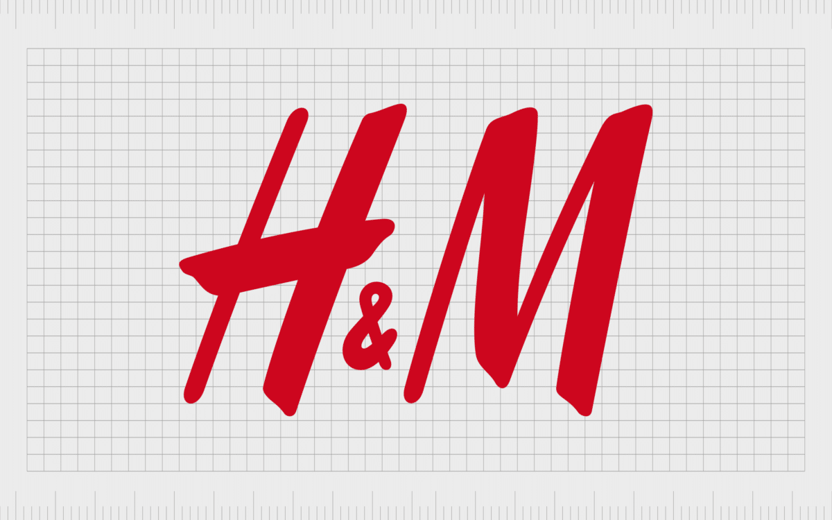
H&M
Logos that are red appear somewhat frequently in the fashion industry because the color is fantastic for generating ideas of sexuality and passion. People feel a sense of real devotion to their fashion choices, as they believe they help to convey ideas about their personality.
The H&M logo is a slightly darker shade of red, so it helps to subdue some of the concepts of excitement and anger associated with lighter hues.
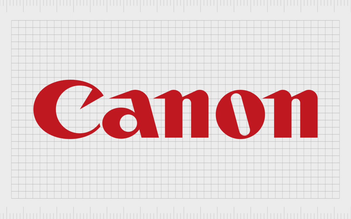
Canon
Wonderfully eye-catching, the Canon logo is yet another example of a red logo we can connect to feelings of spirit and eagerness. People invested in Canon products are likely to be creative professionals snapping photos of the meaningful moments in their lives, or the lives of others.
The Canon logo gives us a feeling of warmth and potential – perfect for a company known for selling a huge range of technology products.

Bugatti
Deeper shades of red are commonly associated with not just fervor and excitement, but also sophistication and heritage. The Bugatti logo, for instance, is an excellent insight into how red a symbol of prestige can be.
Deep red color – as used in the Bugatti logo – is often associated with precious gems, like rubies.
Like many car companies using a red brand logo, Bugatti also leverages this shade to convey concepts of power and speed.
Find out more about the Bugatti logo here.

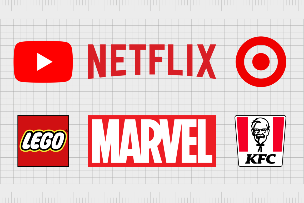
YouTube
The YouTube logo is one of the most famous red logos in the digital world. When choosing a color palette for a company dedicated to helping people share their passions with the world, YouTube clearly made the right choice with red.
The bright, youthful shade of the red in the YouTube logo is enough to generate a sense of excitement. The logo is also warm and engaging, great for attracting a wider audience.

Lego
While the colors of red and yellow might be something we commonly associated with food, thanks to the McDonalds brand, Lego uses the palette to a very different effect. The combination of red, white, yellow creates a fun, playful, and youthful design, intended to attract a younger audience.
When matched with yellow, the red shading in this block logo is more likely to be associated with joy and excitement.

Nintendo
Speaking of popular red logos where the color is associated with fun and excitement, it doesn’t get much more engaging than the Nintendo logo. The combination of red and white work together perfectly to get your blood pumping and your thrill levels rising.
The bright shading of the red for the Nintendo logo also helps to connect the brand to a more youthful community. Lighter reds are more likely to be associated with courage and adventure – common concepts for a gaming brand to explore.

Honda
Often, red can take on different meanings when placed alongside other shades. For instance, the Honda logo combines a red wordmark with a silver design. The combination of elements is excellent for conveying a sense of strength and stability for the brand.
The decision to use red also helps Honda to compete alongside other car companies more commonly associated with things like racing, power, and performance.
Find out more about the Honda logo here.
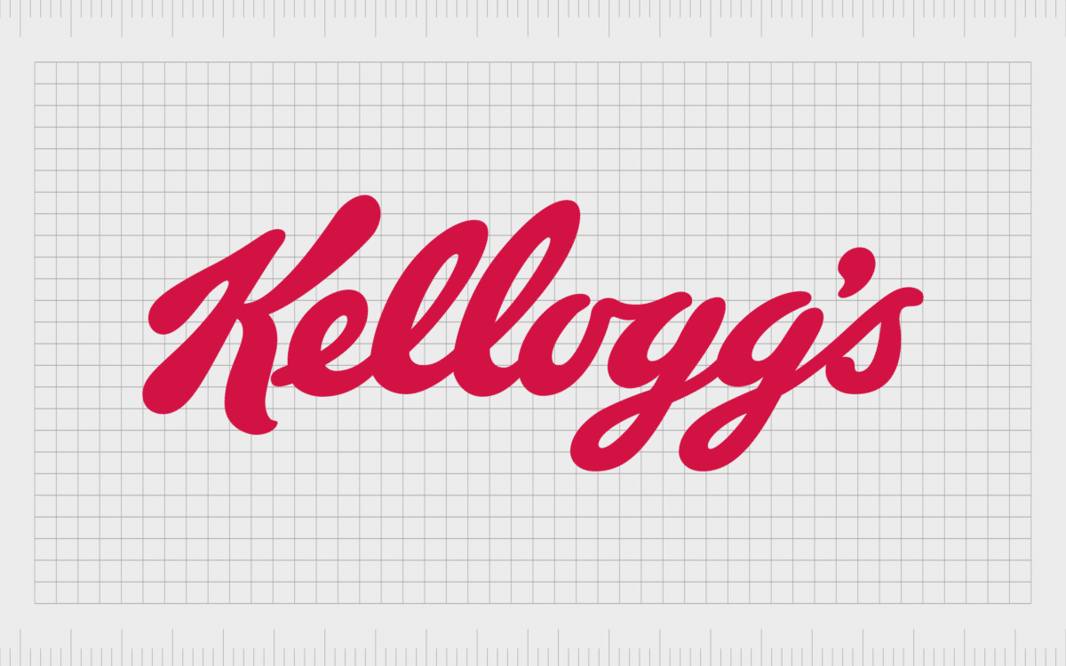
Kellogg’s
The Kellogg’s logo is beautifully eye-catching for all the right reasons. This red logo has changed shades a number of times over the years, searching for the ideal brand identity.
The slightly darker color of red in the current logo helps to create a more sophisticated and historical image for the brand.
In this instance, the color red is ideal for its connection with the food industry, and its links to things like health and vitality. Kellogg’s wants to convince customers its products will provide energy for the day ahead.

Red Bull
The exciting nature of the color red is perfect for increasing our heart rate and generating adrenaline. As a result, we often associate this color with energy and endurance. Red Bull made the perfect choice when choosing a red company logo for this reason.
As red logos go, the Red Bull emblem is bold, eye-catching, and designed to increase your heart rate – just like the energy drinks themselves.
Target
We couldn’t have an article on famous red logos without drawing attention to Target. One of the better-known logos in the world, the Target emblem is ideal for capturing the focus of its target audience.
The design is intended to be similar to a bullseye, letting customers know they’ll get exactly what they need when shopping with this brand.
The bright shade of red for Target is also ideal for grabbing the attention of a wide range of younger customers and families.
Find out more about the Target logo here.

Tesla
The common associations between the color red and ideas like passion and excitement mean the shade frequently appears in the automotive world. Tesla offers an excellent insight into how effective the shade can be in this instance.
The Tesla brand chose a bold shade of red for its word mark, to help capture the attention of its audience, and get people motivated by the unique creations the company is introducing to the world.

Red Cross
As mentioned above, red is an excellent color for forcing us to stop and take notice. This makes it an ideal shade for official groups with a focus on ideas like life, vitality, and health. The American red cross logo draws the mind to thoughts of life, wellbeing, and even danger.
To help balance the visual appeal of the brand, the company has also used a sans-serif font for its wordmark, to make the image more friendly.

3M
A red brand logo can have a real sense of power, making it an effective choice for companies with a significant global impact. The 3M Company, known for producing a huge range of products all around the world, uses red as a way of showing confidence and strength.
In this instance, the color red communicates ideas of fortitude and stability, while the bright shade makes us think of innovation and creativity.
Learn more about the 3M logo here.

Stranger Things
Though the associations we have with the color red aren’t always positive, this doesn’t have to be a bad thing. In the media industry, using red in a logo can create a sense of danger and foreboding. This is definitely the case for the Stranger Things logo.
Used to represent one of the most popular shows ever to be created for a streaming service, this logo has an unmistakable sense of danger connected with it.
Find out more about the Stranger Things logo here.
Colgate
While a red logo might seem like an odd choice for a toothpaste company at first, it’s actually an excellent pick for a brand focused on health and vitality. As mentioned above, we often associate the color red with our resiliency as human beings.
Not to mention, the combination of red and white in the Colgate logo can represent the colors of teeth and gums. Red and white are also commonly used together in health-based emblems, such as with the red cross.

Levi’s
Another example of famous red logos in the fashion industry, Levi’s uses a slightly darker shade of red for its brand image. This color is closer to a maroon in some cases, but it still has the same impact to convey ideas of passion and devotion.
The Levi’s emblem simultaneously helps us to imagine a brand with cloths we can fall in love with, as well as a company with substantial history in its industry.
Oracle
Technology companies often experiment with a wide range of different colors to create the right brand image. Red is a popular choice, because of its associations with creativity and innovation. Oracle’s use of the color red helps the brand to stand out as a thought leader in its field.
The Oracle shade of red also makes the brand seem more animated and excited – committed perhaps to creating the next generation of technology innovations.

Mitsubishi
The Mitsubishi three-diamond emblem is a fantastic example of a red logo for a number of reasons. First, red is a popular choice among car companies, as it helps to convey ideas of passion and excitement. Secondly, the color red is a popular choice among Japanese car brands.
Mitsubishi’s logo is ideal for capturing the attention of people looking for an experience behind the wheel they can fall in love with.

Virgin
Responsible for one of the most significant brand experiences in the world, the Virgin Company has explored virtually every industry over the years. When it comes to red logos, Virgin’s logo is all about experience and discovery.
The design depicts a company willing to experiment and take risks.
Part of what makes the Virgin logo so appealing is the unique nature of the wordmark. The hand-drawn style of the letters draws attention to the raw nature of the brand.

KitKat
The color red is perfect for the food and confectionary landscape because the shade is naturally effective at boosting the human metabolism. This means products like KitKat consistently use shades of red to get your mouth watering when you’re in a store.
The KitKat logo can differ depending on the kind of KitKat you’re buying, but its underlying red brand identity is known throughout the world.

McDonalds
McDonalds is an interesting example for our list of famous red logos, because the red isn’t always present in all of the company’s branding. Sometimes, the organization can get away with just the golden arches of the “M”.
The shades of red and yellow in the McDonalds’ logo were carefully chosen to create a sense of hunger and desire. What’s more, these two colors together create a naturally joyful image, perfect for grabbing the attention of younger customers.

KFC
McDonalds is far from the only fast food brand reliant on red as a central brand color. KFC also uses the traditional color for the food industry to increase the appetite of its target audience. Red is a naturally stimulating color, perfect for making people want to buy.
While the KFC logo has used a number of different shades of red to convey its brand identity over the years, the current logo is a bright and eye-catching image, great for a younger audience.

Netflix
Human beings naturally associate colors like red with eagerness, animation, zeal, and interest. This shade therefore makes an excellent choice for a company focused on entertainment.
The Netflix logo is a slightly darker shade of red than some of the other famous red logos on this list, which helps the company to appear more credible.
At the same time, the use of red for Netflix’s brand image also means the application stands out perfectly on your smart TV when you’re looking for something to do.

Santander
The color red might seem like an odd choice for a bank. Most financial companies prefer to use colors like black and blue to convey sophistication and reliability. However, this red logo is an excellent way for the Santander brand to stand out.
The red logo reminds us of life and vitality, two things we want to enhance when making decisions on how to use our money.

Swiss Airlines
Sometimes, the color red can simply link back to the heritage of a particular company. For instance, the Swiss Airlines company uses red and white in its logo to depict the Swiss flag. This helps to remind customers of the history of the brand and where it comes from.
The fact the color red is commonly associated with aspiration and ambition is just an added bonus for this airline brand.

The Rolling Stones
Passion, lust, and just a hint of danger is just some of the feelings we get from the Rolling Stones logo. This was an image specially designed to grab attention, and perhaps even be slightly offensive.
Great for the “rock and roll” lifestyle, the color red is all about experience.
This image is perfect for making viewers think of the outlandish and daring nature of the band, who were committed to changing music forever.
Find out more about the Rolling Stones logo here.

CVS
For CVS, the color red is all about life, and community. The bright shade of red in this logo is an excellent insight into the company’s desire to make customers as happy and healthy as possible.
When matched with the small heart shape alongside the wordmark, the CVS red logo takes on additional meaning.
By using red in its logo, CVS has created a caring image, ideal for a company responsible for pharmaceutical products.

Marvel
The Marvel Company is a brand all about unbelievable experiences and imaginative stories. The color red not only depicts the passion and heart that goes into the characters in the Marvel franchise, but also the exciting adventures depicted by the company.
Using red as a central shade is an excellent choice for the Marvel Company, because it instantly captures the attention of action lovers.
Brands with red logos
Companies with red logos are everywhere in today’s competitive world. The color red is an excellent way to grab attention, capture the hearts and minds of your audience, and generate an emotional response.
As you can see from the famous red logos above, the right shade is truly unforgettable.
Red can be a wonderfully versatile color in branding, capable of igniting our interest and forging stronger connections with a brand. The key to success is making sure you use the color red correctly, without risking connotations with anger or danger.
Fabrik: A branding agency for our times.
Now read these:
—Famous companies with blue logos
—Green logos to make you envious
—Popular brands with orange logos
—Today’s most famous purple logos
—The timeless black and white logos
—Famous yellow logos with zest appeal
—Standout companies with pink logos
—Exploring the colors of the rainbow

Clarity starts with a conversation.
Thanks—we’ll get back to you shortly.
Whether you're navigating a rebrand, merger, or simply need a clearer identity—we’re here to help. No hard sell, just honest advice from people who know the sector.
Let’s start with a simple question…
Prefer to email? Drop us a line.
Fabrik’s been helping organisations rethink and reshape their brands for over 25 years. We’ve guided companies through mergers, rebrands and new launches. Whatever stage you’re at, we’ll meet you there.