


Famous pink logos: Standout companies with pink logos

Famous pink logos may not be as commonplace as popular red or blue logos, but there are definitely plenty of great examples out there. Companies with pink logos often embrace the color to give their company a more intimate aesthetic, as pink is associated with love and youth.
With a pink logo, companies can instantly make themselves more appealing in certain industries which appeal to a specific audience. For instance, there are various popular pink logos dotted throughout the baking landscape, cosmetics, and even in the fashion world.
Pink is joyful, creative, and romantic. This is a shade many of us associate with relaxation, kindness, and nurturing in the right hues. However, certain types of pink are more commonly associated with vivacity and confidence, similar to red.
Today, we’re taking a behind the scenes look at the fabulous brands with pink logos!
Why do companies use pink in their logos?
As mentioned above, pink company logos aren’t quite as popular as some other colors, because pink is frequently associated with very specific concepts in some parts of the world.
The hue is often described as a “feminine” color, because of the early childhood tradition of choosing pink for a baby girl, and soft blue for a baby boy.
However, if we can move beyond the gender-focused elements of pink, the color psychology behind this shade goes a lot deeper than most people realize.
Pink is one of the many colors considered to have a calming effect, and it’s a shade associated with joy, creativity, and vibrancy. Some people connect pink to the springtime and flowers, while hot pink and brighter colors can sometimes be linked to boldness and sex appeal.
Just like any color, pink can have a positive or negative impact on your audience, depending on how you use it, and which accompanying shades you choose.
Let’s explore some pink logos to see how leading companies use this color effectively…
What companies have a pink logo?
Pink logos have a resounding impact on the people who say them. Connected with everything from unconditional love, to nurturing and compassion, pink can be a wonderfully engaging color.
Here are some pink brand logo examples to help you discover the benefits for yourself…

PINK (Victoria’s Secret)
Starting with perhaps the most obvious pink logo, PINK by Victoria’s Secret uses a soft shade to capture the attention of a feminine target audience. This logo design is intended to convey a sense of confidence and strength, alongside a traditionally womanly shade (soft pink).
The bold and eye-catching logo combined with the pink coloring creates a powerful contrast in the PINK logo, helping the Victoria’s Secret sub brand to stand out from the crowd.

Barbie
Another company using the color pink to connect with a traditionally feminine audience, the Barbie pink logo is well-known around the world. This company created its logo at a time when pink was still advertised as a “girl” color.
The bold shade of pink, however, helps the brand to connect with an audience looking to discover their identity.
The Barbie logo today is eye-catching and engaging, with a slightly darker shade of pink compared to some of the hues we’ve seen from the brand in the past.

Lyft
Logos that are pink are often designed with this nurturing and eye-catching shade to make customers feel more protected and confident in the brand they’re doing business with. The pink company logo of Lyft uses a slightly brighter shade to convey uplifting ideas of innovation and discovery.
The unique font of the Lyft wordmark, combined with the phenomenal color makes the company seem fun, innovative, and forward-thinking. At the same time, we still get connotations with caring and community common with pink designs.
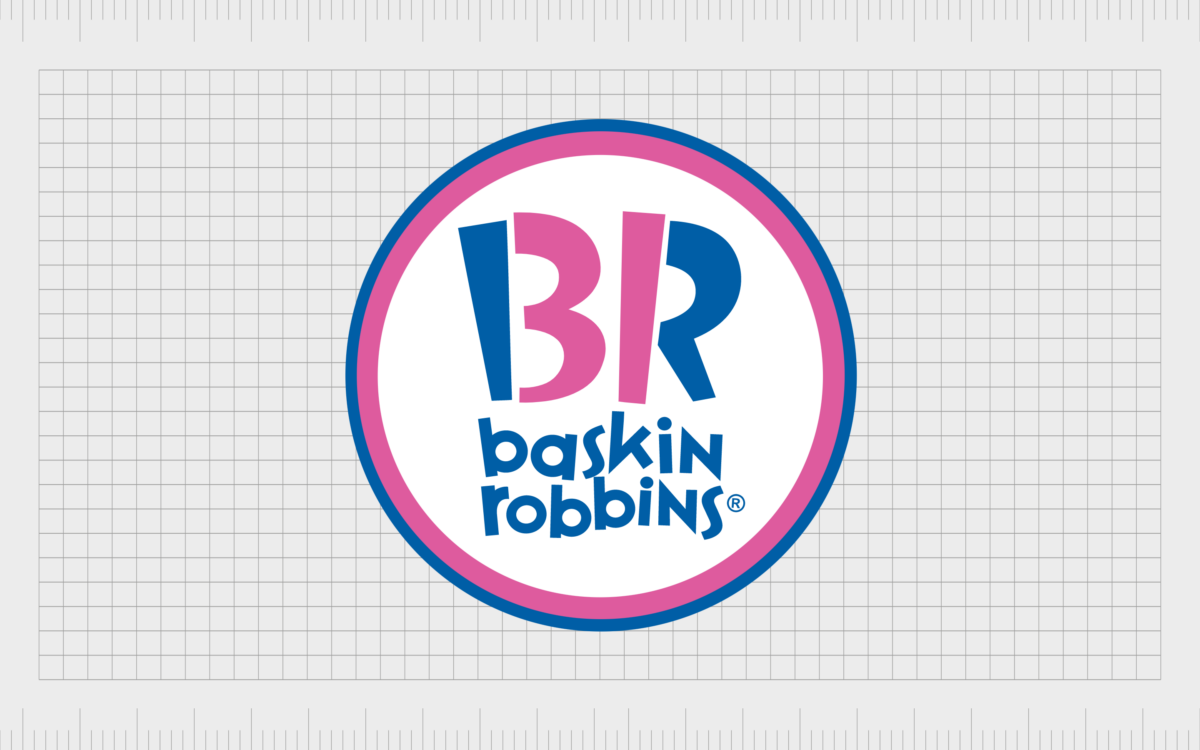
Baskin Robbins
Probably one of the better-known famous fast food logos on the market today, Baskin Robbins uses a combination of blue and pink to demonstrate its appeal to all genders and customers from every background.
This iconic ice cream company also uses the color pink to highlight the initial 31 flavors offered by the vendor.
The Baskin Robbins logo is friendly and youthful, perfect for a company hoping to reach an audience of families and children alike.

Dunkin Donuts
Dunkin Donuts uses a combination of colors in its logo. In recent years, the company has begun to reduce its focus on the pink part of the logo, usually used to convey the word “Donuts”. Instead, we just see the word “Dunkin”, with the pink apostrophe on the end.
However, despite the changes in the Dunkin Donuts branding, many people continue to associate the brand with two colors: pink and orange, intended to convey the shades of the sun rising, fun, and vivacity – all great ideas for a food and coffee company.

Cosmopolitan
One of the better-known publications in the world today, Cosmopolitan advertises itself as a magazine for women, generally focusing on topics like fashion, lifestyle, cosmetics, and so on.
Because this publication specifically wants to reach a larger female audience, it chose a hot pink shade to help make them seem more feminine.
The use of hot pink rather than a softer color, highlights Cosmopolitan as an out-spoken, bold, and confident publication, created for women with the same characteristics.

Pepto Bismol
Pepto Bismol is a company most people associate with the color pink. When it comes to brands with pink logos, Pepto Bismol really knows how to set itself apart from the competition.
Not only does this pink company logo make the product stand out on the shelf, but the company also produces entirely pink medicinal products.
The Pepto Bismol pink logo today is a little different from previous brand images. The shade of pink is a lot darker, closer to a purple color. There’s also a bright yellow to help customers think of happiness and rejuvenation.

Donut King
The Donut King logo represents a business launched in 1981 and owned by the “Retail Food Group”. This Sydney-based brand has used the color pink in its logo for several years, in a variety of different shades. The color is intended to demonstrate boldness, vibrant flavors and sweetness.
The pink and purple shades in the logo helps to make the business more appealing to children and younger people. The logo’s font also helps to make it more attractive to youngers, thanks to its lowercase, sans-serif typography.

LG
While you may argue the LG color is closer to red than pink, there are definitely some pink shades in this design. LG’s color choice is interesting, because it’s less common to see technology and electronics companies experimenting with such shades.
The reason for the pink coloring in the LG logo is simple – it makes the brand seem more nurturing and caring. The design of the LG emblem, with letters intended to create the shape of a face, also makes the pink background seem more human and engaging.

Avon
One of the most famous cosmetic companies in the world, Avon has frequently advertised itself as a “company for women”. It’s probably not too surprising, then, to see the company using various shades of pink – a commonly feminine color – in its branding designs.
Avon’s logo today features a range of colors aside from pink, including shades of reddish orange, and purple. However, the pink elements are still extremely noticeable. The pink coloring here helps to connect Avon to its target audience and make the brand seem more caring.
Find out more about the Avon logo here.

Taco Bell
Like many fast food logos, the Taco Bell emblem has gone through a number of changes through the years. For a while, the organization made great addition to our list of pink brands.
The colors of pink and purple are extremely unusual in the food industry, but this is likely to be one of the reasons why Taco Bell chose them.
In an industry dominated by colors like yellow and red, shades like purple and pink help Taco Bell to stand out as something different. The bold shade of hot pink definitely grabs attention when placed alongside other companies.
However, the company has now switched entirely to purple.
Find out more about the Taco Bell logo here.
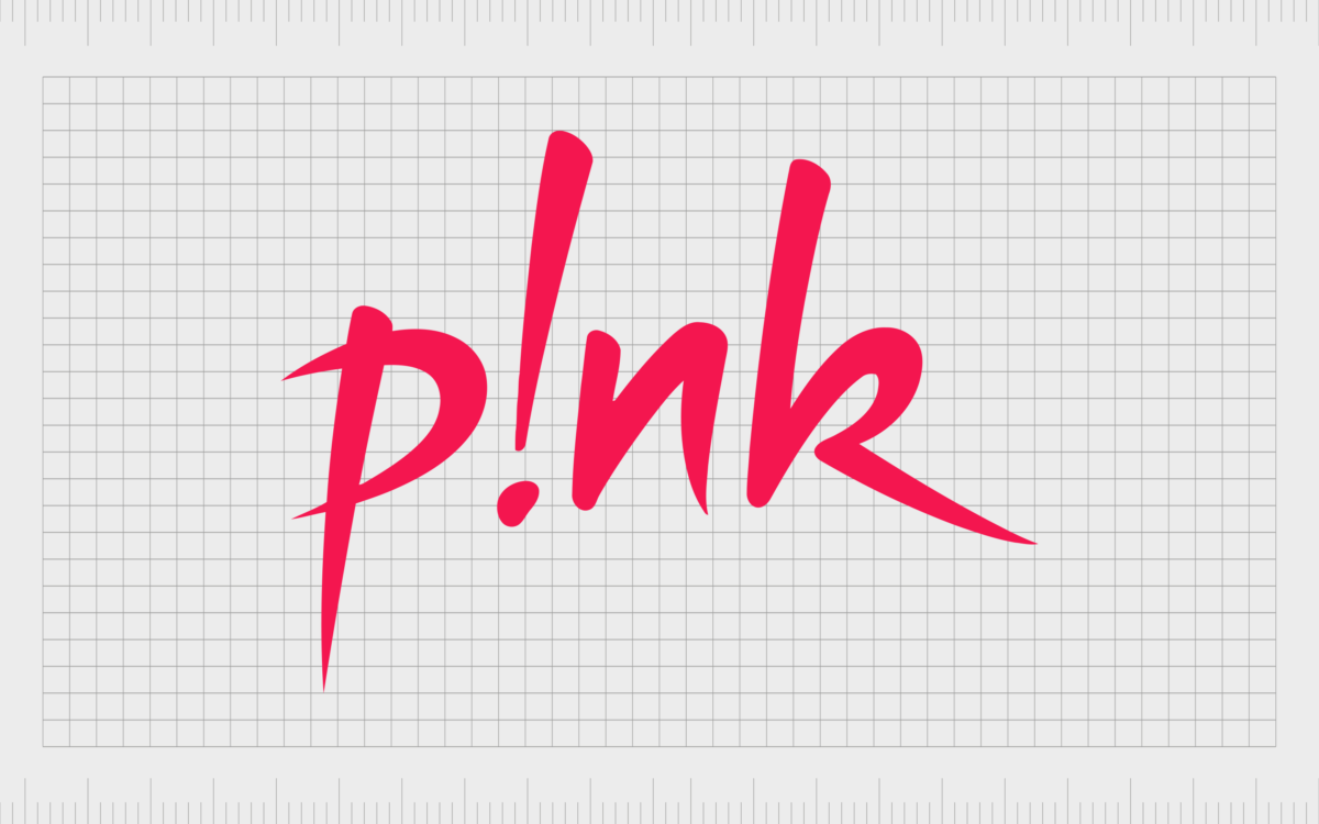
Pink (P!nk)
At a time when personal branding is at an all-time high, and artists need a way to make themselves stand out from their competitors, it’s common to see musicians creating their own logos. The Pink logo from artist “P!nk” is definitely one of the more eye-catching options on the market.
Depicted in pink not just to match her name, but to showcase her devil-may-care and rebellious attitude, this logo is excellent for highlighting the unique nature of the artist behind it.
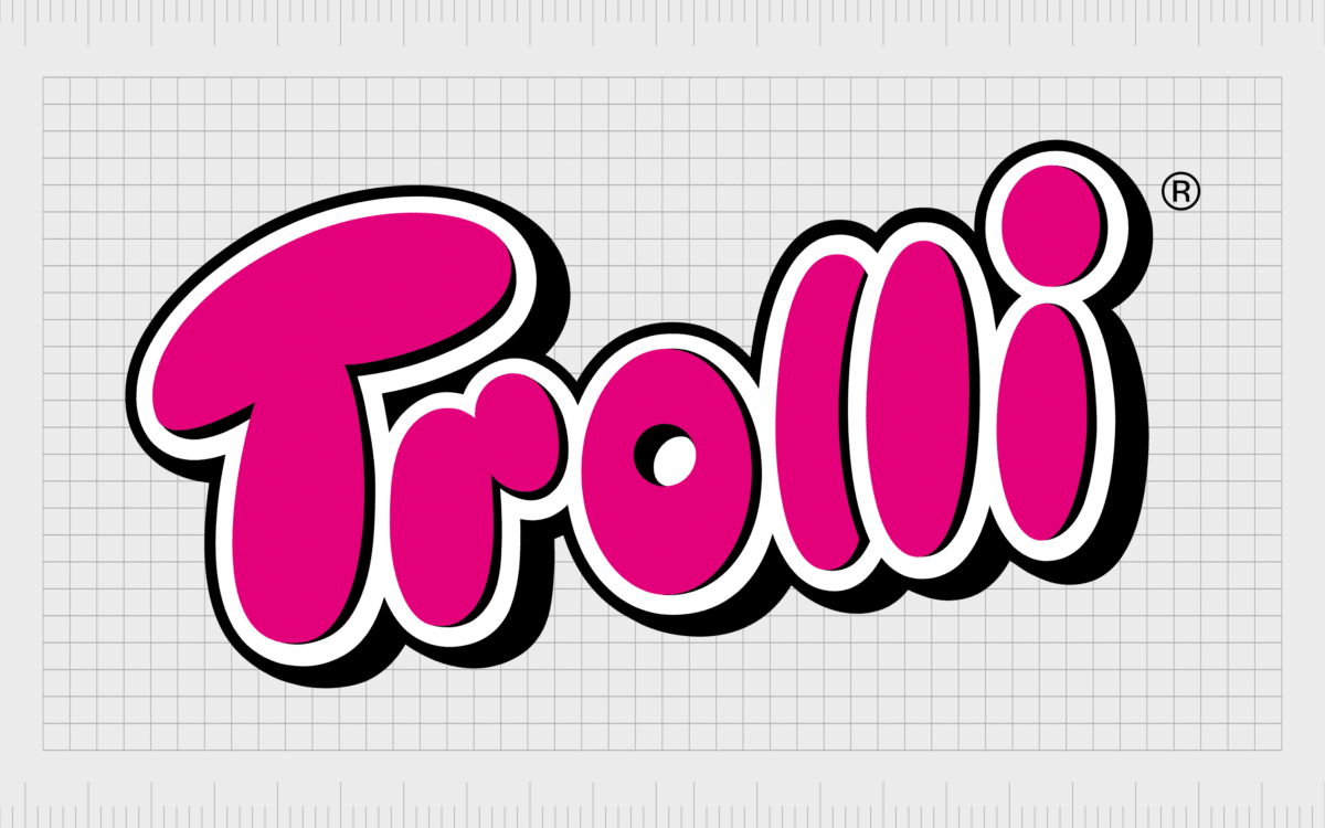
Trolli
A confectionary company introduced in 1975 in Germany, the Trolli brand is responsible for producing a wide range of marshmallows, gummy candies, and liquorice gums across 80 countries today.
This company chose to adopt a pink logo for its image to highlight its focus on youth, fun, and vibrant, unique flavors.
Trolli, owned by Mederer GmbH, uses a dark and impactful color of pink to set itself apart as bold and adventurous. It’s an excellent pick for a confectionary brand.

Tinder
One of the most recognizable pink company logos in the modern dating world, the Tinder logo uses a combination of orange and pink shades in its image. The color pink is something we often associate with concepts like passion and love, so it makes a lot of sense for a dating company.
Rather than using harsher shades like red, commonly associated with lust and aggression, Tinder chose slightly tamer colors, and a lowercase title to make it seem more accessible, and more focused on romantic love.

Benefit
Though the Benefit brand doesn’t always depict its logo in the color pink, the shade is a common part of the company’s branding. In many cases, you’ll see various shades of pink printed on Benefit packaging or placed around the shopping market stalls where these products are sold.
The color pink makes a lot of sense for Benefit, a cosmetics company committed to serving a wide range of different kinds of customers. The color pink also draws attention to the company’s flagship product, the rosy Benetint.
Find out more about the Benefit logo here.

Invision
A software company focused on helping companies transform their collaborative working environments, Invision leverages the color pink as an excellent shade for showcasing ideas of community and inclusion.
While the design of this pink logo might seem a little feminine at first glance, the use of bold, block letters for the “vision” portion of the wordmark helps to set the brand apart as confident and creative.
The pink shading here is an excellent way to differentiate Invision from other technology brands.

Adobe XD
Another example of a company using the color pink to convey thoughts of creativity and discovery, Adobe XD combines a bright pink-purple shade, with a much darker purple background.
In this instance, the color pink gives a more creative and artistic vibe, great for a company which offers software for creating vectors.
To ensure it’s not seen as overly feminine or focused on a particular gender, Adobe XD also leverages a slightly less common shade of pink.

Pink Panther
One of the best-known media franchises in the world, the Pink Panther has spawned endless films, cartoons, and animated series over the years. The logo for the franchise features not just the Pink Panther himself, but the iconic color pink depicted in the wordmark.
The color pink helps to remind us of the unique features of the panther, and what helps to set him apart from other creatures in the media landscape.

Supré
A fashion company based in Australia, Supré was founded in 1984, and has captured the attention of a huge range of customers over the years. The brand is best-known for offering pocket-friendly fashion pieces to a younger crowd.
The dash of hot pink in the Supré logo helps to make the brand more feminine, to appeal to a specific kind of audience. The shading is also excellent for making the company seem more youthful, particularly when paired with the handwritten, lowercase font.
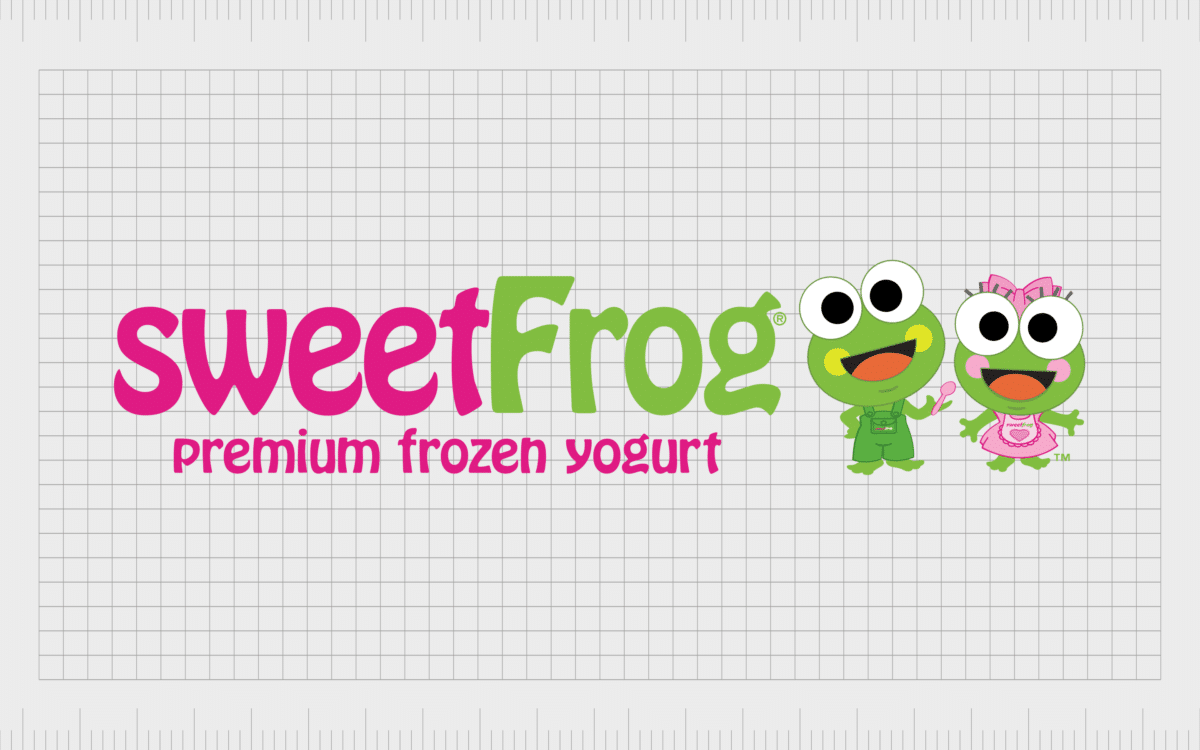
Sweet Frog
As mentioned above, the color pink is often a good pick when appealing to both a younger audience, and people with a sweet tooth. Softer shades of pink often have saccharine associations, because we connect them to things like candy floss and sweet berries.
The Sweet Frog logo uses the color pink to set itself apart as a refreshing and delicious source of frozen treats. The gentle coloring, and the pink hue help to appeal to the kind of audience Sweet Frog clearly wants to attract to its frozen yogurt business.

T Mobile
Probably one of the most memorable pink logos in the world today, and certainly one of the more eye-catching branding choices in the telecommunications industry, the T Mobile logo stands out.
This telecommunications company chose the color magenta as a way of setting itself apart from the other telecommunications brands on the market at the time.
The bright coloring makes T Mobile seem bold and creative, as well as highlighting various positive ideas about community and nurturing – ideal for a company looking to build long-term relationships with its audience.

Breast Cancer Research
Sometimes a color is all it takes to spark a range of emotions which encourage unity and community for a specific cause. The Breast Cancer Research Foundation uses the color pink to connect not just with women, but with a feeling of general caring and nurturing in the modern world.
The Breast Cancer Research Foundation commonly uses a pink ribbon in its branding, which we can easily link to concepts like womanhood and femininity.

Vineyard Vines
Vineyard Vines is an American accessory and clothing retailer, founded in Massachusetts in 1998. The company today sells a wide range of fashion accessories and clothing items, including high-end belts, ties, hats, shorts, and even swimwear.
The soft and eye-catching pink of Vineyard Vines is immediately compelling. The shape of a friendly whale makes the company seem more accessible and welcoming. The smile, matched with the soft pink shading also creates a sense of whimsy and joy.

Bratz
Similar to Barbie, Bratz is a children’s toy company with a focus on specifically creating innovative and inspiring products for a female audience. Over the years, Bratz has created a number of variations of its logo in different colors, but the pink and golden design is still the best-known variation.
With a slightly deeper and darker shade of pink than many of the logos on this list, the Bratz logo is feminine and fun, but with a slight edge. The unique font style of this logo also helps to set the company apart as a brand with a little attitude.

Flickr
Though you could argue the majority of the Flickr logo is blue, the pink element is definitely an important aspect. The bright pink coloring in the Flickr logo is intended to highlight ideas of creativity and innovation.
The brighter shade of pink makes Flickr seem bold and unique.
In some cases, Flickr even replaces its wordmark entirely with two dots. In this instance, the two dots are often in blue, and bright pink – making the color pink even more eye-catching and crucial to the company’s branding.
Celebrating popular pink logos
Famous pink logos have emerged around the world as an excellent opportunity to connect with different kinds of potential buyers. Often, companies with pink logos are specifically working to connect with a more feminine audience, or a younger selection of buyers.
However, pink can also convey various ideas outside of youth and femininity.
Brands with pink logos can use the shade to convey ideas of nurturing, affection, and comfort. Pink is something we frequently associate with sweetness and freshness, making it an excellent pick for many food and confectionary brands.
We also connect pink with ideas like community and creativity, which could make it a good choice for technology businesses too.
While a pink brand logo can be problematic for some companies, as it often pulls attention away from more “masculine” ideas, pink is growing to be an increasingly versatile color.
Many customers are beginning to consider pink as more than just a color for women, which gives it a lot more room to grow as a shade for branding and visual identity.
As with any color, a pink brand logo can be a fantastic way to convey important ideas about your brand and its values. However, you’ll need to make sure you know how to use the color pink correctly.
Fabrik: A branding agency for our times.
Now read these:
—Famous companies with blue logos
—Well-known brands with red logos
—Green logos to make you envious
—Popular brands with orange logos
—Today’s most famous purple logos
—The timeless black and white logos
—Famous yellow logos with zest appeal
—Exploring the colors of the rainbow

Clarity starts with a conversation.
Thanks—we’ll get back to you shortly.
Whether you're navigating a rebrand, merger, or simply need a clearer identity—we’re here to help. No hard sell, just honest advice from people who know the sector.
Let’s start with a simple question…
Prefer to email? Drop us a line.
Fabrik’s been helping organisations rethink and reshape their brands for over 25 years. We’ve guided companies through mergers, rebrands and new launches. Whatever stage you’re at, we’ll meet you there.