


Famous blue logos: Companies with blue logos
There’s no shortage of famous blue logos to mention when it comes to finding popular colors in branding. Associated with everything from reliability to trustworthiness, companies with blue logos capture a wide range of potential customers with their soothing image.
In fact, blue is one of the most popular colors in the world for brands. It’s wonderfully versatile, capable of conveying everything from a sense of freshness to calmness and serenity. There are endless financial companies, technology brands, and even health organizations associated with the color blue.
Today, we’re going to be looking a little more closely at some of the popular blue logos from around the world. We’ll explore which companies use blue logos to convey crucial information about their brands, and why blue is such a powerful color.
Here’s your guide to blue brand logos.
Why do companies use blue for logos?
Choosing the right color palette for your company is one of the most important things you can do as a brand. Colors have a psychological impact on us as human beings.
We associate each shade with something different. Red is commonly linked to passion and strength, while green links to nature and wealth. Blue, as mentioned above, is one of the most versatile colors, capable of taking on a huge range of meanings.
The world’s favorite color, blue appeals to people young and old, regardless of gender or creed. This shade can symbolize the sea and sky, ice and open expanses, intuition and inspiration, reliability, and intelligence.
Some associate the color with wisdom and confidence, while others see it as a hue for stability and sincerity.
There are very few negative connotations with the color blue. This often means when companies aren’t entirely sure which colors they should be using, they often default to blue as a simple choice.
Let’s take a closer look at some blue brand logos.
What companies have a blue logo? Popular blue logos
There are dozens of blue logos out there, spread across a multitude of industries. However, some companies are more likely to choose blue as their intended color than others, such as those in the financial, or healthcare space.
Here are just some brands with blue logos you may be familiar with…

American Express
An international company dedicated to capturing the respect and trust of customers around the world, American Express need a logo which conveys credibility. The color blue was an excellent pick for this company, conveying its commitment to serving its worldwide customers with authenticity.
The color blue is also linked to the sea and sky, reminding us of the international impact of the brand.

Alexa
Alexa is one of the better-known technology companies using the color blue in its branding. The image for the Alexa logo includes elements of the Amazon logo, to remind us of the parent brand responsible for the technology.
However, the use of a light color of blue, rather than Amazon’s standard colors, draws to mind thoughts of innovation and aspiration.
Find out more about the Alexa logo here.

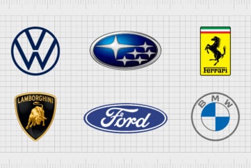
BMW
While there are two colors in use with the BMW logo (blue and grey), the color blue is one of the most important in the image.
While you could definitely link this color to the common associations we have with blue of soundness and trustworthiness, the color is actually intended to represent a flag, highlighting the heritage of the automobile brand.
Find out more about the BMW logo here.

Michelin
Another company with a global appeal, Michelin uses a blue logo with a yellow line to combine ideas of credibility and reliability, with the concept of joy. The combination of blue and yellow can also be an excellent way to depict the sky or a rising sun.
Combined with the jolly Michelin Man mascot, the color blue is an excellent way to make the company seem more friendly.
Find out more about the Michelin logo here.

Cinnabon
One of the better-known blue logos in the fast-food world, the Cinnabon logo is often associated with class, heritage, and sophistication.
Though you might not choose the color blue automatically for a company like Cinnabon at first, it quickly becomes clear the brand is trying to build an image of authenticity and heritage with its wordmark.

Dell
Blue logos are common among technology companies, because they often convey a sense of reliability, and trustworthiness. Customers want to put their money in the hands of tech brands who seem to understand how the inner workings of the complex computer work.
The color blue reminds us of the sophisticated, educated nature of Dell. The use of a circle in the logo also makes the brand seem more welcoming and community-driven.

Probably the best-known blue company logo in the digital age, Facebook has maintained the color blue for the entire life of its branding. The bright shade of blue is intended to convey feelings of trustworthiness and friendliness.
The color blue can often be used to represent the bond of friendship, without the same degree of passion as shades like red. This shade of blue also reminds us Facebook was a technology company.

Meta
Meta is the new name for the Facebook brand, and the innovative, tech-driven company has once again chosen blue as a central color for its branding.
The Meta infinity symbol is depicted in blue to help remind us not only of the Facebook brand, but of the virtues of reliability and trust the company wants to convey.
The color blue is also the color of the sky, which reminds us of innovation and lofty ambition in many parts of the world.

Dove
The color blue is an excellent choice for a cosmetics and beauty brand like Dove, committed to conveying ideas of purity and cleanliness in their brand. The Dove Company chose a deep, royal shade of blue for its wordmark, ideal for conveying soundness and dependability.
The color blue also reminds us of water, which draws attention to the hygiene products Dove sells.

Ford
Another example of famous blue logos most people are familiar with, the Ford logo combines the shades of blue for resiliency and reliability, with white for creativity and innovation. The collection of colors is excellent for capturing the hearts of customers looking for an automobile brand they can rely on.
Ford’s blue coloring is also excellent for signifying the professionalism and capabilities of the automobile brand.
Find out more about the Ford logo here.

HP (Hewlett Packard)
Another excellent example of famous blue logos, HP, or Hewlett Packard has experimented with a few different shades of blue over the years. The current brightly-colored hue is brilliant for highlighting the creative nature of the brand, and it’s friendly, accessible appeal.
The blue color here represents not just reliability, but also the company’s commitment to user-friendly products, and excellent customer service.
Find out more about the Hewlett Packard logo here.

IBM
As mentioned above, many technology companies use the color blue to make their unique, and often complex technology seem more accessible. For IBM, the color blue serves multiple purposes. The shade helps to highlight the ethical nature of the brand, and its commitment to moral strength.
The color blue is also an excellent way to make the business seem more reliable to consumers.

Walmart
Friendly and eye-catching, the Walmart logo reminds us of a sunny sky. The shade of blue here works perfectly alongside the bright yellow sunburst.
Walmart’s logo isn’t just intended to demonstrate credibility, like most blue logos, it also helps capture the hearts of customers by giving them an image they can associate with their everyday lives.
Find out more about the Walmart logo here.

Lowe’s
Due to the concept of things like “blue collar”, we often associate blue with hard working and sensible people. This makes the shade a fantastic choice for a company like Lowe’s.
The blue company logo embraced by Lowe’s makes us think of the kind of stability we would want from a company committed to helping us make our house more of a home.

The Twitter logo is another brand image with a strong focus on the color blue over the years. There’s a good chance Twitter wanted to compete with Facebook during its rise to fame, which may be why the company chose a similar shade.
However, the color blue also reminds us of the sky, and subsequently birds. Since a bird is the primary shape of the Twitter logo, the color blue makes a lot of sense here.

Oral-B
Just as we often associate the color blue with stability and strength, we also regularly connect the color to ideas of good health, hygiene, and cleanliness. With this in mind, it makes sense companies like Oral-B would want to embrace blue as their primary shade.
The blue color of the Oral-B logo is intended to convey professionalism (for a toothpaste recommended by dentist). It’s also closely connected with the water we use to keep our teeth clean.

Fortnite
The Fortnite logo is one of the few blue logos which doesn’t embrace the shade to convey security and honesty. Here, the gradient-style blue hue is all about reminding players of the sky they drop into the game from at the start of each match.
The colors of the sky are also excellent for creating ideas of creativity and innovation, something the Fortnite team definitely want their game to be associated with.
Find out more about the Fortnite logo here.

Oreo
When it comes to listing logos that are blue, there are few people who wouldn’t recognize Oreo. One of the best-known snack companies of all time, Oreo chose blue for its logo as a way of highlighting innovation and creativity.
The color also helps to draw attention to the bold white wordmark, which is intended to represent the crème filling inside of the cookie.

PayPal
As mentioned above, famous blue logos are common in the financial world, because blue is often a color we associate with credibility and soundness. The choice of blue for PayPal, a company which allows for the transfer and management of money in a digital world, makes a lot of sense.
The different shades of blue work together to demonstrate the peer-to-peer sharing nature of the brand’s flagship service too.

IHOP
The International House of Pancakes, or IHOP, offers another insight into the wonderful and versatile world of blue logos. While blue isn’t always the most common color among fast food brands, it can be an excellent way to demonstrate international appeal and community.
Since IHOP wanted to create an image of diversity and accessibility with its logo design, the choice of blue makes a lot of sense.

Estee Lauder
Often, when cosmetics companies embrace the color blue for their logo, they’re striving to accomplish one of two things.
First, blue is often associated with hygiene and cleanliness, so it’s a great pick for a company selling hygiene products.
For companies like Estee Lauder, however, the choice of a deep blue demonstrates heritage and sophistication. Blue can give a company a sense of history, great for an iconic brand.

Subaru
There are a number of car companies with the color blue in their logo – particularly businesses with a focus on building family-friendly roadsters. Subaru is more commonly associated with high-quality sports cars, but the color blue still makes sense based on the brand’s name.
The word “Subaru” refers to the Taurus constellation in the night sky. The use of blue here is intended to represent the sky and the various wonders within it.
Learn more about the Subaru logo here.

Skype
The Skype logo is an instantly memorable design for a popular technology app. This telecommunications and messaging company image is fantastic for making people think of connectedness and accessibility.
The cloud-like blue shape makes us think of freedom and openness – concepts Skype clearly wanted to convey with an app built to connect people.

Samsung
Easily one of the most famous blue logos still in circulation today, Samsung uses the color blue in a similar way to many technology leaders. The Samsung deep shade of blue conveys reliability and sophistication, excellent for a company committed to building high-quality technology.
The color blue has been a common part of the brand’s image for a number of decades now, though the shade has changed slightly.

Cisco
Cisco is a telecommunications company with a strong focus on innovation and connectivity. The color blue in this logo is light enough to remind us of the sky – something many people associate with freedom and openness.
The shade of blue is also excellent for creating ideas of authenticity, sophistication, and professionalism. As a B2B brand, Cisco wants to convince its customers it has their best interests at heart with this logo.

GE (General Electric)
When it comes to blue logo designs, there are few richer in tradition or heritage than the General Electric logo. The sophisticated emblem of General Electric manages to be both modern and wonderfully historical at the same time.
The color blue in this logo also helps to convey a new focus for the brand, which switched its attention to the development of renewable energy in recent years.

Philips
The Philips Company uses a bright and friendly shade of royal blue for its eye-catching wordmark. Though the image is quite simple and straightforward compared to some of the other blue logos on this list, it leverages the power of the hue perfectly.
With the bold, sans-serif letters of the wordmark, Philips conveys an image of reliability and consistency.

SAP
Though SAP has experimented with a few different colors over the years, blue has regularly made its way into the company’s branding. SAP’s quest to develop a brand image its customers could have confidence in finally led the company to create a logo with a gradient-style blue coloring.
The combination of light and dark blue reminds us of a brightening sky in the morning, depicting concepts of new horizons and innovation.

Danone
Danone is one of many companies with blue logos which has continued to use blue throughout its entire brand history. Though the shading has changed a few times over the years, the focus on conveying a healthy brand has always been the same.
For Danone, the color blue conveys good health, purity, and confidence. The lighter blue in the middle of the logo also draws to mind the dawning of a new day, or a fresh start.

KLM
The combination of a bright, friendly shade of blue, and the minimalist crown on the KLM logo creates an image both sophisticated, and friendly. We’re reminded of the heritage and history of the company, which has years of experience delivering fantastic airline experience.
At the same time, the soft shade of blue reminds us of the bright blue skies and makes us feel peaceful.

GAP
Blue hasn’t always been the most common color for fashion and clothing companies, because historically, the shade has been linked to males, which makes it hard for brands to capture the attention of a wide range of customers.
Fortunately, GAP has helped to overcome these prior connotations with a modern and eye-catching logo, capable of withstanding countless changes in the clothing market.

Visa
Visa is easily one of the world’s best-known famous blue logos. The image has become so synonymous with trust and credibility at this point, that it regularly appeals on online store checkout pages, to help put the minds of consumers at ease.
Visa’s logo has evolved to become a symbol of reliability and transparency in the digital world – thanks in part to its use of the color blue.

Nokia
While Nokia might not be quite as well-known in the phone and technology landscape today as it was a number of years ago, its logo is still instantly recognizable. Like many telecommunication brands, Nokia leverages a blue logo to convey ideas of connectedness and resiliency.
After all, everyone wants to be able to trust their phone to deliver excellent communication experiences.

Hyundai
Another automobile company using a combination of blue and silver to capture the attention of buyers, Hyundai combines the modernity of a chrome-style emblem, with the sophistication of a block, bold wordmark.
The sleek and modern capital letters used to depict the name “Hyundai” build on the color blue’s existing ability to create ideas of strength and stability.
Find out more about the Hyundai logo here.

Pepsi
Thanks to its association with water, the color blue is generally considered to be refreshing and cooling. It’s no wonder beverage companies like Pepsi leverage the shade in their logos. The Pepsi logo is made up primarily of a deep dark blue, which covers both the emblem and the wordmark.
The use of an extra shade (red) helps to convey the unique nature of the beverage.
Companies with blue logos
Blue logos are some of the most versatile and reliable in the branding world. There are all kinds of famous blue logos out there, spread across a host of different industries and sectors.
The shade of blue, as well as the surrounding elements of the logo can all contribute to having a different emotional impact on the intended audience.
Some blue brand logos are excellent for conveying feelings of freshness and hygiene, like Dove, or the Oral B company logo. Other blue company logos are perfect for creating images of sophistication and professionalism, like the Dell or HP logo.
The color blue can even be associated with the color of the sky, innovation, freedom, and creativity, like we can see in the SAP logo, or the Nokia brand. The flexibility of the blue logo makes it one of the top choices for branding anywhere in the world.
Fabrik: A branding agency for our times.
Now read these:
—Well-known brands with red logos
—Green logos to make you envious
—Popular brands with orange logos
—Today’s most famous purple logos
—The timeless black and white logos
—Famous yellow logos with zest appeal
—Standout companies with pink logos
—Exploring the colors of the rainbow

As Fabrik’s creative director, Stephen oversees complex branding programmes. He advises our clients on their tone of voice, creates logos and visual identities and crafts names for companies, products and services. Writing for Brand Fabrik Stephen reflects his love for logo design and visual identity.