


Famous green logos: Popular companies with green logos
Associated with luck, nature, and security, there are plenty of famous green logos out there, capturing the hearts and minds of customers. Companies with green logos leverage the power of nature to demonstrate their sustainable side or use green to create a motivational impact.
Green is one of the most popular colors in the world, often evoking strong associations with the lush greens of forests, grass, and plants. The exact shades can also be relaxing, as shorter wavelength hues are generally considered less aggressive and jarring.
Studies show green can prompt creativity, reduce stress, and even inspire motivation in the right circumstances. Many people associate this color with optimism and fun, as well as good luck, thanks to four-leaf clovers, St Patrick’s day, and similar concepts.
Today, we’re going to be exploring some of the most popular green logos from around the world, to further understand the impact of this amazing shade.
Why do companies use green in their logos?
Green is a very popular shade across a wide variety of different industries. Like the world’s favorite color, blue, green is calming, relaxing, and non-combative. It’s great for appealing to a wide audience from different backgrounds, and of different ages.
In color psychology, green has a host of versatile meanings. Depending on the shade you choose and the context of your logo, you can inspire creativity, motivation, energy, or positivity. Green also frequently appears in the logos of companies who want to associate themselves with nature.
Green logos are common in food and beauty industries, where natural ingredients are a focus point.
Like all colors, green has both positive and negative associations, depending on the circumstances. Certain shades of green can be linked sickliness or ill-health, as well as negative feelings like envy or greed.
Green is also linked to money, which can be both a positive and negative thing.
Today’s exploration of brands with green logos should give you a useful insight into how the color green can imbue a business image with additional meaning and depth.
What companies have a green logo?
The versatility of different shades of green, from vibrant, almost neon colors associated with energy, to deeper shades linked to nature and wealth, means green logos can appear almost anywhere.
While some industries like the health, beauty, and food landscapes are more commonly associated with green, there are also excellent examples of green logos elsewhere too.

Acer
A strong connection with creativity and growth makes the color green a fantastic choice for innovative brands. A green company logo can make a company seem reliable and trustworthy, similar to the color blue.
In the Acer logo, a light, bright shade of green is great for conveying ideas of inspiration and ingenuity.
The Acer wordmark wasn’t always green; over the years, the company has experimented with a wide range of different shades, before finally settling on this motivational lime green logo.

Android
Another example from the technology landscape, Android sets itself apart from other colder tech brands with a vibrant shade of green. The bright, but modern shade of green ensure that Android comes across as an optimistic innovator in its space.
This is a color we’re more likely to associate with concepts like achievement and motivation.
Android’s shade of green is lighter to allow for a friendlier vibe. Darker shades are often seen as more sophisticated, while lighter hues are welcoming and inclusive.

Spotify
One of the most famous green logos in the modern world, Spotify’s emblem is instantly eye-catching and unforgettable.
The music streaming company has experimented with its brand image a few times, but the symbol we know today is wonderfully vibrant and energetic, perfect for a company with a strong association to the musical world.
The bright and powerful shade in this green brand logo demonstrates how the color green can often be linked to concepts of life and vitality.
Find out more about the Spotify logo here.

Holiday Inn
Another green company logo with a long heritage, the Holiday Inn emblem is an excellent insight into the versatile range of images used in the hotel and hospitality space.
While many hotel symbols use serif fonts and traditional colors like blue and black to highlight stability, the Holiday Inn logo leverages green as a way of setting itself apart from the crowd.
A gradient of green in the logo image brings the mind to rolling hills and green pastures. This is a color combination which makes us think of exploration and adventure.

Nvidia
Easily one of the most popular green logos among gaming and technology enthusiasts, Nvidia’s logo is all about creativity and discovery. The company, best known for its graphics technology, immediately draws the eye with a bright shade of green and a funky design.
The color green is uplifting and enlightening, ideal for a company striving to motivate and inspire its customers. Matched with the bold wordmark, the Nvidia logo is also wonderfully modern.
Learn more about the Nvidia logo here.

Garnier
As mentioned above, green brand logos are quite common in the health and beauty landscape, because customers place a strong premium on the use of natural products. We like to know the products we’re using to care for ourselves come from organic sources – something Garnier embraces with its logo.
The Garnier logo doesn’t just use a green circle, but a leaf graphic, to pull attention to the natural and high-quality ingredients in the products.
Learn more about the Garnier logo here.

Grab
Fun and eye-catching, the green logo for the Southeast Asian cab-hailing company, Grab, is a great option for the digital world. The wordmark is intended to represent roadways, making you think of travelling and transport, while the sans-serif font makes the image more friendly.
The “Grab” logo’s use of the color green, rather than black or grey typically associated with roads, makes the brand look forward-thinking, innovative, and imaginative.

Fiverr
As a color commonly associated with both growth and creativity, green lends itself well to modern companies and startups exploring new forms of service and products. The Fiverr logo is an excellent example of how green can have an inspiring impact on the right audience.
The green circle seems to convey ideas of inclusivity and versatility, which is useful for a website which helps freelancers and potential hiring companies connect. This freelancing platform also uses a bold slab serif font to create a modern, but sophisticated image.

The Body Shop
Similar to Garnier, the Body Shop is another skincare and beauty company which chooses green as an essential part of its logo. Again, the purpose of the color green in this logo is to draw attention to the natural nature of the company and its focus on sustainable and eco-friendly practices.
The use of a much darker shade of green than many other companies help the Body Shop’s logo to appear more sophisticated and elegant. The color is also wonderful for creating an exotic vibe.

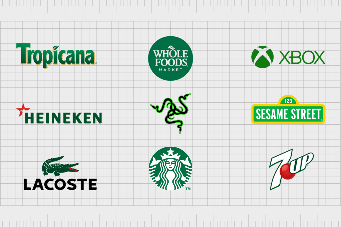
Lacoste
Easily among the best-known green logos in the apparel and sporting landscape, Lacoste chooses the color green because of its natural connection with the mascot of the brand – the alligator.
Founder Rene Lacoste was originally considered the “alligator of tennis”, which is a concept he chose to bring into his brand image.
The Lacoste symbol with its bold and eye-catching reptile gives the brand an unforgettable and unique aesthetic, perfect for the competitive clothing space.

Heineken
If you’re a fan of beer brands, then you’re probably familiar with this green company logo. The Heineken logo combines an eye-catching shade of green with red and white, to make the brand stand out.
A light shade of green in this logo is particularly important, because it helps the company to appear more friendly and approachable – ideal for an alcoholic beverage brand.

Carlsberg
Speaking of beer brands, you can’t have a list of logos that are green without giving at least some attention to the Carlsberg company. Clearly, this organization chose the color green for its associations natural ingredients and to create awareness and brand recognition.
Not only do we get the bold green of the logo to create an optimistic image for the Carlsberg brand, but this company also uses the shape of a clover in its image too.

It’d be tough to find anyone who wasn’t familiar with this green logo in today’s digital world. The WhatsApp logo uses green as a symbol of optimism and innovation.
The bright coloring of the green here is intended to make people feel happy and relaxed about the idea of communicating with friends.
The color green is also frequently associated with growth, so perhaps WhatsApp wanted to convey an idea of growing your social circle with the app.

Starbucks
Probably the most famous green logo of all, Starbucks has an instantly recognizable image in the fast food and coffee landscape. Terry Heckler was responsible for designing this iconic logo, inspired by both marine and Norse aesthetics.
The green coloring in the Starbucks logo gives the company a natural vibe, reminding us of the wide range of delicious ingredients which go into the brand’s drink. This logo is also energetic and brimming with positive energy, just like most people after a cup of coffee!

Tropicana
Another delightful example of brands with green logos, Tropicana uses a gradient of deep green in its logo to remind us of the rainforest and exotic locations. The variety of green hues in this logo gives the company a distinctly organic vibe – ideal for connecting organization to nature.
As an added flourish, the green leaf resting above the Tropicana wordmark in the place of the dot for the “I” adds further weight to the assumption this is a highly natural company.

Land Rover
Because the color green is so commonly associated with nature, it also frequently sparks cognitive connections with the idea of travel, adventure, and exploration. This is something the Land Rover company chose to take full advantage of with its logo.
Land Rover’s logo uses a darker shade of green to give the company a more powerful and sophisticated air. At the same time, the green hue definitely makes us think of off-road adventures and exploration.

Double Mint
Sometimes, a green company logo just makes sense. For Wrigley’s “Double Mint” brand, the shade of deep minty green above is ideal for inspiring thoughts of refreshment.
The double mint logo is simple but effective. The deeper shade of green is a deliberate choice here, as brighter, and lighter shades may be associated with zestier flavors, like lime.
The white font in middle of the green banner is also particularly eye-catching; it helps to enhance the overall refreshing nature of the image.

Hulu
One of a series of popular streaming solutions in the digital world, Hulu chose the color green to help it create space in a competitive market. Hulu stands out as a clear alternative to Netflix (Red) and Amazon Prime (blue), with a focus on innovation and creativity.
The shade of green in this logo is deliberately bright and eye-catching, intended to make us think of innovation and growth. The color is also bright enough to stand out on a smart TV screen when placed alongside other apps.

Xbox
The color green has been a fundamental part of the Xbox brand for several years. Neon green was one of the first colors to appear on the Xbox in its early years, setting it apart from other white and black products in the games console market.
Over the years, Xbox has updated its image a number of times to create a more modern aesthetic, but the color green is something many people still associate with the gaming space.

Tic Tac
Thanks to its natural associations with nature and products like mint, green is commonly seen as a refreshing color. Many green company logos focused on refreshment take advantage of this fact, including the iconic Tic Tac logo.
The shades of green and white used together in the Tic Tac logo have a cooling effect, reminding us of the minty freshness we can get from a pack of Tic Tacs.

Hess
Green might not seem like the most obvious choice for an energy company at first. However, it’s a shade we commonly associate with life and energy in the right circumstances. The Hess Corporation uses a bold shade of green to make it seem like a more sustainable, reliable brand.
The deeper shading in the green of the Hess logo gives the image a more sophisticated element than other brighter or neon hues. This is enhanced by the use of bold, sans-serif letters, symbolizing strength, and consistency.

Whole Foods
One of the better-known green company logos in the world today, the Whole Foods logo is a symbol of nature and quality for the brand. Whole Foods is a supermarket specifically focused on helping its customers to make the most of organic, natural products, making the color green a clear choice.
The dark shade of green in the Whole Foods logo, combined with the traditional serif font helps the brand to seem a little more traditional and sophisticated.

Razer
Certain shades of green, particularly when combined with other colors like black, are connected to ideas of vibrancy, energy, and power. The neon green in the Razer logo, similar to the green shades in the Xbox symbol, helps to set the company apart as an innovator in its field.
The green of the razor logo, combined with its unique symbol of entangled shape definitely identifies this company as a bold, confident, and daring brand. The modernity of the company also shines through in the brand’s unique wordmark.

John Deere
Symbolizing nature and tranquility, the John Deere logo immediately draws the mind to forests, trees, and plains of grass. It’s an interesting image for a company responsible for manufacturing agricultural, forestry, and similar machinery.
The John Deere logo, with its combination of yellow and green is brimming with positivity and inspiration. It draws the mind to the wonders of creativity, discovery, and innovation in the world of construction and building.

Sprite
The color green can be both refreshing and zesty, depending on the shades you use, and the context of the image. The Sprite logo, for instance, is fantastic example of a vibrant green logo which makes us think of tangy flavors from fruits like lemons and limes.
The use of green in this logo was clearly to draw the mind to the flavors evident within the Sprite drink. The punchy shade of green is wonderfully refreshing.

7UP
Similar to Sprite, 7UP uses the color green for its refreshing appeal, but the image has a very different vibe, thanks to the shade of green, and the surrounding colors. The red bubble for the “Up” part of 7UP makes the brand seem more daring and modern.
The darker shade of the green in this logo also draws the mind away from zesty flavors like lemon and lime, and instead pushes us to imagine a broader landscape of natural tastes.
Learn more about the 7UP logo here.

Sesame Street
Perhaps one of the most popular green logos of anyone’s childhood, the Sesame Street logo is a symbol of all things joyful and bright. The color green here reminds us of how the shade can inspire things like creativity and motivation, particularly in an educational setting.
The brighter shade of green, matched with the sunshine-colored yellow borders, make this logo fantastic for younger children – the audience Sesame Street wants to attract.

Subway
Another excellent example of a company using both green and yellow to its advantage, Subway combines the two shades to create a friendly, and joyful image.
The use of yellow and green in this logo also reminds us of a host of natural ingredients we might find on a subway sandwich, from sweetcorn and peppers to lettuce and jalapenos.
The fun design of the subway logo, with its sans-serif font and arrows pointing in either direction, creates a beautiful innovative image for the fast food space.

Sony Ericsson
One of the most famous logos in the technology and telecommunication space, the Sony Ericsson logo is wonderfully refreshing and unique. The green elements in this logo are intended to draw the mind to ideas of inspiration and innovation – ideal for a tech company.
Sony Ericsson’s logo also reminds us a little of the earth, with its round 3D design, this could be an attempt to highlight the company’s ability to connect people around the world.
Get inspired by popular green logos
Famous green logos are littered all over the business landscape today, in virtually every industry you can think of. The color green can link to ideas of wealth and innovation, as well as giving you a natural and organic image if you’re situated in the health, beauty or food space.
As you can see from the companies with green logos above, the context of your logo and shades of green you use to depict your brand image can make a huge difference to the impact you create.
As a soothing and relaxing color in most instances, green can offer an excellent alternative to blue if you want to stand out from the crowd.
Green is also a great way to add vibrancy and vitality to a brand image in the right hues. A bright or neon shade of green can have the same energizing effects as yellow or orange.
With a little luck, the green logos above have given you all the inspiration you need to decide whether green is the perfect color for your brand.
Fabrik: A branding agency for our times.
Now read these:
—Famous companies with blue logos
—Well-known brands with red logos
—Popular brands with orange logos
—Today’s most famous purple logos
—The timeless black and white logos
—Famous yellow logos with zest appeal
—Standout companies with pink logos
—Exploring the colors of the rainbow

Clarity starts with a conversation.
Thanks—we’ll get back to you shortly.
Whether you're navigating a rebrand, merger, or simply need a clearer identity—we’re here to help. No hard sell, just honest advice from people who know the sector.
Let’s start with a simple question…
Prefer to email? Drop us a line.
Fabrik’s been helping organisations rethink and reshape their brands for over 25 years. We’ve guided companies through mergers, rebrands and new launches. Whatever stage you’re at, we’ll meet you there.